Coplanar: Visual Identity System Design

Philipe Bastos



Coplanar: Architecture and Construction on the Same Plane
Visual identity and graphic system for an architecture and construction practice, built around alignment, precision and the relationship between planes.
By Philipe Bastos · Visual Identity / Graphic Design
The project
Coplanar starts from the idea that design and construction should operate together. The identity translates this approach into alignment, typography and relationships between planes, balancing technical rigor with understated warmth.
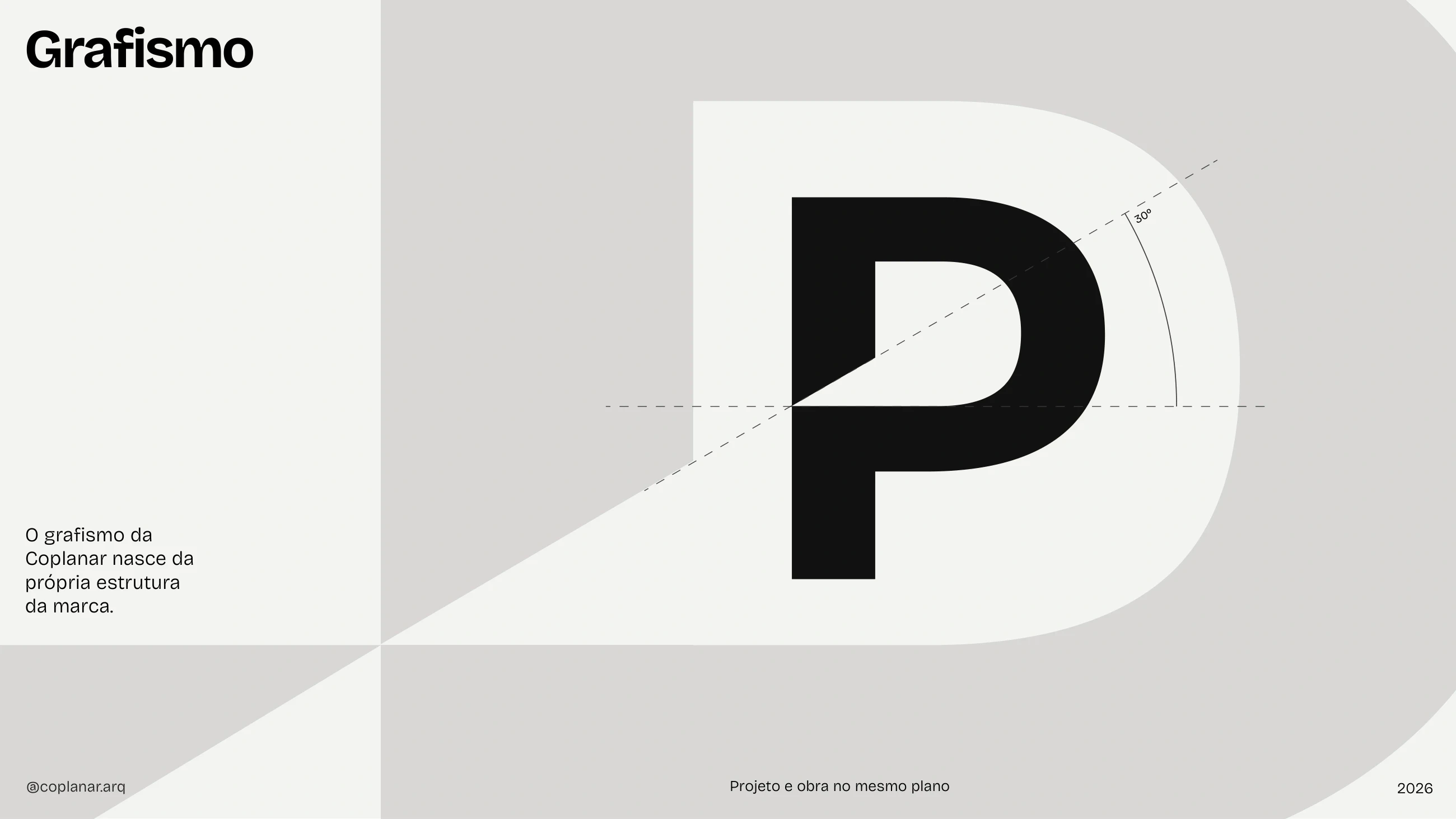
The starting point is coplanarity: distinct elements sharing the same plane. A horizontal and a diagonal make this concept recognizable across different formats.
The challenge
The design challenge was to connect the practice's architectural thinking with its everyday communication. The system needed to remain coherent across project presentations, technical documents, stationery and digital content, while giving each format enough flexibility to serve its purpose.
A precise signature
The horizontal wordmark is the primary signature. Its customized P adds a distinctive detail and provides a starting point for the graphic language. A stacked version supports formats where a horizontal signature is less suitable.
The identity guidelines define clear space using the P as a reference and specify minimum widths of 20 mm in print and 175 px in digital applications. These rules help preserve the signature's proportions and legibility.

Contrast, under control
Neutrals establish the foundation of the identity. Two restrained blues extend the palette, creating contrast without overwhelming architectural imagery or project information.
Color HEX Plano Noturno #0E0E0F Concreto Profundo #3F3F41 Concreto Médio #6E6E70 Plano Neblina #CFCFD1 Azul Estrutural #1F3247 Azul Horizonte #465B73
One family, different scales
Bricolage Grotesque carries headlines, highlights and body text. Hierarchy comes from changes in weight, scale and proportion, bringing continuity to both expressive compositions and practical documents.
The guidelines support proportional scales based on a 1.618 ratio. Segoe UI is the specified alternative for email, shared documents and environments where the primary family is unavailable.
A graphic system derived from the wordmark
The relationship between horizontal and diagonal grows out of the logo and recurs throughout the compositions. Alignment provides continuity as the format changes.
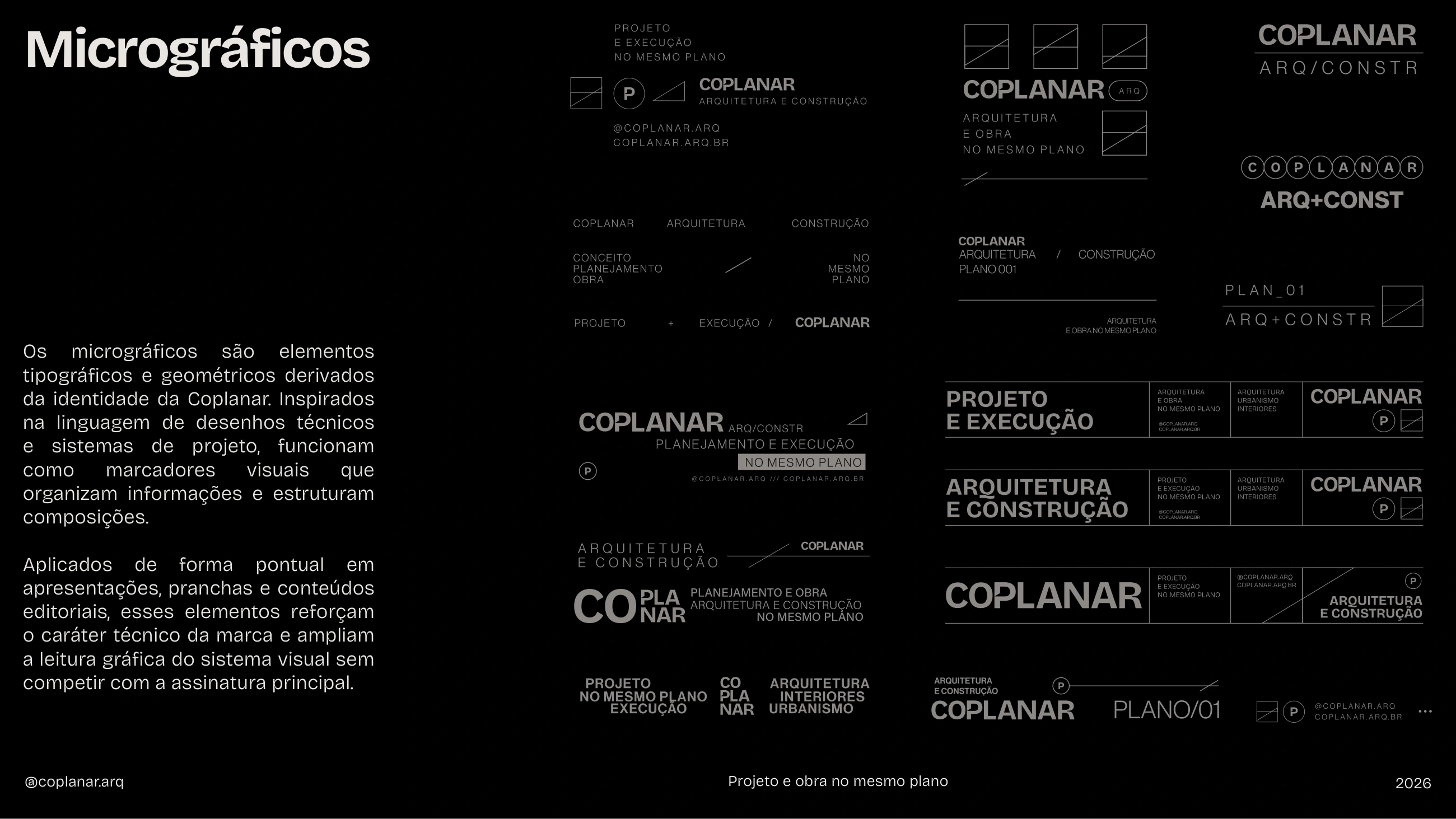
Micrographics, including codes, markers and technical elements, help organize information without competing with the signature. Together, these resources connect the visual identity to the language of architectural practice.
Project communication
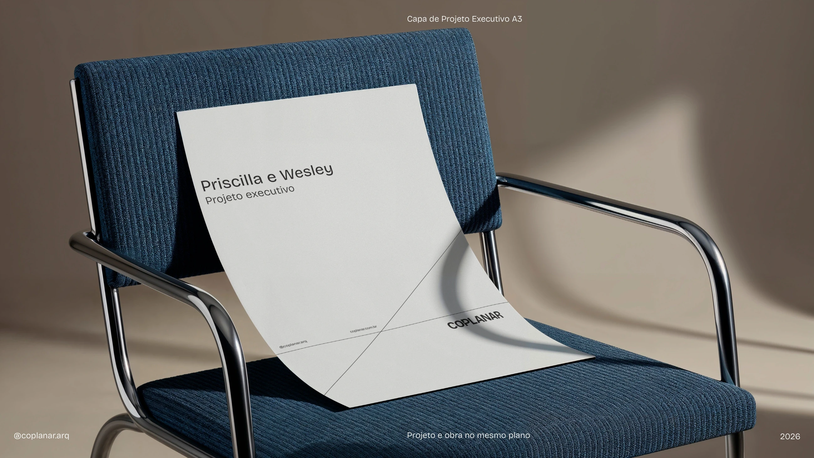
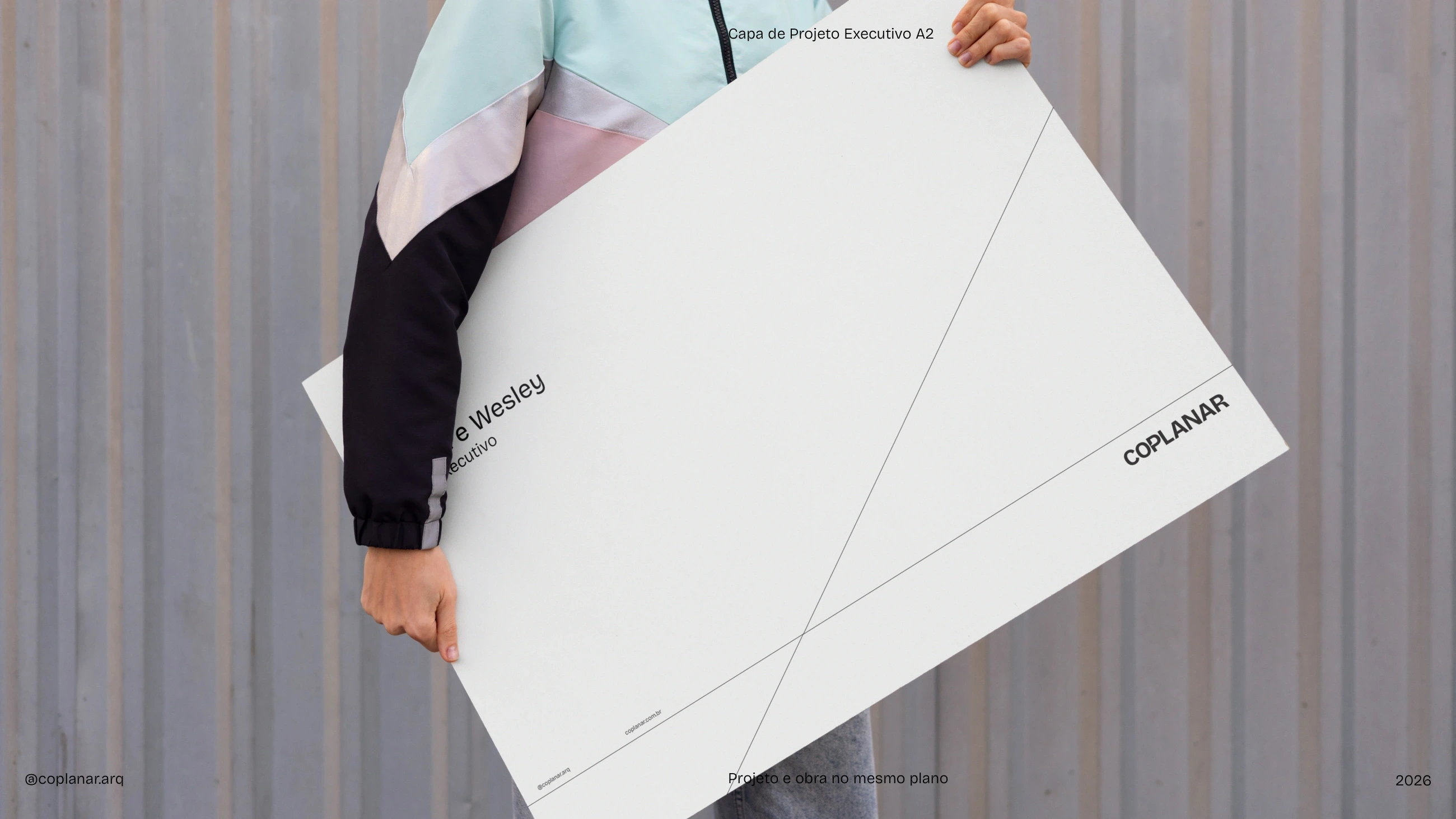
The identity organizes project presentations and boards through clear hierarchy, consistent alignment and space for the architectural content.
Physical applications
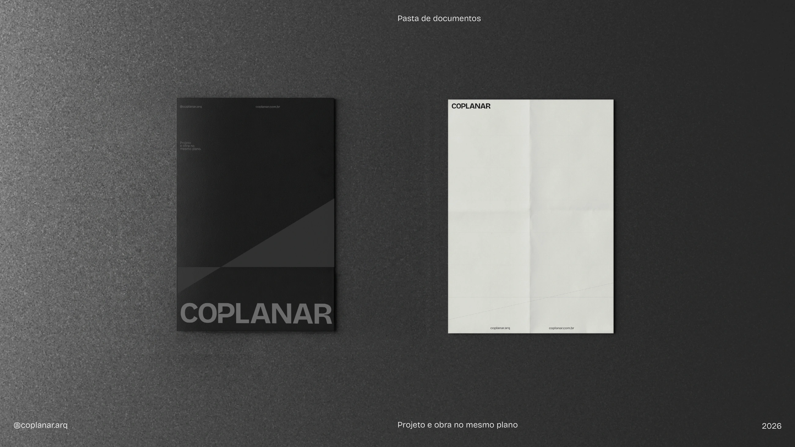
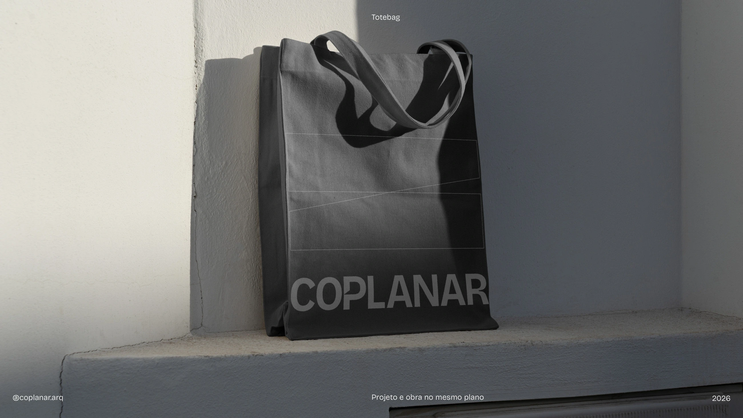
The same principles extend to document folders, business cards and a tote bag. Typography, color and graphic elements connect these different touchpoints to the same identity.
Digital communication
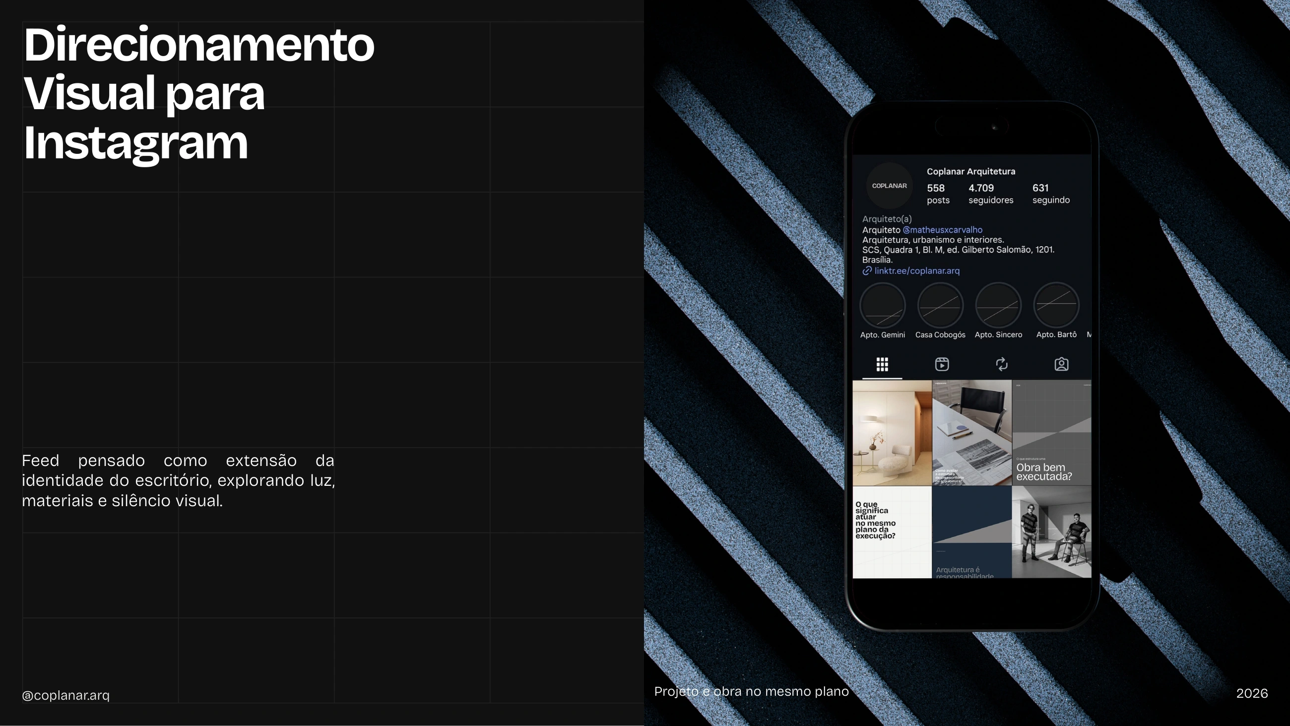
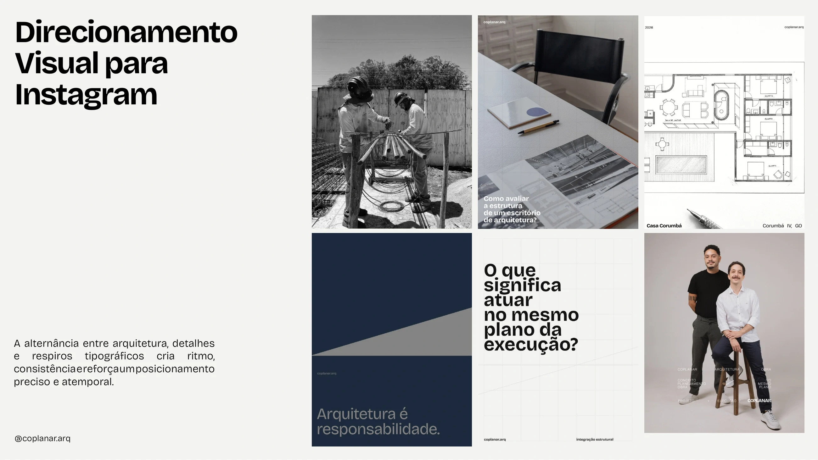
Architecture, details and typographic breathing room establish a rhythm for the practice's digital communication. The social layouts demonstrate how the identity can remain recognizable across a sequence of images and messages.
The design outcome
The resulting identity brings the practice's communication into one coherent system. A distinctive wordmark, controlled palette and reusable graphic language connect architectural presentations, physical materials and digital content.
Scope: Visual identity and graphic system
Sector: Architecture and construction
Designer: Philipe Bastos
Like this project
Posted Sep 9, 2026
Created visual identity system for an architecture firm, focusing on alignment and precision.