Built with Framer
AYARA Healthcare Website Design

Devowise Studios


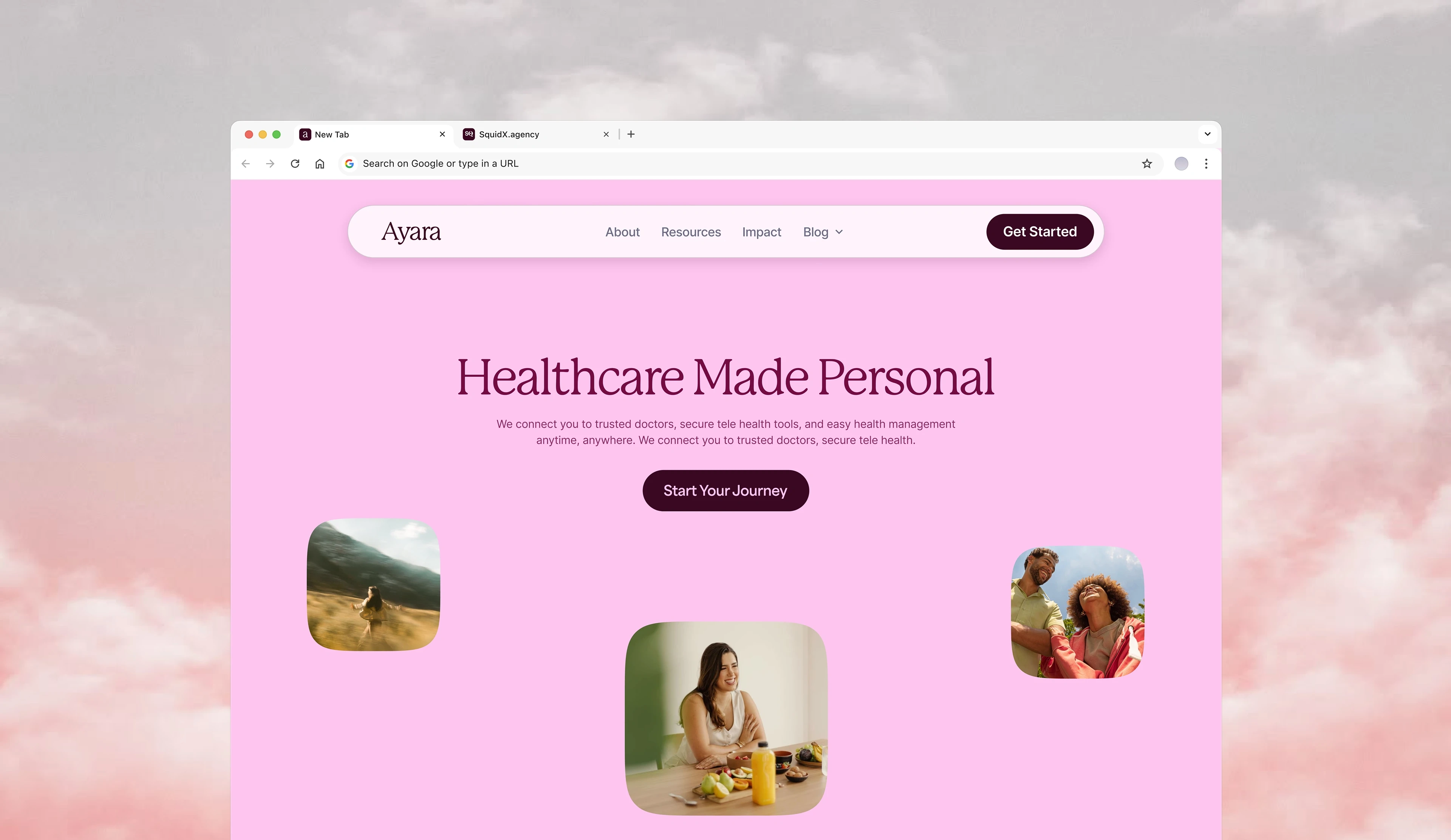
AYARA — Designing a Human-Centered Healthcare Experience
Overview
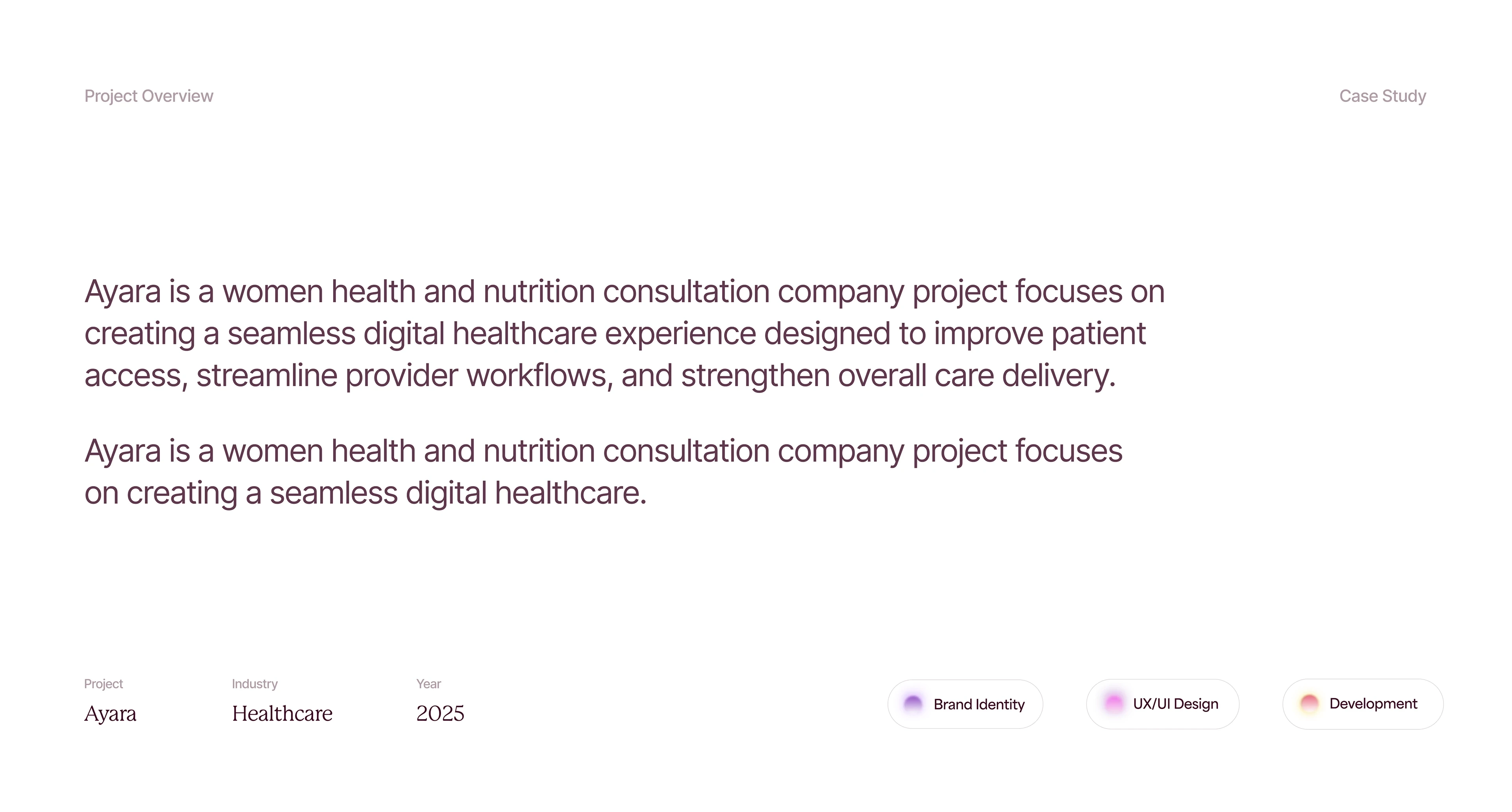
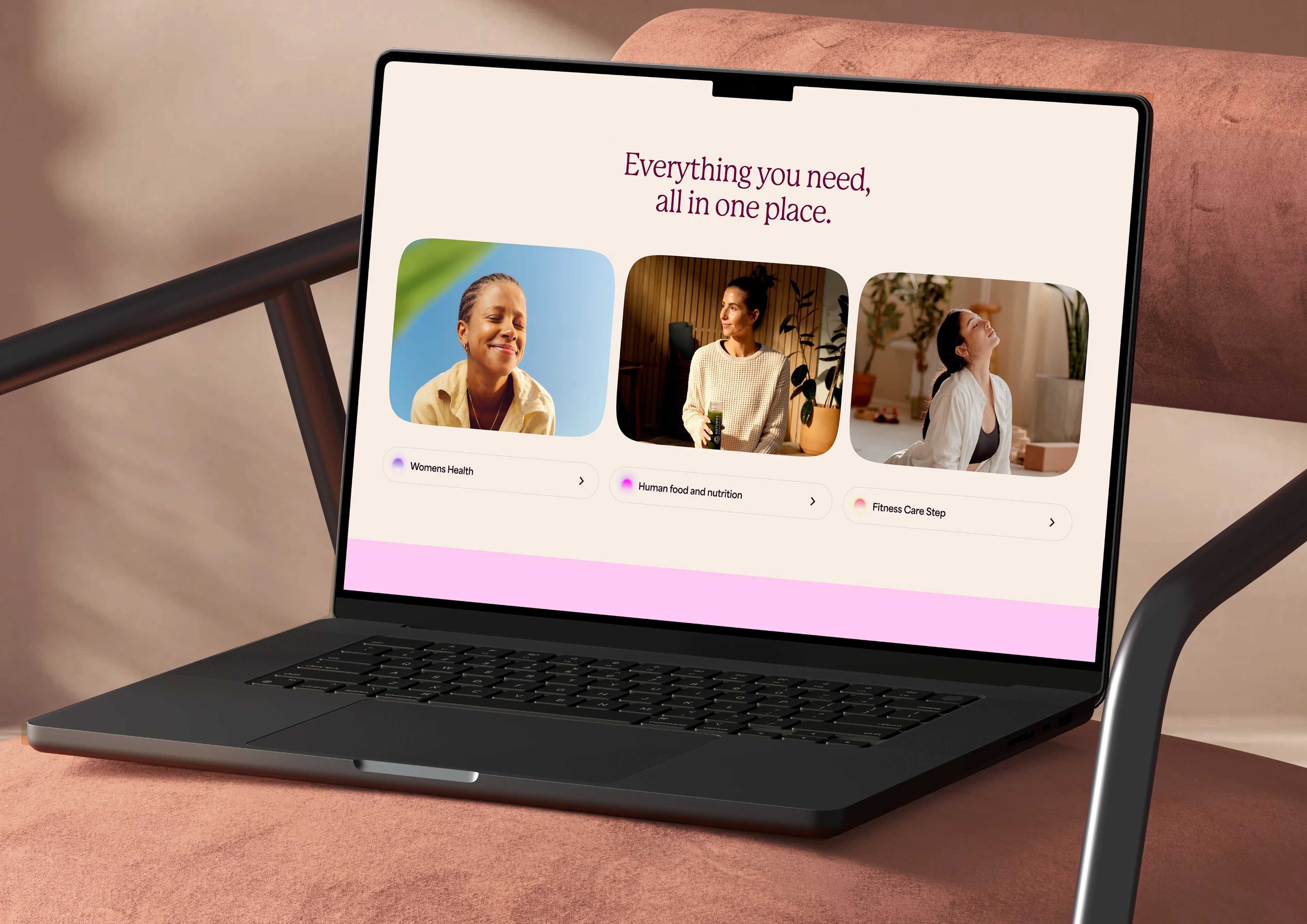
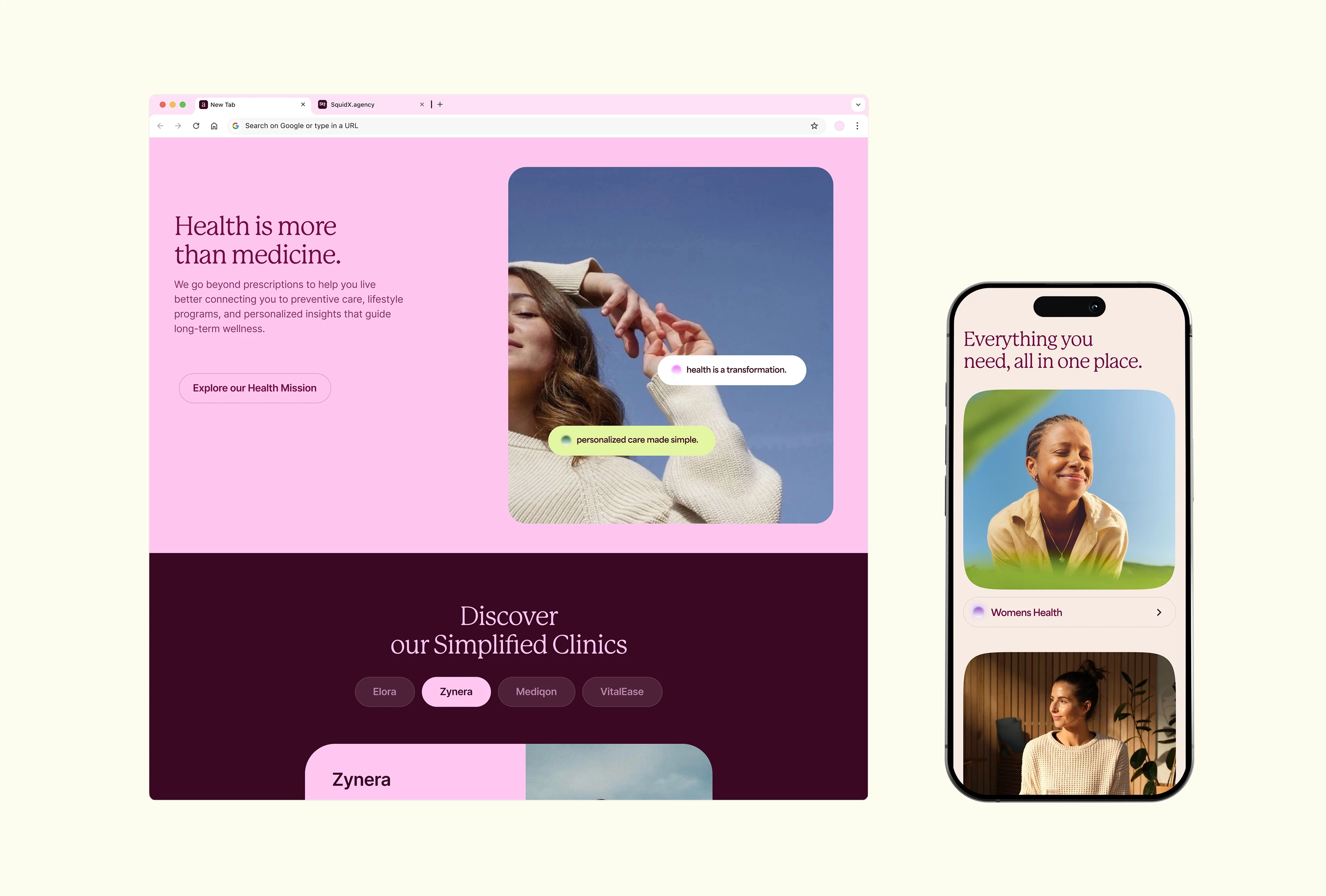
At Devowise Studios, we designed AYARA, a modern healthcare website concept focused on making healthcare services easier to understand, navigate, and access online.
Our objective was to create a digital experience that inspires confidence from the very first interaction. By combining clean visual design, intuitive navigation, and thoughtful UX strategy, we built a website that helps patients quickly find information, understand available services, and book appointments with ease.
Designed in Framer, AYARA demonstrates how modern web experiences can make healthcare feel more approachable, reassuring, and accessible without sacrificing professionalism.
The Challenge
Healthcare websites often present large amounts of information in ways that can feel overwhelming, especially for users seeking immediate answers or medical support.
Our challenge was to design a platform that would:
Build trust through a calm and professional visual identity.
Present healthcare services in a simple, easy-to-understand format.
Reduce friction when navigating medical information.
Create a seamless appointment booking journey.
Deliver a responsive experience that works consistently across all devices.
Project Objectives
To achieve these goals, we focused on:
Creating a welcoming and trustworthy online presence.
Simplifying healthcare information through clear information architecture.
Designing intuitive navigation for users of all technical skill levels.
Encouraging appointment bookings through strategically placed calls-to-action.
Building a scalable Framer project using reusable components.
Ensuring accessibility and readability across every device.
Our Role
Our team managed the project from concept through high-fidelity design, including:
UX Strategy
Information Architecture
User Journey Planning
Wireframing
UI Design
Responsive Design
Framer Component System
Interaction Design
Developer-Ready Project Structure
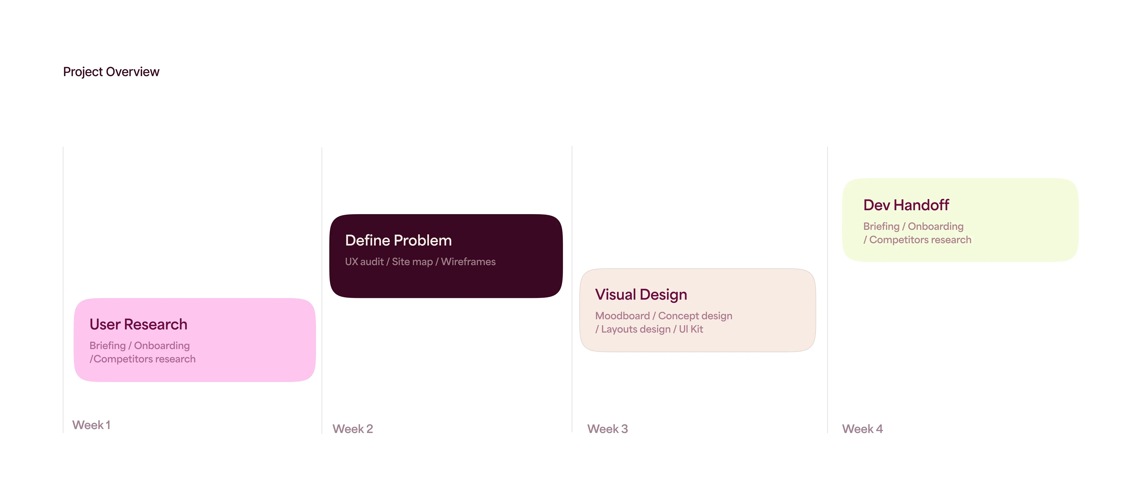
Our Process
1. Discovery & UX Strategy
We began by researching modern healthcare platforms and identifying opportunities to simplify the patient experience.
Rather than overwhelming visitors with information, we focused on creating a clear journey that helps users quickly understand services, build confidence, and take action.
The experience was designed around a simple flow:
Understand → Build Trust → Explore Services → Book an Appointment
2. Information Architecture
Healthcare information was carefully organized into a structured hierarchy that makes essential content easy to locate.
Priority was given to:
Service explanations
Medical expertise
Patient reassurance
Appointment booking
Contact information
This approach reduces cognitive load and helps users navigate with confidence.
3. UI Design
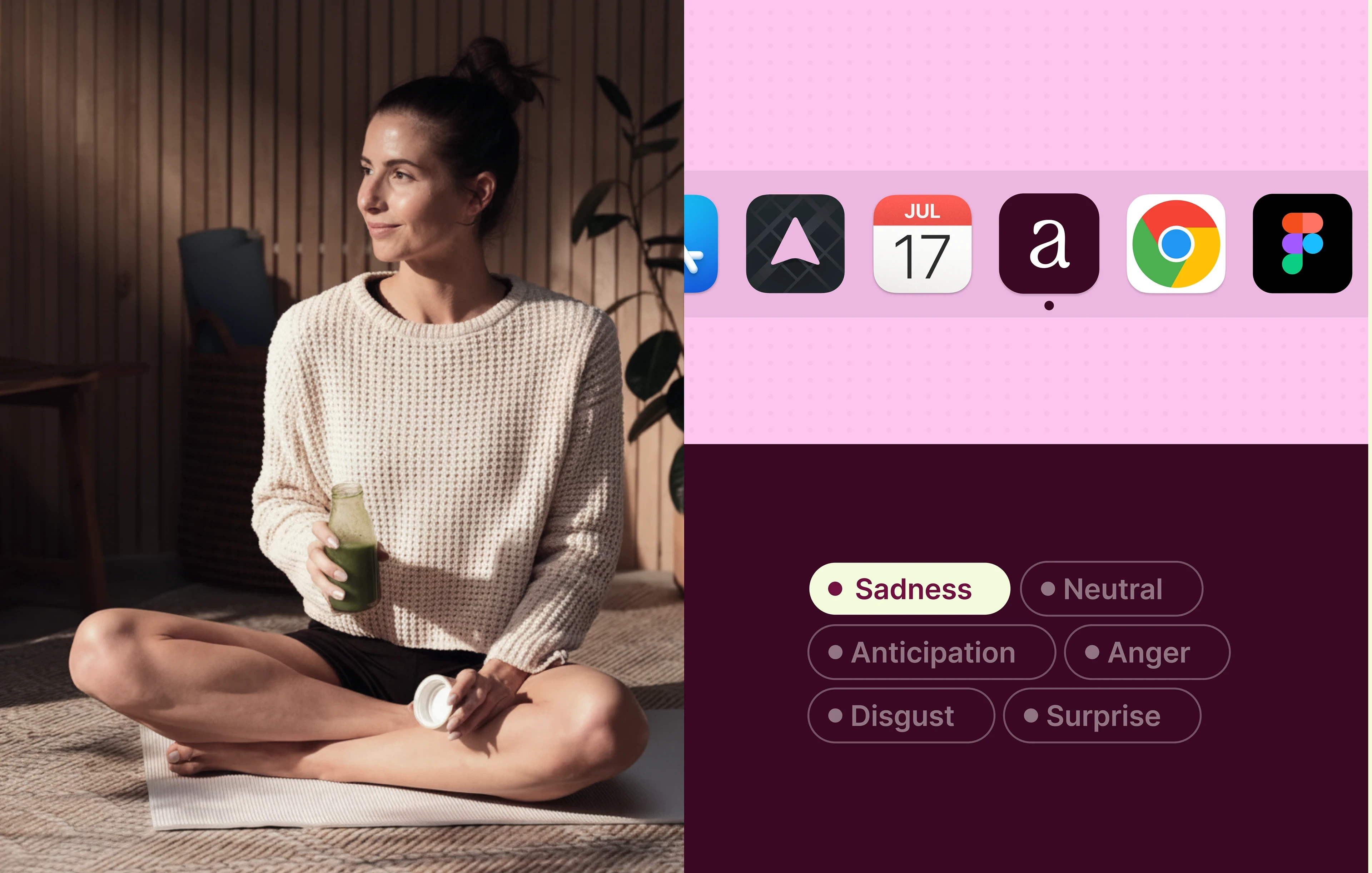
The visual language was intentionally calm, clean, and accessible, reflecting the trust and professionalism expected from healthcare providers.
Key design decisions included:
Spacious layouts with generous whitespace.
Clear typography hierarchy for improved readability.
Soft visual styling that creates a reassuring experience.
High-contrast interface elements for accessibility.
Consistent spacing and reusable UI components.
Strategic visual emphasis on important healthcare information.
Every design decision was made to reduce anxiety and improve clarity throughout the user journey.
4. Framer Implementation
The website was designed using Framer's component-based workflow, allowing for a scalable and flexible project structure.
Our implementation focused on:
Responsive layouts across desktop, tablet, and mobile.
Reusable interface components.
Smooth page transitions.
Lightweight micro-interactions.
Accessibility-conscious design.
Easy maintenance and future content expansion.
Animations were intentionally subtle, guiding user attention without creating unnecessary distractions.
Key Features
The completed website includes:
Modern healthcare homepage.
Clearly structured service pages.
Medical expertise and provider introduction sections.
Patient trust and credibility content.
Appointment and consultation call-to-actions.
Mobile-first responsive layouts.
Framer-native interactive components.
Smooth transitions and lightweight animations.
Accessible navigation and readable content hierarchy.
Scalable component-based architecture.
Technology Stack
Design & Prototyping
Framer
UX & Interface Design
Component-Based Design System
Implementation
Responsive Design
Interactive Components
Accessibility-First Layouts
Outcome
The final concept delivers a professional healthcare website that simplifies the patient experience while reinforcing trust and credibility.
Key outcomes include:
A calm and welcoming digital presence that strengthens patient confidence.
Improved usability through intuitive navigation and structured content.
Clear communication of healthcare services and expertise.
Responsive performance across desktop, tablet, and mobile devices.
A streamlined appointment journey supported by strategically placed calls-to-action.
A scalable Framer foundation prepared for future service expansion and content updates.
Key Takeaways
AYARA demonstrates how thoughtful UX strategy and modern interface design can make healthcare experiences feel more accessible, reassuring, and user-friendly.
By combining clear information architecture, accessibility-focused design, and scalable Framer implementation, we created a healthcare concept that balances patient needs with business goals. The result is a digital experience that builds trust, simplifies decision-making, and provides a strong foundation for future growth.
Like this project
Posted Jun 17, 2026
AYARA is a healthcare website built in Framer, designed for clarity, trust, and simplicity with smooth interactions and a calm, user-friendly experience.