K2KOMBO | Personal Branding, Identity, Strategy, Art Direction.
K2KOMBO Project: Professional Overview
Brief:
K2KOMBO is an artistic duo focusing on building a strong personal brand to differentiate themselves in the competitive rap and trap music scene. The project aims to create a distinctive identity that emotionally resonates with their audience, leveraging visual elements, merchandise, and targeted content strategies.
Competitors:
K2KOMBO faces competition from both emerging and established artists such as Kuremino, Kid Yugi, Shiva, Geolier, and Noyz Narcos, making it crucial to establish a unique brand identity.
Personal Branding Process:
1. Target Overview
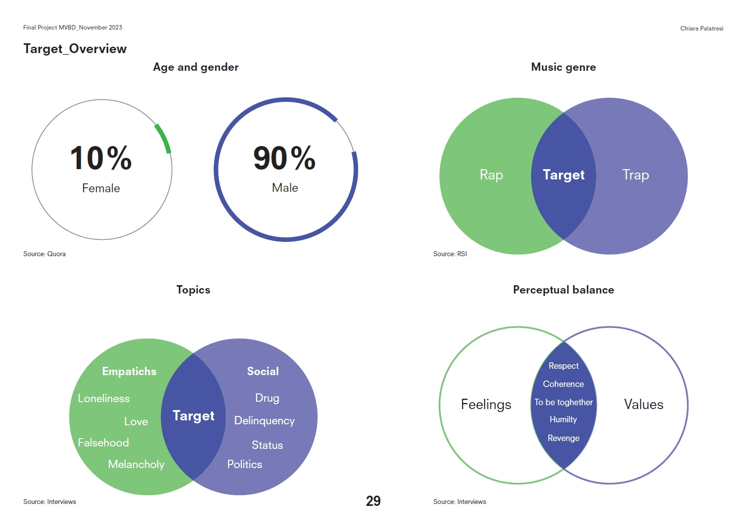
Age & Gender: Primarily males (90%) aged between 17 and 25.
Music Genre: Rap and trap, with themes such as revenge, respect, loneliness, and love.
Perceptual Balance: The target audience relates deeply to social issues and personal struggles, positioning K2KOMBO as both relatable and aspirational.
2. Building Personas:
Two primary personas were developed:
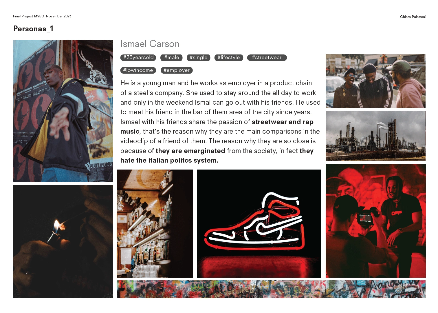
Ismael Carson: A 25-year-old low-income worker who is passionate about streetwear and rap music, reflecting feelings of societal marginalization.
Persona 1
Federico Innocenti: A 17-year-old student driven by trends in rap music and dealing with teenage frustrations about love and identity.
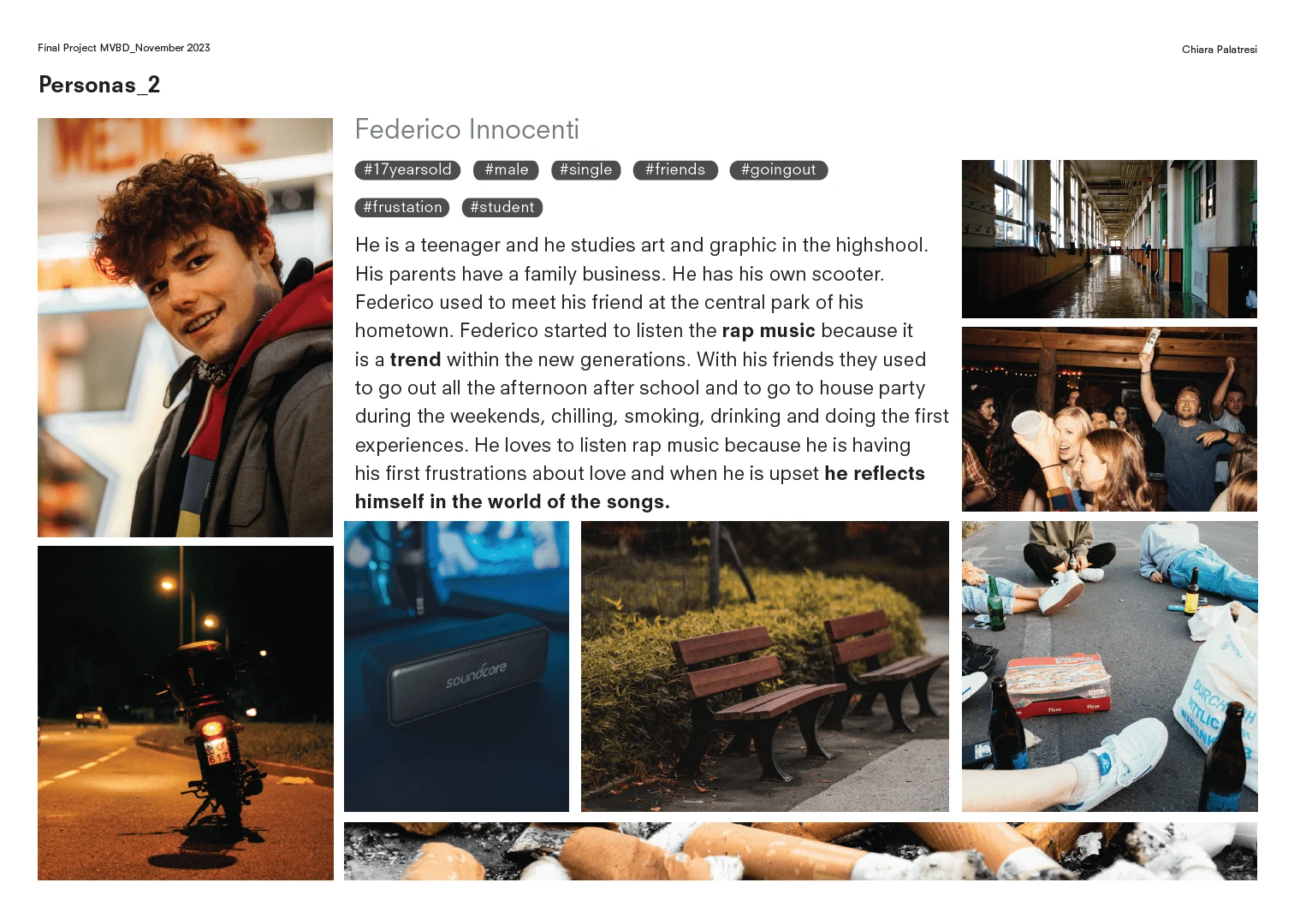
Persona 2
Branding Strategy
1. Tone of Voice:
Communicates a rebellious, yet loyal and authentic attitude that resonates with the duo's values of rebellion, loyalty, and brotherhood.
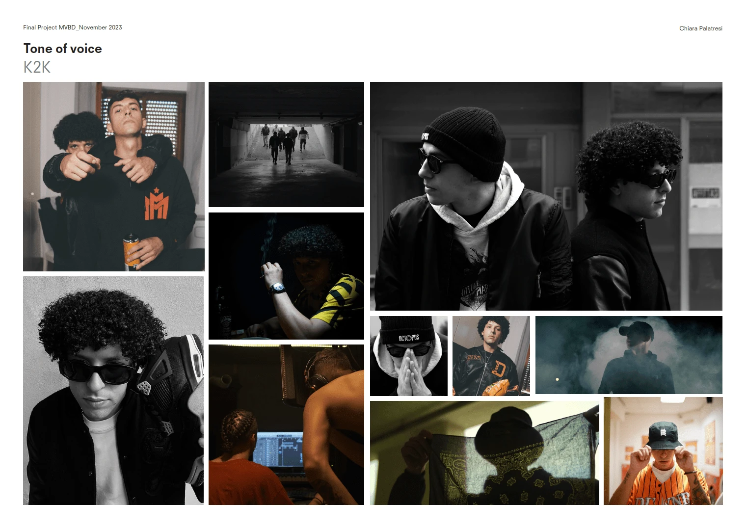
Photoshoot all over the years
2. Sketching & Design Development:
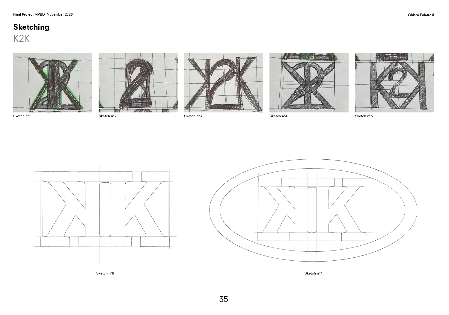
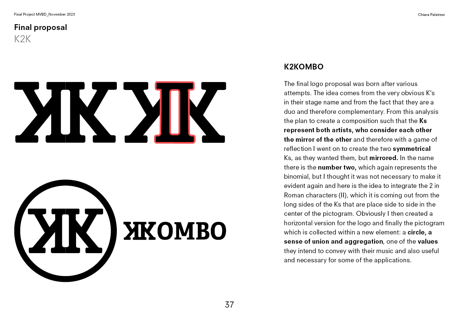
Multiple logo iterations were sketched before finalizing a symmetrical, reflective design for the two “K”s, reinforcing the concept of duality.
4. Color Palette:
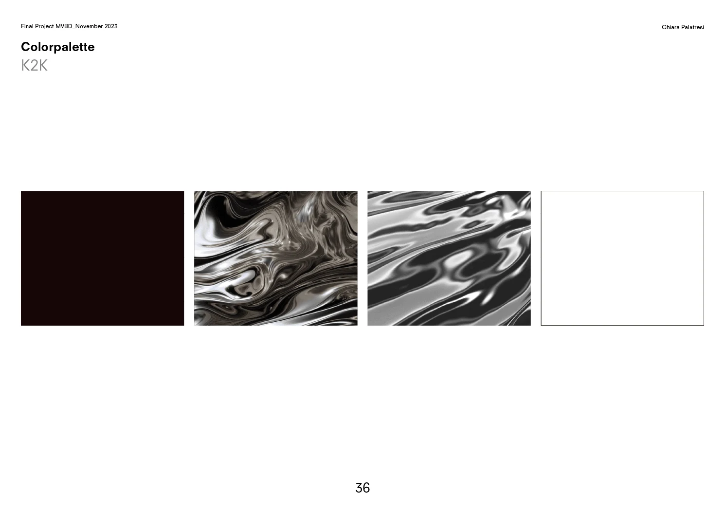
A carefully selected color palette to convey their music's emotional depth and intensity, symbolizing rebellion and unity.
5. Typography:
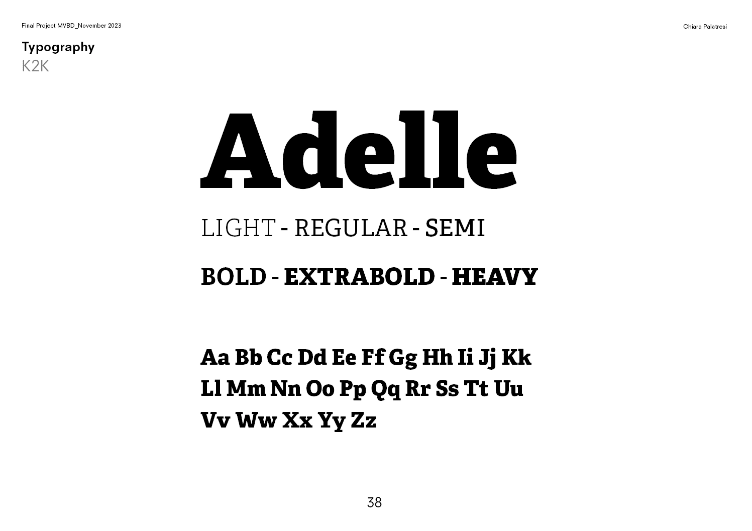
The Adelle typeface (ranging from Light to Heavy) was chosen for its modern, impactful style.
6. Final Proposal:
A dynamic, recognizable logo that represents the essence of K2KOMBO’s music and values, with both horizontal and circular formats for flexibility in various applications.
Merchandising:
T-shirt Designs:
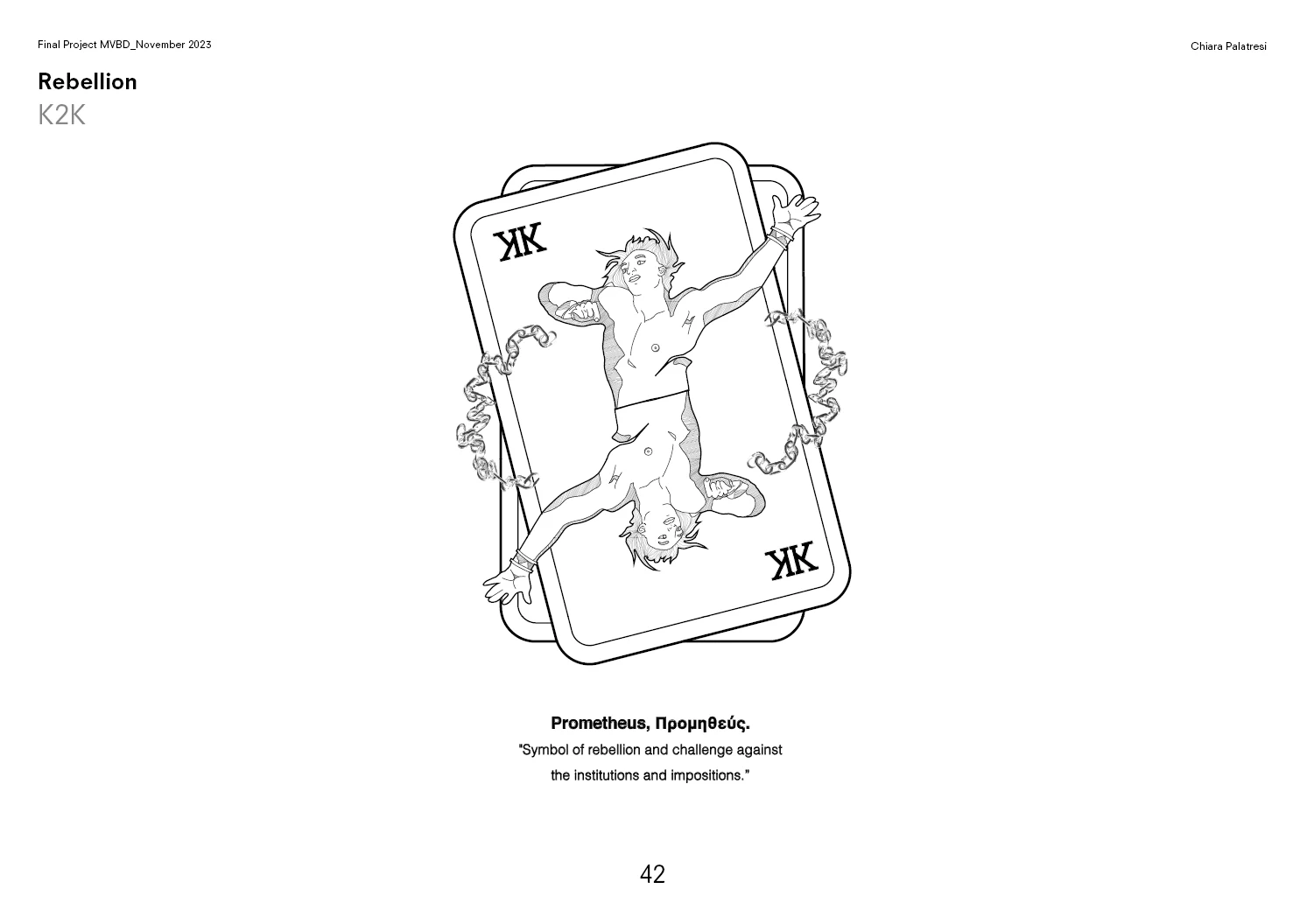
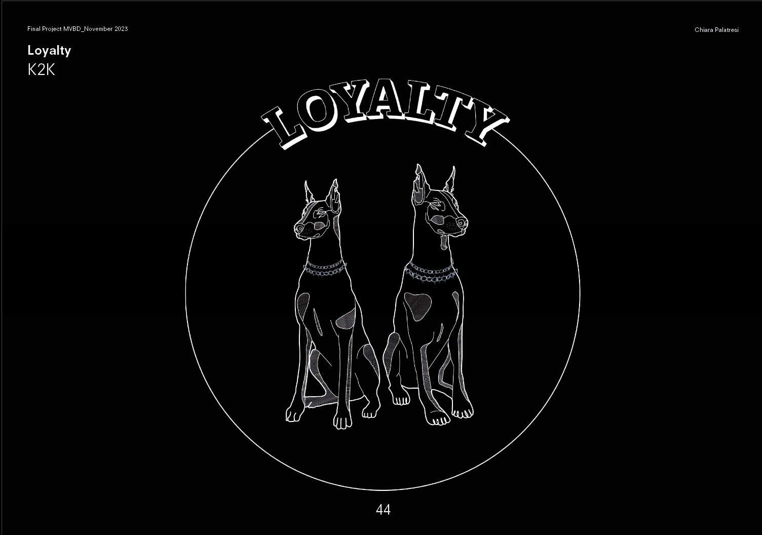
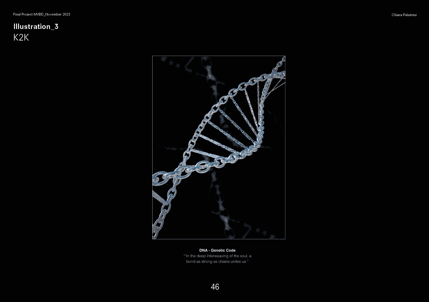
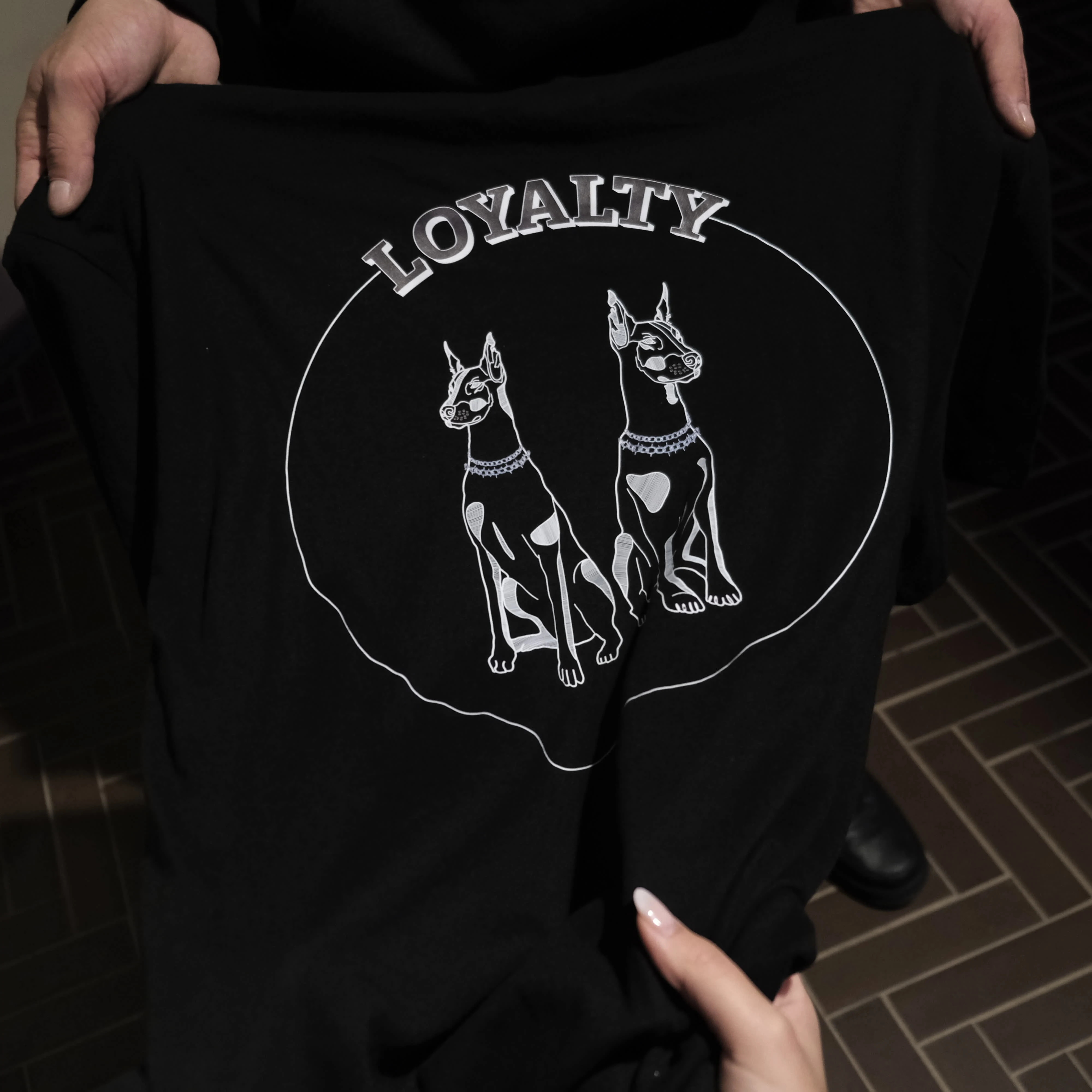
Three key illustrations represent K2KOMBO’s strongest values, all integrating the symbolic element of a chain:

The Myth of Prometheus – Rebellion: Symbolizes defiance against authority and societal impositions.
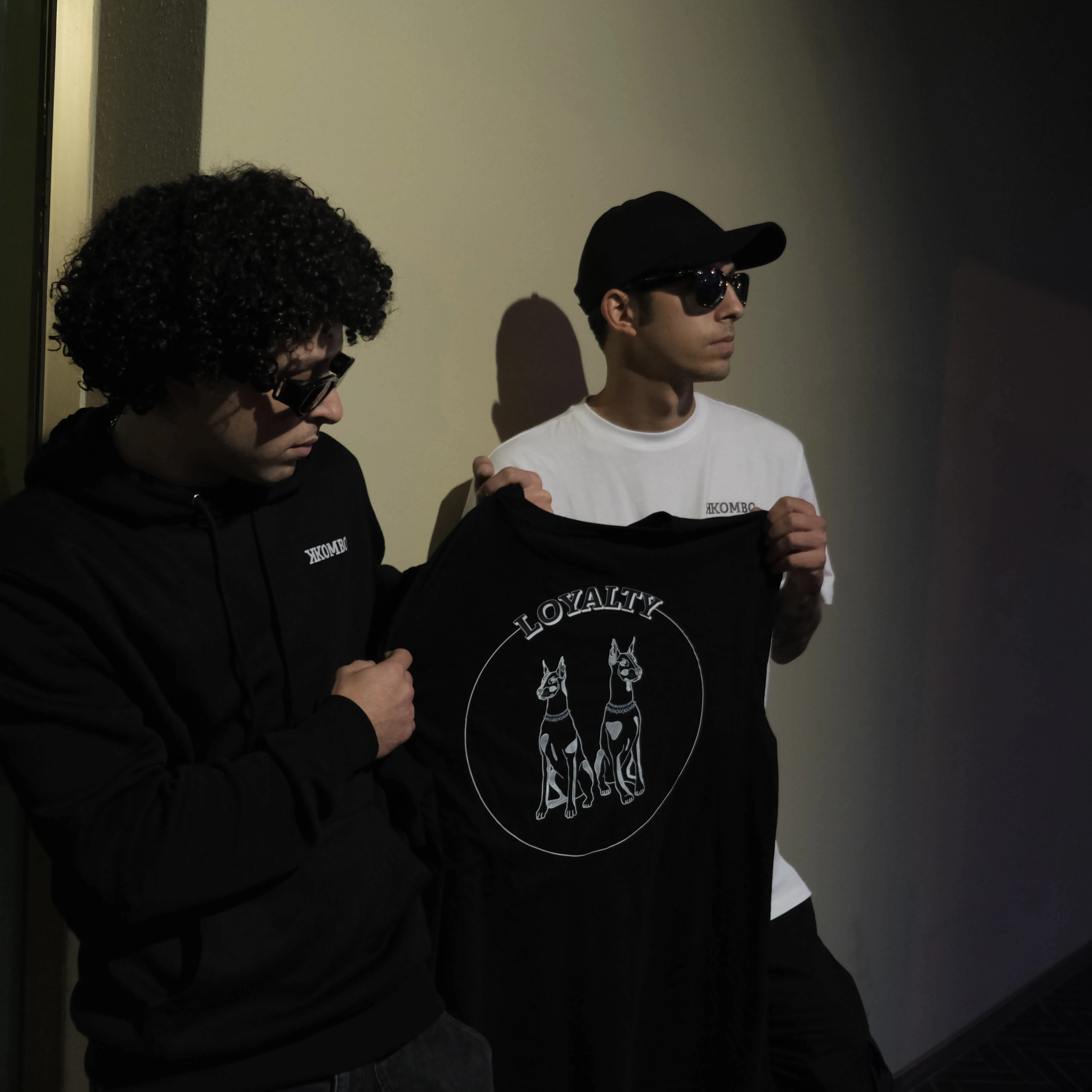
Doberman – Loyalty: Embodies undying loyalty, elegance, and strength.
Genetic Code – Bond: Represents brotherhood and the unbreakable connection between the duo, illustrated with DNA strands as chains.
Music & Content Strategy:
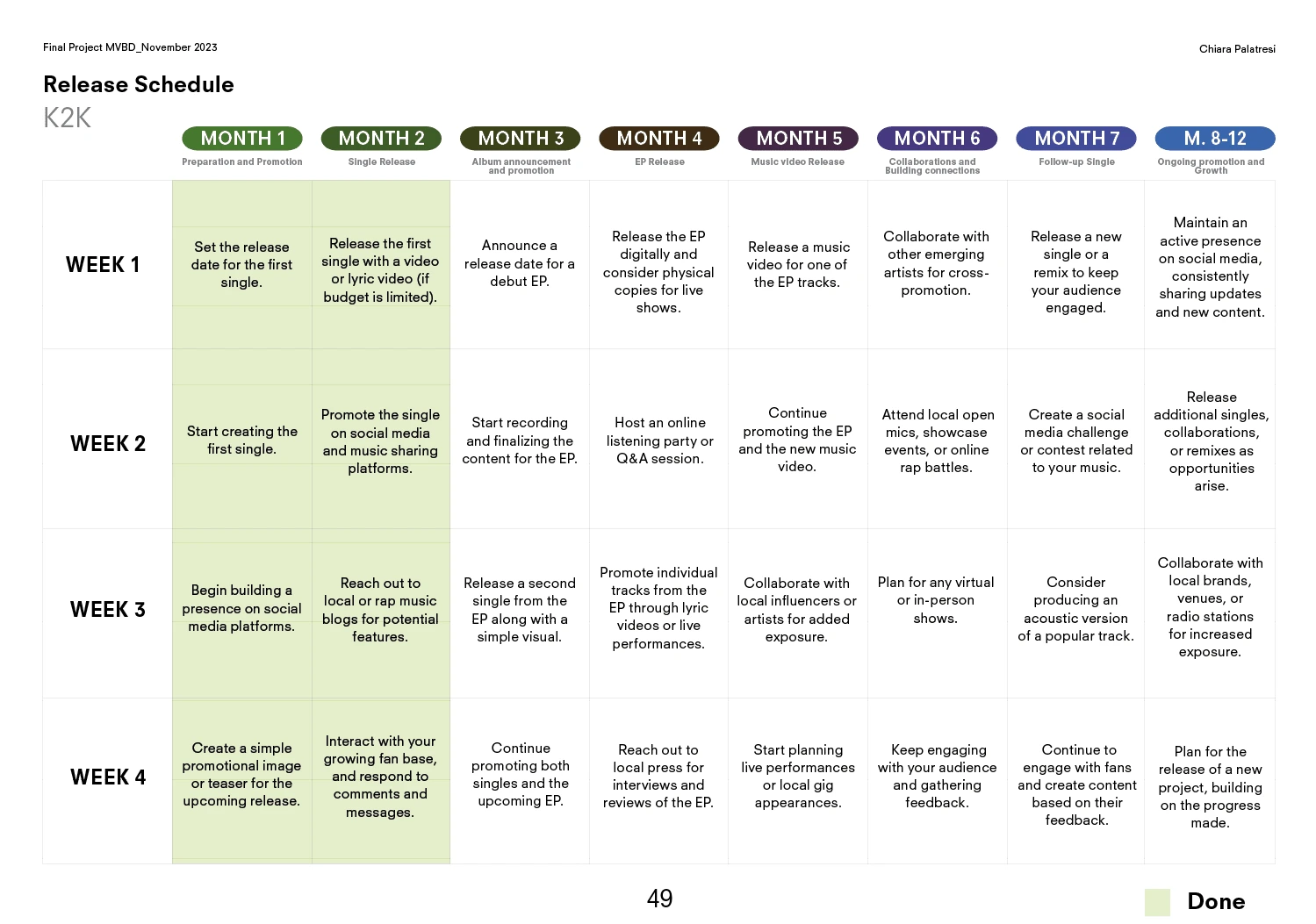
Release Schedule:
A meticulously planned 8-12 month content strategy focusing on building momentum through single releases, EP announcements, collaborations, and consistent audience engagement on social media and streaming platforms.
Partnership:
K2KOMBO collaborates with Rude Records for merchandise customization, integrating eco-friendly and innovative production methods such as using Greenyl, a PVC-free, recyclable vinyl compound, reinforcing their commitment to sustainability.
This professional approach to personal branding and strategy ensures that K2KOMBO stands out in the competitive music landscape, creating a lasting impression on their audience.
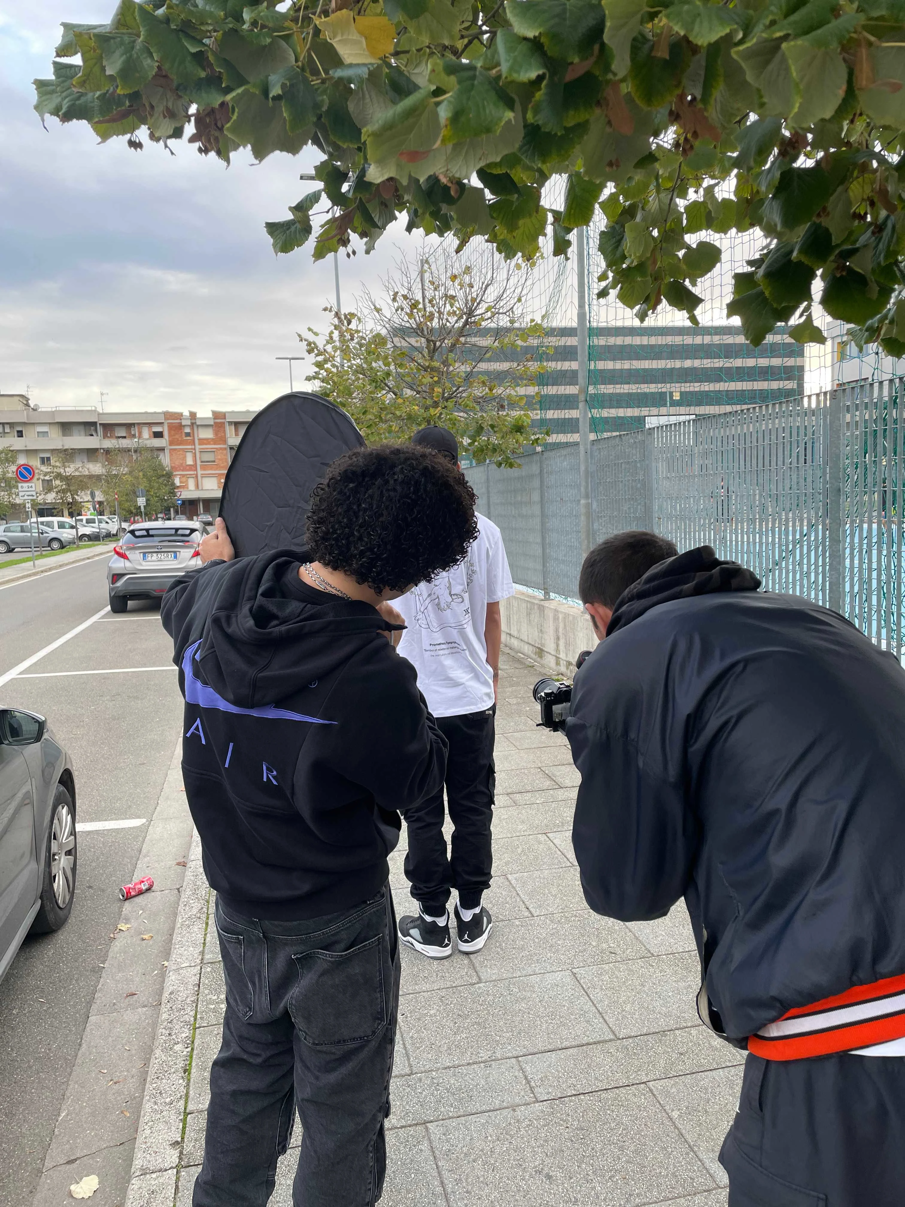
Backstages and Shooting

Like this project
Posted Oct 3, 2024
K2KOMBO is an artistic duo focusing on building a strong personal brand to differentiate themselves in the competitive rap and trap music scene.


