Steering a Conversion-Driven Website Redesign for TweakMyContent
Overview
As we charted a new course for TweakMyContent, I spearheaded a strategic website redesign, aligning it seamlessly with our refreshed brand identity. With a clear focus on enhancing user experiences and boosting conversion rates, I assumed full ownership of the journey from inception to launch.
Duration
3 months (September-December 2022)
Responsibilities
My role spanned the entire spectrum of research and design, orchestrating each step with precision. As the sole designer working with a UX writer on the project, I took charge of the entire process, encompassing user flow design, information architecture, wireframing, prototyping, design system creation, developer handoff, and website launch.
Deconstructing the Website: Uncovering UX Challenges
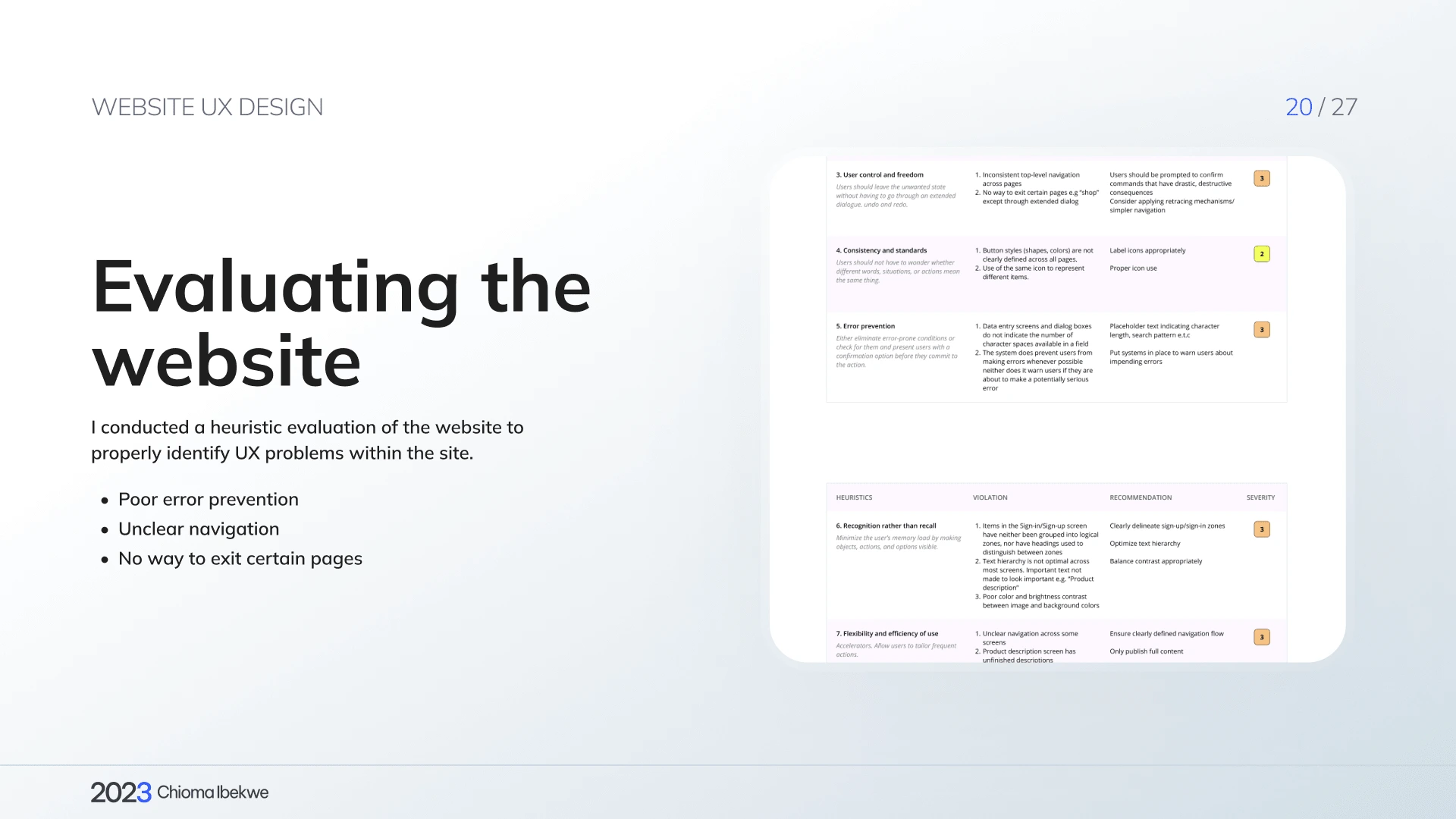
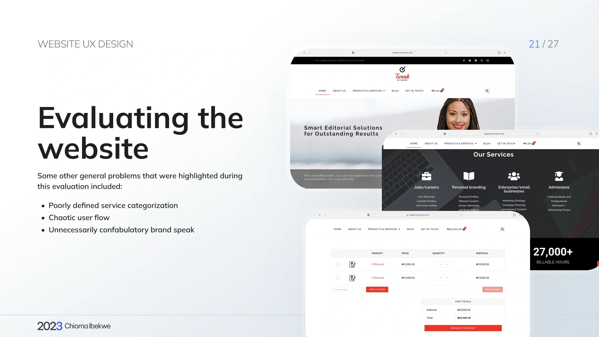
My initial task involved a thorough evaluation of the website. Through a heuristic assessment, I identified several UX issues, such as unclear navigation, confounding brand language, and a tangled user flow. This foundation paved the way for transformative enhancements.
Strategic User Flow Mapping: Crafting Seamless Interactions
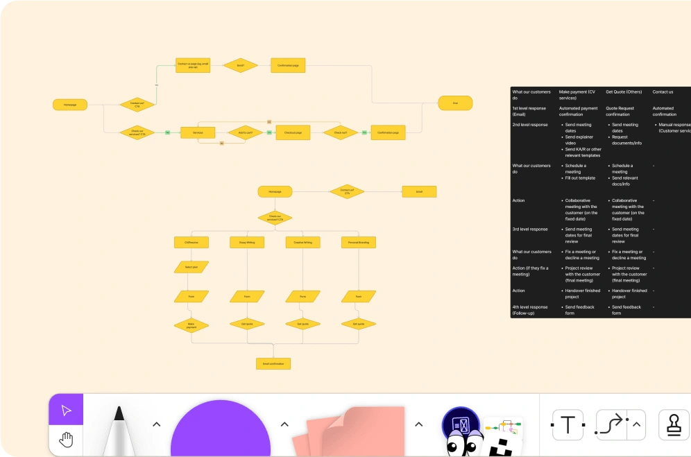
User flow mapping played a pivotal role in our design evolution. Utilizing Figjam, I explored a range of pathways, ensuring each interaction felt intuitive and engaging.
One significant focus was encapsulating the essence of "collaboration" in the design. I carefully choreographed the user journey to reflect a sense of collective creativity, fostering a connection that transcended the screen.
Navigating the intersection of brand identity and website payment proved to be a thought-provoking challenge. The user flow design acted as a bridge, ensuring smooth transitions that built trust and streamlined the process.
Simplicity emerged as a guiding principle. The user flow map worked to declutter the experience, guiding users with clarity and purpose at every step.
Beyond the design elements, this process was about creating an experience – a digital voyage that feels natural, leaving users empowered and satisfied. This foundational work sets the stage for a digital landscape where interactions are seamless, purposeful, and satisfying.
User Flow
Refined Information Architecture: Enhancing User Experience
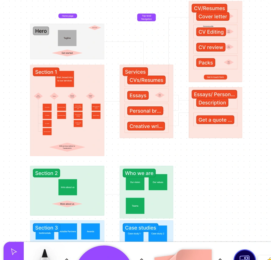
As part of our journey, I embarked on a meticulous card-sorting process. This exercise was pivotal in unraveling the intricate web of content and services, enabling us to classify and group them seamlessly.
Guided by this process, I introduced a series of thoughtfully crafted solutions:
Brand Clarity: We redefined brand offerings by streamlining away from B2B services, creating a clear and concise narrative that resonates with users.
Unified Experience: Merging personal profiles with CV editing and reviewing services streamlined the user journey, simplifying access and enhancing coherence.
Unlocking Opportunities: The introduction of an "Opportunities" page and optimization of the "About Us" page enriched user engagement and provided a deeper insight into our ethos.
Tailored Solutions: The inception of the "Create A Pack" and FAQs pages personalized the experience, empowering users with customizable choices and ready answers.
Enhanced Content: We transformed high-performance blog pages into impactful landing pages, maximizing their value and creating seamless transitions.
This orchestrated interplay of information architecture and strategic solutions formed a cohesive guide, ushering users through a more intuitive and rewarding exploration. It's a testament to the power of structure in enhancing user experiences and deepening engagement.
Streamlined Wireframing: Designing with Clarity
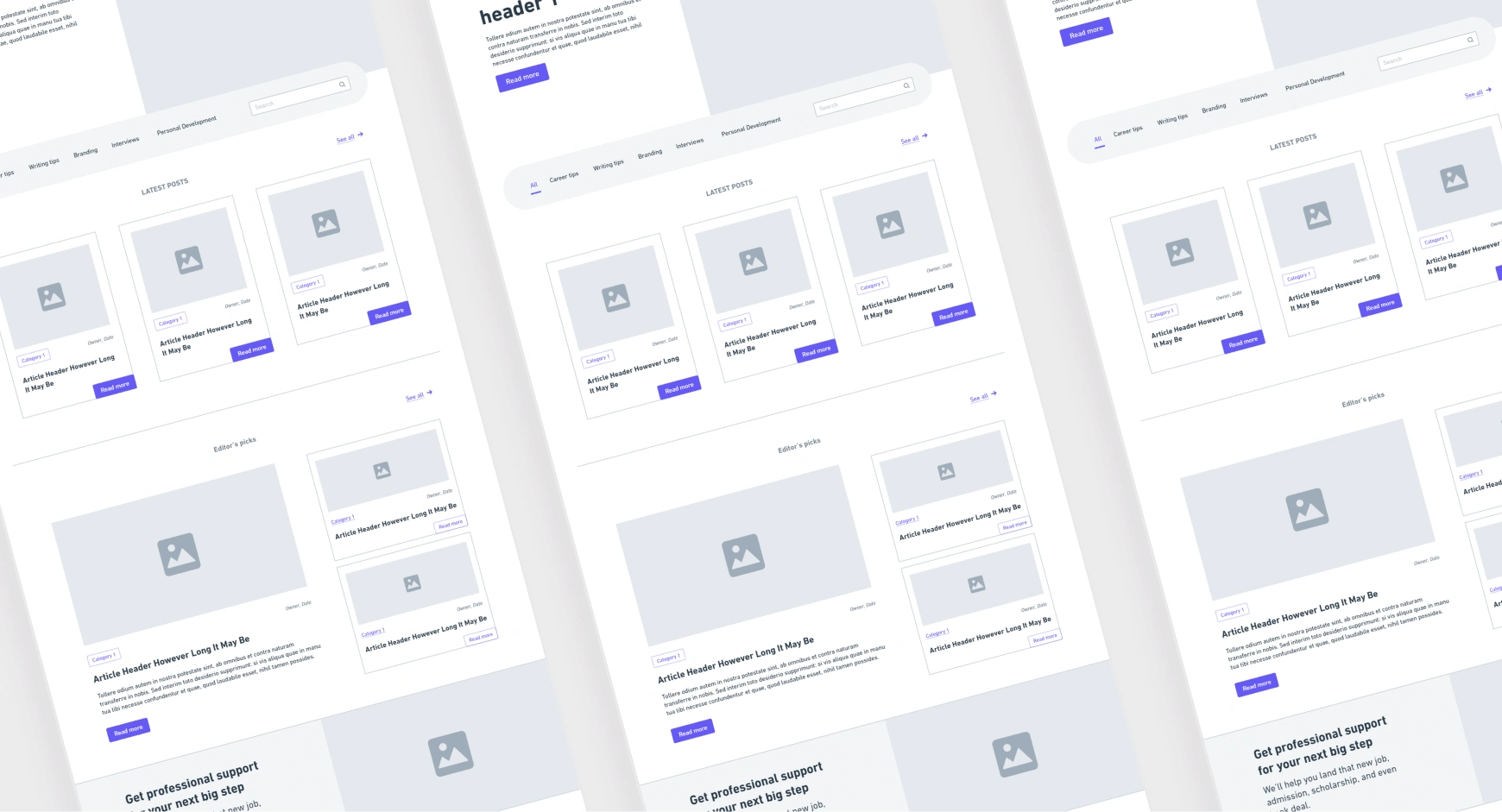
With Whimsical as my guide, I meticulously crafted wireframes that acted as blueprints, mapping out the user journey and interactions. This agile approach facilitated quick revisions, ensuring we stayed aligned with the evolving project vision.
From Wireframes to Reality: Crafting High-Fidelity Prototypes and Design Systems
With a solid wireframe foundation in hand, I seamlessly transitioned to crafting high-fidelity screens within Figma. Embracing a mobile-first mindset, I meticulously refined each detail before scaling up to larger screens. A well-structured design system underpinned this phase, enabling efficient and consistent design execution.
This design system wasn't just a toolkit; it was a catalyst for efficiency. Leveraging its components and guidelines, I swiftly translated concepts into polished visuals. This strategic approach didn't just save time – it ensured visual harmony and a cohesive user experience across the board.
Organization played a pivotal role – files, and assets were meticulously arranged, streamlining collaboration and ensuring a seamless handoff to the development team. Collaborative efforts thrived through frequent meetings with the developer, fine-tuning the translation of the design and prototype into a functional website.
From wireframes to pixel-perfect prototypes, this comprehensive process brought the design to life.
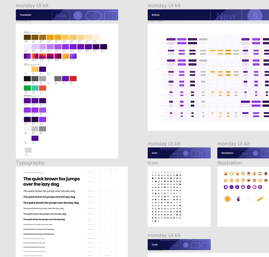
Design System
Elevating User Experience: A Successful Website Launch
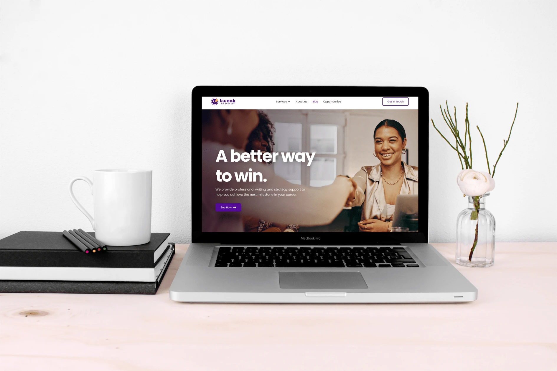
The result was a contemporary website that provided a professional and collaborative user experience.
The metrics told a compelling story:
Conversion Uplift: Conversion rates experienced a remarkable 25% increase, underscoring the effectiveness of the user-focused enhancements.
Bounce Rate Drop: Bounce rates witnessed a significant drop of 30%, a testament to the captivating user journey that held visitors' attention.
Enhanced Interaction: Time spent on the website exhibited a positive trend, with users spending 20% more time exploring content and offerings.
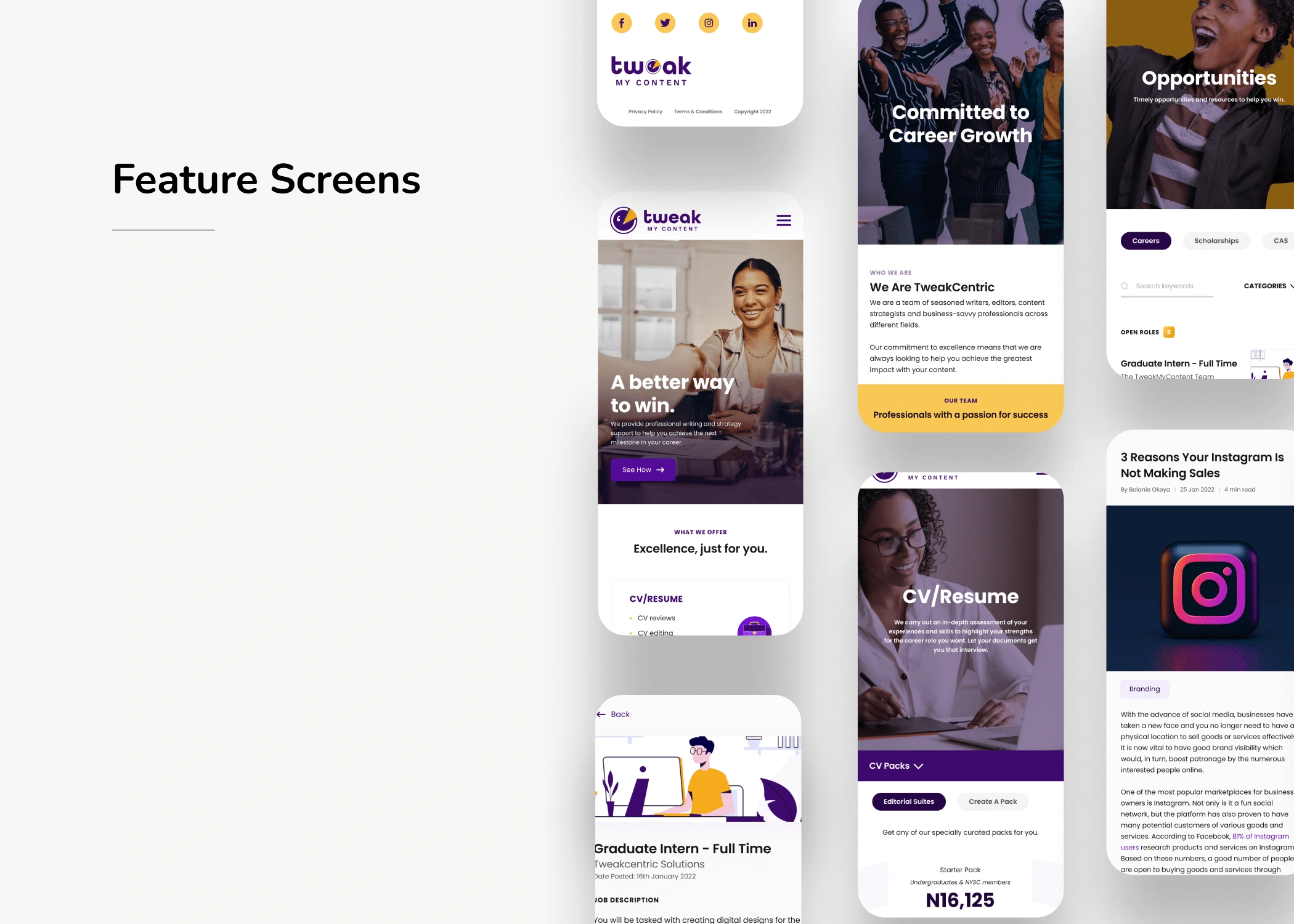
Mobile UI Design
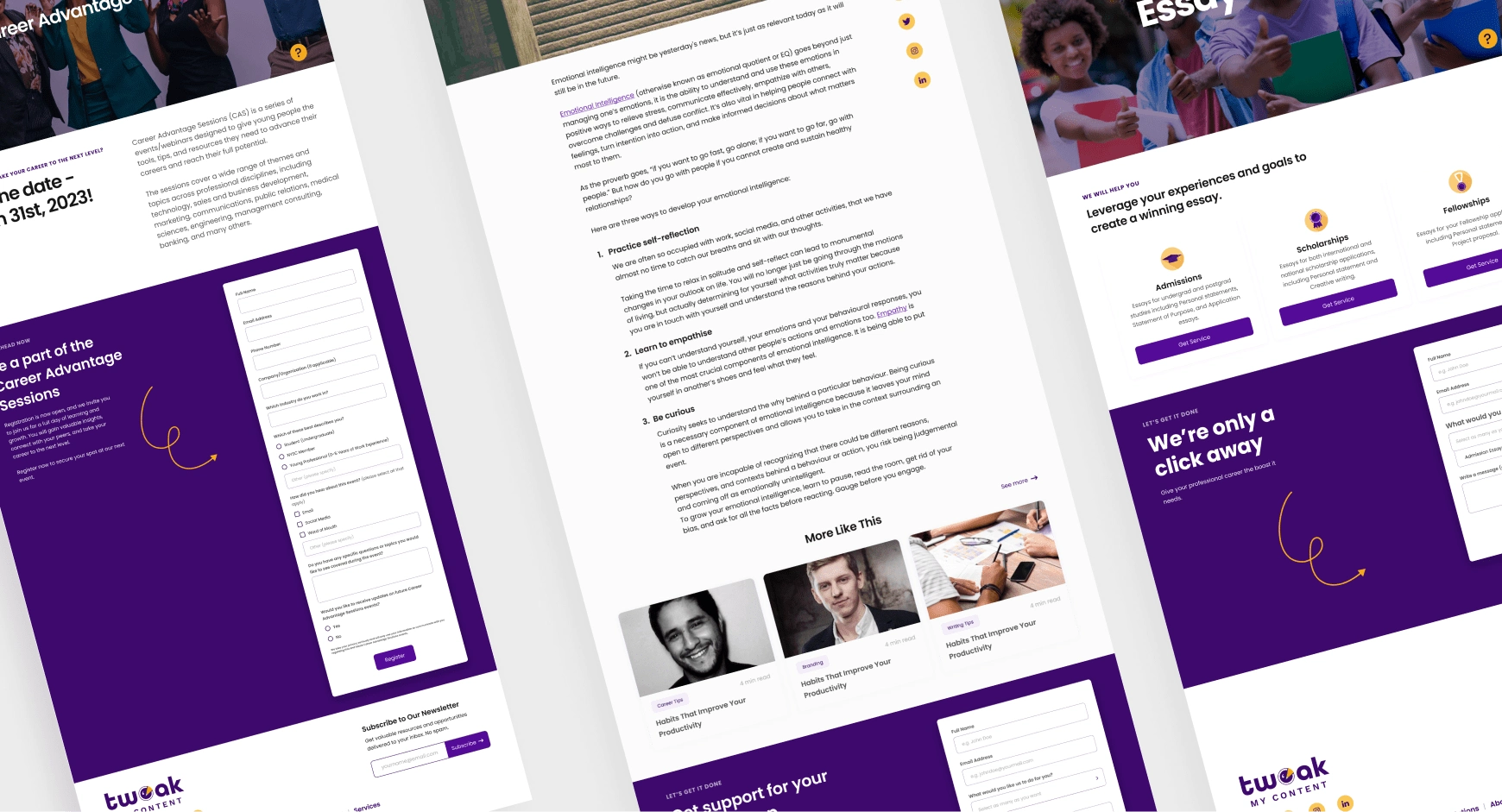
Web UI Design
Like this project
Posted Aug 7, 2023
Crafted compelling brand identities that authentically conveyed each brand's essence, forging meaningful bonds with target audiences.
Likes
0
Views
22

