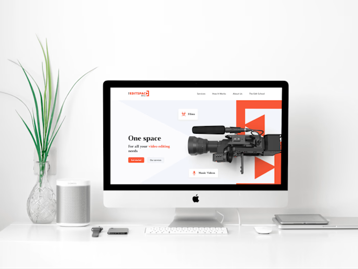
Empowering Video Editors: Transforming TESA's Brand
Overview
The Edit Space Africa (TESA)'s ambitious journey was clear – carve a niche in the multimedia world by amplifying its distinctive identity as a haven for film and video editors. This project was all about unlocking potential and shaping a narrative that resonates.
Duration
2 weeks
Responsibilities
In my capacity as the sole designer, I engaged in close collaboration with the founders. My responsibilities spanned the entire design journey, including conducting comprehensive company audits, analyzing target audiences, brainstorming innovative concepts, crafting a memorable logo, developing an encompassing brand system, compiling comprehensive guidelines, creating impactful social media graphics, and designing compelling print materials.
Unlocking Potential: A Journey of Aligning Brand and Audience at The Edit Space
Despite the brand's foundation addressing a critical industry need and bearing great potential, a challenge emerged: bridging the gap between offered services and target users.
Our journey began with a diagnosis. Through client and user surveys, we embarked on a quest to unearth the underlying cause of the brand-user discrepancy. The survey delved into some essential aspects.
Key Insights
Collating the responses, a pivotal revelation emerged. The brand assets, spanning tone of voice to graphics, were paradoxically misaligned with the brand's intended direction. The existing assets felt outdated, not relatable to the target demographic, and overly stylized. The logo, in particular, lacked scalability across digital platforms.
Sculpting Solutions: Brand Persona and Logo Transformation
Brand Persona Unveiled:
Delving into audience analysis, a revelation emerged – the brand persona aligned seamlessly with 'The Everyman', characterized by a quest for belonging and enjoyment. The essence of 'YOUTHFUL', 'FUN', 'FRIENDLY', and 'RELATABLE' painted a vivid portrait of the brand's personality.
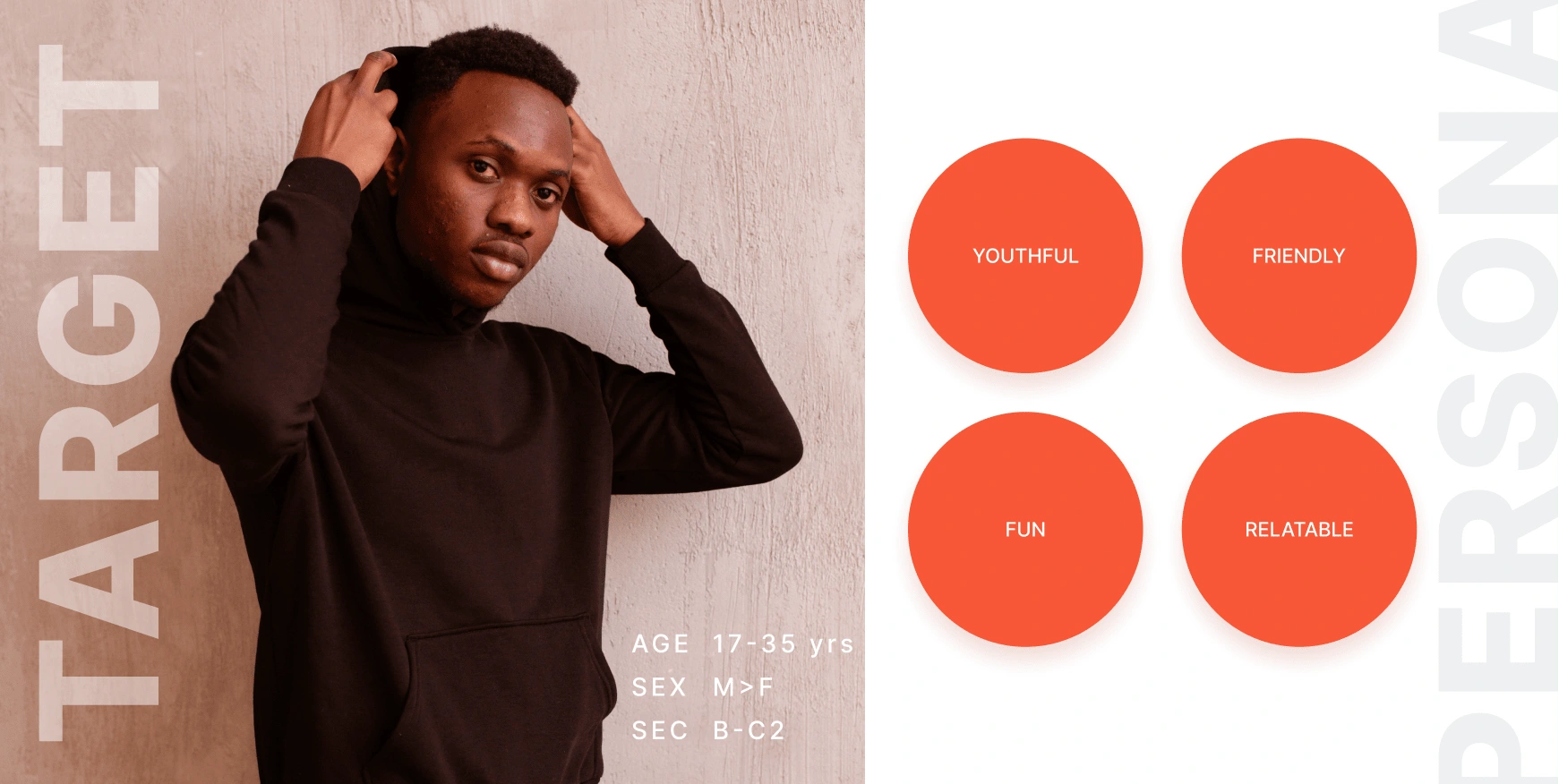
Brand Persona
Crafting the Emblem:
The journey continued with dissecting core brand elements, honing a concise list tailored to the brand essence. These elements were strategically woven together, culminating in a logo that exudes a unique sense of belonging. The challenge lay in structuring the logo effectively. Opting for a layout that showcased visual equilibrium and accessibility, it seamlessly conveys the essence. Additionally, the amalgamation of elements coalesced into a camera lens, harmoniously associating the logo with the art of videography and film.
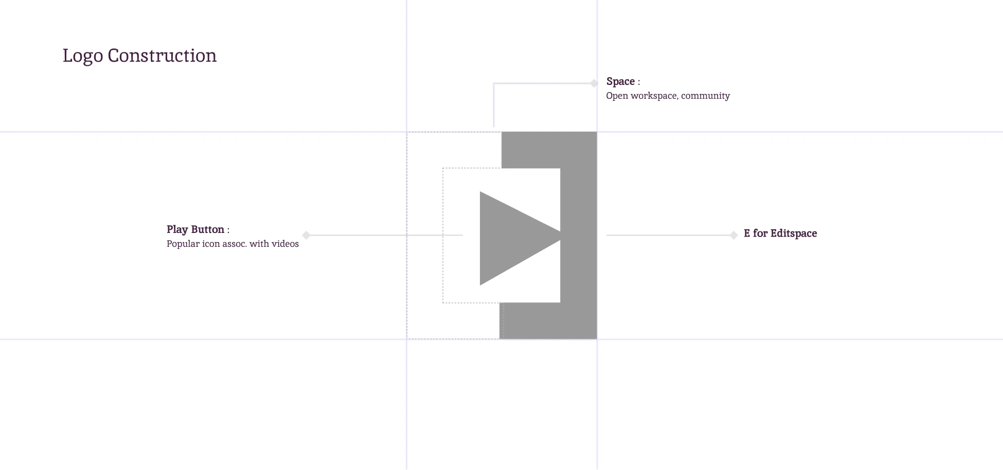
Logo Design
Primary Logo
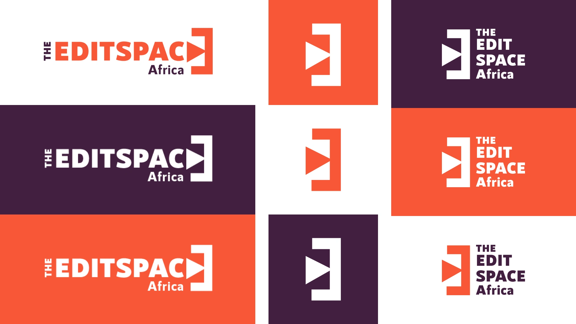
Logosuite
Vibrant Brand Palette:
The Edit Space Africa embraces the regal allure of Dark Purple and the invigorating vibrancy of Orange Soda as its primary hues.
Dark Purple personifies creativity, intelligence, and empathy. Interacting with the brand elicits inspiration and a sense of belonging.
Orange Soda embodies playfulness and kindling communication. It ignites enthusiasm, vitality, and comforting warmth, fostering positivity and optimism.
Typography in Harmony:
A fusion of sans serif and serif fonts epitomizes the brand's essence.
RNS Sanz champions legibility, simplicity, and directness.
Native Txt infuses vivacity and a dash of panache, bringing vibrancy to the forefront.
Dynamic Design Pattern:
The interlocked logos converge to form an intricate pattern, mirroring the unity of a collaborative workspace.
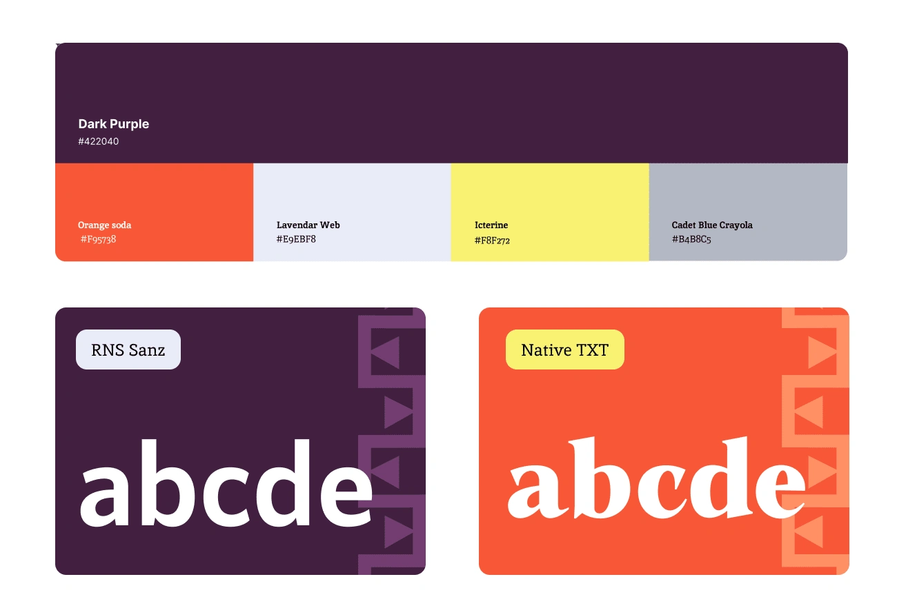
Brand System Design
Radiant Transformation: Unveiling The Edit Space Africa's Vibrant Brand Identity
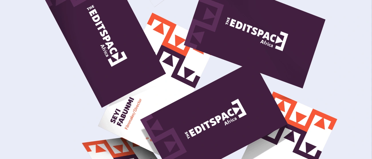
Print/ Stationery Design
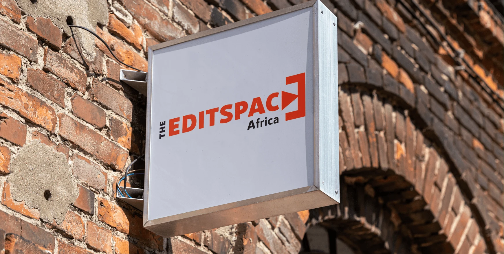
Signage Design
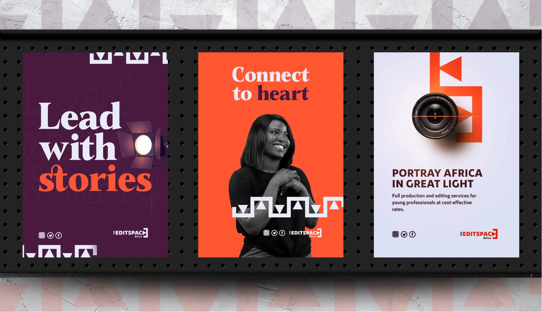
Poster Designs
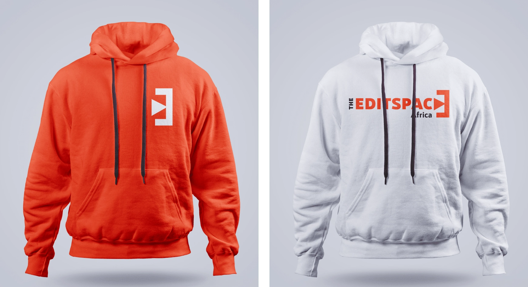
Shirt Design
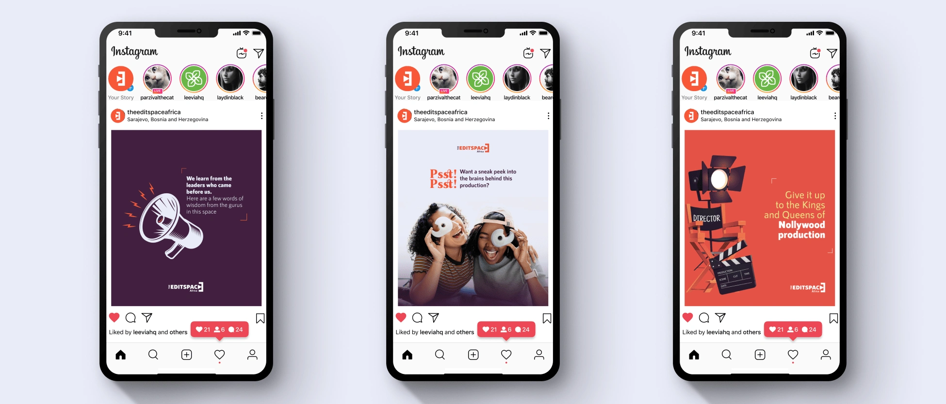
Social Media Designs
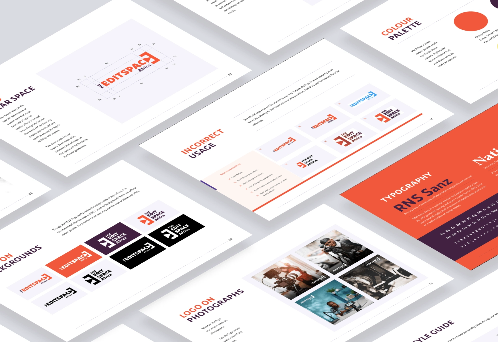
Brand Guideline Compilation
Like this project
Posted Aug 12, 2023
Energized TESA's rebranding with dynamic visuals, boosting engagement and resonance.
