Thresh · SaaS for Renewable Energy Acquisitions — Framer Dev

Madison Green
Web Designer
UX Designer
Framer Designer
Figma


Framer

Rive

Thresh Power

Thresh Site Redesign: From Ideas to Responsive Design
Thresh, a company focused on accelerating M&A analysts’ ability to land renewable energy projects, was struggling with outdated visuals and a general need for a modern, clean look for their website. Their mission to streamline workloads with AI-assisted file consolidation, due diligence reporting, and collaboration tools wasn't effectively communicated through their site’s design. Thresh wanted to stand out in a competitive market, but their old interface didn't reflect the cutting-edge, modern solutions they provided.
Project Goals
Thresh sought a redesign that would:
Modernize their visual identity, making the interface sleek, intuitive, and responsive.
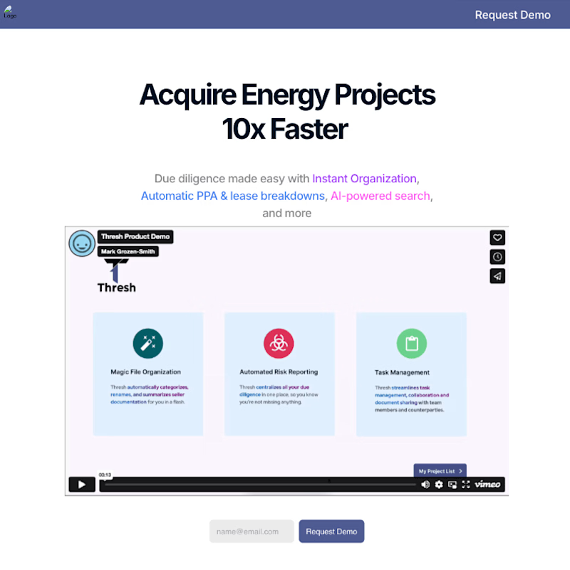
Replace static demo screenshots with dynamic animations to better showcase the platform’s key functionalities.
Translate their internal sketches for diagrams and component callouts into high-fidelity, animated mockups.
Redefining Website Strategy
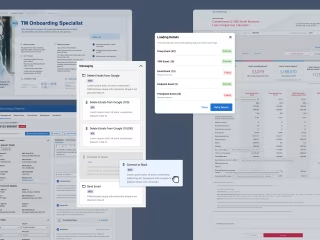
Small snippet of the original site
The Approach
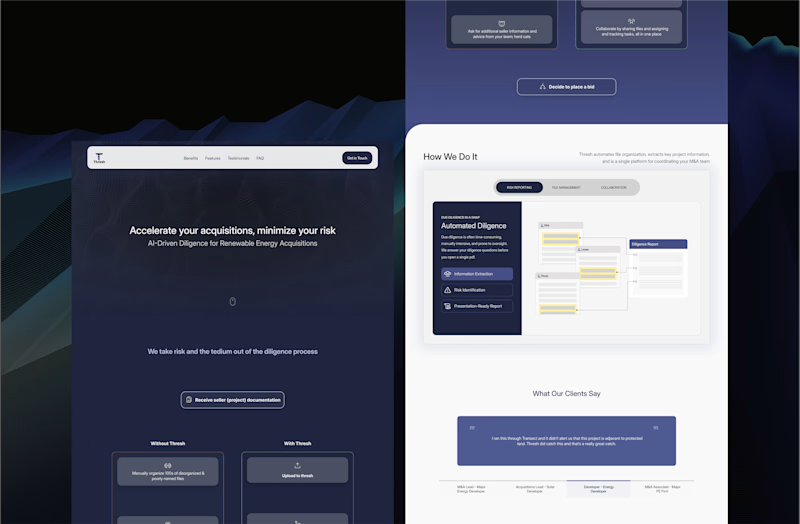
At the heart of the redesign was a simple but critical question: Why are people on your site? What will they achieve or take away? Thresh needed a website that didn’t just explain their services but actively showed users how it could solve their most pressing pain points. Complex concepts like file consolidation and due diligence reporting can often feel overwhelming, and without clear visual communication, key messages can be lost or overlooked.
With that in mind, I proposed moving beyond the traditional approach of static demo screenshots and generic calls to action. Instead, the focus shifted toward interactive visuals—modern animations and flow charts that walk users through the very processes they struggle with, step by step. This approach ensured that users wouldn’t just see Thresh’s value proposition—they would experience it firsthand. By guiding visitors through a clear, engaging narrative, the redesign created a clear through-line between Thresh’s innovative tools and the needs of M&A analysts looking to streamline their workflows.
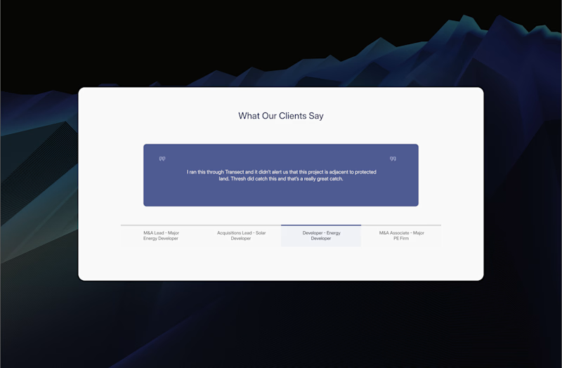
Showing Not Telling
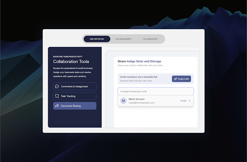
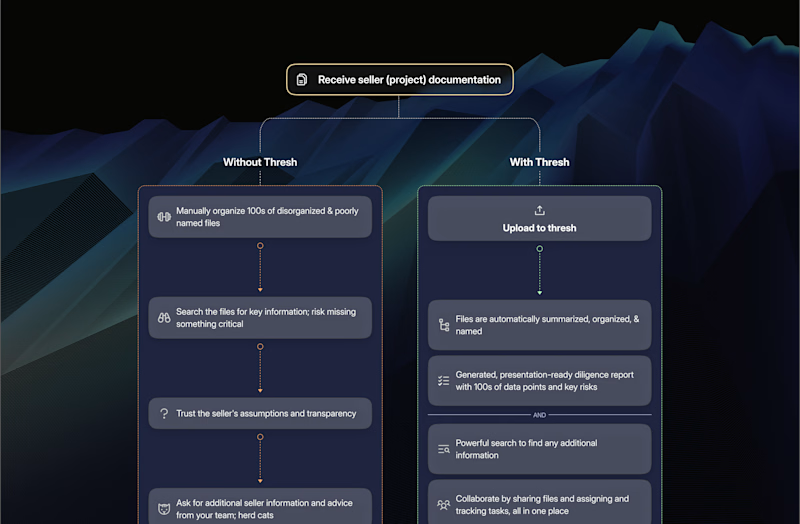
Beyond the foundational elements of the redesign—responsiveness and establishing a cohesive design system—one of the standout features was a clean, visually engaging diagram that brought clarity to the user journey. Rather than overwhelming users with vague promises or complicated jargon, the diagram boiled things down to the essentials: What do you need, and how do we solve that for you?
This approach helps users immediately connect their pain points with Thresh’s tailored solutions, offering an intuitive, results-driven way to understand the platform's value. By guiding users through this visual narrative, we made it easier for them to grasp complex processes, translating abstract concepts into concrete actions.
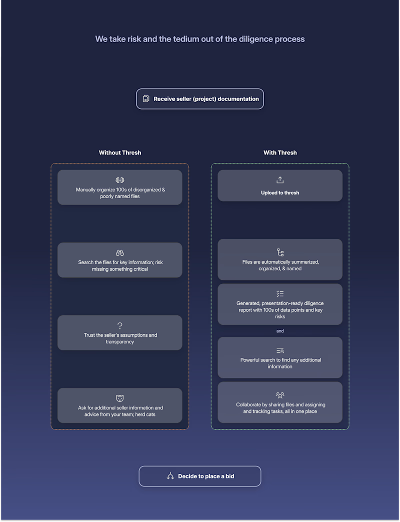
"User need—our solution" diagram
From Sketch to Motion
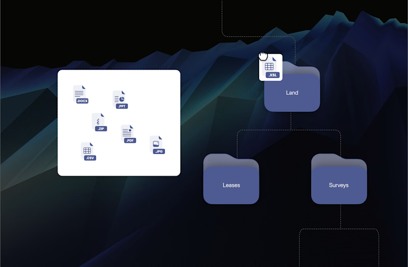
How it started:
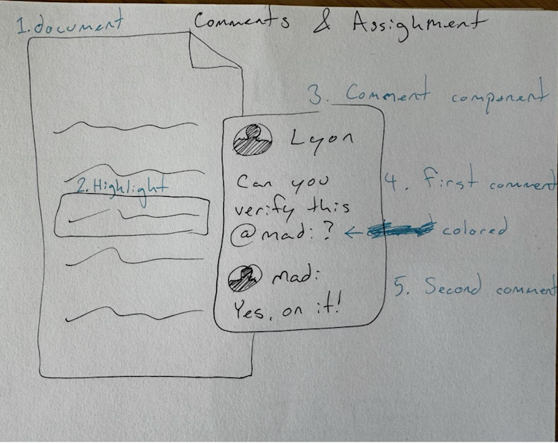
One of the client's sketches, showing their vision for showcasing their product's functionality
The Process of Transformation:
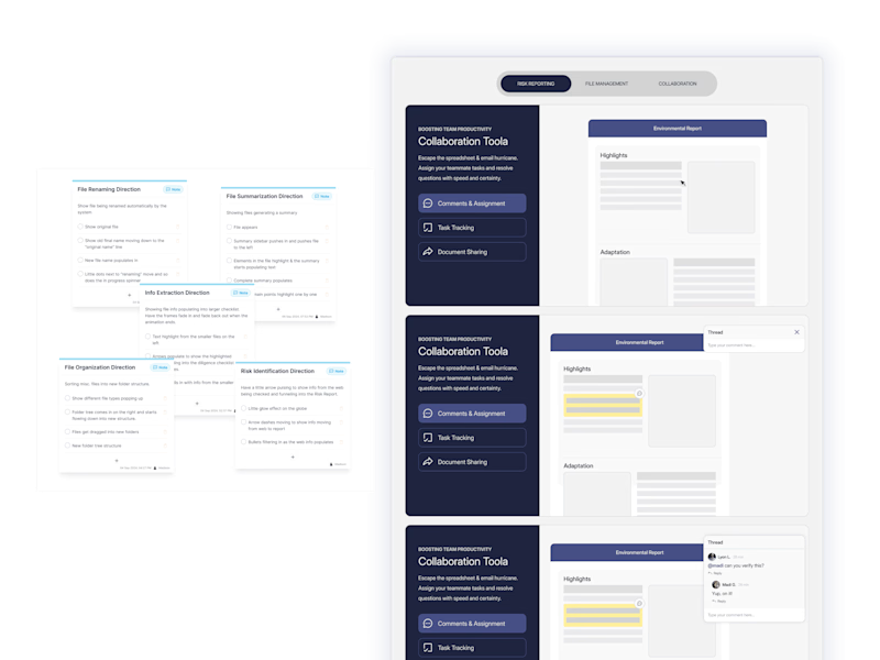
My direction for the animations + mockups in Figma
I took the client’s initial sketches for diagrams and component callouts and transformed them into detailed mockups. These mockups were then animated by the wonderful Cayo, allowing users to visualize the features Thresh offers to streamline M&A analyst review touch points.
The Result:
The Outcome:
The final design was a sleek, modern website that perfectly encapsulated Thresh’s cutting-edge technology. The redesign not only elevated Thresh’s website, but also focused heavily on showcasing how Thresh optimizes the user journey for their users and reflected the company's commitment to innovation in the renewable energy space.