E-Commerce Website Redesign | Web Design
PROJECT SUMMARY | TL;DR
Baccarat Rouge 540 redesign was a journey that began with deep brand research and a thorough understanding of the target audience.
By analyzing the brand's presence and conducting a competitive analysis, I identified key elements to incorporate into the redesign.
Through digital sketches, mood boards, and a meticulously crafted style guide, I developed high-fidelity designs that encapsulated the brand's luxurious essence.
Iterative refinement and constant updates to the style guide ensured a polished, user-centric final product.
The result is an enhanced digital presence that offers a seamless, elegant user experience, perfectly aligned with Maison Francis Kurkdjian's sophisticated identity.
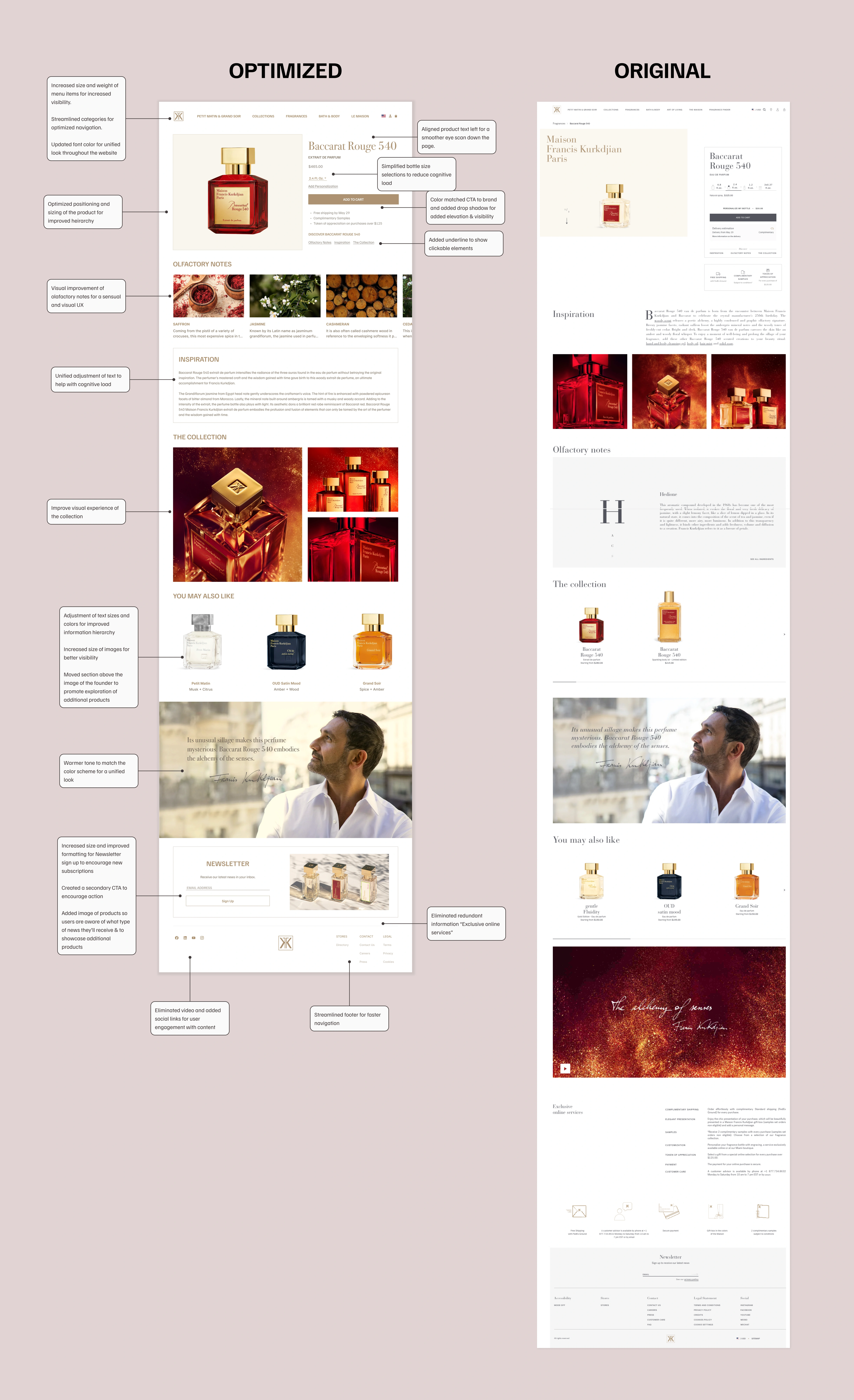
THE OUTCOME: OPTIMIZED v. ORIGINAL

Zoom in to see descriptions of optimizations made
MY DESIGN PROCESS
🔍 DISCOVERY
→ Brand Identity
I researched Maison Francis Kurkdjian's brand identity to understand its core values, mission, and vision. This included exploring the website, viewing interviews of the founder, and watching videos of the founder exercising his craft.
Through the founder's words, I found that the brand exudes luxury, sophistication, and exquisite craftsmanship, which must be reflected in the redesign.
→ Target Audience
I analyzed the target audience, primarily men and women aged 30-45 who appreciate high-end, niche fragrances. This demographic values quality, elegance, and exclusivity.
→ Brand Presence
I reviewed the brand's online presence, including its website, social media channels, and other digital touchpoints. I noted the consistent use of luxurious imagery and refined language, which would be critical to incorporate into the redesign.
→ Competitive Analysis
I studied key competitors in the luxury fragrance market to benchmark their digital presence. Identified best practices and innovative features that could be adapted to enhance the MFK website
✍🏼 SKETCH
→ Digital Sketches
I sketched out some initial ideas digitally to play around with different layout options, focusing on making the user experience smooth and the visuals stunning.
🎨 INSPIRATION
→ Moodboard
I carefully crafted a mood board to capture the essence of the MFK brand including lightness, refinement, and fragrance.
→ Style Guide
Created a style guide inspired by elements from the current product and competitors, including color palettes, typography, and imagery.
💻 DESIGN
→ High-Fidelity Designs
I took my sketches and turned them into detailed, high-fidelity designs in Figma, ensuring they matched the luxurious feel of the brand.
✨ REFINE
→ Iterations of Hi-Fi Designs
I refined the designs through several iterations, making sure to enhance both usability and visual appeal.
→ Updated Style Guide
Updated the style guide throughout the process to keep everything consistent and aligned with the brand.
REFLECTION
This project taught me the profound importance of understanding a brand's essence and its target audience. It reinforced that every design decision should be deeply rooted in thorough research and aligned with the brand's core values. The iterative process of refining high-fidelity designs highlighted the value of continuous improvement and the power of feedback in creating a polished final product.
The challenges faced, such as addressing the current website's issues with navigation and imagery, honed my problem-solving skills and underscored the importance of a user-centric approach. By focusing on user needs and preferences, I was able to create a design that not only looked beautiful but also provided a seamless and enjoyable user experience.
MORE ABOUT ME
Hi, I'm Roxanne! As a designer and former educator, I understand the importance of connecting with your audience. Your brand deserves a digital presence that not only looks stunning but also engages and inspires your users to action.
I know how challenging it can be to convey your brand’s unique essence through design. That's why I bring a thoughtful approach to every project, diving deep into understanding what makes your brand special. My goal is to create user-centric designs that capture the heart of your brand and captivate your audience.
If you're looking for a passionate designer dedicated to understanding your brand's identity and refining every detail to perfection, I’m here to help. Together, we can create a final product that not only meets your expectations but also makes a significant impact on your brand and your users.
By choosing to work with me, you're selecting a designer who is committed to embodying your brand's identity, crafting a user-centric experience, and delivering exceptional results.
Let’s collaborate to bring your vision to life and make your digital presence truly remarkable.
Like this project
Posted Jul 11, 2024
eCommerce website redesign for a niche, luxury perfume brand.
Likes
1
Views
18
Clients

Maison Francis Kurkdjian
Personal Project


