Redesigning how people get into Stagetimer

Thomas Oldenburger

Optimized Stagetimer’s signup workflow to improve user onboarding, reduce friction, and increase conversion through clearer UX and faster registration.
The brief
Stagetimer is a countdown and cueing tool for live events. Show callers, AV techs and producers run it in the back of a room where a mistimed segment is a visible, public failure. The product itself is fast and no-nonsense. The way people got into it wasn't.
The ask was straightforward: design account creation, login, and the flow for joining a team by invite. No research phase, no rebrand and the visual language kinda already existed. This was a surface that needed to be complete and correct rather than reinvented.
That framing matters, because auth is the part of a product nobody talks about until it breaks. Nobody has ever praised a signup form. They only ever remember the one that lost them.
Mapping it first
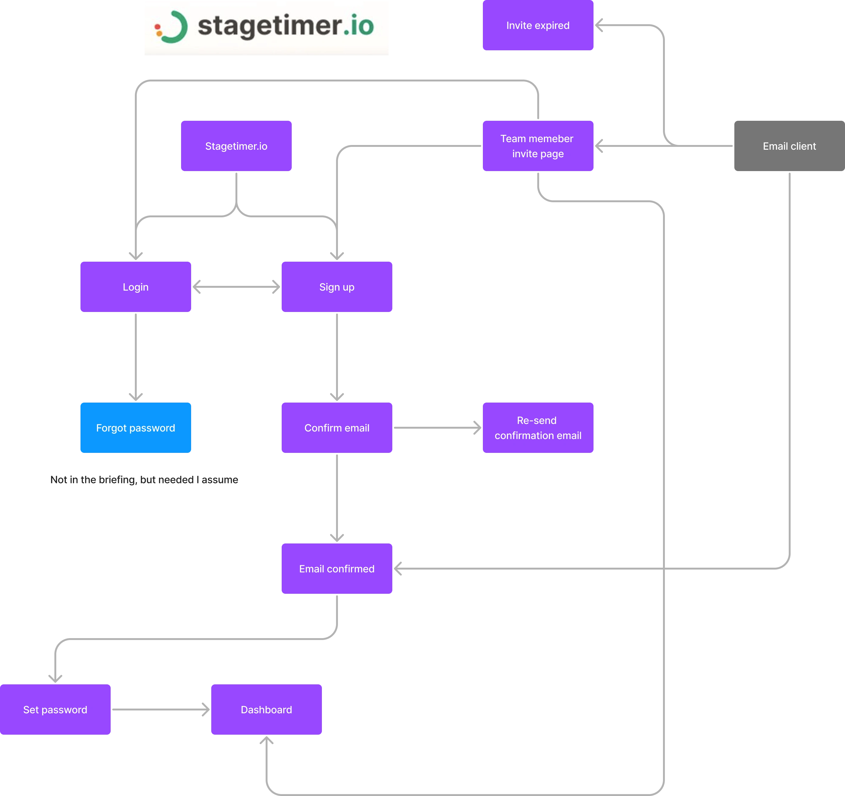
I started with the flow rather than the screens, because auth is mostly branching and the branches are where products leak users.
Two entry points: someone arriving at stagetimer.io on their own, and someone landing from an invite email. Those are genuinely different people with different intent, and the diagram made that obvious quickly. The self-serve visitor needs a reason to sign up. The invited teammate already has one — a colleague sent them a link — and anything that gets between them and the team is friction with no upside.
Mapping it also surfaced two things the brief hadn't covered.
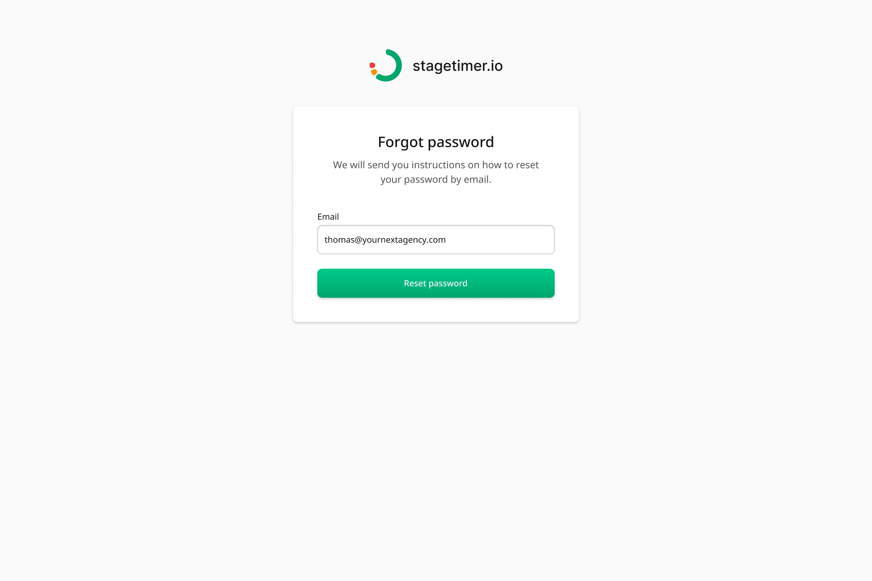
Password recovery was missing.
Not in scope as written. Also not optional — the flow simply doesn't close without it. I flagged it in the diagram, designed it, and it was accepted.
The invite step was in the wrong place.
Team invites were being treated as a separate, later task. I proposed folding an optional invite step into the end of onboarding, skippable in one click. New accounts are the moment someone is most willing to add colleagues; asking them to come back and find a settings page later means most never do.
Both were small suggestions. Both changed the shape of the product.
Key decisions
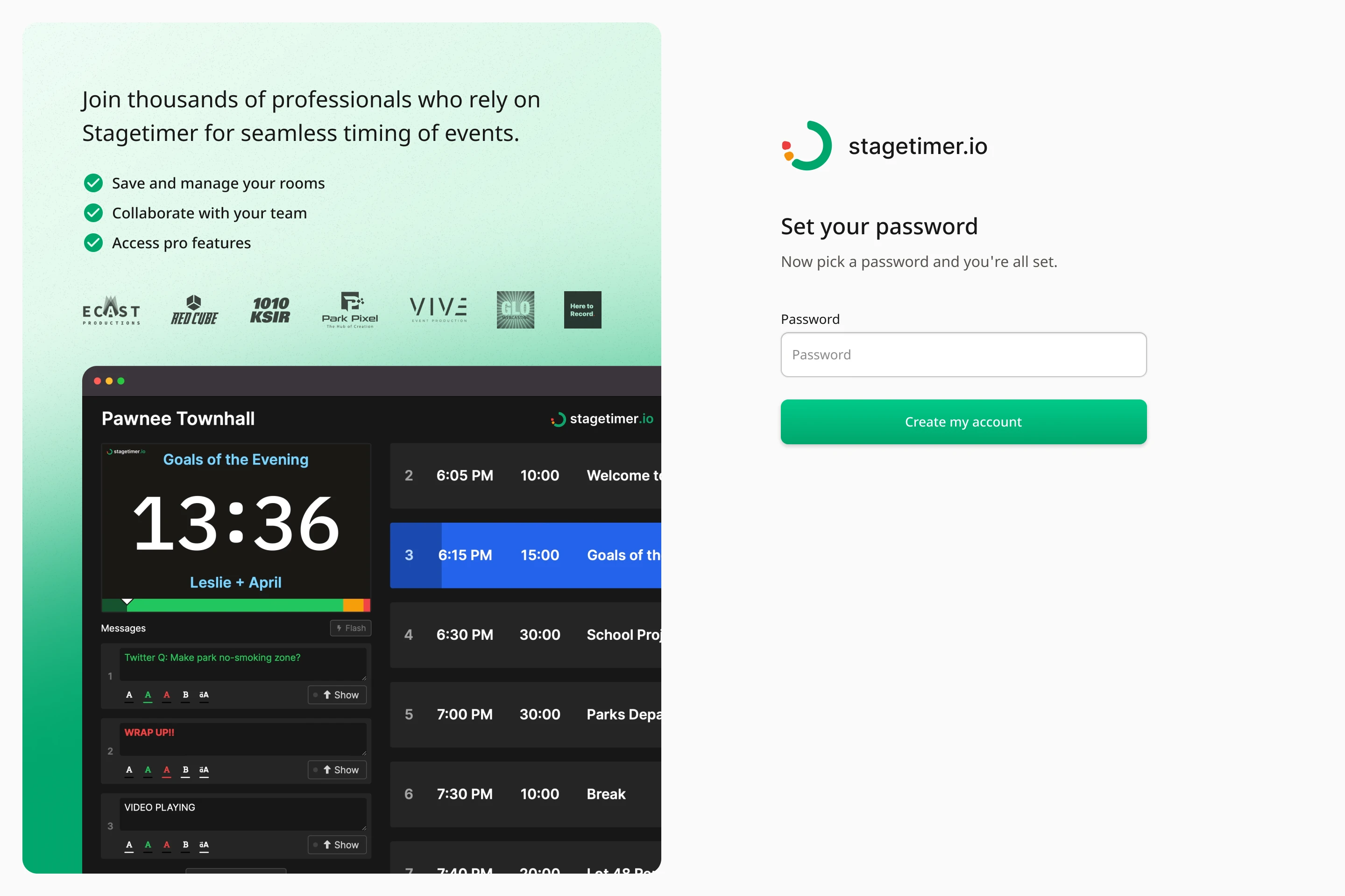
Email first, password last
The signup form asks for one thing: an email address. Password comes after the address is verified, on a dedicated screen — "Now pick a password and you're all set."
Front-loading a password field means asking someone to make a decision (and often fight a validation rule) before they've seen anything. Splitting it does two things: the first step is nearly frictionless, and by the time an account exists, the email attached to it is already confirmed. No unverified accounts sitting in the database, no support tickets from people who typo'd their own address.
The trade is an extra screen. Worth it.
Verification paths
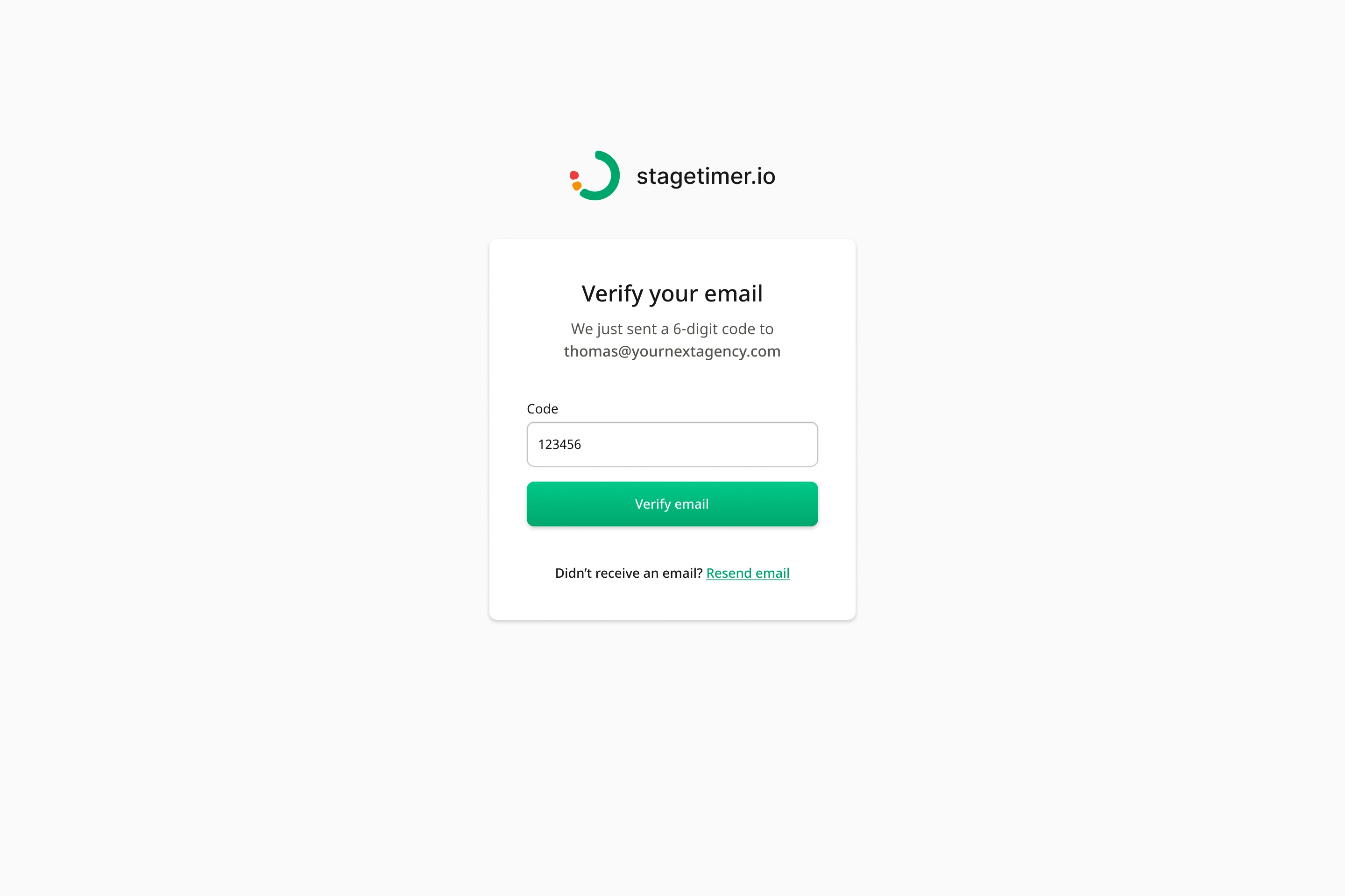
The link is fewer steps when someone is checking mail on the same machine. The code survives the cases the link doesn't: mobile mail apps that open in a sandboxed browser, corporate mail scanners that pre-click links and burn the token, and anyone verifying on a laptop from a phone. Live events skew heavily toward people on their phones in a venue with bad wifi.
Both screens carry a Resend link. That's the one control that determines whether a stalled signup recovers or gets abandoned.
Signup sells. Login doesn't.
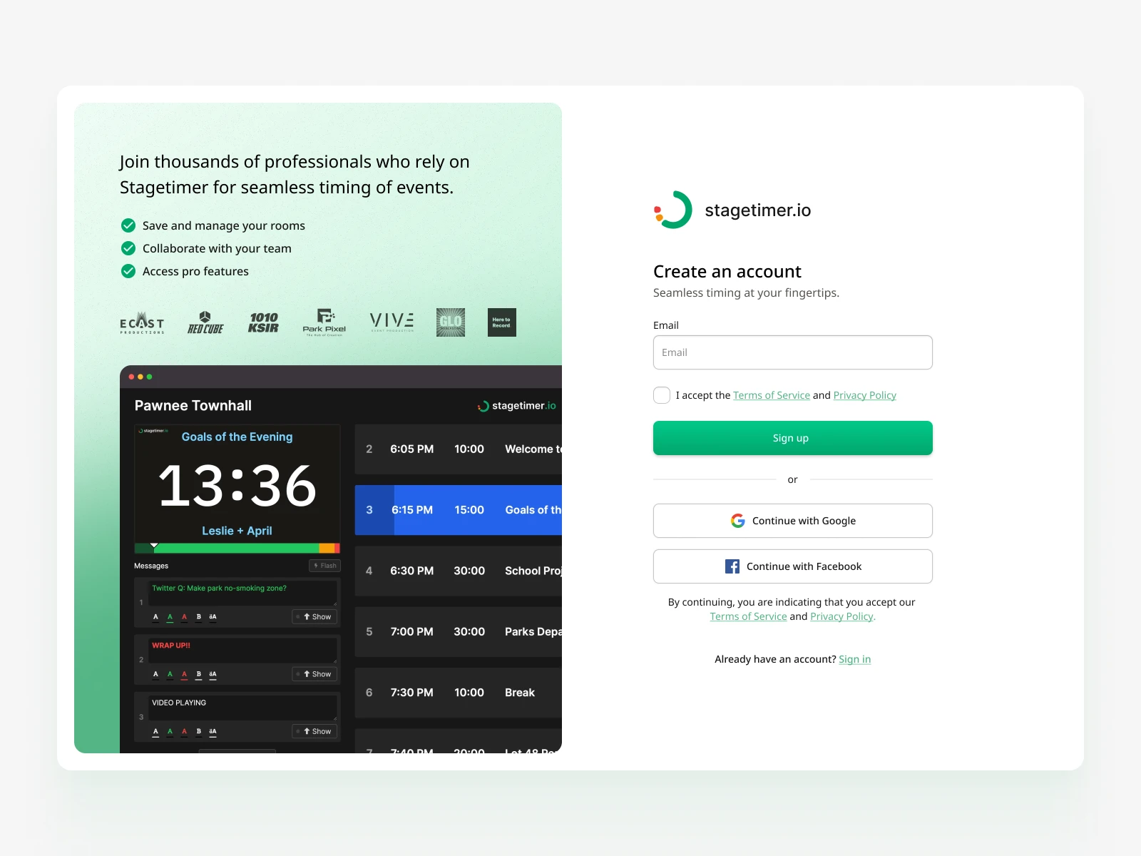
Signup uses a split layout: form on the right, and on the left a green panel with a plain-language value line, three concrete benefits, a row of client logos, and a screenshot of the actual controller UI mid-event.
Login is a single centred card. No panel, no logos, no pitch.
Someone logging in has already bought. Selling to them is noise, and worse, it slows down the person who most needs speed — the operator opening the app twenty minutes before doors. Same design system, opposite priorities.
The invite keeps its context
This is the decision I'd defend hardest.
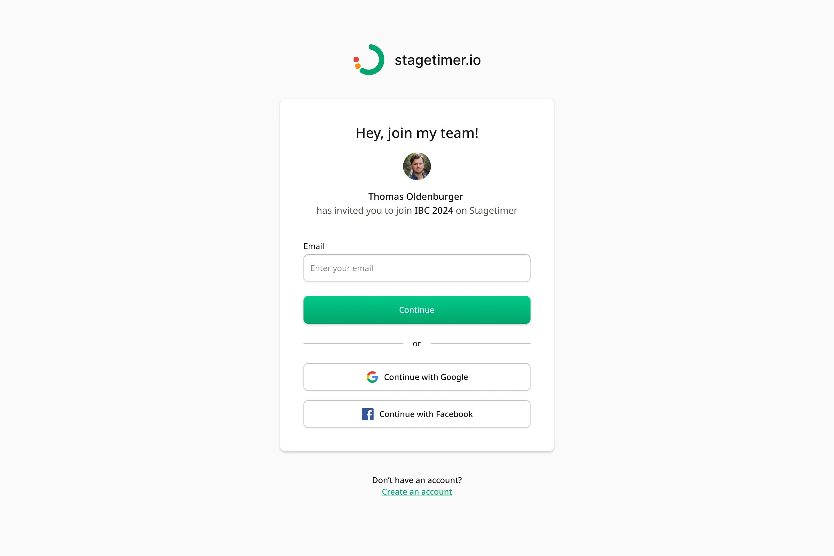
An invited person clicks a link and sees who invited them, their photo, and which event they're being added to: "Thomas Oldenburger has invited you to join IBC 2024 on Stagetimer."
If they're already logged in, that's the whole screen plus an Accept invite button. One action.
If they're logged out, the invite context stays exactly where it is and the auth form appears underneath it. The common failure here is redirecting to a generic login page — the invite disappears, the person forgets why they're there, and a warm handoff from a trusted colleague turns into a cold form from a company they've never heard of. Keeping the inviter's face on screen through authentication costs nothing and preserves the only thing that was ever going to convert them.
Failure states get a way out
Invites fail. The link expires, or it was sent to a different address than the one you're signed in with. Both cases show a clear message rather than a dead end.
Expired: tells you it's expired and points you at your team admin — the only person who can actually fix it.
Wrong account: "This account does not have permission to join," with a Logout link right there. That link is the whole screen. The overwhelming cause of this error is being signed into a personal account when the invite went to a work address, and putting the fix one click away turns a support ticket into five seconds of self-service.
What shipped
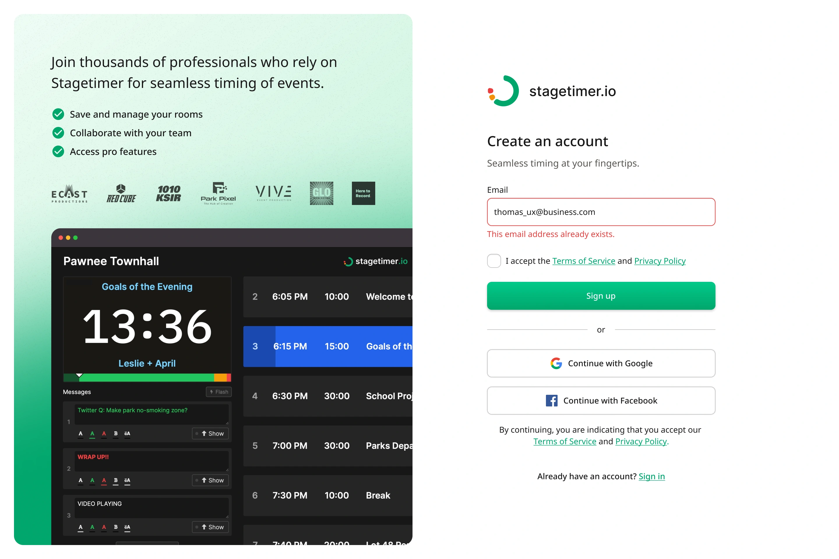
Signup — create account, inline error for an existing address, verify email (link), verify email (code), set password
Login — login, forgot password, request confirmation, reset password, password changed confirmation
Invite — logged in, logged out, expired, no permission
Plus — the end-to-end flow diagram
Like this project
Posted Nov 3, 2025
Optimized Stagetimer’s signup workflow to improve user onboarding, reduce friction, and increase conversion through clearer UX and faster registration.
Likes
0
Views
15