Tripee — The Smart Travel Timeline
Agatha Sanabria
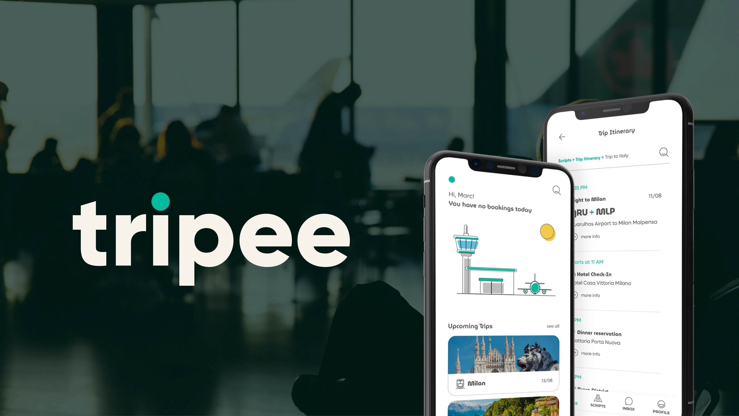
Tripee - The Smart Travel App
Travel planning today is fragmented. Users constantly switch between airline apps, hotel confirmations, ride-sharing services, and email confirmations to manage a single trip.
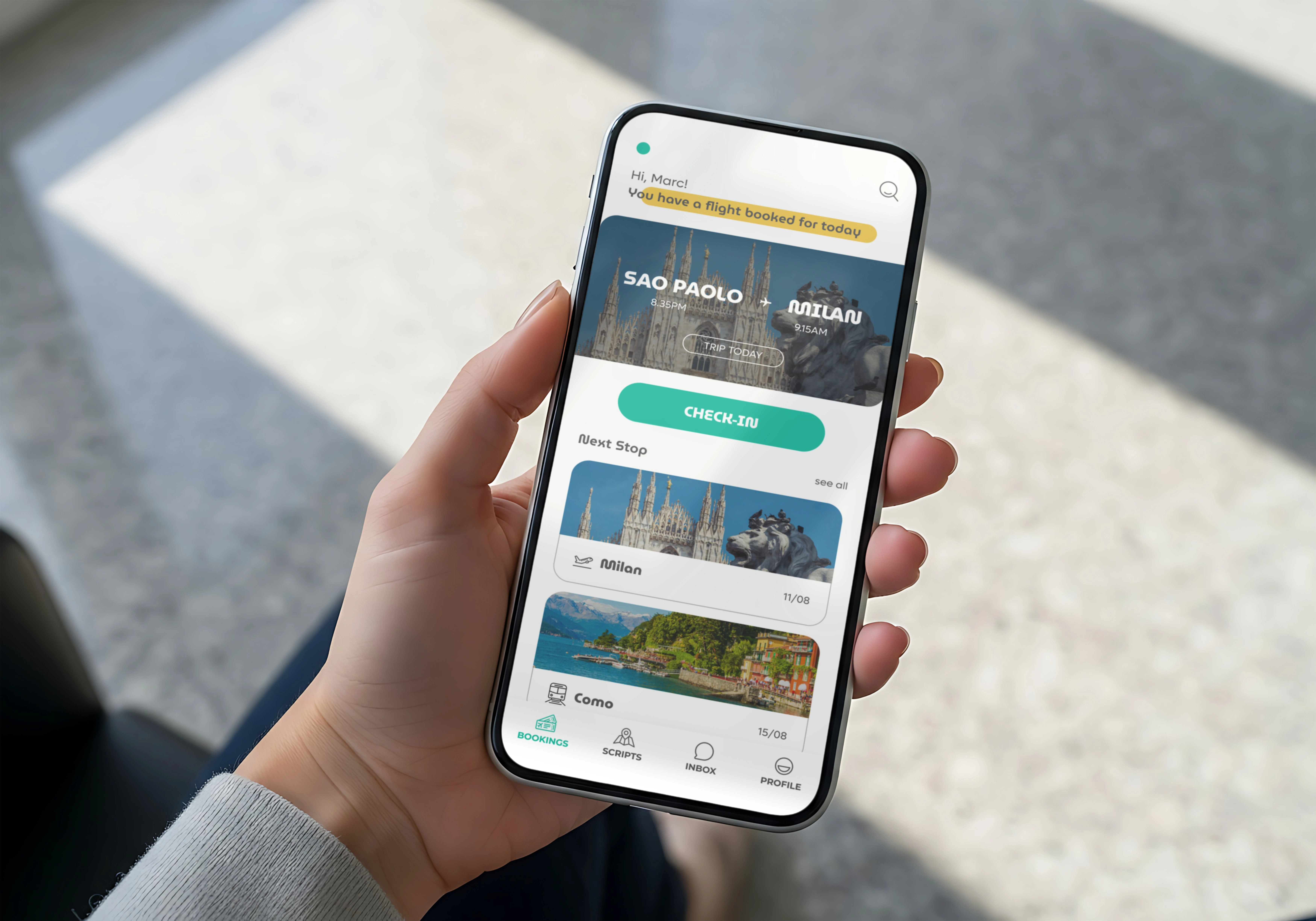
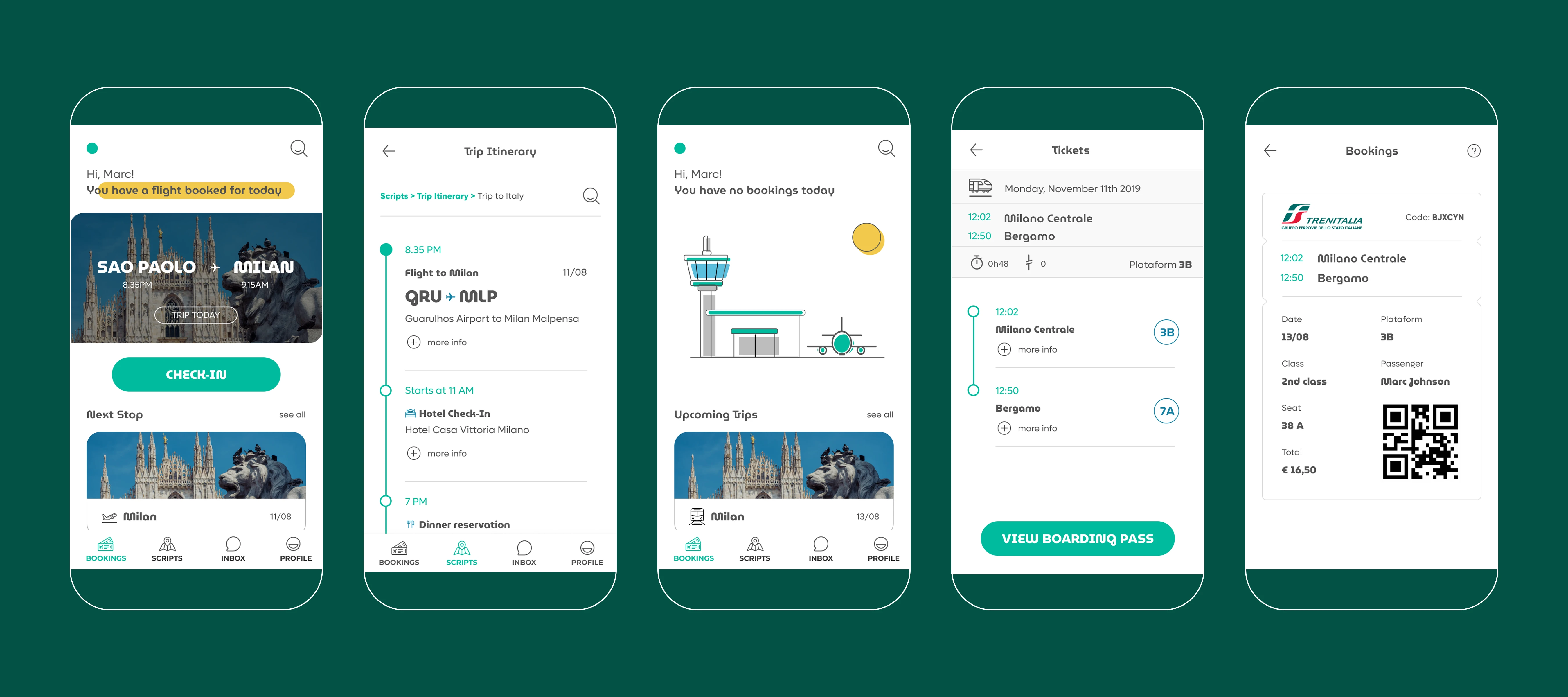
This project explores the concept of a travel companion mobile app that structures every step of the trip in one clear timeline, from leaving home to arriving at the destination and returning.
The app consolidates travel logistics by combining manual planning, automatic integrations, and QR scanning, creating a single, intuitive overview of the entire journey.
The main inspiration for the interface structure is the task-timeline logic used in the productivity apps, yet adapted specifically for travel planning.
Problem
Planning and managing travel is fragmented.
Travelers often deal with airline apps, hotel confirmations, ride apps, booking emails, screenshots of reservations and personal calendars. Because these systems are
disconnected, travelers must constantly manually piece together their itinerary.
This leads to:
• missed details
• stress during travel days
• difficulty finding information quickly
• switching between multiple apps
Travelers don’t need more booking platforms. They need one place that organizes
the trip.
Solution
A timeline-driven travel organizer that automatically compiles all trip details into one structured interface.
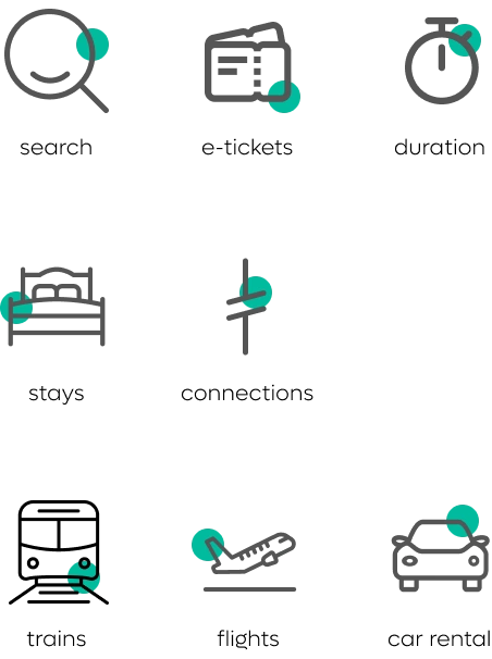
The app combines three methods of trip creation:
Automatic integrations with travel services
QR code scanning for reservations and boarding passes
Manual itinerary creation
All travel information is transformed into a visual timeline representing the entire journey.
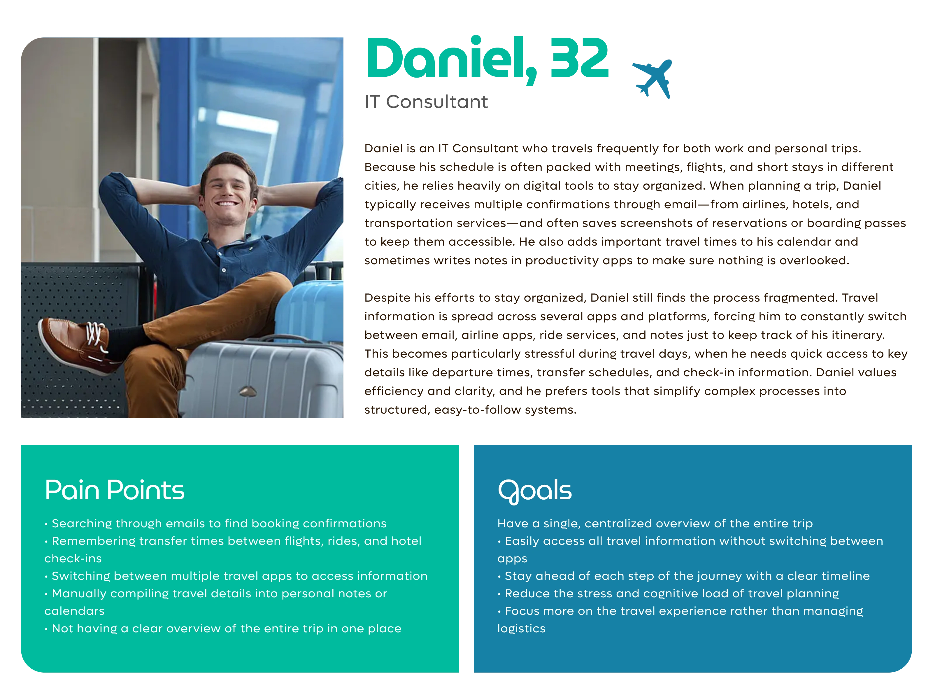
Understanding Our Users
The primary audience for this product is organized travelers—people who value structured planning and clear schedules when preparing for a trip. These users often approach travel with the same mindset they apply to their daily productivity: keeping track of details, planning ahead, and maintaining a clear overview of their schedule. Having all travel information in one place helps them feel more in control and reduces the stress that can come with managing multiple reservations and confirmations.
This group includes frequent travelers, digital nomads, business professionals, and detail-oriented vacation planners who often juggle flights, accommodations, transportation and activities. Because they already rely on tools such as planners, calendar apps, and itinerary trackers, they are comfortable using digital systems to stay organized. A timeline-based travel organizer naturally fits into their habits by consolidating travel details into a clear, chronological view of the entire journey.
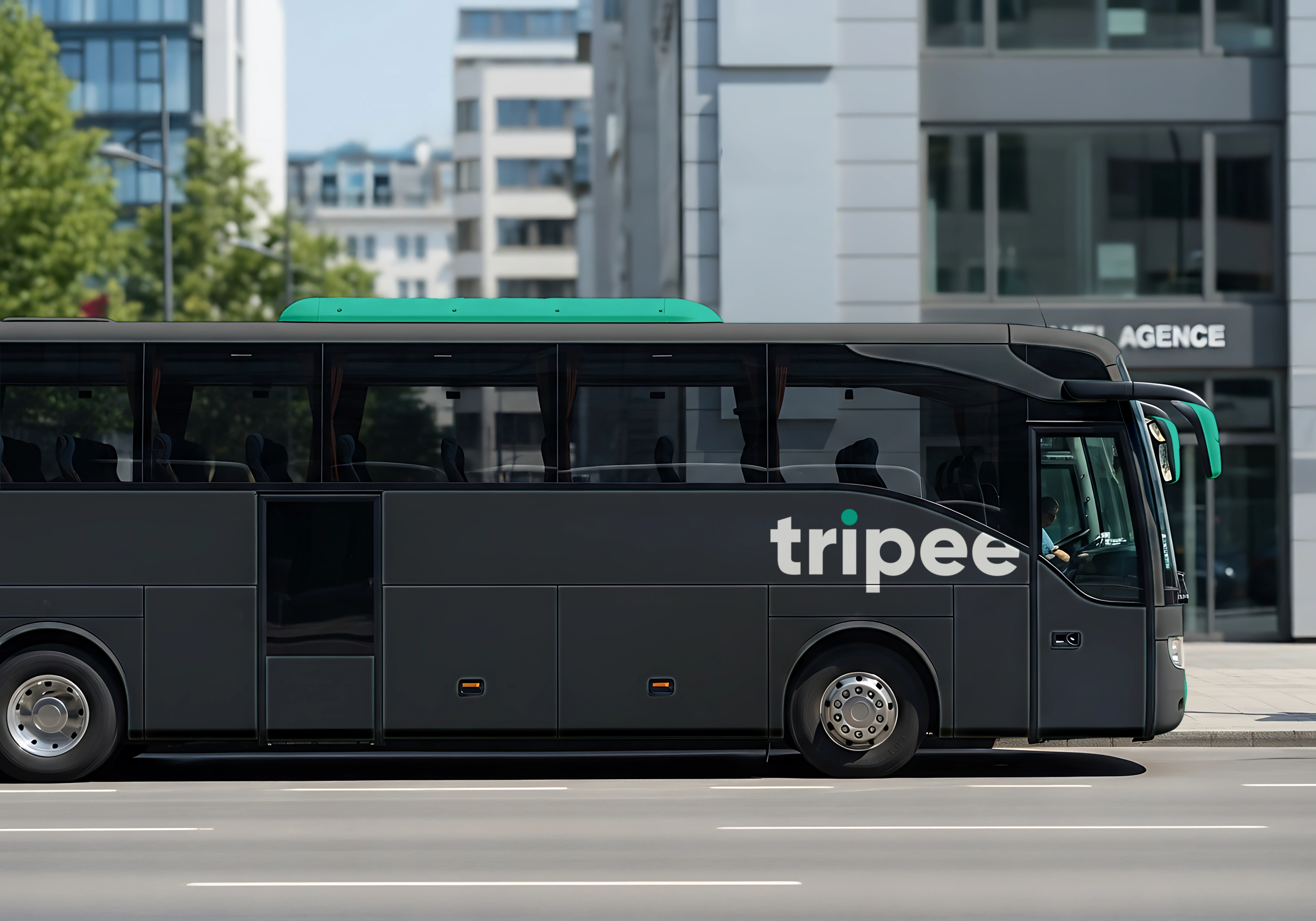
Brand Identity
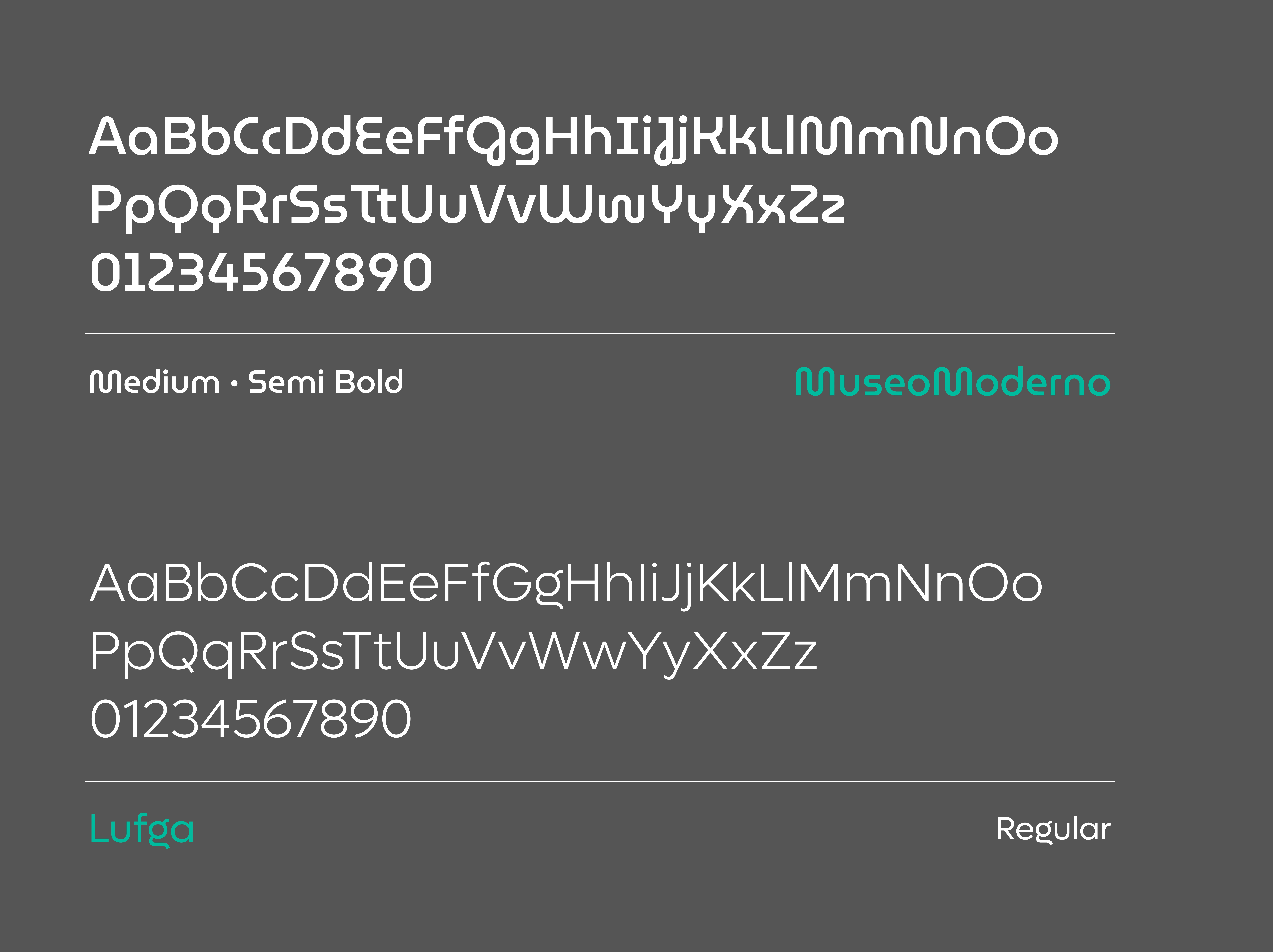
Typography plays a central role in the identity. A bold, expressive type style was chosen to create a fun and approachable tone while maintaining strong readability across the interface. Large typographic moments are used to highlight key travel information such as destinations, departure times, and activity titles. This use of statement typography gives the brand a confident and energetic presence while reinforcing the sense of movement and anticipation associated with travel.
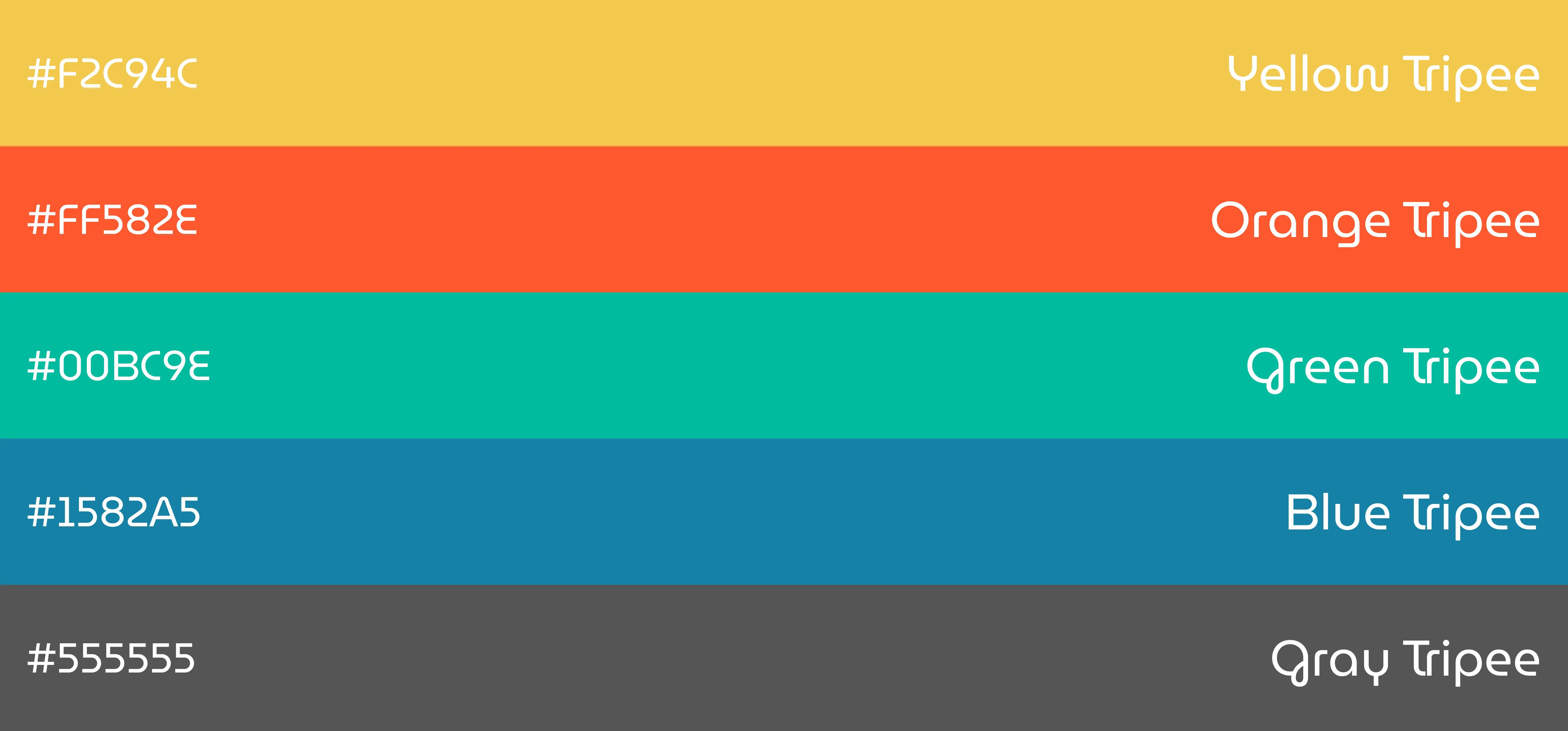
Color also plays an important functional and emotional role in the system. A vibrant palette introduces energy and personality, helping the brand feel modern, casual, and accessible. At the same time, color is used strategically within the interface to categorize different parts of the journey, such as flights, transportation, accommodations, and activities. This approach ensures that the brand identity is not only visually engaging but also supports usability by helping users quickly scan and understand their travel timeline.

The brand identity was designed to reflect the balance between structured organization and the excitement of travel. Since the product’s core functionality revolves around transforming complex travel logistics into a clear timeline, the visual language emphasizes clarity, movement, and progression. The identity uses structured layouts and strong visual hierarchy to mirror the app’s timeline-based experience, ensuring that the brand feels consistent with the product itself.
Like this project
Posted Mar 27, 2026
Unified travel planning into one timeline, reducing app switching and user stress while improving clarity, efficiency, and confidence throughout the journey.
Likes
0
Views
0