Built with Framer
Animated Hero Section | Web Development and Design
Animated Desk Hero
Objective
The goal of this project was to enhance the hero section of my personal portfolio by improving its visual appeal, usability, and branding consistency.
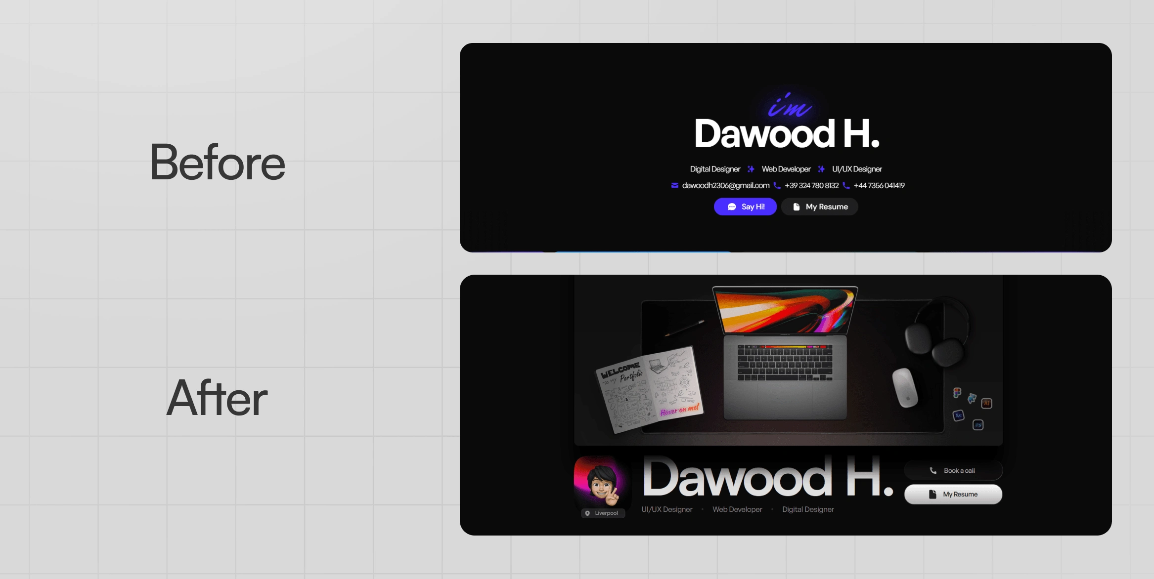
Before & After
In the previous design, the layout was minimal, with a basic structure and a standard typography approach. While it effectively conveyed my identity and skills, it lacked a strong visual impact and interactive elements.
The redesigned version introduces a modern, sleek, and engaging user interface. Key improvements include:
Stronger Visual Hierarchy: A bold, dynamic layout that immediately grabs attention.
Refined Aesthetics: Dark-themed, high-contrast elements with a futuristic touch.
Enhanced Call-to-Actions: Improved button placements for better navigation and conversion.
Branding & Personalization: Added a unique touch with better typography, colors, and an animated avatar.
Hover interactions Demo
Elements
Stickers
Every element on the hero section was designed by me on Figma, including the stickers on the desk that needed to showcase my design stack somewhere in the hero section.
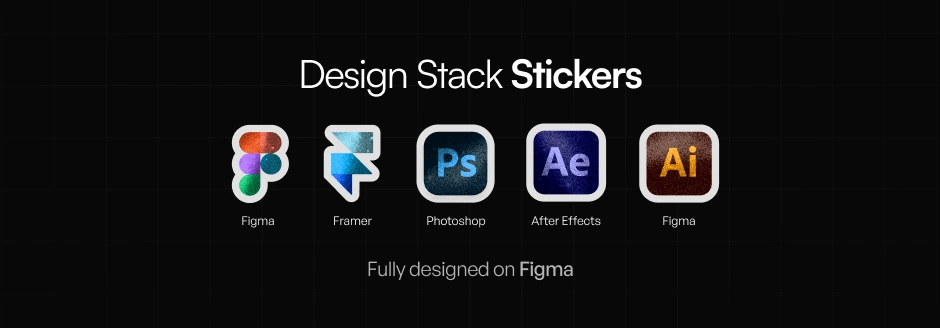
Here is a demonstration on how the stickers were animated on Framer
Desk Elements
The rest of the desk element were designed on Figma as well, with some tweaks in Photoshop for the mouse pad texture.
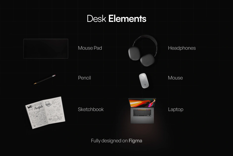
Outcome
The new design successfully elevates my personal brand, making my portfolio more professional and engaging. It creates a strong first impression, effectively communicates my expertise, and improves the overall user experience.
Check the live website here! 🚀
Like this project
Posted Feb 24, 2025
My personal portfolio needed a renovation in terms of the hero section as my skills improved as it need improvement on its visual appeal and branding.
Likes
5
Views
33
Timeline
Feb 24, 2025 - Feb 24, 2025
