Agha Atelier Brand Identity System
Shafaq Taimoor
The Brief
Agha Atelier is a design-led architecture and interiors studio that operates at the intersection of refined living and spatial intention. The studio needed a complete visual identity system — one that communicated permanence, quality, and restraint without feeling cold. My role was to translate that philosophy into a cohesive brand kit: a logo suite, a typography system, a color palette, and usage guidelines, built to scale across print, digital, and signage.
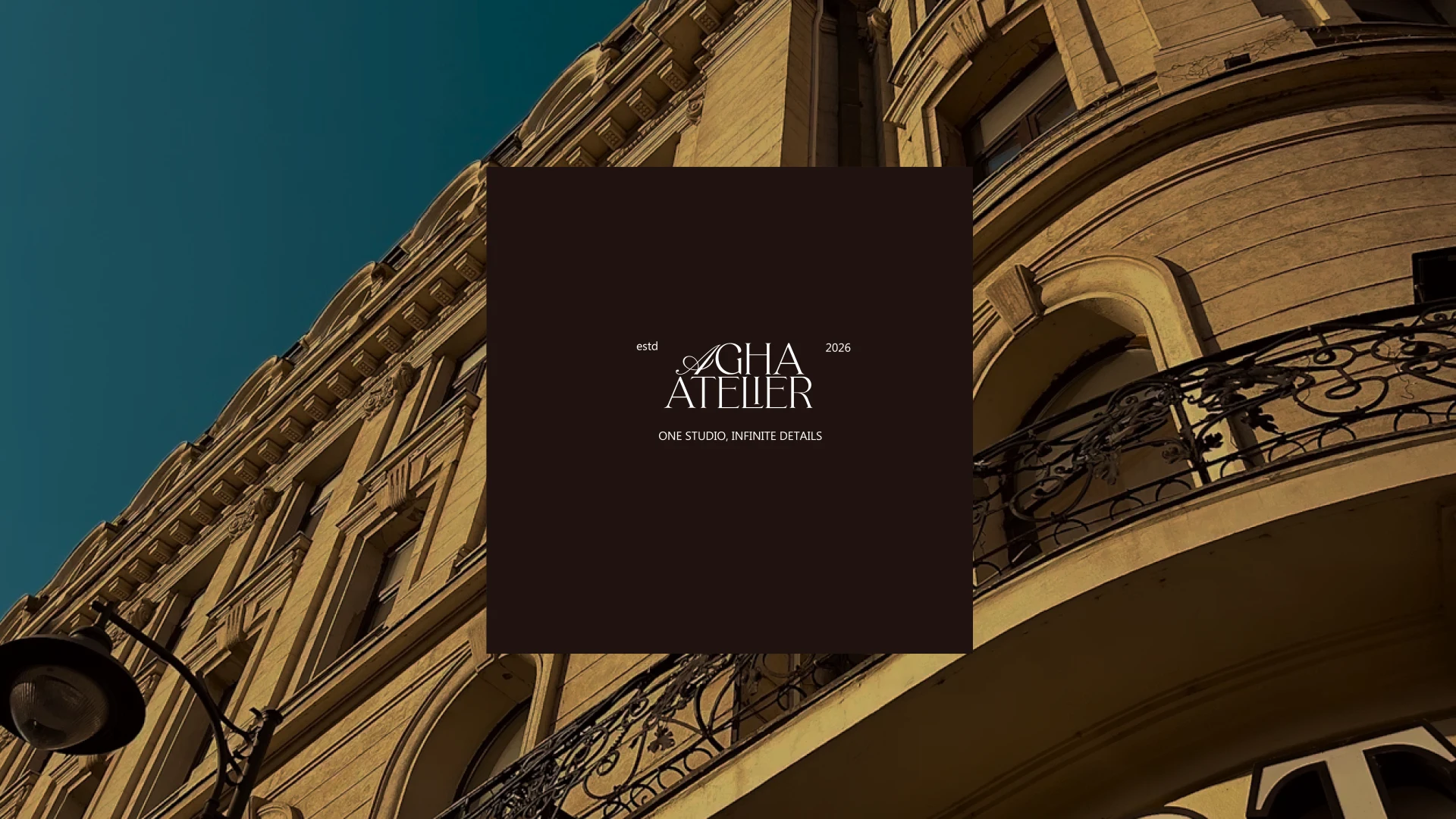
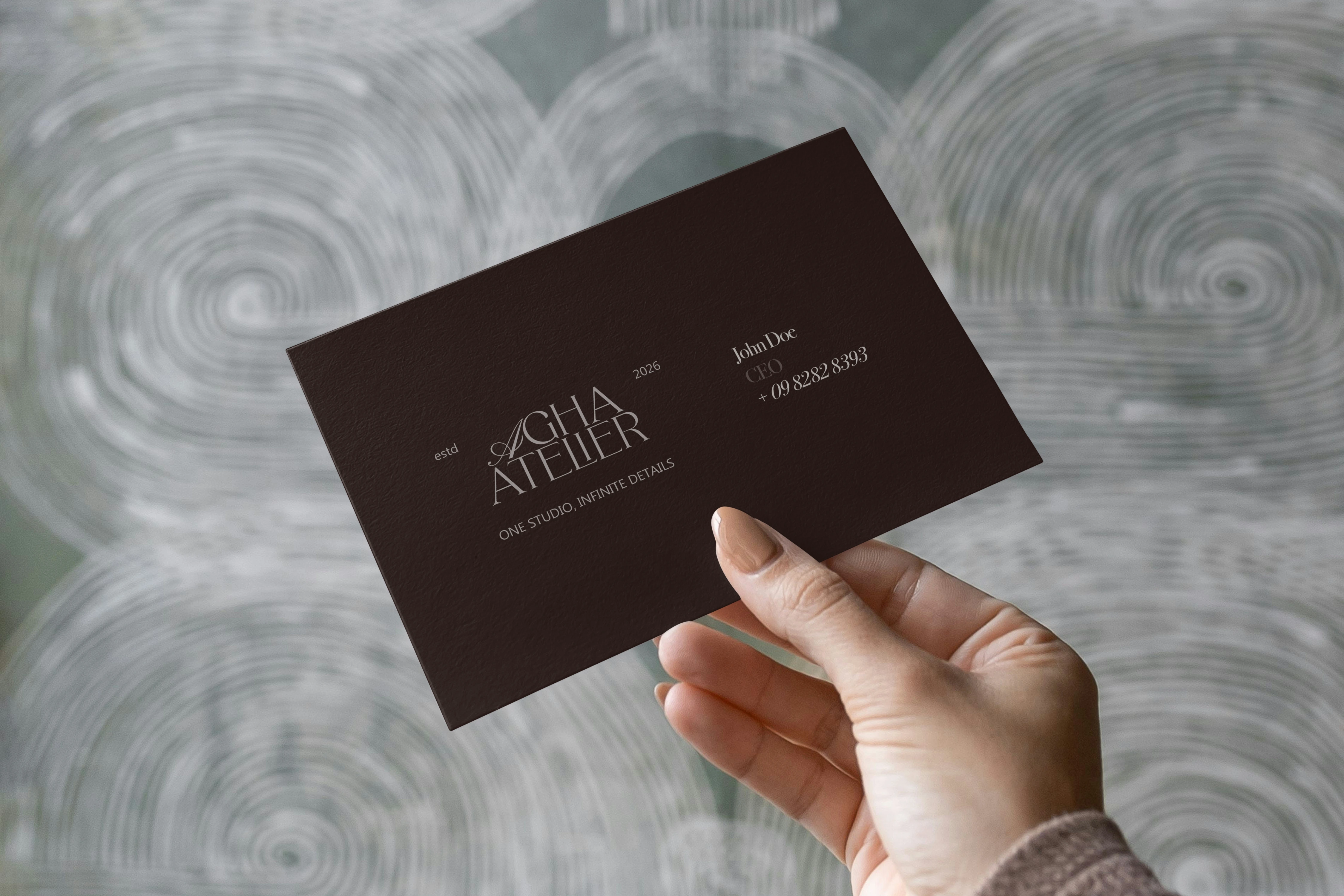
"One studio, infinite details."
From Discovery to Delivery
Every brand project I take on moves through four deliberate phases. For Agha Atelier, each stage was driven by a single question: Does this feel inevitable for this studio, or could it belong to anyone?
01 - Research | Studied the studio's existing work, competitor positioning, and the visual language of luxury architecture brands globally.
02 - Ideation | Explored logo concepts rooted in architectural letterforms — balancing editorial serif character with structural precision.
03 - Brainstorm | Developed multiple directions: a typographic primary mark, a compact monogram seal, and a flexible secondary variant.
04- Execution | Refined in Adobe Illustrator, applied across brand touchpoints, and documented in a complete guidelines presentation.
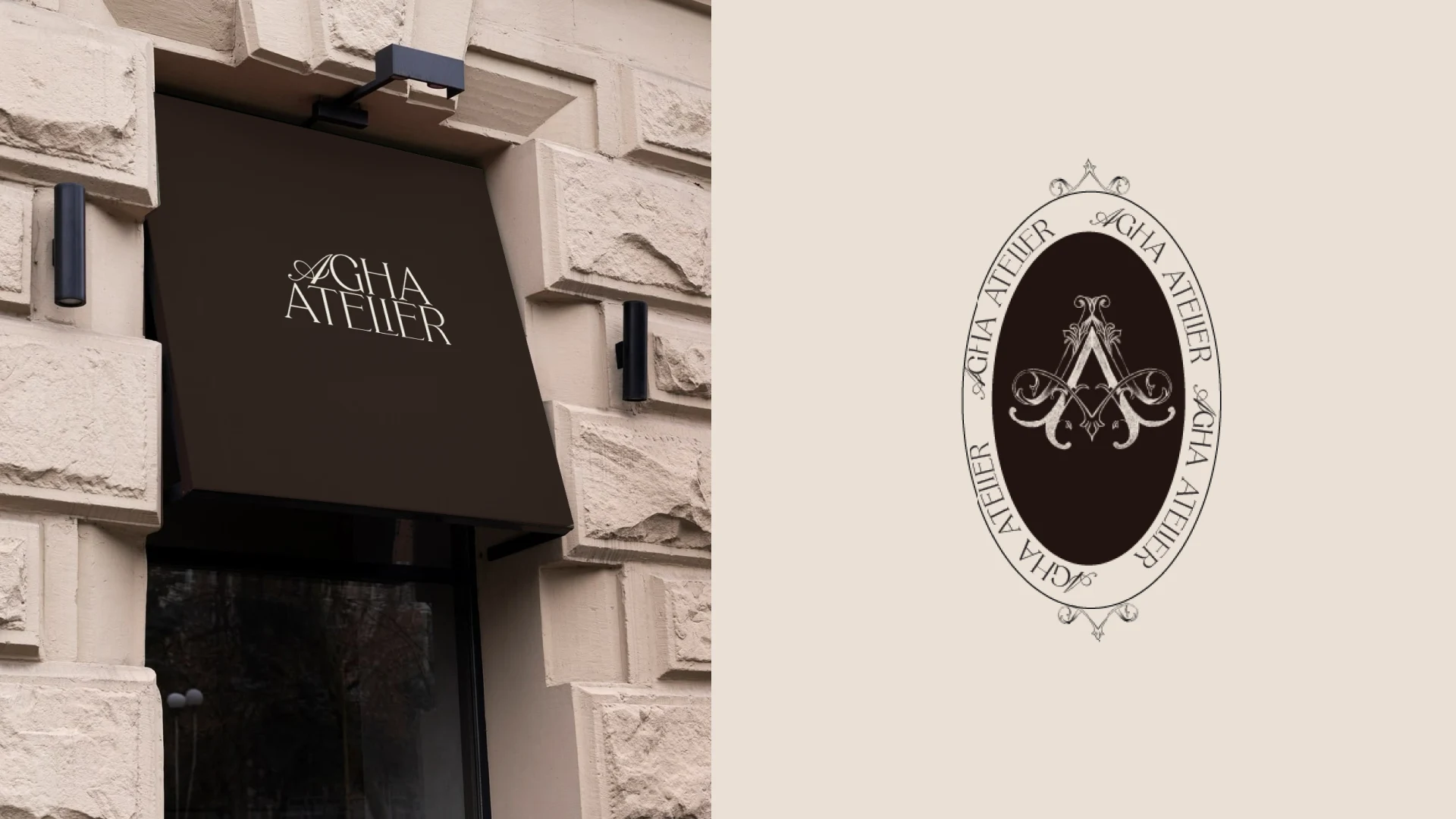
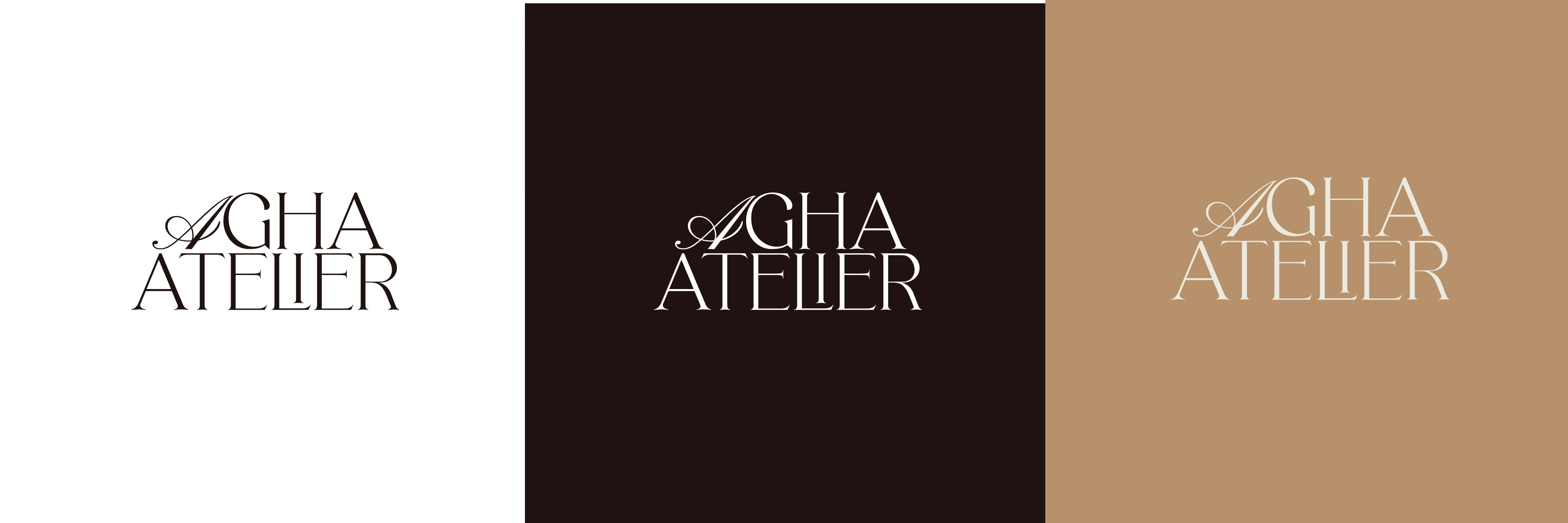
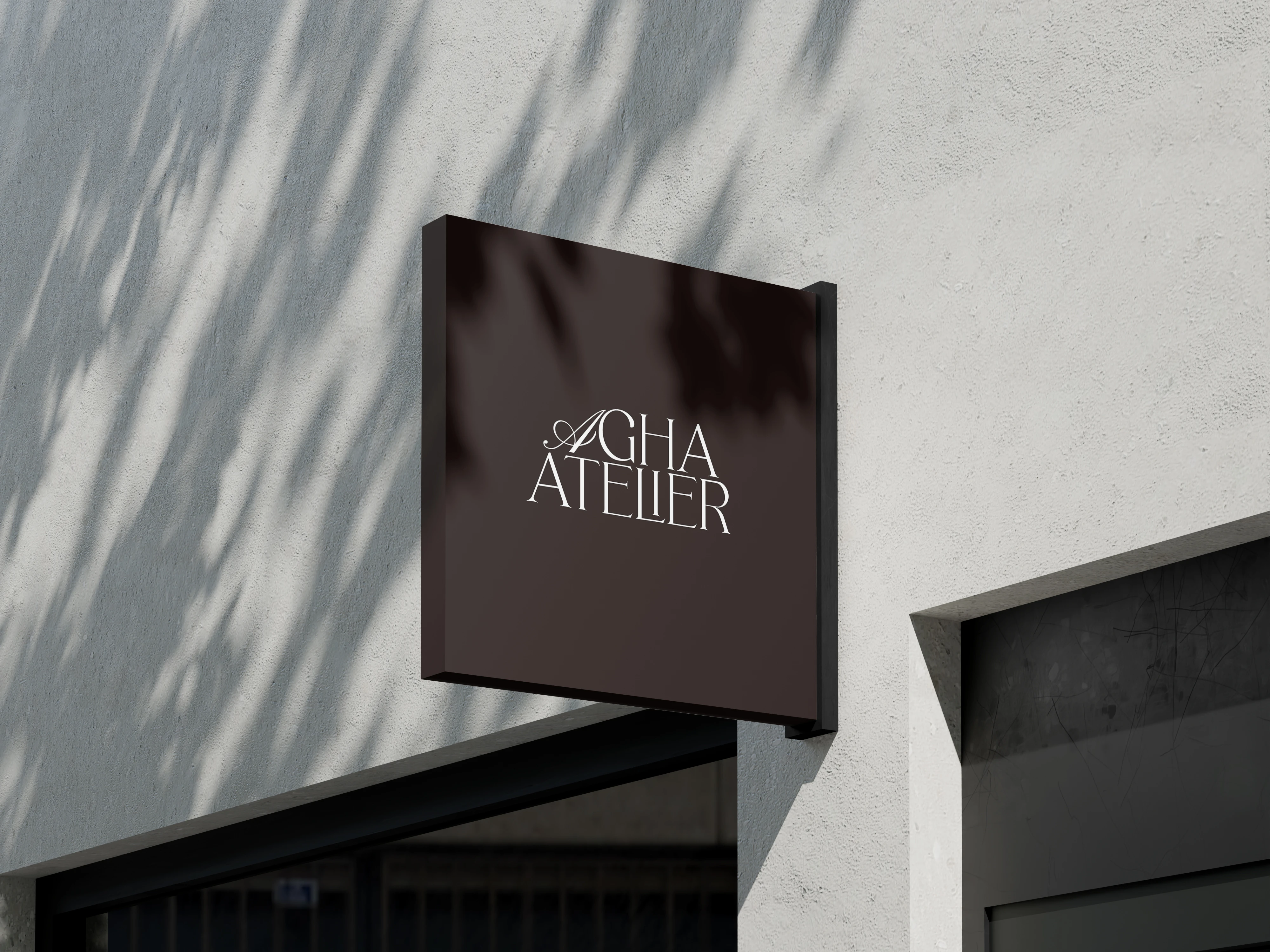
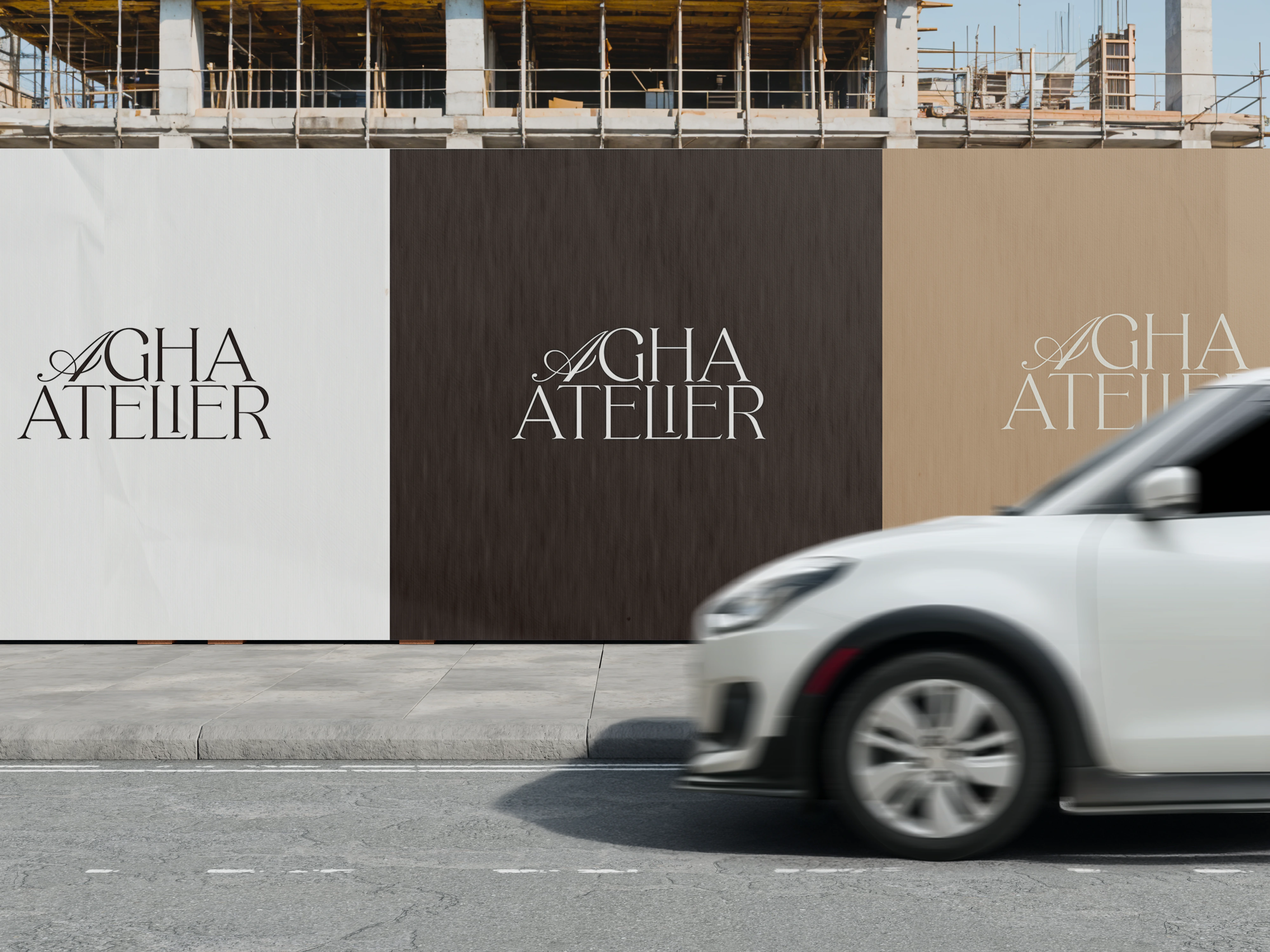
Rather than a single logo, I developed a suite of three complementary marks — each optimised for different applications while maintaining consistent character. The primary logo anchors the brand across headers and formal documents. The secondary variant adapts to space-constrained layouts. The emblem seal works at a small scale for stamps, profile images, and signage.
Brand Pillars
The visual system is grounded in Agha Atelier's four defining principles. Each design decision in the brand kit was filtered through these pillars — ensuring the identity didn't just look luxurious, but genuinely reflected how the studio thinks.
01 - Structure
Everything begins with structure: Proportion, alignment, and spatial balance. Nothing in the identity is arbitrary — every element earns its place.
02- Restraint
Less, but better: The brand avoids excess. Decoration that doesn't serve the system was removed — allowing form and material to speak.
03- Experience
Spaces are felt, not just seen: The warm palette and editorial typography evoke atmosphere — a brand you sense as much as read.
04 - Detail
Precision at every level: From logo spacing rules to caption sizing, the guidelines capture refinements that make the outcome feel complete.
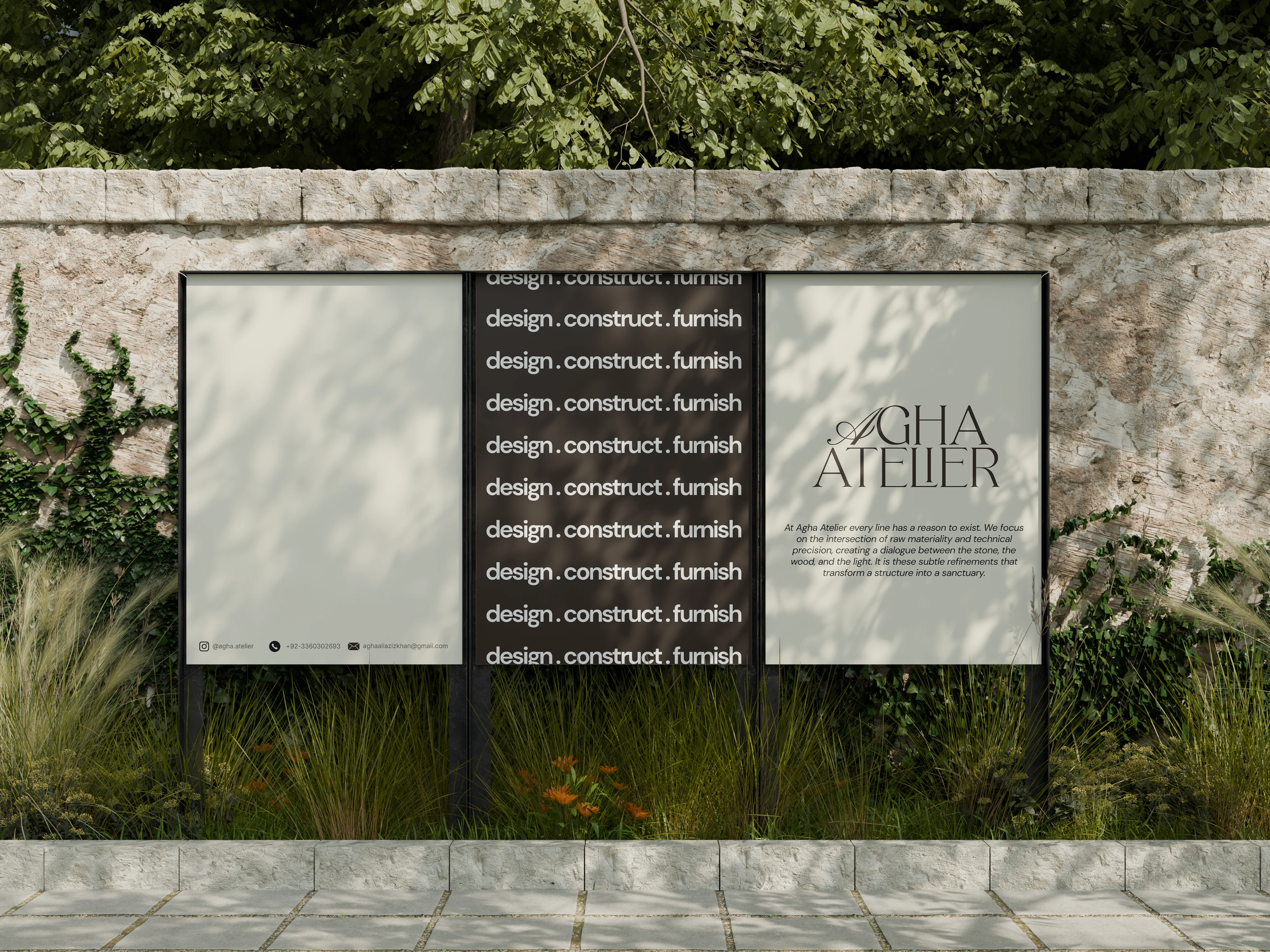
The typography system pairs three typefaces across distinct roles. Cormorant Garamond anchors the brand with heritage and elegance — used exclusively for headlines and key messaging. Inter brings clarity and neutrality to body text. DM Sans handles captions, labels, and UI elements where structure matters more than expression.
Visual Direction
The guidelines extend to photography and social media — defining not just what the brand looks like, but what it chooses to show. Materiality, texture, light, and process moments. Nothing trend-chasing, nothing over-edited. A slower, more intentional visual rhythm that mirrors how the studio works.
Materiality: Textures, finishes, and close-up details that communicate craft and tactile quality.
Light & atmosphere: Spatial moments defined by shadow and light — the way a room feels, not just how it looks.
Process: Site progress, behind-the-scenes, and the tools of the trade — honest, unpolished moments.
Like this project
Posted Jun 17, 2026
Brand identity for a luxury architecture studio: logo suite, type hierarchy, color palette, and social direction in Illustrator & Photoshop.