Plus Ultra: Trail Running Landing Page

Ella Sh.

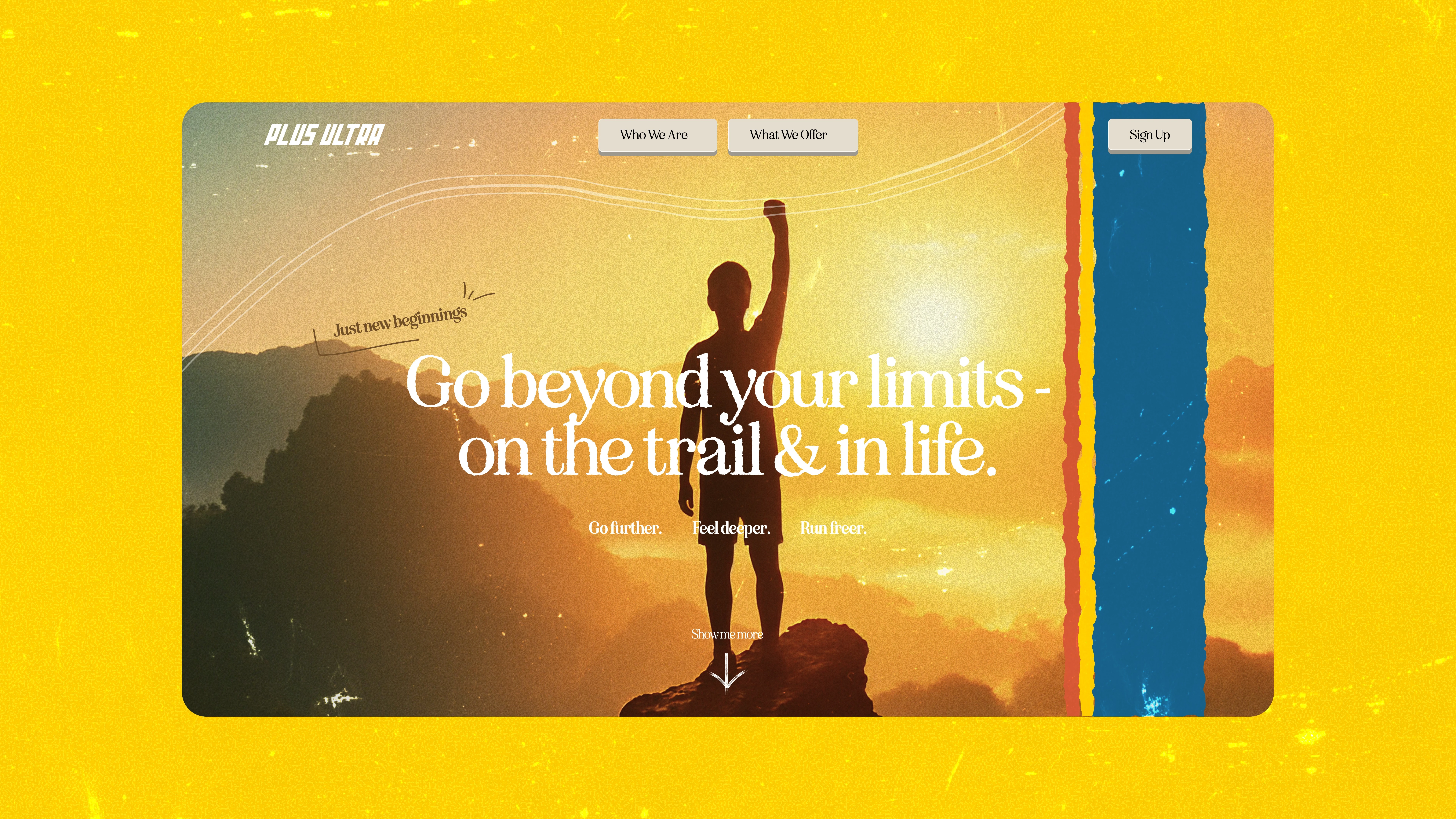
The original landing page worked. It was clean, navigable, and completely forgettable. A visitor could scroll it in under a minute and retain nothing about the brand. For a company built on community, movement, and energy, that was the actual problem, not anything on the usability list.
The direction. The redesign pulls from the 80s: bold poster typography, warm muted tones, grainy texture, polaroid framing. Not an arbitrary aesthetic call. The era's visual language maps onto what Plus Ultra stands for, which is freedom, optimism, and the physicality of being outside. The nostalgia is not decoration, it is the brand's personality finally made visible.
Rebuilt section by section. The hero carries cinematic weight. Community moments are framed like polaroids, which gives user generated content the feeling of something worth keeping instead of something scraped from a feed. The palette places you immediately: orange sunsets, film grain, the warmth of analog photography. Retro typography sets the pace all the way down.
The result reads like a trail running magazine from 1987 and converts in 2025. Visitors do not just see a product, they step into a world. That is the difference between a page people scroll past and one they remember.
Timeline: 3 weeks. Year: 2025. I led art direction, brand, and page design.
Like this project
Posted Aug 28, 2026
Landing page redesign for a trail running community brand, built on 80s poster language. Memorable first, conversion-shaped throughout.
Likes
0
Views
3
Timeline
Aug 1, 2025 - Aug 27, 2025