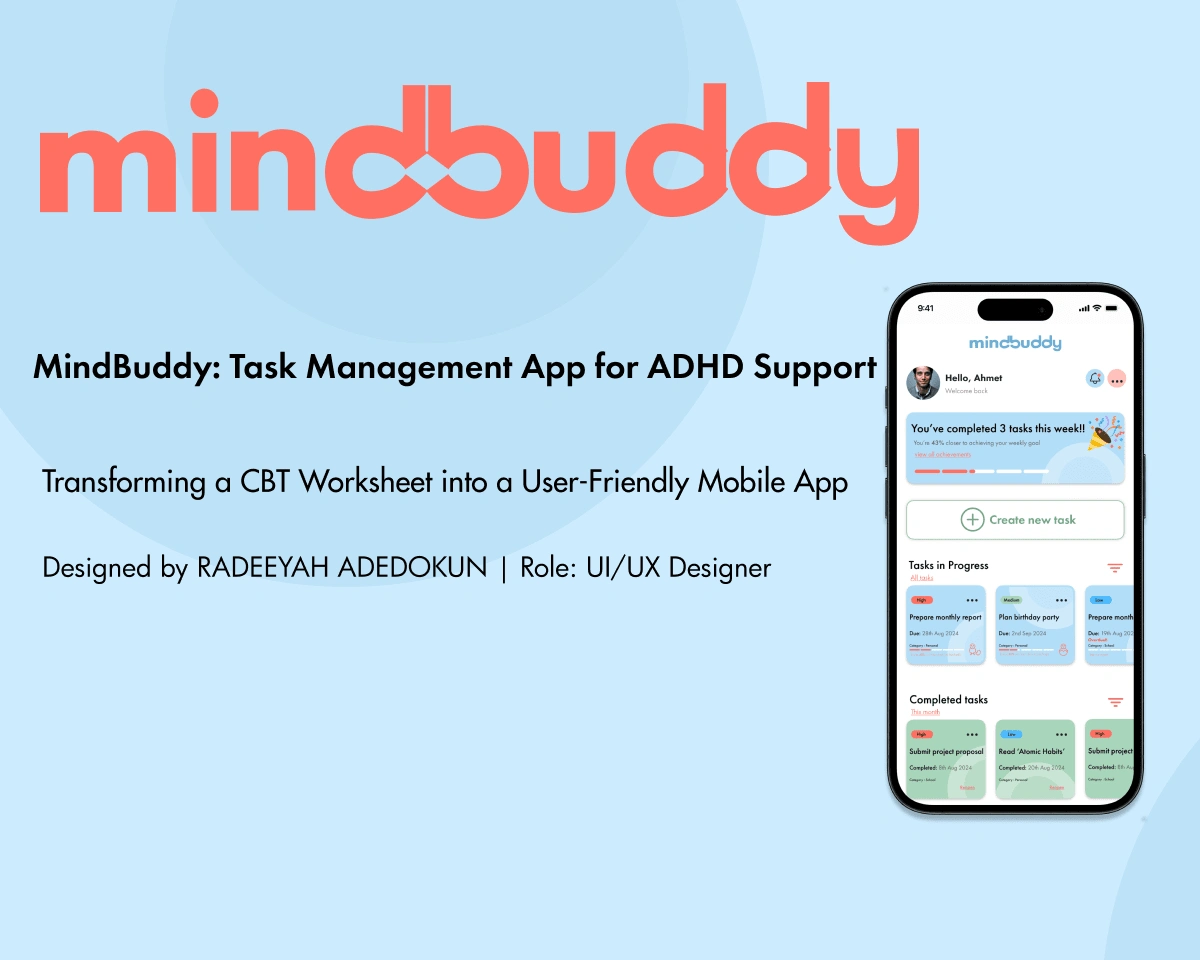
MINDBUDDY - Turning a worksheet into screens
The Worksheet
Brand Identity
Logo
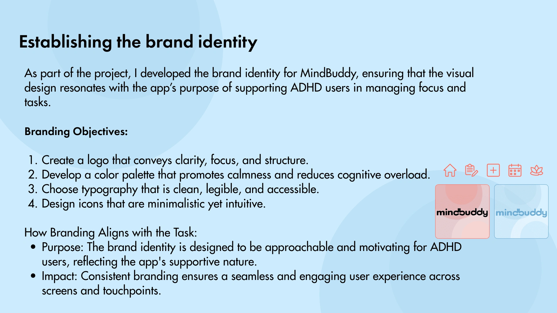
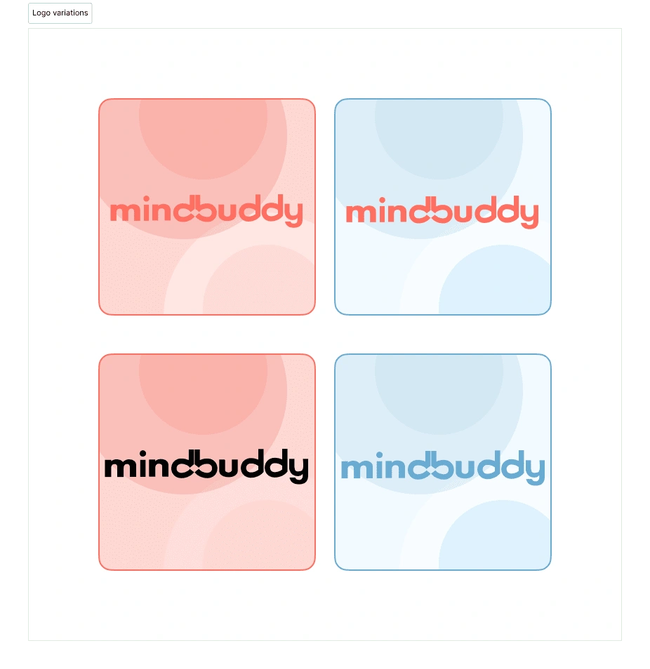
The concept for this logo draws inspiration from the neurodiversity symbol, a rainbow infinity sign that represents inclusivity and endless possibilities. The closeness of the letters "d" and "b" was reimagined to form an infinity symbol, creating a direct connection to the theme.
The design is heavily typography-based, emphasizing the creative manipulation of letterforms rather than incorporating standalone symbols or illustrative elements. This approach demonstrates how thoughtful typographic exploration can result in a meaningful and cohesive visual identity.
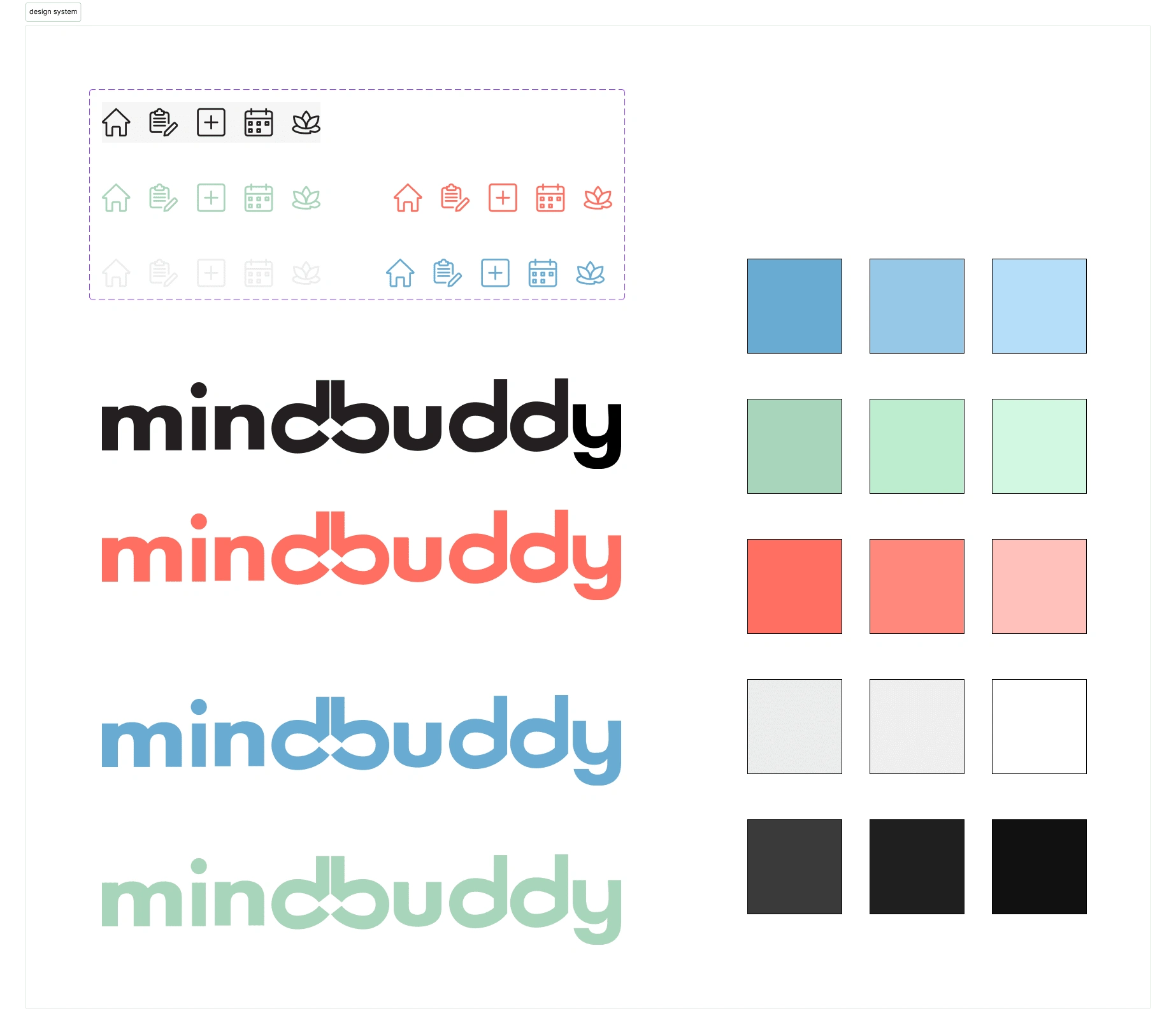
The colour palette for this project was very well thought out, putting into consideration, colors like blue and green known associated with calming beneficial for users with anxiety and also promoting focus. The coral color was also chosen as an accent colour to draw attention and also keep the users quite interested in the app. Accessibility considerations were also made according to the WCAG guidelines, enabling users to be able to experience the app regardless of their ability status.
Design Process
Step 1: Research
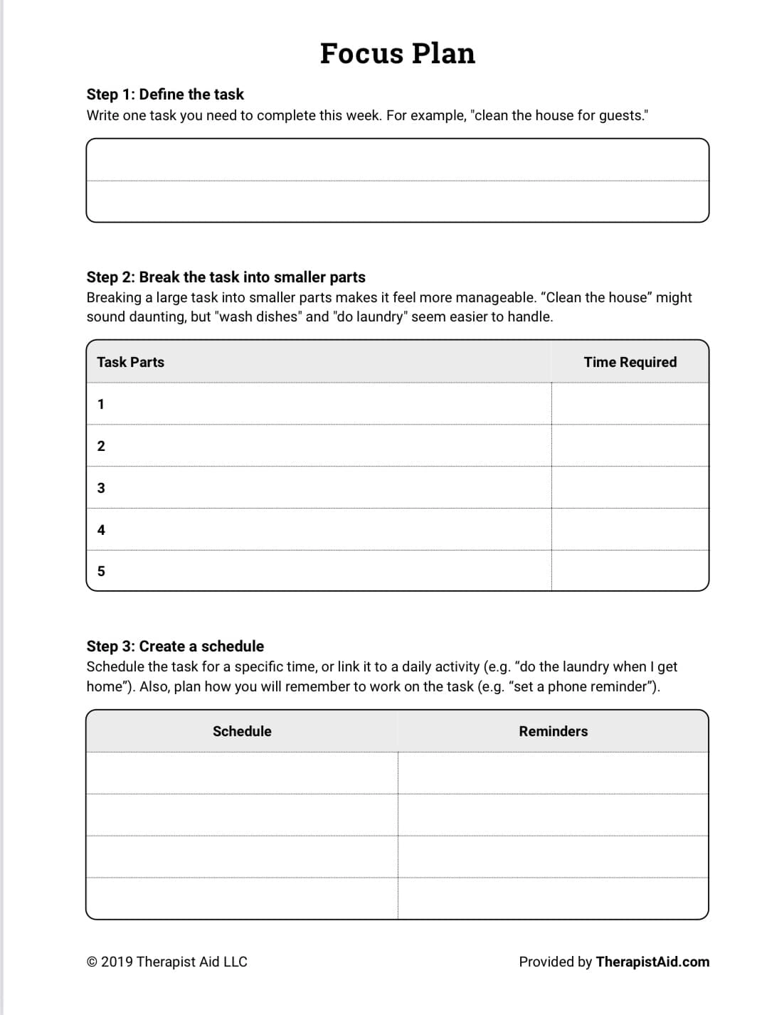
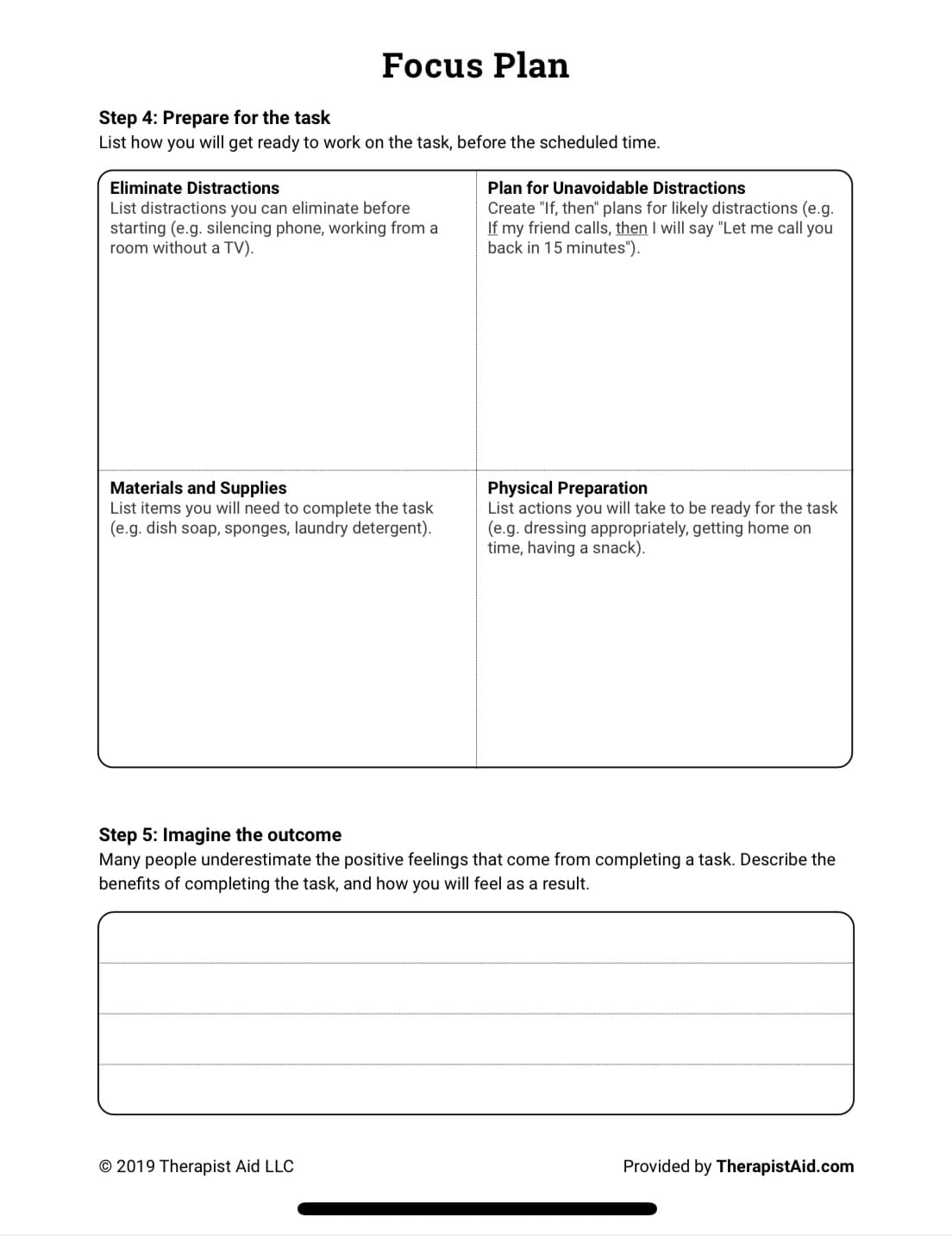
Analyzed the ADHD Focus Plan worksheet to identify key steps for task management.
Researched ADHD challenges to design with low cognitive load in mind.
Step 2: Ideation
Created low fidelity wireframes to map workflows for task creation, scheduling, and visualization
Step 3: Visual design
Chose calming color palettes and readable typography for accessibility
Built high-fidelity screens using the design system created.
User Flow
Start: Dashboard:
The user begins at the dashboard, which provides an overview of ongoing and completed tasks, as well as achievements.
Task Creation:
The user clicks "Create New Task" and is taken to a screen where they input task details, set priorities, and define categories.
Task Breakdown:
Once the task is created, the user can break it into subtasks, add deadlines, and assign time estimates.
Scheduling:
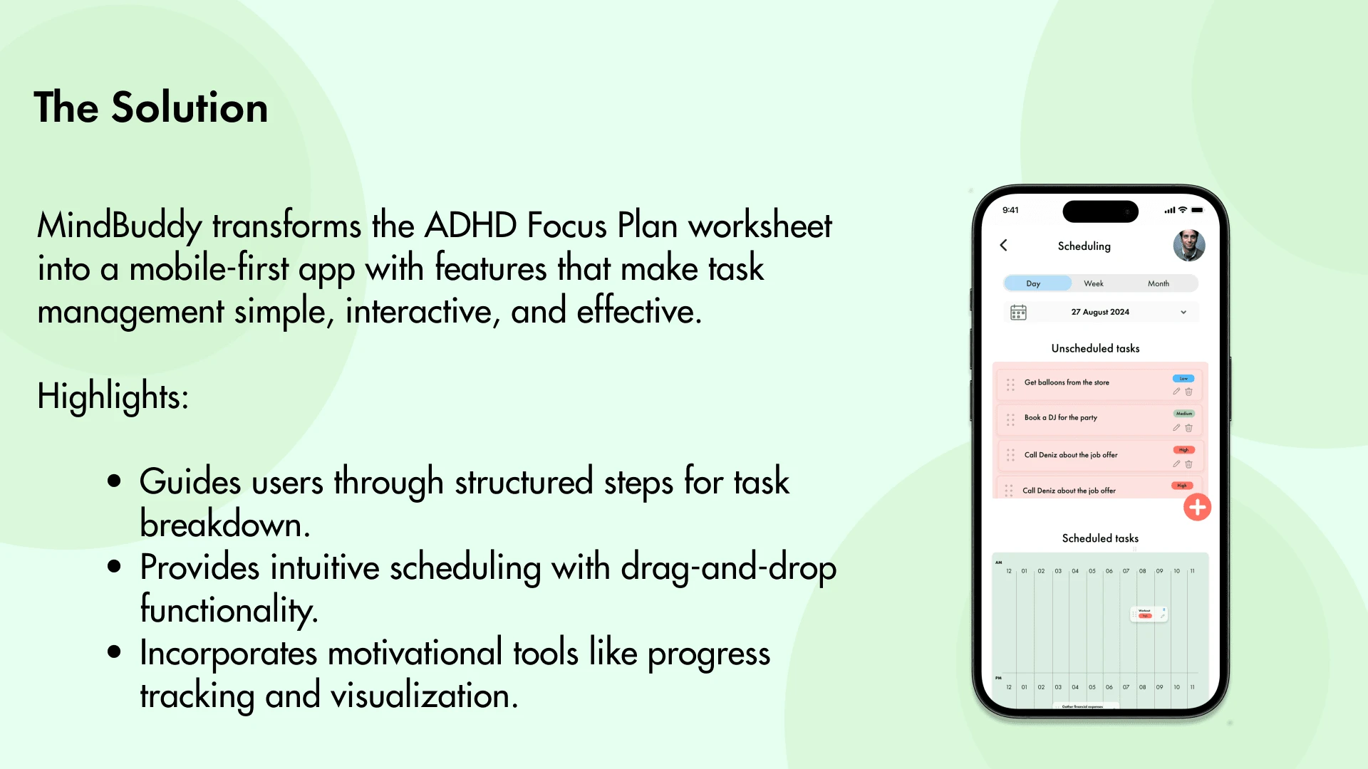
Tasks and subtasks are scheduled into a daily, weekly, or monthly calendar using drag-and-drop functionality.
Preparation:
The app guides the user to eliminate distractions, gather materials, and set reminders to ensure they are ready for the task.
Visualization:
Before completing the task, users can visualize positive outcomes, using motivational cues and meditative tools.
Dashboard Completion:
The user is redirected to the dashboard where task progress and achievements are updated.
From Worksheet to Screens
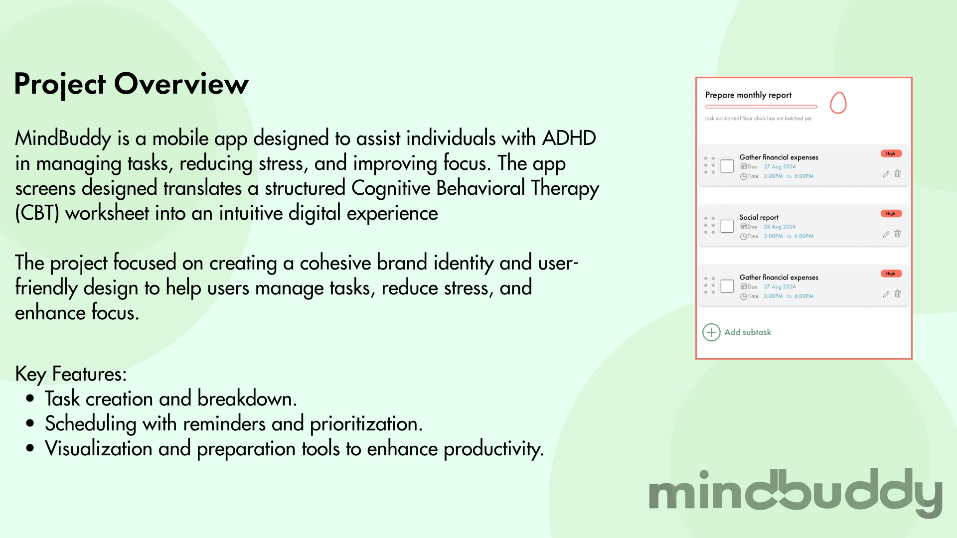
The CBT worksheet was the foundation for the app’s functionality, guiding users through defining, breaking down, and scheduling tasks.
Step 1: Define Task → Task Creation Screen.
Step 2: Break Down Task → Subtask Management Screen.
Step 3: Prepare for Task → Preparation Tools.
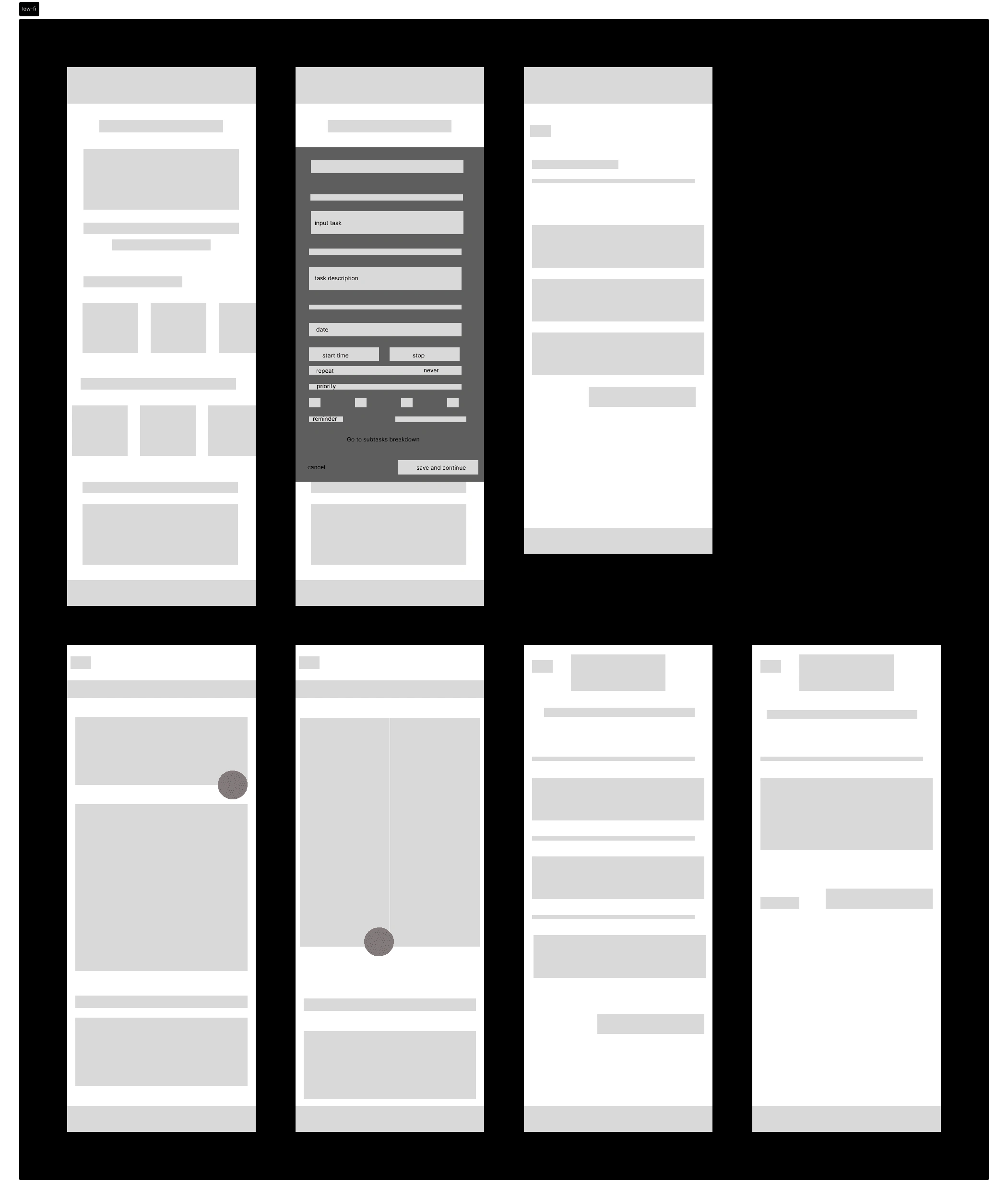
Low fidelity wireframes

High fidelity wireframes
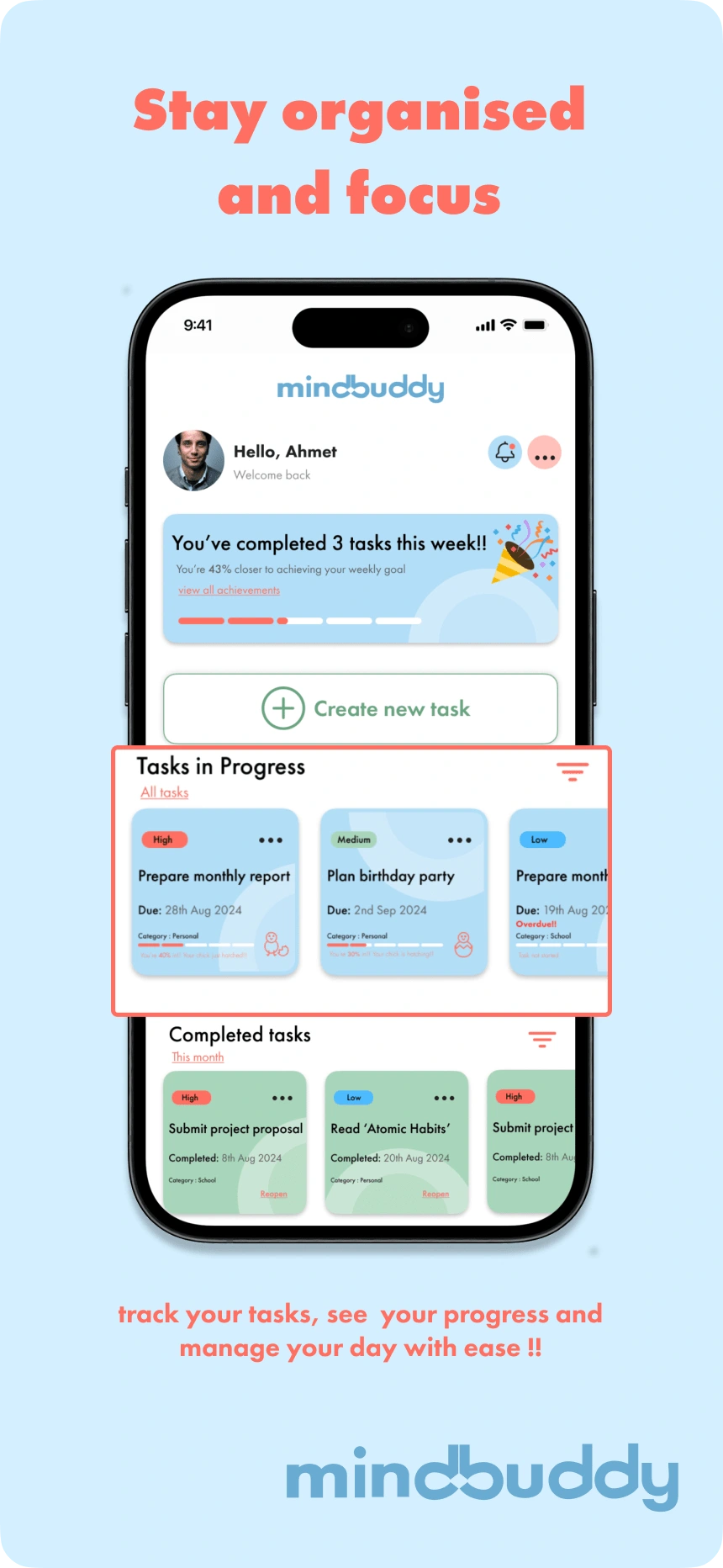
app preview screen 1
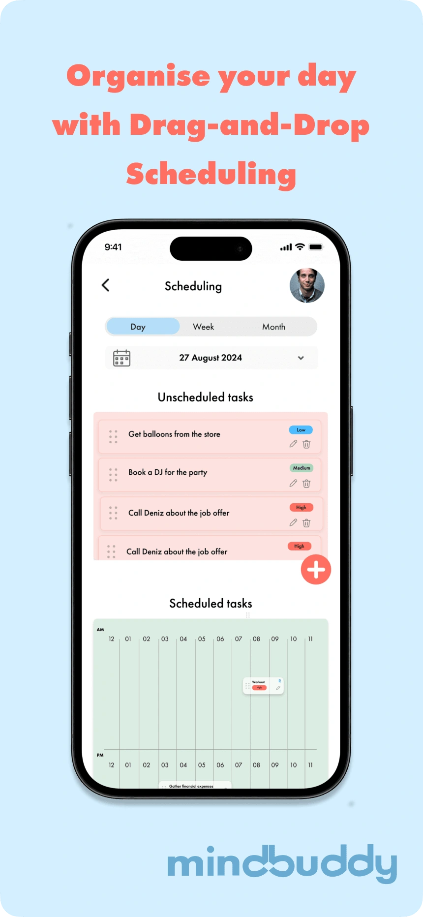
app preview screen 2
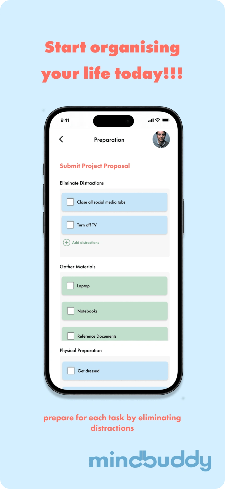
app preview screen 3
Ensuring Accessibility and Inclusivity
Accessibility was central to the design, ensuring ADHD users can interact with the app effortlessly
Accessibility Features:
High-contrast colors for readability.
Large tap areas for touch interactions
Simple navigation to reduce cognitive load
Consistency:
Applied the brand identity (logo, colors, typography) across all screens for a cohesive user experience.
Reflection and Takeaways
What I Learned
Designing for ADHD users required balancing simplicity with functionality.
Branding was critical to creating an engaging yet calming experience
Iterative prototyping helped refine usability based on research insights.
Next Steps:
Incorporate user testing to improve workflows.
Expand features like recurring tasks and detailed analytics.
Like this project
Posted Nov 30, 2024
Designed MindBuddy, a mobile app for ADHD task management, translating CBT worksheets into intuitive screens. Focused on branding, user flows and accessibility
Likes
0
Views
39

