Piligrim Camper — Brand Identity for a Truck Camper Manufacturer

Diana Shchurova


Piligrim Camper — Visual Identity for a Truck Camper Brand
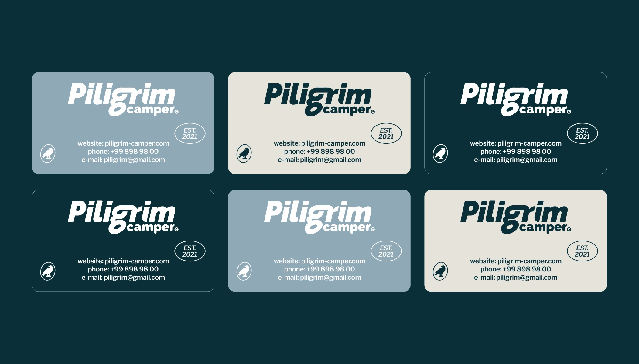
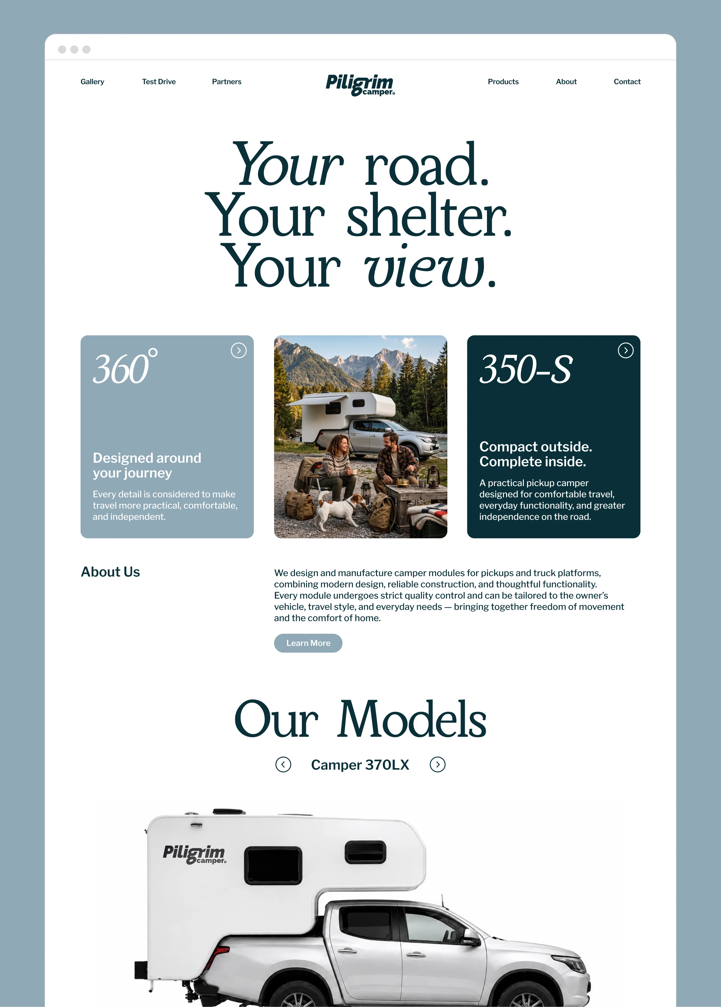
Piligrim Camper is a truck camper and mobile home manufacturer creating solutions for comfortable travel, outdoor living, and life on the road. The brand needed a visual identity that would feel distinctive, memorable, and emotionally connected to the spirit of freedom and adventure.
The founder’s brief was to make the brand feel like an “American dream” — inspired by country culture, classic American vehicles, open roads, and the nostalgic mood of road travel. This direction became the foundation for the identity: a slightly retro, confident, and warm visual system with a strong
outdoor character.
Visual idea
The identity is built around the idea of a camper as a mobile home — a personal space that lets you wake up with a new view every day. One of the key visual metaphors is a scalable camper window, used as a flexible frame for photography across the brand system. It turns landscapes, road scenes, and product images into recognizable brand moments.


Symbol
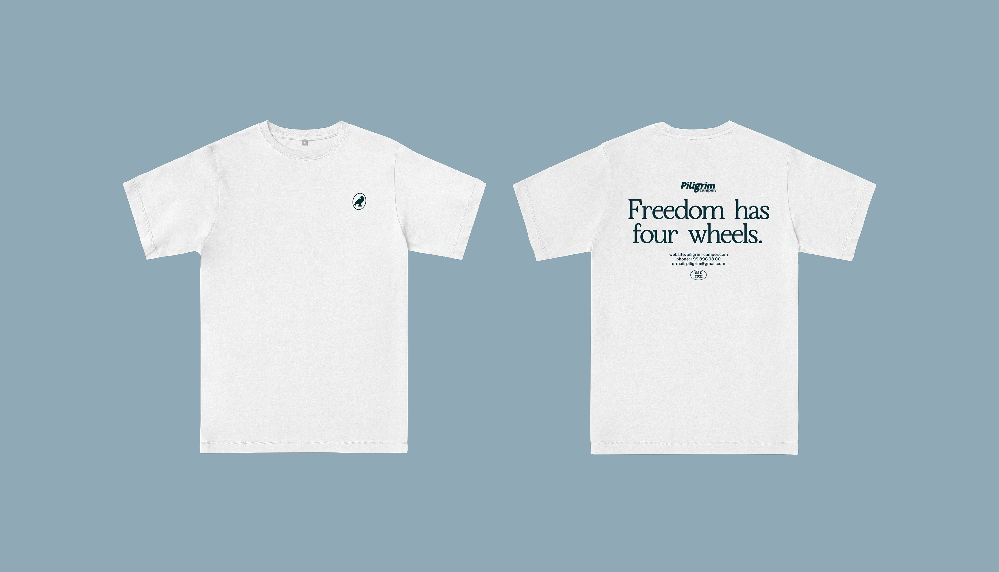
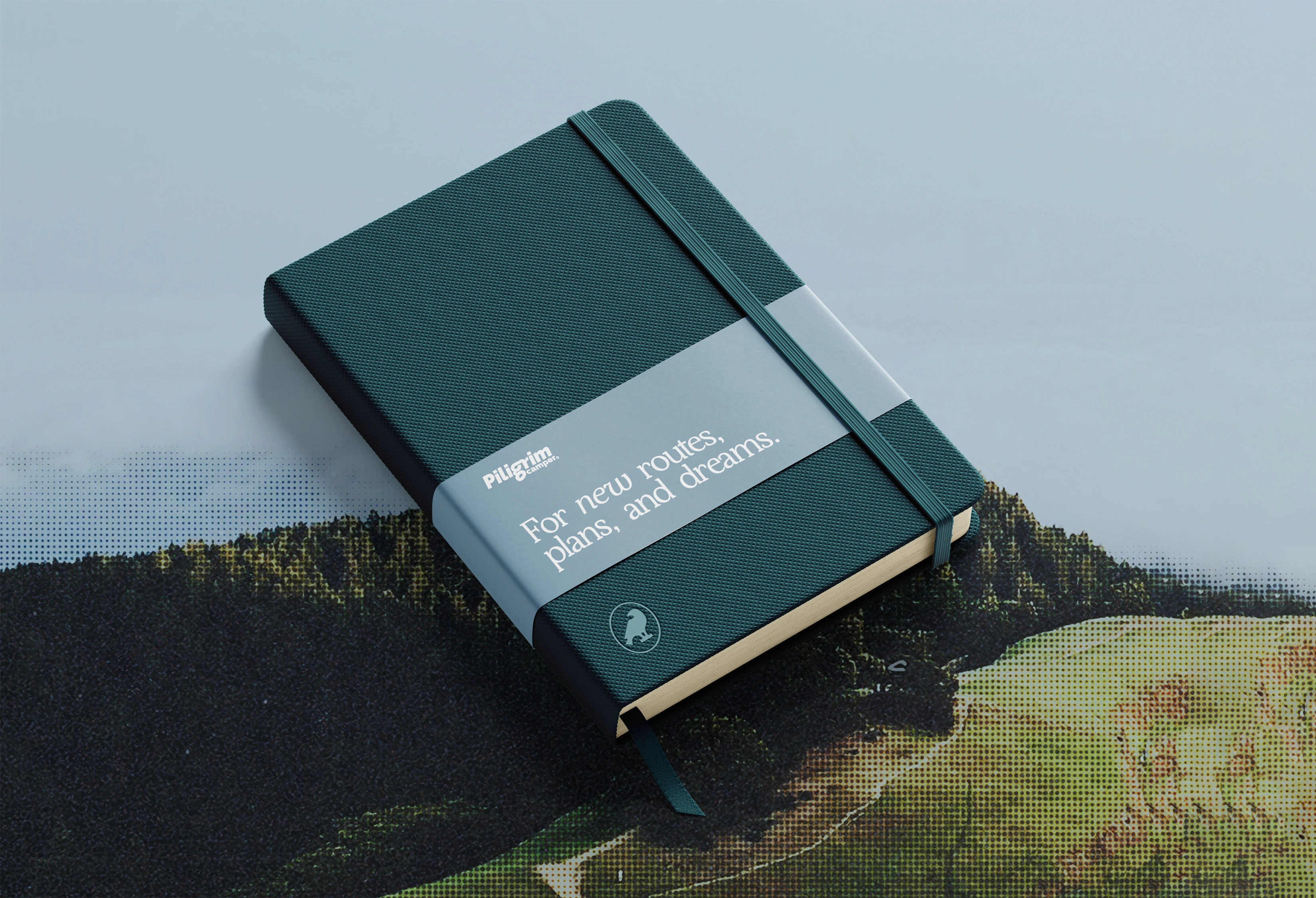
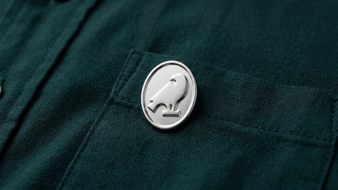
The symbol — a pilgrim bird — refers both to the brand name and to the idea of movement, independence, and freedom. It works as a compact brand mark across digital, print, merchandise, and outdoor applications.


Like this project
Posted Jul 12, 2026
Piligrim Camper is a manufacturer of mobile homes for pickup trucks, combining functional design, comfort, and freedom of travel.