Unloop Landing Page and Product Redesign
Henry Ugo
Verified
Unloop Landing Page and Product Redesign
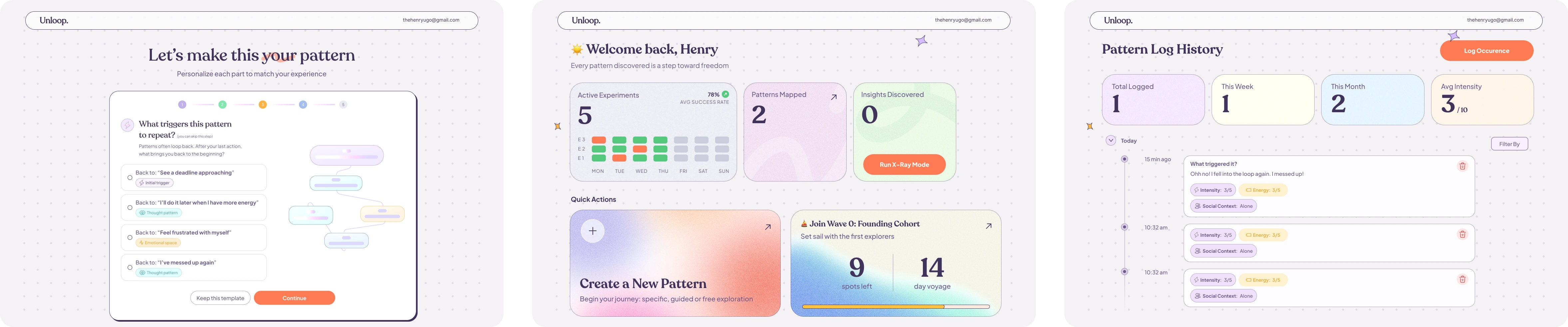
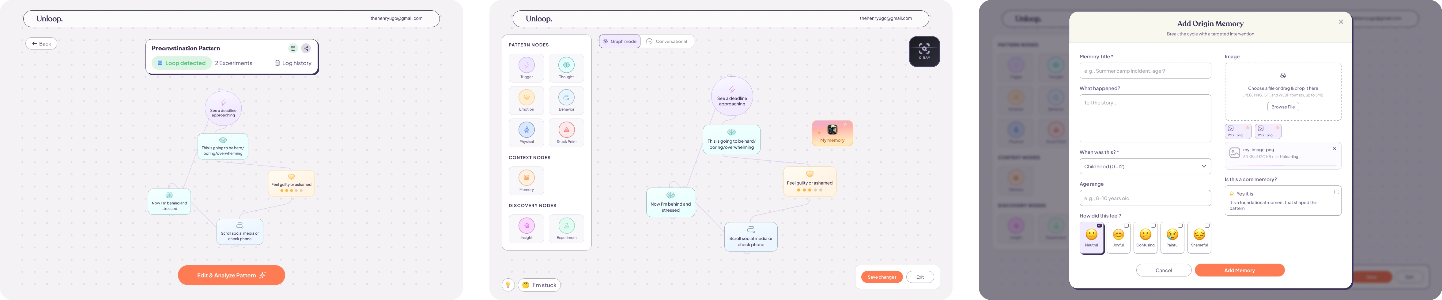
Unloop is a self-guided visual tool for people who feel stuck in repeating behaviours. The hard part wasn’t building features. It was getting new visitors to understand what this is before they bounced. Early users kept saying the same thing: “I didn’t get it… then I tried it, and it clicked.” The old landing page didn’t get them to that first “click”. It was heavy on terminology and light on felt experience, so the product was losing people before the first interaction.
So instead of asking people to read paragraphs, I made the page behave like the product: you learn by seeing, nudging, and noticing.
Information Architecture (the rebuild)
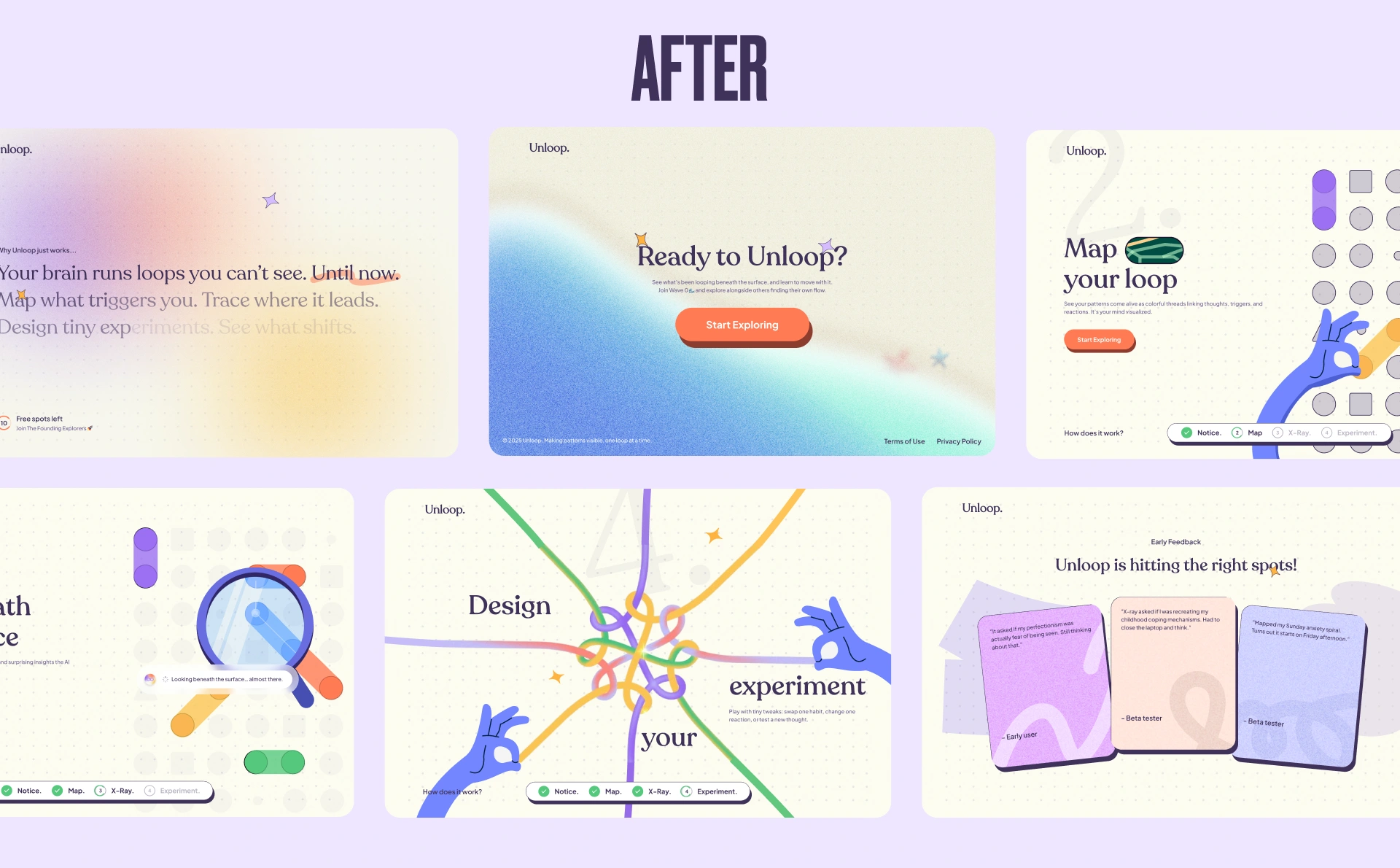
The original structure had repetition, unclear flow, and sections that didn’t connect. I rebuilt the information architecture from scratch using the business goal as the guide: get understanding fast, then move people toward trying it.
The new flow became: What → How → Social Proof → Questions → Act.
That meant simplifying walls of text into visual storytelling, and adding an FAQ section to address common doubts early and build trust.
1) Hero: “What is this?”
What it needed to do: communicate value in 5 seconds and earn the scroll.
What I designed: a calm, high-clarity hero that pairs a plainspoken headline with a gentle promise before asking for any commitment.
2) “How it works”: (show don't tell)
What it needed to do: make the product click without paragraphs.
What I designed: a step-based narrative where the illustration does the explaining—dots become connections, connections become a map, X-Ray reveals hidden links, and a small experiment shifts the outcome.
Social proof (real, specific, believable)
Instead of generic testimonials, I used real early-user moments that show the product doing its job. The quotes are specific enough that visitors instantly understand the value:
“Mapped my Sunday anxiety spiral. Turns out it starts on Friday afternoon.”
“It asked if my perfectionism was actually fear of being seen. Still thinking about that.”
“X-ray asked if I was recreating my childhood coping mechanisms. Had to close the laptop and think.”
That kind of specificity builds trust fast, without hype.
FAQ (trust-building without slowing the momentum)
The FAQ section answers the questions that quietly block conversion:
What is Unloop, really?
Is this therapy?
What about privacy?
What’s the pricing model?
Who is this for?
It’s written like a thoughtful friend, not a SaaS brochure. The goal is to reduce anxiety and hesitation, not “sell harder.”
Lightweight Brand Foundation (created alongside design)
I added a basic brand layer because the site needed a consistent language for color, type, and motion:
Palette: rich purple base, coral for curiosity/action, mint for success/relief, warm off-white background.
Type pairing: humanist serif for warmth + clean sans for clarity.
Motion rules: slower pacing, subtle easing, celebration moments only at insights/wins.
Voice rules: conversational, reflective, never prescriptive.
This ensured the landing page wasn’t a one-off “pretty screen,” but the start of a system.
What Changed vs. the Old Page
Before:
explanation-heavy
jargon first
weak emotional framing
static sections describing an interactive product
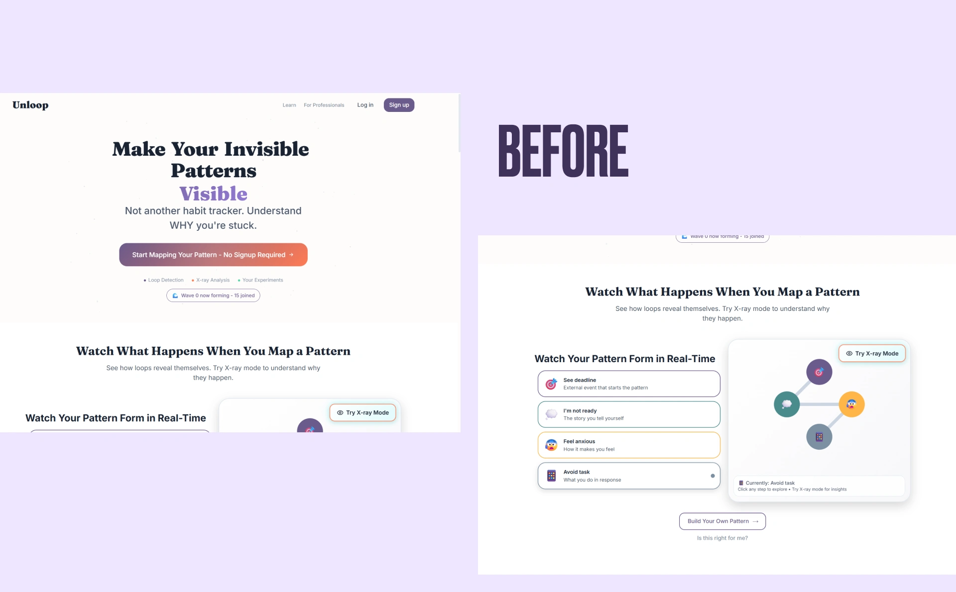
After:
value shown in motion first
language that invites curiosity, not correction
story continuity from hero to footer
a strong “try it now” moment earlier in the page
social proof that demonstrates the click in real human terms
The result
The page moved from “explain an interactive tool with text” to “let people feel it quickly.” The product didn’t change. The way it landed did.
Instead of asking visitors to believe Unloop works, the page gives them a small version of the experience upfront, so clicking “Start” feels like the obvious next step.
Like this project
Posted Nov 24, 2025
Redesigned Unloop’s landing page to boost conversion by replacing jargon with clearer messaging, visual storytelling and calm, playful motion.
Likes
6
Views
54
Timeline
Nov 11, 2025 - Nov 22, 2025
Clients
Unloop