Landing Page Redesign for AB Automations by Milan GohilLanding Page Redesign for AB Automations by Milan Gohil

Landing Page Redesign for AB Automations

Milan Gohil

Milan Gohil

Verified

Project Snapshot

Client: AB Automations / AB WebStudios Industry: Business process automation, AI, and SEO consulting Work: Landing page redesign, visual direction, custom graphics, UI design, development Role: Research, UX structure, visual direction, UI design, custom section graphics, Webflow/ WordPress development Tools Used: Mira/Miro, Figma, Webflow, WordPress
Goal: Create a landing page that clearly explains the offer, builds trust, and makes the automation process feel simple instead of technical.

The Reality Check

The service was strong, but the landing page needed a clearer story.
Automation, AI, SEO, and process optimization can quickly feel abstract. If the page is too technical, users don’t understand the value. If it is too generic, it looks like every other consulting website.
So the main challenge was not only to make the page look better.
The real challenge was to make business owners understand this in a few seconds:

This helps me reduce chaos, save time, and build clearer processes inside my company

That became the base for the full redesign.

What needed to change

The landing page needed a stronger conversion path.
Instead of simply showing services, the page had to guide the visitor through a clear journey:
First, show the problem.
Then, explain the method.
Then, make the solution feel practical.
Then, build trust.
Then, move the visitor toward a consultation.
The page needed to feel modern and premium, but still simple enough for non-technical business owners to understand.

My Approach

Before jumping into the design, I worked on the visual foundation first.
We created moodboards to define the direction clearly before designing the actual page. This helped avoid random design decisions and made the final landing page more consistent.
The chosen direction was:

Light, clean design with dark premium sections, glassmorphic graphics, soft cards, strong spacing, and custom visuals.

From there, we built a small visual system inside Figma:
Color palette
Icons
Brand logo usage
Country flags
Avatar assets
Custom UI graphics
Section-based visual references
Reusable cards and components
This gave the landing page a much more structured and polished look.

What I Redesigned

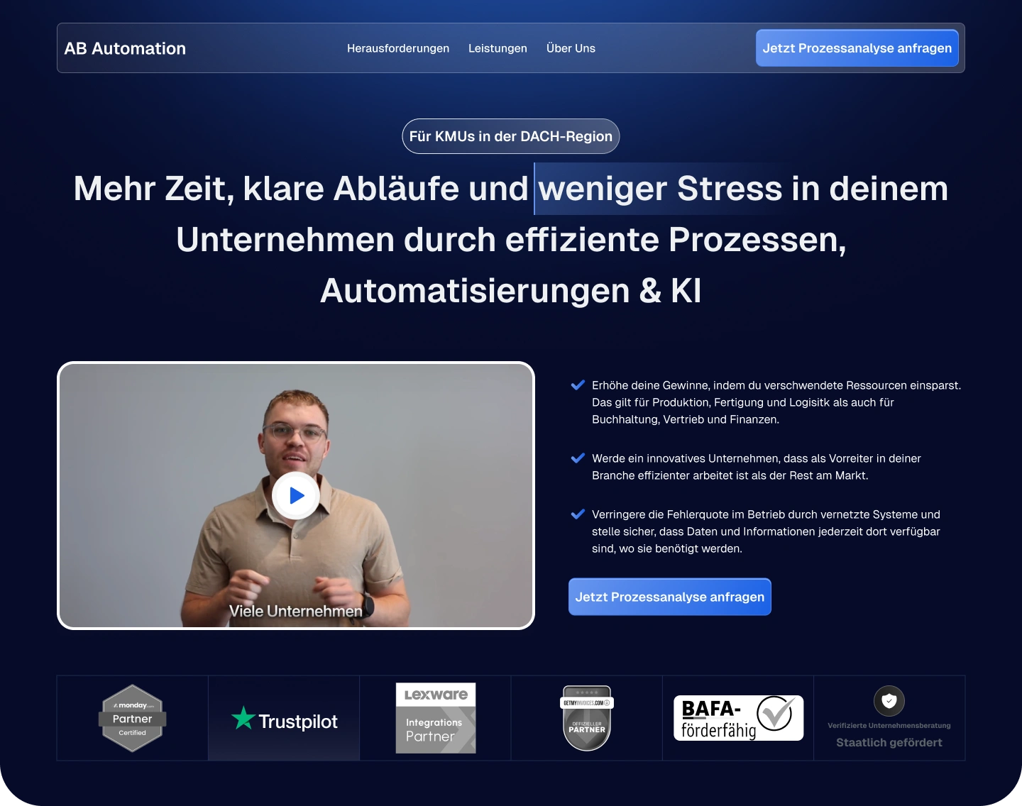
1. Hero section with clearer positioning

The hero was designed to explain the offer quickly:
More time, clear processes, and less stress through automation and AI.
Instead of making the first screen too abstract, we used a direct headline, a video-style visual, trust elements, and a clear CTA.
The goal was simple:
Make the visitor understand the value before they scroll.

2. Problem section with the “stress curve”

To make the pain point more visual, we added a custom “Unternehmer-Stress-Kurve” section.
This helped turn a common business problem into something the visitor can immediately relate to:
Too many manual processes
Too much dependency on people
Too many scattered tools
Too many repeated tasks
Not enough clarity
This made the landing page feel more like a business diagnosis, not just a service pitch.

3. Service areas as scannable chips

Instead of writing long paragraphs for every possible automation area, we used compact service chips.
This made the page easier to scan and helped visitors quickly identify where they need help.

4. Process method section

The landing page needed to show that AB Automations has a method, not just a service.
So we created a dedicated section for the Prozesswerk-Methode, breaking the work into clear service pillars:
Prozessaudit
Strukturen & Standards
Automation
Integration
Each section got its own custom visual, short explanation, and CTA.
This made the offer feel more concrete and easier to trust.

5. Custom graphics for complex ideas

A key part of this project was creating custom graphics for important sections.
We created visuals for ideas like:
Moving from chaos to clear processes
Reducing errors
Improving efficiency
Lowering dependency
Connecting tools and integrations
Showing automation as a system, not a random tool
These graphics helped simplify technical topics and made the page feel more unique.

6. Stronger trust and conversion sections

The lower part of the page was structured to build confidence before asking for action.
We added and improved sections like:
Testimonials
Founder / expert section
Process explanation
Statistics
Blog/news cards
FAQ section
Location section
Final CTA
This gave the page a complete landing page journey from awareness to trust to action.


The Result

The final landing page now feels more focused, premium, and easier to understand.
Instead of presenting automation as a technical service, the page explains it as a practical business transformation:
from chaos → to clear processes → to scalable systems.
The result is a landing page that can now support paid traffic, organic visitors, sales calls, and direct client conversations with much more confidence.
No performance metrics were available at the time of writing, so the success of this project is measured through the improved structure, clearer messaging, stronger visual consistency, and a more conversion-focused landing page flow.

Final Thought

A good landing page is not just a beautiful screen.
It is a decision path.
For this project, my role was to take a complex automation offer and turn it into a clear, visual, and trustworthy landing page experience that business owners can understand quickly.
The page now communicates the value of automation without making it feel complicated.
landing page design in png
Like this project

Posted Jul 8, 2026

Redesigned a landing page to improve clarity and conversion for a business automation service.

Likes

0

Views

0

Timeline

Sep 2, 2025 - Oct 22, 2025