Zen Hypnotherapy Website Redesign

Milan Gohil
Verified


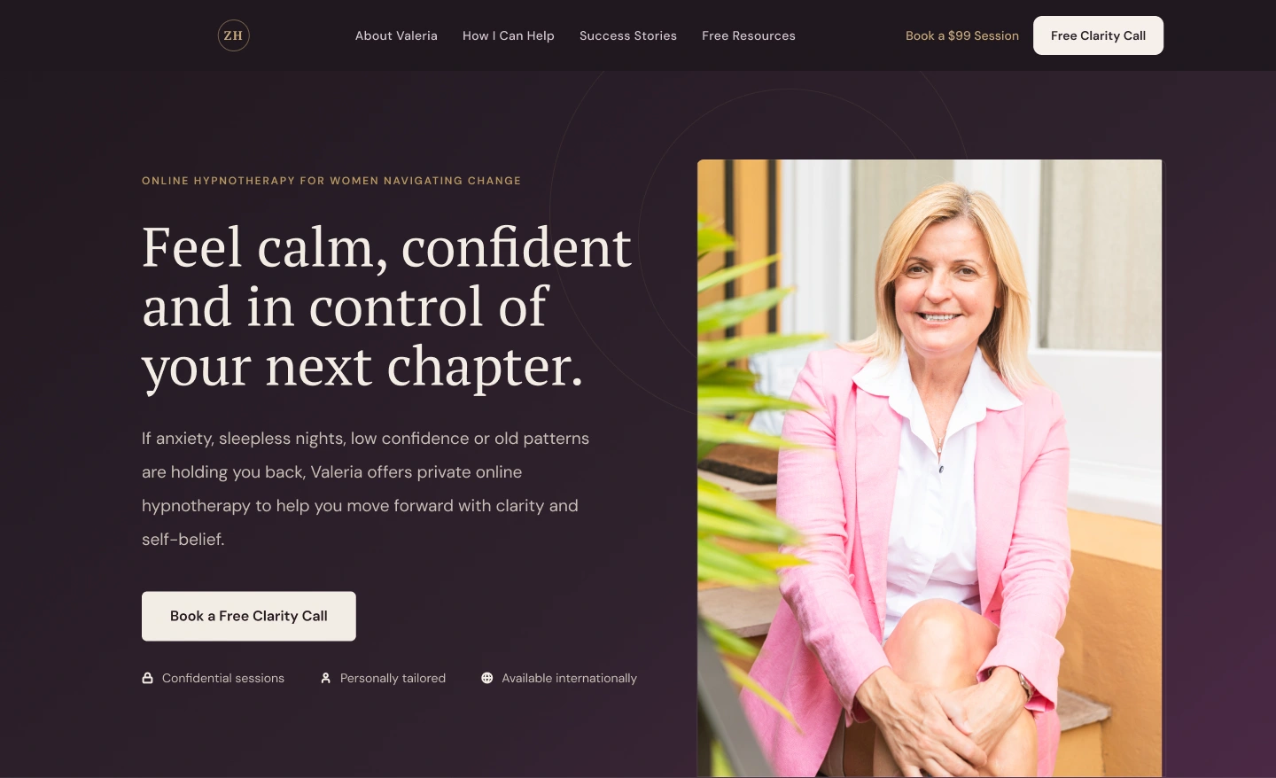
Designed a calm, premium website concept for a hypnotherapy brand (demo project)
Project Snapshot
Project: Zen Hypnotherapy
Type: Demo website redesign task
Industry: Hypnotherapy, wellness, personal transformation
Target Audience: Women over 50 dealing with anxiety, sleep issues, confidence, weight, divorce, empty nest, and major life changes
Work: Homepage redesign, visual direction, design system, landing page structure
Role: UX structure, UI design, design system, content hierarchy, conversion flow
Tool Used: Figma
Goal: Create a website direction that feels calm, trustworthy, feminine, mature, and emotionally supportive without looking generic, salesy, or “woo woo.”
The Reality Check
The brief had a strong business direction, but it also had many moving parts.
There were multiple services, pricing tiers, lead magnets, booking flows, testimonials, videos, forms, and conversion paths.
The challenge was not just to design a nice wellness website.
The real challenge was to organize everything into a clear experience for women who may be anxious, overwhelmed, or unsure about taking the first step.
The website needed to feel:
calm, safe, personal, mature, and emotionally grounded.
At the same time, it had to support real business goals:
Book clarity calls
Capture leads through the free video library
Explain paid sessions
Present pricing clearly
Build trust around Valeria’s personal approach
Make the brand stand out from the male-dominated hypnotherapy space
What Needed to Change
The website direction could not feel too clinical.
It also could not feel too soft, generic, or spiritual in a way that reduces trust.
The brand needed a stronger middle ground:
feminine but not fluffy
calm but not boring
premium but still personal
emotional but still clear
supportive but still conversion-focused
That became the foundation of the redesign.
My Approach
Before designing the homepage, I created a small design system to make the direction consistent.
This included:
Dark feminine color palette
Soft neutral background colors
Accent colors for CTAs and highlights
Typography direction
Button styles
Card styles
Form styles
FAQ style
Pricing card style
Testimonial card style
Section spacing and layout rules
This helped the design feel intentional from the start instead of becoming a random set of sections.
The goal was to make the website feel like a safe personal space, not just another wellness landing page.
What I Designed
1. Hero section with emotional clarity
The homepage opens with a direct emotional message:
Feel calm, confident and in control of your next chapter.
This speaks directly to the target audience without sounding too aggressive or salesy.
The hero combines:
Clear headline
Short supportive copy
Primary CTA
Trust points
Personal photography of Valeria
The goal was to create an immediate sense of safety and connection.
2. Problem section for real-life pain points
Instead of jumping straight into services, the page first reflects what the visitor may be feeling.
This section speaks to women who are:
Overthinking
Struggling with sleep
Feeling stuck
Losing confidence
Facing a new life chapter
This makes the page feel personal and relatable before introducing the solution.
3. Support section for everyday life changes
The next section organizes the service areas in a clean, practical way.
Instead of making hypnotherapy sound abstract, the design connects it to everyday challenges:
Anxiety and stress
Sleep issues
Confidence and self-worth
Weight and habits
Life transitions
This makes the offer easier to understand.
4. Personal approach section
Because the service is deeply personal, the design needed to build trust around Valeria.
The page includes a dedicated section for her approach, using photography and calm copy to explain her style.
This helps visitors understand that the work is not generic. It is guided, supportive, and personal.
5. Clear journey from first step to paid support
The page needed to support multiple conversion paths.
So I structured the user journey around clear next steps:
Free video library
Free clarity call
$99 breakthrough session
Membership
Custom programs
This gives different types of visitors a path based on their readiness level.
Someone who is not ready to book can start with a free video.
Someone who is more serious can book a session.
Someone looking for deeper support can explore custom programs.
6. Pricing section with less pressure
Pricing can easily feel heavy on wellness websites.
So I designed the pricing area to feel simple, calm, and easy to compare.
The goal was not to push the visitor aggressively. The goal was to help them understand the options and choose the right next step.
7. Testimonials and trust sections
The homepage includes testimonials and emotional proof to support credibility.
This was important because the target audience may need reassurance before booking.
The design uses testimonials in a calm, readable format instead of making them feel like loud sales blocks.
8. Strong final CTA
The final section brings the message back to the emotional outcome:
You do not need to have everything figured out before taking the first step.
This works well because it reduces pressure. It makes the CTA feel supportive instead of transactional.
The Result
This demo redesign turned a detailed hypnotherapy brief into a clear, premium website direction.
The final concept feels calm, mature, and emotionally supportive while still keeping the business goals clear.
The homepage now gives the visitor a structured journey:
understand the problem → connect with Valeria → explore support options → choose the next step.
Because this was a demo task, there were no live analytics or conversion results. The success of the project is shown through the improved clarity, stronger emotional positioning, consistent design system, and a more thoughtful conversion flow.
Final Thought
For this project, the design could not be only beautiful.
It had to feel emotionally safe.
The goal was to create a website experience where women going through a major life change could feel understood, supported, and ready to take one small step forward.

demo landing page design png
Like this project
Posted Jul 8, 2026
Designed a premium, calm website for a hypnotherapy brand aimed at women over 50.
Likes
1
Views
9
Timeline
Apr 1, 2026 - Jun 7, 2026