Carbon Offsetting Solutions for Palm Carbon
Meddy ㅤ
Carbon Offsetting Conglomerate, here goes...
Website and visual language design was amazing. The clients were high energy, banterous, and really fun to work with. I never knew much about carbon offsetting before this, but by the end of this project (8 weeks), I was so fascinated by the space and continued my studies into land ownership, carbon offsetting, and net zero energy certificates.
When I work with a client and enjoy the process, I really fall in love with learning about new industries because the more research I do, the better I can fulfil my client's needs. Palm Carbon serves in over eight countries with their largest land ownership being in Ghana. As well as a website, they wanted an introduction video and a pitch deck to show potential clients.
The Visual Language,
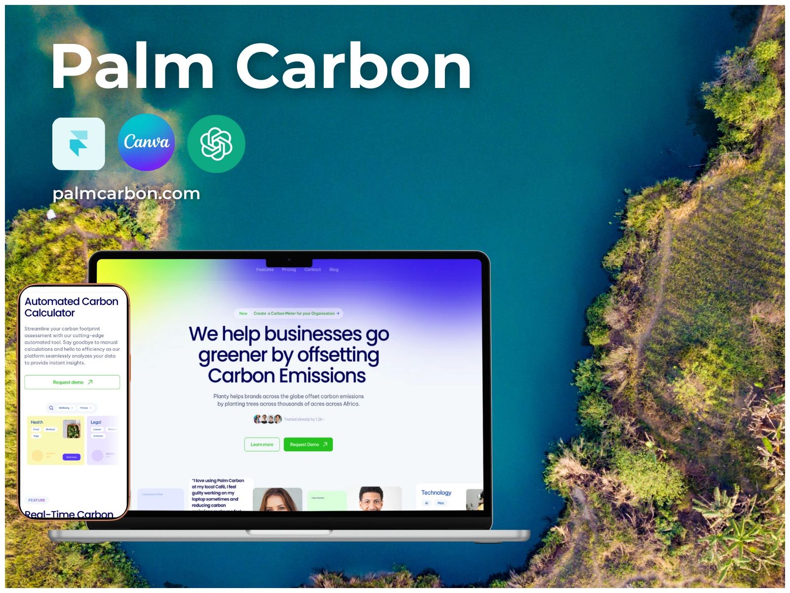
Found the website on Framer. The visual language had to be very neutral, using earth tones, so greens, blues, and browns, and have a lot of social proof via the clients that they have worked with. For this, we designed a simple interface making use of all of the colours in pastel and a lot of photos from their clients. We did this by working with a headshot photographer who went around to as many clients' offices as possible to get a consistent photo / background design.
For the pitch deck, I used Canva because it is very powerful and simple to use. I wanted to design in a way that my clients have a strong template to work from after the progect has concluded. We use a templatized strategic approach so even after the project has ended, we can assist our clients with the extensive documentation we produce towards the end.
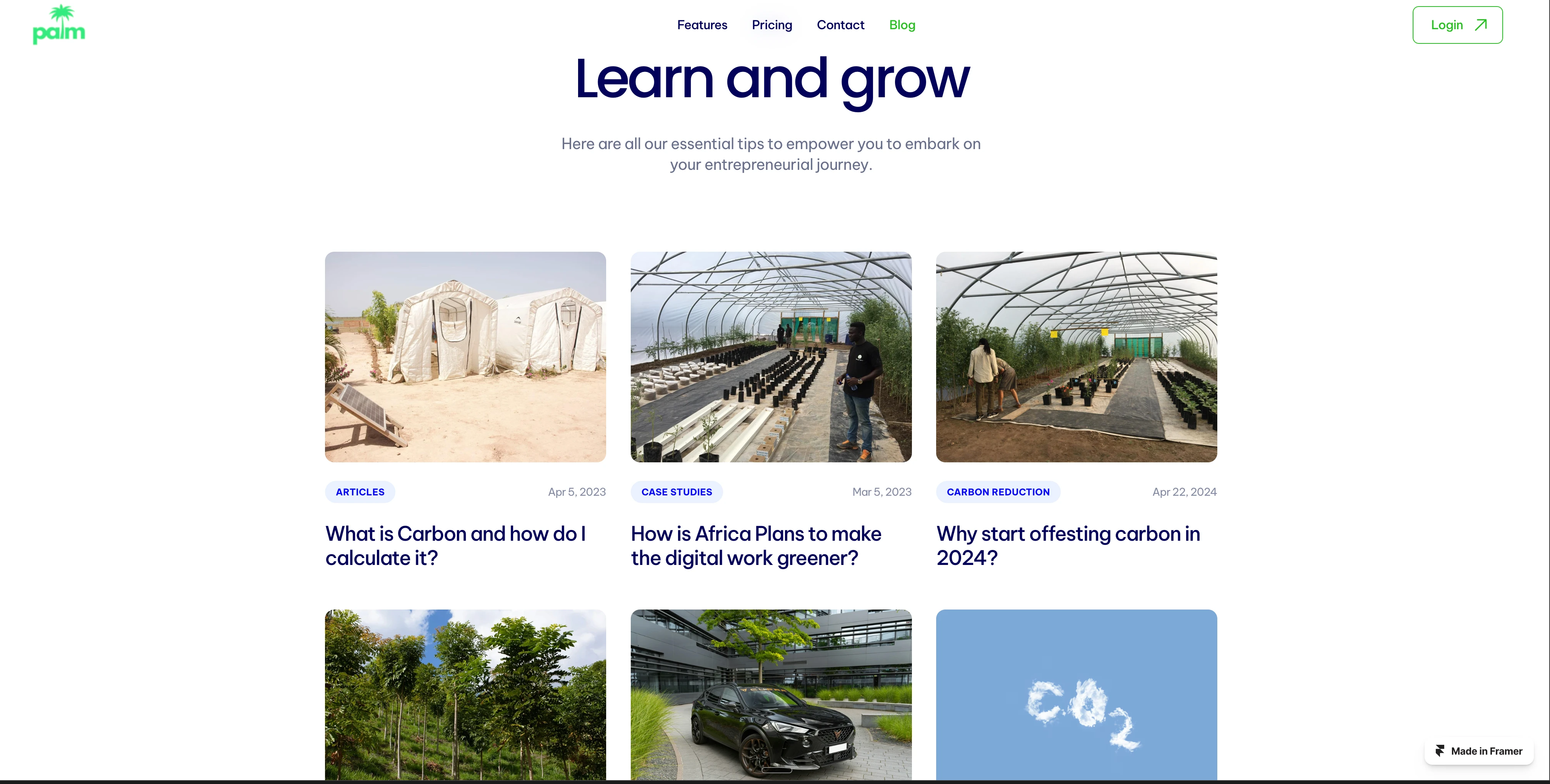
Palm Carbon (Framer)
The Tech Stack
Framer (Wesbite + Hosting)
Open AI Codex (Carbon Offsetting Calculator)
Canva (Pitch Deck Design)
Experience working with another Studio,
Word, awesome. From knowing nothing about carbon offsetting and the industry, to knowing a lot more than 90% of the population. I love working on projects that I can learn from, with the research, design, and amazing chats with clients. I learned that is the ingredient to a special project and a lasting professional relationship .
Check it out: https://palm-carbon.framer.website/
Like this project
Posted Dec 3, 2025
I Designed website, visuals, video, and pitch deck for carbon offsetting firm Palm Carbon. I conducted research and loved learning about this industry.
Likes
0
Views
8