Sigmaclinic - Urgent Care Platform Research and Redesign
Karin Suvaryan
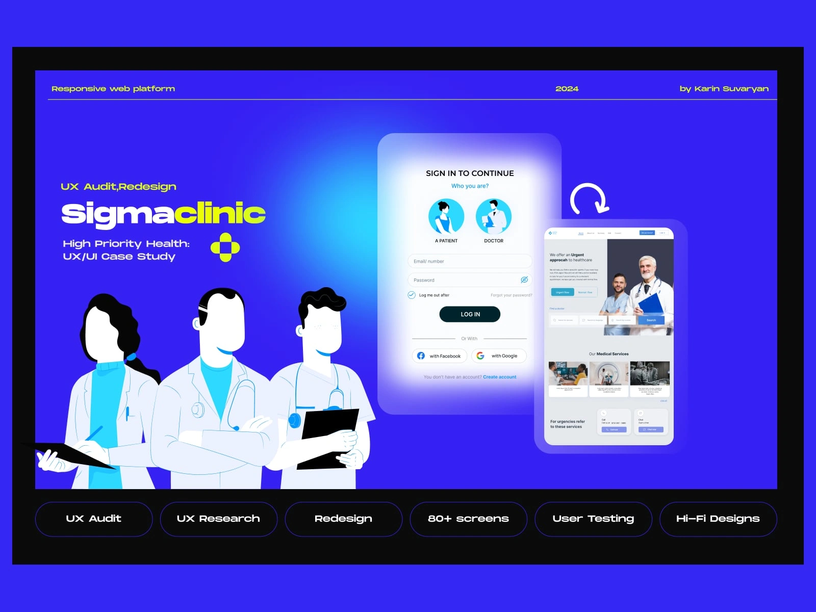
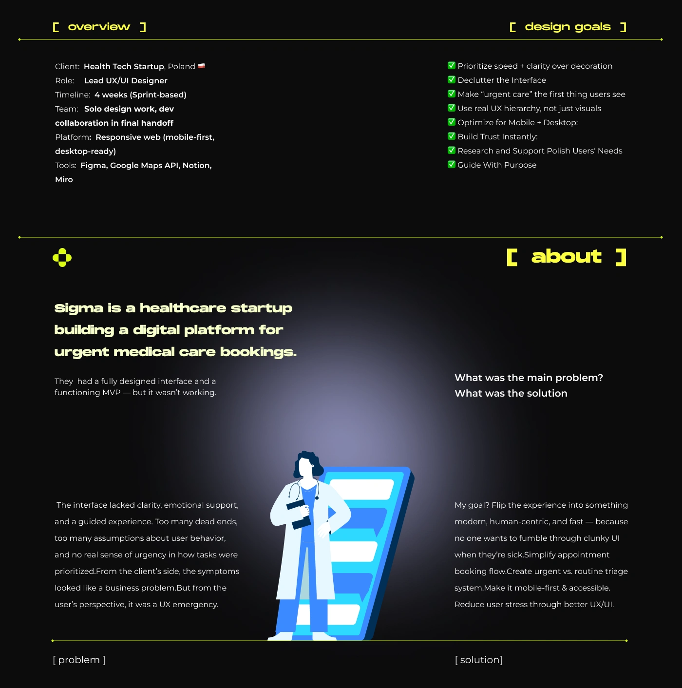
About the App
I was approached by a healthcare client who had an urgent care platform. It was functional — but only if you were trained on it. The UI was outdated, the UX was confusing, and patients (the primary users!) were left navigating a system clearly built for internal admins.
The client provided six disconnected screens, each attempting to serve a different function — from doctor profiles to appointment booking. However, no clear user flow existed between them. The experience felt scattered and inconsistent, lacking a unified structure or narrative. Instead of a seamless journey, users were forced to jump between loosely connected pages, leading to confusion, friction, and drop-offs.
What was the main problem, how was I going to solve the problem?
The platform was originally designed around administrative workflows, not user needs. Patients seeking urgent care faced a cold, transactional experience that made booking difficult and time-consuming — especially under stress. The interface lacked a clear booking flow, mobile responsiveness, and emotional reassurance. There was no way to quickly attend to urgent needs, and key actions were buried in poor visual hierarchy
Key Issues the Client Faced:
🚫 Low conversion rates: Users were landing on the platform but not completing bookings.
📉 High drop-off during form flows: Especially in the login and appointment stages.
📵No mobile optimization: A critical flaw for users trying to book care on-the-go.
🤯 User confusion: There was no clear path — urgent care needs were treated like generic admin tasks.
🎨≠🧠 Aesthetic ≠ Usability: The UI looked polished but was missing UX fundamentals like hierarchy, clarity, and affordance.
Without a plan I would not be able to proceed fast and deliver results
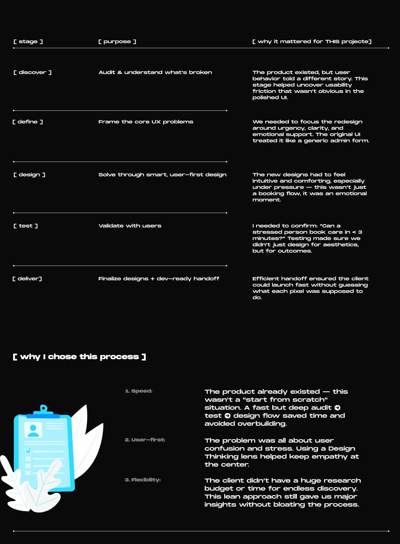
With enough research and planning was time to move on to the next phase!
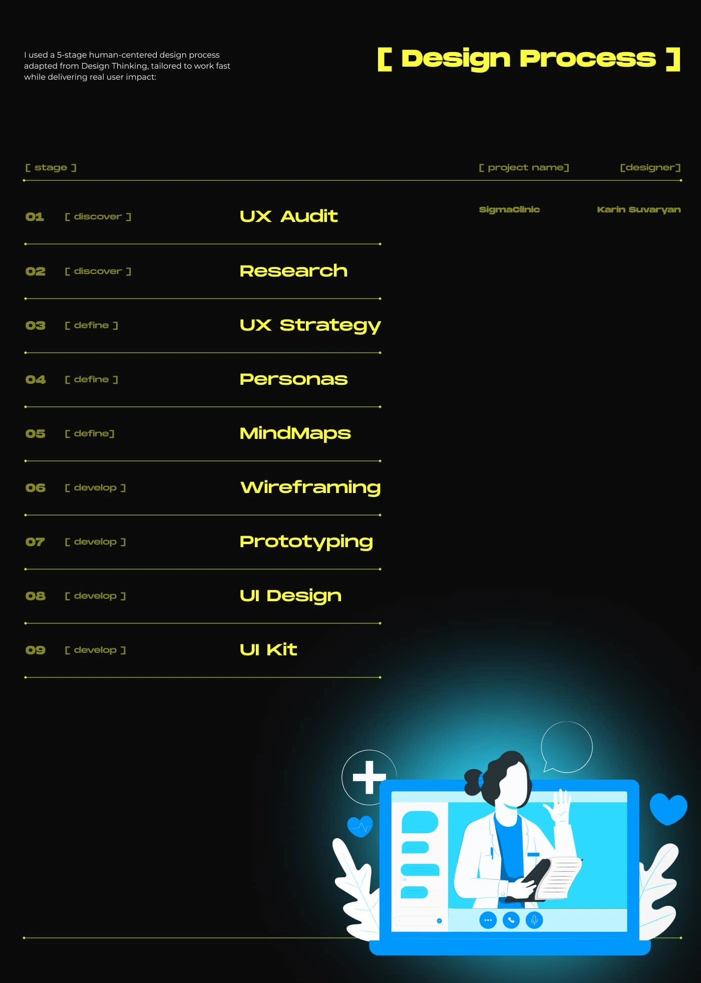
🛠️ Audit Process
I followed a structured approach:
Heuristic Evaluation – Identified issues in usability, clarity, and flow consistency.
User Testing – Observed user struggles with navigation and form logic.
Competitive Benchmarking – Compared with successful healthcare and booking apps.
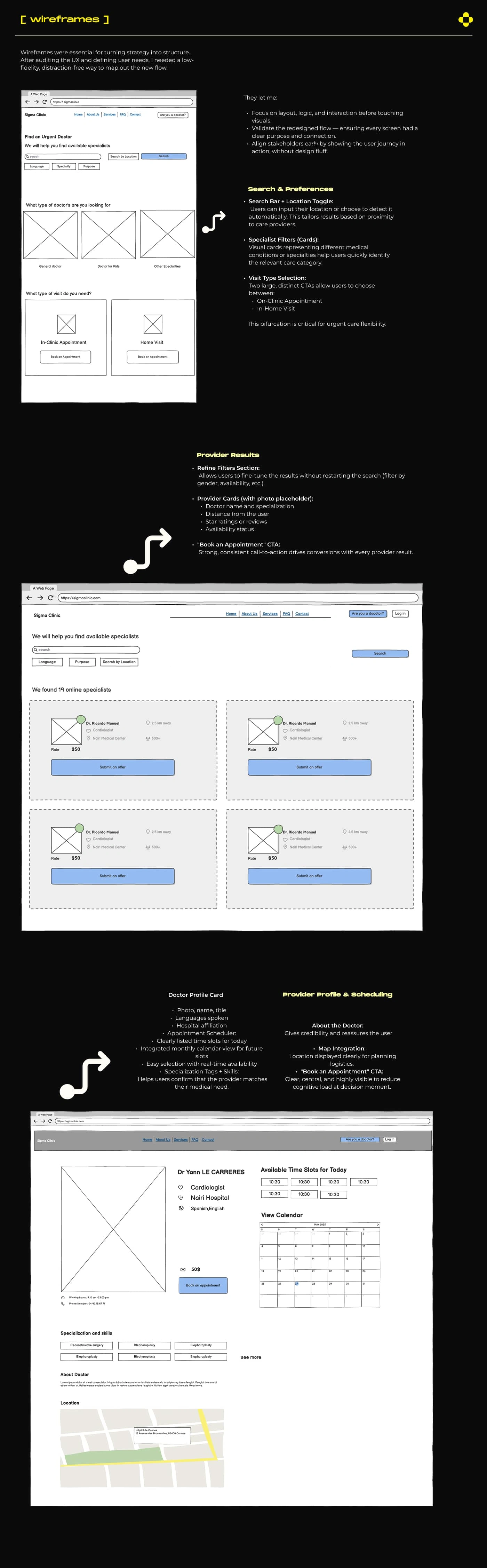
Wireframing & Redesign – Rebuilt the flow to follow a linear, story-like experience.
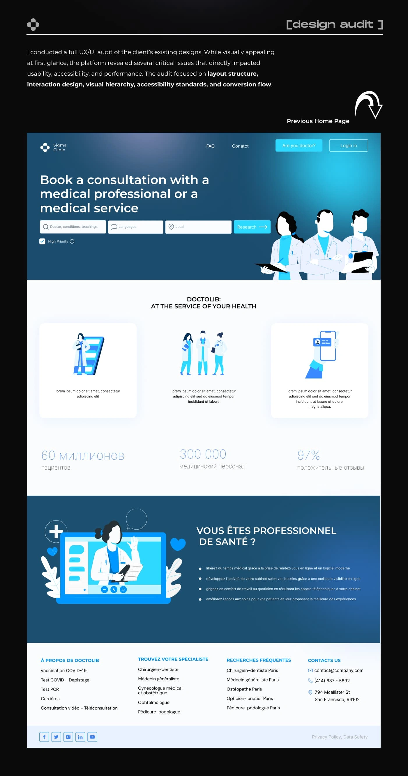
Home page is extremely problematic!
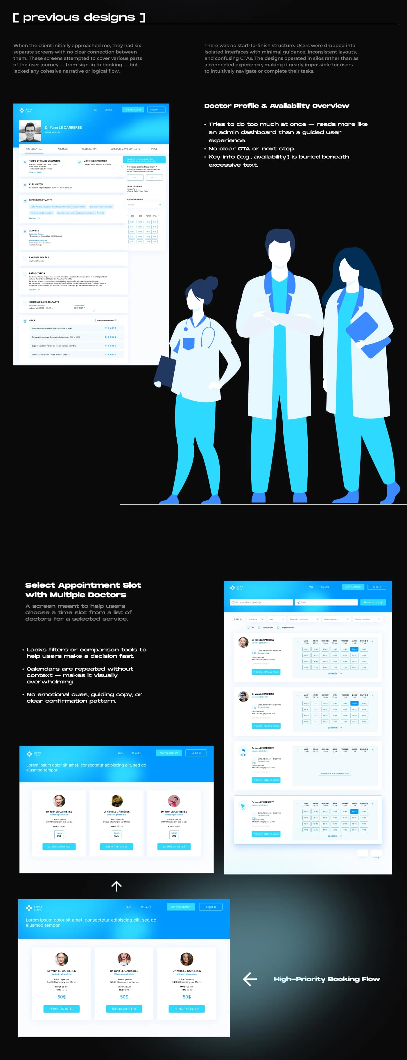
6 screens. No flow. Just fragments of a user journey — scattered like puzzle pieces with no picture to complete.
🧠 Outcome of the Audit
I translated the confusing experience into a seamless journey — built around the user’s urgency, emotional state, and mental model. This included:
A simplified booking flow
A new design system (UI kit)
Context-aware prompts and microcopy to guide users
The new direction ensured clarity, trust, and actionability — exactly what urgent care users need in a moment of stress.
🗺️ Mind Map:
Afterwards I created a mind map to visually untangle the chaos. It helped structure every user touchpoint, goal, and potential pain point into a clear, connected system. This was crucial for spotting redundancies, filling flow gaps, and aligning the experience with user intent.
👤 User Persona:
The user persona grounded the entire redesign in real-world behavior and emotional context. It ensured I wasn't designing for aesthetics alone, but for someone with urgent needs, limited patience, and high anxiety. It kept empathy at the center of every decision.
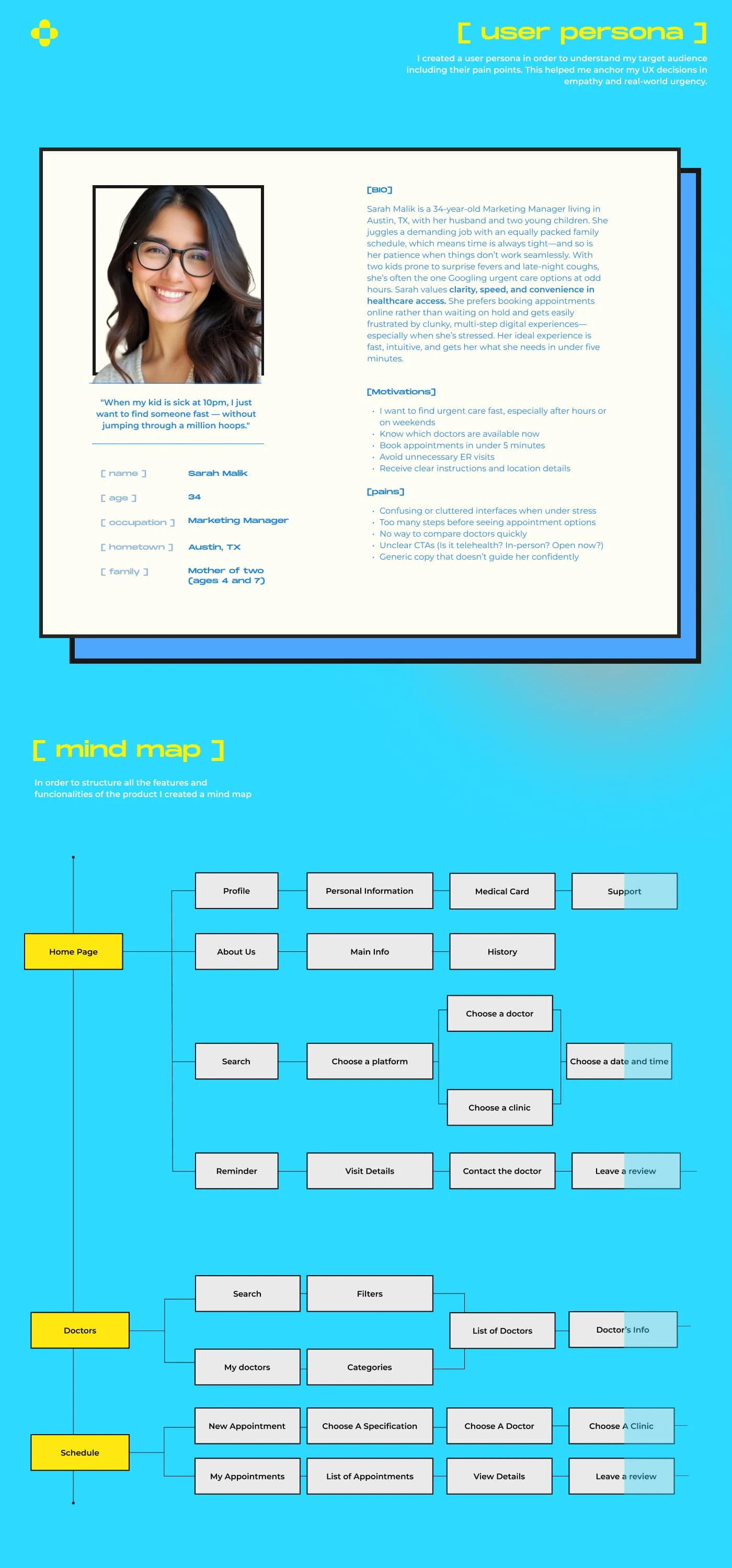
a snippet of the mindmap
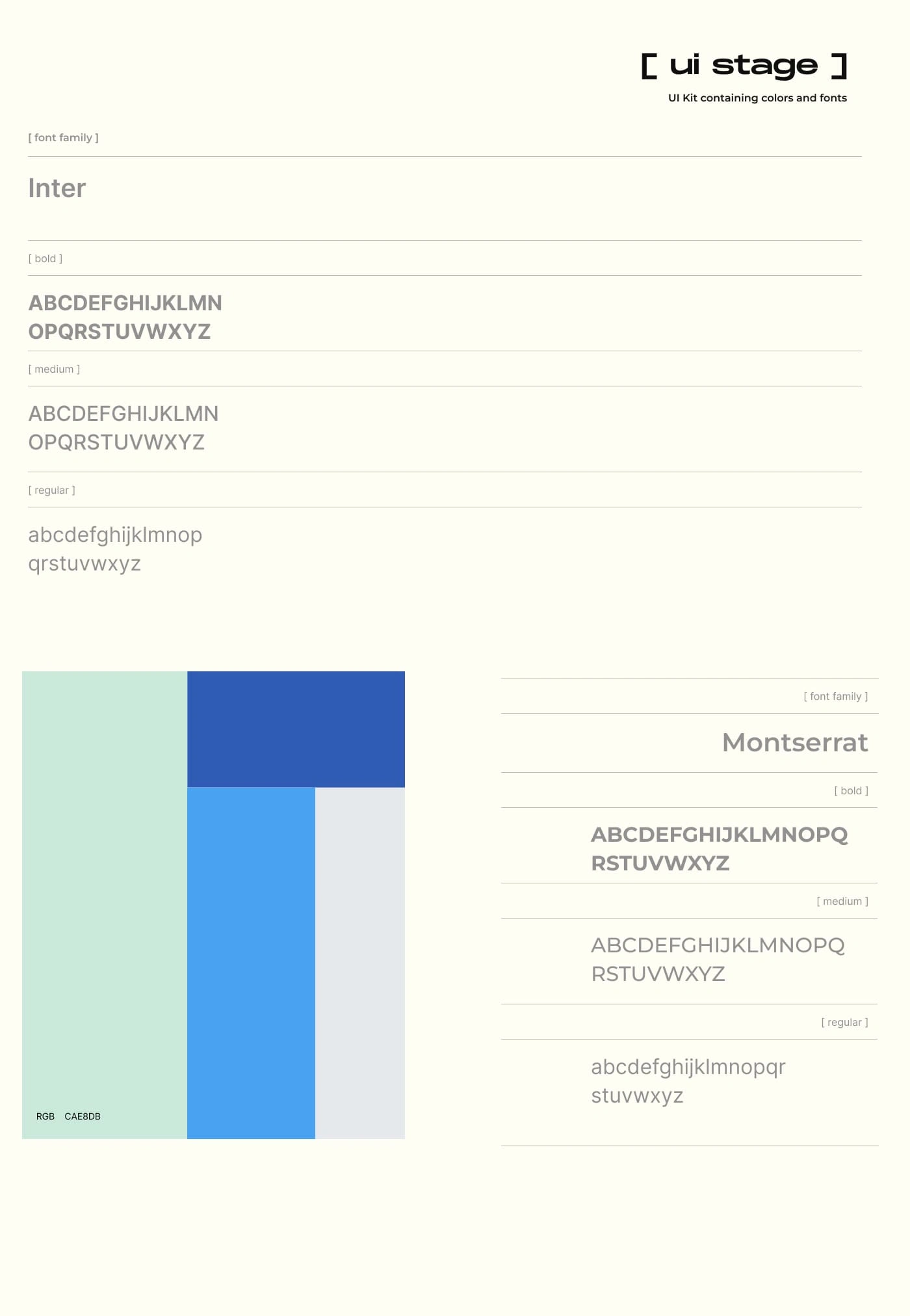
color and typography
Like this project
Posted May 28, 2025
This project turned a fragmented experience into a fluid journey and created a foundation that’s scalable, accessible and optimized for real-world urgency.