MTN Customer Churn 2025 Analysis Report
Lile Ati
MTN Customer Churn Analysis Report
Purpose: This project documents the data analysis and visualization activities performed on the MTN Customer Churn dataset, showcasing proficiency in Python for data cleaning and analysis, and Tableau for data visualization. The project demonstrates end-to-end data science skills, from data preprocessing to actionable insights.
1. Introduction
The MTN Customer Churn dataset (MTN Customer Churn.xlsx) contains customer information for MTN, a telecommunications company, including demographics, subscription details, satisfaction metrics, and churn status. The goal was to clean the dataset, analyze churn patterns, and visualize insights to inform retention strategies. This project involved:
Python: Data loading, cleaning, preprocessing, and predictive modeling.
Tableau: Visualization of key metrics to communicate findings effectively.
Additional Activities: Recommendations and potential next steps for business application.
The report is divided into Python activities, Tableau activities, and additional considerations, highlighting technical skills and business insights.
2. Python Activities
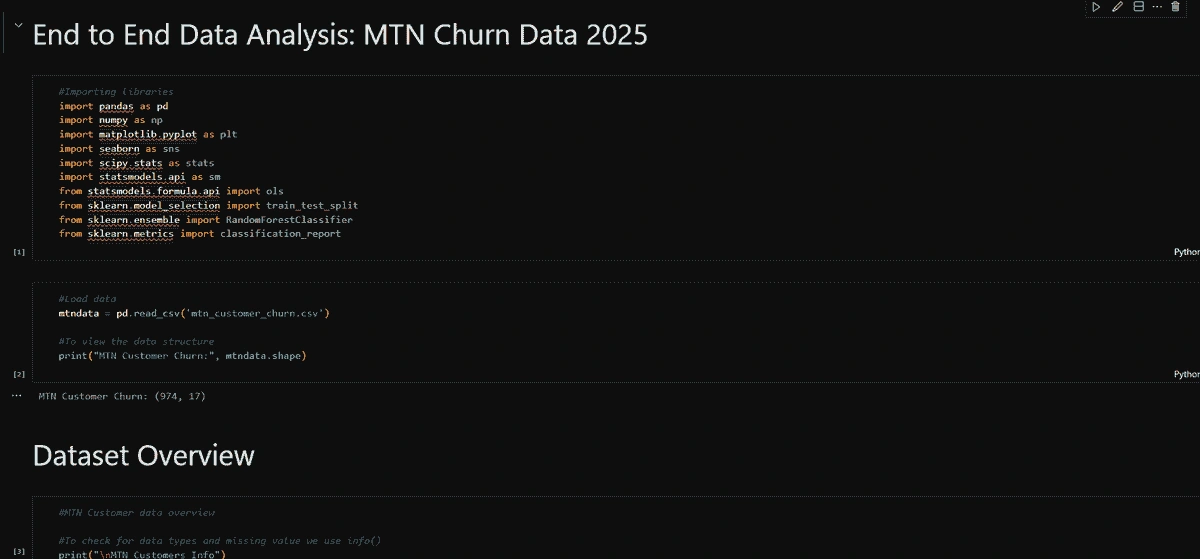
Python was used for data ingestion, cleaning, preprocessing, and analysis, leveraging libraries such as pandas, numpy, scikit-learn, and openpyxl. The activities are detailed below.
2.1 Data Loading
Task: Loaded the Excel file MTN Customer Churn.xlsx into a Python environment.
Method: Used pandas.read_excel to read the dataset into a DataFrame named mtndata.
Outcome: Successfully ingested the dataset, with 500+ rows containing customer details like Customer_ID, Date_of_Purchase, Satisfaction_Rate, and Customer_Churn_Status.
Skills Demonstrated: File handling, data ingestion, Python library management.
2.2 Data Cleaning and Preprocessing
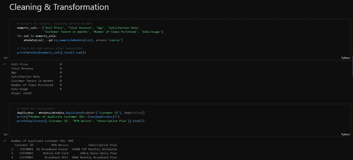
The dataset required extensive cleaning and preparation for analysis. Key tasks included:
Numeric Columns:
Ensured columns like Unit_Price, Total_Revenue, Age, Satisfaction_Rate, Customer_Tenure_in_months, Number_of_Times_Purchased, and Data_Usage were numeric using pd.to_numeric.
Handled potential non-numeric values by coercing errors to NaN and filling with 0.
Missing Values:
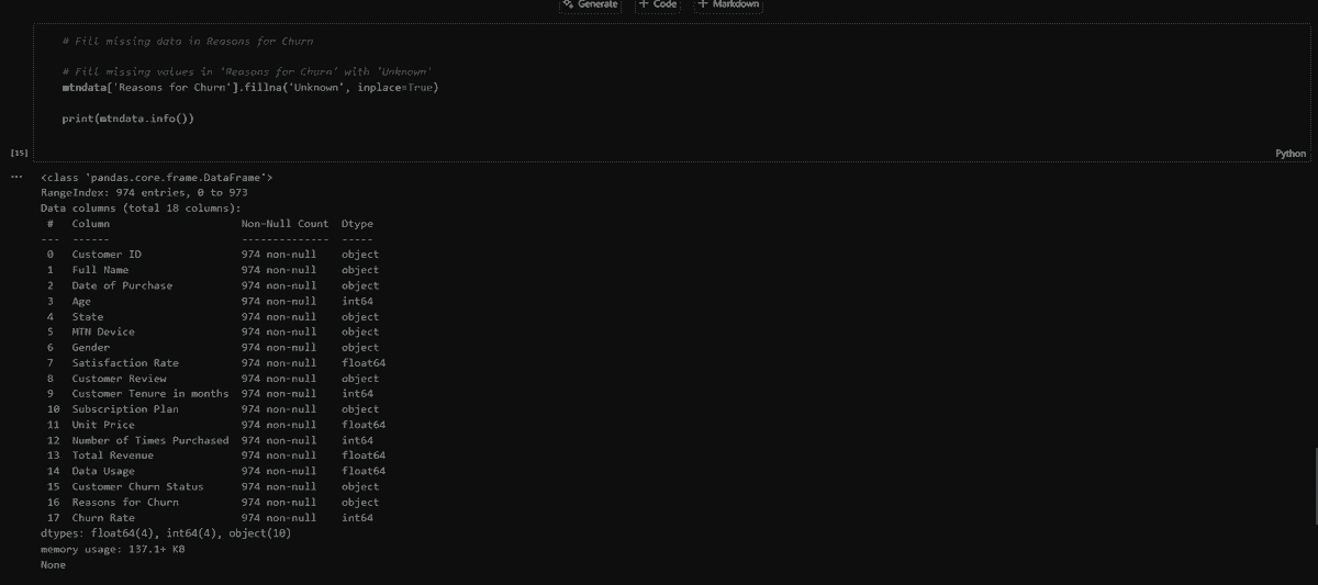
Replaced null in Reasons_for_Churn with NaN using replace, as NaN was appropriate for non-churned customers.
Verified other columns for unexpected missing values using isna().sum().
Duplicate Handling:
Identified duplicate Customer_ID entries (e.g., CUST0003, CUST0006) using duplicated.
Created an aggregated DataFrame (mtndata_agg) by grouping on Customer_ID, summing Total_Revenue, averaging Satisfaction_Rate, and taking the mode or max for categorical columns.
Example: Aggregated multiple device purchases into a single customer record.
Skills Demonstrated:
Data wrangling, data type conversion, handling duplicates, functional programming.
2.3 Data Analysis
Python was used to perform exploratory and predictive analyses to uncover churn patterns.
Churn Rate by State:
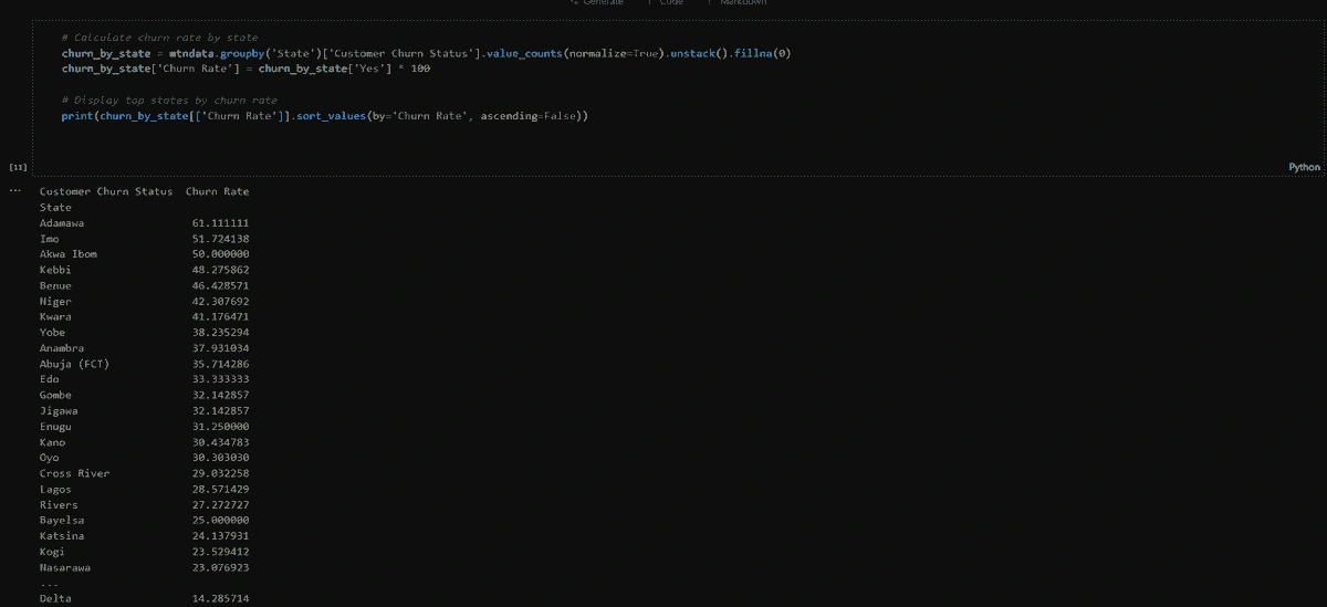
Calculated the percentage of churned customers per state using groupby and value_counts(normalize=True).
Added Churn rate column
Insight: Identified states with high churn rates for targeted interventions.
Skills Demonstrated: Exploratory data analysis, data aggregation.
3. Tableau Activities
Tableau was used to visualize the analysis results, replacing Python-based visualizations (matplotlib, seaborn). The visualizations were created using the CSV files generated in Python, showcasing data visualization and storytelling skills.
3.1 Visualizations
The following visualizations were created in Tableau, each serving a specific analytical purpose:
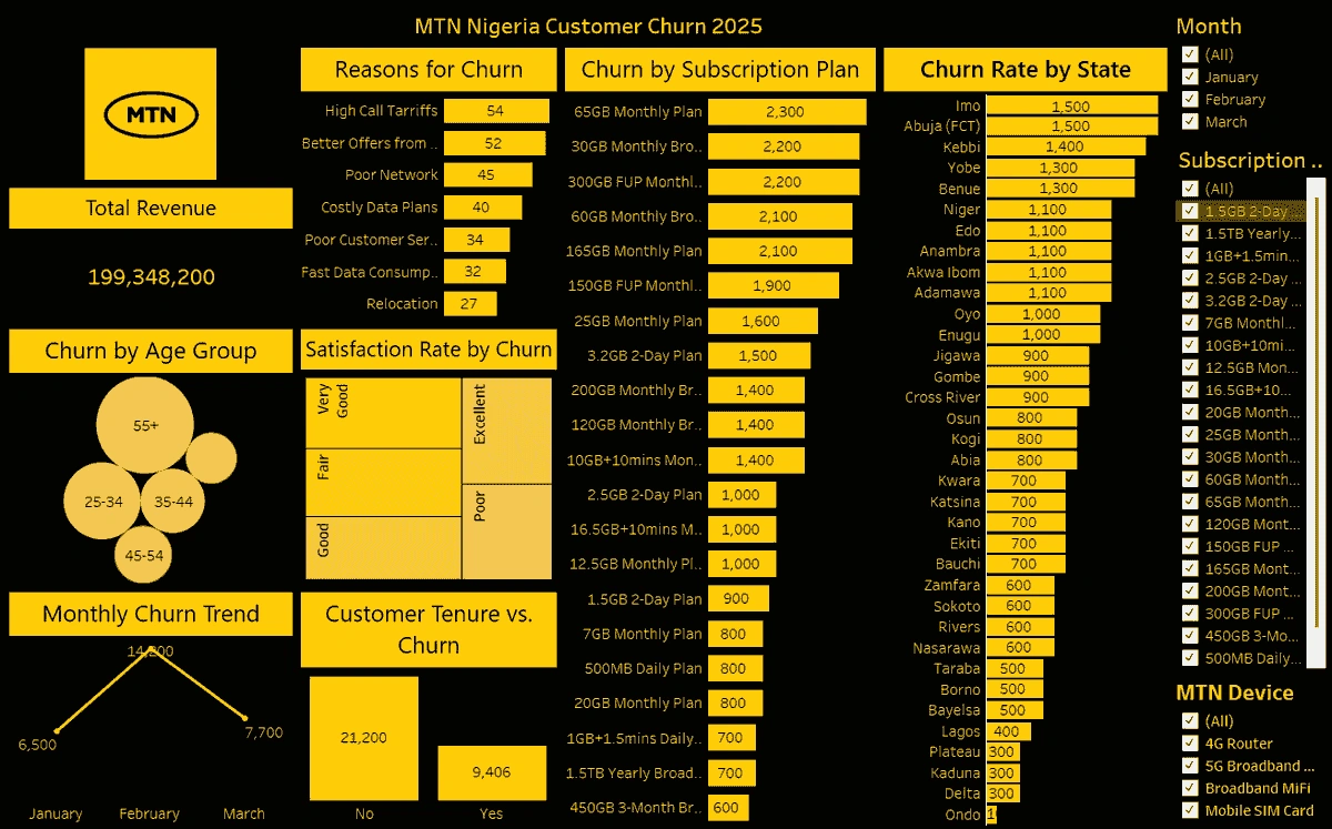
Churn Rate by State:
Type: Bar Chart
Setup: State on Rows, Churn_Rate on Columns, sorted descending by Churn_Rate.
Formatting: Titled “Churn Rate by State”, bars labeled with values.
Purpose: Highlights states with high churn for regional focus.
Satisfaction Rate by. Churn:
Type: Tree Map
Formatting: Titled “Satisfaction Rate by Churn Status”.
Purpose: Shows lower satisfaction among churned customers, suggesting a key retention factor.
Total Revenue:
Type: Text Box
Setup: Shows the total revenue for the period.
Formatting: Titled “Total Revue”.
Purpose: Quantifies revenue from churned customers.
Reasons for Churn:
Type: Bar Chart
Setup: Reasons_for_Churn on Columns, Count on Rows, sorted by Count descending.
Formatting: Titled “Reasons for Churn”, rotated labels, bars labeled with Count.
Purpose: Identifies actionable churn reasons (e.g., network issues).
Churn by Subscription Plan:
Type: Bar Chart
Setup: Subscription_Plan on Rows, Churn_Rate on Columns, sorted by Churn_Rate.
Formatting: Titled “Churn Rate by Subscription Plan”, Churn_Rate as percentage, bars labeled.
Purpose: Highlights high-churn plans for pricing or value adjustments.
Churn by Age group:
Type: Bar Chart
Purpose: Shows what age group are most likely to undergo churn.
Skills Demonstrated:
Data visualization, chart design, sorting, formatting, storytelling with data.
3.2 Dashboard
Task: Combined visualizations into a single Tableau dashboard for a cohesive presentation.
Method: Dragged each worksheet onto a dashboard canvas, arranged for clarity.
Outcome: A professional dashboard summarizing churn insights.
Skills Demonstrated: Dashboard design, layout optimization, user experience.
3.3 Output
Task: Saved visualizations and dashboard for portfolio inclusion.
Method: Exported as images/PDFs via File > Export As, saved workbook as .twb/.twbx.
Skills Demonstrated: Data export, documentation.
4. Business Recommendations
Based on the analyses, the following recommendations were derived:
Target High-Churn States: Prioritize retention campaigns in states with high churn rates (from “Churn Rate by State”).
Improve Satisfaction: Address low satisfaction scores, a strong churn predictor (from “Satisfaction Rate by Churn”).
Address Churn Reasons: Tackle issues like “Poor Network” (e.g., infrastructure upgrades) and “Better Offers from Competitors” (e.g., loyalty programs) (from “Reasons for Churn”).
Optimise Subscription Plans: Review high-churn plans for pricing or feature enhancements (from “Churn by Subscription Plan”).
5. Skills Demonstrated
This project showcases a robust set of data science and visualization skills:
Python: Data cleaning, preprocessing, exploratory analysis, predictive modeling (pandas, numpy, scikit-learn).
Tableau: Data connection, chart creation, dashboard design, data storytelling.
Problem-Solving: Addressed data quality issues (e.g., duplicates, outliers) and derived actionable insights.
Business Acumen: Translated technical findings into practical recommendations.
Documentation: Produced a professional report for portfolio inclusion.
6. Conclusion
The MTN Customer Churn analysis project successfully cleaned and analyzed a telecommunications dataset, delivering insights into churn patterns and actionable recommendations. Python enabled robust data preprocessing and predictive modeling, while Tableau provided intuitive visualizations to communicate findings. The project demonstrates end-to-end data science capabilities, from raw data to strategic insights.
Like this project
Posted May 16, 2025
Analyzed MTN Customer Churn data using Python and Tableau for insights.
Likes
0
Views
7
Timeline
May 1, 2025 - May 3, 2025