Farmers' Market Sales Data Analysis and Visualization
Lile Ati
Overview
This project demonstrates a complete data pipeline for analyzing and visualizing farmers’ market sales data using SQL and Power BI. The dataset, contains 300 rows across four tables: Vendors (10 rows), Products (20 rows), Customers (50 rows), and Sales (220 rows). The goal was to clean, transform, and query the data in SQL, export it for Power BI, and create an interactive dashboard to showcase key insights.
SQL Activities
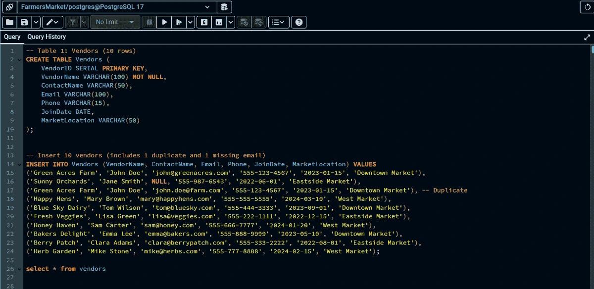
Database Creation and Population
Schema Design:
Created a relational database with four tables:
Vendors: Stores vendor details (e.g., vendorid, vendorname, marketlocation).
Products: Contains product information (e.g., productid, productname,category, unitprice).
Customers: Tracks customer data (e.g., customerid, firstname, loyaltymember).
Sales: Records transactions (e.g., saleid, saledate, quantity, totalamount).
Data Population:
Generated 300 rows of synthetic data, including 10 vendors, 20 products, 50 customers, and 220 sales transactions, reflecting a realistic farmers’ market scenario.
Data Cleaning and Transformation
Duplicate Removal: Identified and removed duplicate entries in Sales usingDISTINCT and GROUP BY to ensure unique transactions.
Foreign Key Validation: Fixed invalid foreign keys (e.g., non-existent VendorID orProductID) with LEFT JOIN and UPDATE statements to align with referential integrity.
Data Standardization: Standardized saledate formats using DATE_FORMAT andensured consistent totalamount calculations with a computed column(totalamountcomputed = quantity * unitprice).
Advanced SQL Queries
Aggregation: Created a view to categorize sales by season, using CASE
WHEN EXTRACT(MONTH FROM SaleDate) IN (12, 1, 2) THEN 'Winter'
WHEN EXTRACT(MONTH FROM SaleDate) IN (3, 4, 5) THEN 'Spring'
WHEN EXTRACT(MONTH FROM SaleDate) IN (6, 7, 8) THEN 'Summer'
Top-N Analysis: Identified the top 5 products by quantity sold using GROUP BY and LIMIT 5, and top sales by vendor using GROUP BY and ORDER BY.
Files were imported into Power BI for visualization, enabling both raw data modeling and pre-aggregated analysis.
Power BI Activities
Data Model
Imported Loaded CSV files (vendors.csv, products.csv, customers.csv, sales.csv) into Power BI Desktop.
Relationships: Established a star schema with:
Sales as the fact table, linked to Vendors, Products, and Customers via many-to-one relationships on vendorid, productid, and customerid, respectively.
Relationships configured with single-direction filtering for optimal performance.
Model View: Confirmed relationships visually, ensuring data integrity for calculations and visuals.
DAX Measures
Created measures:
– Total Sales Count: CALCULATE(COUNT('Sales'[saleid]),
ALLSELECTED('Vendors'))
– Total Revenue: CALCULATE(SUM('Sales'[totalamount]),
ALLSELECTED('Vendors'))
– Total Quantity Sold: CALCULATE(SUM('Sales'[quantity]),
ALLSELECTED('Products'))
– Total Revenue: CALCULATE(SUM('Sales'[totalamount]),
ALLSELECTED('Products'))
Additional measures: Total Customers, Loyal Customers (count of loyaltymember = 'Yes'), and %LoyalCustomers.
Dashboard Design
Visuals:– Cards: Displayed Loyal Customers (25), Total Customers (50), Total Number of Sales (477), Total Quantity Sold (1318), and Total Revenue (4.54K).
Bar Charts: Showed top vendors by organic status (e.g., Happy Hens with 1032 sales) and top products by category (e.g., Dairy with 387 sales).
Line Chart: Illustrated quantity sold per month, with a steep rise from 173 (January) to 821 (April).
Treemap: Highlighted top products sold (e.g., Free-Range Eggs with 258 units, Basil with 133 units).
Pie Chart: Illustrated sales by payment method. With each method (Mobile, Card, Cash) having 159 sales each.
Formatting: Used a green color scheme to reflect the farmers’ market theme, with clear titles and legends.
Insights
Vendor Performance: Happy Hens led with 1032 sales, indicating strong organic product demand.
Category Trends: Dairy (387 sales) outperformed other categories, suggesting a market preference.
Sales Growth: Quantity sold increased significantly from January to April, peaking in April (821 units).
Customer Loyalty: 25 out of 50 customers were loyalty members, representing 50% engagement.
This project showcases:
SQL Proficiency: Database design, data cleaning, advanced querying, and export.
Power BI Expertise: Data modeling, DAX measure creation, and interactive dashboard development.
Business Insight: Ability to derive actionable insights (e.g., vendor performance, sales trends) for stakeholders. The report, SQL scripts, exported CSVs, Power BI file (.pbix), and dashboard screenshots are available for review, demonstrating a fullstack data analysis workflow.
Like this project
Posted May 16, 2025
Developed a data pipeline and interactive dashboard for farmers' market sales analysis using SQL and Power BI.
Likes
0
Views
3
Timeline
May 5, 2025 - May 6, 2025