CITY Furniture: PDP Configurator
The business asked us for a better way to showcase their new Edgewater collection. The collection boasts 100+ configurations and 50+ colors, but how could they make that interactive and easy-to-digest for our online customers?
Strategy
The product team and I met in order to discuss a strategy and plan out a roadmap for this project. We agreed that we needed a better understanding of our customers' sofa/sectional shopping behavior before any design work began.
We also met with our online merchandising team and our dev team. Together, we all aligned on technical and data limitations.
Research
Our amazing user researchers were so ready to find answers to our many questions! My team worked alongside them to determine what would be the best kinds of tests to run and how we would present our questions. The three things that we wanted to get out of these tests were:
Understand customer sofa/sectional shopping behavior
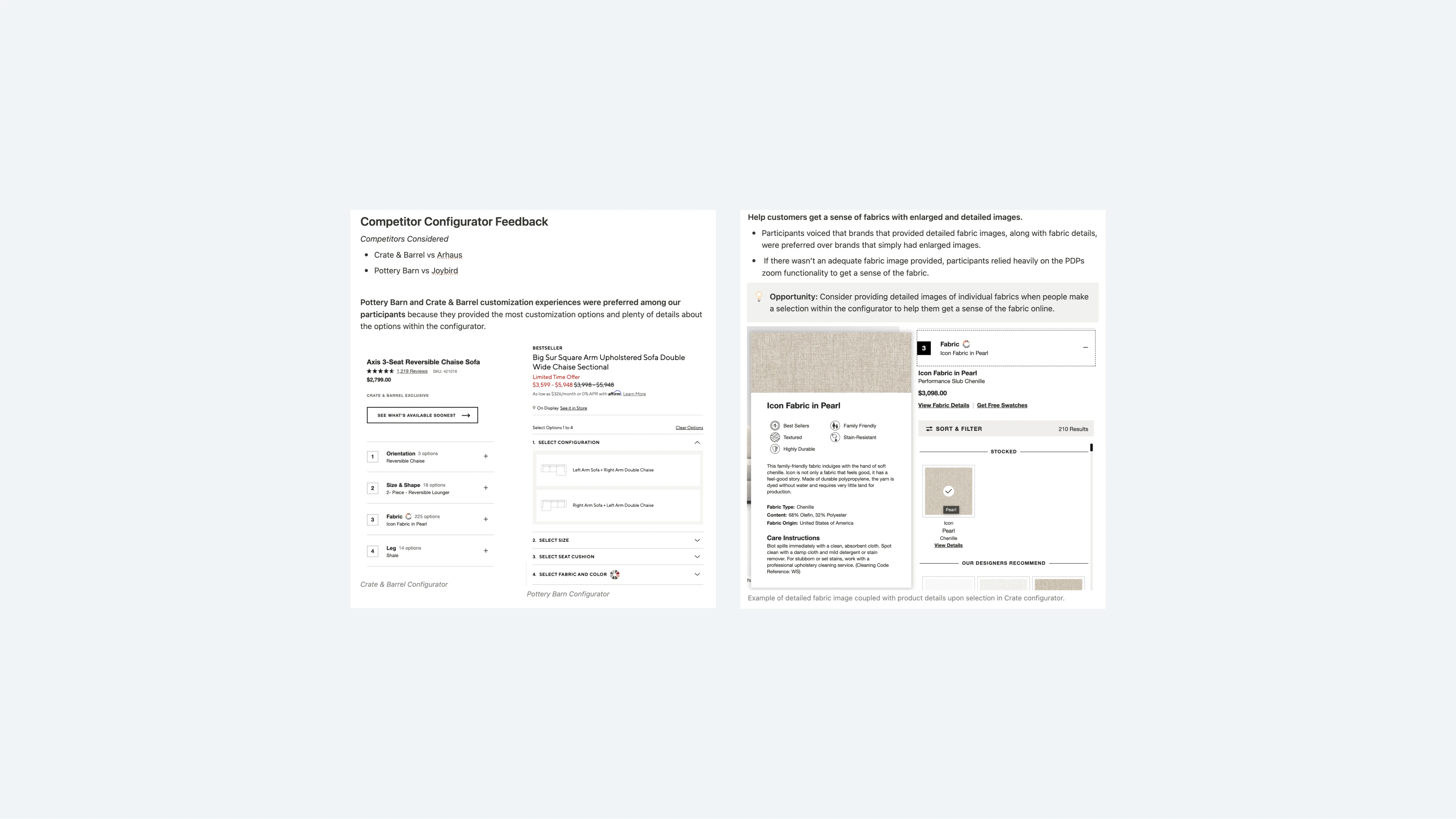
See where competitor configurators are exceeding expectations or falling short
Run a gut-check of our initial wireframe layout
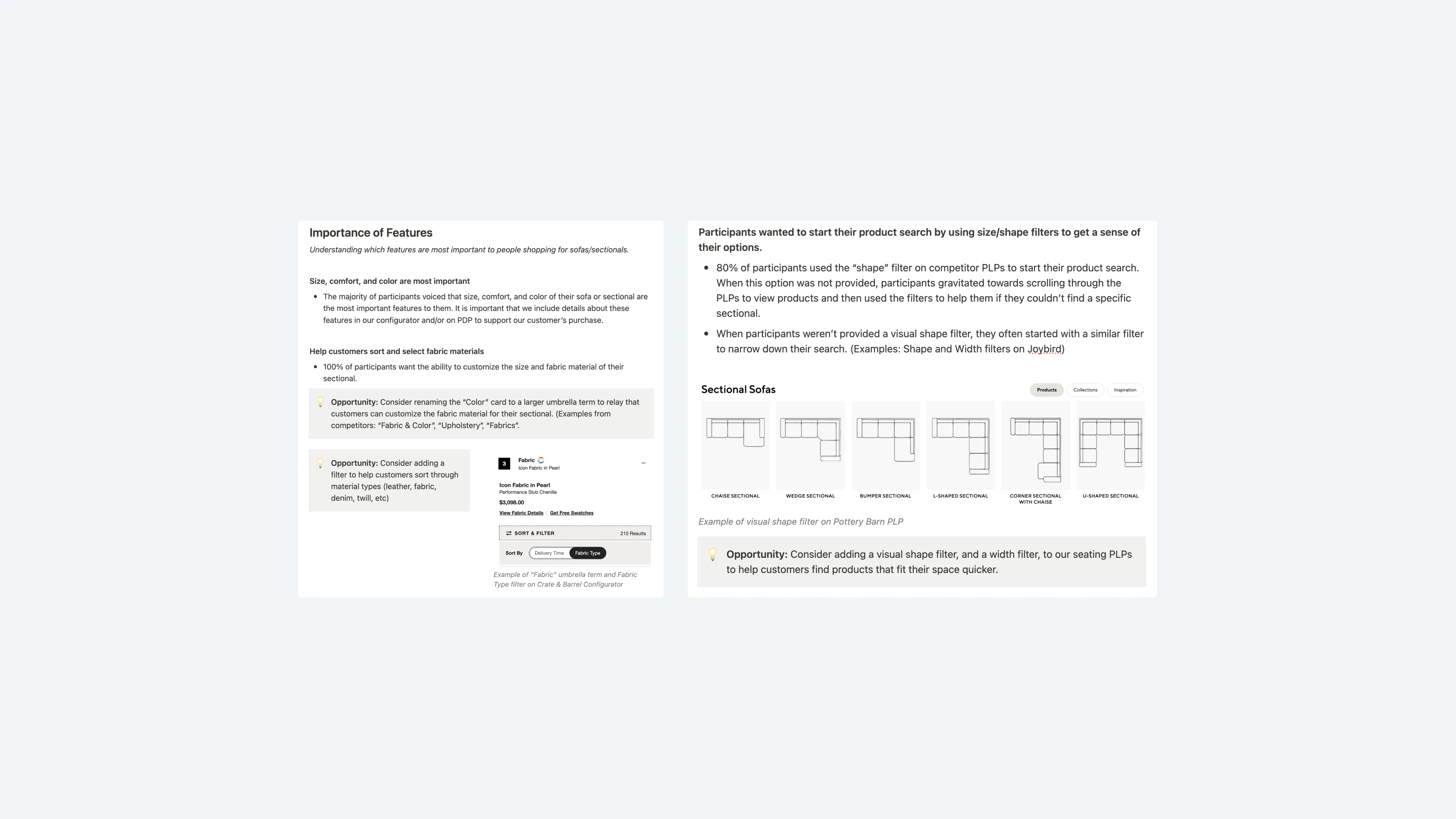
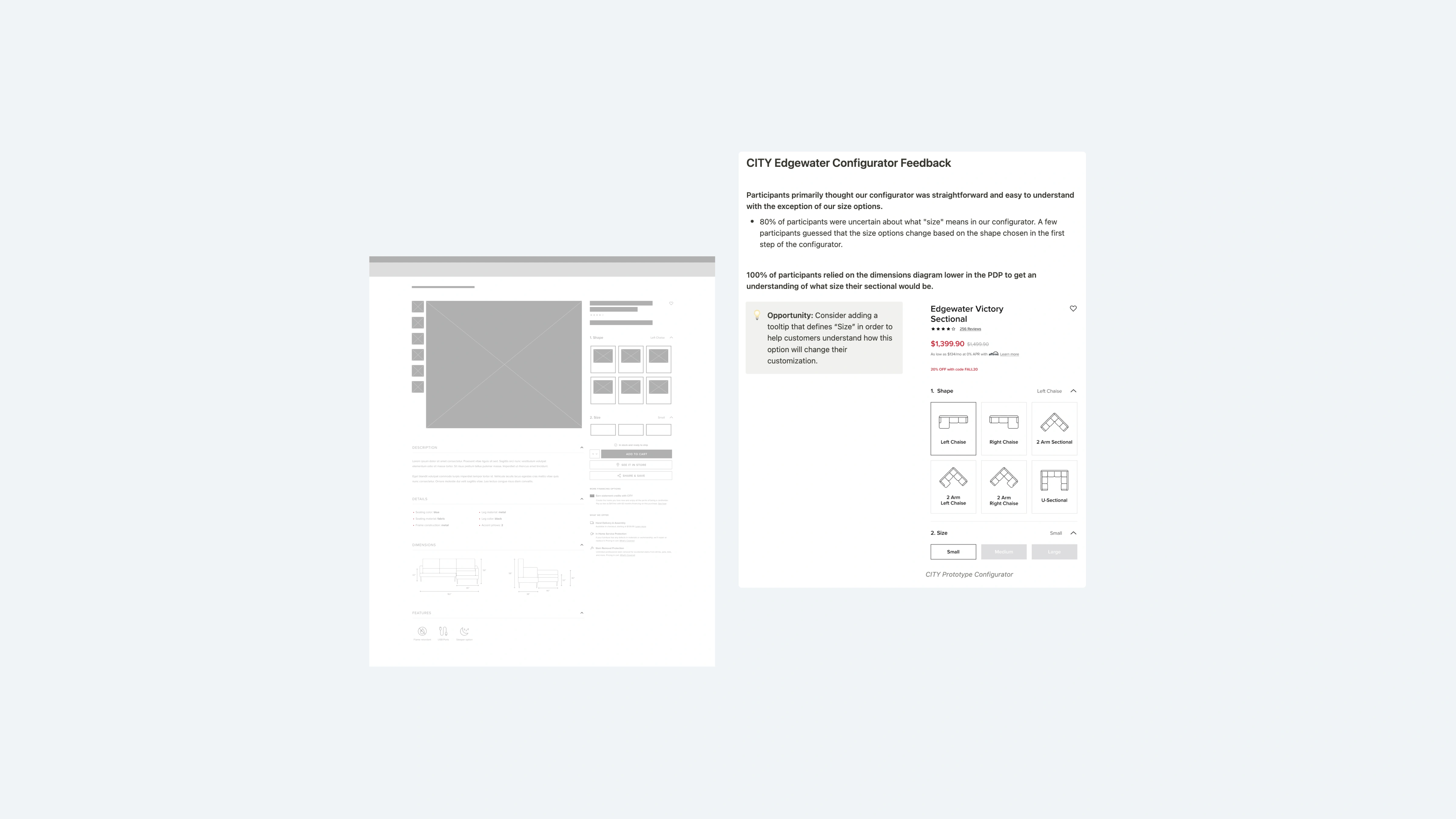
The feedback we received from these tests were great! Results showed that 80% of participants started their sofa/sectional search by using the visual shape filters on product landing pages (PLPs), so we knew these visual icons were a must on the configurator. We also learned that participants enjoyed the Pottery Barn and Crate & Barrel customization tools—primarily because these two had just the right amount of fabric and product details. And our wireframe layout was on the right track, however, users expected more details and clearer messaging.
"Participants primarily thought our configurator was straightforward and easy to understand, with the exception of our size options" - CITY Furniture User Research Team
MVP Session
From these results, a flood of ideas came to my brain; but, with the Edgewater marketing efforts launching in only 3 months, we had to get something out the door quickly.
I met with our product owner and ran a simple MVP session where we looked at what ideas and functionality should really move on to the next phase in our process. These were the items that had a high ROI, but were low effort for design and development.
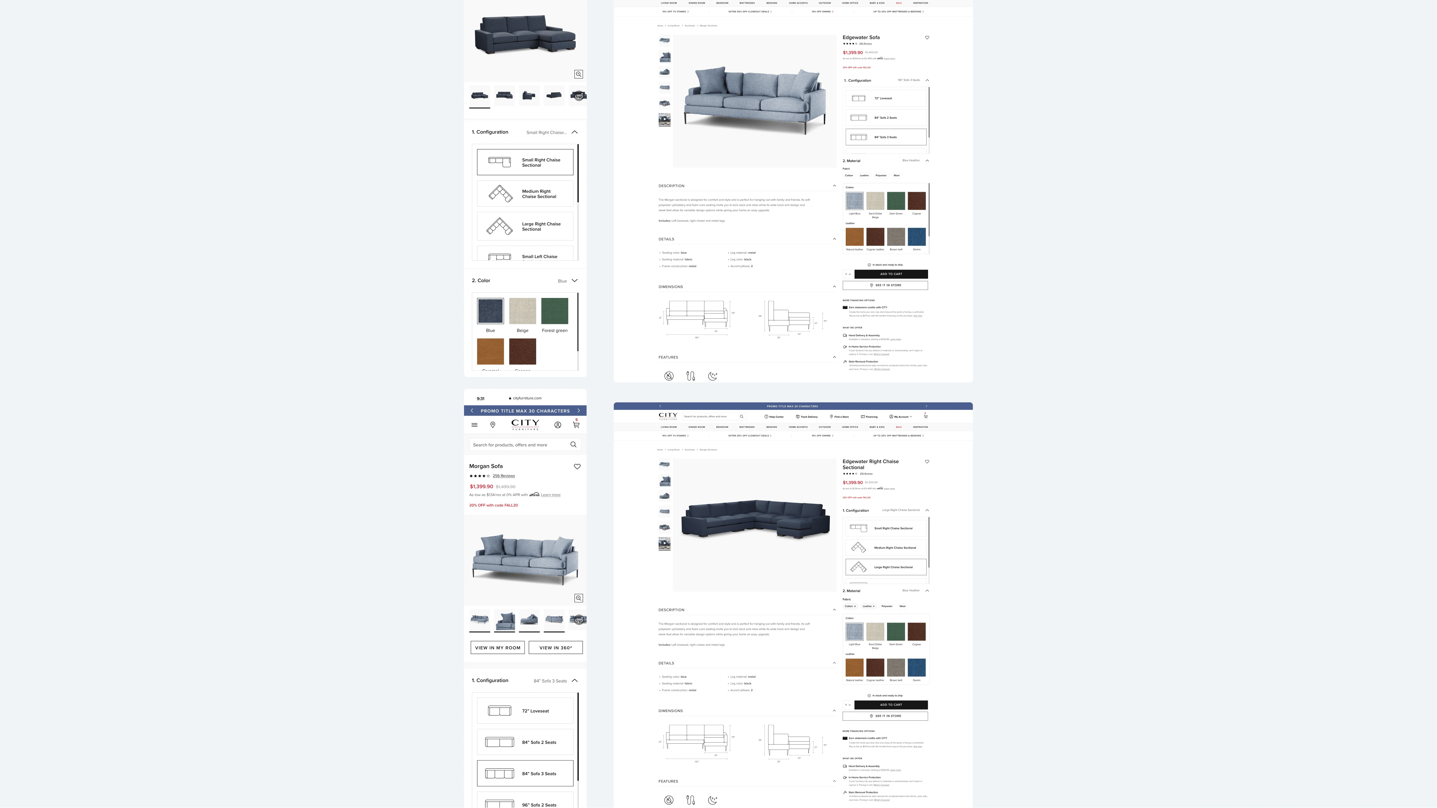
The items we moved on with were color/fabric swatches, color/fabric names, sectional orientations, visual shape icons, seamless open/close animation for accordions, and fabric filtering. (Spoiler alert: we later had to remove fabric filtering due to tech delays).
Final design
Once my team and I finalized the design, we met with stakeholders to get any last thoughts on the experience. Everyone seemed happy and eager to get this live, so we prepared our documents, assets, and a prototype in order to hand this off to our dev team.
Outcome
Once our developers were able to prepare the code, my designer and I took a close look at the experience in our pre-production environment and did some visual QA. We gathered our feedback on a document that contained specs, screenshots, and even where we found the issue (desktop vs mobile).
We decided to slowly roll this out to keep an eye on metrics and any potential errors. The data had been manipulated throughout the process and we did not want anything to break or show the wrong information to customers.
Within the first month of launching this design, our daily sectional revenue increased by 138% and our daily amount of sectional orders increased by 91%. Our users loved this experience (and the business did too)!
Like this project
Posted Jul 5, 2023
A sleek and easy-to-use configurator for CITY Furniture's customizable Edgewater line.
Likes
0
Views
18
