trufyx: Phone Repair Service App
Role:
I was the Principal Product Designer leading the project.
Project goal:
This client approached me with a brilliant idea: He told me all about how difficult it was for him to get his phone fixed recently—having to jump from repair shop to repair shop, waiting long hours, insane prices—and he wanted to make that process easier for others.
We started off by really trying to understand who our users were and what difficulties they each had. We identified two main user bases: those who need quick phone repairs, and those who are technicians that are looking for some extra cash.
Once we were able to digest who our users were and how this product could solve their phone repair problems, we dove deep into our UX: user flows, stakeholder interviews, product strategy, information architecture, competitor analysis, and wireframes.
Solution:
Our solution to both, the mobile app and the website, was quite simple. We made sure to design with the user in mind and removed any unnecessary steps. We took inspiration from the greats, like Uber and Lyft, to really nail down clear messaging and intuitive tasks from the customer side and the technician side.
The technician mobile app contained a seamless onboarding flow, allowed users to accept/decline/cancel local calls, chat with clients, set up their work schedule, keep track of their revenue, and much more.
The responsive customer website allowed users to receive a quick quote, book a call, chat with their technician, review their service, and more.After a successful pilot in NYC, Trufyx is expanding to other states in 2022. This product was featured on MarketWatch and Exeleon Magazine.
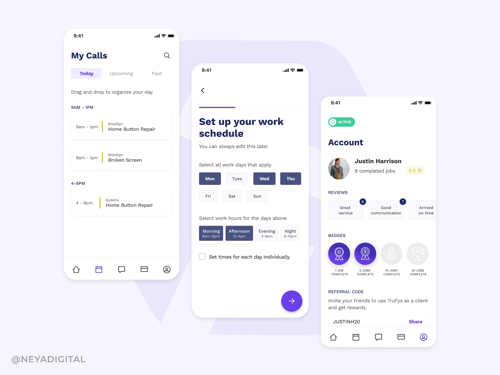
Mobille app for technicians
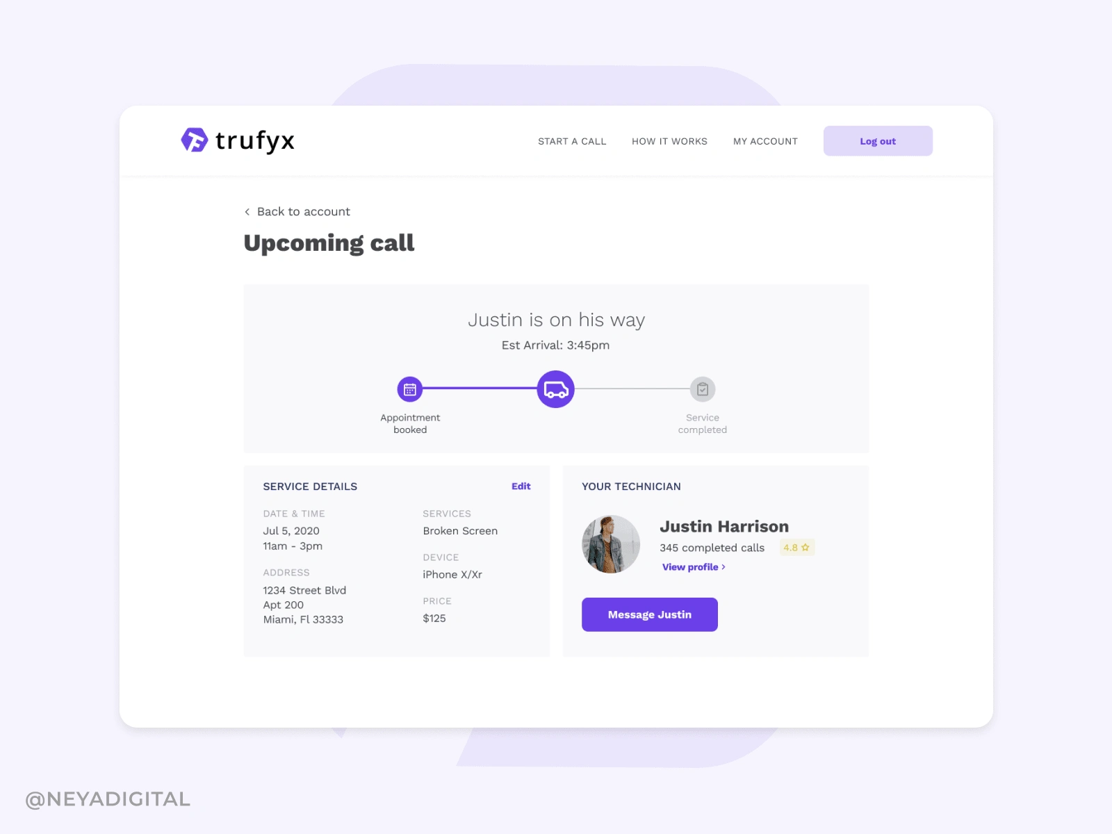
Web app for clients
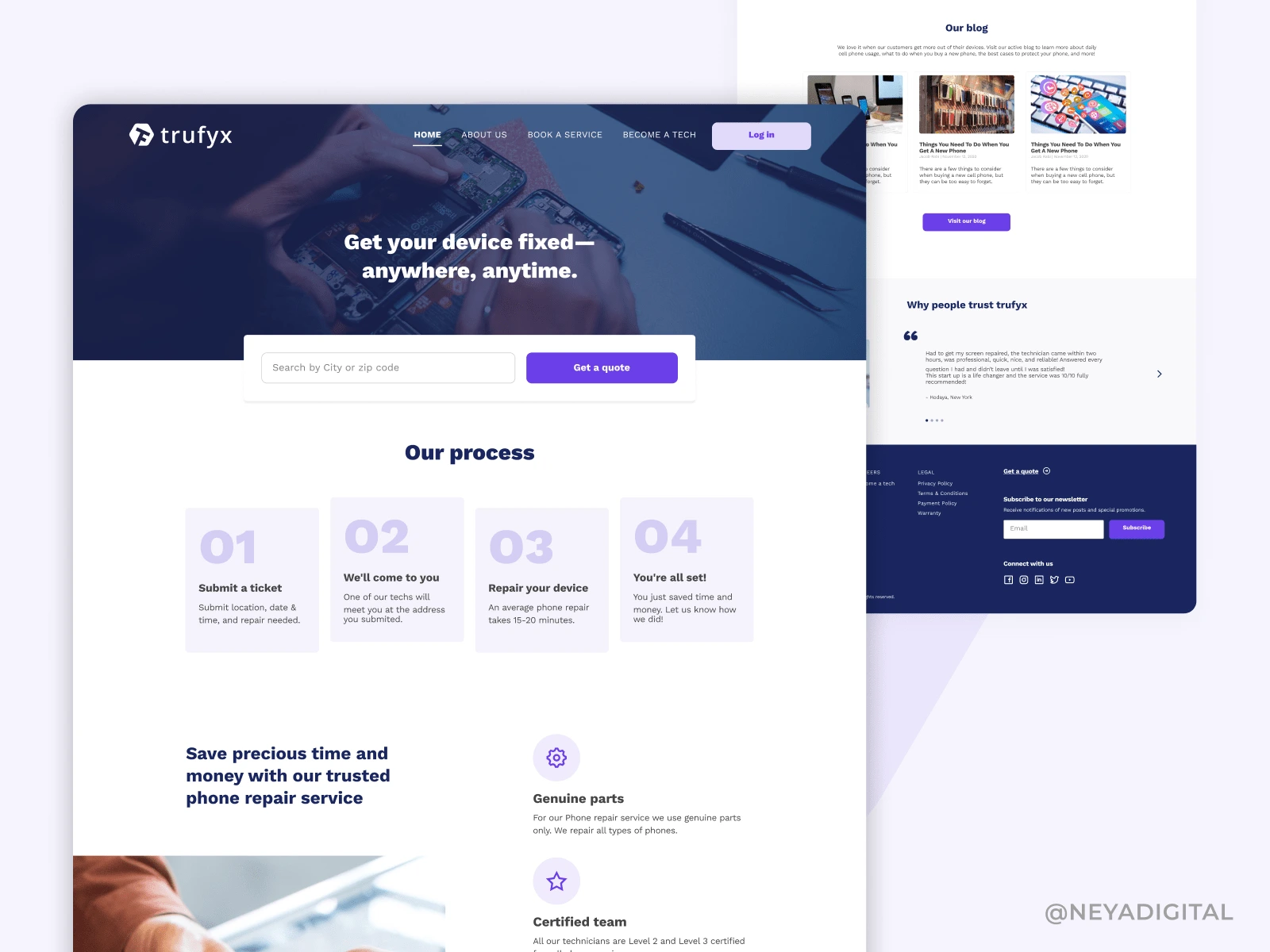
Landing page
Like this project
Posted Jun 2, 2023
A mobile app for technicians and a responsive website for clients, to make phone repair a breeze. After a successful pilot in NYC, Trufyx is expanding to other
