The $1M Upgrade: Revolutionizing Verve AR’s Export Feature for A

Kenneth Madukwe
Visual Designer
UX Designer
Product Designer
Figma
VerveAR
Project Overview
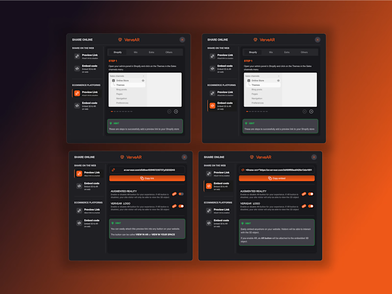
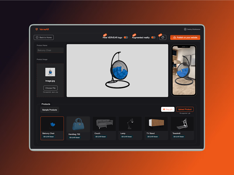
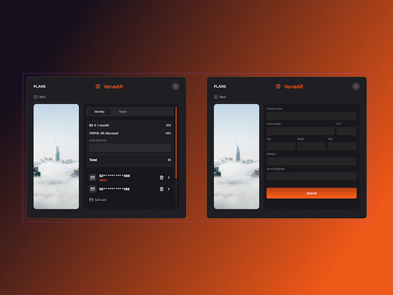
In September, Verve AR secured $1 million in investor funding to drive innovation in augmented reality (AR) solutions, including enhancing user-centered features within its platform. As part of this investment push, I was tasked with designing a robust export component that would seamlessly integrate into the Verve AR ecosystem. My objective was to create a flexible, intuitive export solution that catered to various user needs, supported multiple file formats, and aligned with Verve AR’s refined product vision.
This funding underscored Verve AR’s commitment to elevating its product quality and user experience, enabling us to prioritize advanced features and address core user challenges more effectively. With this renewed focus, the export component aimed to streamline the process for exporting AR assets—from complex 3D models to detailed reports—making the platform more efficient and responsive to the growing needs of AR professionals and content creators.
Problem Statement
Despite its robust AR capabilities, Verve AR’s platform faced persistent challenges with the existing export feature, leading to user frustration and operational inefficiencies. Key issues included:
Lack of Customization: The limited export options prevented users from adjusting file quality, format, and other preferences, which hampered flexibility.
Complex Navigation: The export system was unintuitive, requiring excessive steps to perform basic tasks and slowing down workflows.
File Format Constraints: The limited selection of output formats made it challenging for users to share assets across diverse platforms and devices, limiting the versatility of Verve AR’s offerings.
These issues highlighted the need for a reimagined export component that would leverage the recent investment to optimize user experience and deliver greater flexibility and efficiency.
Solution Strategy
To address these challenges, I developed a new export component with a focus on:
Usability: Ensuring a simple, intuitive experience with clear navigation and minimal steps.
Flexibility in Export Options: Enabling users to export AR assets in multiple formats—such as OBJ, FBX, and Verve AR-specific types—along with customizable settings for resolution and quality.
Alignment with Verve AR’s Brand Identity: Designing within Verve AR’s style guide to maintain visual consistency and a familiar interface for returning users.
With the new funding, Verve AR was positioned to prioritize a user-focused approach. This allowed me to dedicate resources toward understanding users' nuanced needs, and delivering a refined export solution that:
Streamlined Navigation: Reduced clicks and optimized workflows for faster exports.
Customization for Diverse Use Cases: Allowed users to select specific formats and resolutions, from preview quality for rapid sharing to high-resolution for final deployment.
Design Process
User Research and Requirement GatheringI conducted extensive user research to clarify the functional and usability gaps in the existing export feature. Interviews with AR designers, project managers, and developers provided insights into the specific export challenges faced. With investor support backing the development, I was able to dig deeper into these areas, gathering critical user insights on:
Desired Export Formats: Users needed industry-standard file types (e.g., OBJ, FBX) for compatibility with external systems.
Customization Needs: Flexibility for setting resolution and quality control were must-haves for different project requirements.
Workflow Simplicity: Users prioritized a streamlined experience that minimized friction and reduced task completion time.
Wireframing and PrototypingBased on these insights, I created detailed wireframes in Figma, focusing on optimizing user flows to support intuitive navigation. Each wireframe aimed to:
Simplify Access to Key Features: Organize export options for ease of access, reducing the time required for setup and file output.
Ensure Visual and Functional Consistency: Follow Verve AR’s design system to create a cohesive interface.
Balance Customization and Simplicity: Structure export settings so users could easily find and apply the necessary adjustments.
Interactive prototypes allowed users and stakeholders to test early versions of the layout and flow. I leveraged this phase to confirm that the design improvements met users' expectations and aligned with Verve AR’s strategic goals.
Iterative Refinement Based on FeedbackWith regular feedback from early testers and Verve AR’s team, I refined the design to emphasize flexibility and accessibility. Input from the user tests revealed opportunities to enhance the layout, making it easier to toggle between options and fine-tune settings. As a result, I incorporated file format icons and visual cues to improve clarity, further simplifying navigation for both new and returning users.
Final Design and Developer HandoffWith the design finalized, I collaborated closely with the development team to ensure accurate implementation. Detailed annotations and weekly check-ins helped streamline the handoff, minimizing potential misinterpretations and ensuring that each feature was implemented according to the design vision. The process allowed for smooth integration of the export component into Verve AR’s platform, reflecting the high standards of functionality and usability expected by stakeholders.
Project Outcome
The updated export component was well-received by Verve AR’s user base, who noted several significant improvements:
Improved User Satisfaction: Enhanced functionality allowed users to select the precise export settings needed for various use cases, from rapid previews to high-resolution exports.
Increased Workflow Efficiency: By minimizing steps and enhancing navigation, the new component significantly reduced time spent on exporting tasks.
Positive Brand Alignment: The redesigned component’s consistency with Verve AR’s visual style reinforced brand identity and usability.
Verve AR’s recent funding helped enable these improvements, providing resources to optimize both design and testing, ensuring a user-centered outcome.
Key Takeaways
This project emphasized the value of combining user-centered design with strategic investment, demonstrating that meaningful product improvements stem from deeply understanding user needs and having the resources to iterate thoughtfully. Working on the export component for Verve AR highlighted:
The Impact of Investor Support on User Experience: With dedicated funding, we were able to enhance research, refine features, and provide a highly customized solution that addressed real user needs.
Balancing Flexibility and Ease-of-Use: Offering diverse options without overwhelming users required careful design choices, ultimately creating a component that delivered both functionality and simplicity.
The Value of Iterative Design and Feedback: Continuous input from users and stakeholders allowed us to hone the component until it met Verve AR’s standards and exceeded user expectations.
Future Directions
The successful rollout of the export component has positioned Verve AR to build on these improvements, potentially adding further integration with AR-specific tools and more export formats as user demand grows. With the recent investment, Verve AR is also positioned to explore additional usability enhancements and performance optimizations across the platform.
This project underscored the potential for impactful design supported by strategic investment, enabling Verve AR to meet its goals for growth, product excellence, and user satisfaction. The export component now stands as an example of how thoughtful design, aligned with organizational objectives, can provide tangible benefits for both users and the brand.


