UI Design: Rubies Junior
Introduction
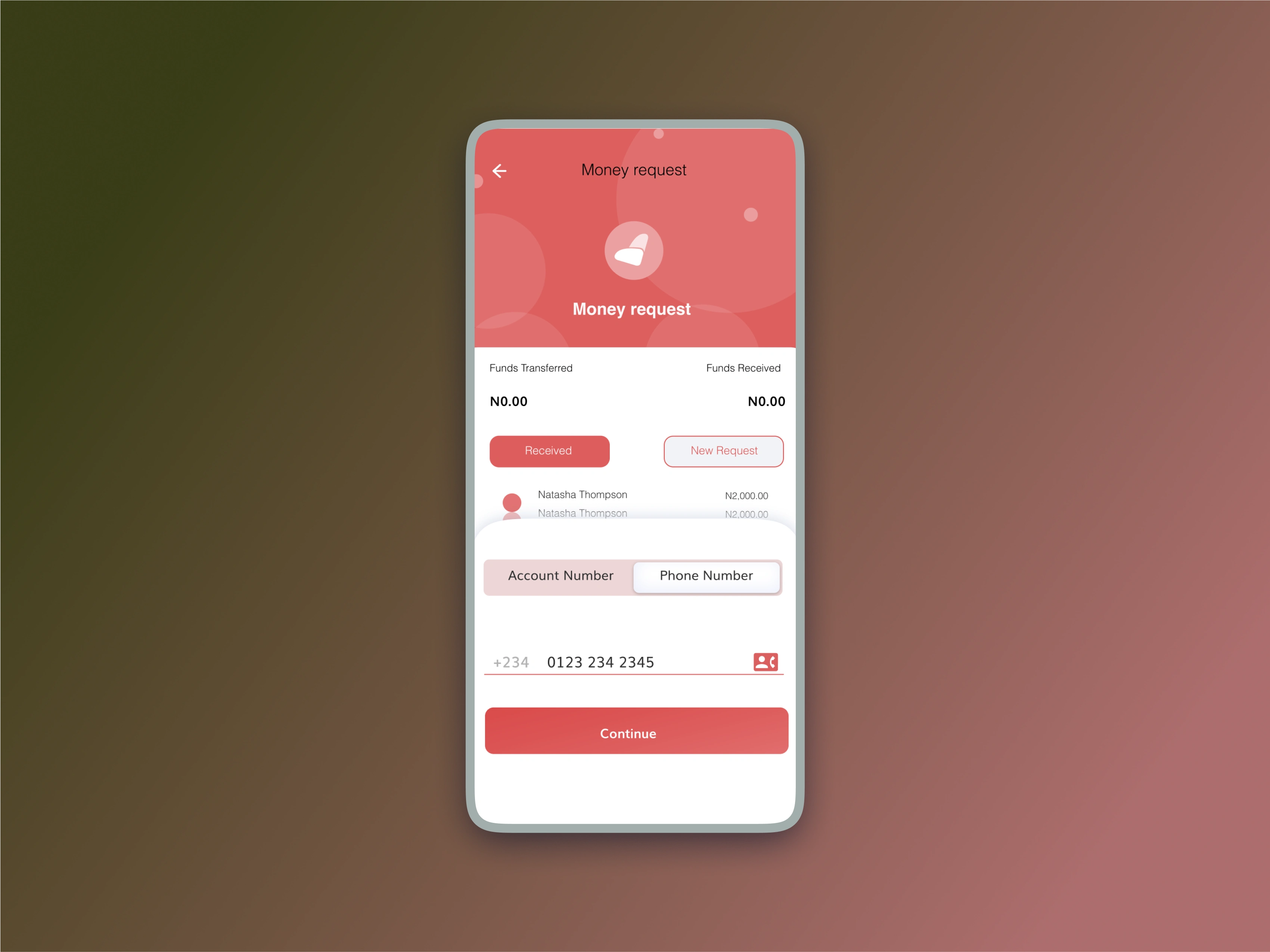
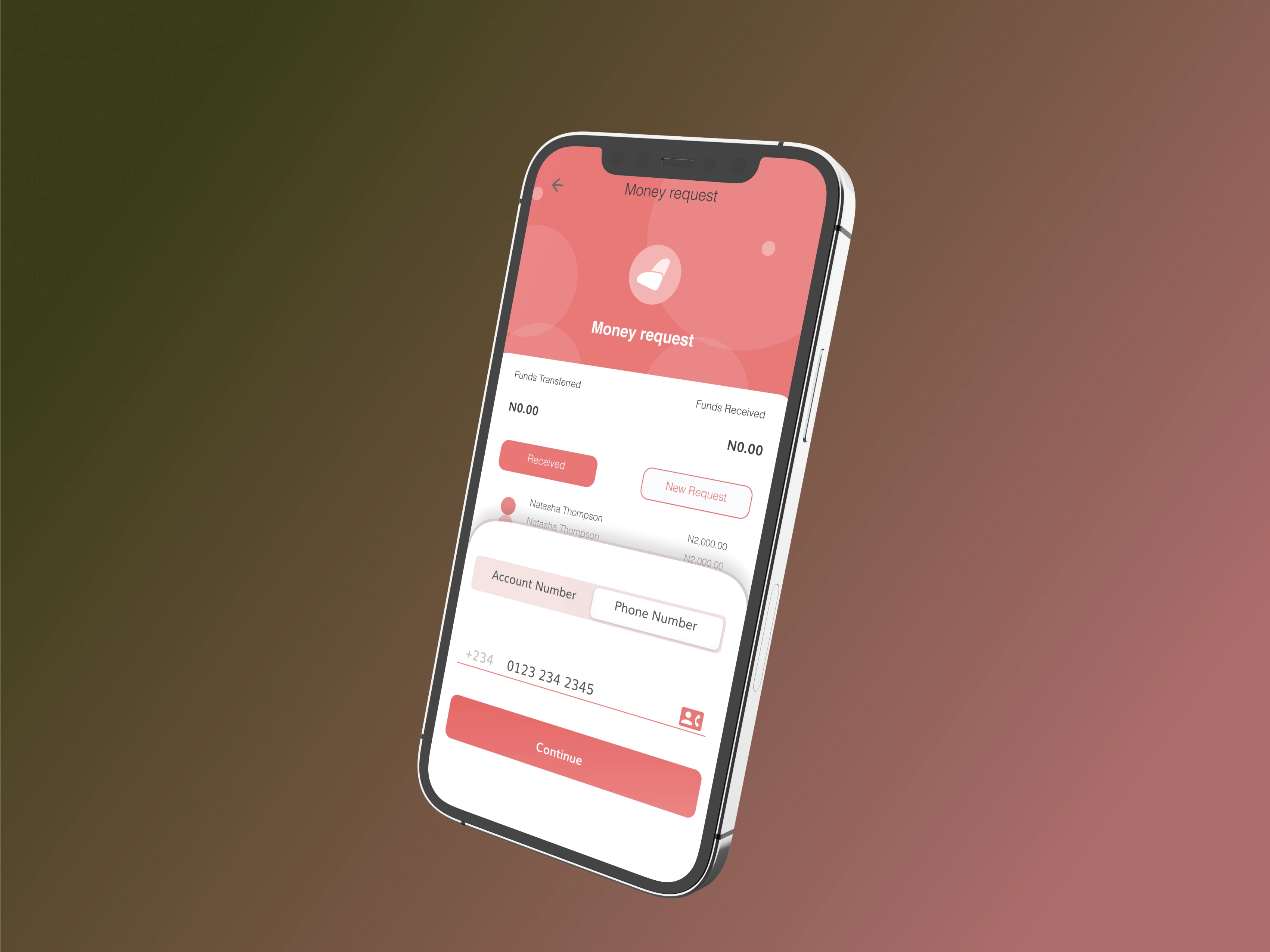
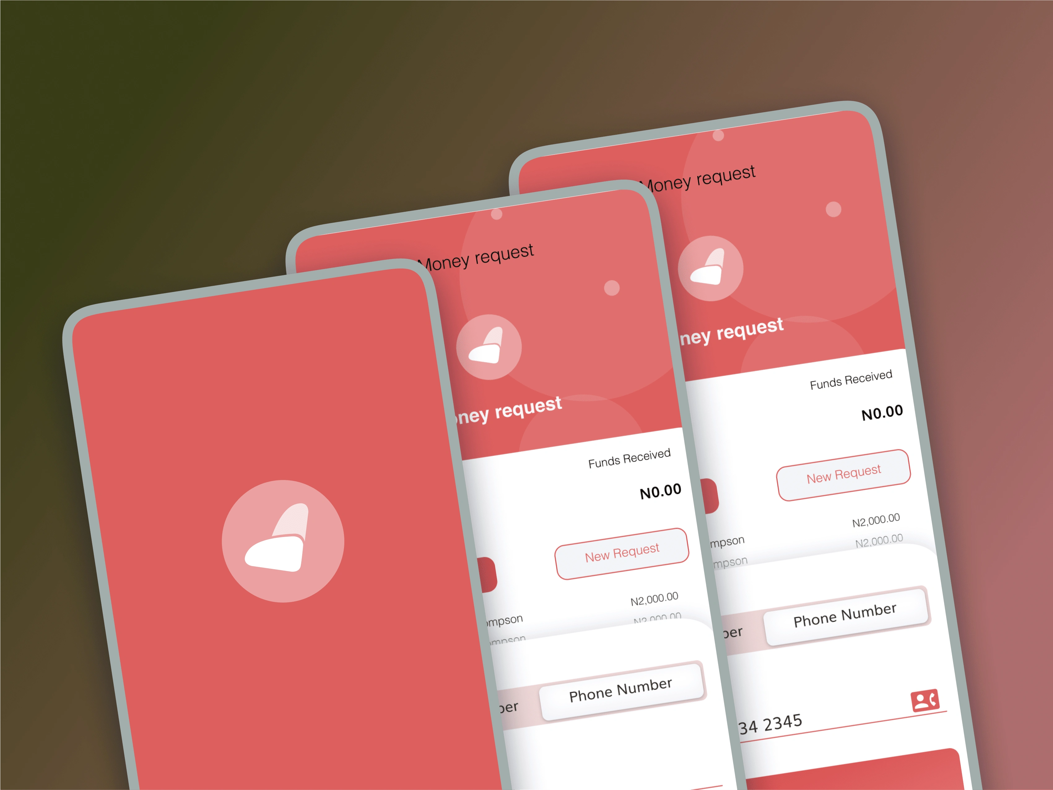
In my role at Rubies Bank, I was responsible for a complete overhaul of the money request feature within the Rubies Junior app, a banking app designed specifically for children and teenagers. This essential feature enables young users to request loans from contacts, such as family members or friends, creating an opportunity to educate them on financial responsibility within a safe and engaging environment. My goal was to simplify and enhance the feature’s usability, ensuring a seamless experience for both young users and their guardians.
Challenges
The previous version of the money request feature presented several usability obstacles, both for young users and their guardians:
Complex Navigation: Young users found it challenging to navigate through the request and approval process, and they often abandoned the process midway due to confusion.
Guardian Difficulties: Guardians struggled with the feature’s approval management system, finding it difficult to track, review, and approve loan requests.
Engagement Limitations: The existing design lacked interactive and engaging elements, which are essential for a younger audience, affecting overall user engagement and satisfaction.
Problem Statement
The primary challenge was to redesign the loan request feature to create an intuitive, user-friendly, and engaging process. The aim was to:
Simplify navigation for young users while ensuring the process remains educational.
Improve the approval management system for guardians to streamline their experience.
Introduce engaging elements to increase retention and enhance the overall user experience within the app.
Design Process
1. User Research
To understand the full scope of user pain points, I conducted in-depth interviews with Rubies Junior app users and their guardians:
Key Findings: Users, particularly younger ones, frequently expressed confusion over the steps needed to request a loan. Guardians reported issues with receiving, reviewing, and approving requests, which often led to frustration on both ends.
Insights: The feedback highlighted the need for a streamlined, guided process that could easily be navigated by users of all ages, as well as a more manageable approval system for guardians.
2. Ideation and Mind Mapping
Based on research findings, I facilitated a mind mapping session to brainstorm solutions focused on clarity, accessibility, and engagement:
Feature Prioritization: Ideas were evaluated based on their potential to enhance usability. High-priority features included clear step-by-step guidance for young users, approval tracking for guardians, and visual cues to support navigation.
Innovative Solutions: Concepts such as a progress tracker, simple icons for each step, and personalized messages for both users and guardians emerged as essential elements to create a more intuitive experience.
3. Wireframing
With these priorities in place, I began creating low-fidelity wireframes that illustrated each phase of the loan request and approval process:
Iterative Refinement: These wireframes were tested with users through multiple rounds of feedback, allowing me to make real-time adjustments based on their responses.
Usability Focus: The wireframes were specifically designed to reduce cognitive load by displaying only essential information at each stage, which minimized confusion for both users and guardians.
4. Prototyping
After refining the wireframes, I developed a high-fidelity prototype using Sketch and InVision:
Step-by-Step Interface: The prototype presented a streamlined, step-by-step process that guided young users through each part of the loan request journey, with visual aids and prompts for clarity.
Guardian Dashboard: A dedicated dashboard for guardians allowed them to view, approve, or reject requests easily. The dashboard included notification features to alert them to pending approvals, further enhancing usability.
Feedback Integration: Following user testing, the prototype was modified to incorporate additional improvements, including enhanced icons, simplified language, and distinct color schemes to differentiate between user and guardian views.
5. User Testing and Validation
The final prototype was rigorously tested using Maze, where users navigated the redesigned money request process:
Positive Feedback: Users reported a marked improvement in ease of navigation, with an 83% usability score. Guardians appreciated the new approval dashboard, which simplified request management and improved their overall experience.
Engagement Metrics: The streamlined, engaging interface increased user satisfaction and engagement, with young users feeling more confident in completing the request process and guardians reporting a clearer understanding of their role in approvals.
Results
The redesigned money request feature significantly enhanced the Rubies Junior app’s usability and overall user experience:
Improved Navigation and Usability: By providing a clear and guided interface, the feature became much easier for young users to navigate and complete.
Enhanced Guardian Interaction: The new approval management system reduced frustration for guardians and empowered them with a clear, straightforward process to monitor and approve requests.
Higher Engagement and Retention: User engagement levels increased due to the feature’s interactive and educational elements, helping Rubies Junior retain its audience by offering an engaging, user-centered experience.
Conclusion
The redesign of the money request feature has elevated the Rubies Junior app’s commitment to providing a safe, educational, and engaging banking experience for young users. This project emphasized the importance of a user-centered design approach and thorough collaboration, leading to a solution that enhances usability, supports financial literacy, and keeps users engaged. The redesigned feature not only reflects Rubies Bank’s dedication to supporting young people’s financial journey but also serves as a model for future app enhancements.


Like this project
Posted Feb 23, 2023
Rubies Junior Case Study: Designing the Money Request Feature


