Unicapp - Visual Identity Redesign

Unicapp
Unicapp's mission was to provide a one-stop solution for all delivery needs, offering services for shipping various products of any size and distance. The brand aimed to establish itself as a trustworthy and reliable service provider while maintaining a fun and approachable identity.
I refreshed Unicapp's visual identity, creating a new logo, color palette, and visual elements that conveyed trustworthiness and playfulness. The detailed visual guidelines ensured consistency across all brand touchpoints.


However, despite a robust service offering, Unicapp struggled with its brand image.
Because of a poor and inconsistent visual identity.
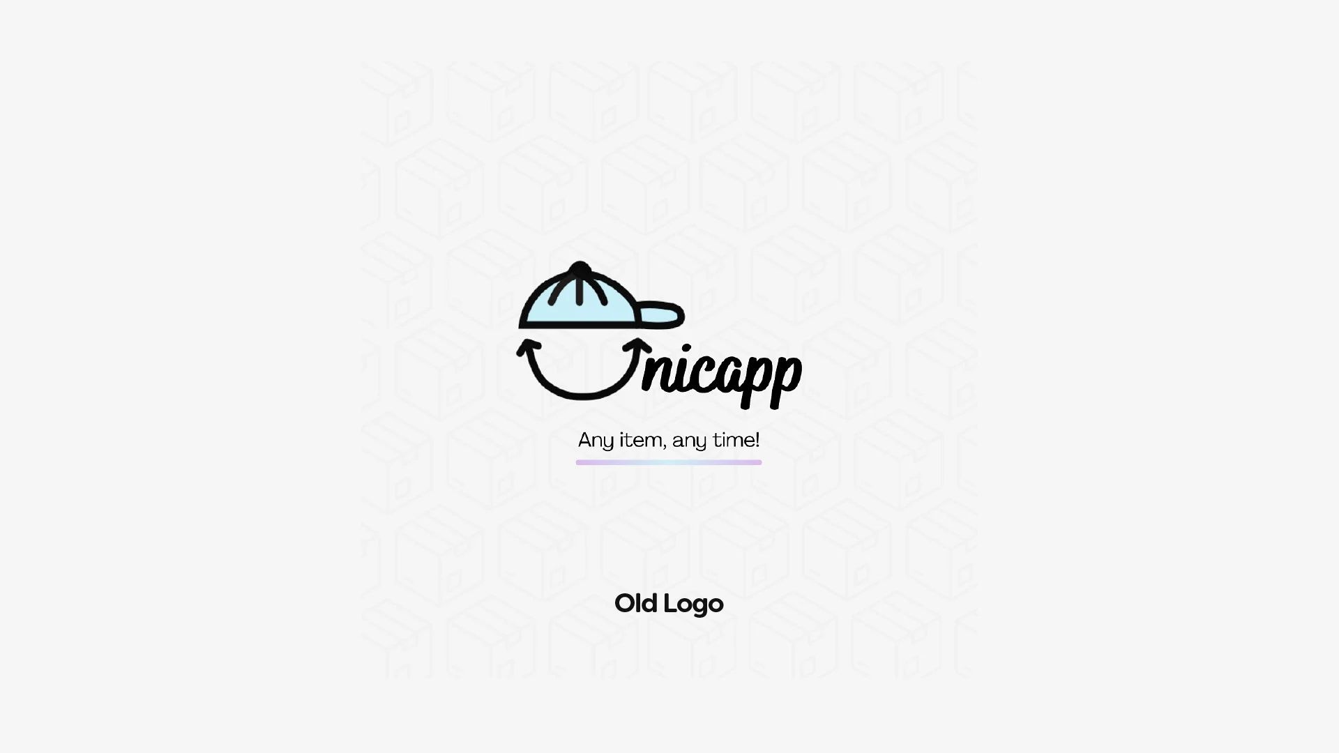
The visuals were uninspiring, the logo was ineffective on various backgrounds, and the overall aesthetics were generic.
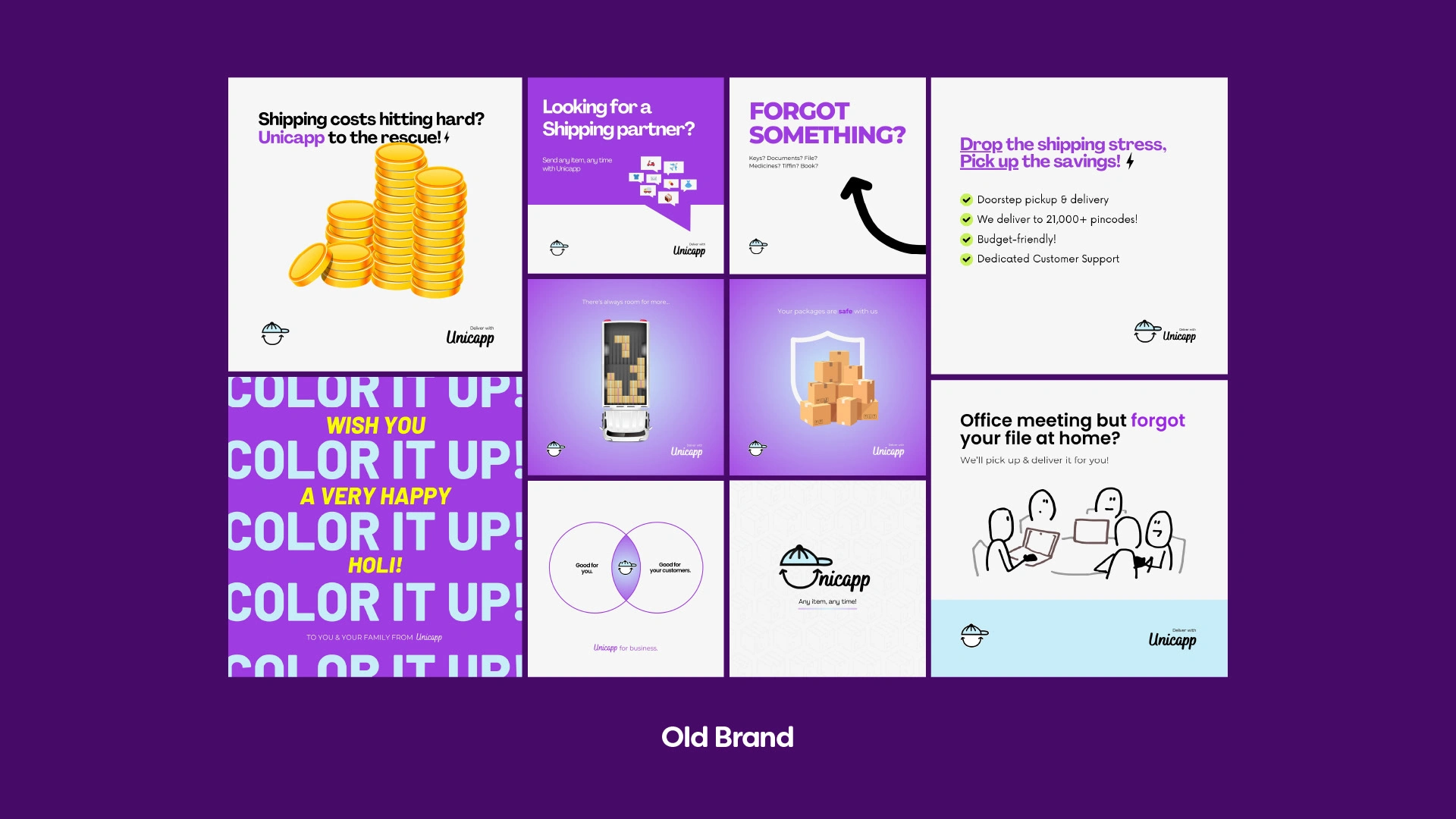

The rebranding journey for Unicapp was thorough and collaborative. I began with an in-depth industry analysis, examining what other players were doing and identifying opportunities for differentiation.
Creating a mood board, I presented Jitendra with several visual directions, explaining the potential impact of each.
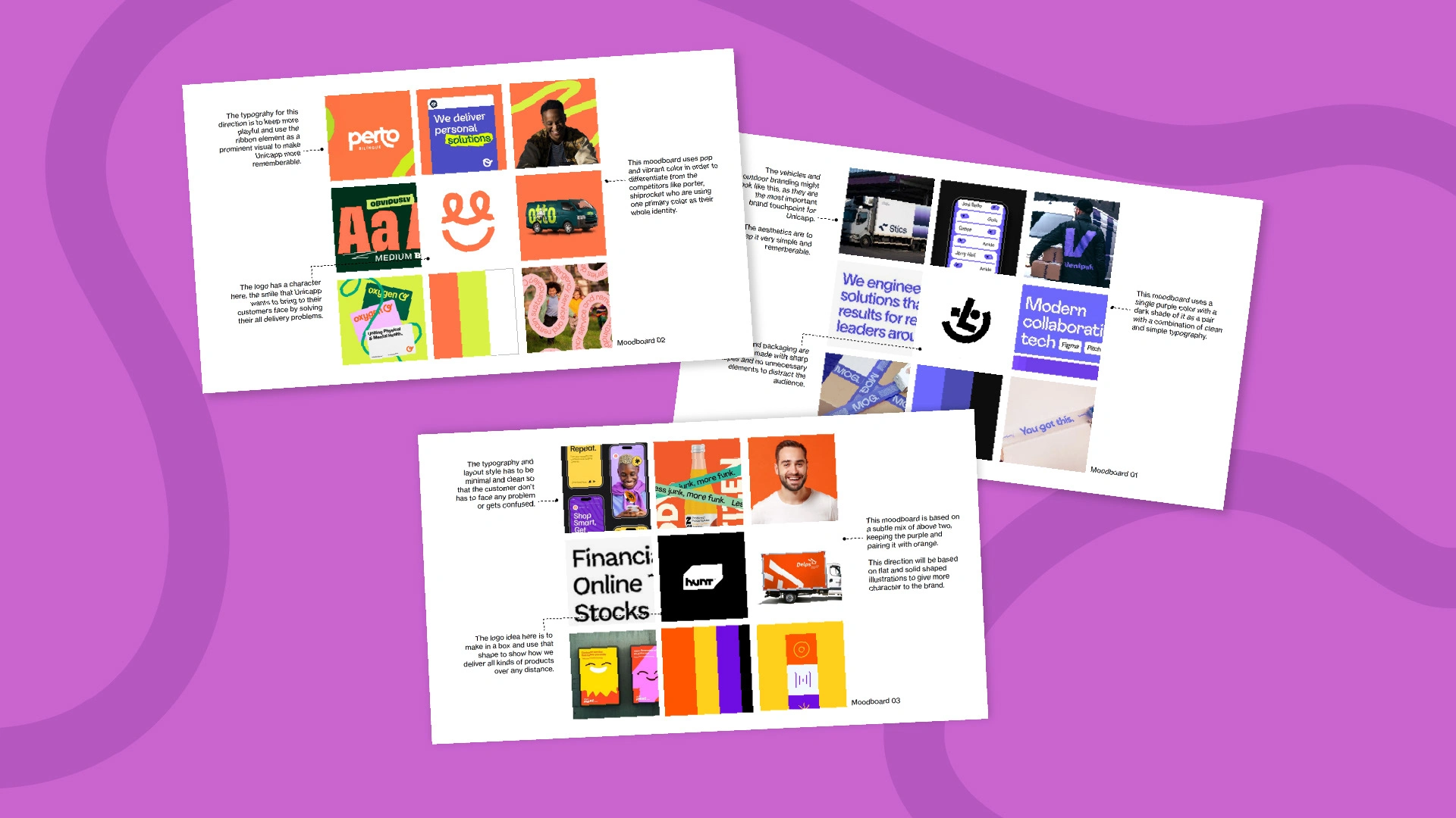
3 Proposed Moodboards
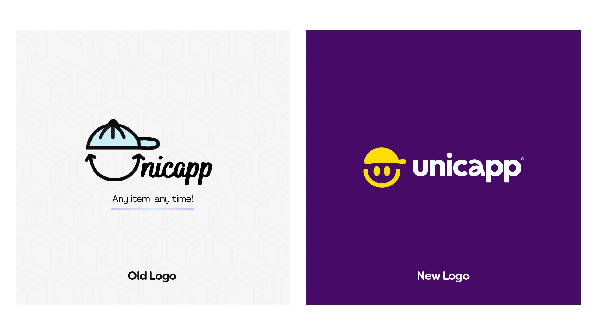
Old vs New Logo
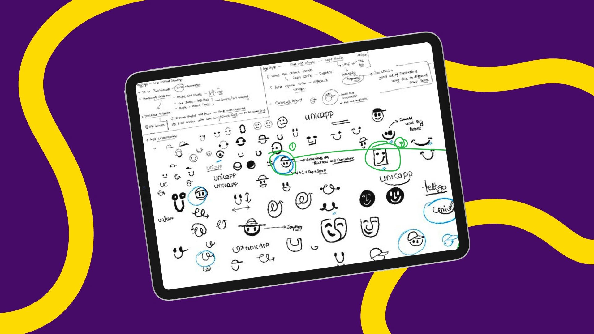
Logo Explorations
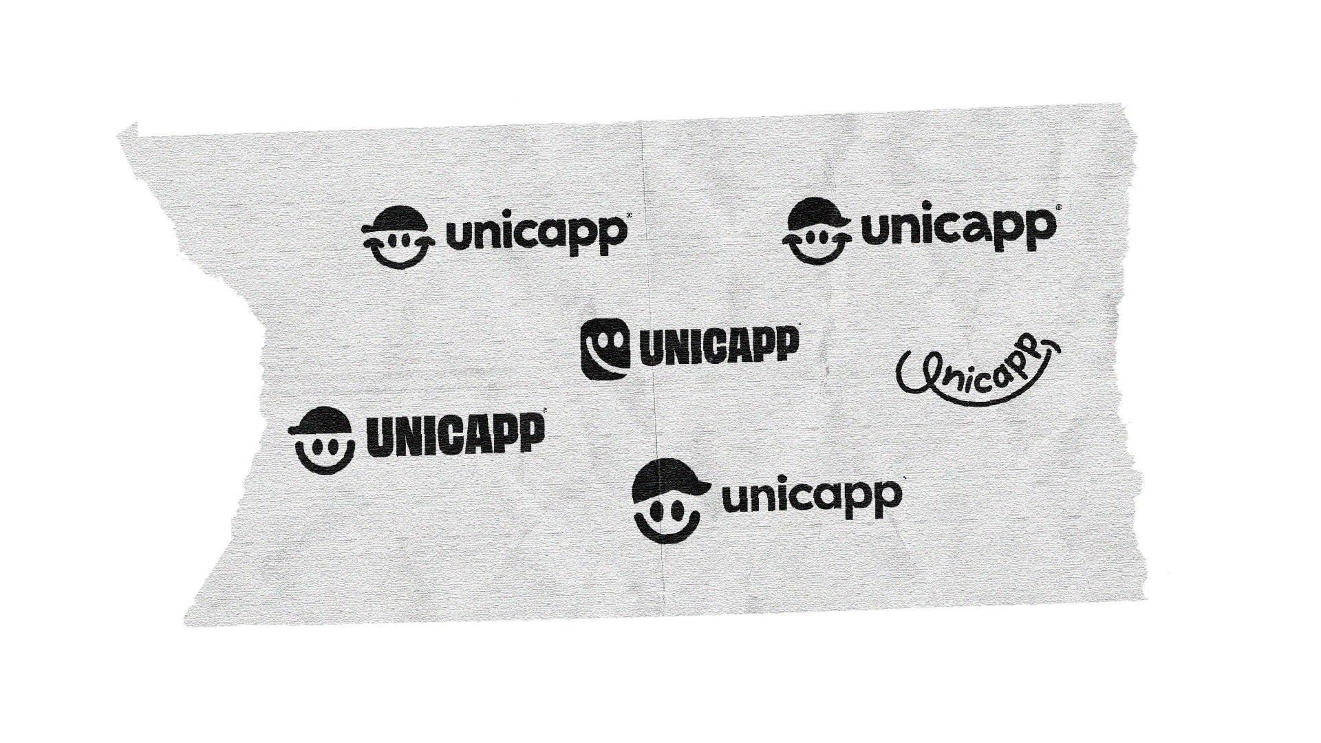
One major challenge was the existing logo, which had accessibility issues and wasn't adaptable to various backgrounds. I restructured the logo, ensuring it was versatile and iconic.

Refreshed New Logo


Meet Unicapp, a versatile delivery service aiming to be the go-to solution for all delivery needs. Whether it's a small business shipping equipment, a family moving households, or individuals needing to send parcels across town, Unicapp is there.

Visual Elements derived from the logo mark to extend the brand's recall value.
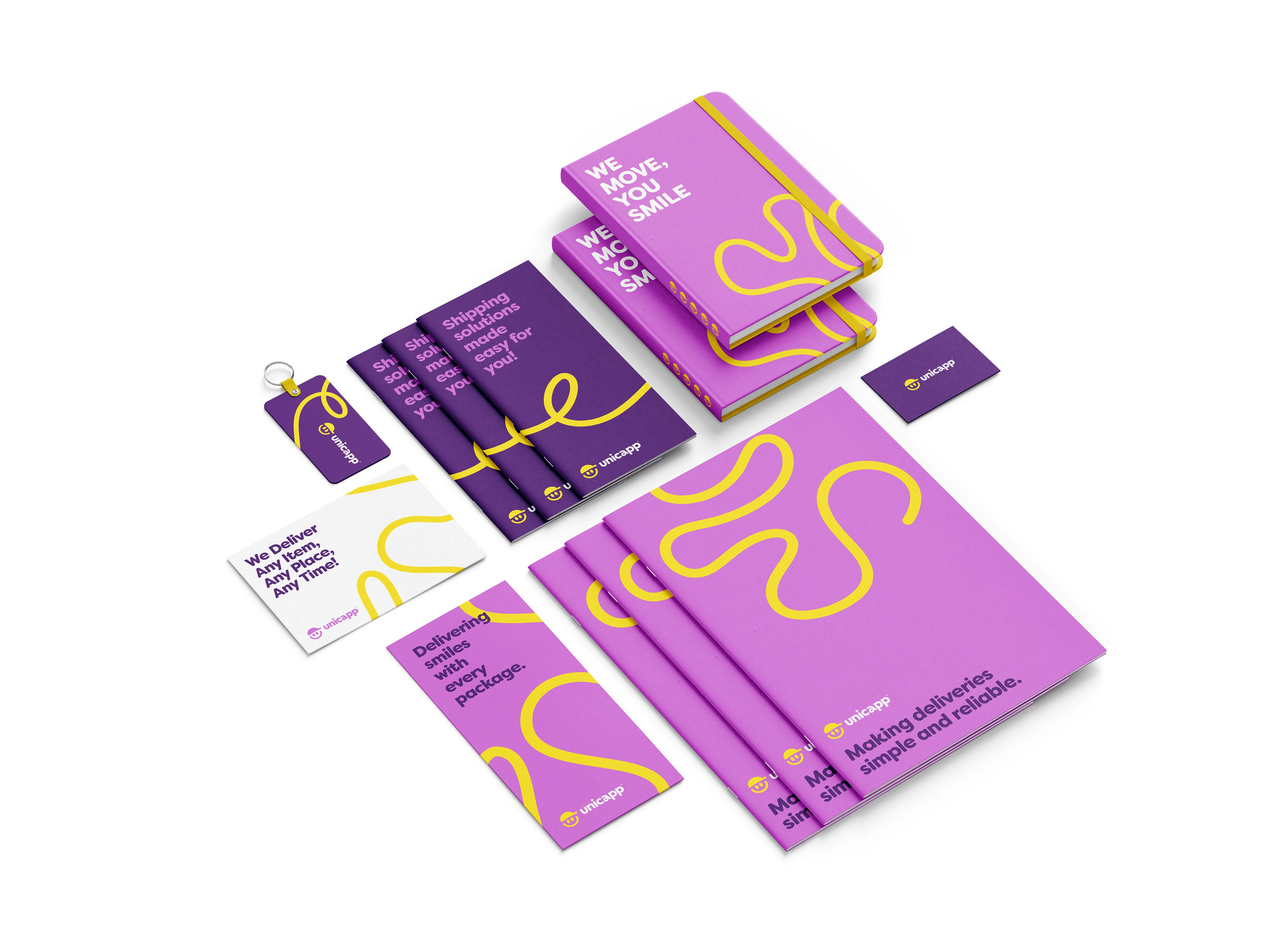
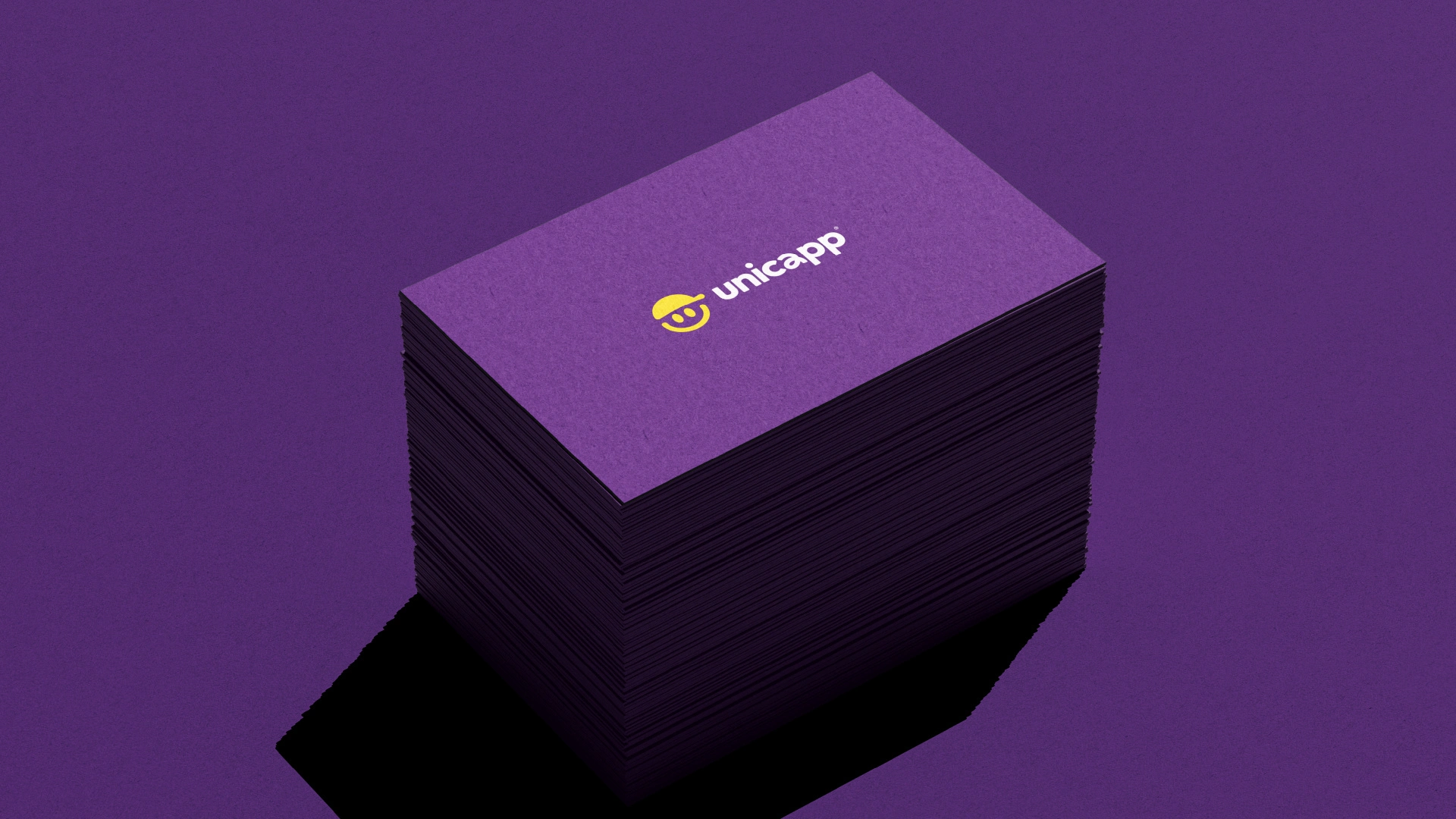
The rebranding effort resulted in a refreshed logo and a comprehensive visual identity for Unicapp.
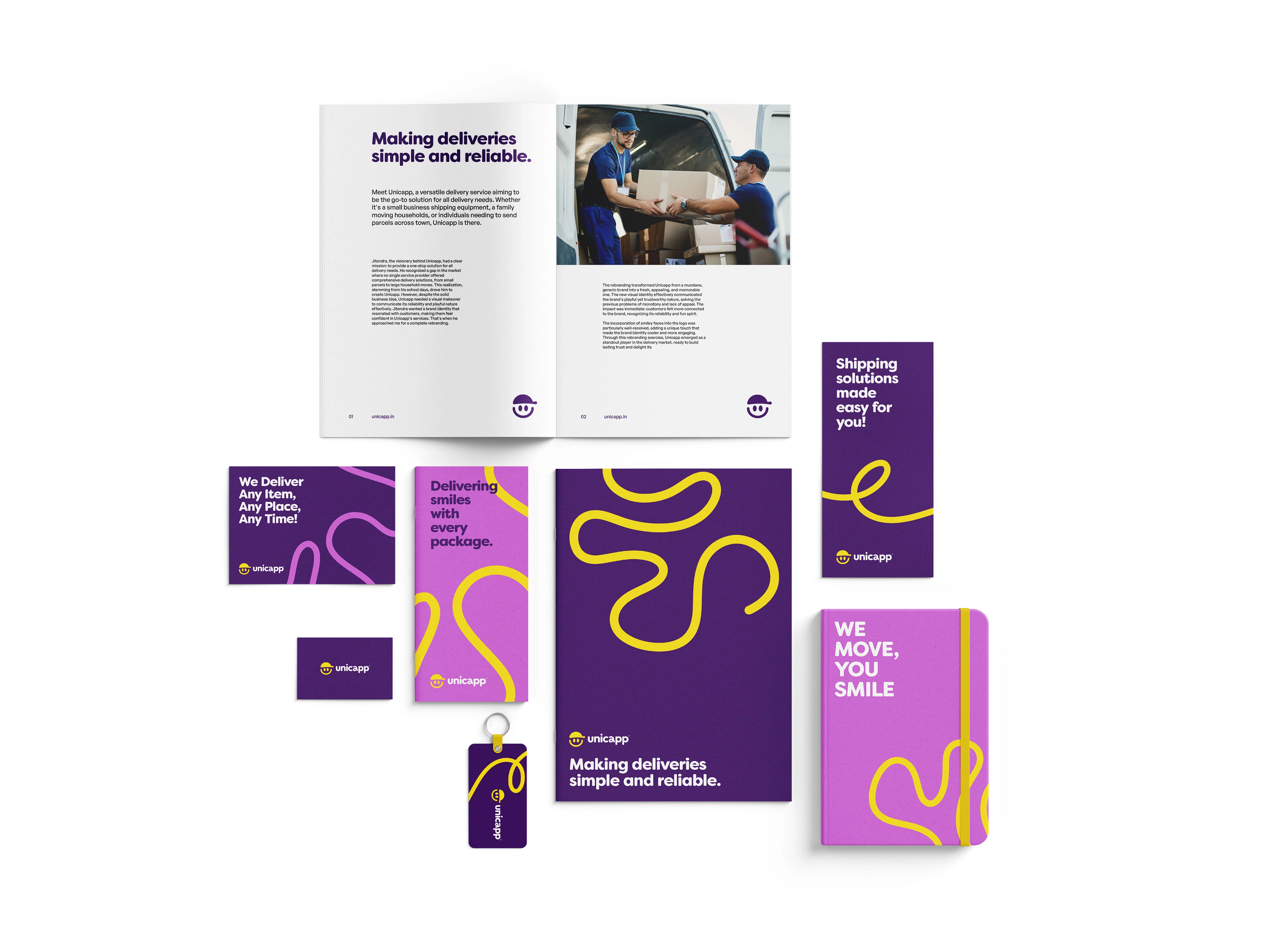
I crafted a detailed visual guidelines document to ensure consistency across all brand touchpoints.
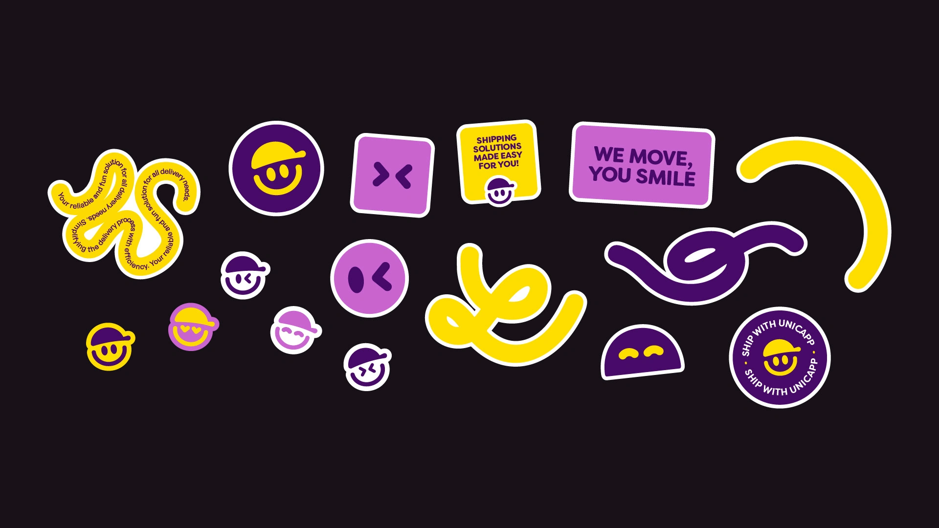
Specific elements, such as a set of ribbons and smiley faces inspired by the logo, were created to enhance the brand’s visual appeal.
These elements not only extended the brand's aesthetics but also reinforced its fun and trustworthy nature.
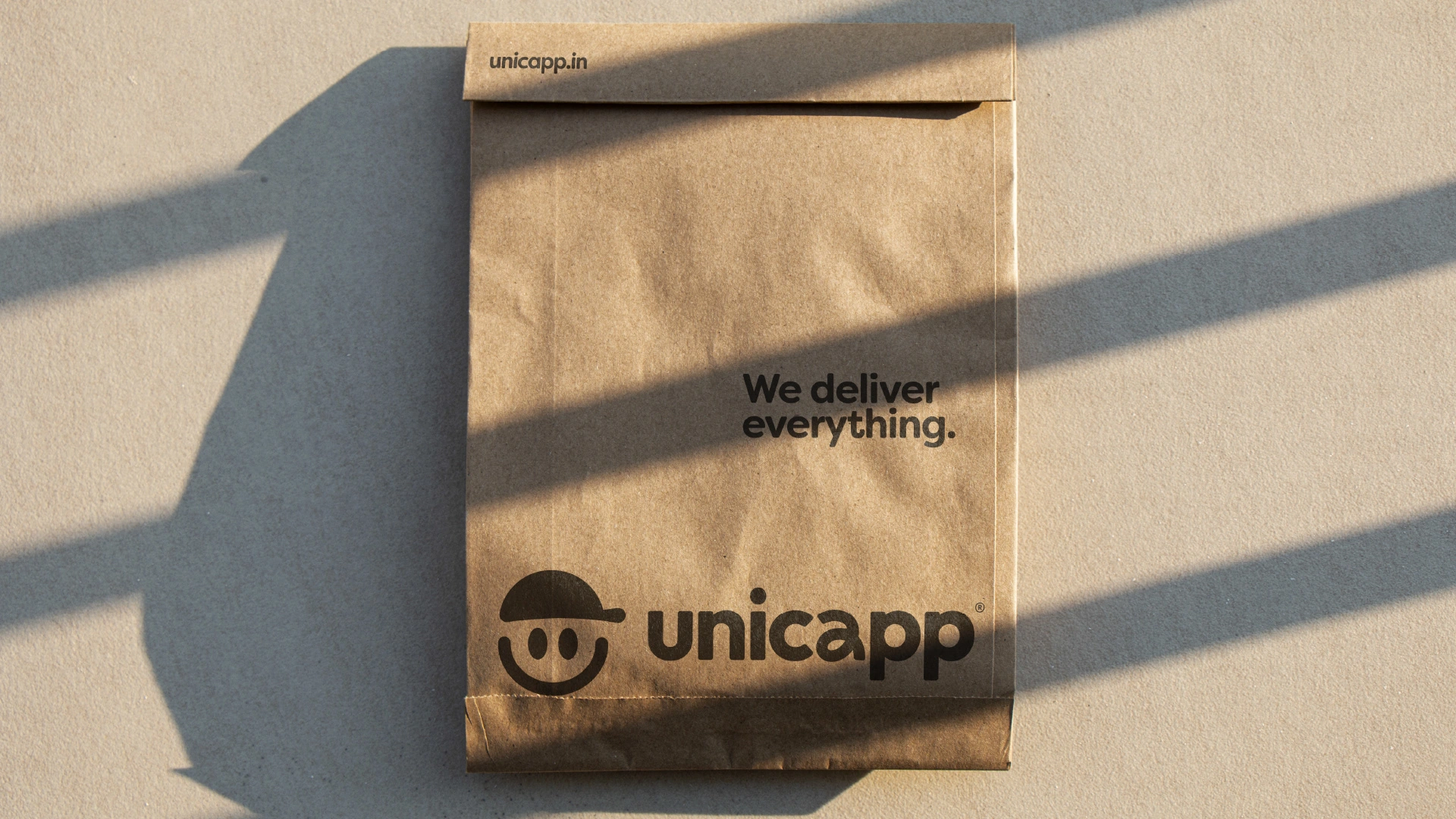
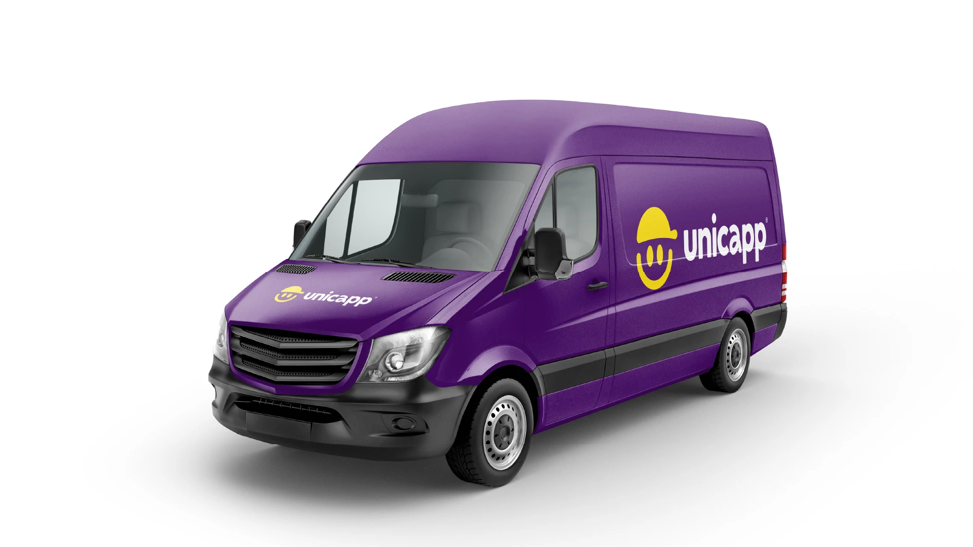
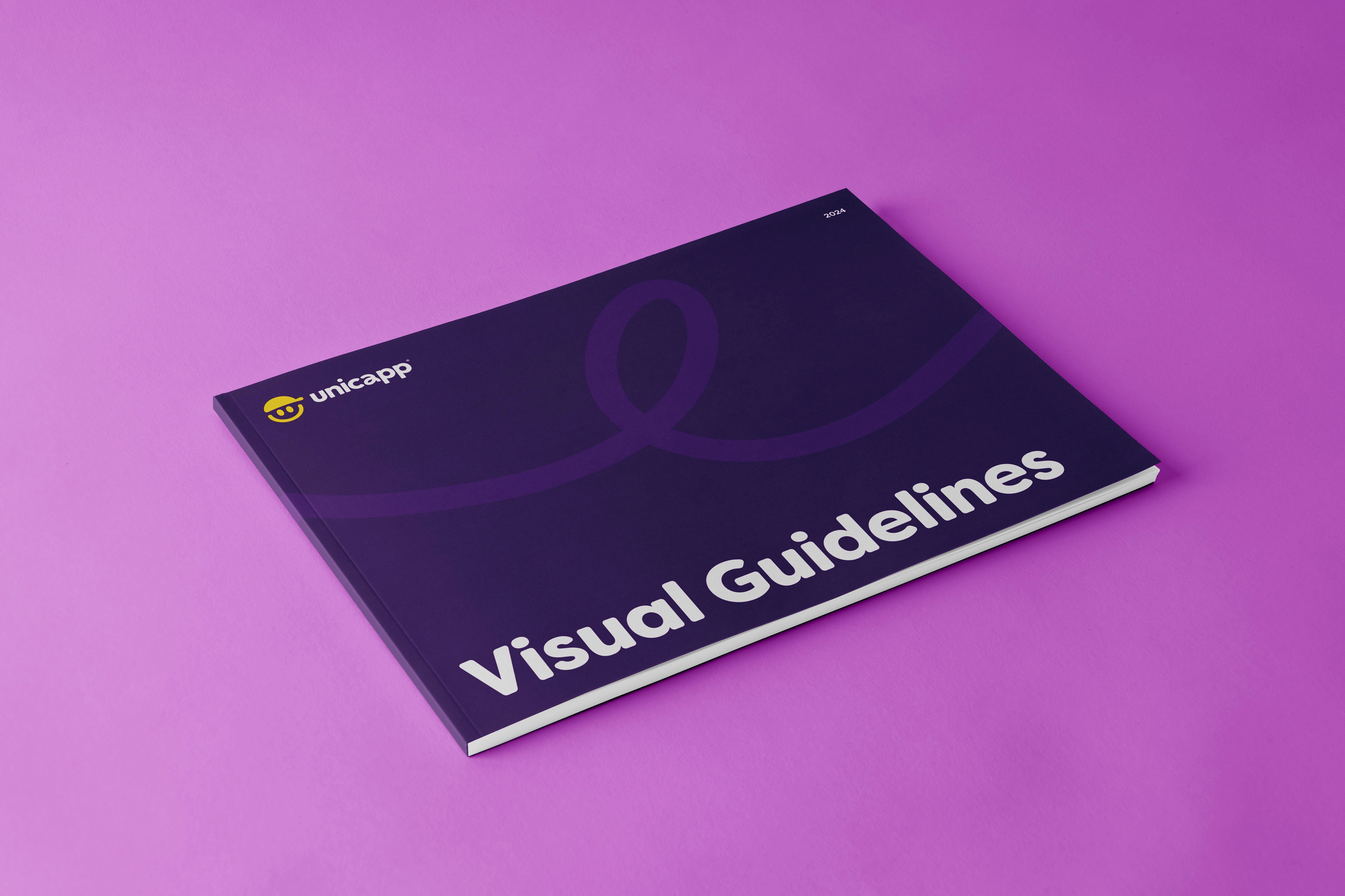
A detailed Visual Guidelines to make sure the brand applications are uniform.
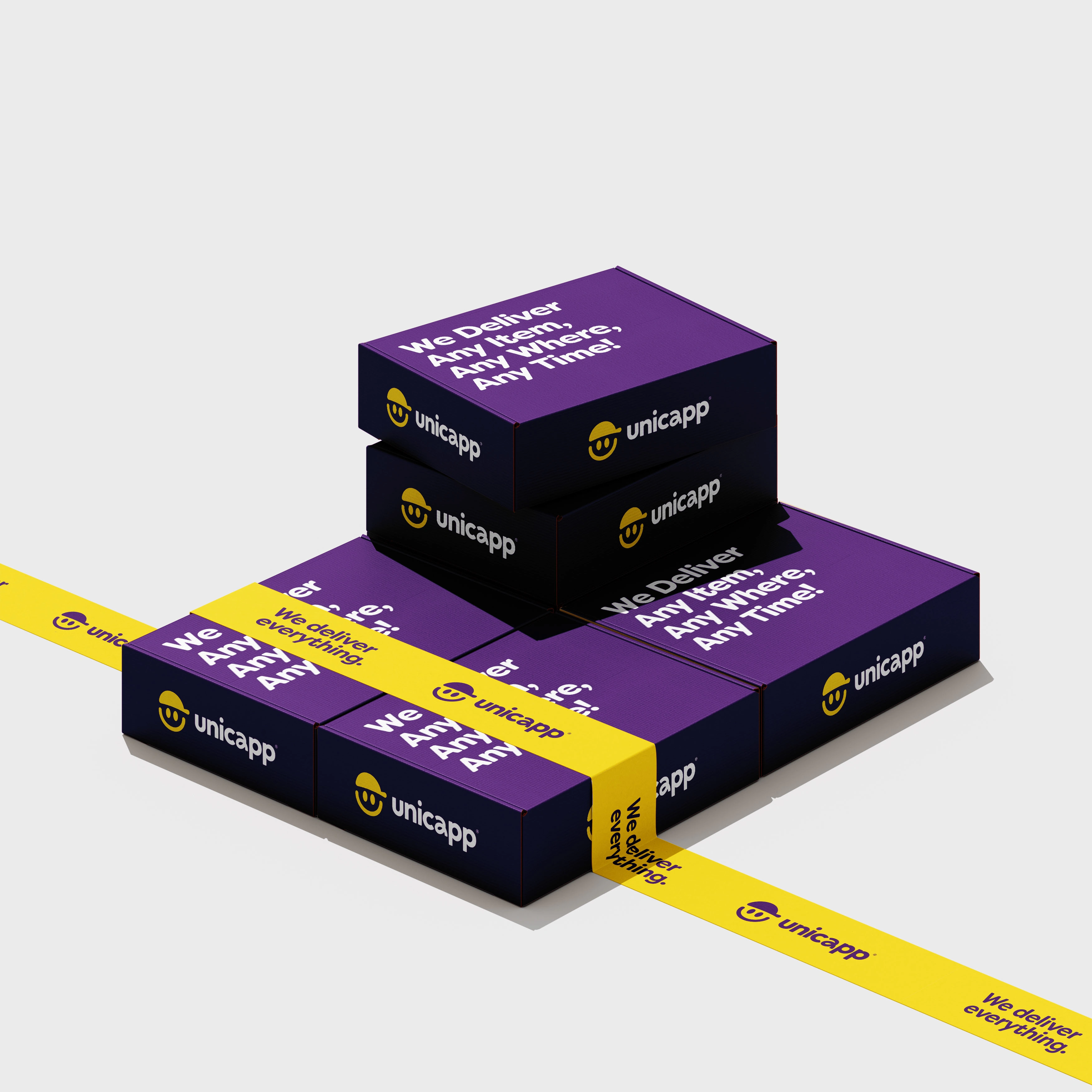
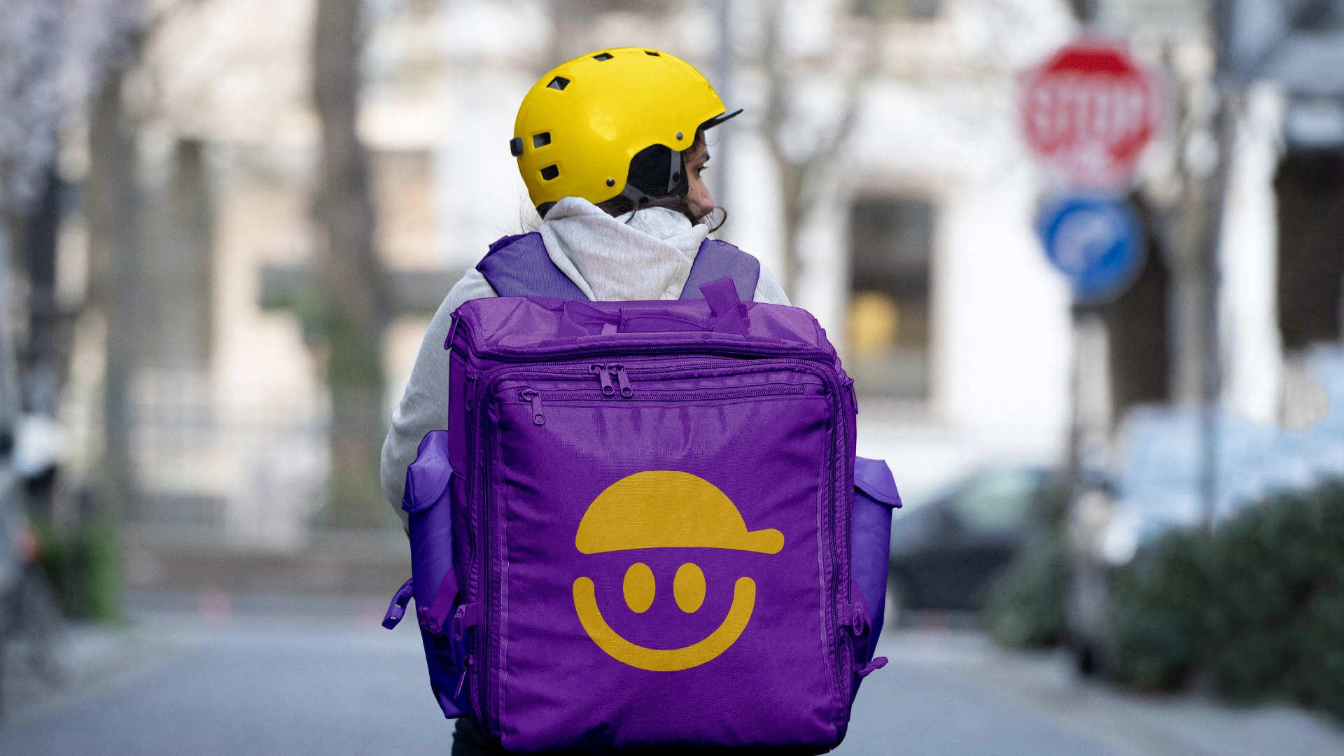
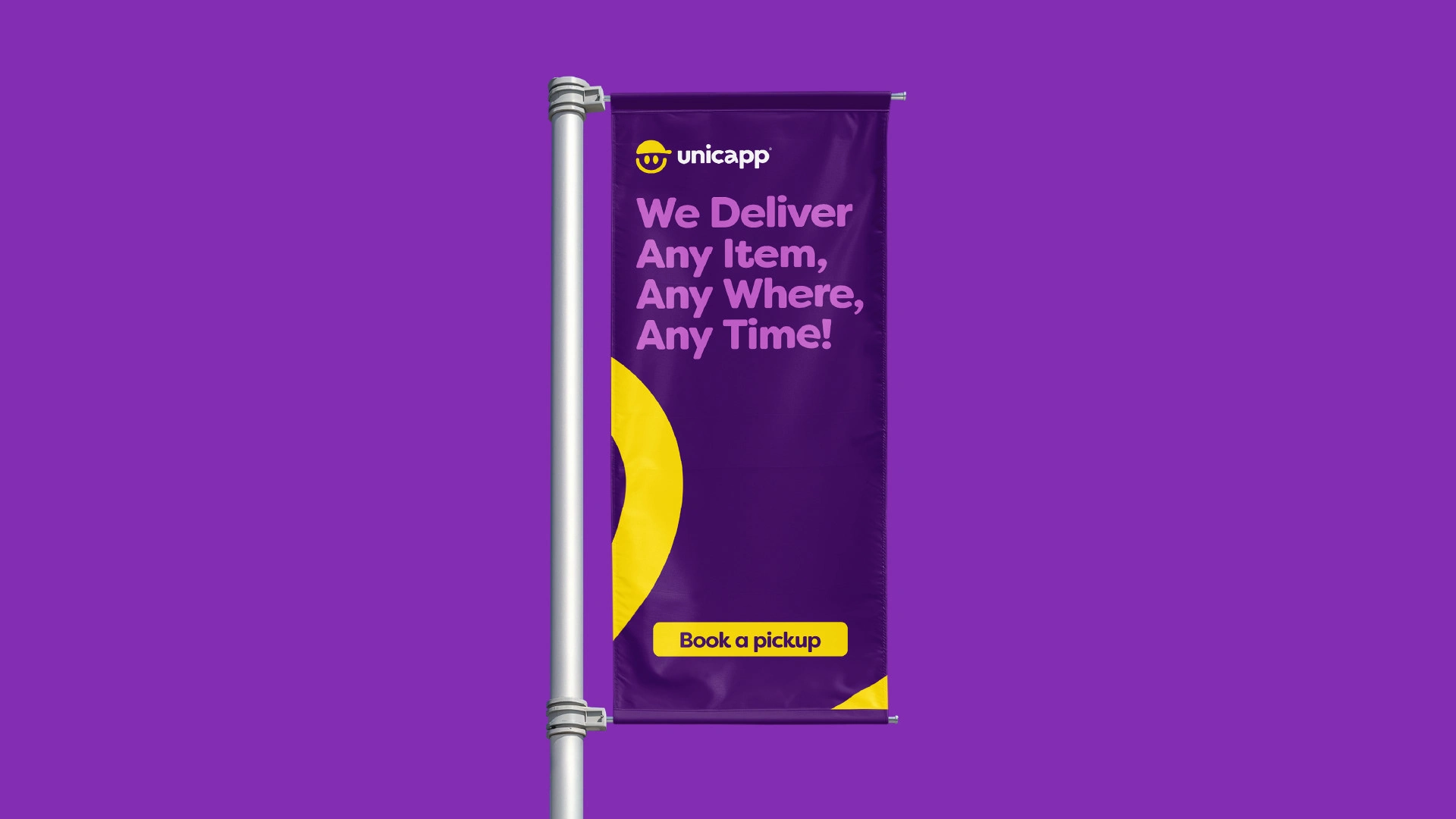

The new logo was designed to be adaptable and iconic, resolving the accessibility issues of the previous version.
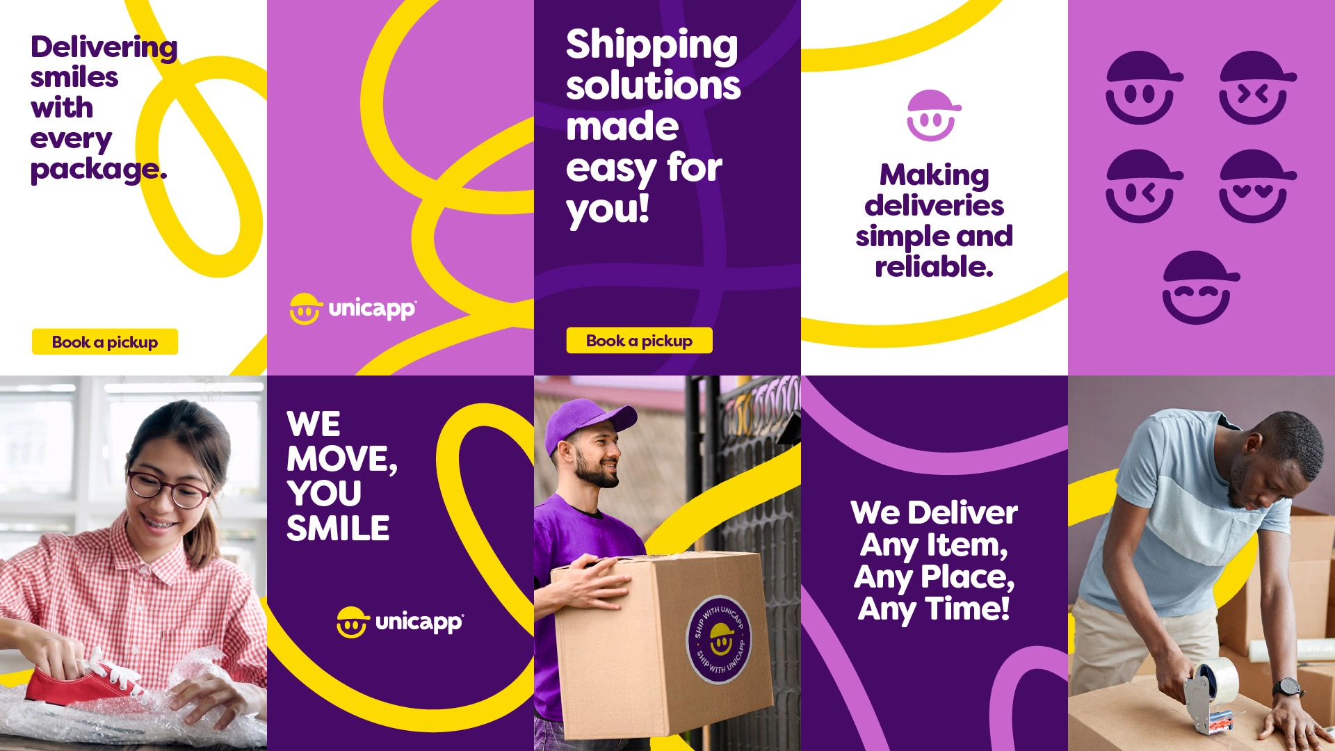
The color palette of purple and pop-yellow made Unicapp stand out in the crowded delivery market, while the playful smiley faces added a touch of friendliness and approachability.

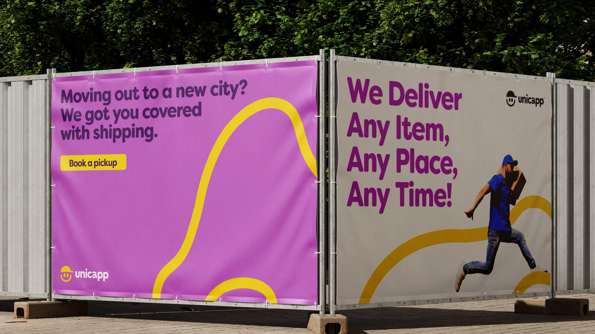
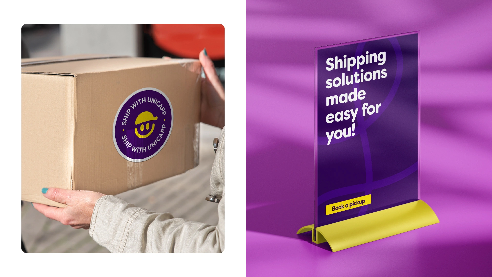



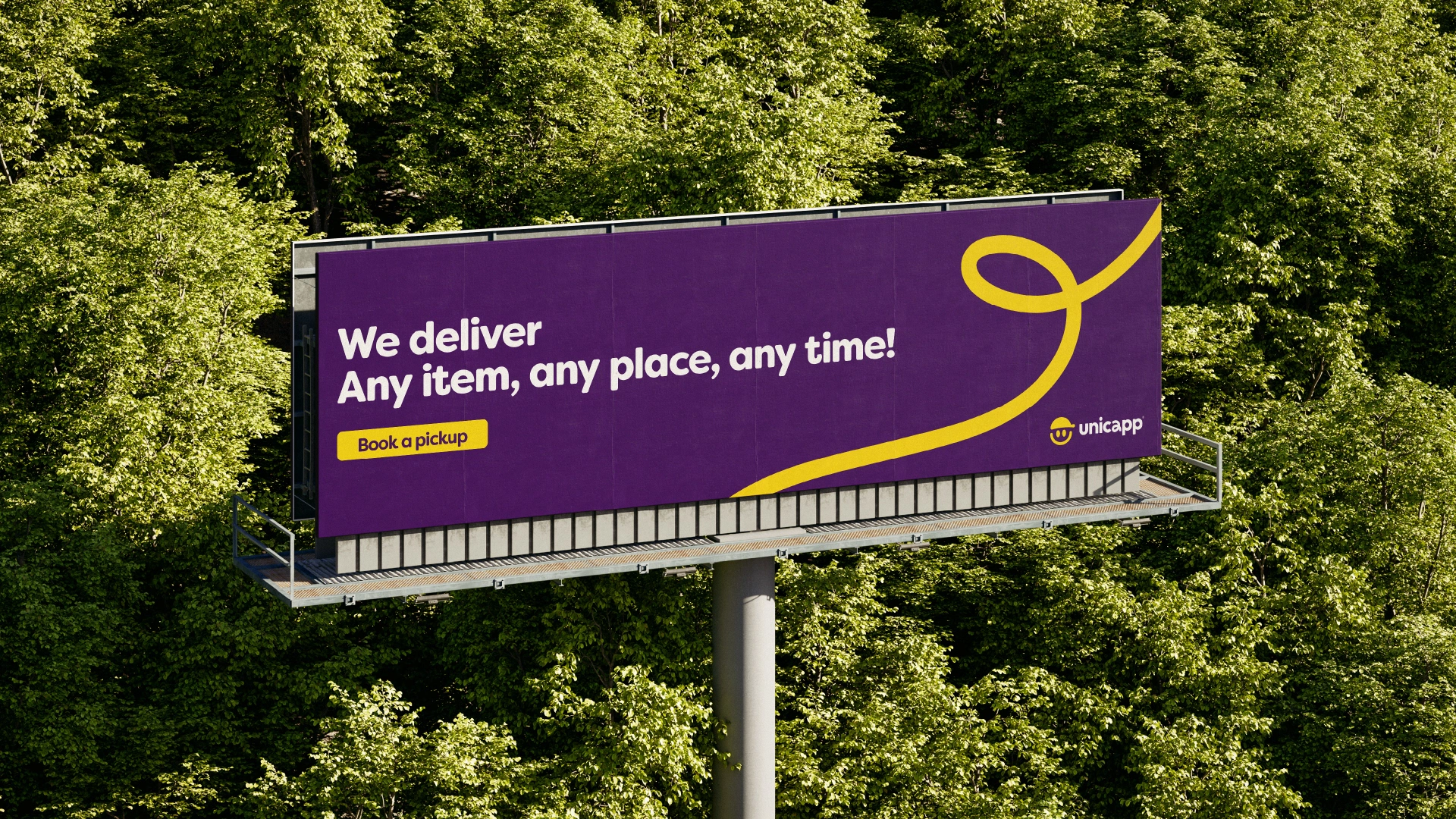
The new visual identity effectively communicated the brand's playful yet trustworthy nature, solving the previous problems of monotony and lack of appeal.
The impact was immediate: customers felt more connected to the brand, recognizing its reliability and fun spirit.

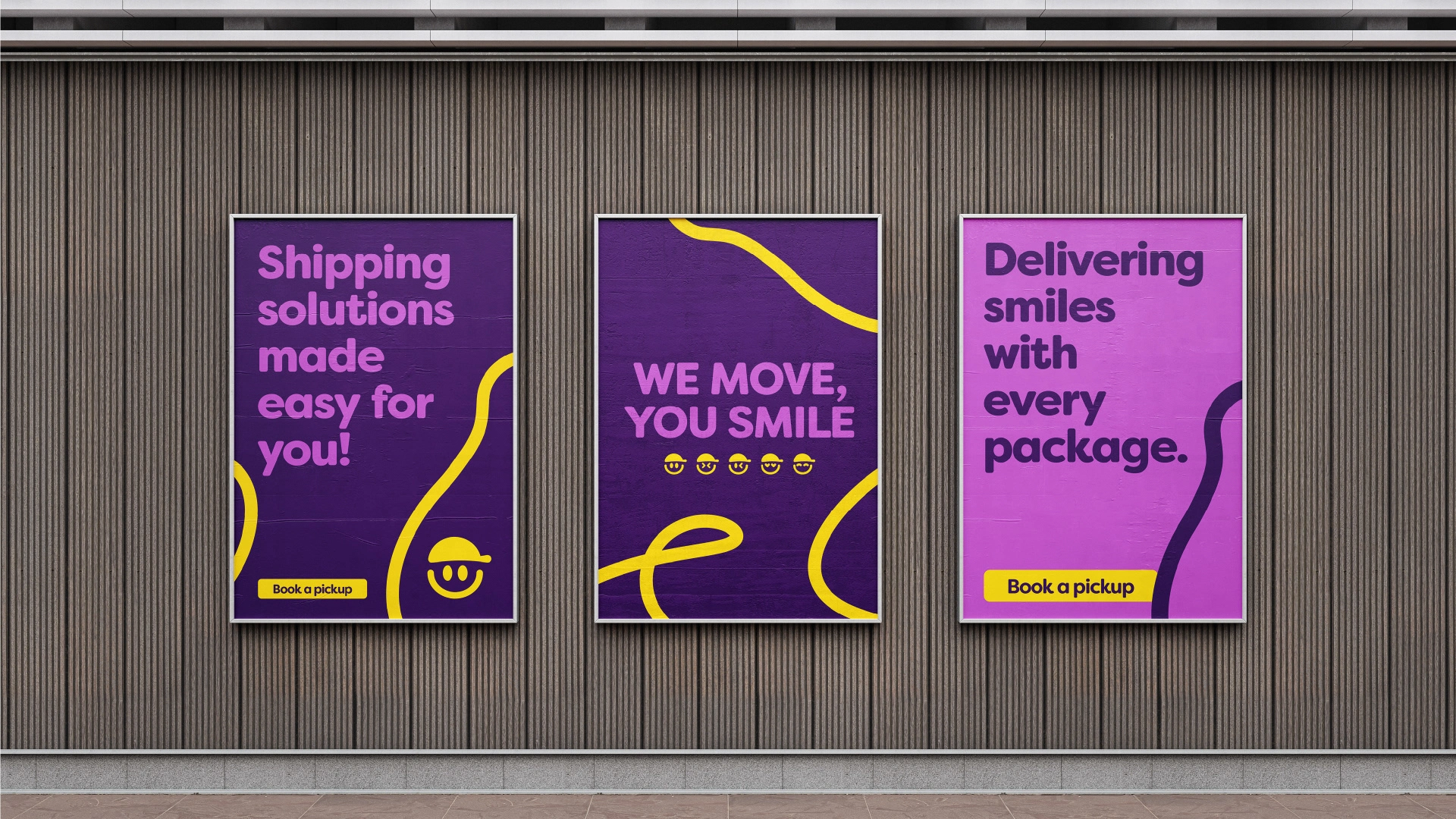

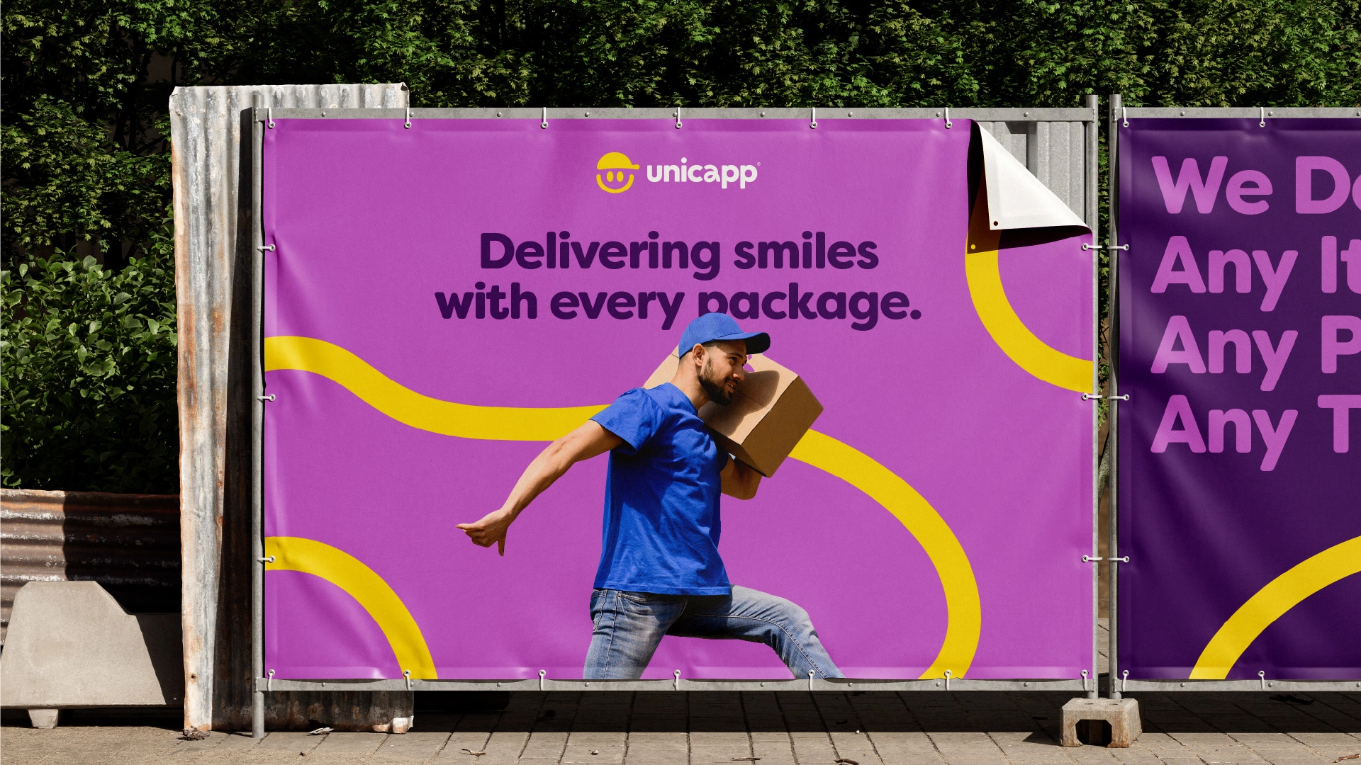
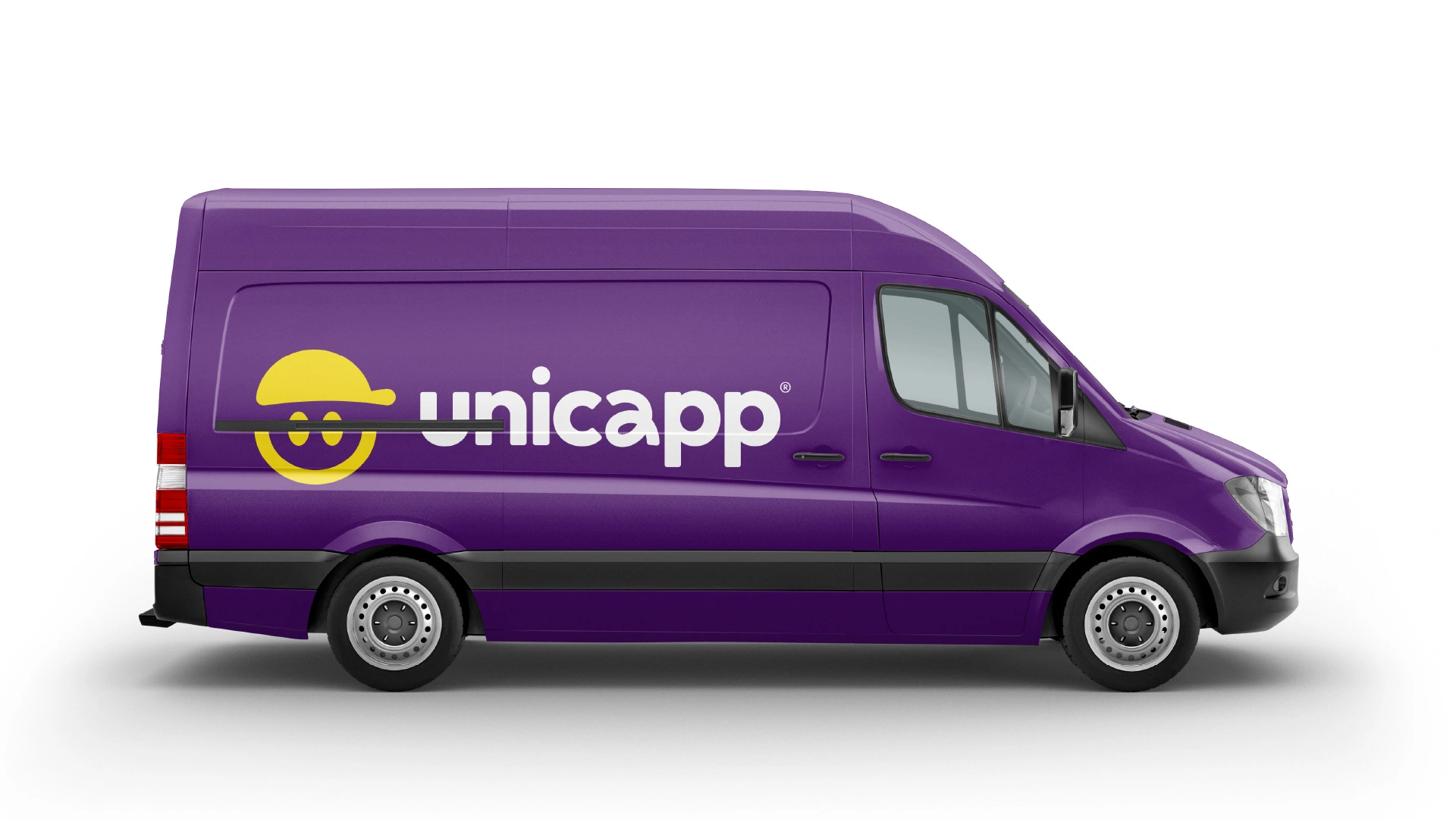
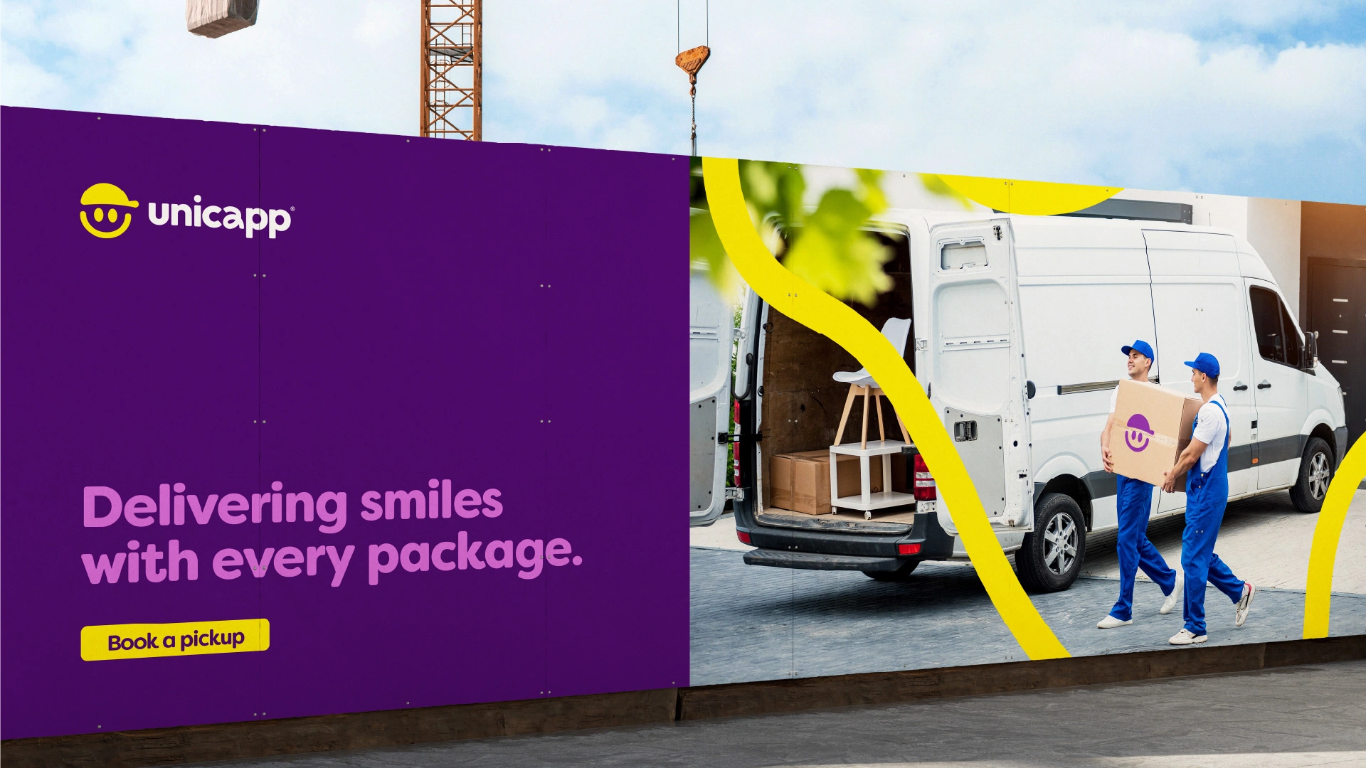


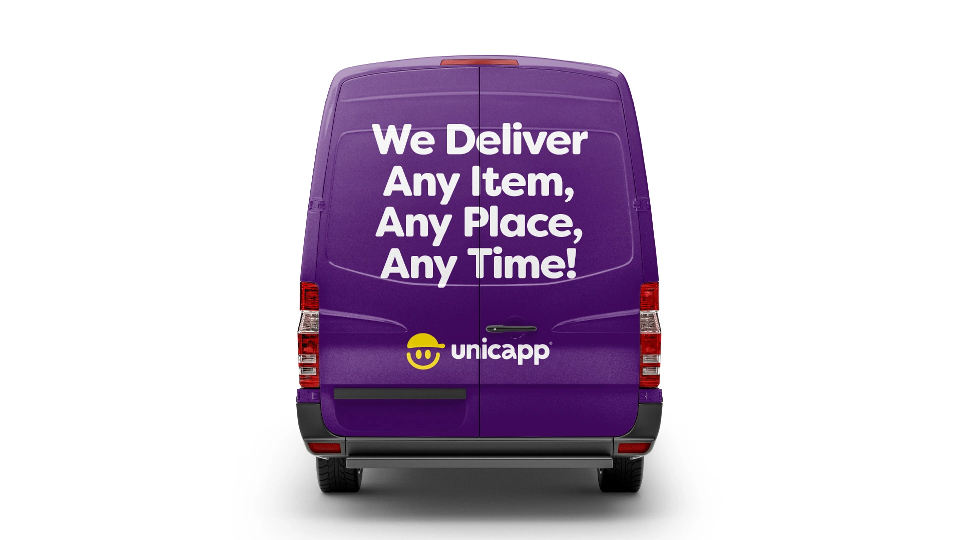
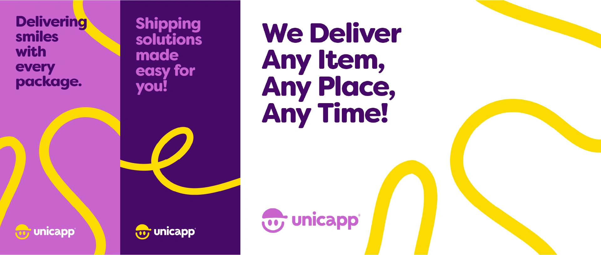

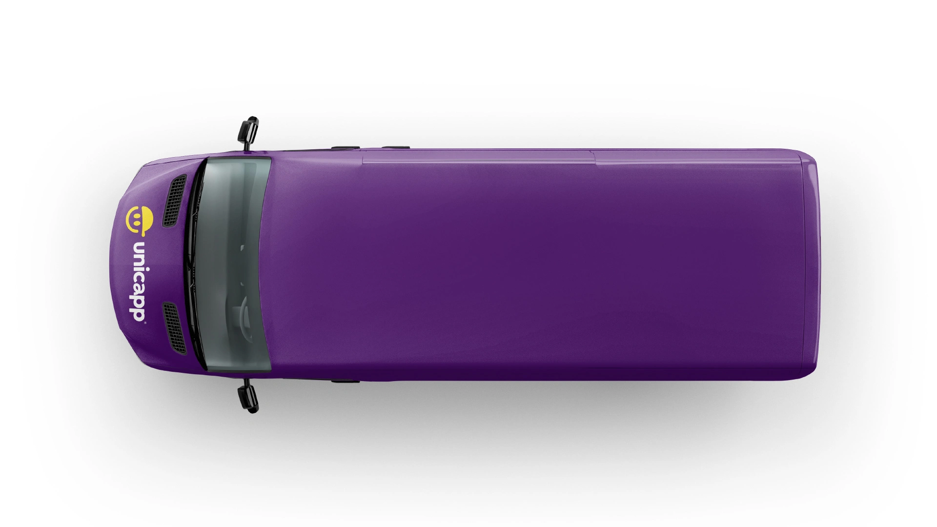

Ribbons - Most important visual asset of the identity.

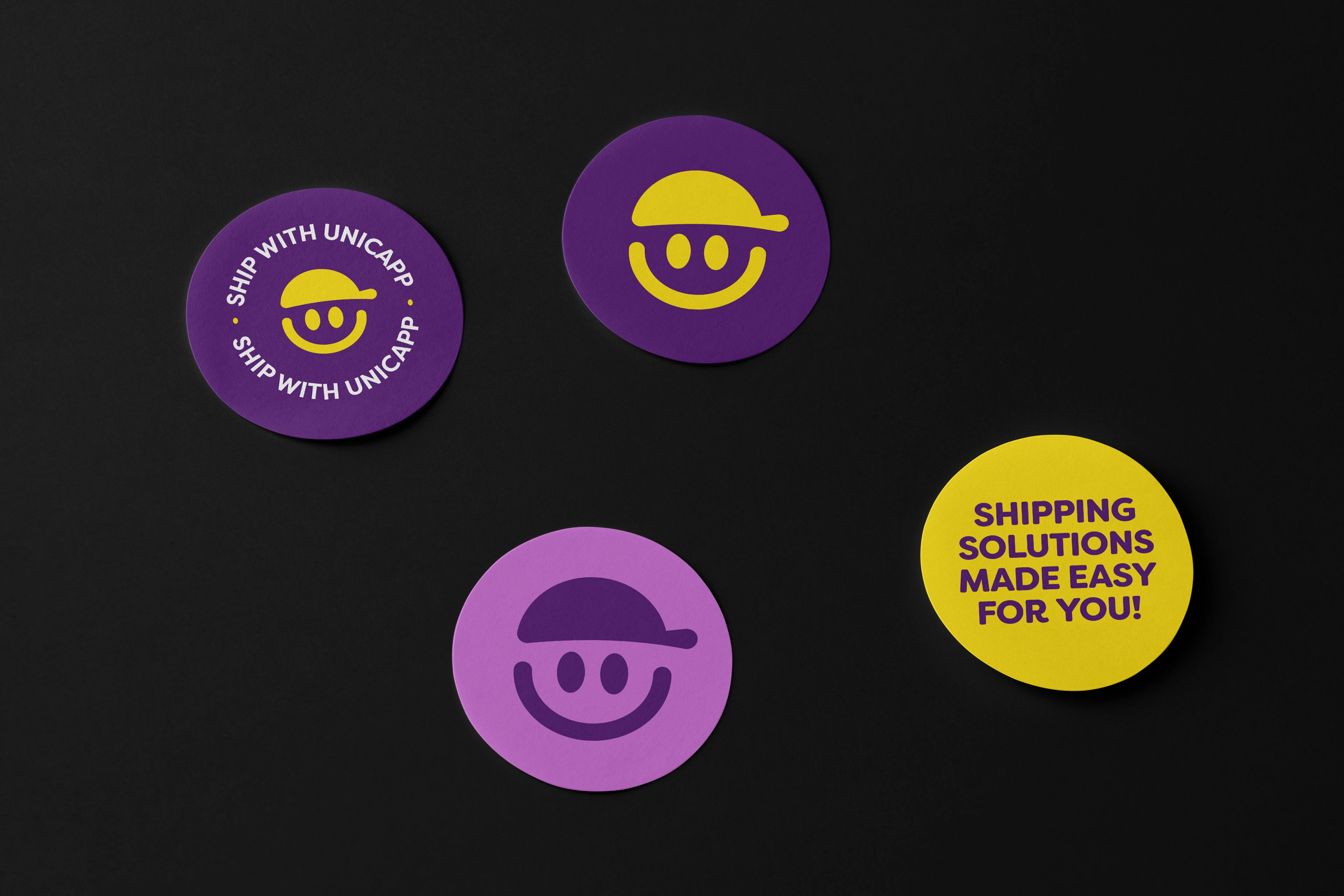
Stickers

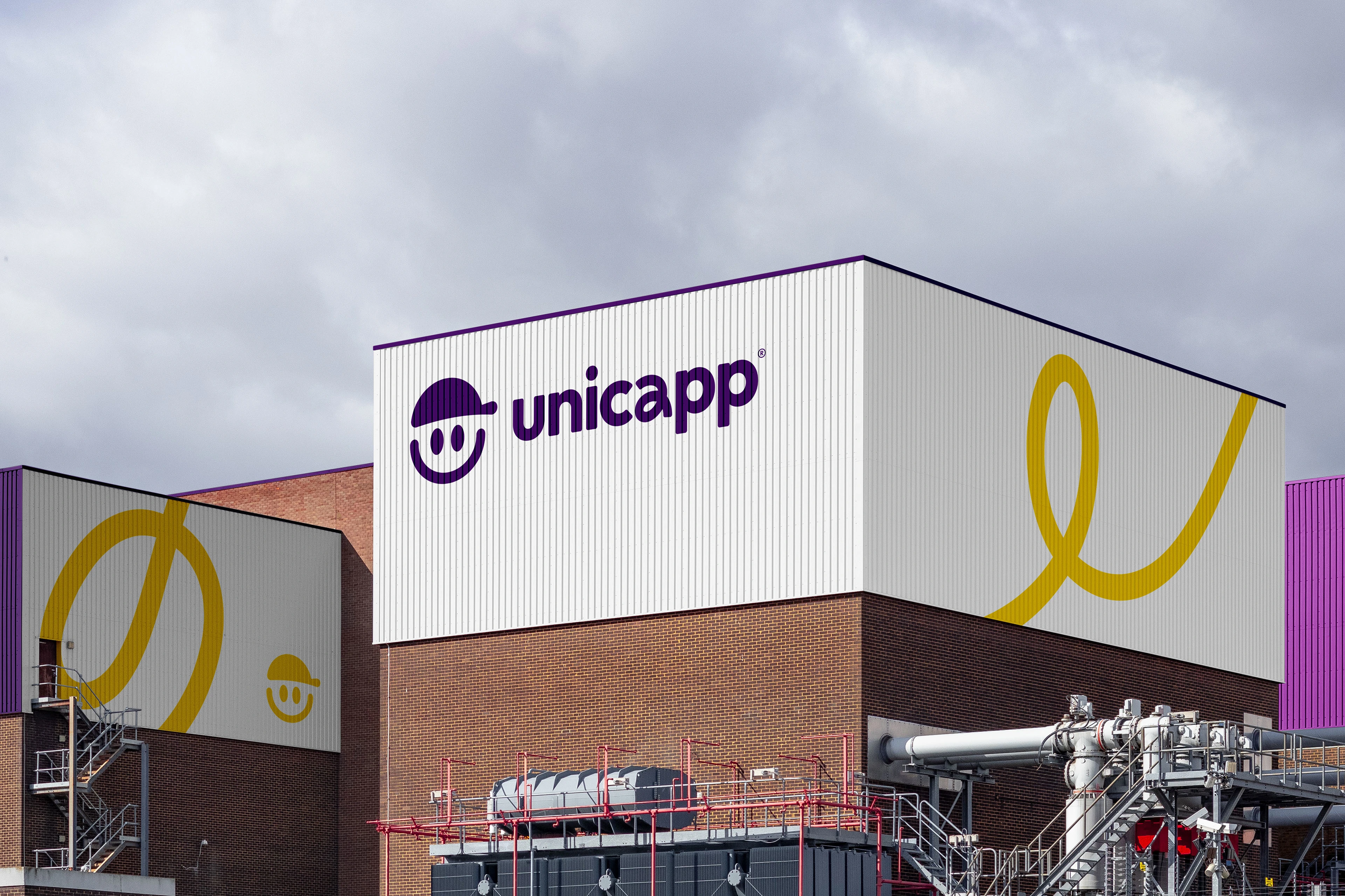
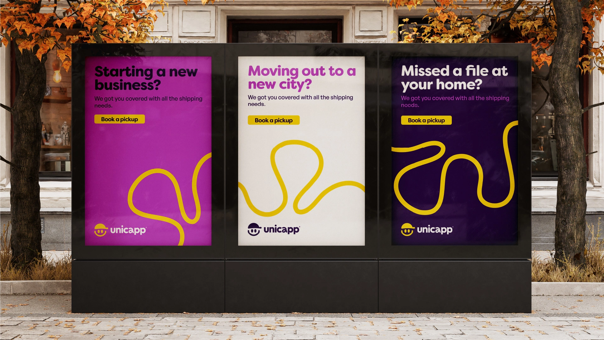
Brand in Action
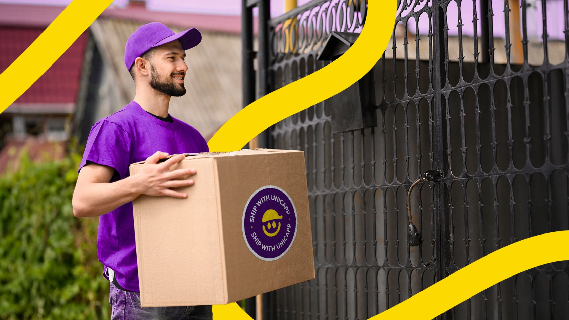

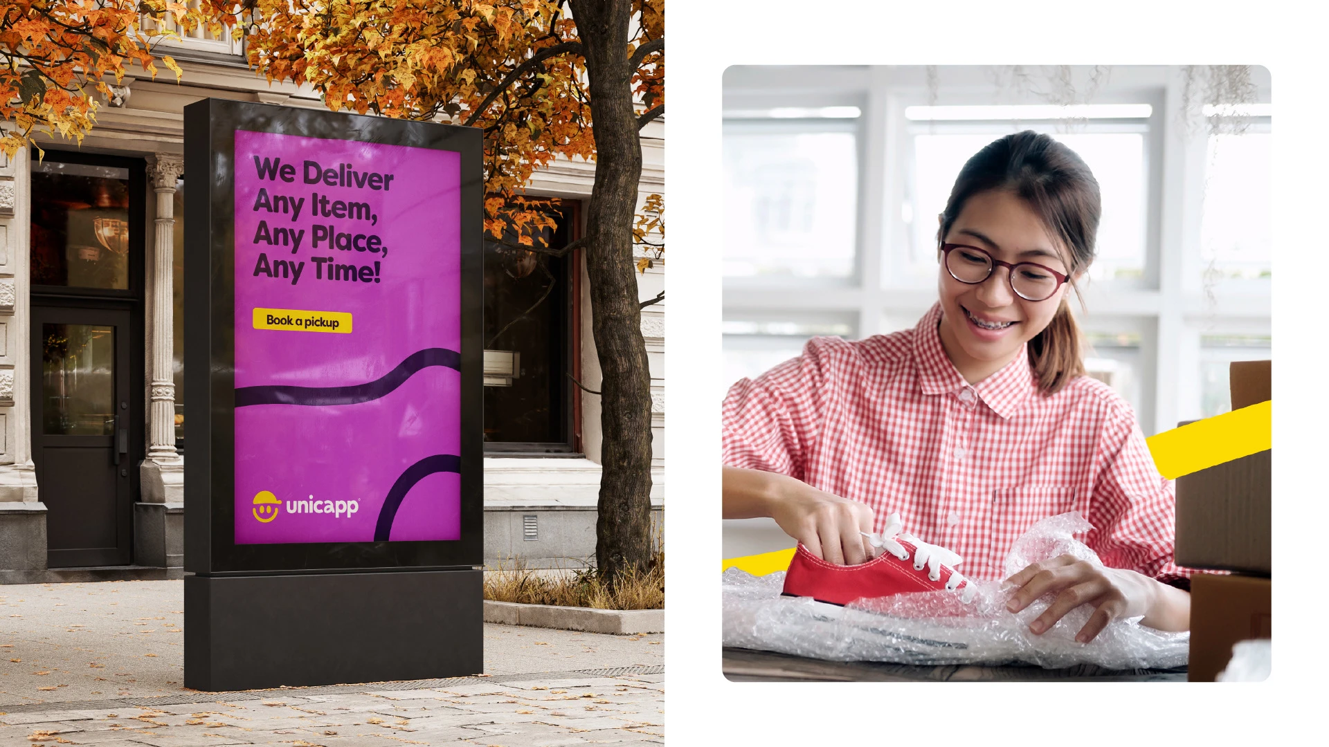
OOH Campaigns

Thanks for checking this out! 🫶
Like this project
Posted Aug 8, 2024
I refreshed Unicapp's visual identity, creating a new logo, color palette, and visual elements that conveyed trustworthiness and playfulness.


