Pickup - Energy Drink - Identity and Packaging Design

Vaibhav Yadav


Logo & Brand Identity Design
Crafting a brand identity for "Pickup," a premium energy drink brand that blends organic ingredients with scientific innovation.
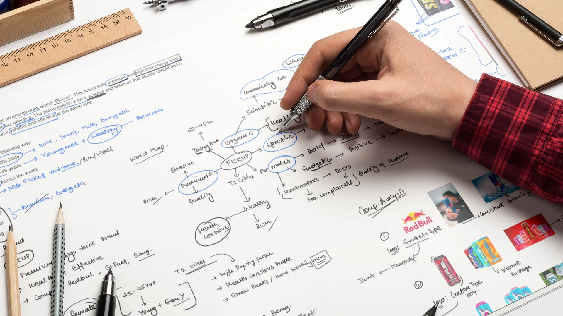
The challenge was to create a design that resonates with the brand's unique positioning - healthy yet effective, and appealing to a predominantly male audience in Tier 1 cities globally.
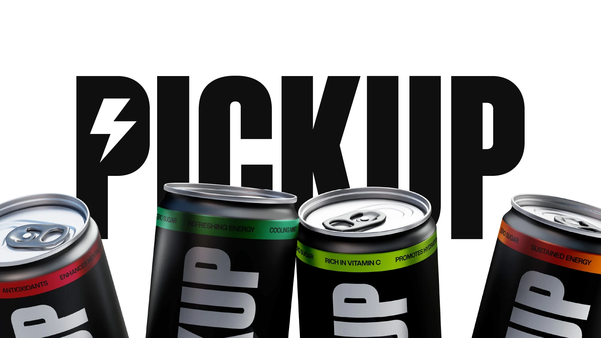
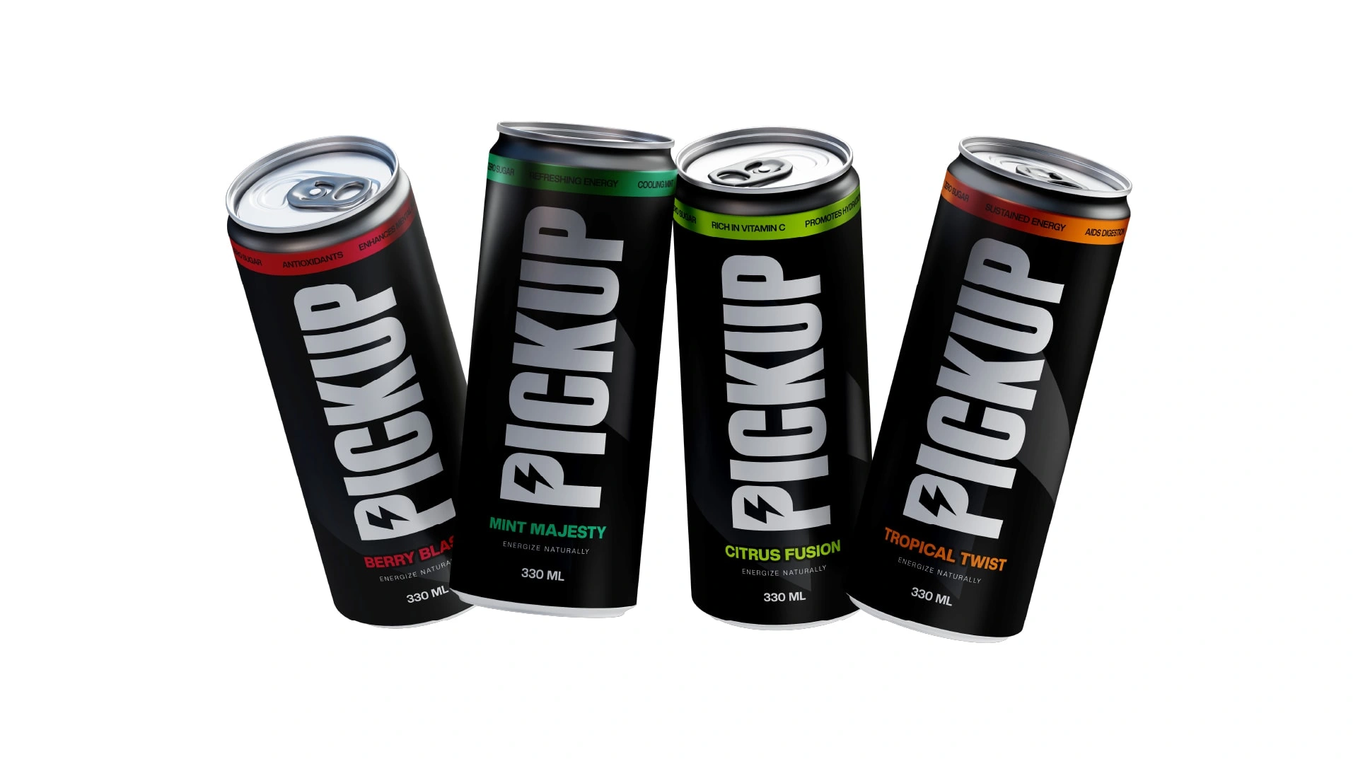
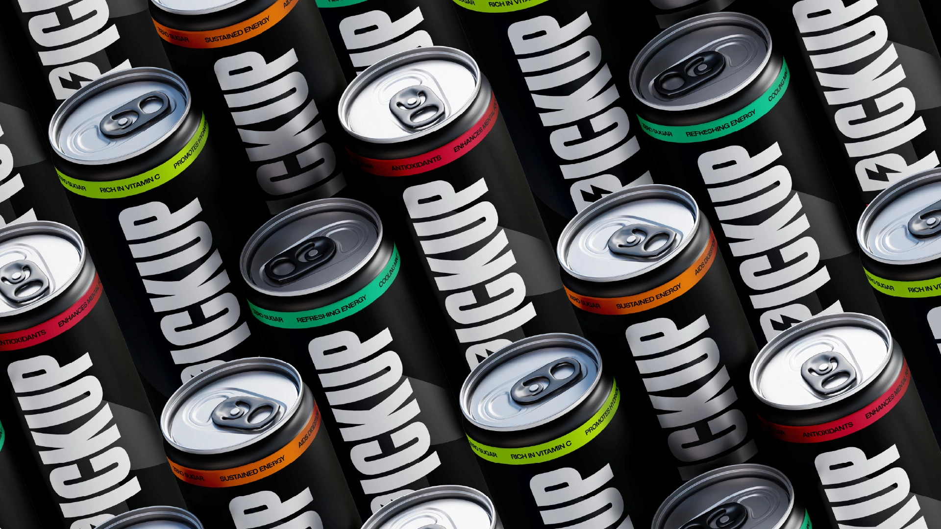
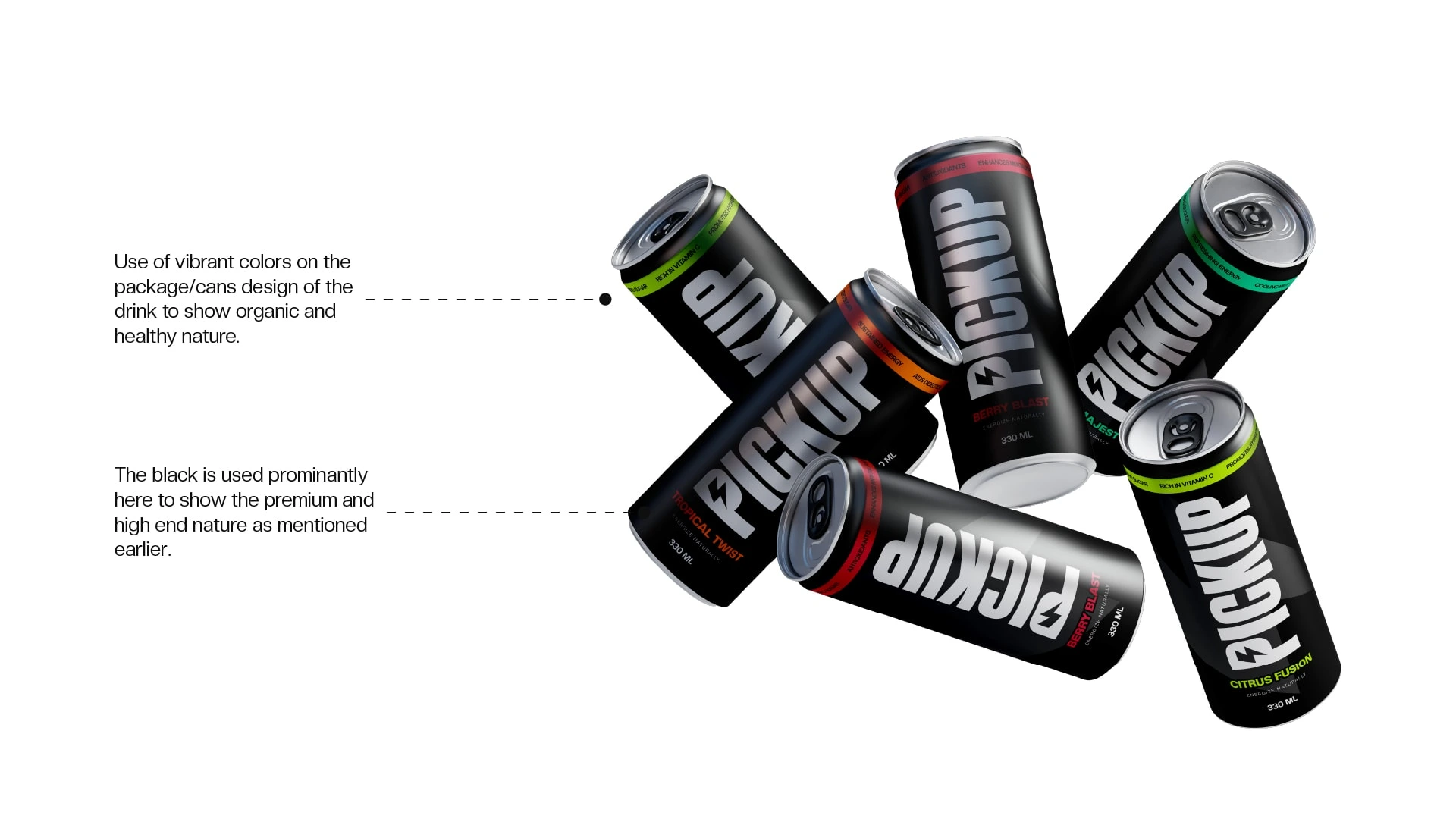
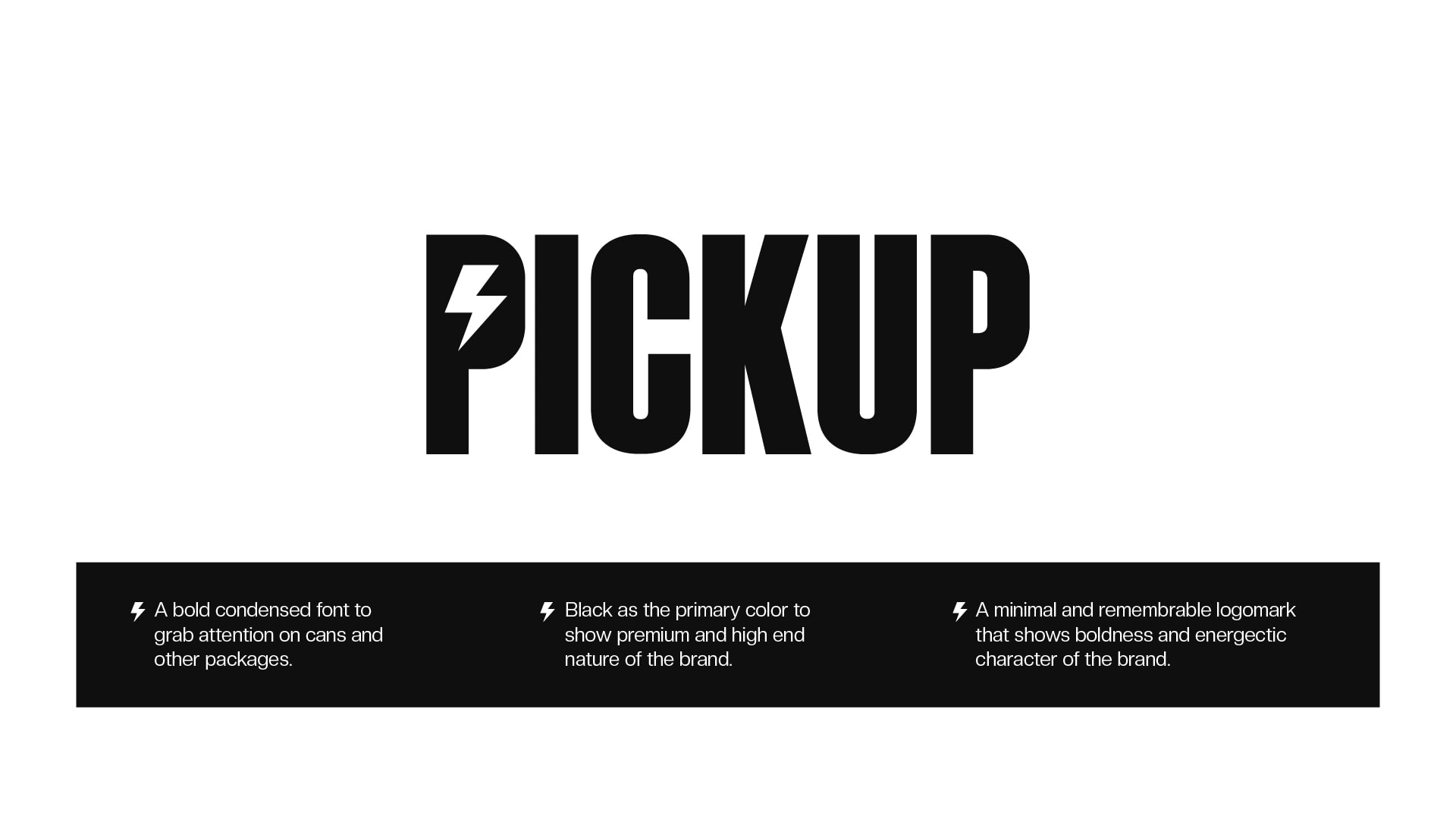
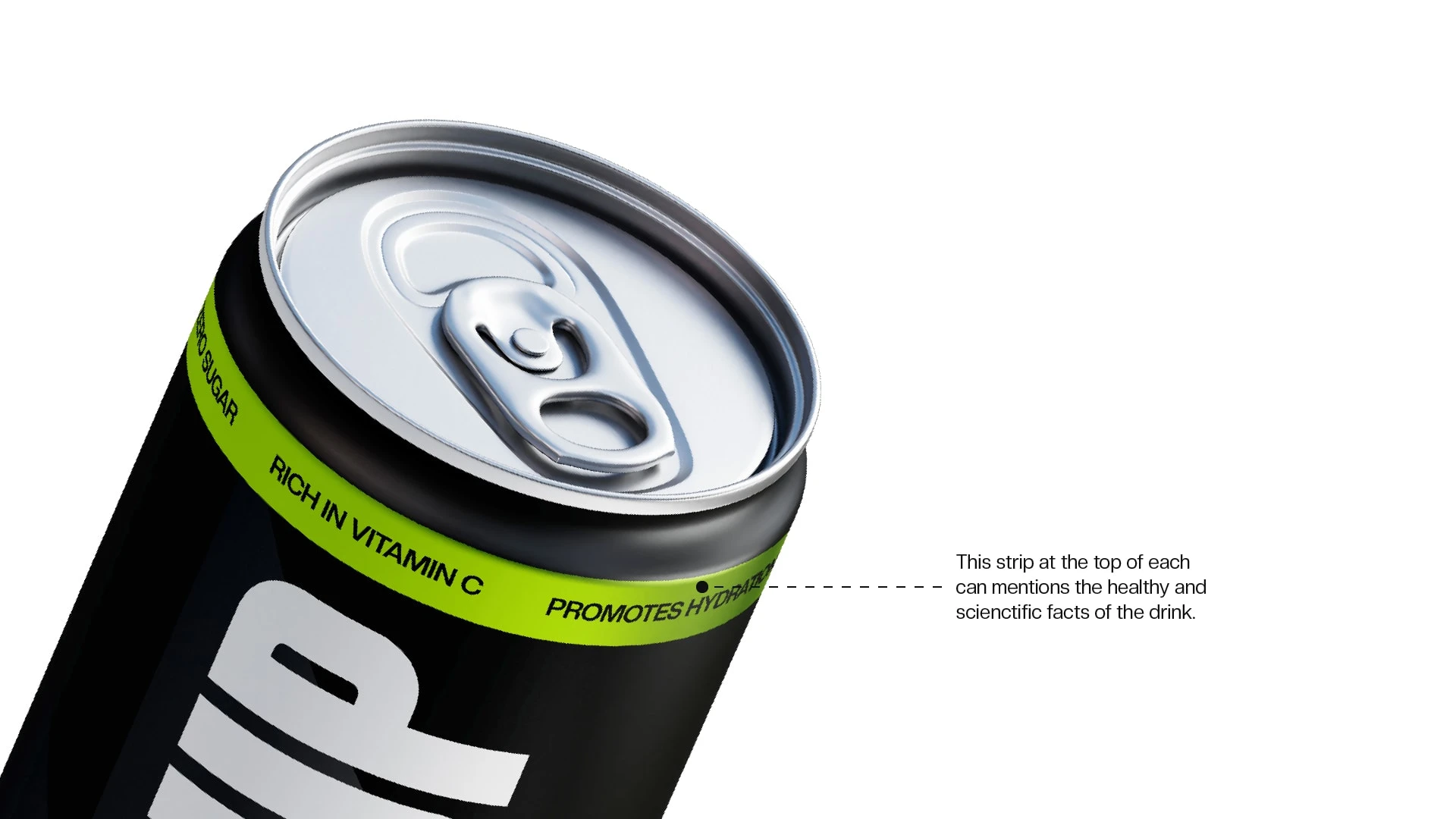
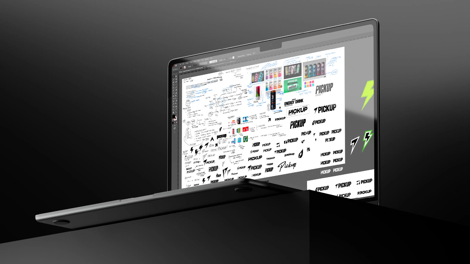
The project kicked off with a comprehensive analysis of the target audience and competitors like Redbull, G Fuel, and Bang. The logo, a fusion of bold and minimal fonts with a memorable electric shock symbol, symbolizes energy and caters to the male audience. Vibrant colors were chosen to represent the healthy and organic aspects of the brand, while the dominance of black and white maintained the premium feel.

Colour Applications
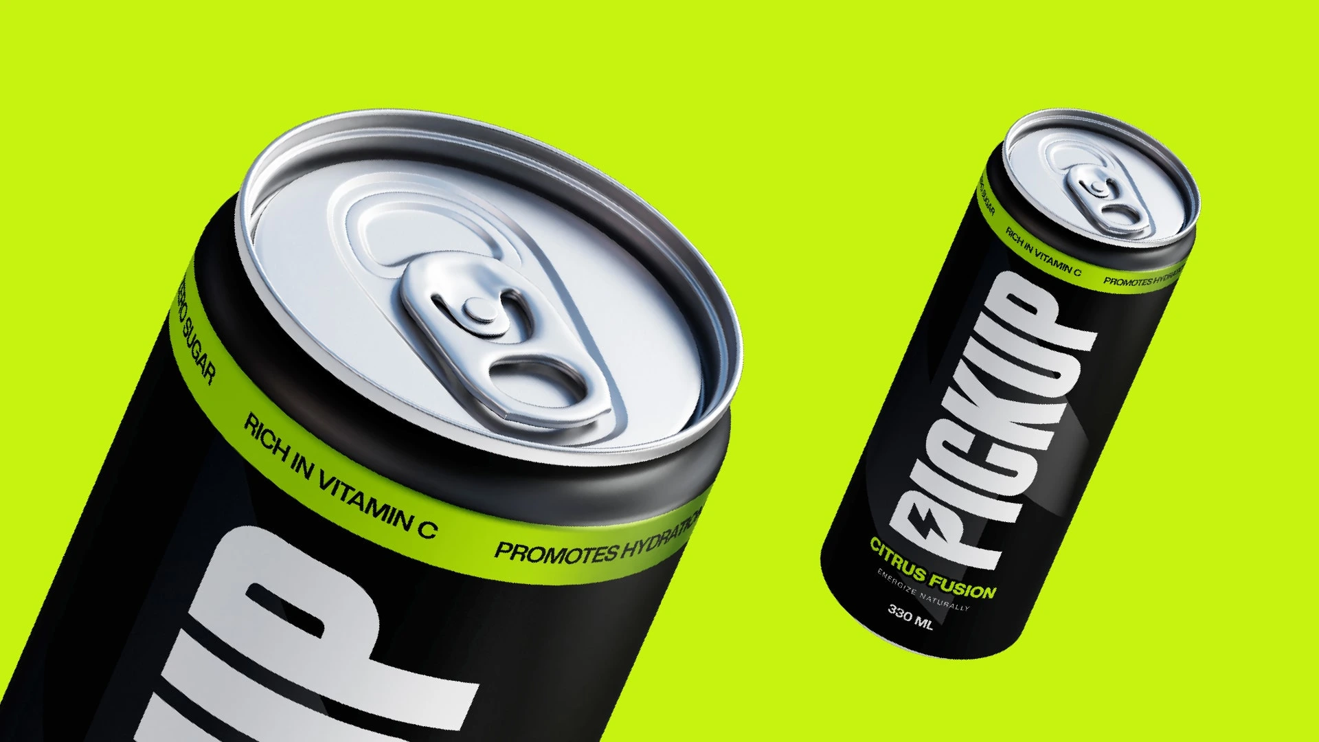
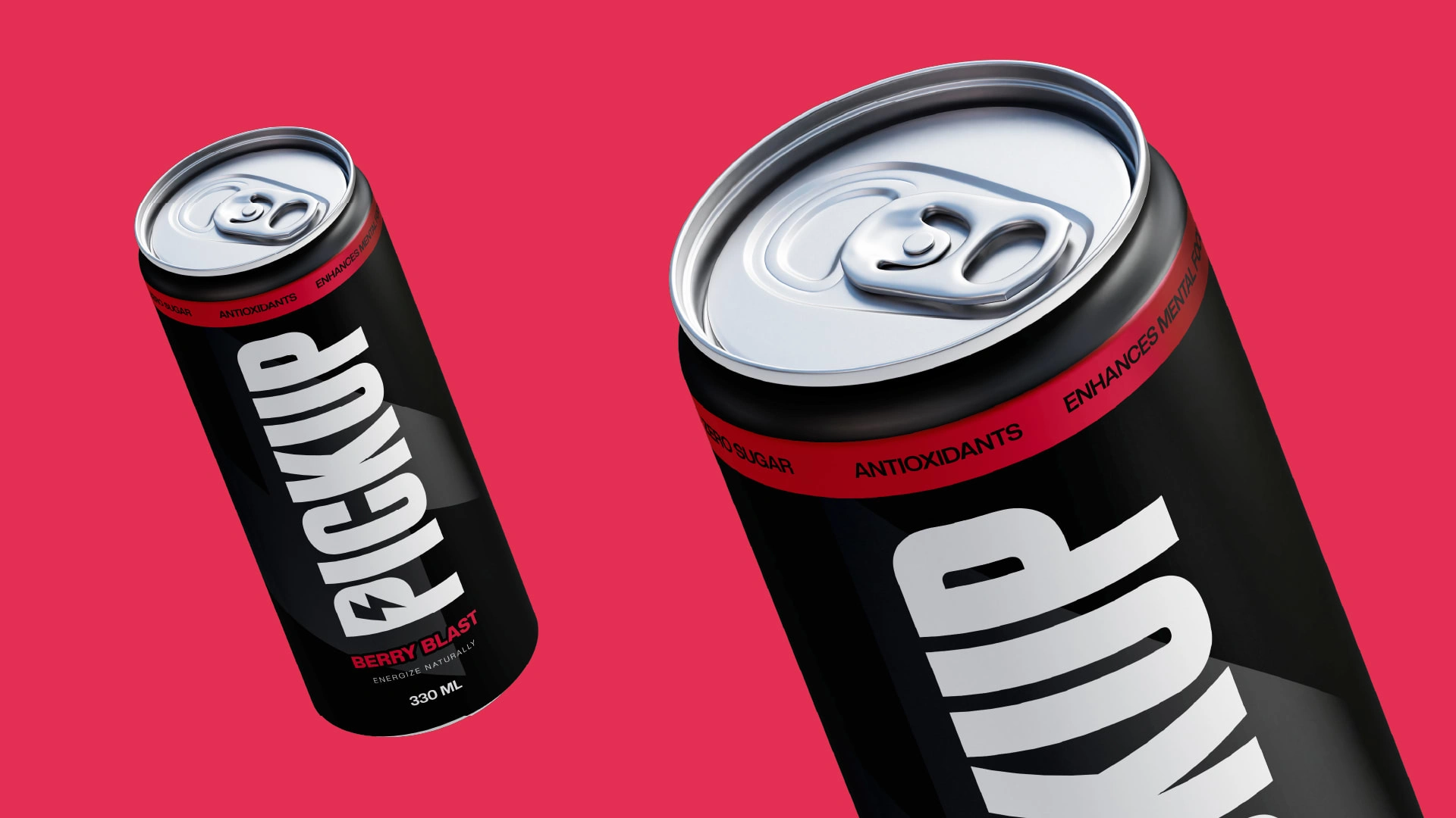
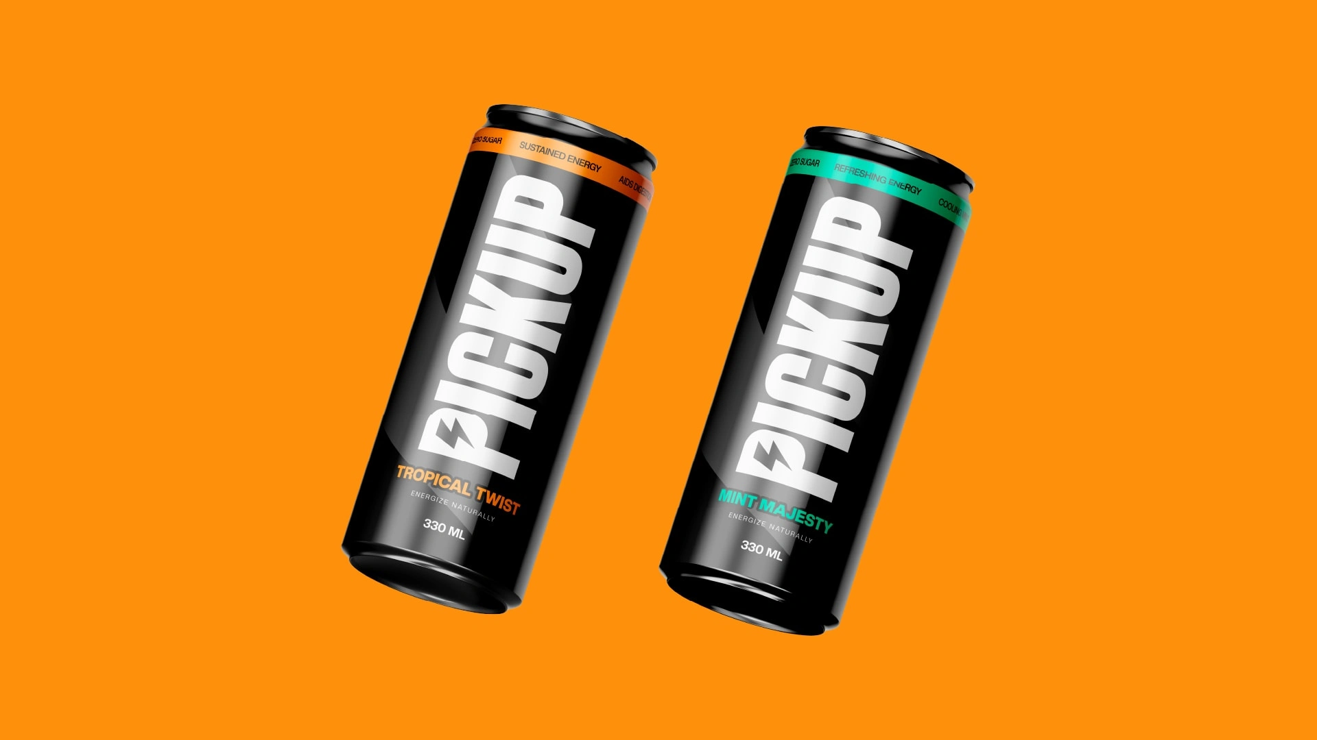
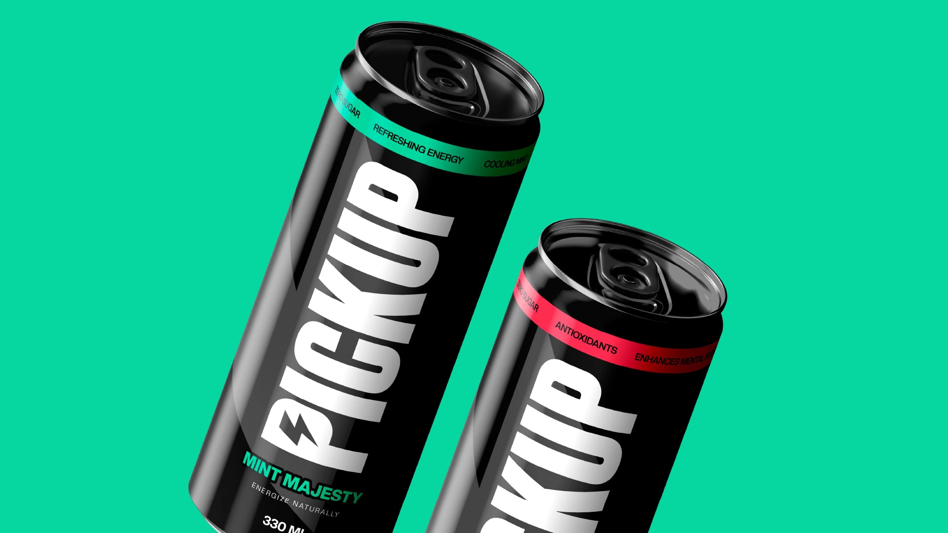
The balance between vibrancy and premium aesthetics was a nuanced challenge. The bold font was strategically used to increase shelf impact and attract a broader audience, instilling a sense of trust.
The final identity successfully captured the essence of Pickup, reflecting both its investment in science and its commitment to health. The client was thrilled with the result, and the design has set a new standard in the high-end energy drink market.
Concepts and Design Decisions
Check a detailed case study here:
Like this project
Posted Sep 6, 2023
Crafting a brand identity for "Pickup," a premium energy drink brand that blends organic ingredients with scientific innovation.