UI/UX Mobile App Redesign with Figma ⚡
Gloria Norvor
Overview 👀
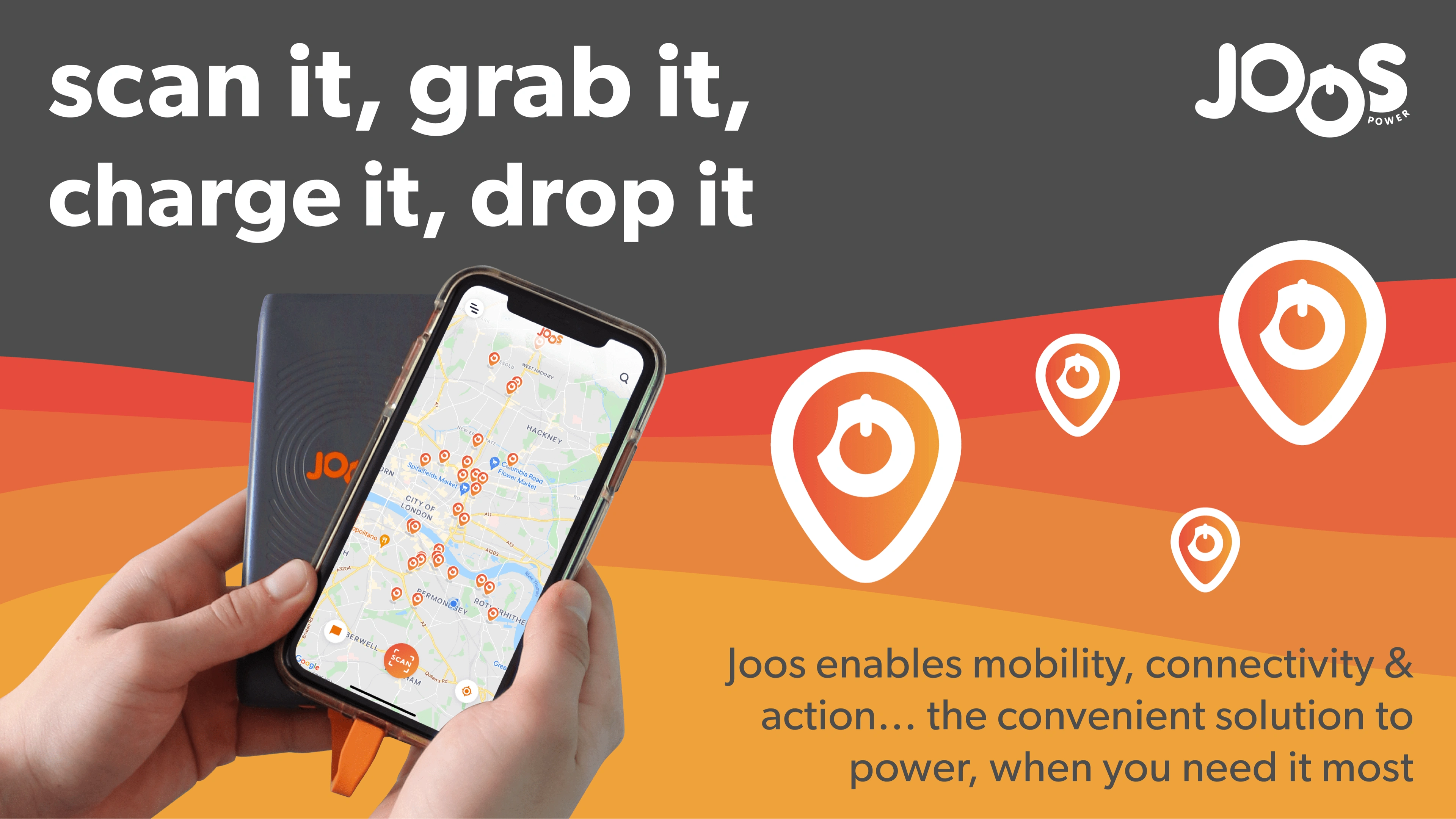
Client: Joos Power
Project Duration: 3 months
Role: UX/UI Designer
Tools: Figma, Google Suite and WhatsApp
Check out the live app here ⤵️
🔥App store: https://apps.apple.com/gb/app/joos/id1523258693
Introduction
In a fast-paced world where our smartphones are our lifelines, running out of battery can be a major inconvenience. Joos Power is your go-to solution for keeping your phone charged while you’re on the move. Our app simplifies the process, ensuring you never face the dreaded dead battery scenario again.
About Joos Power
What is Joos Power?
How Does It Work?
Why Joos Power?
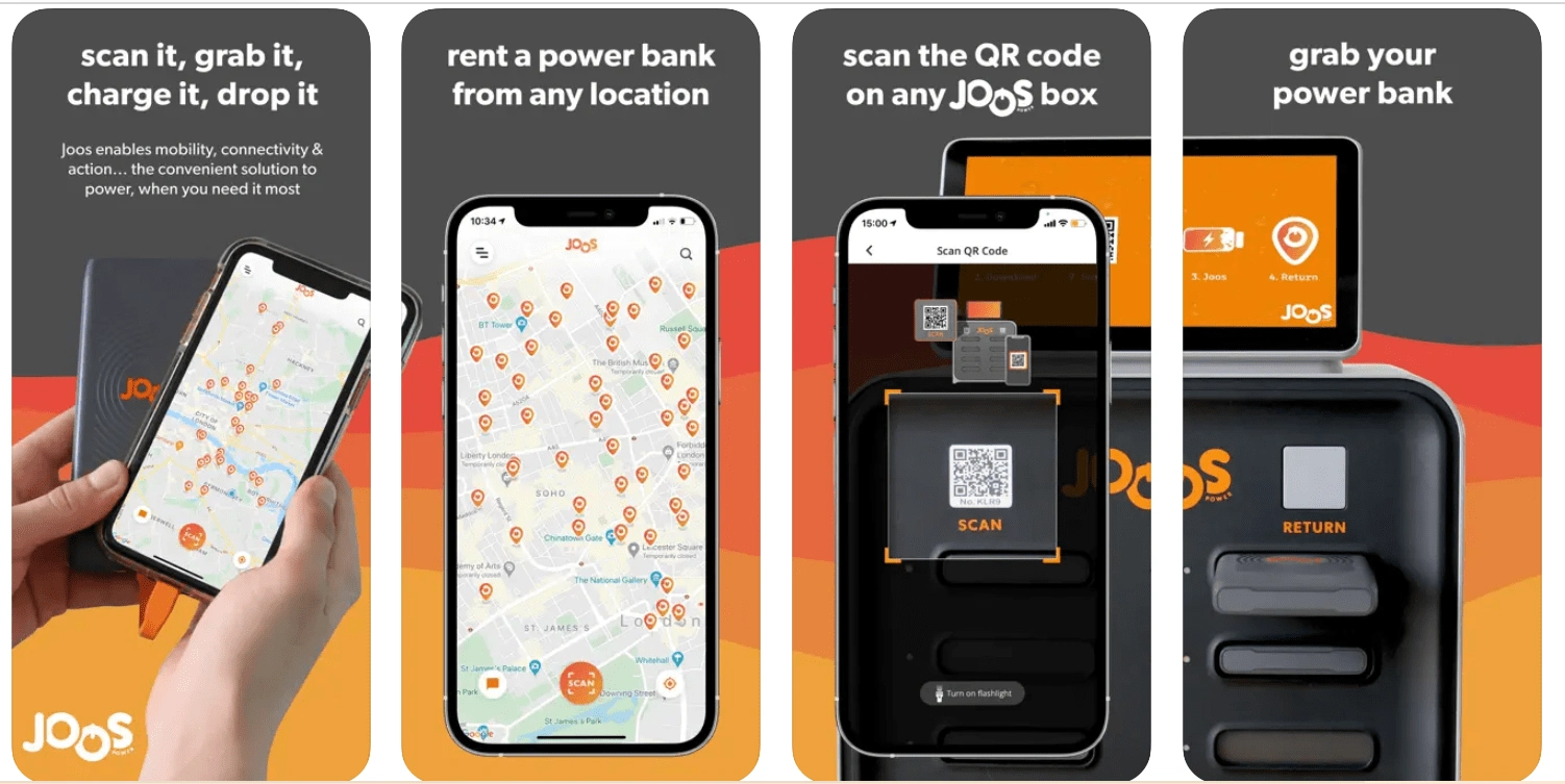
Joos Power Charging Experience
The Challenge
Joos Power faced challenges related to user comprehension of the pricing page and an inefficient user journey. As a UX/UI designer, my mission was clear: redesign the app to address these pain points and create a delightful charging experience for our users.
Process: Redesigning Joos Power App
1. Research Insights
Before diving into design, I conducted thorough research to understand user pain points and gather insights:
User Interviews: I read the complaints of existing Joos Power users to identify their challenges and expectations.
Competitive Analysis: Studied other charging apps to learn from best practices and identify areas for improvement.
Market Trends: Explored trends in mobile charging solutions and user preferences.
2. Concept Sketches and Ideation
With research insights in mind, I began ideating solutions:
Brainstorming: Collaborated with the team to generate ideas for improving the user journey.
Sketches and Wireframes: Created low-fidelity sketches to visualize different app flows and layouts.
Information Architecture: Structured the app’s content and navigation logically.
3. Iterative Design and Prototyping
The heart of the redesign process involved iterative design and prototyping:
Low-Fidelity Prototypes: Translated wireframes into interactive prototypes using tools like Figma or Sketch.
Usability Testing: Conducted usability tests with potential users to validate design choices.
Feedback Loop: Iterated based on user feedback, refining the app’s interface and interactions.
4. High-Fidelity Mockups and Visual Consistency
The final steps focused on creating polished designs:
Visual Design: Developed high-fidelity mockups, paying attention to typography, color schemes, and branding.
Interaction Patterns: Defined how users would navigate through the app—ensuring consistency across screens.
Accessibility: Ensured the app adhered to accessibility guidelines.
Key Takeaways
Solving Pain Points: The redesigned Joos Power App now simplifies pricing information and streamlines the user journey.
User-Centric Approach: Every design decision was made with the end user in mind.
Continuous Improvement: The iterative process allowed us to refine the app based on real-world feedback.
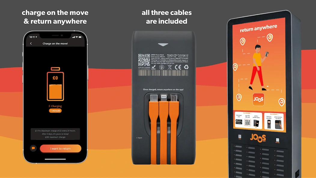
New Designs
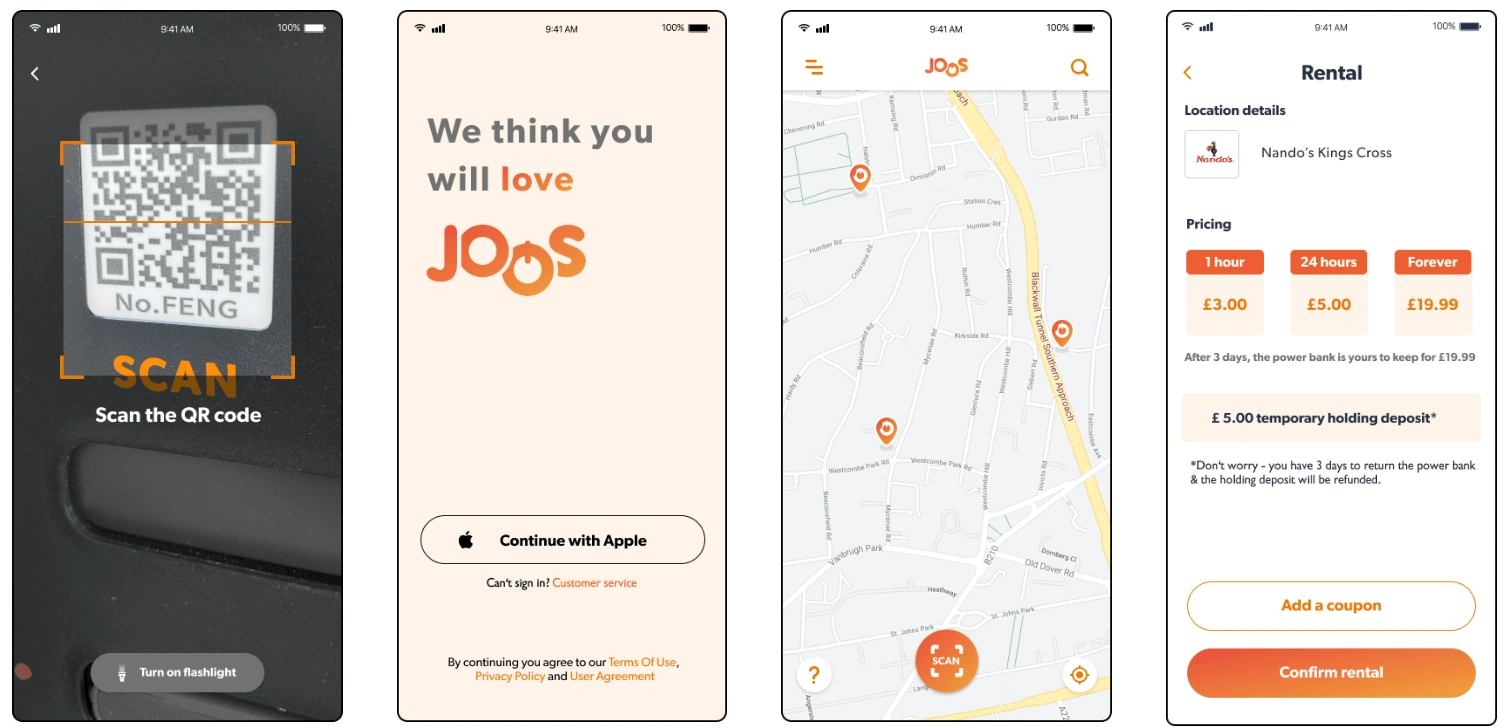
Improved User Journey and Pricing Page Design
Results and Impact
Metrics That Matter
Increased User Engagement:
Reduced Bounce Rate:
Lessons Learned
Iterate Continuously:
Balance Aesthetics and Functionality:
Stay User-Centric:
Thank you for taking the time to look at my work.😄
Like this project
Posted Mar 11, 2024
As a UX/UI designer, I embarked on redesigning the Joos Power App—a solution to the dreaded dead phone scenario. I simplified the pricing page and user journey.
Likes
0
Views
44