How we redesigned MoEngage IA
How we redesigned MoEngage IA

·
5 min read
·
Jul 28, 2020
How we redesigned the Moengage menu backed by data
MoEngage is a Mar Tech SaaS platform that let’s marketers engage users with their product by sending Push, Email, WhatsApp, and SMS notifications.
Role: I am the lead designer along with a UX research intern and one product designer who helped us on and off
User problem: Over time Moengage menu was dumped with a lot of options. It was hard to navigate for users and not able to find what they wanted quickly due to the lack of hierarchy.
Business problem: Effect on CSAT score and complaints. This also let to a few customers churning.
What is our process:
Understand current navigation and obvious problems
Make assumptions
Do competitor analysis
Look at quantitative metrics
Build a hypothesis
Test the assumptions with users
Analyze the data and prototype
Take internal stakeholder feedback and customers on design
Iterate and Implement the design
See the metrics and customer feedback and then decide what to do
Understand current flow
Created a mind map to see how the IA of the entire product works and noted down obvious visual problems we have. you can find it here
Assumptions
All the users create campaigns and that is what they want to see mostly
They use settings frequently
Create campaign is used from the side nav
people access all the settings in one place
Competitor analysis
We looked at various menu structures of competitors and how they have structured and made our assumptions about why they have structured in a certain way. You can find a detailed analysis here.
Look at current metrics
We looked at metrics and understood few of our assumptions were wrong. you can find the detailed analysis here
Hypothesis
Our users analyze data, create a segment and then create a campaign from all campaigns page looking at previous campaign and they already know what campaign to create.
Validating hypothesis using card sorting
We used an open card sort where we asked the user to sort and then write their own category names because we want to understand if the terms we are using are technical for them and then analyzed that data.
Few card sorting pics we did with customers
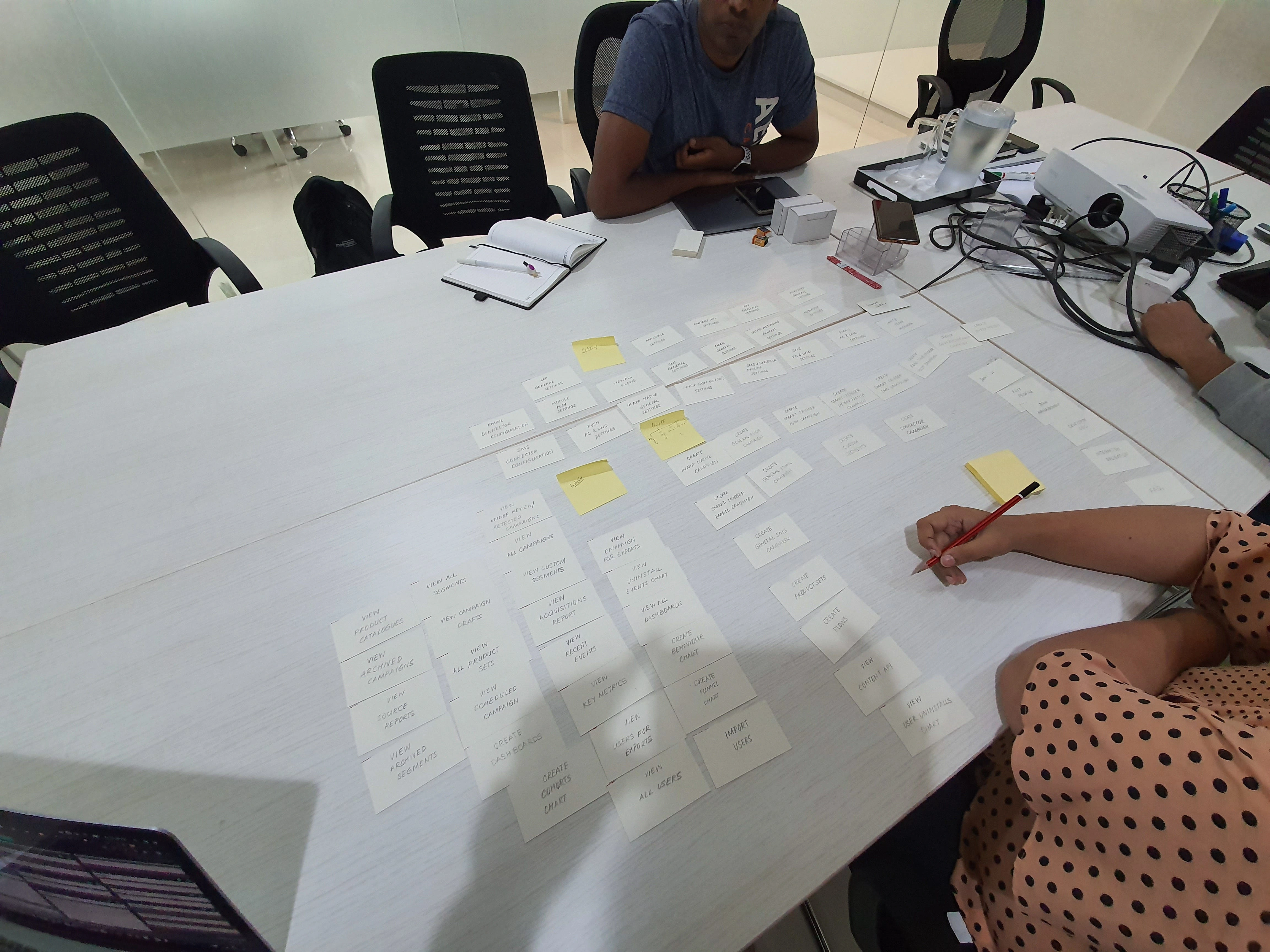
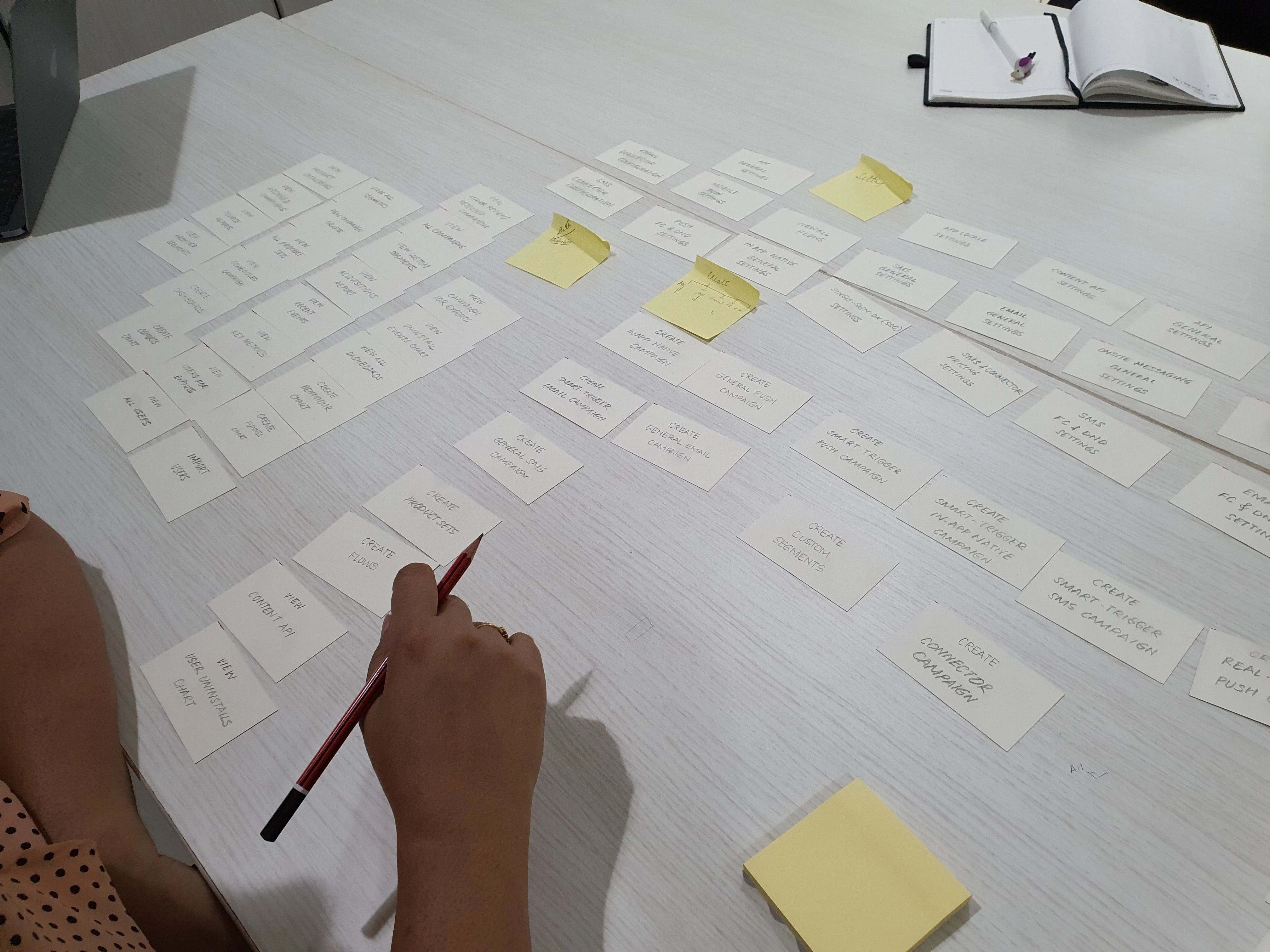
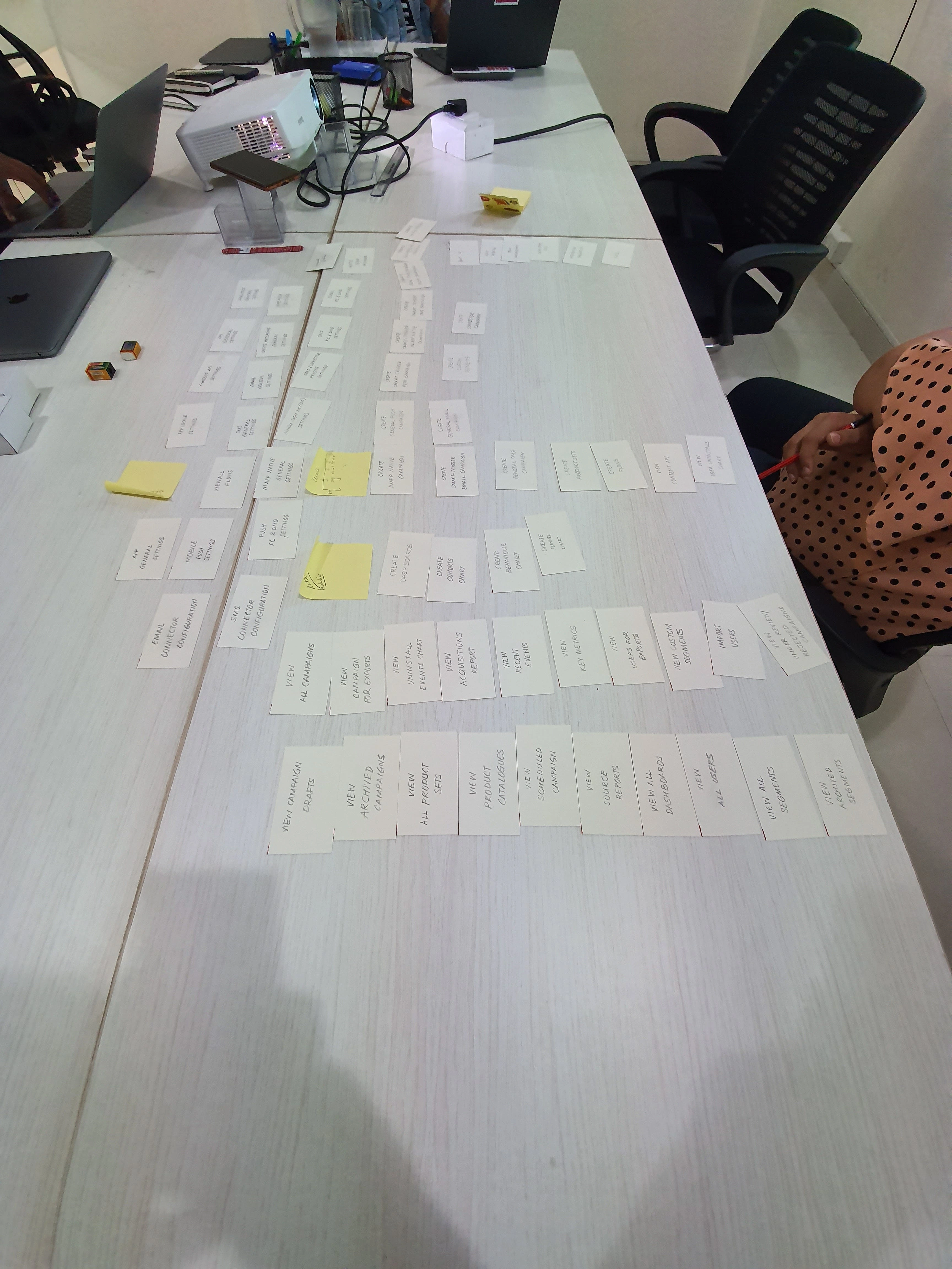
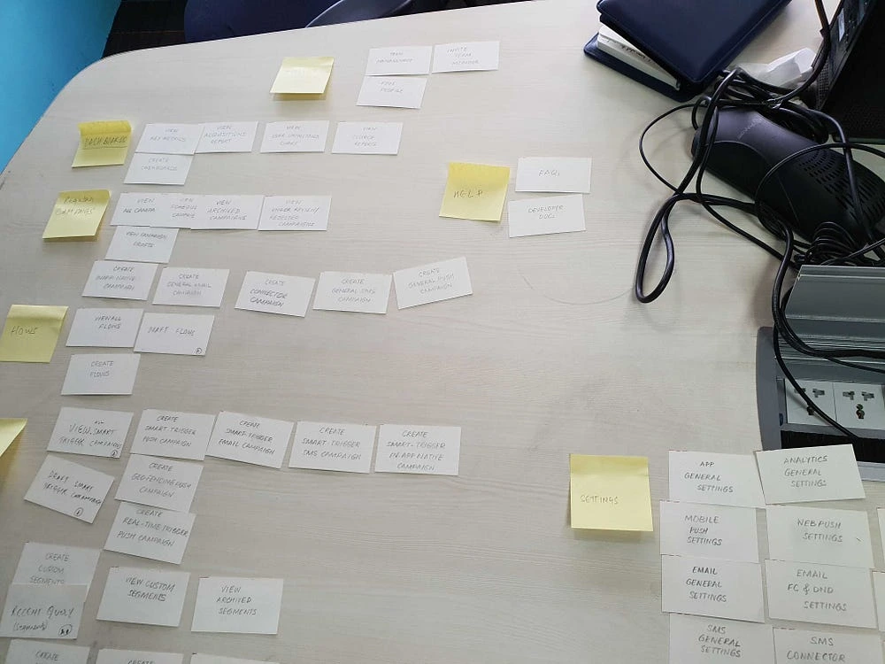
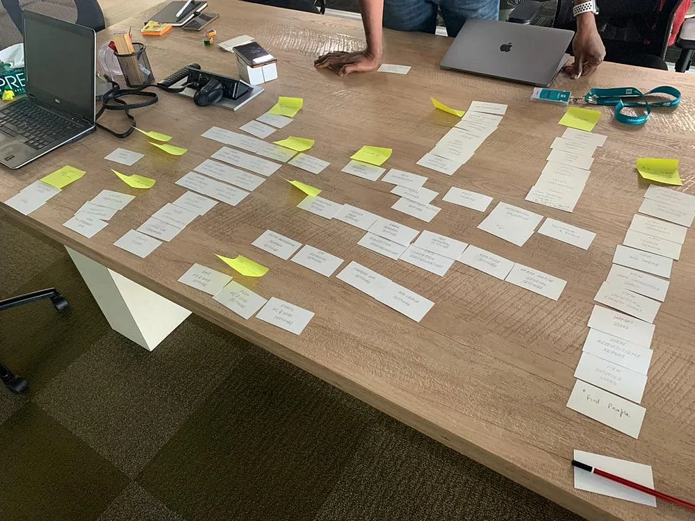
We have recorded these sessions and analyzed all the data using Provenbyusers.com to understand the pattern in card sorts to use that data to make design decisions.
After analyzing it came out that there are two types of users.
Who buys the product
Who actually uses the product
People who buy the product look at hight level metrics only and Marketers analyze the data, segment the users and create the campaign and see how that individual campaign is performing.
Settings, dev docs, Integration validation, getting started are all one time options and are rarely used. you can see the card sort pattern here
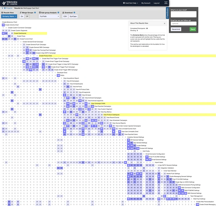
Similarity matrix
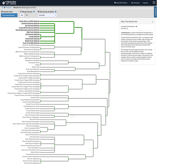
Dendrogram representing the grouping in card sorts
We have analyzed a lot of data (Notes, audio recordings, card sorts)
We have done card sorts with internal stakeholders too. Based on this data we have started prototyping and then the Visual design to take the feedback. You can see the entire design and iterations we have gone through in the link here. Note: Figma file has different pages on the left navigation. go through them to see the iterations
We have implemented the design and it came out well. I can show you if you want to see as it's in staging and not on prod yet.
What next?
We need to see if the metrics have improved of whatever metrics we looked before for eg:
Number of campaigns created
Less time to navigate between the options
Go to customers again to understand their feedback on the redesign and then take further design decisions.
While our redesign had got good feedback, with one of the customer posting this.
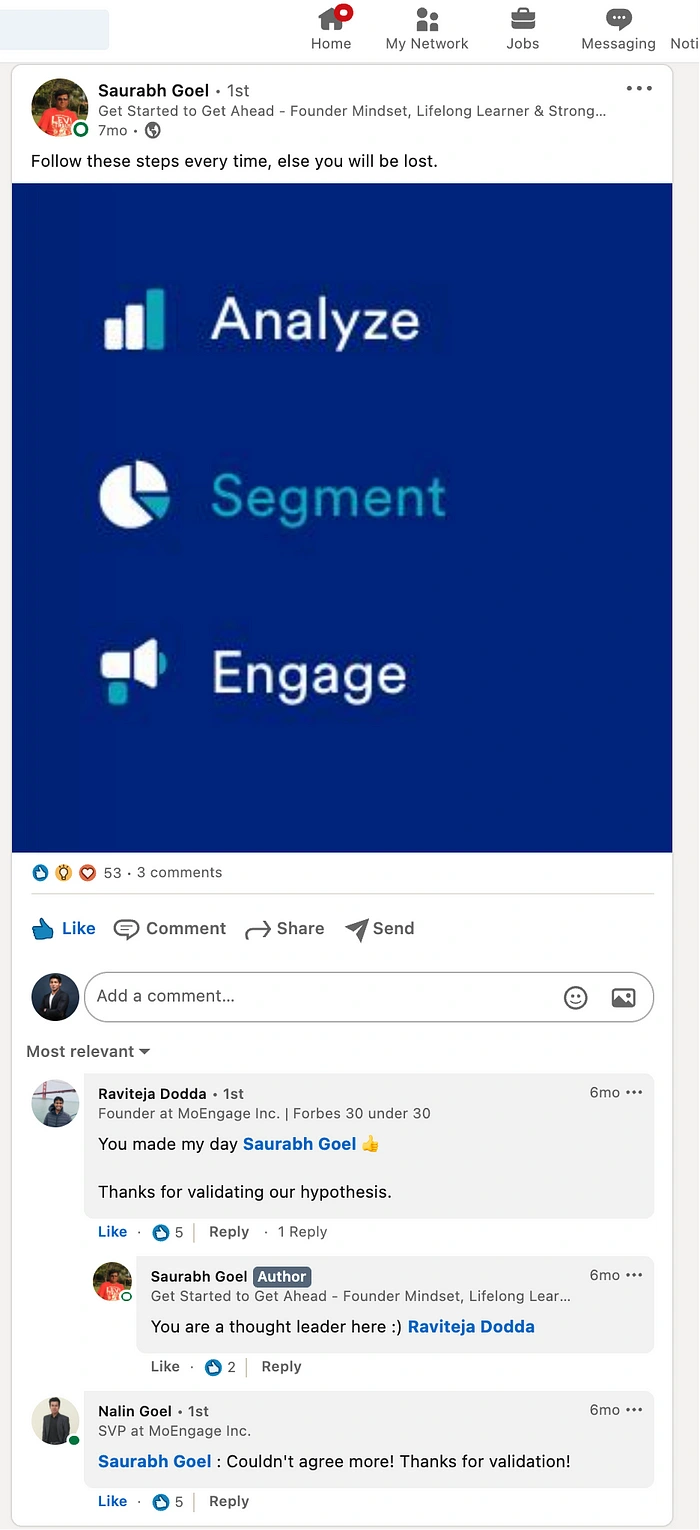
One of our customer posted this on Linkedin and other customer feedback has flown in through CSM channels. One thing in our hypothesis that was wrong was, removing create campaign broke their mental models and customers started complaining of not able to find it.
We have solved that problem with a new create thing that will let you create everything from the menu. Below is the design for it.
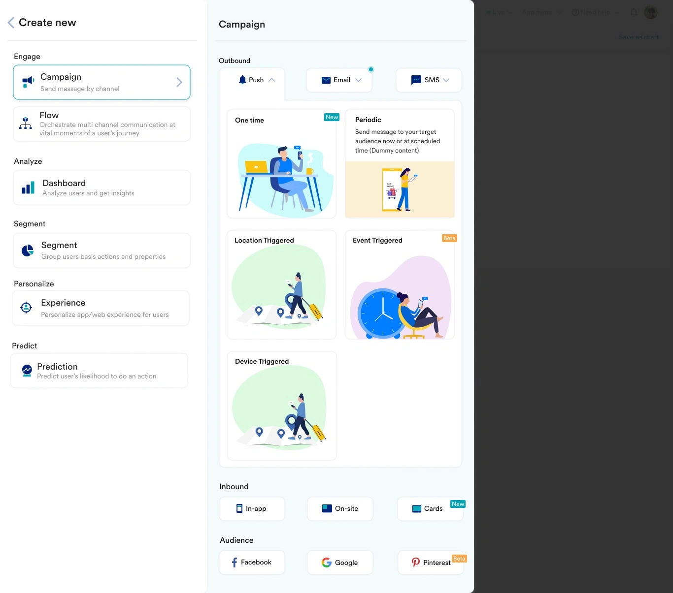
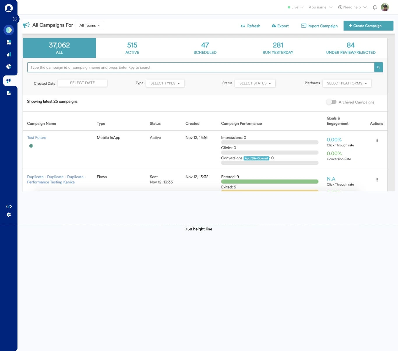
We are at the implementation and UAT stage as of now. We got a good response on the User testing phase. we will continue improving the product and measuring the success of things.
Launched this and had few customer calls where they gave good feedback saying “We are able to find everything quickly now” “Visually looks good and minimal”
Like this project
Posted Oct 8, 2023
MoEngage is a Mar Tech SaaS platform that let’s marketers engage users with their product by sending Push, Email, WhatsApp, and SMS notifications. Role: I am t…

