E-commerce website for clothing brand.
Opemipo Odunsi
Maven, a contemporary menswear brand, approached me to design a modern, conversion-driven landing page for their online store.
The goal: elevate their brand aesthetic, improve product discoverability, and create a smoother, more aspirational shopping journey for male shoppers aged 20–35.
My responsibilities included UX layout planning, visual hierarchy design, interaction decisions, and brand-consistent styling.
Hero Section — High-Impact Brand Introduction
Objectives
Immediately signal style, quality, and seasonality.
Introduce the newest drop in a bold but clean way.
Design Decisions
Large portrait imagery to capture emotion and texture of the fabric.
Minimalist right-side copy (“New Drop! ’23 Summer Collection”) to keep focus on the model while reinforcing the seasonal campaign.
Single CTA (Shop Collection) for clear conversion direction.
Neutral background + white space to mimic premium editorial brands (COS, Uniqlo).
Result: A calm, high-end entry experience that positions the brand as refined and fashion-forward.
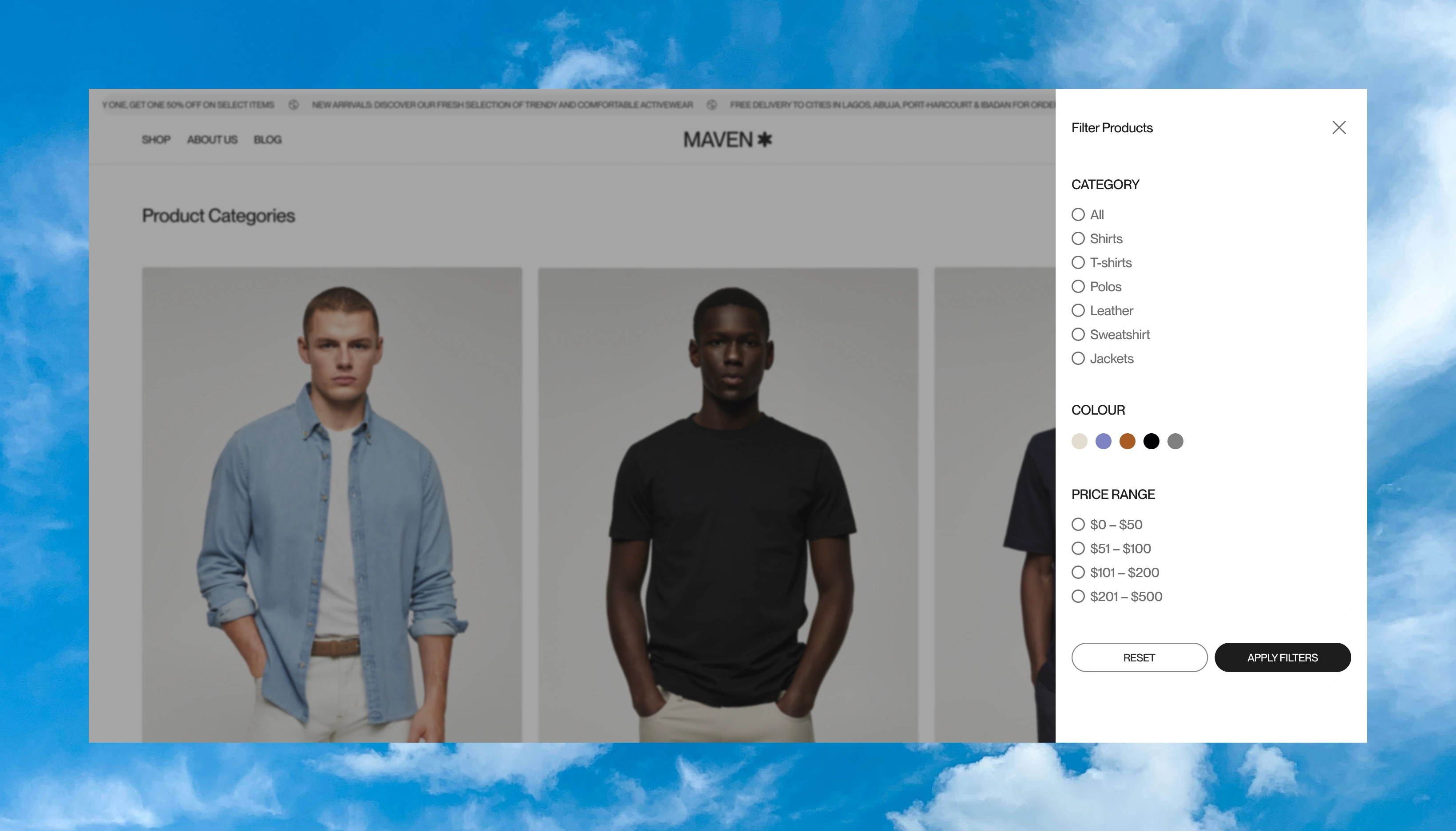
Product Categories Grid — Faster Path to Shopping
Objectives
Let users dive into preferred categories immediately.
Provide clarity without overwhelming them with products.
Design Decisions
Three simple rows of category blocks: Shirts, T-Shirts, Polos, Sweatshirts, Leather, Jackets.
Consistent styling: Neutral backgrounds, evenly spaced card layouts, and straightforward labeling.
Each card uses model photography to visually communicate fit & vibe.
“See All Categories” CTA for users wanting an expanded selection.
Result: Users can self-segment instantly, improving the path-to-product and reducing bounce rates.
Brand Story Section — Emotional Trust Anchor
Objectives
Insert a moment of lifestyle storytelling.
Build brand trust through values rather than just products.
Design Decisions
Split layout: Lifestyle photo on the left + brand mission on the right.
High contrast black canvas with bold white text for visual drama.
Simple statement: “Brand built on trust, quality, convenience.”
Result: Elevates the brand from a store to a lifestyle identity, increasing emotional connection.
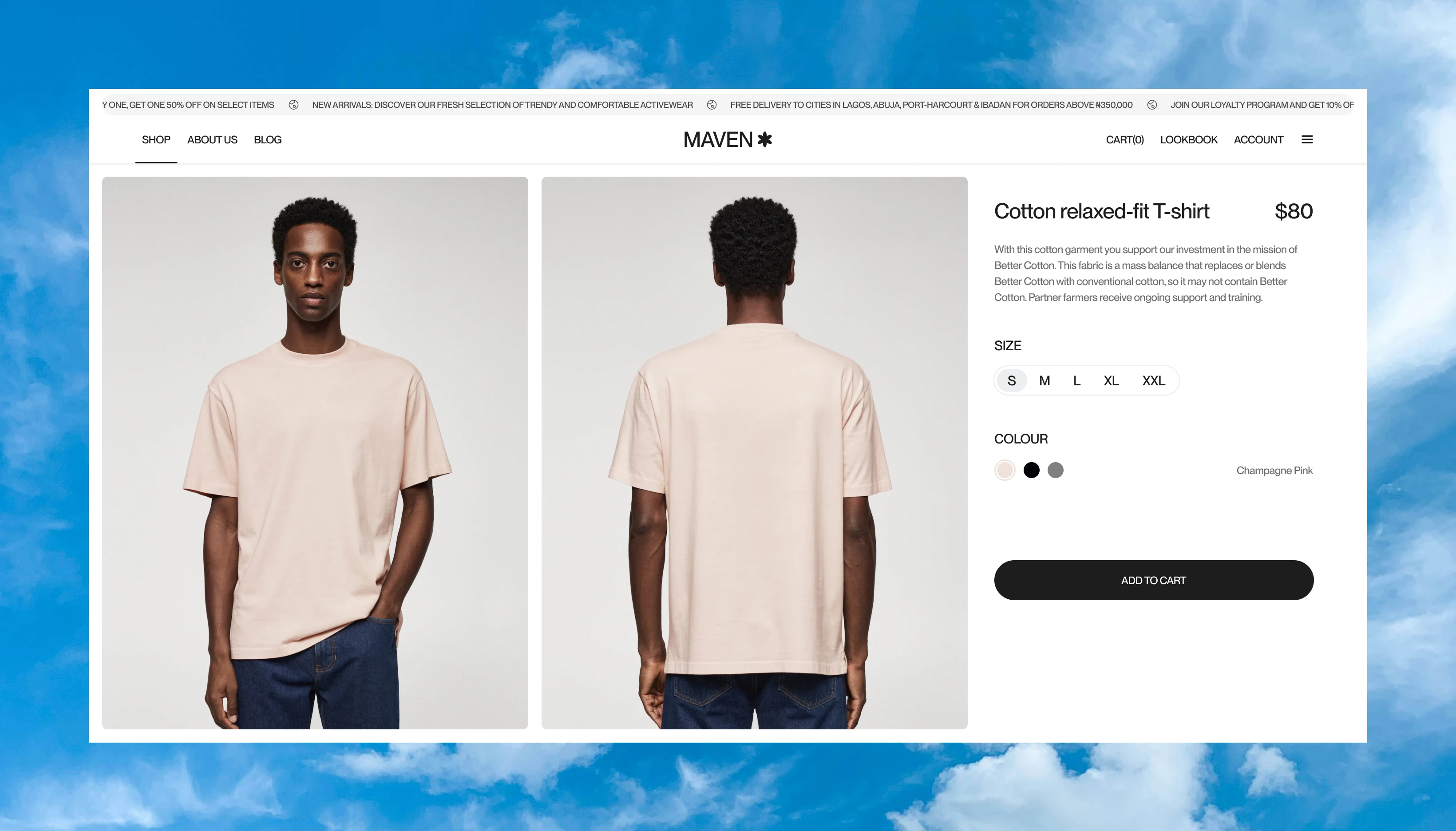
Featured Products — Highlighting Bestsellers
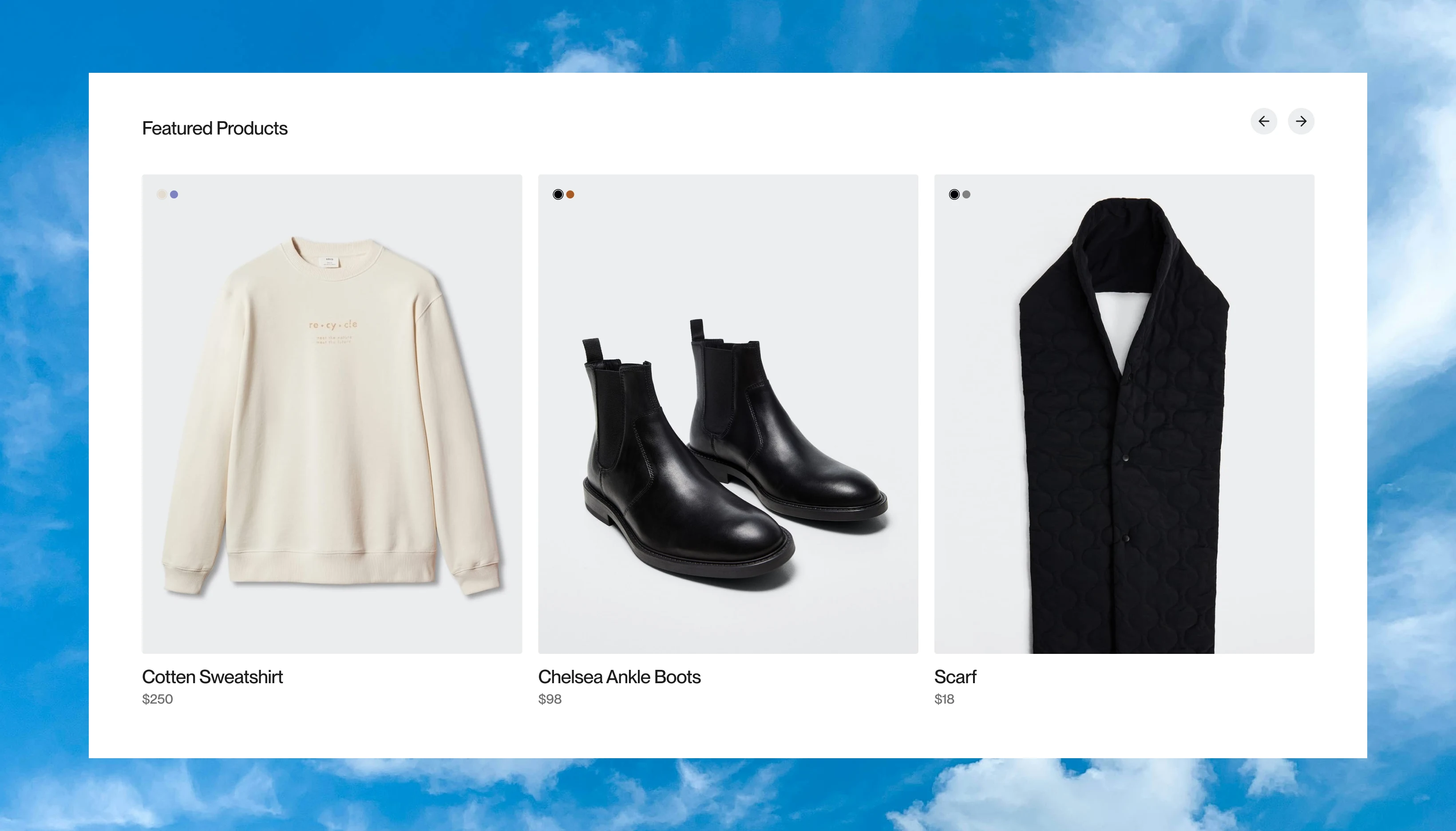
Objectives
Showcase hero products with premium treatment.
Encourage faster add-to-cart behavior.
Design Decisions
Three large product cards with clean shadows and ample whitespace.
Minimal descriptions (name + price) to keep the focus on aesthetics.
Products chosen across categories to appeal to varied tastes (Sweatshirt, Chelsea Boots, Scarf).
Result: Reinforces craftsmanship and quality, encouraging impulse buying.
Footer — Strong Information Architecture
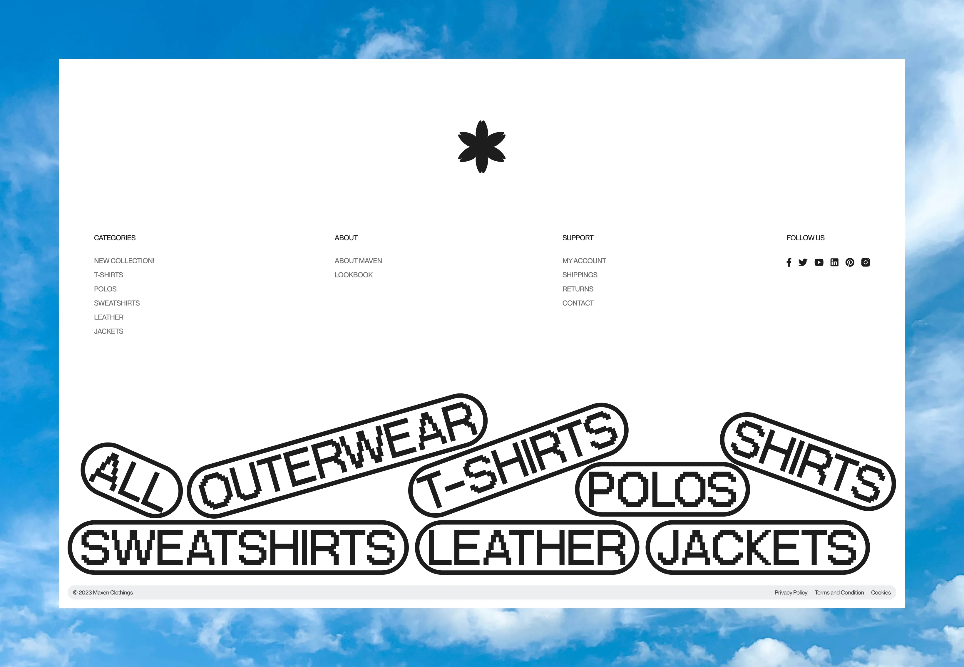
Objectives
Provide structured access to customer service, company info, and social channels.
Maintain the premium tone of the site.
Create a unique signature touch that stands out visually.
Reinforce product categories in a fun, shareable way.
Design Decisions
Three clean columns: Categories, About, Support.
Reduced visual noise—simple links, minimal dividers.
Social icons aligned right for a modern, balanced feel.
Scattered pill tags with bold text (e.g., “OUTERWEAR”, “POLOS”, “LEATHER”).
Organic, hand-placed arrangement to feel energetic and young.
Black-and-white palette ties back to the brand identity.
Result: The user leaves the page with a sense of order and trust and a memorable ending element that adds personality and keeps the brand from feeling overly rigid.
EXCERPTS
THANK YOU! ✌🏾
Like this project
Posted Nov 5, 2025
I designed an e-commerce website for RED - a menswear clothing brand.
Likes
3
Views
28