Landing page for RED
Opemipo Odunsi
RED is a new fintech startup focused on solving online payment failures in Africa and beyond.
I designed a conversion-focused landing page that communicates trust, speed, and inclusivity while introducing their virtual and physical payment card system.
My role included UX structuring, UI styling, messaging layout, and visual storytelling to make the brand feel reliable, youthful, and modern.
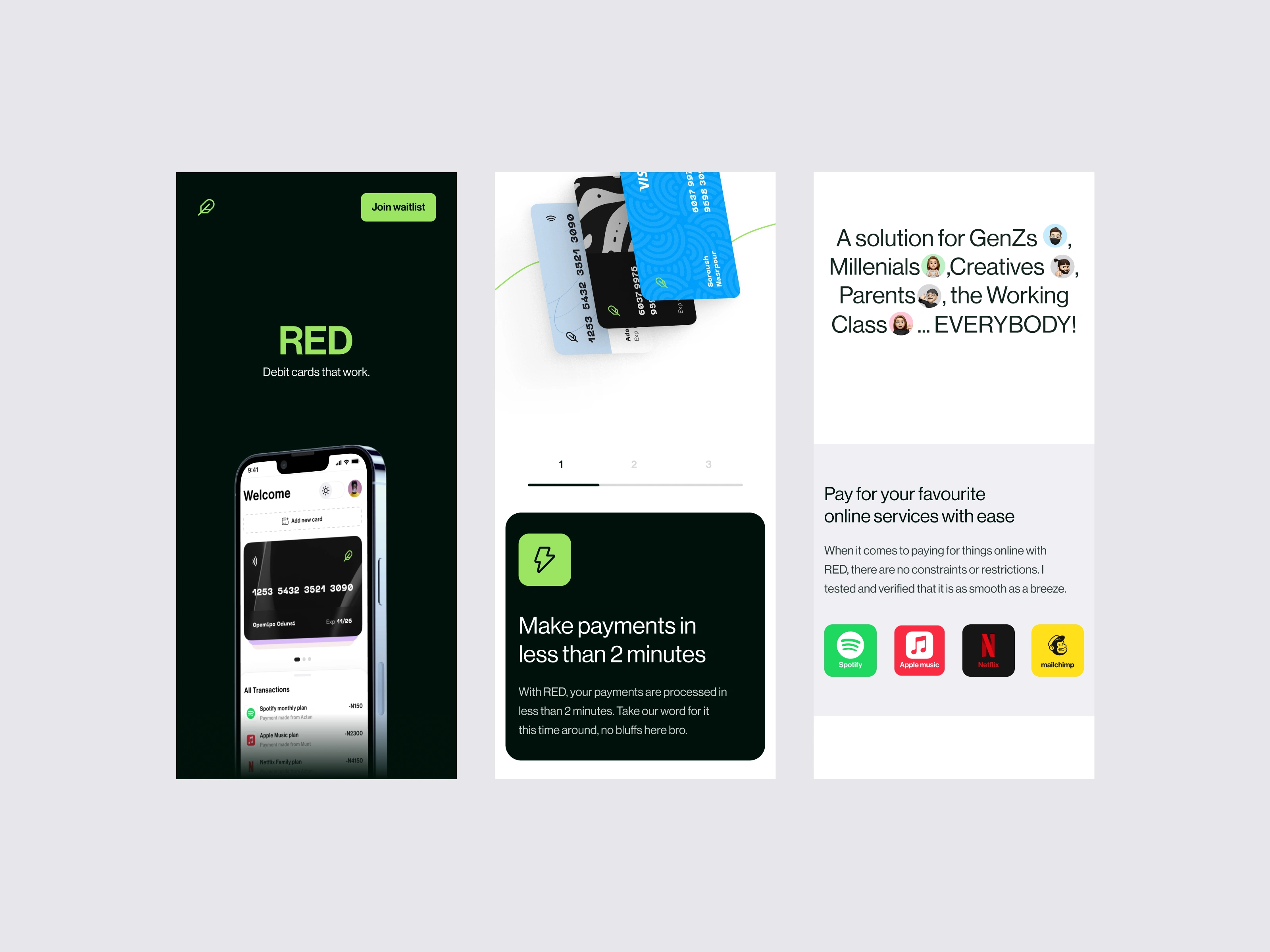
Hero Section — Instant Clarity & Trust
Objectives
Establish trust within the first three seconds.
Communicate the core product: a seamless payment card that actually works.
Encourage early sign-ups.
Design Decisions
Dark, premium background to give the product a high-end fintech feel.
Floating phone mockup showing the app dashboard to create immediate product context.
Crisp one-liner: “An end to unsuccessful online payments” to address the biggest user pain point right away.
Email input + CTA (“Join waitlist”) placed centrally for fast conversions.
Outcome: A strong first impression that feels credible, modern, and solution-oriented.
Problem Statement — What RED Solves
Objectives
Show empathy for user frustrations.
Clarify the problem before introducing the solution.
Design Decisions
Clean white background for readability and contrast after the dark hero.
Short, direct copy explaining payment failures and how RED improves success rates.
Soft, gentle micro-illustrations (curved card lines) to introduce movement and flow.
Outcome: Users quickly understand why RED exists and why they should care.
Broad Audience Messaging — Inclusivity as a Feature
Objectives
Position RED as a universal solution, not a niche tool.
Reduce cognitive bias that fintech is “too technical.”
Design Decisions
Friendly typography + inclusive emojis (Gen Zs 👩🏾💻, Millennials 👨🏽💼, Parents 👨🏾👧 etc.).
Light, conversational tone to make the brand feel youthful and approachable.
Wide horizontal spacing for breathability.
Outcome: Users feel represented and included, increasing emotional connection and trust.
Online Services Accepted — Social Proof by Recognition
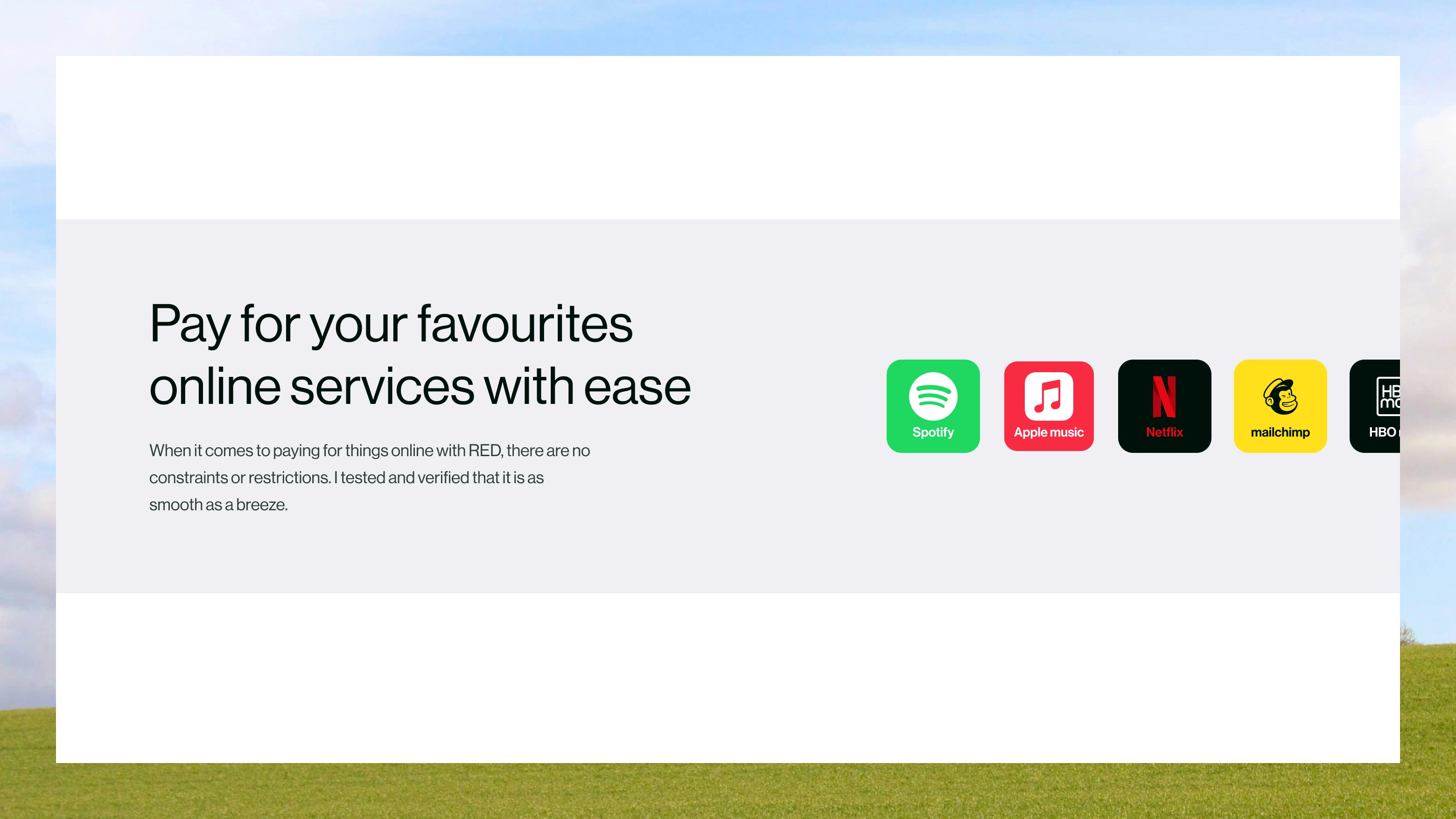
Objectives
Show that RED works for major platforms users already trust.
Communicate utility with recognisable logos.
Design Decisions
Horizontal row of icons (Apple, Netflix, Spotify, etc.) to create quick visual validation.
Minimal supporting text to reinforce effortless subscription payments.
Outcome: Increases belief and reduces friction—users see that RED fits into their daily digital habits.
Virtual vs Physical Cards — Feature Explanation
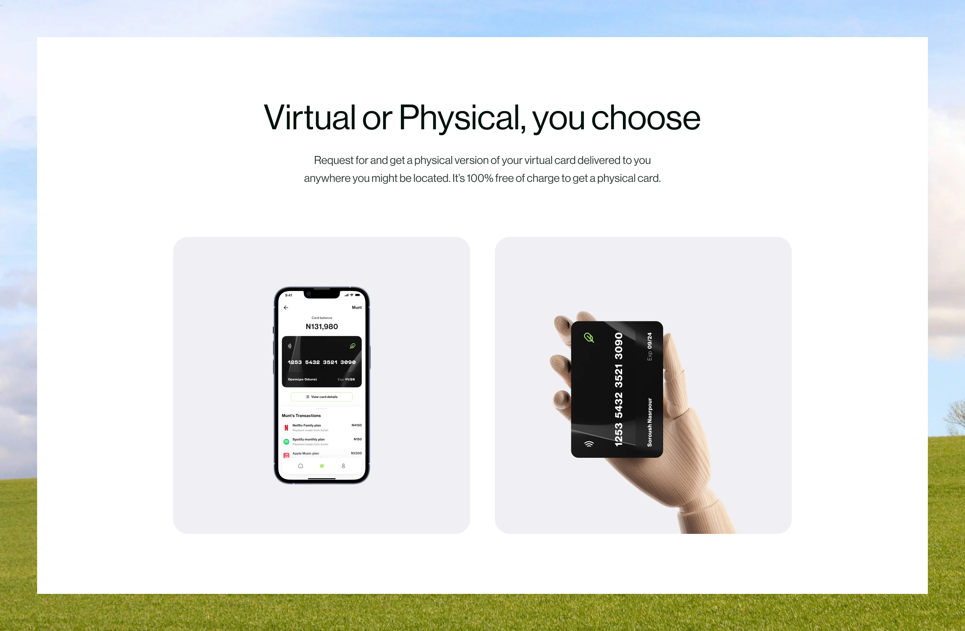
Objectives
Present the flexibility of choosing card types.
Highlight personalization and accessibility.
Design Decisions
Two-column layout (Virtual Phone Mockup vs Physical Card in Hand).
Neutral pastel blocks for a lightweight, modern aesthetic.
Captioning that clearly compares both options.
Outcome: Users understand the product offering without needing long paragraphs.
Feature Highlights — Security & User Control
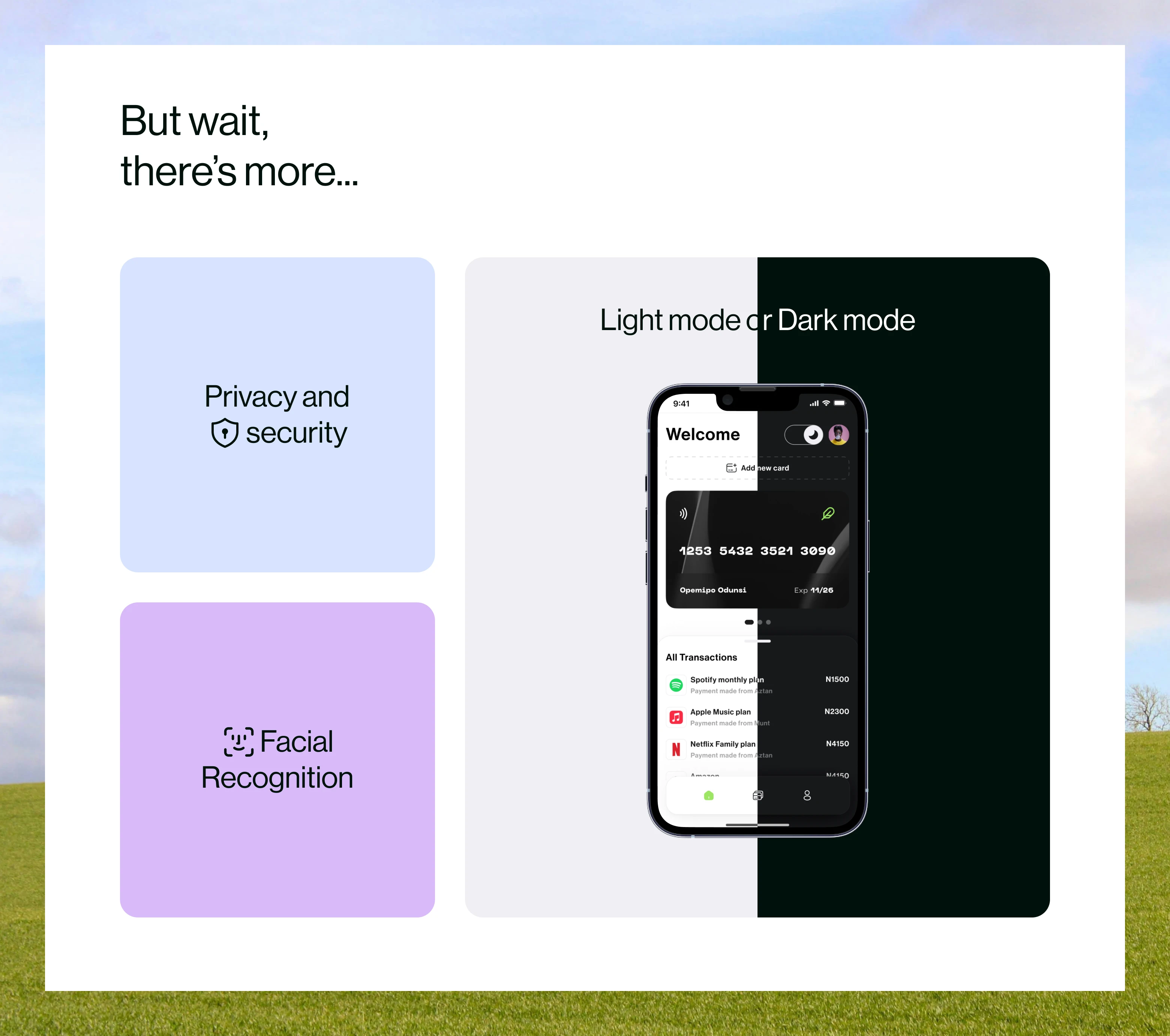
Objectives
Build trust by emphasizing safety and tech-forward features.
Design Decisions
Grid layout with simple icons:
Privacy & Security
Facial Recognition
Light Mode / Dark Mode Interface
Each card spaced generously to avoid visual clutter.
Outcome: Gives RED a premium, secure, Apple-like feel — a huge trust booster in fintech.
Final CTA Section — Reinforce Conversion
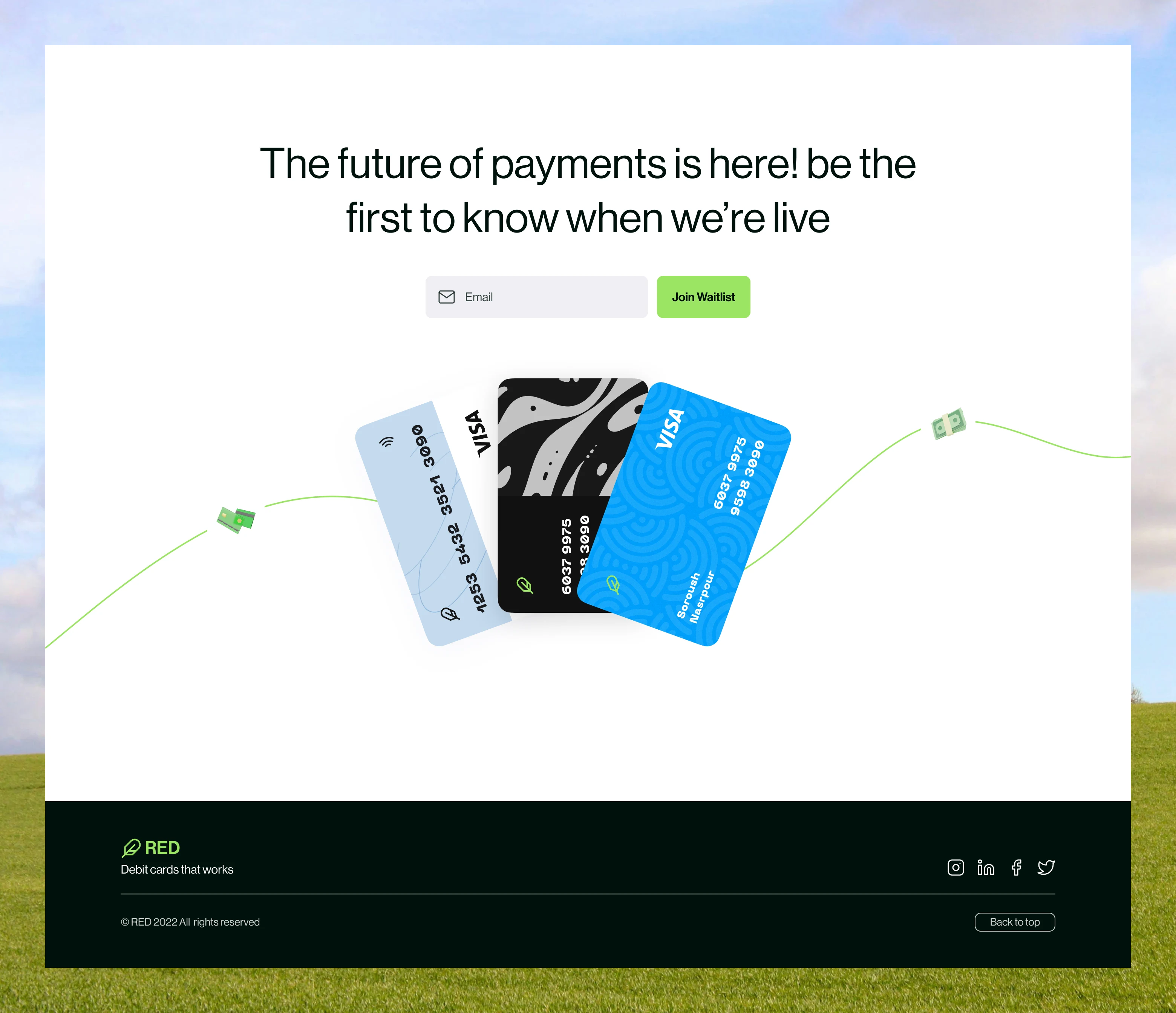
Objectives
• Capture emails at the end of the scroll. • Provide a second chance for users who weren’t ready at the top.
Design Decisions
• Repeated visual motif of cards floating along a curved line, creating motion and continuity.
• Direct copy: “The future of payments is here! Be the first to know when we’re live.”
• Clean email field + CTA (“Join waitlist”).
Outcome: Smooth transition into sign-up with a friendly, optimistic tone.
Mobile Screens
Thank you! ✌🏾
Like this project
Posted Nov 4, 2025
I worked on a Landing page for RED a Fintech virtual card provider.
Likes
2
Views
11