Landing page/Website design for Validify.
Opemipo Odunsi
Validify is a SaaS tool built to help businesses verify email lists, improve deliverability, and reduce bounce rates.
My task was to design a clean, credible, and conversion-focused landing page that communicates trust, explains the process clearly, and highlights the product’s advanced verification features.
The final design blends soft colors, structured layout, intuitive steps, and strong visual hierarchy to help users understand the tool within seconds..
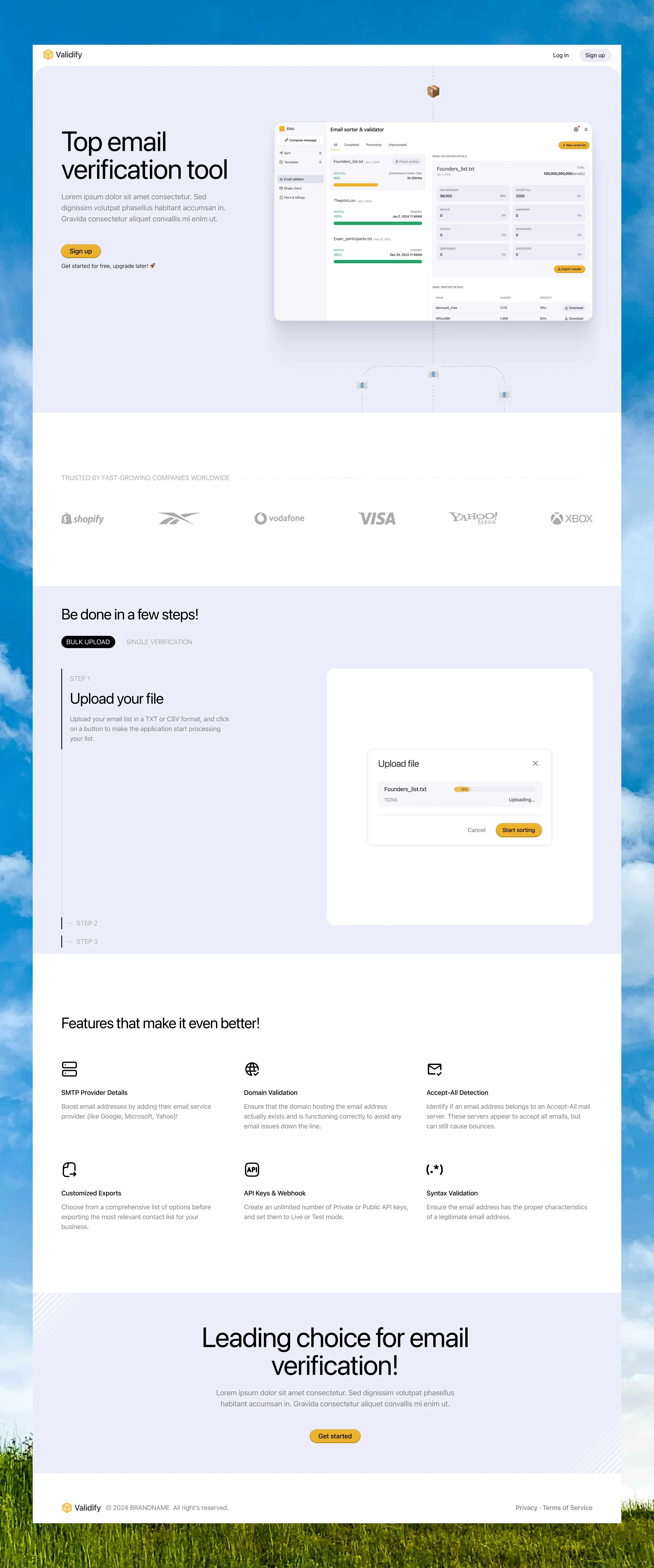
Hero Section — Clear Value Proposition & Trust
Objectives
Introduce Validify as a professional, reliable email-verification tool.
Showcase the application interface immediately.
Drive sign-ups from new visitors.
Design Decisions
Large headline (“Top email verification tool”) to instantly communicate purpose.
Light background with a floating dashboard mockup to visually demonstrate functionality.
Short benefit subtext explaining the tool without overwhelming users.
Strong CTA (Sign up) placed early to encourage trial adoption.
“Get started for free, upgrade later” added to remove friction.
Outcome: A clean, enterprise-level hero that creates confidence from the first screen.
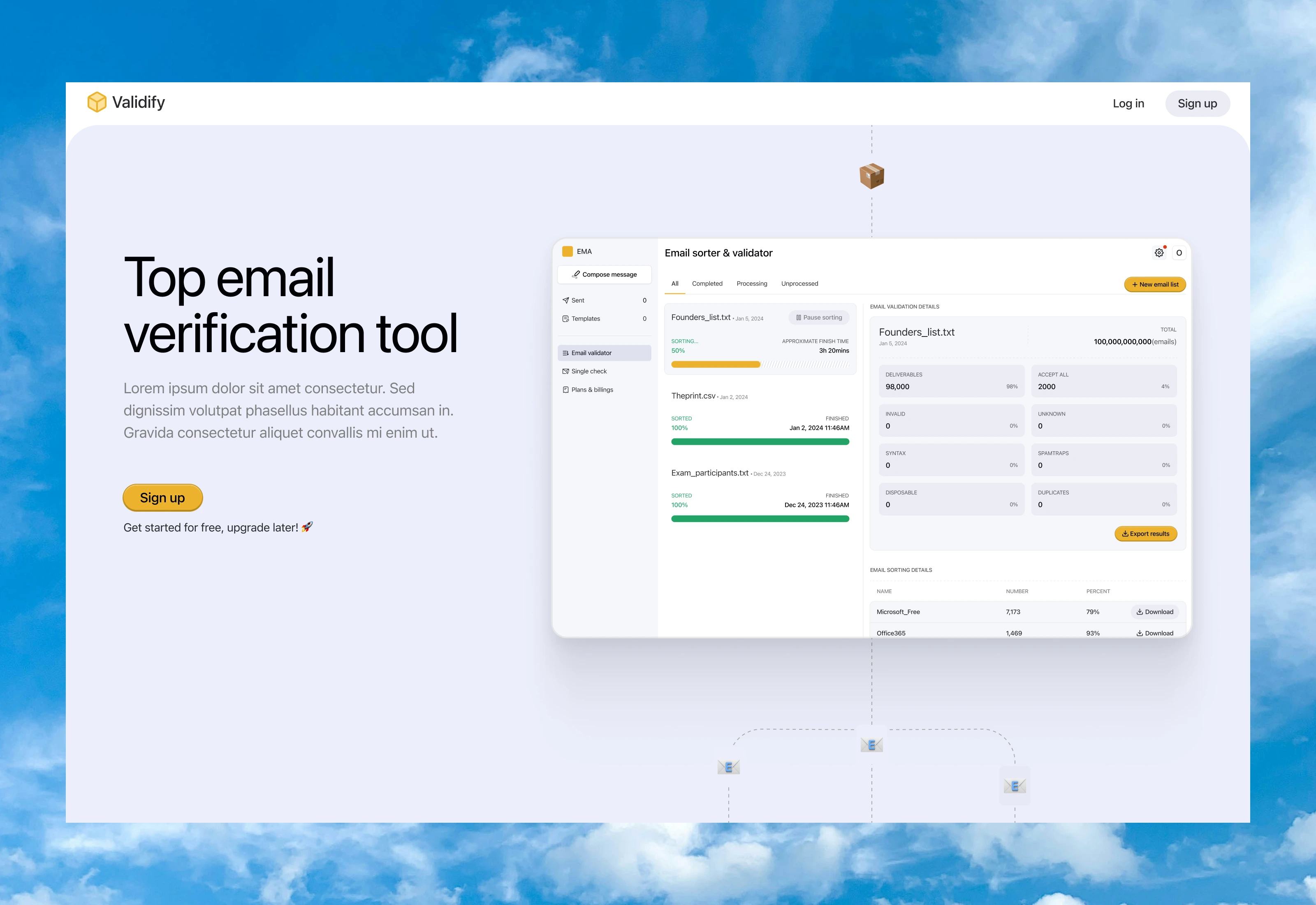
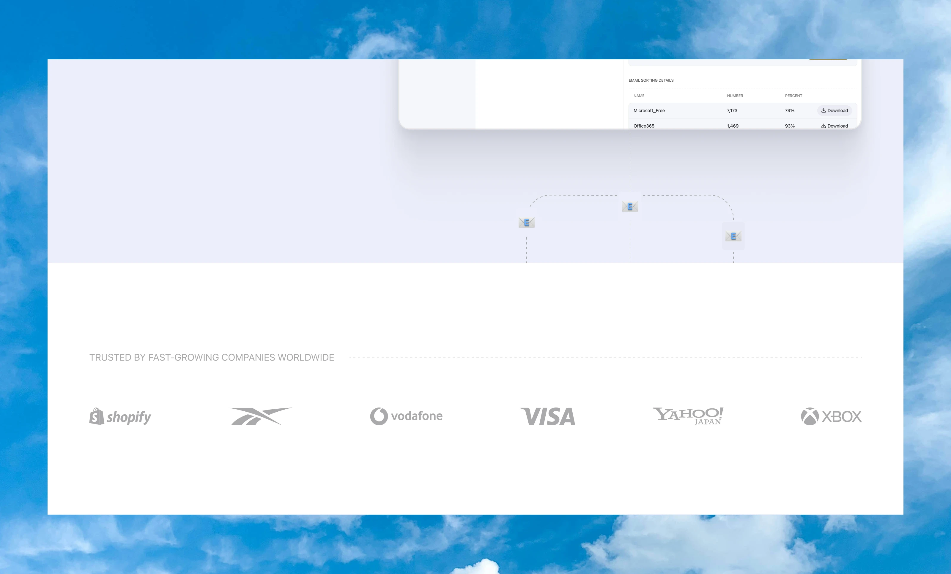
Trusted Companies Section — Social Proof
Objectives
Build instant credibility.
Reinforce that Validify is reliable and battle-tested.
Design Decisions
Soft gray background to visually separate this section from the hero.
Logos of known brands (Shopify, Vodafone, Visa, Yahoo, Xbox) arranged horizontally for simple scanning.
High contrast between logos and background for easy recognition.
Outcome: Users perceive the product as vetted, trusted, and safe.
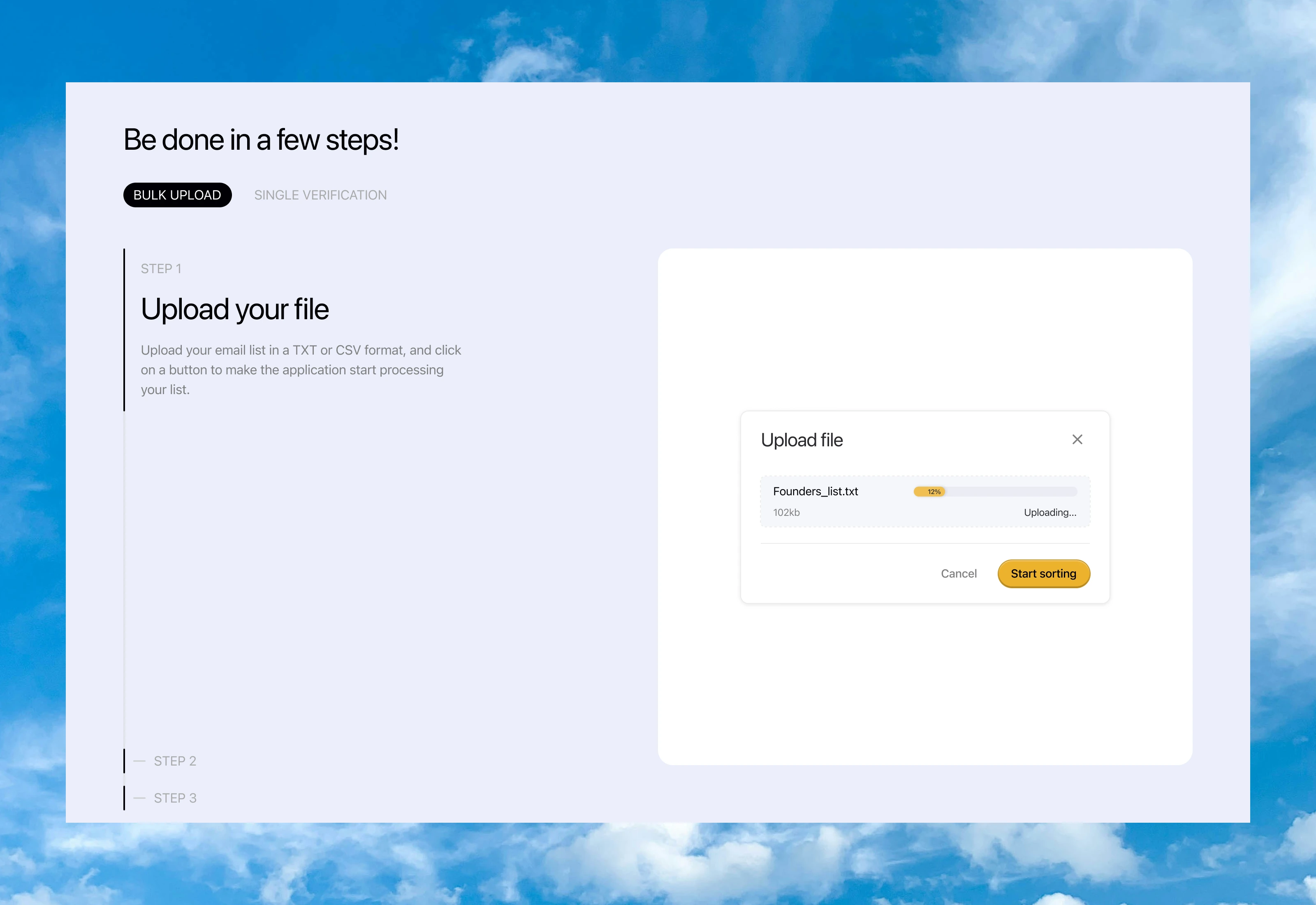
Step-by-Step Workflow — Reducing Cognitive Load
Objectives
Communicate how easy the tool is to use.
Turn a technical process into a friendly, step-driven journey.
Design Decisions
Two clear tabs: Bulk Upload and Single Verification.
Step 1 displayed prominently with:
Title (“Upload your file”)
Simple instructions
Minimalistic UI mockup showing real upload behavior.
Generous whitespace to reduce complexity.
Outcome: Users understand the workflow at a glance, making the tool feel accessible and simple.
Feature Grid — Communicating Depth & Capability
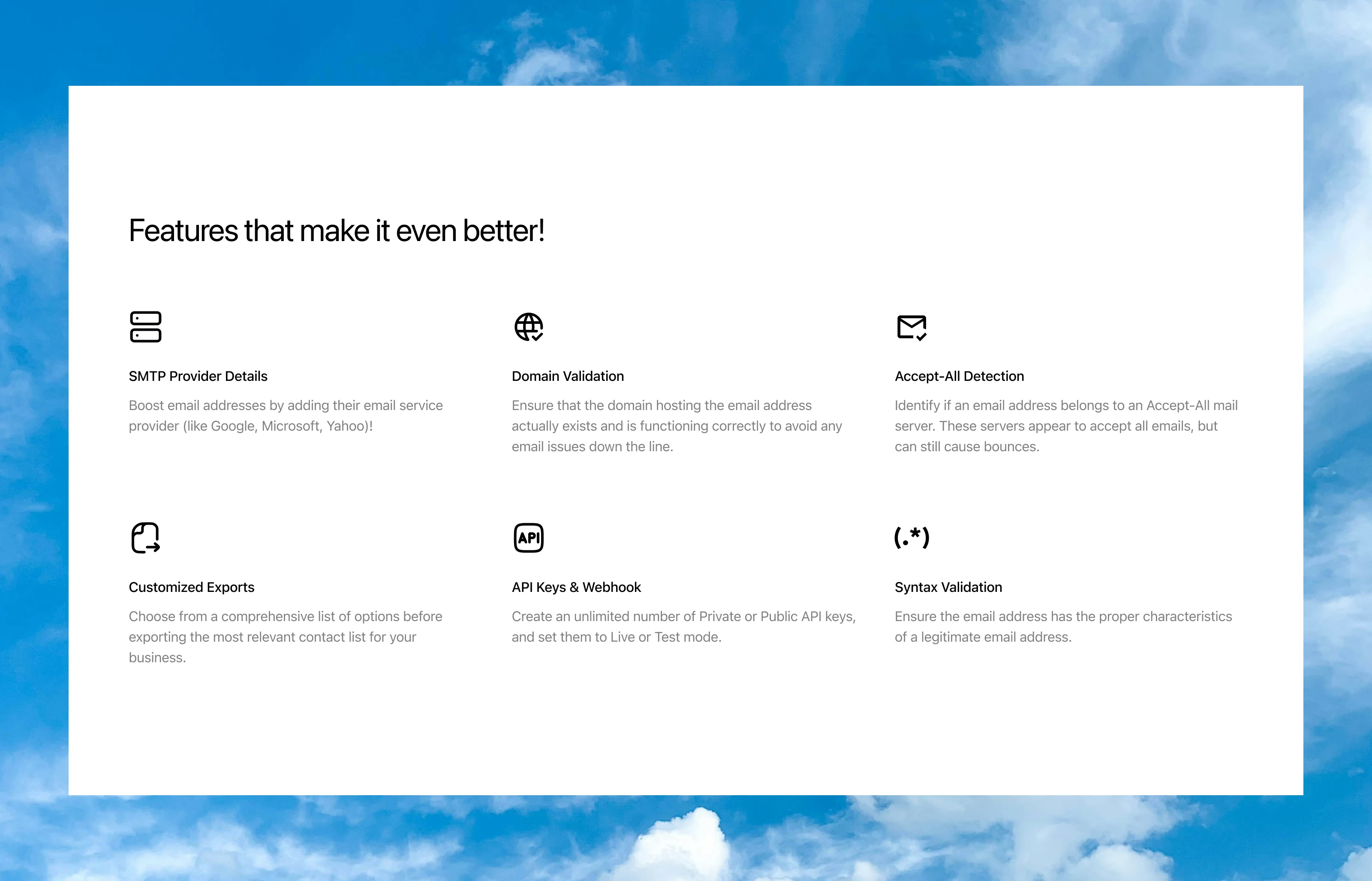
Objectives
Highlight the advanced features that separate Validify from competitors.
Allow technical users to quickly validate product fit.
Design Decisions
6-feature grid with icons:
SMTP Provider Details
Domain Validation
Accept-All Detection
Customized Exports
API Keys & Webhooks
Syntax Validation
Equal spacing and minimal icons keep the layout modern and lightweight.
Short descriptions for fast reading.
Outcome: Visitors understand the full power of Validify without needing to scroll through paragraphs.
Final Call-to-Action — Reinforcing Conversion
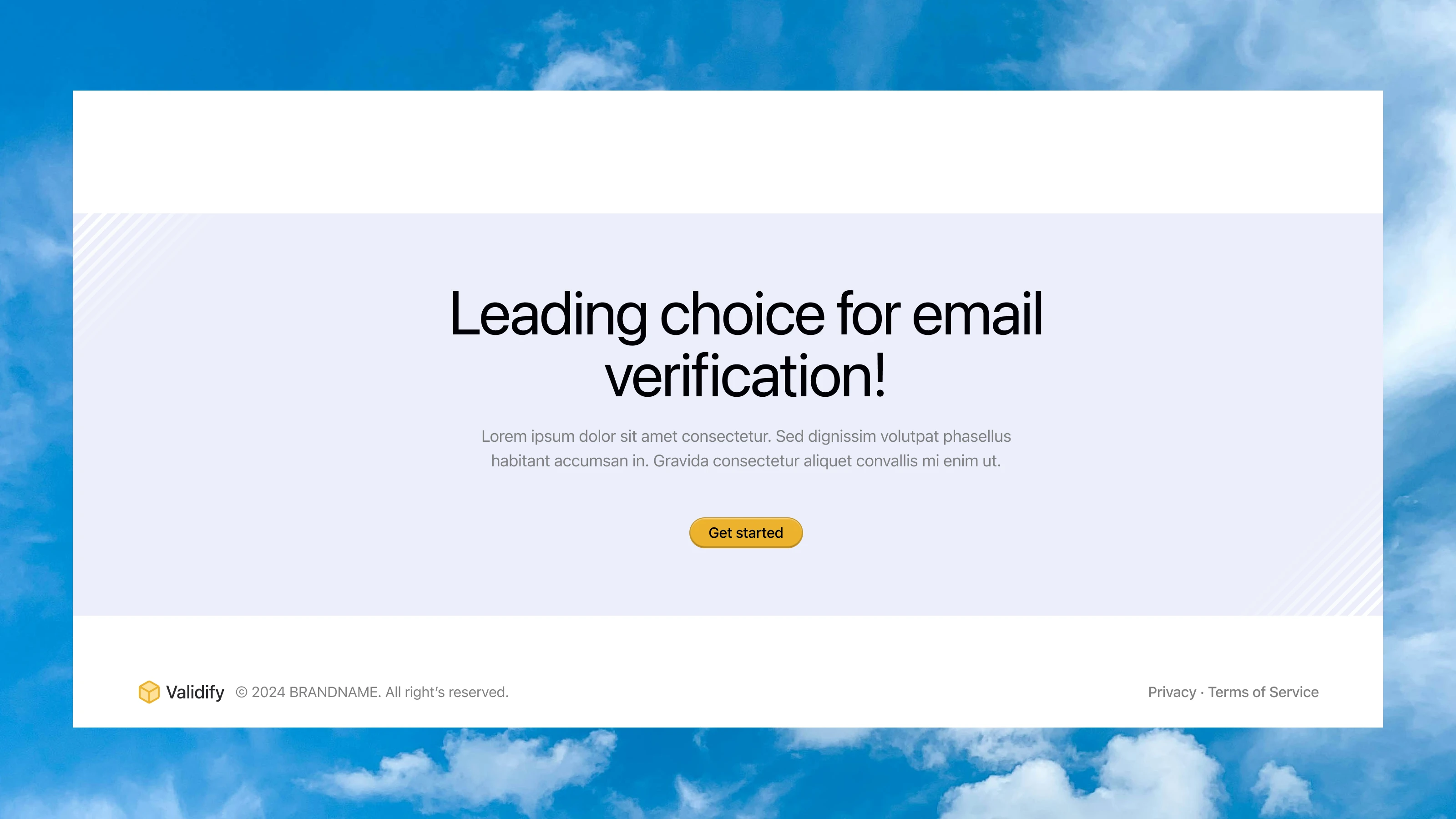
Objectives
Re-engage users who scrolled to the end.
Create a confident, encouraging message to start using the product.
Design Decisions
Motivational headline:
“Leading choice for email verification!”
Support text reinforces trust and professionalism.
Prominent Get Started button repeated to increase conversion opportunities.
Soft background tones maintain visual continuity.
Outcome: A clean, friendly CTA closure that nudges the user to take action.
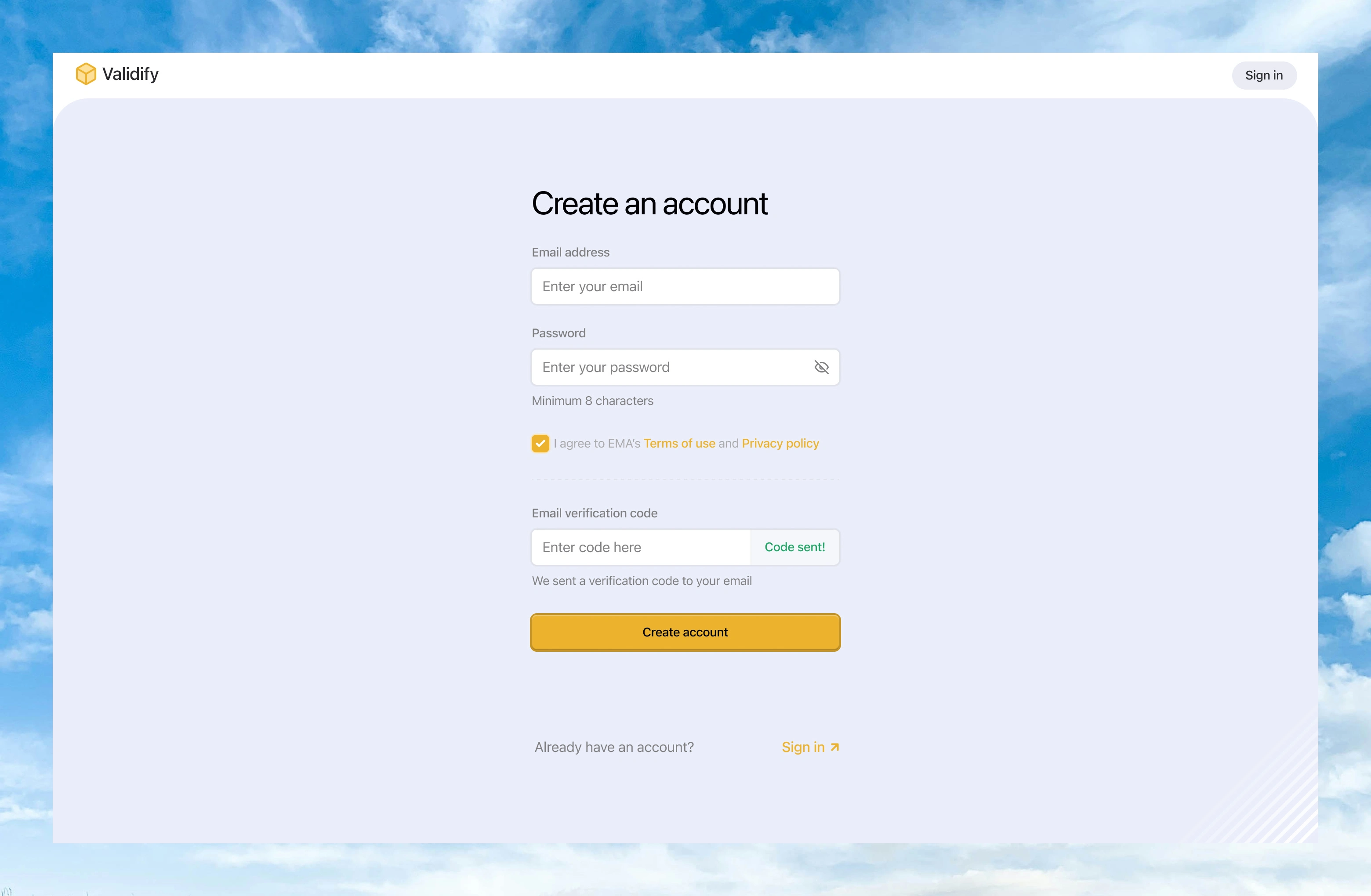
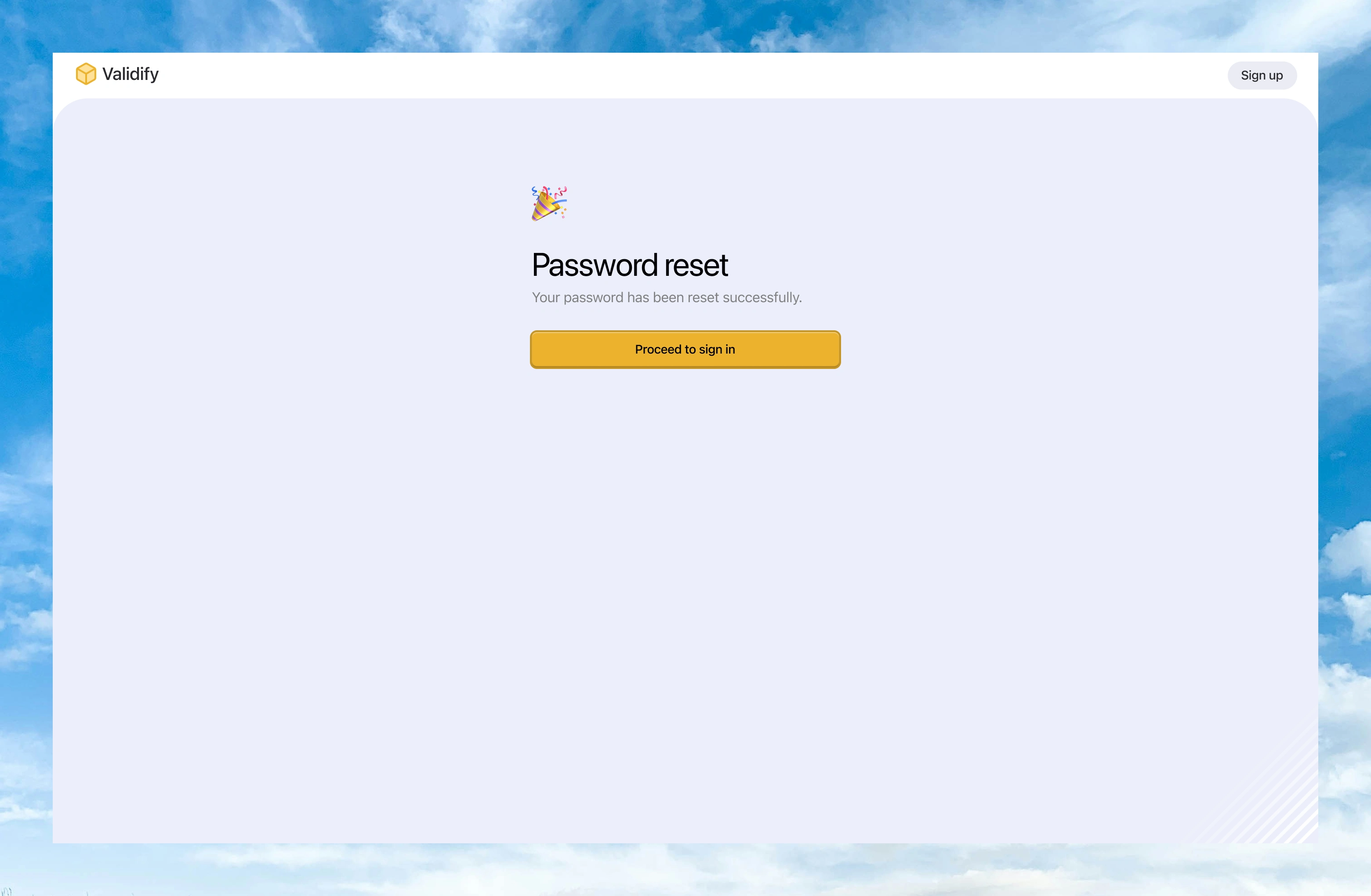
Authentication Excerpts
Thank you! ✌🏾
Like this project
Posted Nov 4, 2025
I designed a Landing page/Website for Validify - an all-ensuite web application for email verification, sorting and mailing.
Likes
3
Views
11