Zillion Dines: From Clunky ERP to Mobile-First Operational Suite

Shubham Arya


Zillion Dines: From Clunky ERP to Mobile-First Operational Suite
Have a look at what I Delivered
The Problem & The Hook: From 17 Modals to 9 Minutes
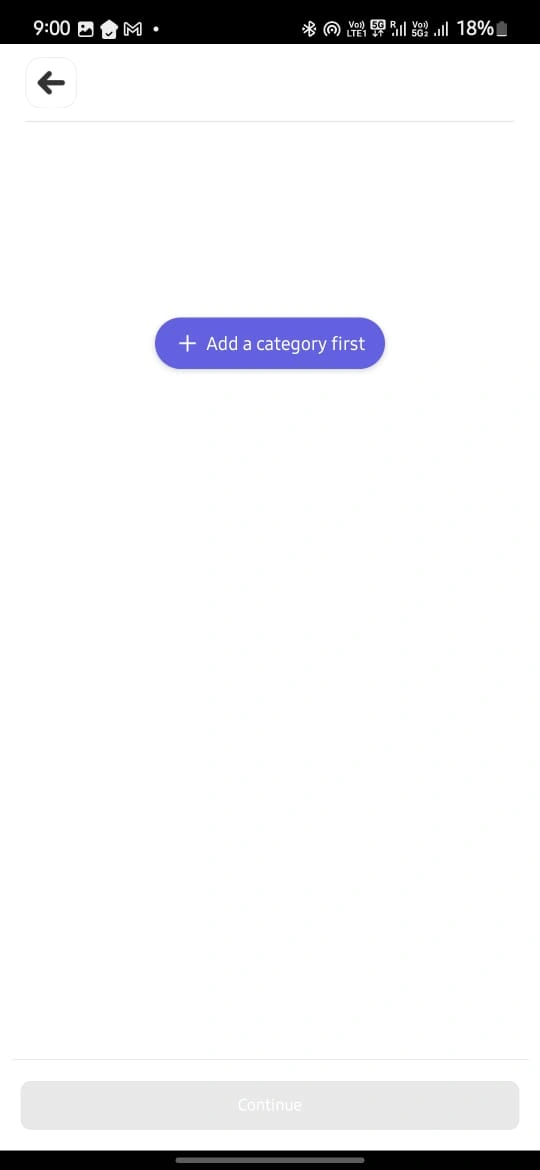
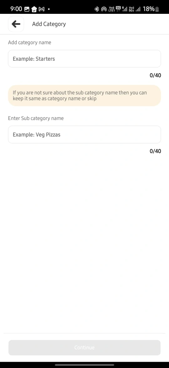
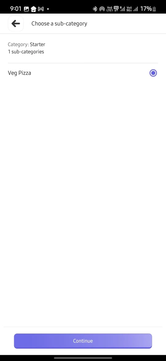
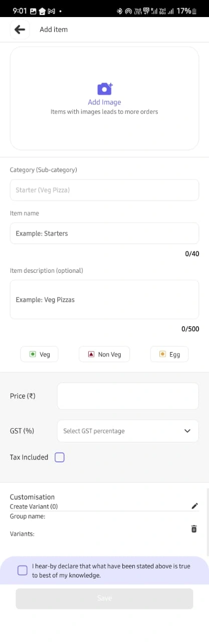
The original Zillion Dines ERP was a feature-rich engine trapped in a "barely-usable" interface. Onboarding a new restaurant was a high-friction marathon: creating a single menu item required 17 modal jumps, leading to massive user drop-off. As the solo freelance designer, my mission was to dismantle these barriers and create a mobile-first "First-Time User Experience" (FTUE) that enabled owners to go from sign-up to their first bill in under 10 minutes.
The Systemic Approach: The "Lean Pivot" for Velocity
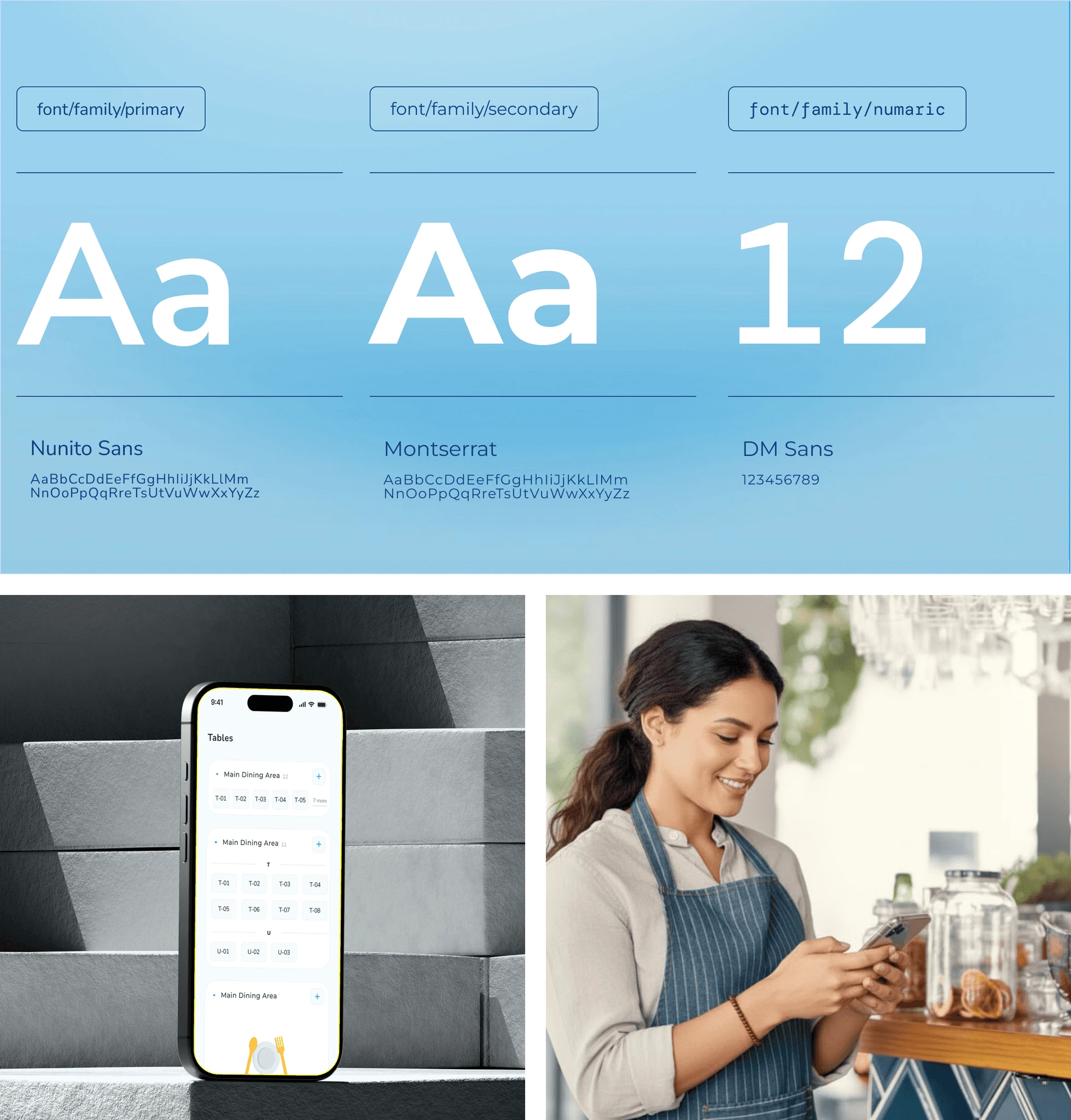
To hit a 2-week prototype milestone, I initially architected a robust design system but pivoted based on developer feedback to prioritize implementation speed.
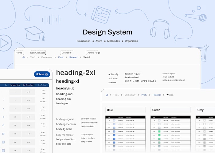
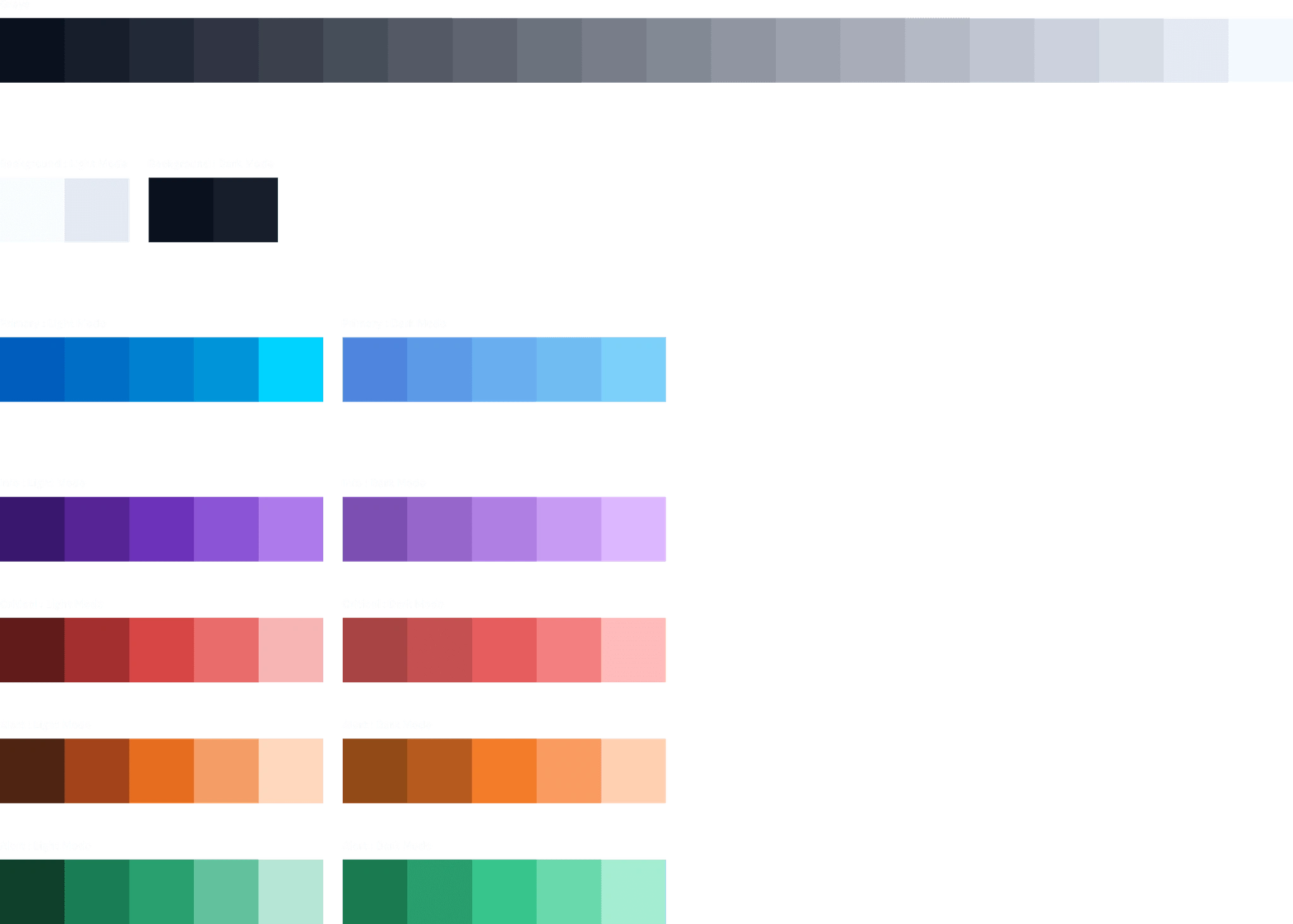
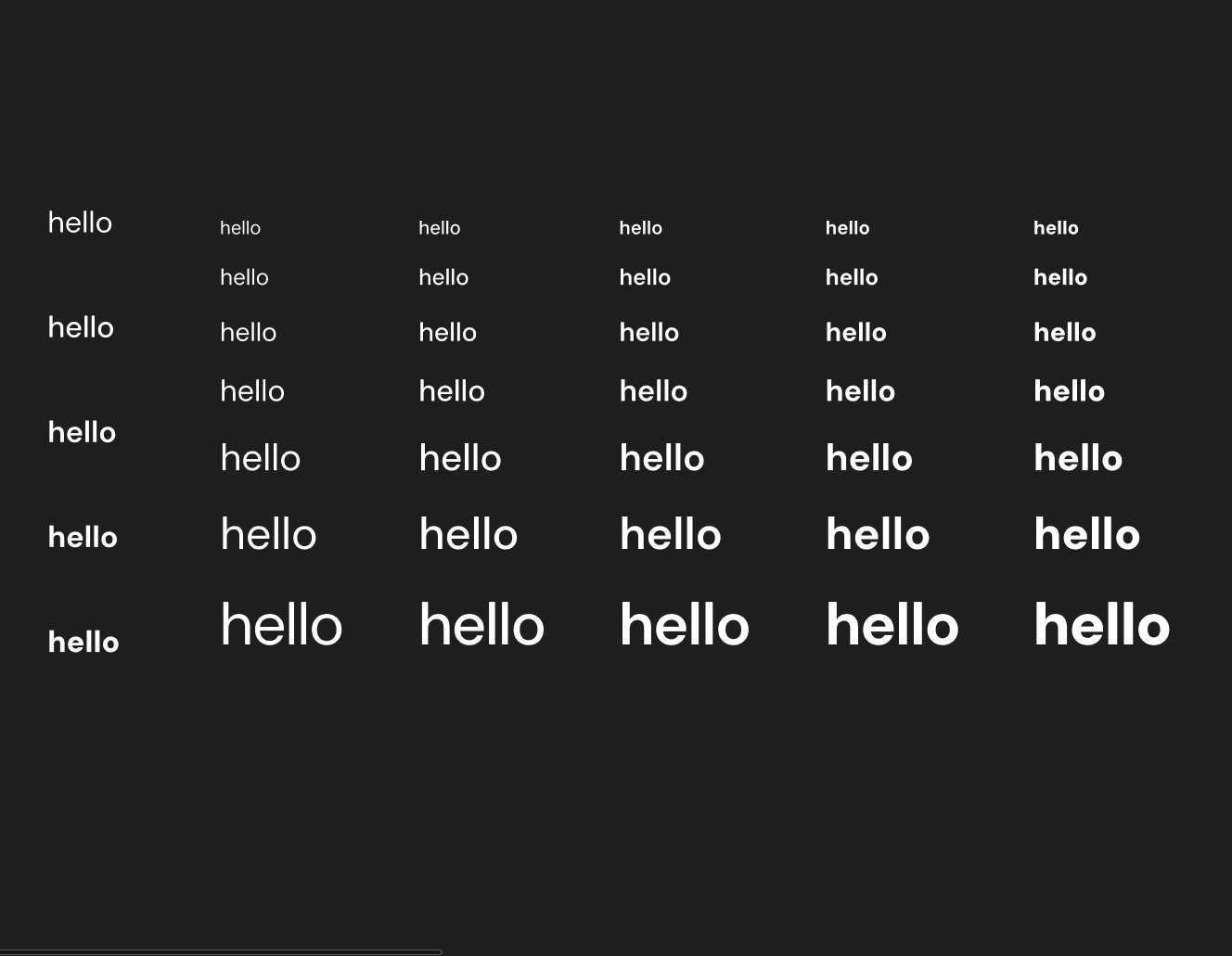
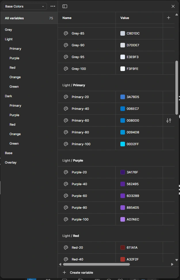
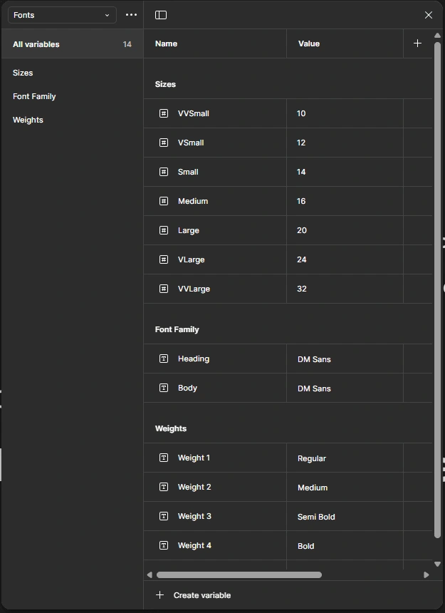
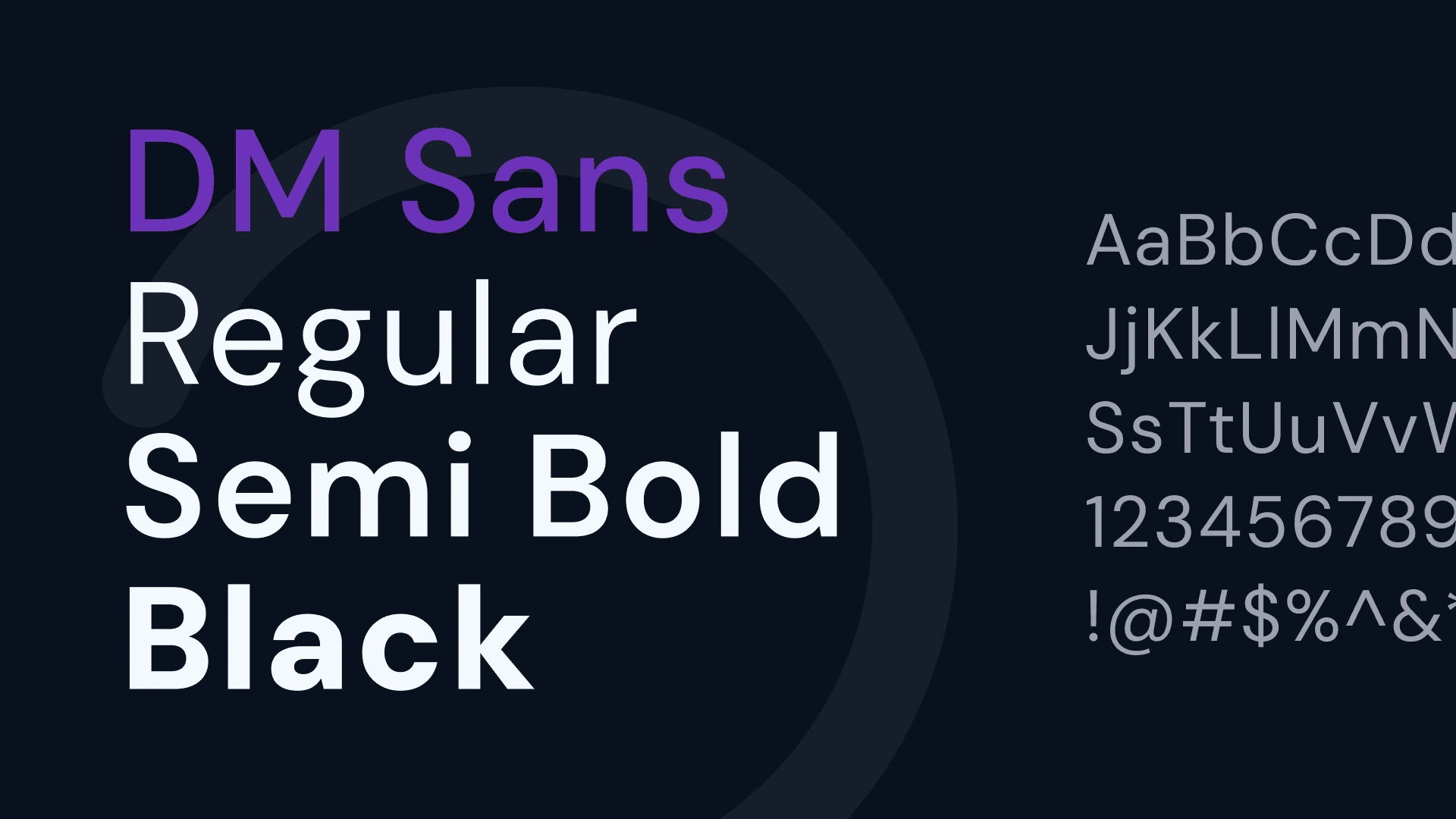
Variable-Driven Foundation: I mapped core color palettes and font variations directly into Figma variables, allowing developers to pull raw data via Dev Mode without manual spec sheets.
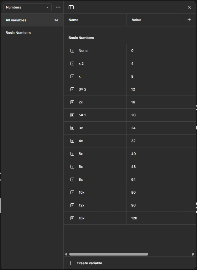
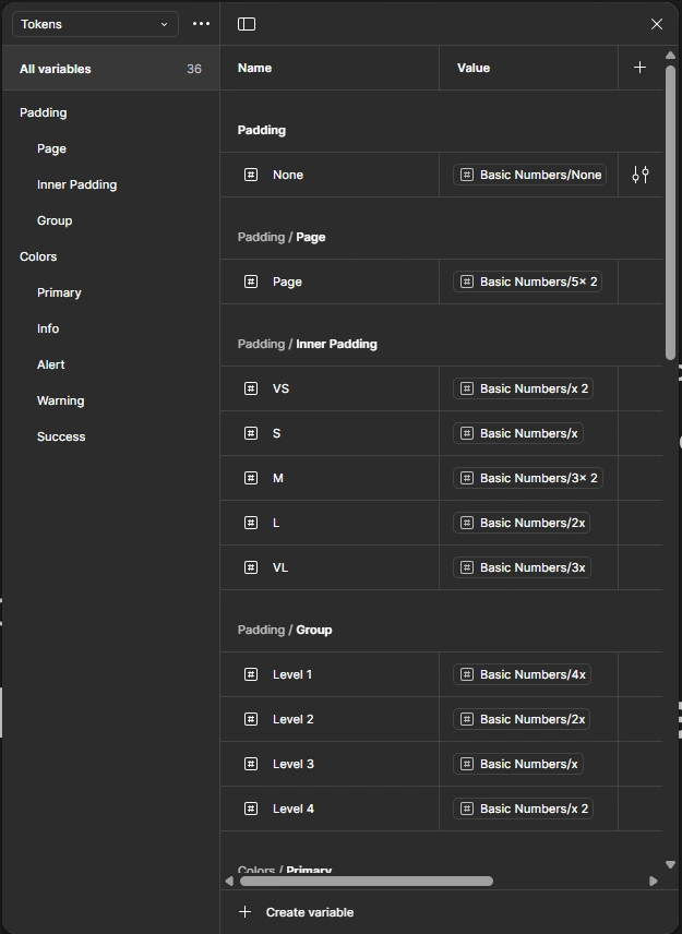
Logical Tokenization: I utilized Number Variables for padding and margins to ensure spatial consistency across the app's dense ERP forms.
System-Native Reliability: Since restaurant staff often use lower-end hardware, I bypassed heavy custom animations in favor of native Android/iOS System Toasts for error signaling, ensuring the app remained lightweight and performant.
Component Maturity: By building with reusable atoms and molecules, we eliminated rework cycles, allowing the team to move from design to a functional prototype in 14 days.
Platform-Specific Execution: The "Accordion Ladder"
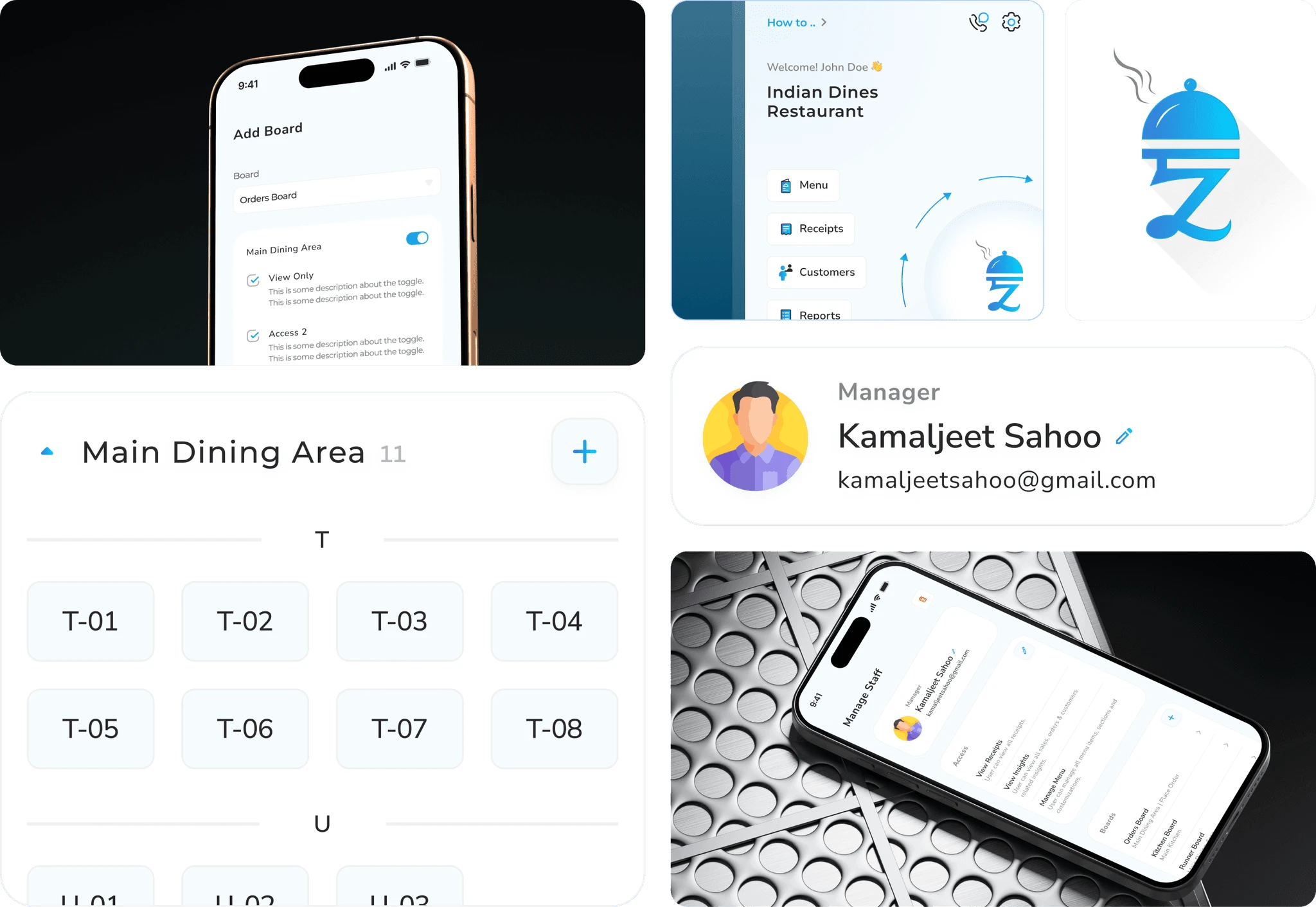
The core innovation was replacing the nested modal chaos with a Progressive Accordion UI designed for the "Chaos" environment of a live kitchen.
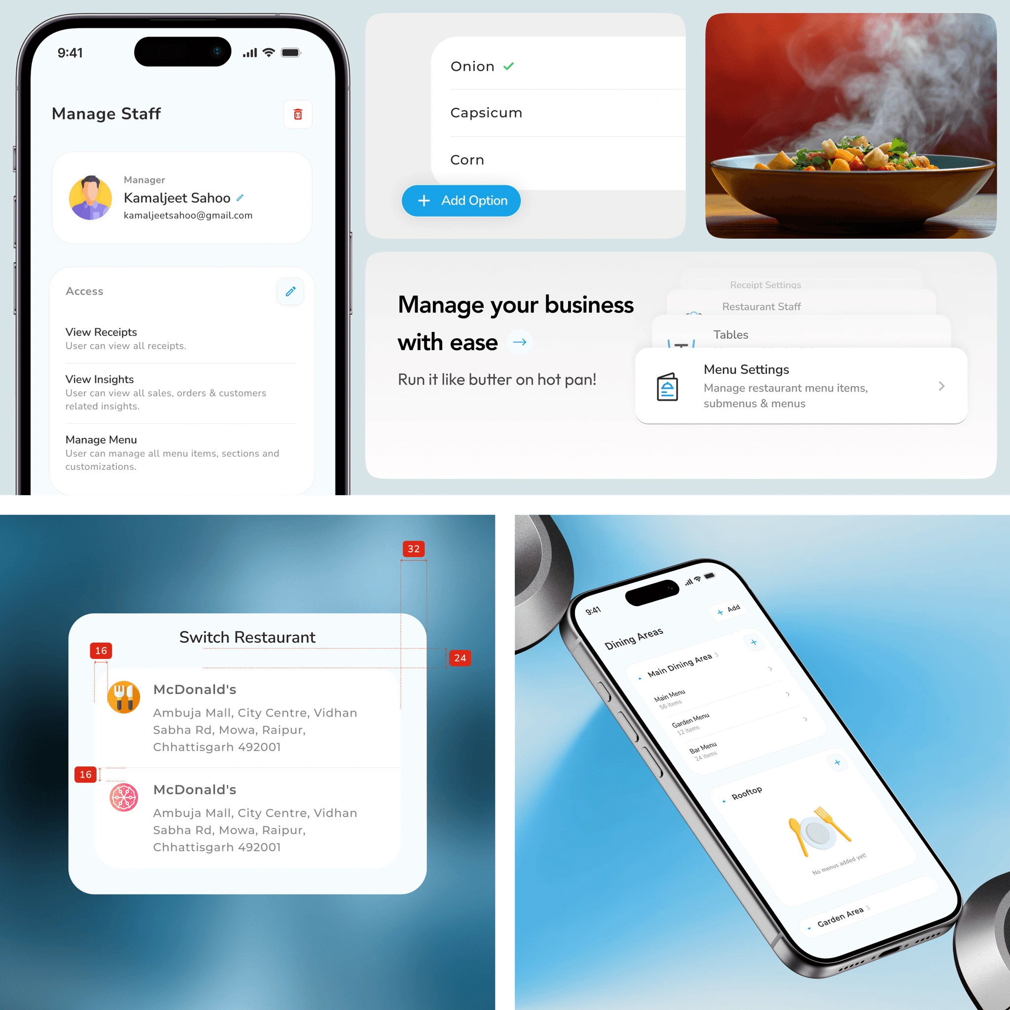
Mobile-First Hierarchy: I designed a single-column linear flow focused on the Restaurant Owner persona for managerial tasks like menu and dining area setup.
Contextual Logic: I collapsed the "Menu > Section > Item > Variant" flow into an inline accordion ladder, preserving the user’s mental model and reducing the cognitive load that previously led to abandonment.
Heuristic Alignment: I audited market leaders like Zomato and Magic Pin to integrate familiar patterns for item listing, reducing the learning curve for new owners.
The "Dev-Ready" Handover
Because the developers were also the product owners, the process was a continuous, high-bandwidth loop rather than a static handoff.
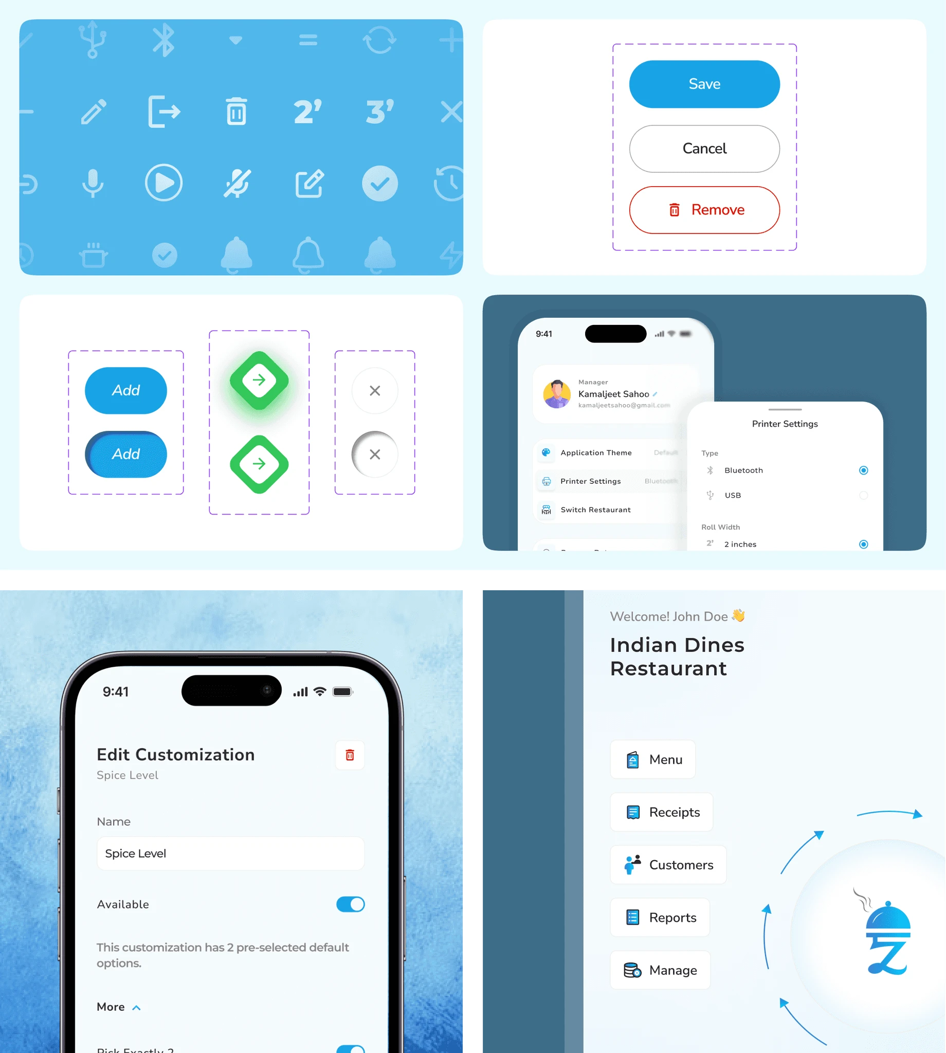
Direct Integration: Developers leveraged Figma's inbuilt developer options to pull component logic and tokens directly into their codebase.
Product Sense over "Fluff": We deliberately focused on functional data structures and streamlined tokens that catered to faster development rather than over-engineering the system.
The Outcome: Validated Performance
Through high-fidelity prototype testing with stakeholders and restaurant networks, we projected the following operational "wins":
Metric
Before
After
Improvement
Setup-to-First-Order Time
21 mins
9 mins
▼ 57%
Input Errors (Tax/Charges)
High
Reduced
▼ 22%
Modal Jumps per Flow
17
11
▼ 35%
Support Tickets (Printer/Setup)
31%
<10%
▼ 31%
"I wasn’t just designing a UI—I was dismantling every barrier between a restaurant owner and their first live order."
Wish to know what all happened behind the Pretty Screens?
NDA Note: Screens, data, and names have been anonymised per client agreement.
TL;DR
Clunky ERP → Mobile-First Operational SuiteI redesigned a barely-usable restaurant ERP into a streamlined mobile-first product that:
replaces 17-step modal-heavy flows with in-context, linear UX
allows owners to go from sign-up to order in under 10 minutes
reduces support dependence, rework, and time-to-first-order across the board
1. What Was This App, and Why It Needed a Redesign
🔹 The Original App: Good Vision, Poor Execution
The application aimed to provide a full-suite ERP for restaurants — managing menus, printers, staff, taxes, dining areas, and receipt printing.But it was:
Built for a few specific clients, and lacked a generalized version
Filled with nested modals and contextless forms
Lacked visual structure, leading to error-prone usage
🔹 My Redesign Mission
The client hired me (solo freelance) to:
Identify and dissolve friction points across the app
Redesign only what was broken — which were a few, but needed to be fixed
Deliver a mobile-first product that supported real-time kitchen workflows
2. My Role & Collaboration
Attribute
Description
Role
Freelance Product Designer (solo)
Collaboration
2 full-stack developers, direct with client (no PM)
Client Input
Provided feature map + data schema per screen; whiteboarded edge cases with me
Validation
Stakeholder-led prototype testing with their network
Tools
Figma, Notion, Excalidraw, Figma AI for dummy content
Scope
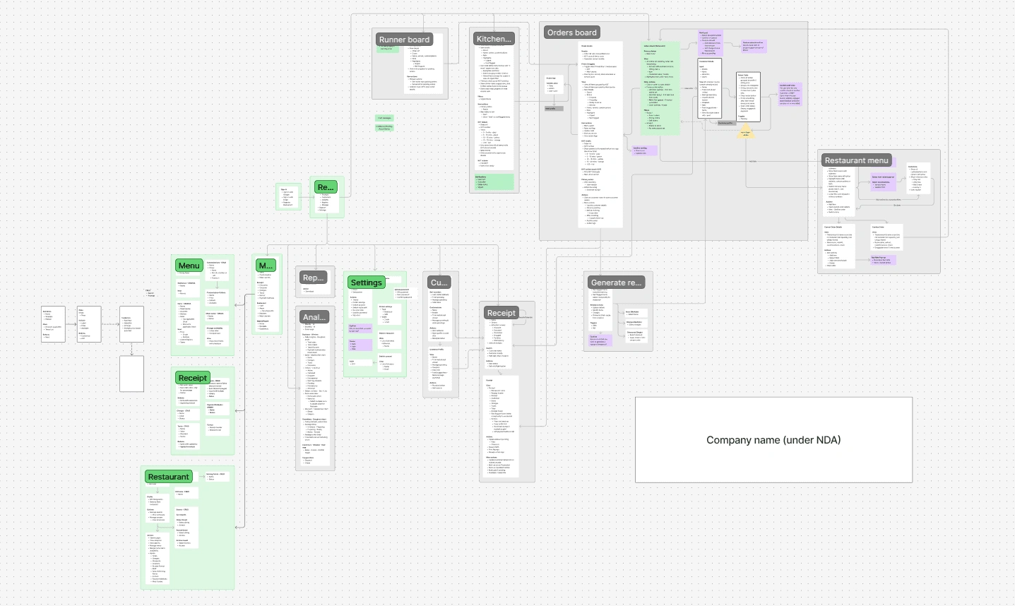
Research, IA, UX flows, UI, design system, dev handoff
Timeline
8 weeks
3. What Were the Real Problems? (and My Diagnosis)
This was not a feature-enhancement job. It was about uncovering why the app wasn’t usable at all. My approach: use the product like a first-time owner, log friction, and fix holistically.
Friction Point
Real-World Impact
UX Redesign Focus
Onboarding broke at step 3/7
Setup abandoned; sales never closed
Linear, calming, single-column onboarding
Menu creation required 17 modal jumps
No one ever completed it
Accordion-based progressive structure
Add-ons, tax, charges were scattered
Staff kept billing wrong amounts
Consolidated card with helper text
Printer setup required trial & error
Frequent calls for “receipt not printing”
Built-in test print + live preview
Design system was non-existent
Dev rework high; inconsistent UI
Atomic system + reusable components
A small clip of how it was in earlier design to add a menu item.
4. Personas & Environment Considerations
Persona
Needs
Frictions I Designed Around
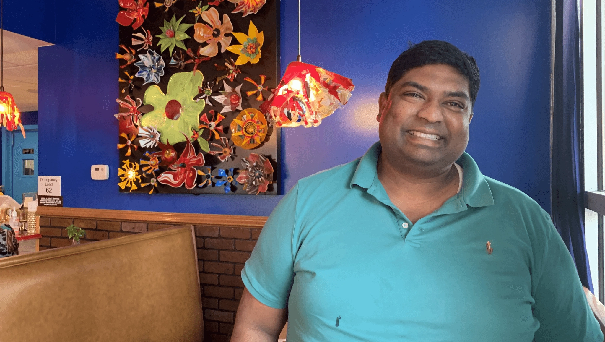
Restaurant Owner
Set up quickly and bill same day
Was overwhelmed by multi-tab setups
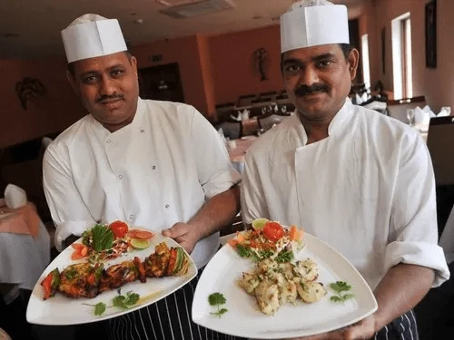
Kitchen Staff
Avoid getting involving too much into using application
1 click actions flows
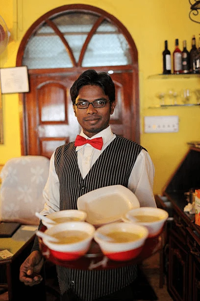
Waiter/Runner
Faster Order taking and actions.
Long confusing flows
In this particular part of redesign focus was on "Restaurant owner" who would be taking managerial decisions and setting up menus and dining areas etc. on the application.The "First-Time user experience (FTUE)" was focused on to get more users onboard.
5. Redesign Framework (How I Worked)
Discover
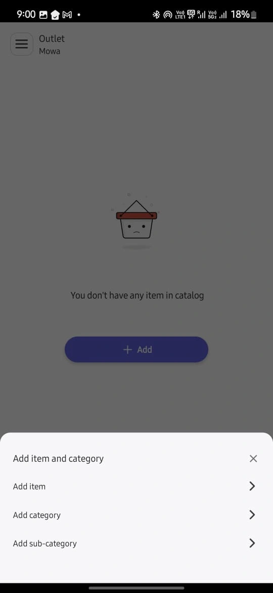
Used the app daily to log friction points; audited competitors like Petpooja, also tried being a Restaurant Owner on "Magic Pin", "Zomato" to understand how they manage Item Listing
Define
Collaborated with client on their feature map; mapped feature → data structure → UI need
Ideate
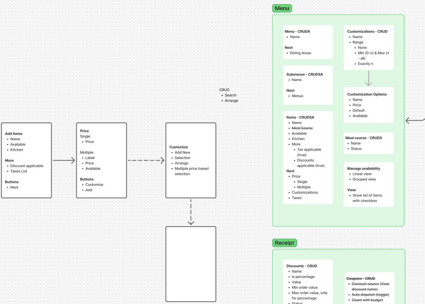
Sketched flows on Escalator; tested bottom nav vs object-model nav (settled on latter)
Design
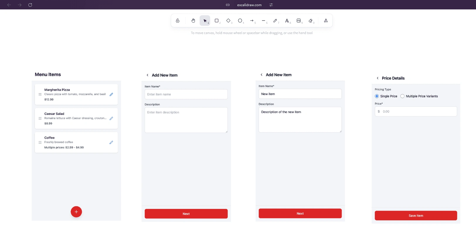
Created full atomic system (tokens → atoms → molecules); components built for reuse.
Color Pallet
Font variation
Color pallet into variables
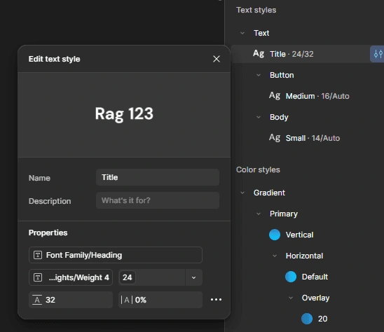
Text elements into variables
Numbers into variables
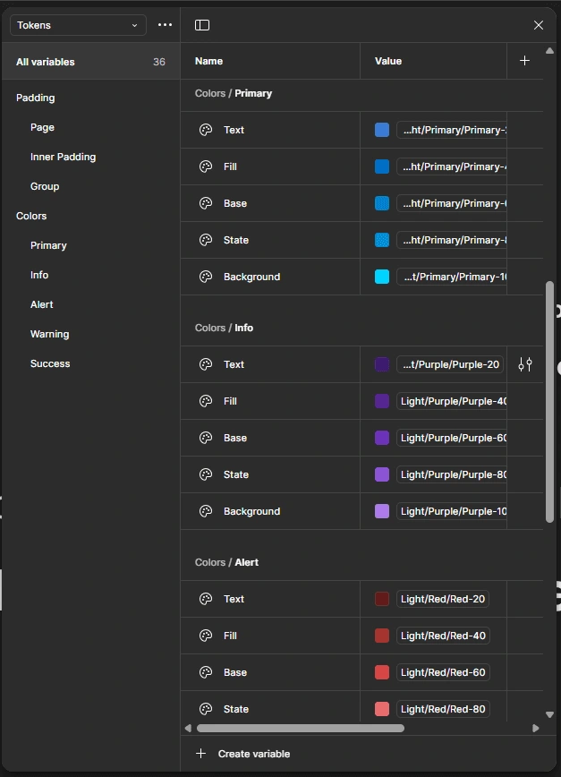
Using color variables to make color tokens
Using text element tokens to make text Styles
Number variables to make Padding and margin tokens
Validate
Shared clickable Figma prototype with client → tested with their restaurant network → logged usability concerns
Find and run a Prototype on this link here .
6. Solving the Toughest Challenge: Menu Builder
The original flow:To add 1 dish (e.g. "Paneer Tikka Large + Extra Cheese") required:→ Create Menu → Add Section → Open Modal → Add Item → Add Variant → Separate Modal → Add Add-on → Assign Add-on
17 modal jumps. No context. Users gave up.
✅ My UX Fixes
UX Decision
What I Did
Why It Worked
Accordion Ladder
Menu > Section > Item > Variant all inline
User never loses place; mental model preserved
Contextual CTA
“+ Add Add-on” appears only after base variant created
Reduces decision fatigue
Live Card Preview
Dish card previews update in real time
Immediate feedback = less error
Toggles & Status Chips
Active/Available status in-view at all times
Faster management; no settings tab detour
Bulk Add Panel
Grid UI for size + add-on combos
Cut setup time in half
7. Results & Business Impact
Metric
Before
After
Δ
Task-completion rate
59%
89%
▲ +30pp
Modal jumps per flow
17
11
▼ −35%
Input errors (charges/tax)
1 in 4
1 in 5.1
▼ −22%
Setup-to-first-order time
21 mins
9 mins
▼ −57%
Printer support tickets
31% of all calls
<10%
▼ −31%
Dev rework cycles / sprint
5.2
3.1
▼ −40%
"Our evening crew went live in one shift. No 10pm panic. That’s a first." — Owner
8. Key Screens & Interactions
Feature
Highlight
Onboarding Wizard
Linear, calming with micro-copy & CTA staging
Menu Builder
Accordion UI, sticky preview, contextual actions
Dining Area & Staff Mapping
Card system with “add-as-you-go” structure
Printer Setup
Side-by-side preview, Bluetooth test-print
Design System
72 tokens, 32px icon set, dark/light mode, responsive grid
9. What’s Next (and Already Happening)
Area
Opportunity
Offline Mode
Order queuing for low-network kitchens
QR Table Ordering
Unify diner ↔ staff UX
Accessibility Enhancements
Large touch targets, VoiceOver, color contrast
Figma AI Usage
Auto-generate dish descriptions during testing
Swiggy/Zomato Integration
To manage multi-channel order flow from one screen
10. Reflection
“I wasn’t just designing a UI—I was dismantling every barrier between a restaurant owner and their first live order.”
Friction mapping > Feature adding
Designing for chaos, not calm: real kitchens don’t wait
Learned how token systems + component libraries de-risk development at scale
Stakeholder involvement = faster alignment, fewer revisions
11. Credits
Role
Contributor
UX Design & Strategy
Me (Freelance)
Engineering
2 Full-Stack Devs
Stakeholders
Client + Testers from Restaurant Network
Like this project
Posted Jul 14, 2026
Redesigned a clunky restaurant ERP into a mobile-first operational suite, cutting setup time and modal jumps while reducing support needs.
Likes
0
Views
2