ReturnEase — Doorstep Returns, Redesigned for Busy Londoners

Shubham Arya


Return Ease
ReturnEase — Doorstep Returns, Redesigned for Busy Londoners
Tags: Mobile App Design · UX Strategy · Two-Sided Marketplace
Project Snapshot
Location
London, UK
Duration
6–8 weeks
Date
2026
Tools
Figma, FigJam, Notion
The Client
ReturnEase is a London-based startup on a mission to kill the post-purchase nightmare. The idea is simple but powerful: instead of trekking to the post office with an armful of parcels, a local shopkeeper partner collects your returns at your door, takes them back to their shop, and processes everything through their courier setup — ASOS, Amazon, and all. It's a win for busy Londoners stuck with what they call the "Doom Pile," and a win for local shop owners looking for a smart new income stream.
The platform works as a two-sided marketplace: customers book pickups through the consumer app, while shopkeeper partners manage jobs, availability, and earnings through a dedicated partner app.
The Creative Challenge
ReturnEase had a compelling proposition but no product to show investors or early users. The founding team came to Groto with a detailed vision — multi-retailer aggregation, barcode scanning, Uber-style live tracking, subscription vs. one-off pricing — but everything existed only in documents and a partial IA diagram.
The challenge wasn't just designing screens. It was making a genuinely complex two-sided logistics product feel effortless on both sides. A customer shouldn't have to think about couriers. A shopkeeper shouldn't have to manage chaos. And neither should ever wonder what happens next.
We had to design two complete hi-fi clickable prototypes — customer app and shopkeeper/partner app — across a 6–8 week timeline, while also building the foundational design system to hold it all together.
Our Approach
We started where ReturnEase's users live: in the frustration of the "Doom Pile."
Before opening Figma, we mapped the full end-to-end journey from both sides of the marketplace. The customer flow had six distinct stages — onboarding, add return, basket, booking, tracking, and proof of collection. The shopkeeper flow was equally layered: profile setup, availability windows, job queue, door pickup, shop check-in, and earnings. Getting these right required aligning tightly with the client on every decision point, particularly the courier matching logic (shopkeepers only appear if they support that retailer's return type) and the three-stage proof model (collected → received at shop → processed).
The FigJam IA board we inherited was customer-only and incomplete. We expanded it, mapped the shopkeeper journey end-to-end, then moved into wireframes before touching visual design.
What We Did
The "Doom Pile" Dashboard
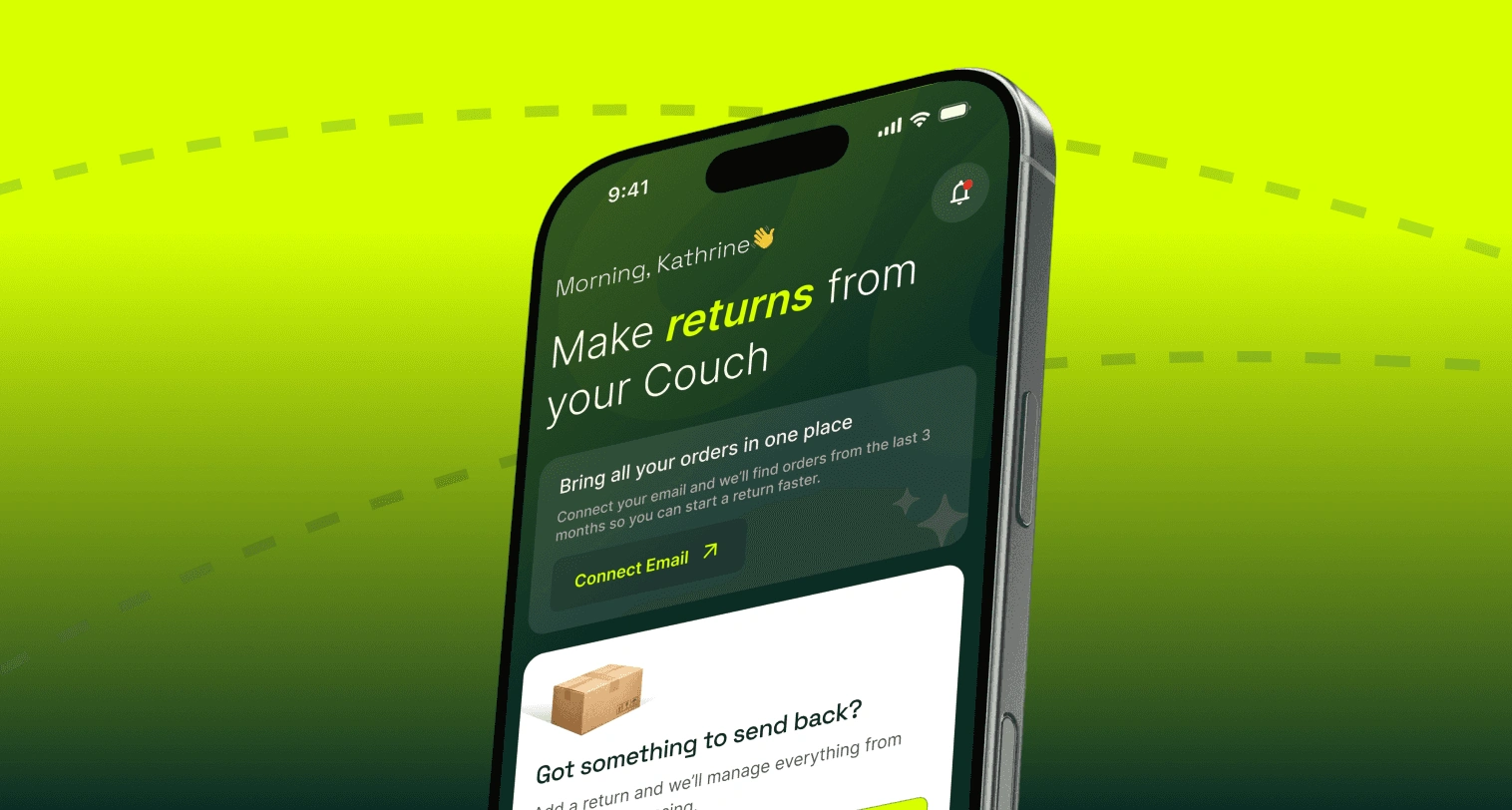
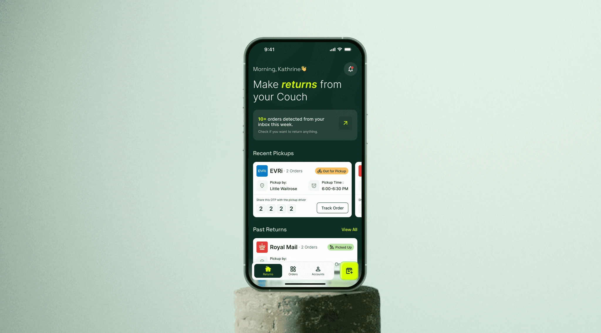
The name is everything. ReturnEase's dashboard needed personality as much as clarity. We designed an "Active Returns" list that feels like a task manager — each card showing the retailer, parcel count, and current status — so users immediately understand what's waiting and what's moving.
The empty state was treated as a first-time experience moment, not an afterthought. No clutter, no generic illustration. Just a clear nudge to add the first return with a warm, human tone.
Add Return Flow: QR/Barcode Scan + "No Printer Needed"
One of the biggest barriers to online returns is the printer. People don't have them. ReturnEase's entire model removes that friction — and the UX needed to say so clearly, not bury it in small print.
We designed the Add Return flow around the QR/barcode scan as the primary action, with a persistent "No printer needed" validation badge that appears immediately after scanning. The courier confirmation step follows naturally, so users always know who's actually handling their parcel before they commit.
Aggregator Basket: Multiple Retailers, One Pickup
The basket is ReturnEase's core differentiator. Unlike existing return services that handle one parcel at a time, ReturnEase lets you bundle ASOS, Amazon, and beyond into a single doorstep pickup.
We designed the basket to make this feel intuitive, not complicated. Each retailer gets its own grouped section within the basket, with courier details shown clearly at the item level. A summary at checkout rolls everything up — total items, total cost, pickup window — before the user commits. The design makes multi-retailer pickup feel like table stakes, not a premium feature.
Booking + Checkout: One-Off vs. Subscription
ReturnEase's business model hinges on converting one-off users into Prime subscribers. The booking and payment screens had to carry that upsell without feeling manipulative.
We designed a side-by-side comparison at checkout that makes the value case for subscription feel natural — not a dark pattern. The per-pickup cost vs. monthly subscription is shown in plain numbers, with a clear "save X per pickup" callout for regular users. One-off payment flows through without friction; the subscription option surfaces at the right moment without blocking the path.
Uber-Style Tracking + Proof of Collection
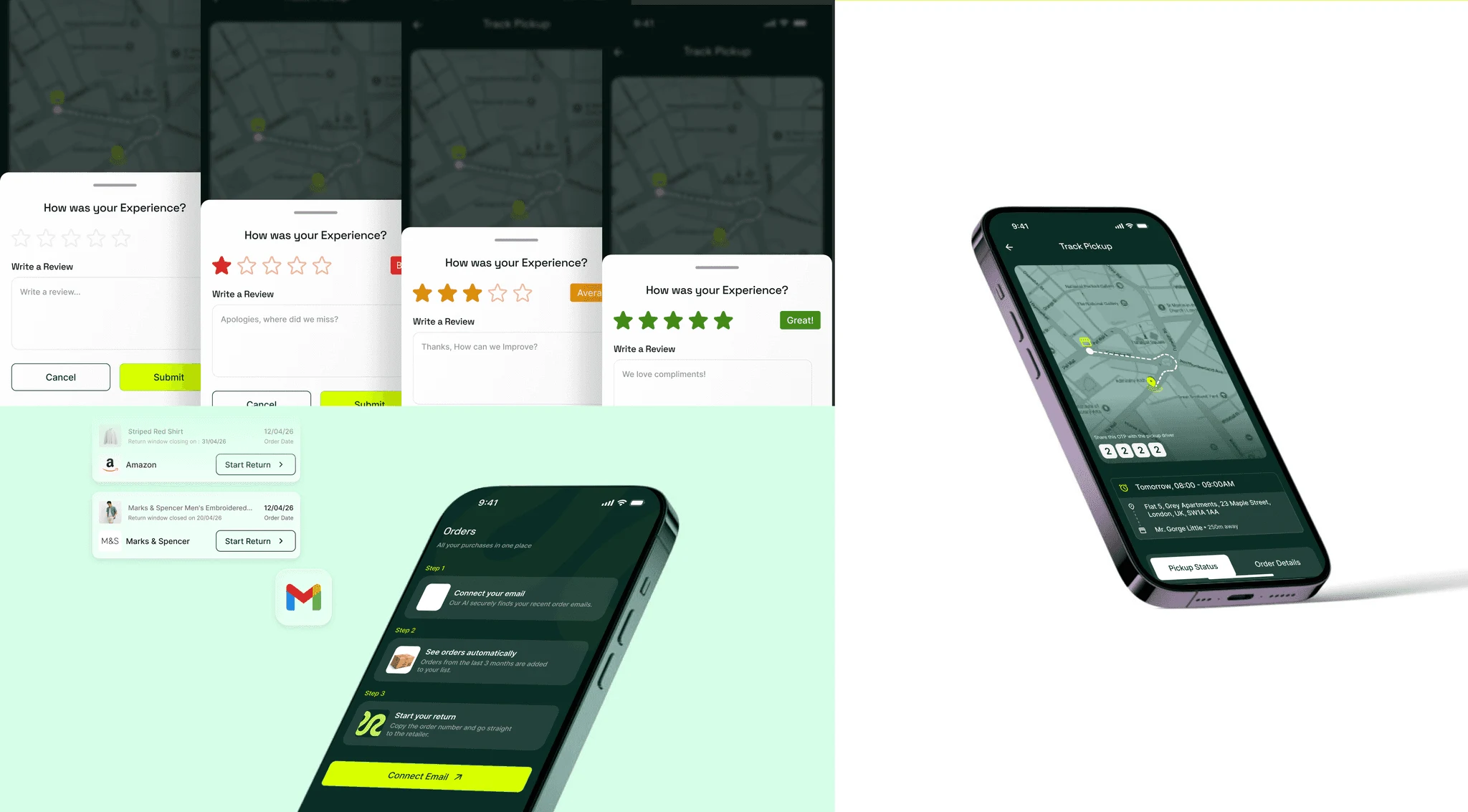
Live tracking is a trust signal as much as a feature. We designed the tracking screen around a map view with the shopkeeper's location updating in real time, paired with a clear status timeline below: Pickup Booked → Shopkeeper En Route → Collected → At Shop → Processed.
Proof of Collection is a three-stage confirmation: a photo-based receipt at door pickup, a shop check-in confirmation, and a final processed notification once the retailer's courier has it. Each stage sends a push notification and updates the parcel card on the dashboard — closing the loop for the customer without them needing to chase anything.
Shopkeeper App: Running a Returns Business from Your Phone
The partner app is a full logistics tool in its own right. Shopkeeper onboarding covers courier partnerships and the return types they support — this feeds directly into the customer-side matching algorithm, so only relevant shopkeepers are surfaced for each return.
The job queue shows batched pickups on a run-list view, optimised for a single zone session. Door pickup is handled via OTP verification and parcel photo capture — both required before the job status updates. Shop check-in triggers the proof-of-receipt confirmation to the customer. Earnings and payout history close out the experience.
Design System Foundation
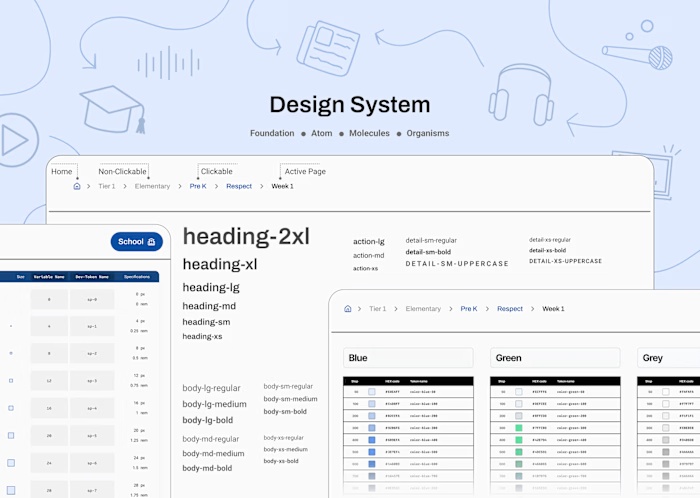
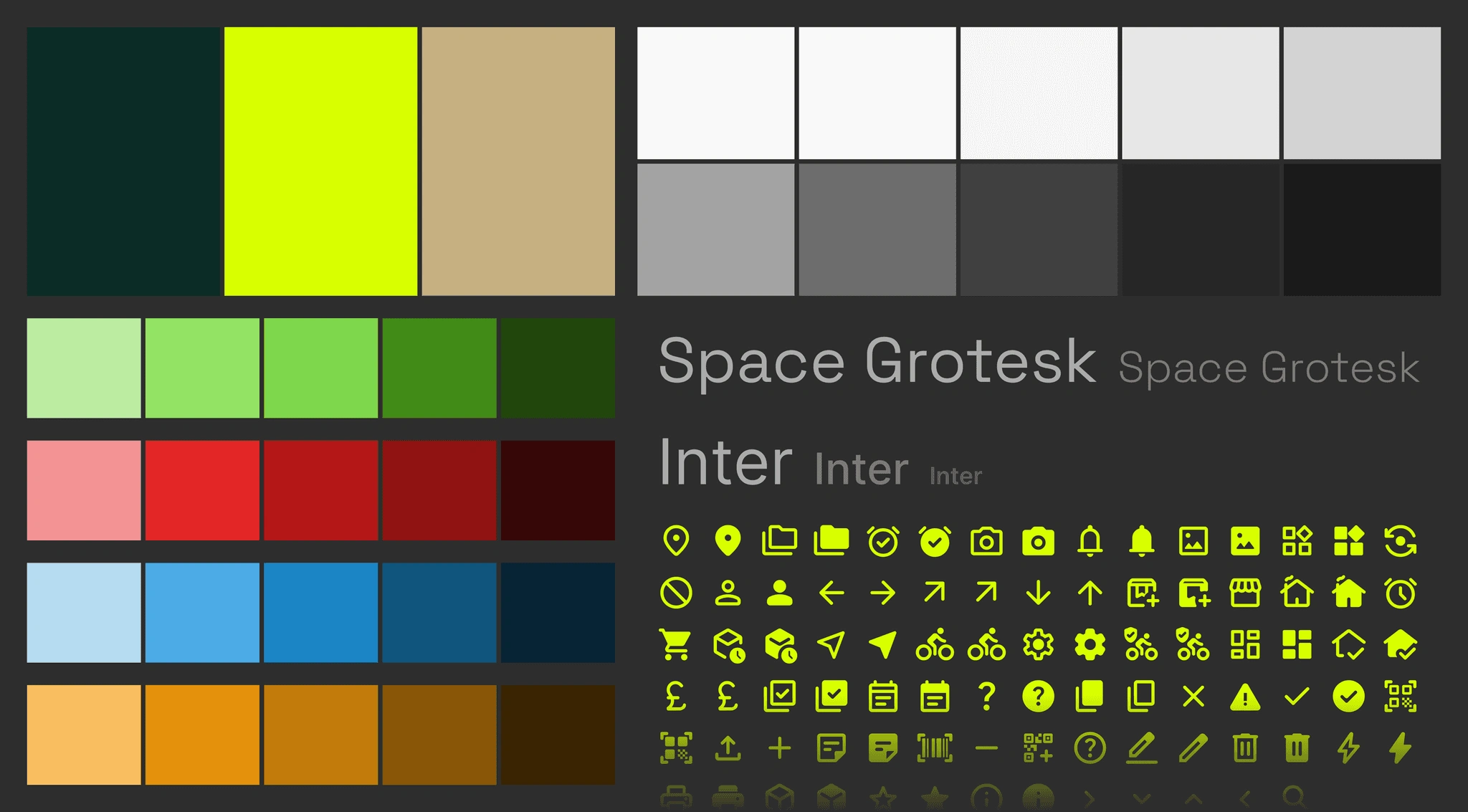
Alongside both prototypes, we built a small but production-ready component set covering the core UI primitives: buttons (primary, secondary, destructive), input fields (default, scanning, error states), cards (parcel, job, earnings), status badges, bottom sheets, and navigation patterns for both apps. Typography and colour tokens are documented and ready for handoff.
The Results
ReturnEase now has two complete, high-fidelity clickable prototypes ready for investor demos, user testing, and developer handoff. The customer app takes a first-time user from zero to a booked, tracked, proof-confirmed return without confusion at any step. The shopkeeper app gives a local partner everything they need to run a returns round professionally — from setting up their courier profile to getting paid.
The Doom Pile finally has a design that matches its ambition: clear, confident, and built around the real behaviour of people who just want their money back without the hassle.
Phase Breakdown
Phase 1 — IA & UX Direction (Weeks 1–2) Flow alignment for both apps, expanded IA covering the shopkeeper journey, wireframes for all key screens across both happy paths.
Phase 2 — Design System Setup (Weeks 3–4) Colour tokens, typography scale, button states, input fields, cards, badges, bottom sheets. Built to serve both apps with shared foundations.
Phase 3 — Visual Design (Weeks 5–6) All main happy-path screens designed at hi-fidelity. Doom Pile dashboard, scan flow, basket, booking, checkout, tracking, proof, shopkeeper job queue, door pickup, shop check-in, earnings.
Phase 4 — Polish & Prototype (Weeks 7–8) UI consistency pass, micro-interaction design, prototype linking, and final clickable flows in Figma for both apps.
Want to see how we think through two-sided marketplace UX? Let's talk.
Like this project