Charm City Logo Design
Samuel O
CHARM CITY LOGO DESIGN
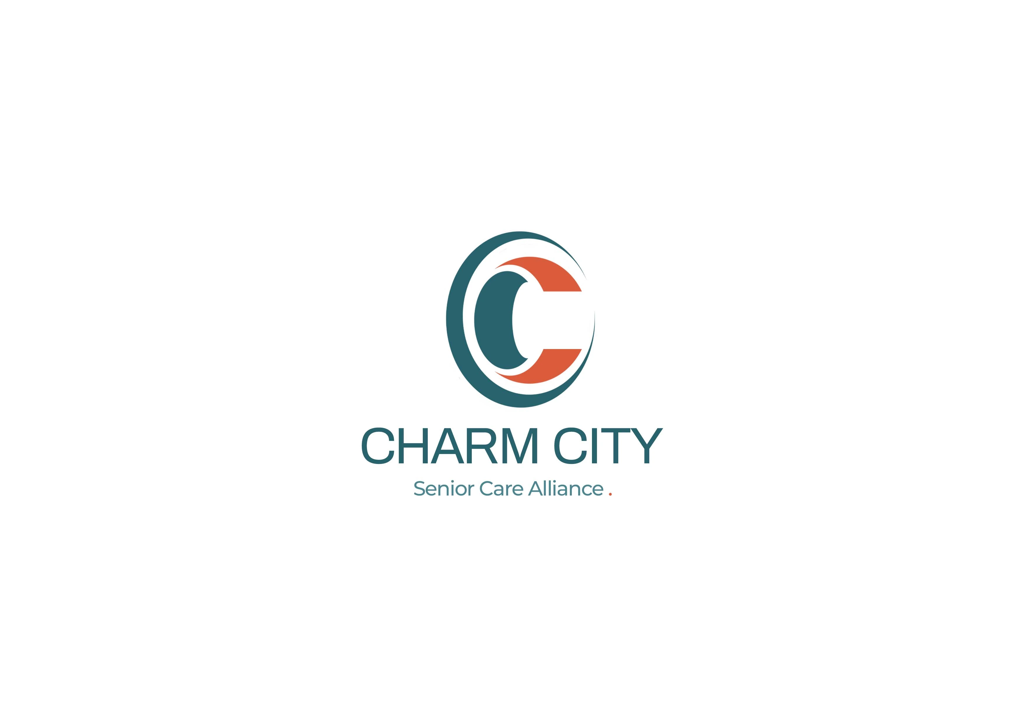
The Charm City Senior Care Alliance logo was created to represent care, continuity, and community.
At the center of the mark is a circular form built from the letter “C”, symbolizing Charm City and the idea of an open embrace. The flowing curves reflect movement and connection — a reminder that senior care is not static, but an ongoing relationship built on trust and support.
The inner and outer shapes come together to form a unified whole, representing collaboration between caregivers, families, and care providers. The balance between soft curves and structured form communicates both compassion and reliability.
The color palette was chosen intentionally: calming teal to convey stability and reassurance, paired with a warm accent tone that represents empathy, dignity, and human warmth.
This logo was designed to feel welcoming, timeless, and respectful — a visual identity that honors the lives it represents while remaining clear, modern, and adaptable across all platforms.

Like this project
Posted Feb 4, 2026
This project explores a thoughtful blend of strategy and creativity to deliver visually compelling design solutions.