Built with Framer
brox.ai panel — Branding + Custom Template Design in Framer
Brox.ai Panelist Recruitment Website
💼 Client acquired through Learned Media
🖥️ View live site here ↗️
Project Overview
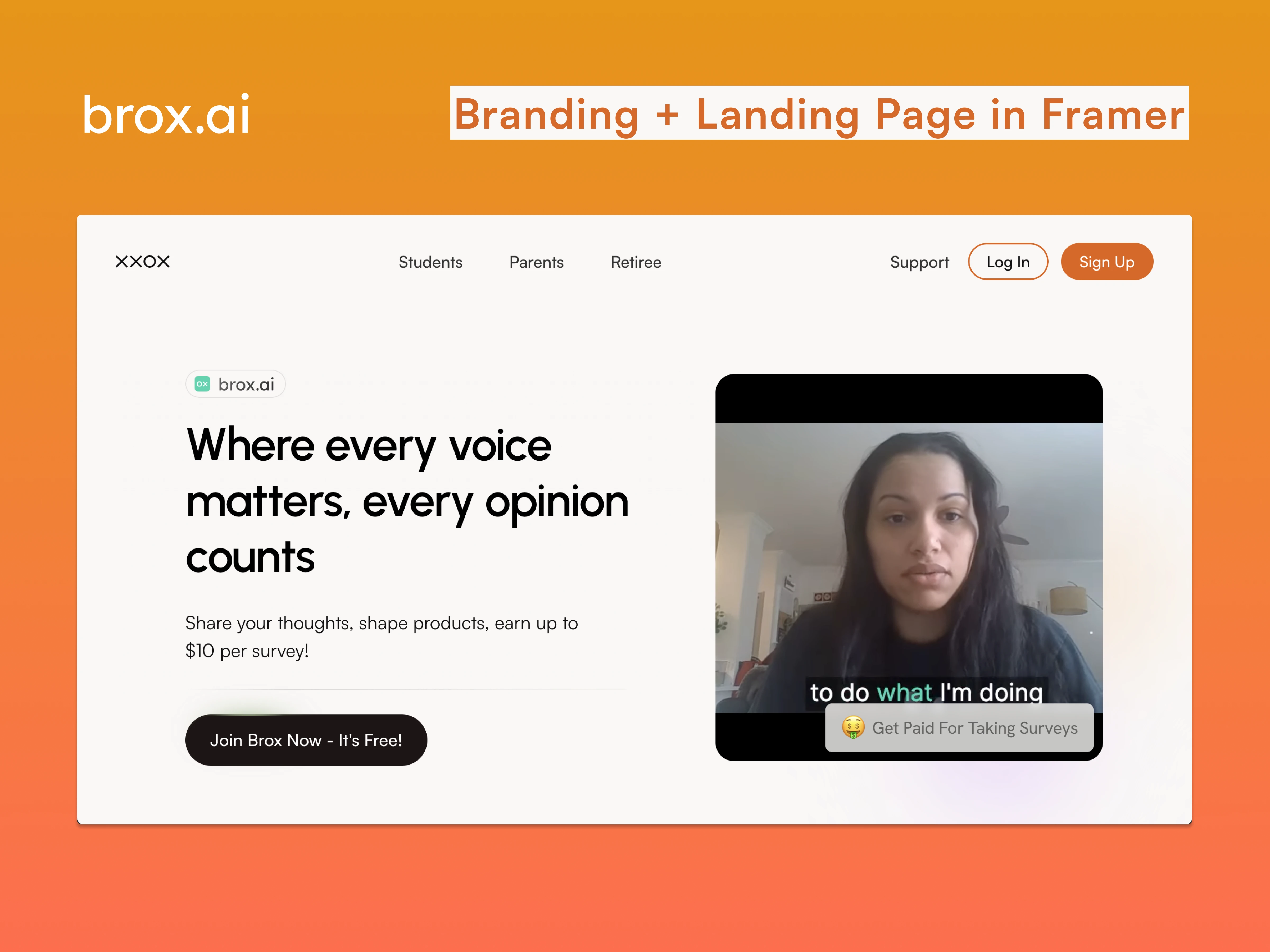
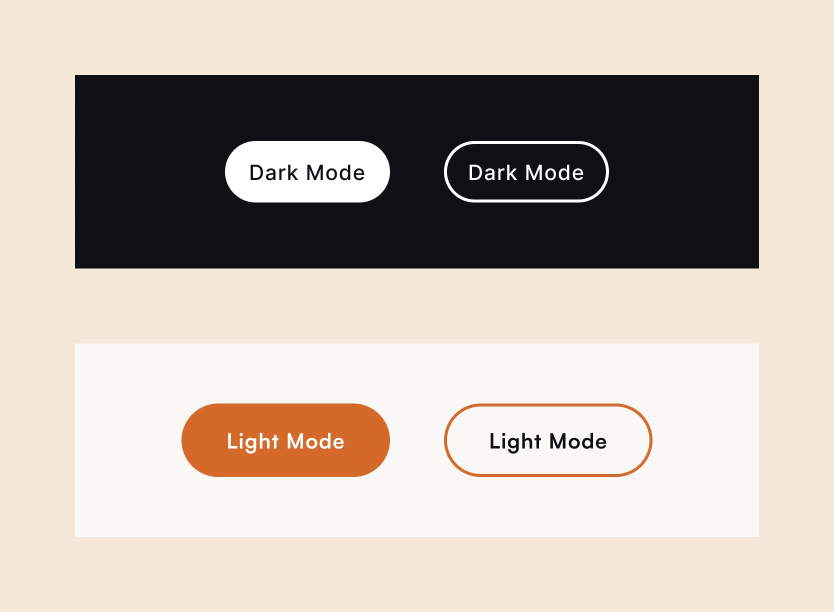
Brox.ai sought to design a fresh, user-friendly website aimed at recruiting a diverse range of panelists for their data platform. To differentiate from their original dark branding, they requested a “light mode” look with one distinct accent color, a burnt orange, for the CTAs. The goal was to attract new panelists—students, parents, and retirees—by making the site welcoming, intuitive, and highly accessible for this wide demographic range.
Understanding the Problem Space
Brox.ai’s main challenge was to create a welcoming, easily navigable site that could appeal equally to users of varying ages and technical abilities. A few specific design requirements shaped our approach:
Accessibly Simplicity
The layout needed to feel accessible at a glance for any user, whether a retiree or a college student.
Broadly Applicable Templates
Each target group—students, parents, and retirees—required unique yet reusable layouts, emphasizing broad usability while maintaining Brox’s brand identity.
Using each target group page as a "landing page" for SEO ads for the different demographics.
Visual Cohesion
While maintaining simplicity, the design had to feel cohesive and engaging, with each use case clearly highlighted to guide potential panelists to information relevant to them.
This clear understanding of brox.ai’s diverse audience allowed me to design a solution that went beyond mere visuals, creating an experience centered on user accessibility and relevance.
Design Process: Crafting a Welcoming, Accessible Experience
Defining Brox.ai’s “Light Mode” Brand Identity
To maintain a sense of cohesion while distinguishing this site from Brox’s original brand, I redefined the brand in a “light mode” aesthetic:
Emojis and Icons for Scanability
To ensure that users could quickly identify sections relevant to them, I integrated intuitive emojis and icons, adding a layer of visual guidance for quick scanning. Emojis were chosen as a design element because they bring a sense of approachability to the site. These are visuals all age groups are exposed to and open up potential for further brand evolution.

Engaging Color Selection
I selected a range of colors that complemented the burnt orange CTA without overwhelming the page, focusing on creating an inviting, clickable experience for a wide age range.
User-Centric Layout and Flow
Working in Framer, I crafted layouts that are clean, accessible, and centered around panelist video examples, allowing potential recruits to instantly understand Brox’s purpose.
Highlighting Video Content
The video examples were prioritized as focal points to make the platform’s function clear, creating immediate interest and relatability for visitors.
Simple Scalable Templates
Each use case (students, parents, retirees) was given its adaptable layout template. This helped ensure clarity while maintaining a consistent flow, allowing Brox.ai to easily replicate the layout for future use cases without losing the site’s core simplicity.
Outcome: An Inviting, Accessible Website for a Diverse Audience
The final design successfully captured Brox.ai’s intent to create an inclusive, appealing platform for new panelists. By focusing on simplicity, clear visual cues, and an intuitive flow, the website caters to a broad audience with varied technical familiarity. Each design choice serves a purpose: enhancing user accessibility, building trust, and ensuring visitors feel welcomed. This project demonstrates my commitment to designing with inclusivity and purpose, adapting the brand while making the user journey clear and engaging for everyone involved.
Like this project
Posted Nov 18, 2024
Fresh, user-friendly branding and website aimed at recruiting a diverse range of panelists for a data platform.
Likes
3
Views
141

