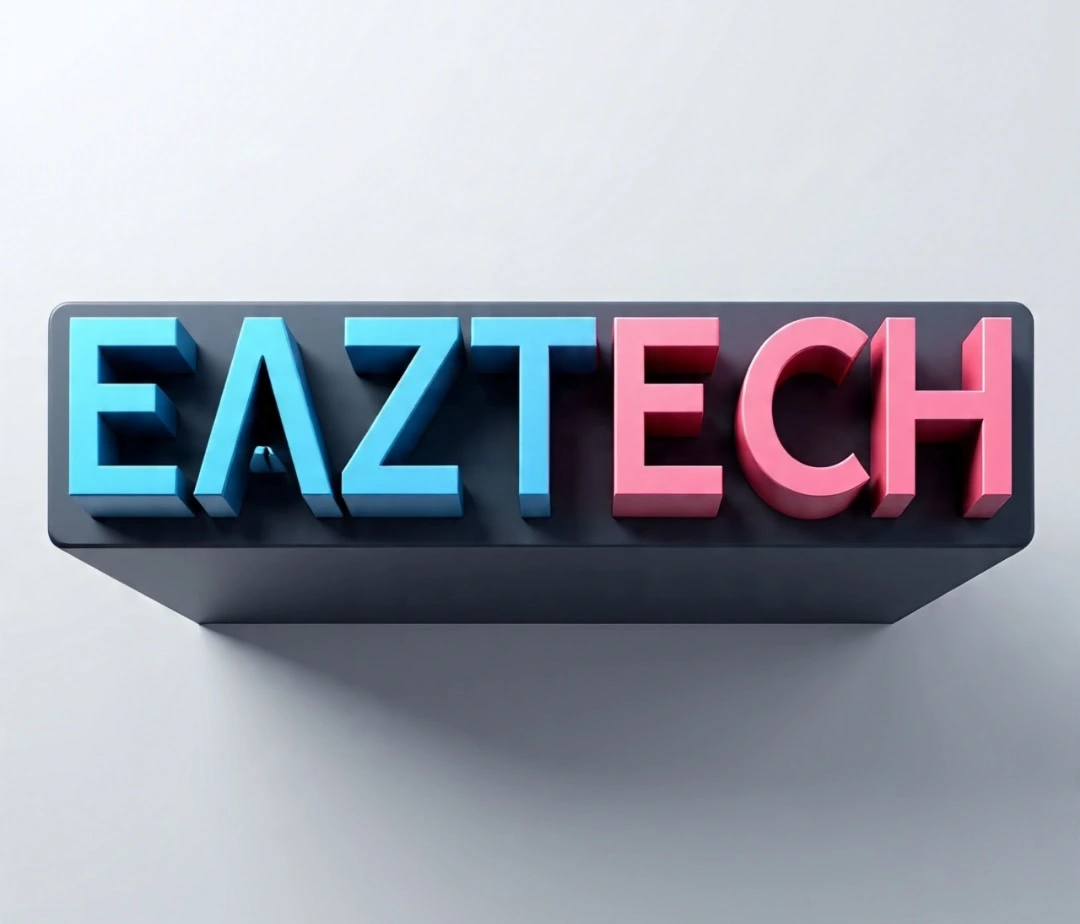
Brand Logo Design for EAZTECH
Success Creatives
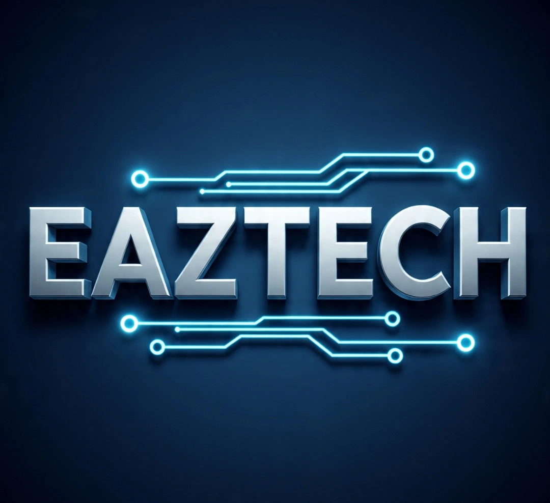
Brand Logo Design for EAZTECH — Elevating a SaaS Startup’s Visual Identity
Technical Specifications
Type: Brand logo design & style direction
Tools: Canva mobile
Services Delivered: concept sketching, icon selection, typography pairing, color psychology, integration
Goal: Establish a memorable, trustWorthy, scalable brand identity for EAZTECH
Integrated with: Landing page, Blog post, & other marketing assets!
Mini Story case study
Creating a visual identity That powers SaaS Growth
When we began shaping EAZTECH'S digital presence through a high converting landing page and expert content strategy, we quickly recognized something vital was missing.
A distinct, trustworthy brand mark that could tie it all together
I stepped in to develop EAZTECH'S Logo, focusing on what mattered most for a SaaS brand competing for trust and attention in a crowded market.
Simplicity & scalability:
The mark had to look equally strong on a mobile browser, a tiny app icon, or a giant conference Banner!
Color psychology:
We explored cool tech tones that conveyed innovation, reliability, and security - anchoring the palette in deep purples and vibrant accents that already flowed through their landing page & Blog visuals.
Meaningful symbolism:
By blending subtle circuit-inspired lines into a sleek abstract shape, we hinted at connected workflows and streamlined processes - exactly what EAZTECH offers.
Powerful Integration Across the Brand
The new logo didn't just sit on a file, it transformed every touch point
🚀Featured at the top of their landing page, building instant Brand recognition
📚 Embedded in Blog headers to tie content marketing directly back to EAZTECH
🖥️ set-up for future marketing use and Campaigns!
💡Highlights
Designed a tech-driven scalable logo builds instant trust.
Integrated seamlessly across their marketing platforms
Strengthened EAZTECH'S visual identity, making all campaigns and customer touchpoints consistent and recognizable
Delivered in vector & PNG formats for easy use by their Developers
Let's contribute to your long-term business Growth!!!
Like this project
Posted Jul 9, 2025
Designed a scalable logo for EAZTECH, enhancing their SaaS brand identity.
Likes
0
Views
12
Timeline
Jun 15, 2025 - Jun 17, 2025