Senior Home-Care Website & Family Enquiry Journey

Joshua Adehi

Helping families understand home-care services
This design showcase uses the Right at Home website visuals from my portfolio. It focuses on how families explore care options, learn about the provider, and find a route to contact a local team.
The design challenge
Home-care information needs to feel approachable while remaining easy to scan. Families may arrive with different needs and different levels of familiarity with the services. The page therefore needs more than a strong hero image: it needs clear service categories and a simple way to find the next step.
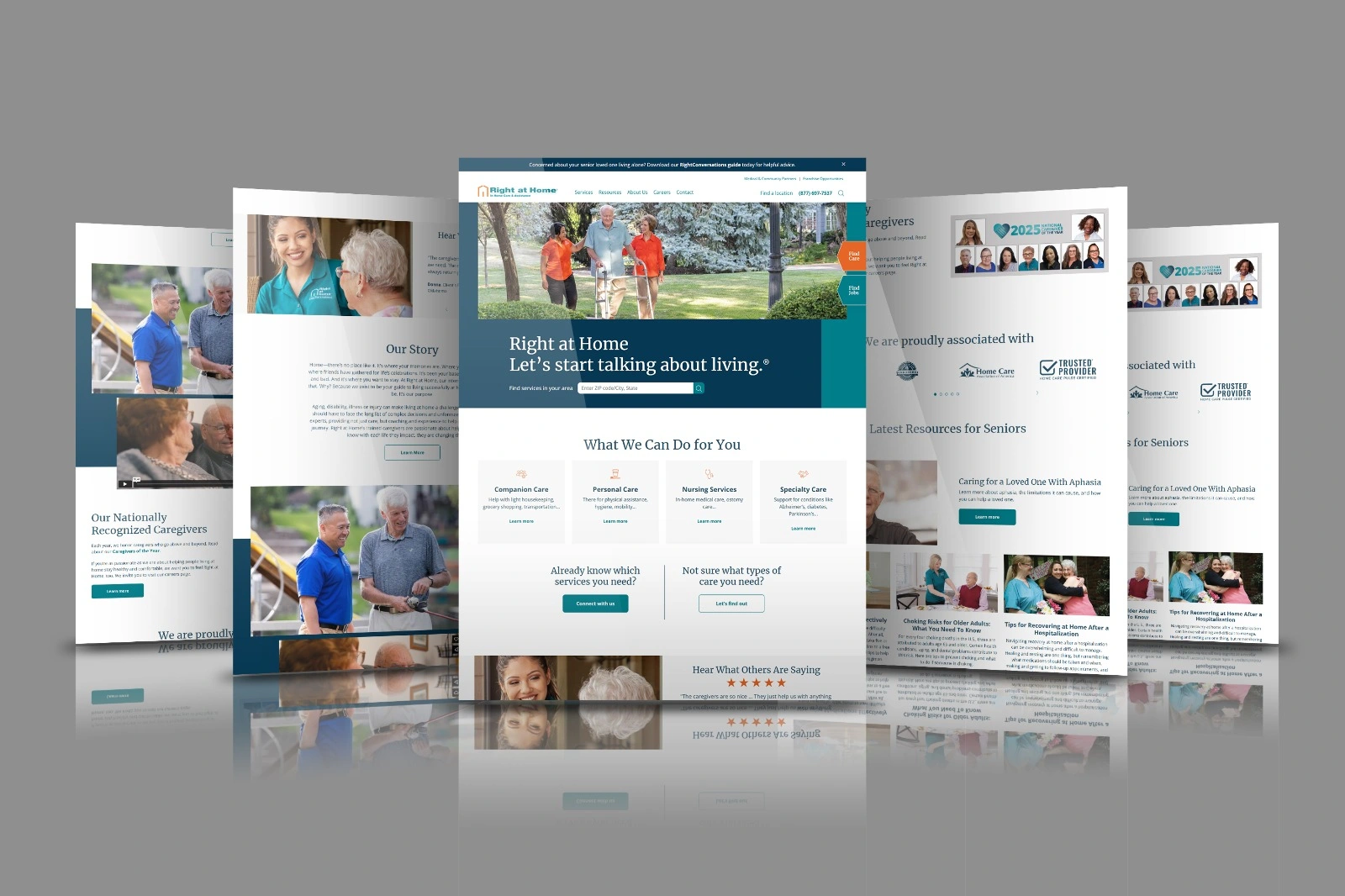
The layout introduces the provider before presenting companion care, personal care, nursing services, and specialty care as separate choices. This keeps the offer understandable without placing every detail in the opening section.
A clear next step for different visitors
The page separates visitors who already know which service they need from those who want help exploring the options. A location search appears near the introduction, while service cards and contact prompts give families other ways to continue.
Caregiver stories and resource sections sit alongside the service information. They give the page a human focus without hiding the practical details a family came to find. Teal accents identify actions, generous spacing separates topics, and photography breaks up the longer sections.
What the portfolio shows
The original multi-panel mockup brings the homepage, service choices, caregiver content, and resources together. The supporting full-page image shows the longer page structure. Both are retained as project visuals; no invented dashboard or replacement interface has been added.
This is a website-design case focused on presentation and navigation. It does not claim clinical results, care-provider endorsements, verified accessibility compliance, or an increase in bookings.
More website work: https://www.upwork.com/freelancers/kajabiexperts/
For a clear, welcoming website for your service business, send me a message on Contra.
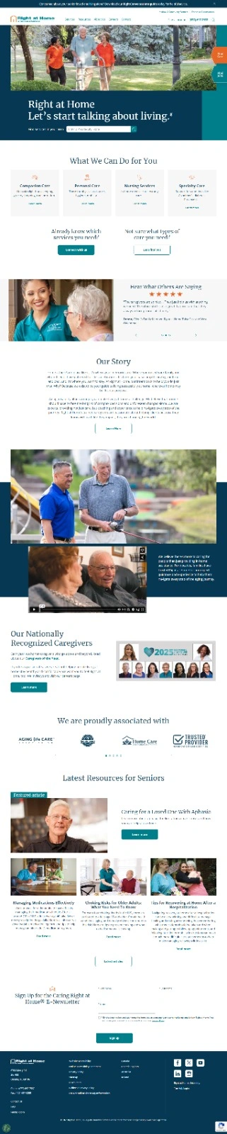
Original full-page home-care website preview, supporting the multi-panel mockup.
Like this project
Posted Aug 24, 2026
Home-care website design with clear service choices, local-team discovery, caregiver stories, and a simple enquiry journey for families.
Likes
0
Views
3