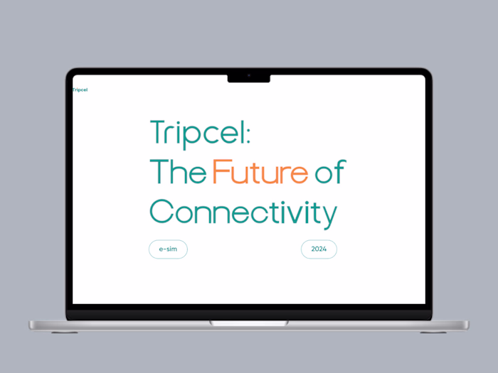
P2P Mobile app redesign| Figma| Frontend|React|
studio neil
My process
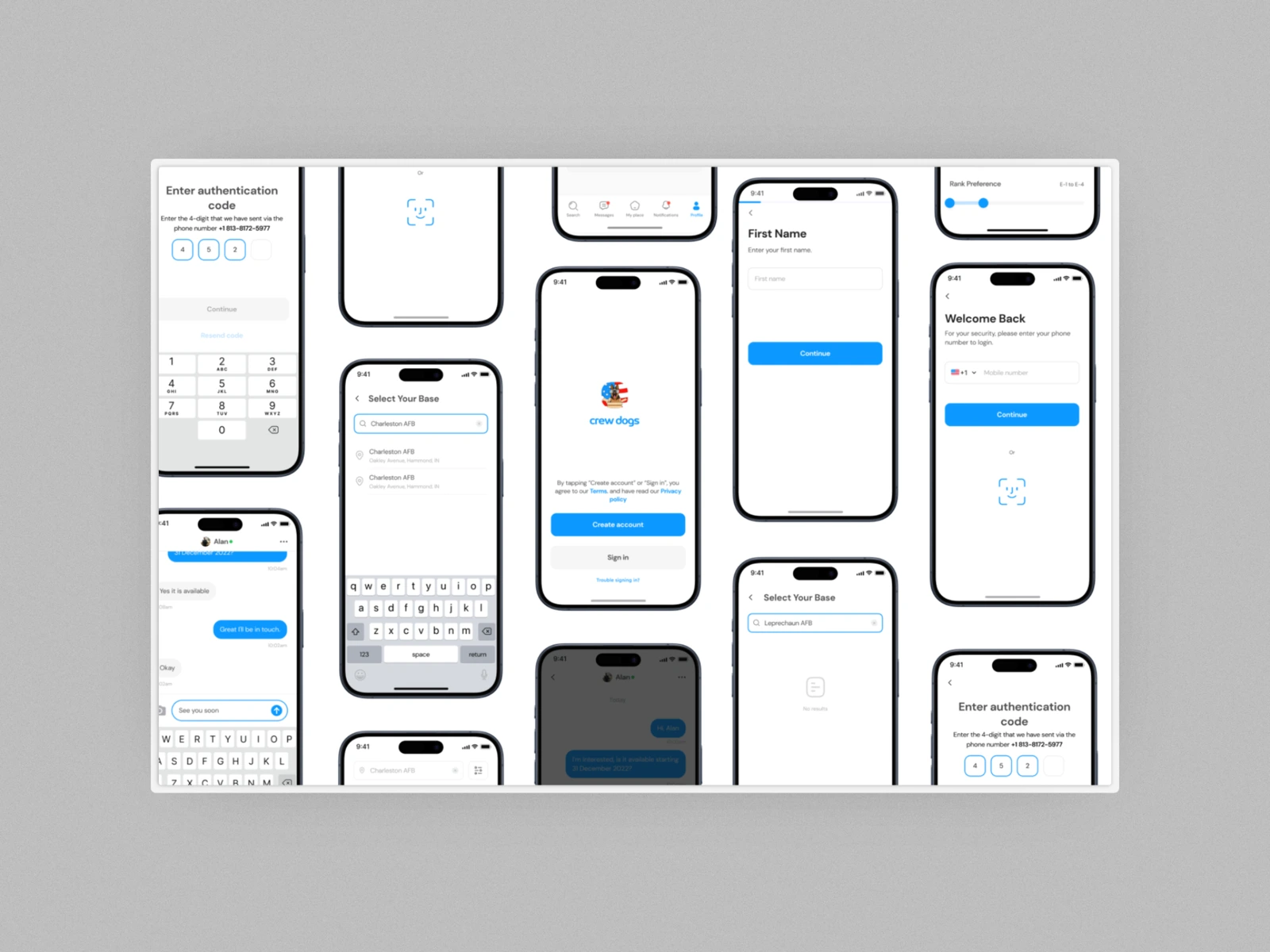
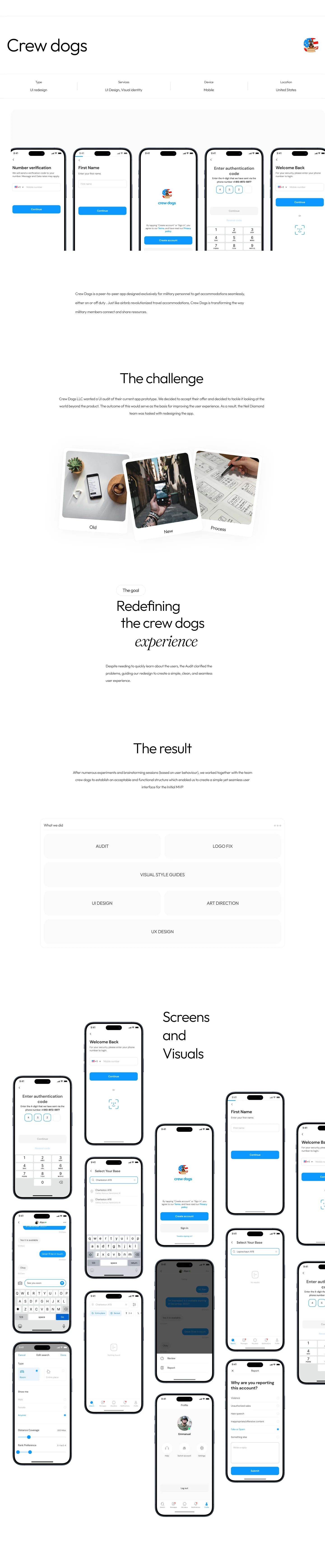
When I joined the CrewDogs project as the product designer handling the full mobile experience, I immediately saw that the work was bigger than a visual refresh. CrewDogs serves the American military community, and this shaped every part of the challenge. The users are active duty personnel, veterans, and individuals who operate in fast moving and high pressure situations. Their tools must be clear, dependable, and effortless to use. The previous mobile experience did not meet those expectations. The structure felt scattered, key actions required too many steps, and the overall flow made simple tasks feel heavier than they needed to be.
The app is built around peer to peer interactions within the military space. Users list stays, book places, connect with others, and share important information. These actions happen while people are traveling, moving between bases, or working irregular hours. In those moments, a slow or confusing interface becomes more than an inconvenience. It affects trust and usability. The challenge was to redesign the entire mobile interface so it could support fast decisions, reduce cognitive load, and present a sense of identity that matched the culture and lifestyle of the community it serves.
My goal was to turn the mobile app into a tool that users could rely on without thinking, a tool that felt built for them. The redesign needed to solve navigation issues, visual inconsistencies, and overall experience gaps. The new structure had to be clean, predictable, and scalable as the product continued to grow.
My Role
I handled the full mobile redesign from research to final output. I studied how military users interacted with the old version, what slowed them down, and what confused them. This helped me identify patterns. Many users wanted clearer flows, fewer steps, and better visual hierarchy. I mapped out the entire user journey and restructured the experience so each action felt natural and straightforward.
I redesigned every mobile screen with simplicity and clarity in mind. I focused on spacing, alignment, readability, and the order in which information appears. The goal was to make each screen speak for itself. The experience needed to guide the user even before they touched anything. This approach reduced friction and helped users complete actions faster.
I created the design system that now supports the mobile app. This included reusable components like buttons, cards, navigation elements, headers, and interactive patterns. The system made the app consistent and gave the development team a solid foundation for future updates. I documented the styles clearly so the entire team could follow the same visual language without guessing.
I shaped the creative direction for the mobile experience. This covered tone, color, typography, and the overall feel of the product. The direction blends utility and personality so the app looks modern while still feeling grounded in the identity of its audience.
The final mobile experience is cleaner, faster, and more intuitive. It reflects the lifestyle of its users and supports them in moments when clarity matters the most.
Like this project
Posted Dec 1, 2025
Redesigned Crew Dogs app for military, enhancing UI/UX for seamless, intuitive use with over 10,000 user after launching