Studio Nile| UI UX| Landing Page| Branding
studio neil
Studio Neil — Designing Our Digital Home
Designing for others? That comes naturally to us. But designing for ourselves? That was personal.
When we set out to create the website for Studio Neil, we knew it couldn’t just be a portfolio. It had to be a reflection of who we are, how we think, and the kind of experience we deliver. Clean, calm, and thoughtful—with just the right amount of edge.
The first version got us going. It worked. But something was missing—it didn’t feel like us. So we did what we do best: stepped back, asked the tough questions, and treated our own brand like we would a client’s. That’s when everything started to click.
Our Focus Areas:
Telling Our Story, Simply
We didn’t want to overwhelm visitors with walls of text. Instead, we let the visuals, flow, and intentional design choices do the talking. Every section was crafted to say something about us—with clarity and purpose.
Designing for Real People
We mapped user journeys from the first click to the last. Every interaction had to feel intuitive. No fluff, no dead ends. Just a smooth, welcoming experience.
Building a Brand That Feels Lived-In
We played with contrast, refined our type system, chose a color palette that felt grounded, and created a layout that was simple—but full of personality.
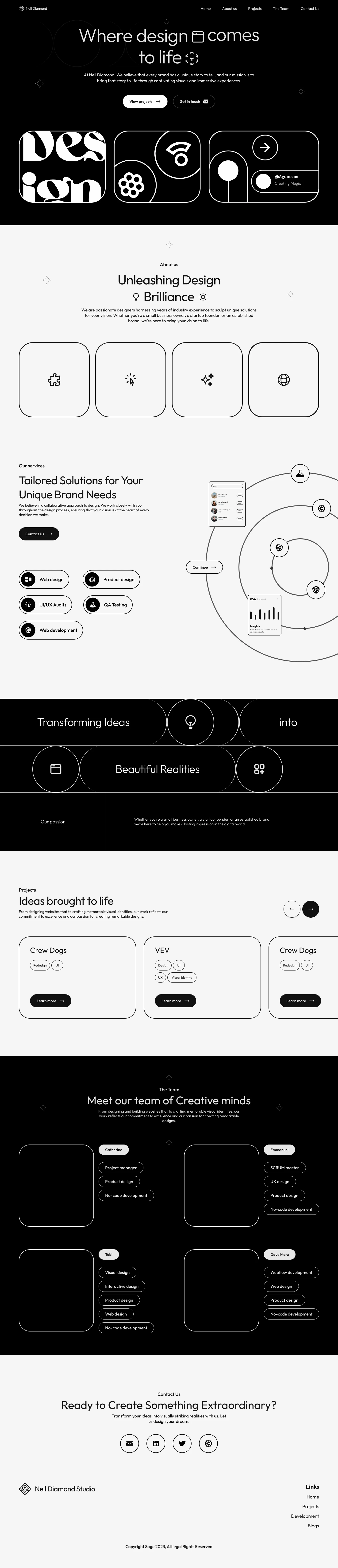
Putting Mobile First
We know how people browse today—on the go. So we ensured that the mobile experience was just as beautiful and seamless as desktop. No compromises.
What Made This Project Special:
This wasn’t just another website. It was a reminder that design is never just visual—it’s emotional. It’s how people feel when they land on your page. That’s what we focused on.
Now, when clients visit our site, they’re not just seeing a list of projects. They’re stepping into our world. They’re feeling what it’s like to work with a team that genuinely cares about craft, clarity, and connection.
That’s what good design does—it makes you feel something.
Like this project
Posted Apr 3, 2025
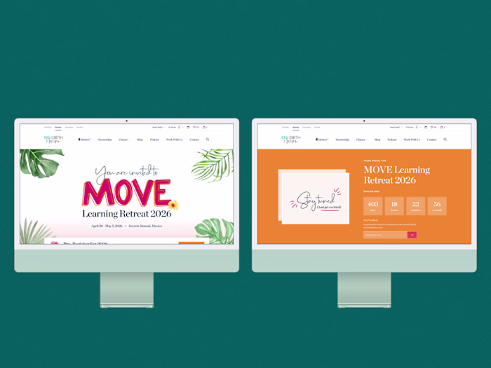
"Sharing an early glimpse of one of our initial design iterations for the Studio Neil website—where our brand vision first began to take shape!"
Likes
0
Views
5
Timeline
Jan 31, 2024 - Feb 1, 2024