Her Place
Her Place
Homeware Store
The Client
Her Place is more than just a homeware store; it is a haven for artistic expression. Founded by Ellen Wells, it serves as a collaborative space where women specializing in sculpture and handmade items come together to create unique pieces of art. The store's primary objective is to promote aesthetics and beauty while emphasizing the idea that the quality of our lives is reflected in every product. With a vision to foster creativity and collaboration, Her Place has become a platform for empowering women artists.
The Problem
The challenge in designing Her Place's visual identity was to create a brand image that effectively embodies the store's personality and philosophy. The visual identity needed to capture the essence of aesthetics, femininity, attention to detail, integrity, and trust. Additionally, it needed to differentiate Her Place from other homeware stores and establish a strong, unique identity.
The Concept
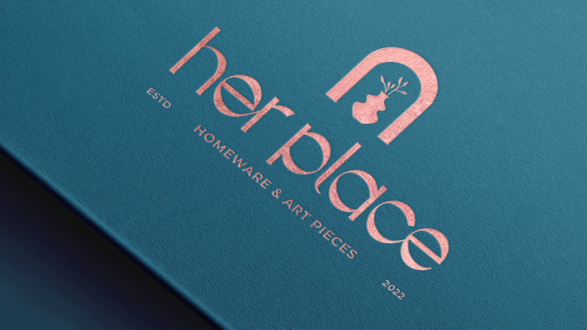
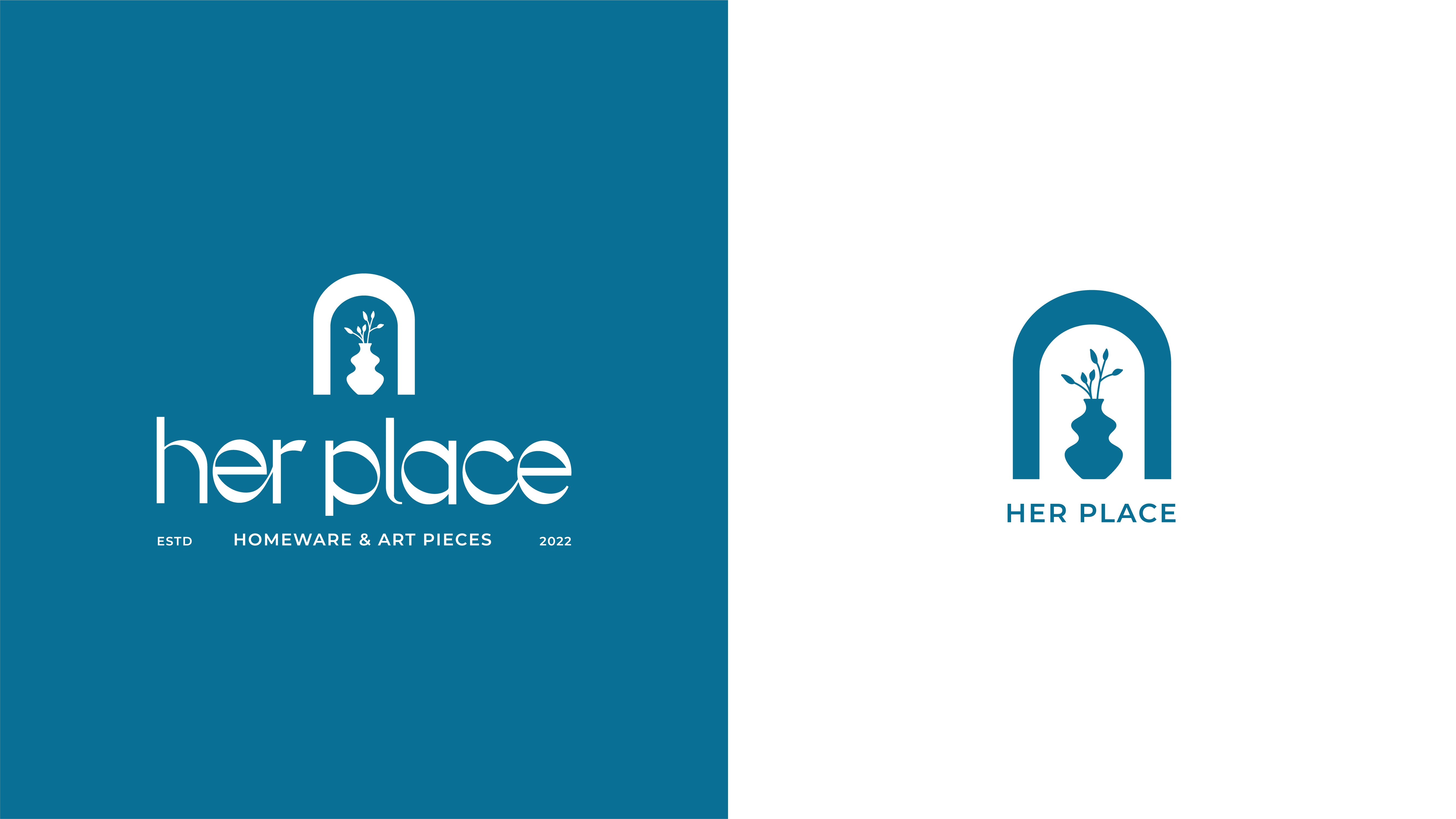
The visual identity of Her Place is built upon the concept of celebrating feminine artistry and promoting collaborative work. It aims to portray the brand's commitment to aesthetics, beauty, integrity, and trust. The use of feminine elements, such as pink gold foil, signifies elegance and sophistication. The incorporation of a brand symbol further emphasizes the store's dedication to artistic craftsmanship. The dominant use of blue establishes a sense of stability and reliability, reflecting the core values of integrity and trust. Overall, the visual identity represents a harmonious blend of creativity, femininity, and quality.

The Palette
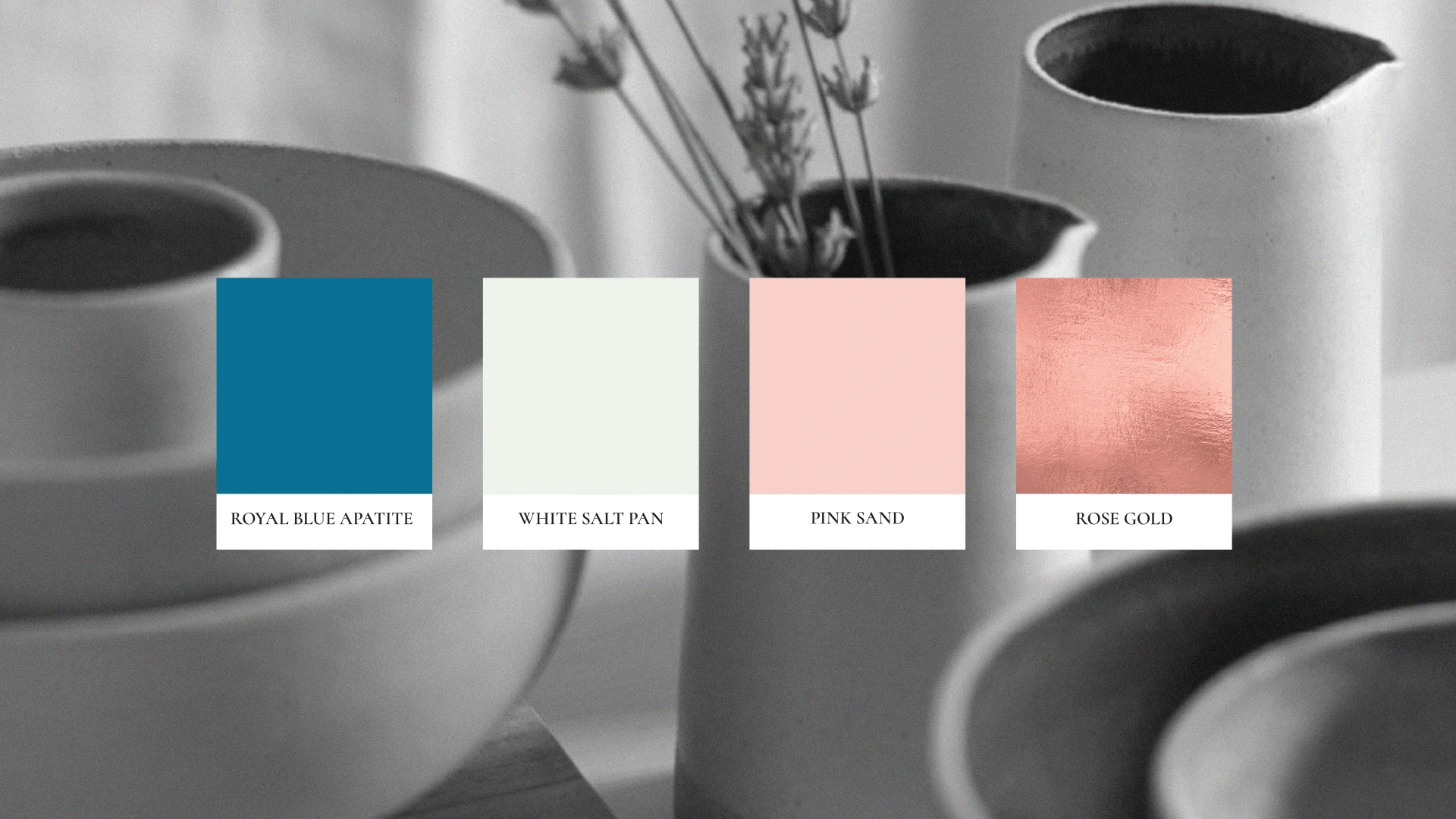
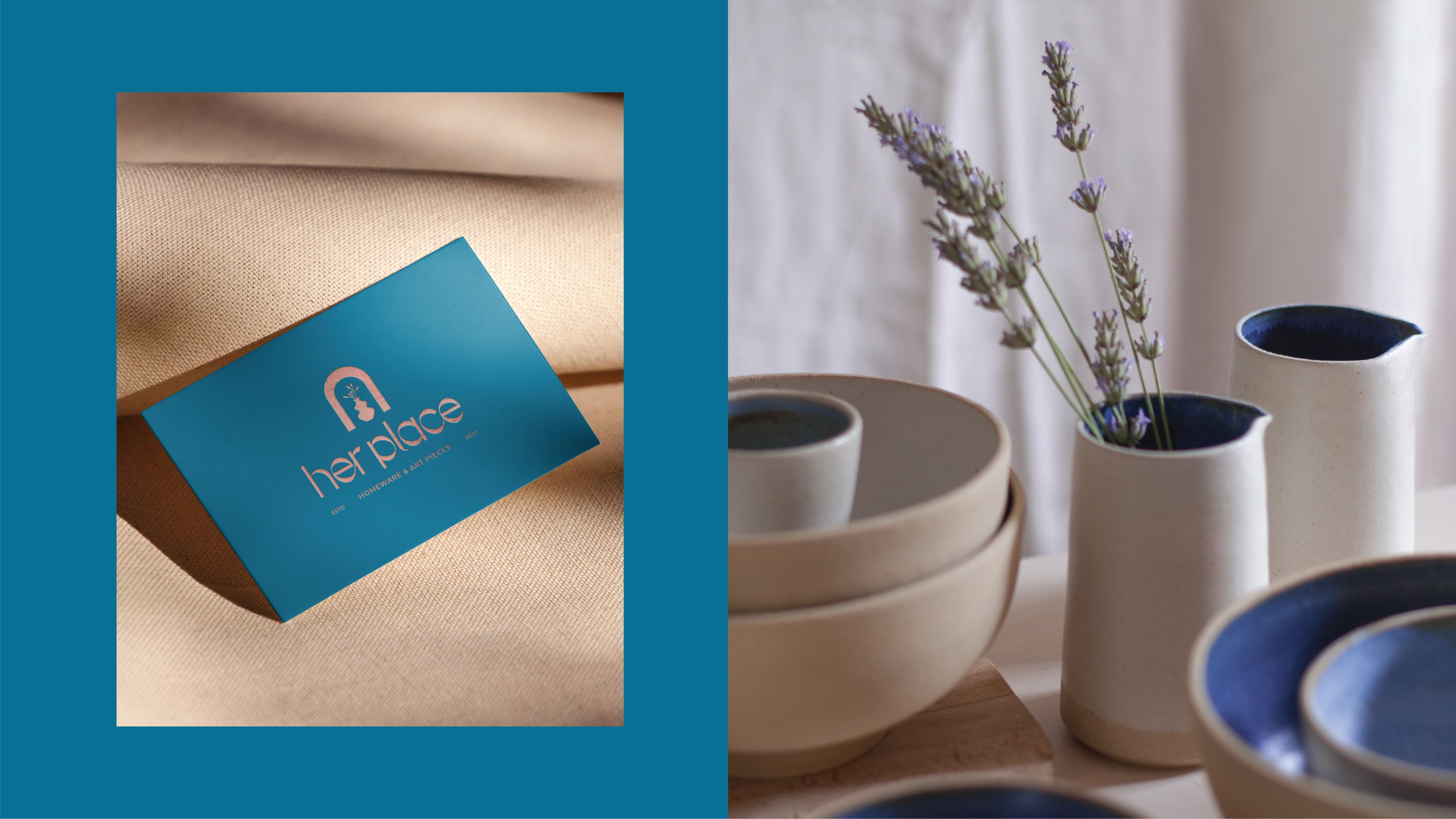
The combination of royal blue apatite, white sand, pink sand, and rose gold creates a visually appealing and harmonious color palette. It captures the essence of femininity, aesthetics, and quality, contributing to a distinct and memorable brand image.
The Illustrations
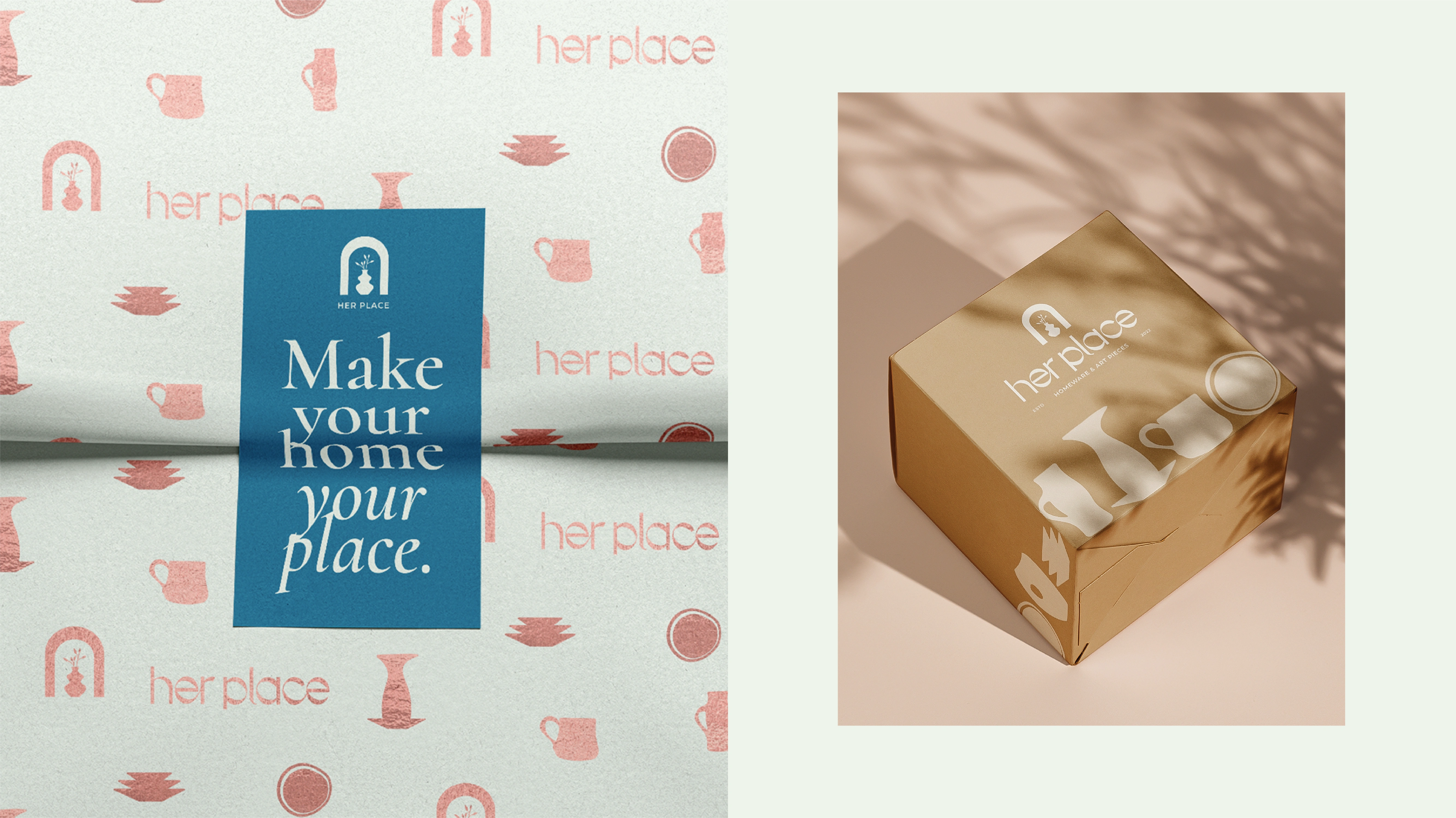
Flat, simple, and organic illustrations are incorporated, showcasing different types of ceramics. These illustrations add a touch of artistic charm and further emphasize the store's focus on handmade items and sculptural artistry. This aesthetic choice allows the ceramics to be the main focal point, highlighting their unique shapes, textures, and artistic qualities.

The Stationary
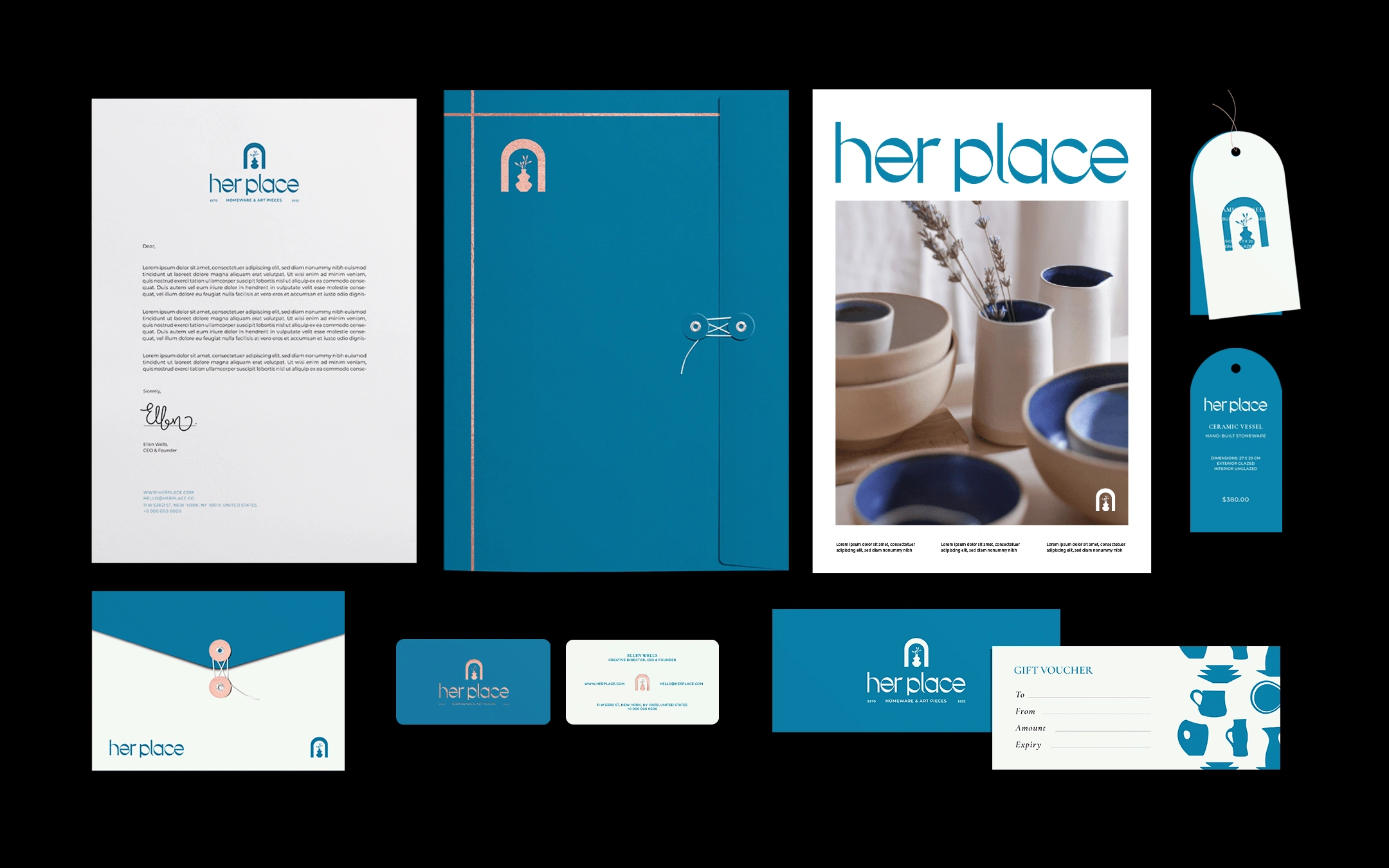
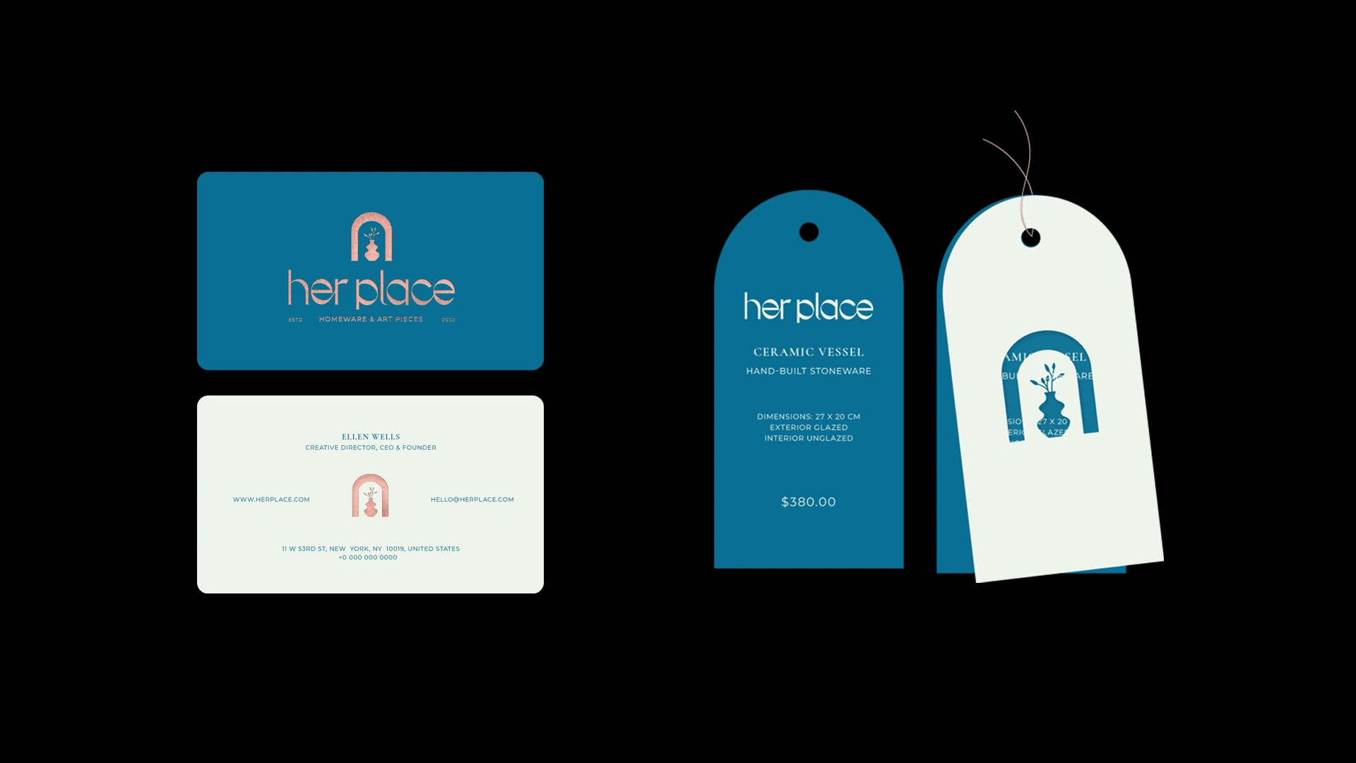
Her Place's corporate stationery is meticulously designed to convey the brand's visual identity and reinforce its core values. The stationery features a combination of elegant typography, utilizing clean and refined fonts that exude sophistication. The color palette revolves around shades of blue, serving as the primary hue to establish a strong brand presence. The use of pink gold foil accents adds a touch of femininity and elegance, enhancing the overall aesthetic appeal. The brand symbol, thoughtfully incorporated into the stationery design, serves as a recognizable and memorable element that symbolizes the collaborative spirit and craftsmanship of Her Place.
Like this project
Posted Jun 29, 2023
Her Place is not just a homeware store, it is a space that fosters the creation of unique pieces of art.


