Dark Mode Web3 Feature Cards
Reyshel Garcia
Hey 👋
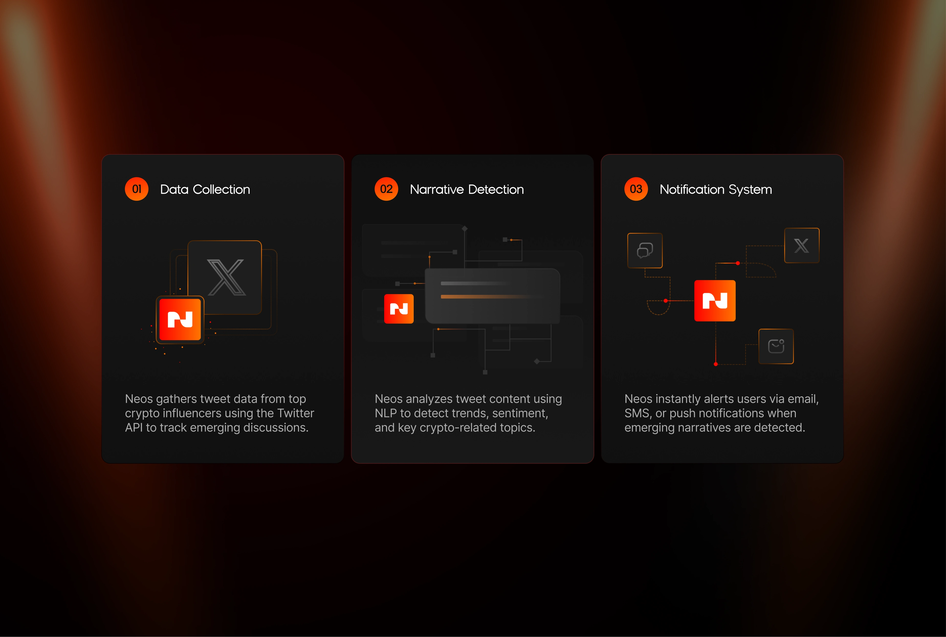
Here’s a closer look at the How it Works section I designed for a Web3 crypto project. This part of the page breaks down each step of the product flow using cards — built in dark mode to match the brand’s bold, tech-forward vibe.
Each card is designed to do a few things:
→ Make the info digestible at a glance
→ Create a clear step-by-step flow
→ Feel structured without being stiff
The rhythm between spacing, typography, and interaction makes it easy to scan while still feeling sharp and deliberate — perfect for product storytelling.
Disclaimer: I was brought on as a freelance designer for this project — not officially part of the team.
Like this style?
Want these kind of cards for your own product section or landing page?
I’d love to help — reach out below! ⚡️
Like this project
Posted Jun 22, 2025
How It Works section of a Web3 crypto project landing page