STOCK MARKET ANALYSIS ON NASDAQ VIA PYTHON
DARYL ALLOO
This basic stock market analysis project will help me understand some of the basics of Python programming in financial markets. I focused on Nasdaq from June 2022 to June 2024, two years of data. I have used Python libraries like NumPy, Pandas, and Matplotlib.
Dataset: https://finance.yahoo.com/quote/NDAQ/key-statistics/
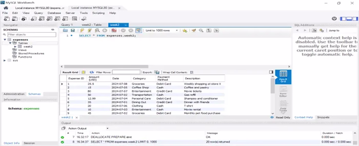
Part 1: Import the necessary modules.
I started by importing the necessary modules, including the libraries I would use.
Figure 1
Part 2: Import Data.
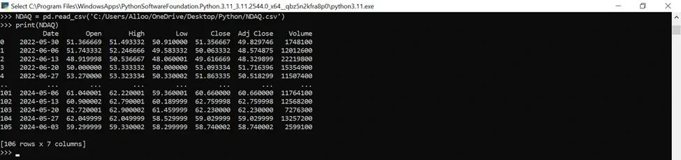
Figure 2
Part 3: Explore Data Characteristics:
At this stage, I began with the basics — running the info(), head(), shape, and tail() methods. These functions provide a simple yet effective way to get a quick overview of my data, making it easier for me to understand the dataset we’re working with.
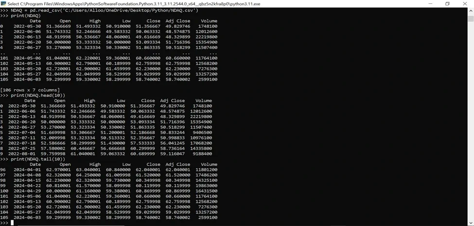
Figure 3
Part 4. Visually inspect exciting events:
i). Line Chart (Closing Prices Over Time).
Looking for trends or patterns in closing prices over time: I created a graph using Matplotlib to show the difference in the date and price.
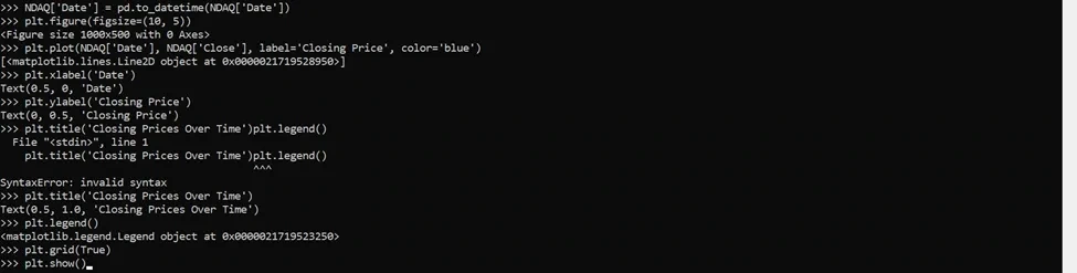
Figure 4
This was the Output:
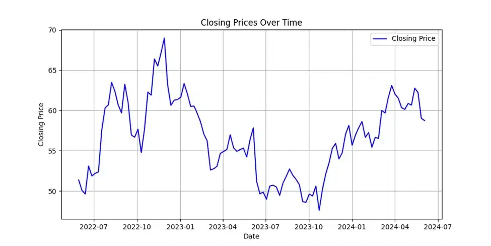
Figure 5
ii). Bar Chart (Volume Over Time)
This is to show the volume over time.
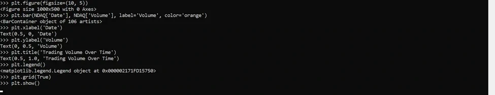
Figure 6
The Output:
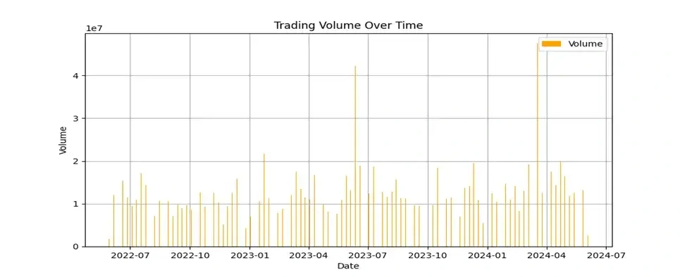
Figure 7
iii). Calculate Yearly Summaries:
I have computed yearly summaries for the three years of high, low, closing prices, and volume.
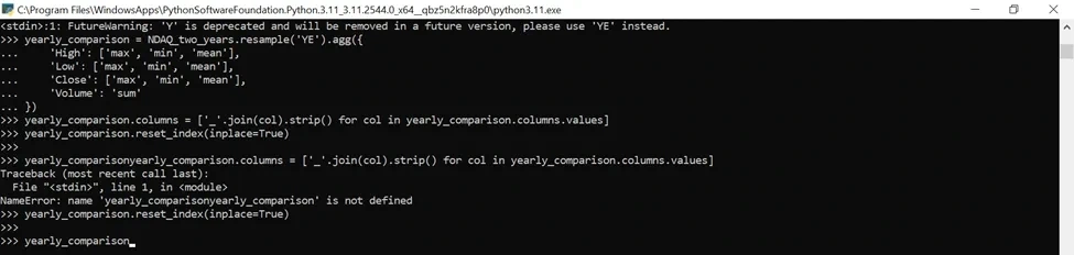
Figure 8
The Output:

Figure 9
iv). The progression over the two years.
Figure 10
The Output.
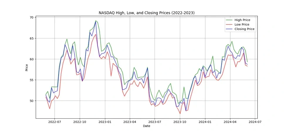
Figure 11
From the analysis and visualisation, I observed the following:
1. Price Trends:
· The line chart for high, low, and closing prices shows how the prices have fluctuated over the two years.
· Significant peaks and troughs indicate periods of high volatility or significant market events.
Each year's average high, low, and closing prices provide insight into overall price trends.
2. Volume Trends:
· The bar chart for trading volume indicates the total number of shares traded daily.
· Periods with high trading volumes may correspond to market events or changes in investor sentiment.
3. Yearly Metrics:
· The yearly comparison table provides a detailed summary of the maximum, minimum, and average prices and the total trading volume for each year.
· Comparing these metrics year by year highlights the changes in market behaviour, such as increased volatility, changes in average prices, and variations in trading volume.
By visualising and analysing these trends, I gained a comprehensive understanding of the progression of NASDAQ over the past two years, capturing the differences in high, low, closing prices, and trading volume.
General Observation:
The Nasdaq Composite Index has experienced significant volatility over the past two years. There have been periods of both strong growth and decline.
Upward Trends: The chart shows several upward trends, indicating periods where the closing price generally increased. These periods could be due to factors such as economic optimism, positive earnings reports from major technology companies, or investor confidence in the technology sector.
Downward Trends: The chart shows several downward trends, where the closing price generally decreased. This could be due to economic concerns, interest rate hikes, negative news about significant technology companies, or a general risk-off sentiment in the market.
Impact on the Market:
The volatility of the Nasdaq Composite Index can significantly impact the overall stock market, particularly stocks in the technology sector. When the Nasdaq Composite Index goes up, it can increase investor confidence and buying activity in technology stocks, potentially driving up their prices. Conversely, when the Nasdaq Composite Index goes down, it can trigger investor selling and cause technology stocks to decline.
Like this project
Posted Jul 25, 2024
This basic stock market analysis project will help me understand some of the basics of Python programming in financial markets. I focused on Nasdaq.