Cantisani x Canovas Logo Design
Overview
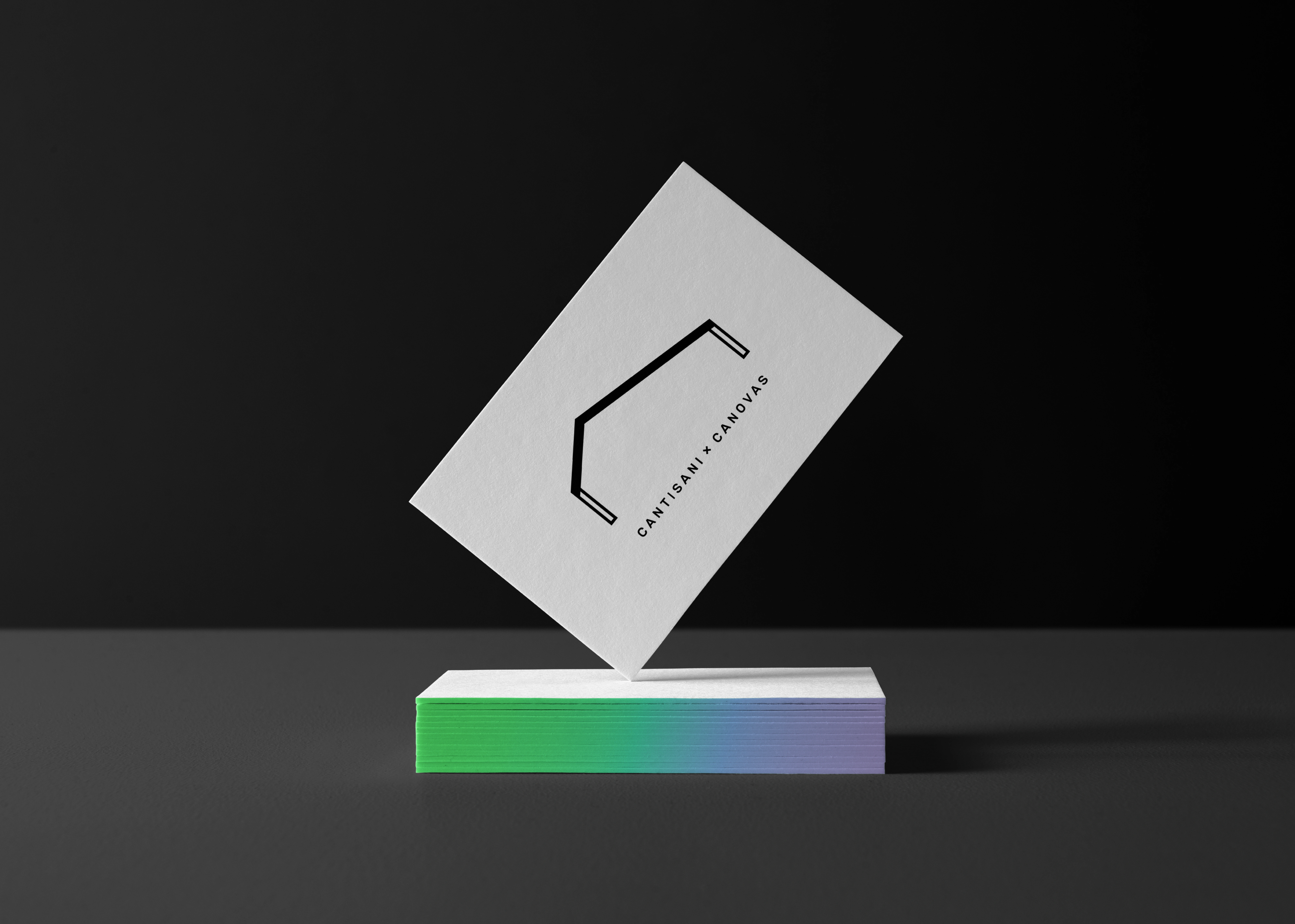
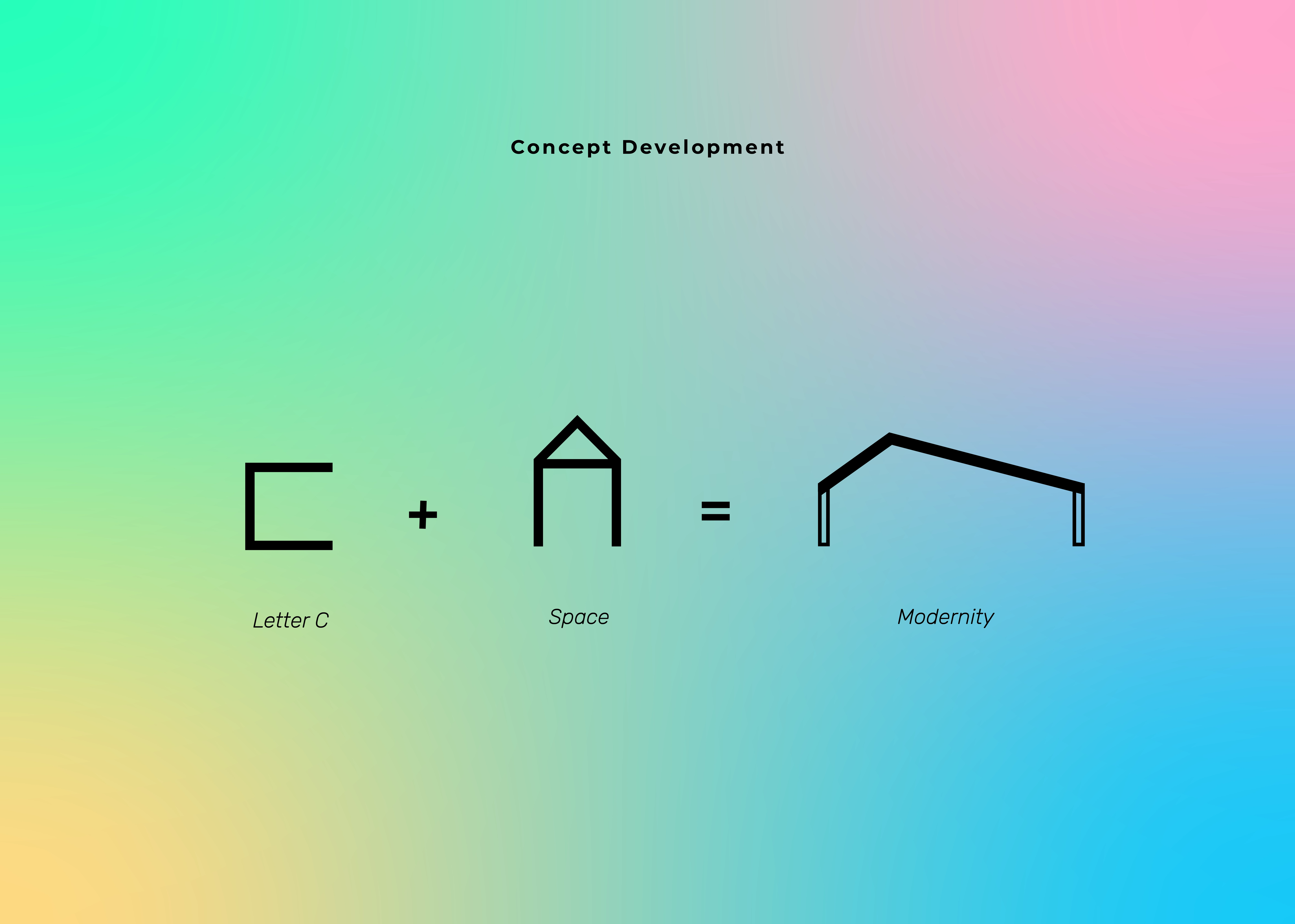
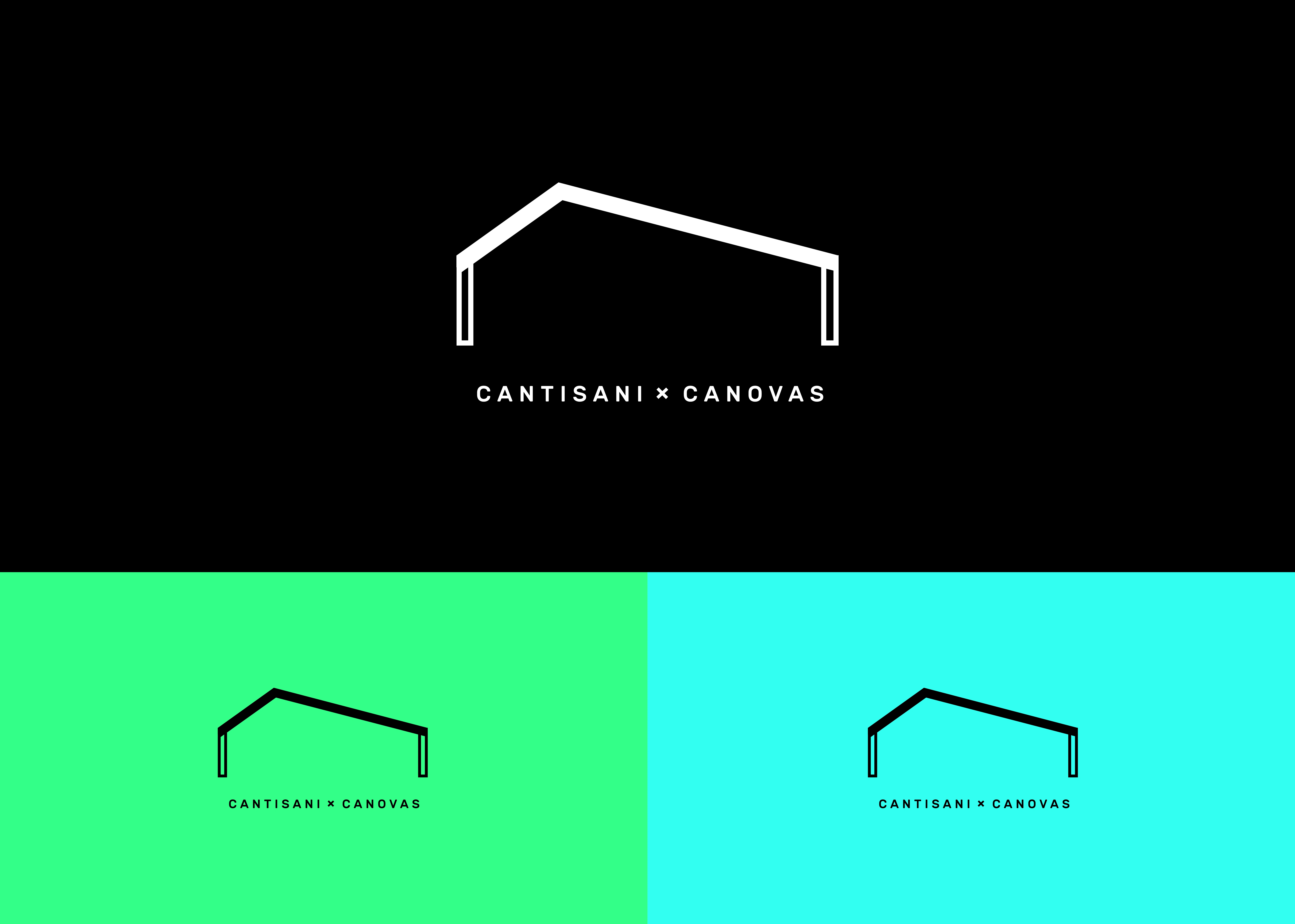
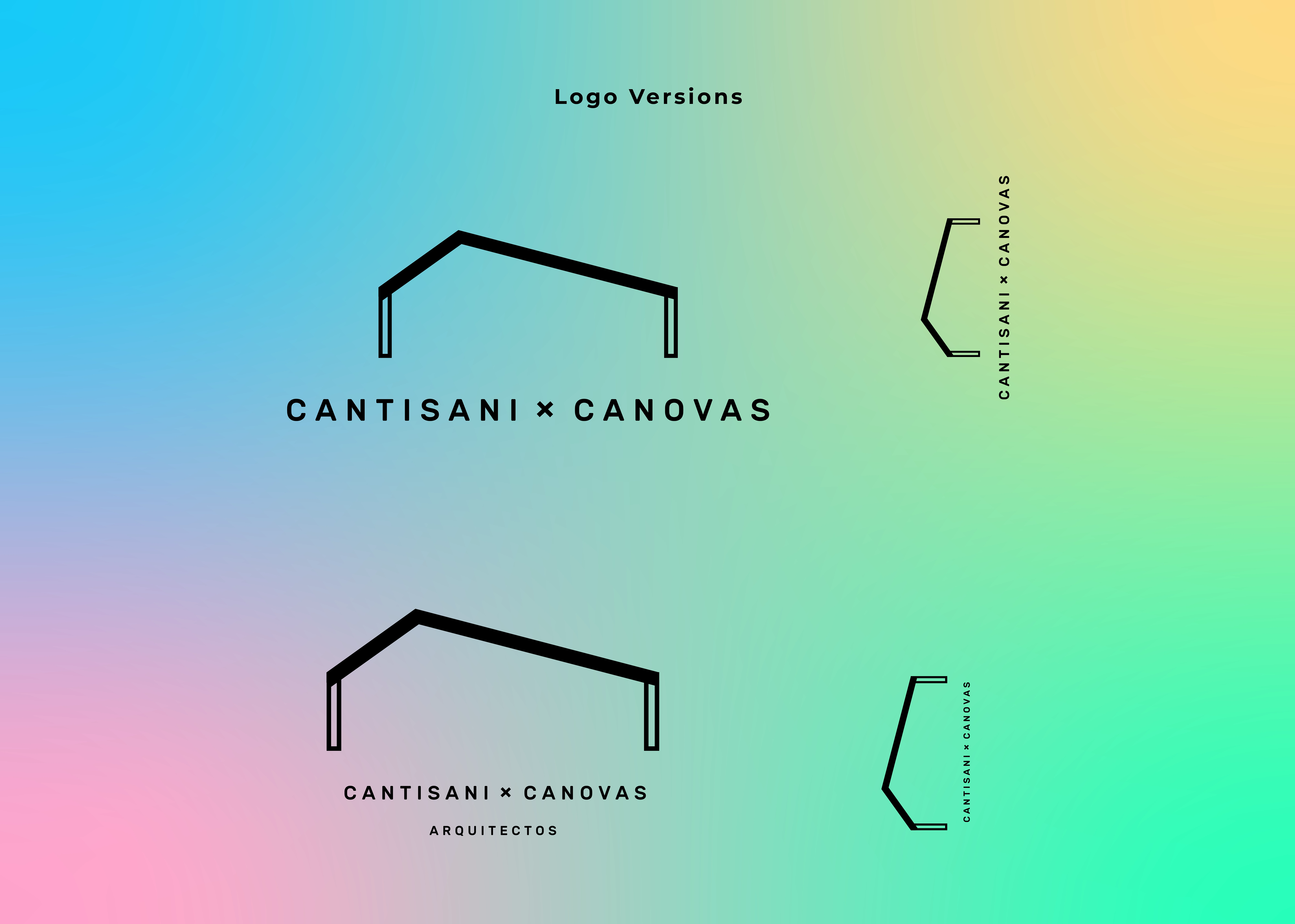
The client requested a minimalist logo for their architectural firm: Cantisani x Canovas - Architectural Space. The concept was formulated by incorporating the initial 'C' of the founders' names and simplifying the idea of a house to its basic form. I experimented with scale and lines to transform the simple house shape into a volume representing residential and commercial spaces.
Process
Brainstormed and researched minimalistic architecture design examples to understand aesthetics and context.
Developed different design options, playing with scale, lines, and proportions to achieve the desired minimalistic and C-shaped vibe while maintaining the idea of a living space.
The color palette sets them apart from other architectural firms in the area, while the gradient adds to the feeling of a young and modern space.
Results
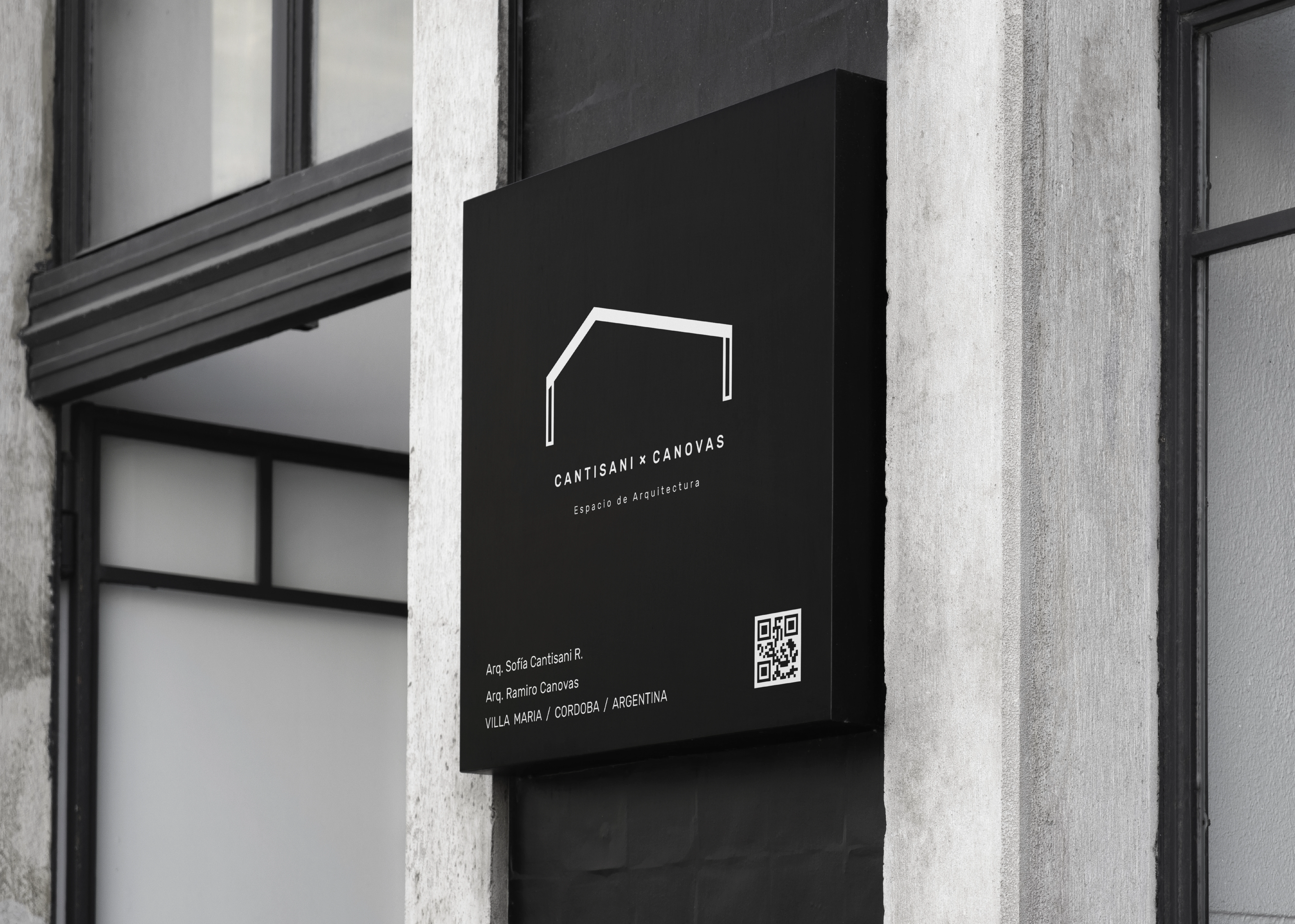
The clients are pleased with the result and were able to differentiate themselves from the competition and had very positive feedback about the new branding from their community.
We had a fantastic experience working with Soledad. She not only interpreted our vision for our firm accurately but had great advice for our brand.
Sofía Cantisani
Architect • Co-Founder Cantisani x Canovas.
Like this project
Posted Apr 17, 2023
Designed a minimalist logo that reflects the modern young identity of Cantisani x Canovas Architectural Space.

