Bditto ◦ SaaS Website

Ajeya Sharma


Transforming BDITTO’s Website — SaaS Product Built for Enterprise Collaboration
I partnered with the brand to transform their website into a high-conversion platform tailored for enterprise users. It replaces the old cluttered layout with something more trustworthy, easy to understand, and built to convert. Ready to compete with Slack, Teams, and Notion.
Background
To solve inefficient and time-consuming collaboration within an enterprise, BDITTO allows users to share, connect and explore thoughts effortlessly & expedite the enterprise`s productive process. It provides a range of communication features that give users access to knowledge at their fingertips to get things done at the speed of thought.
My Role 👋
While working for BDITTO, I created a seamless website experience to set BDITTO apart from the competition. During this project, I was the sole designer & worked on it from scratch and finished it to perfection. I also collaborated with other people-
CEO & Product Manager: To figure out desired user & business goals we wanted to achieve. Ensured that I organised regular review meetings to stay in sync with the high-level decision-makers.
Engineers: To comprehend the technical constraints of design & ensuring that the “website in production” matched the designs I created completely.
Stakeholders: To incorporate feedback & changes into the designs from end-users & team by conducting user interviews, brainstorming sessions & design testing.
The challenge
Why Redesign?💭
Due to a variety of factors, the earlier website was not performing well in terms of the number of users signing up for the platform. Additionally,
1. The old website does not target businesses
In 2019, BDITTO did not have a defined target audience but recognising the opportunity to make BDITTO flourish in the business collaboration space (competitors-Slack, Microsoft Teams etc), the stakeholders decided to target businesses & big companies in 2021 & 2022.
2. How will we onboard businesses?
BDITTO, as a collaboration tool in the enterprise space, is not competitive & direly needs an upgrade. To onboard companies/businesses, we will require a desirable & effective website experience that can convey how BDITTO will enable collaboration in real-time, which is currently missing.
3. Lacked visual appeal & looked cluttered
Multiple users & stakeholders conveyed that the old website could not convince them to try BDITTO. Users did not feel that it was a premium product that could help them collaborate.
*Old landing page*
GOALS FOR THE REDESIGN
Redesign should convey the brand's visions🎯
So the product manager & CEO briefed me on the old website design, user research earlier conducted, technical constraints and timelines for the redesign.
The primary goals were:
Create a consistent, inclusive & accessible design system for the website (mobile & web)
Research & incorporate user-centred solutions to stand out from the competition
Aim for least cognitive friction, simplified user flows & perfect implementation of beautiful designs with the engineers
KICKOFF
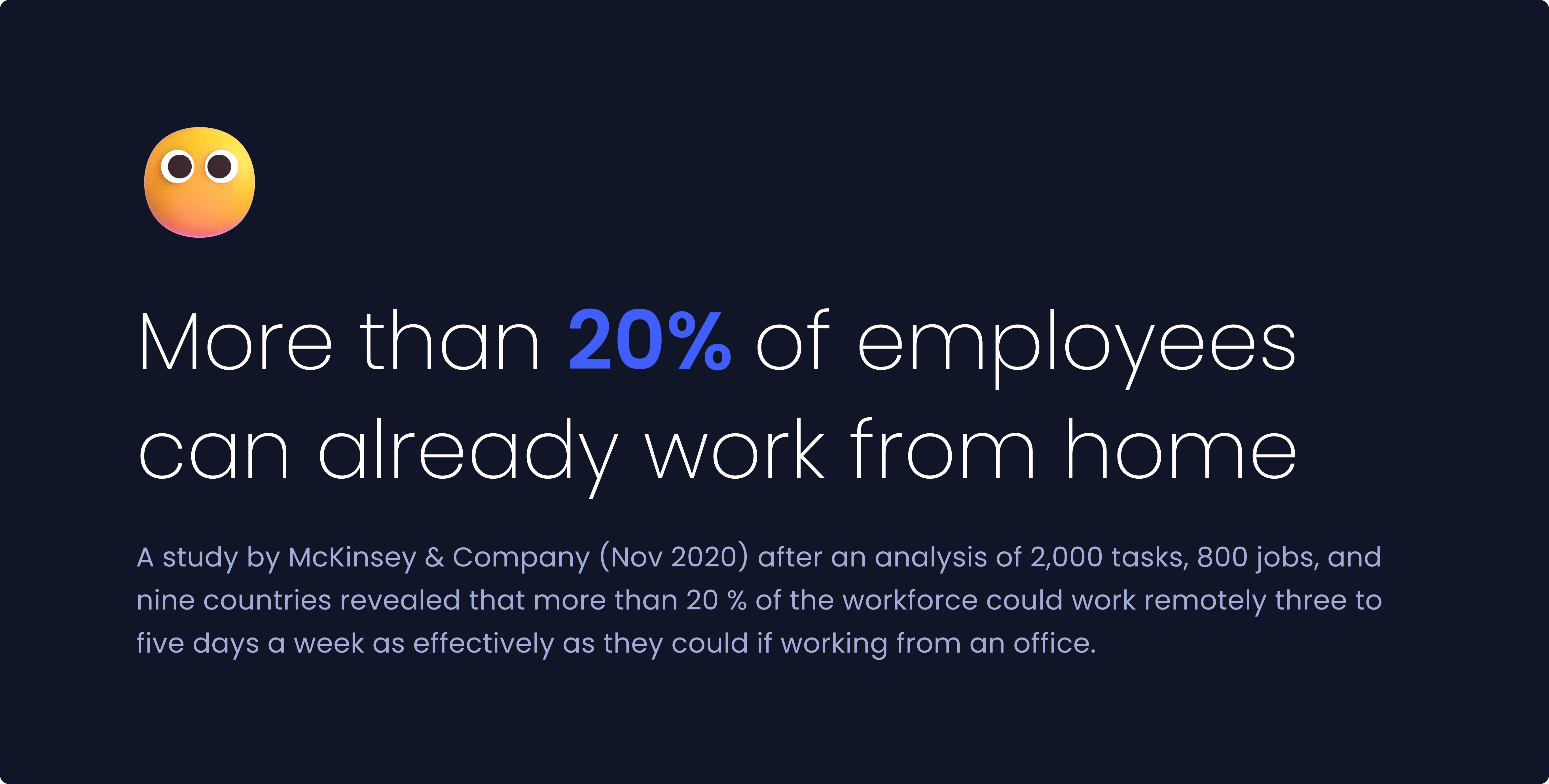
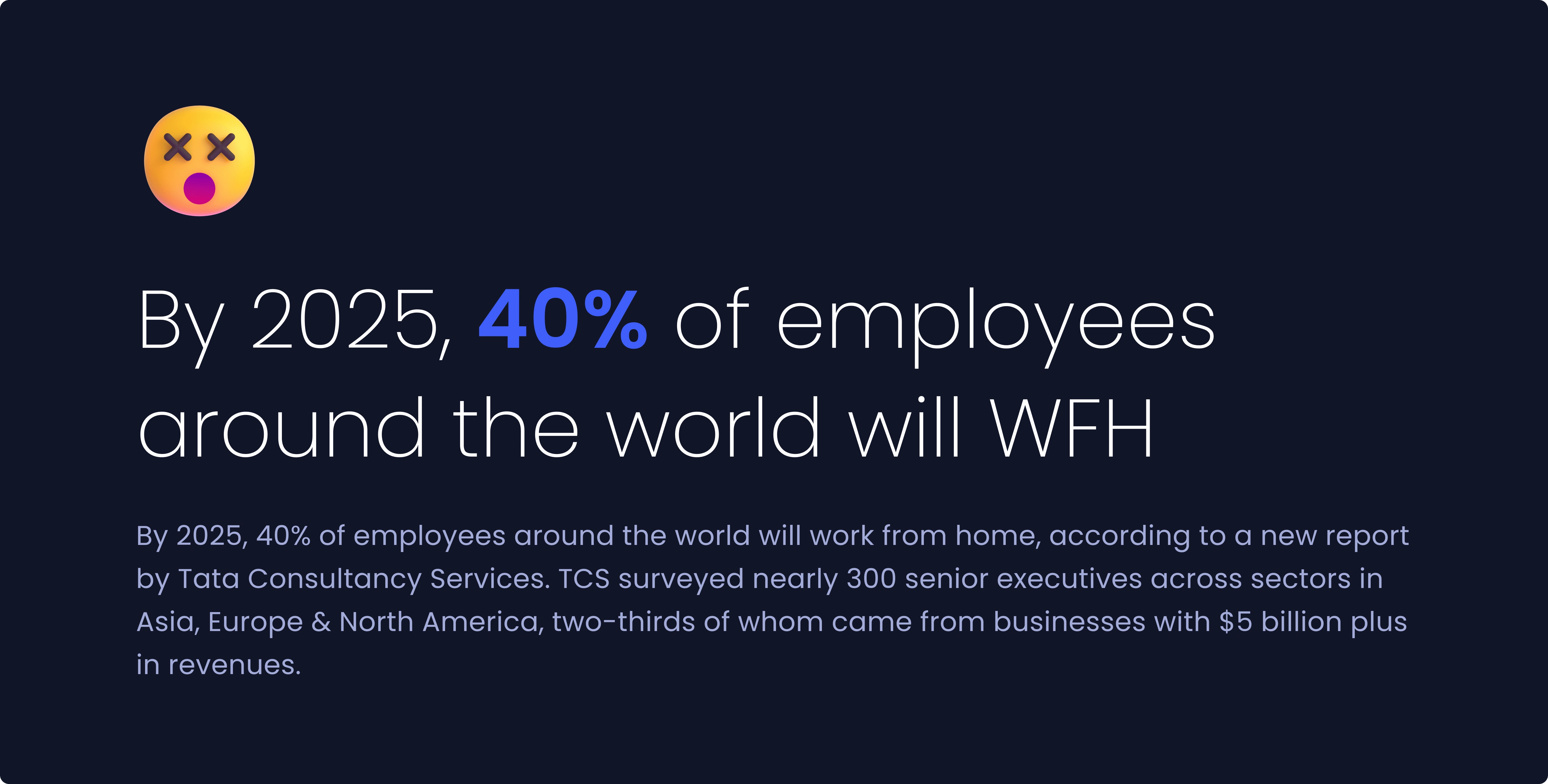
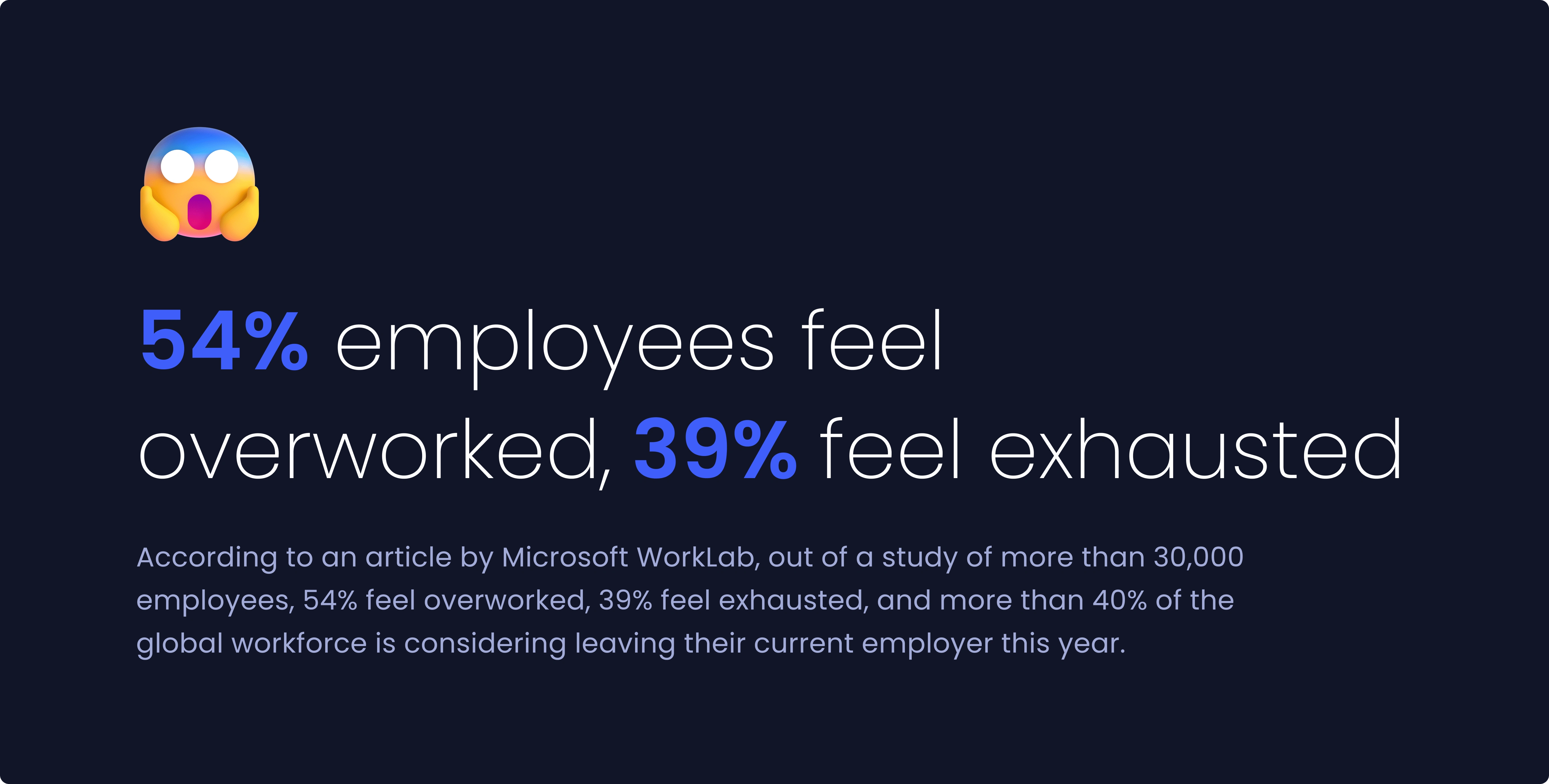
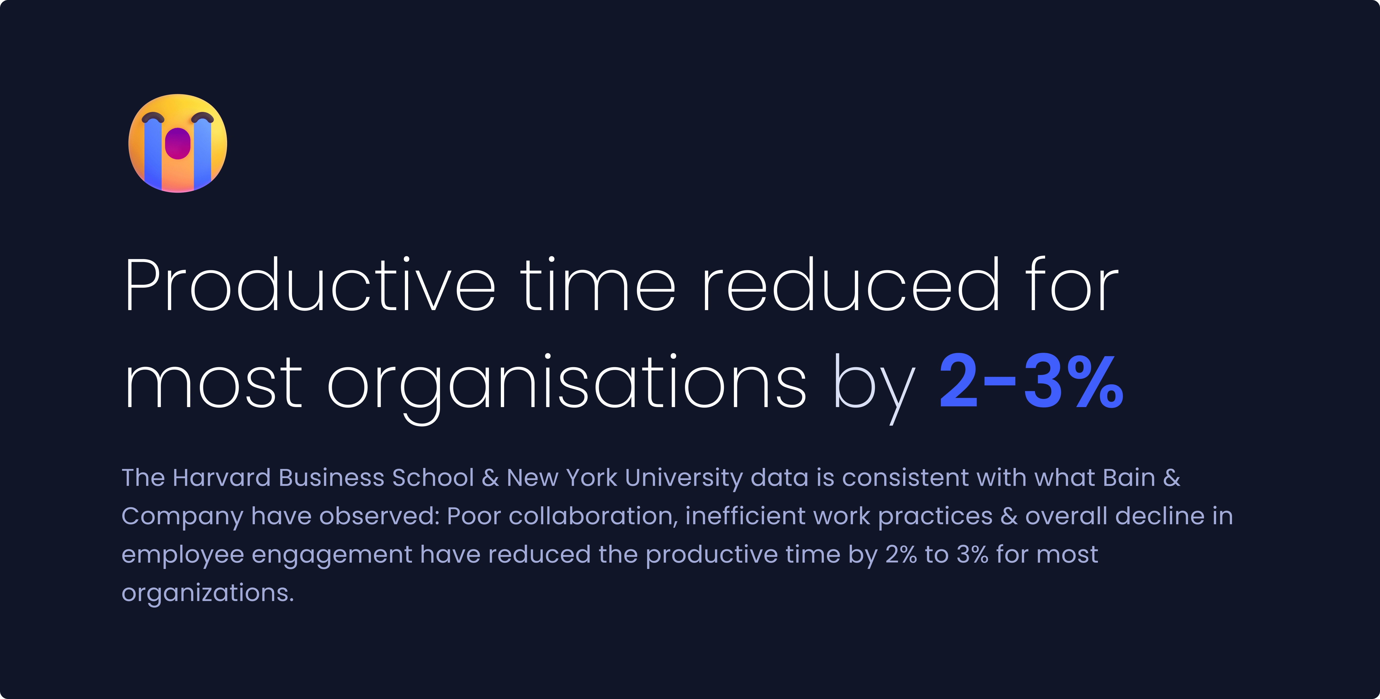
How enterprise collaboration was, is, and will be?🚀
To know more about the pain points of people working in companies before and during the Covid-19 pandemic, I delved into multiple studies conducted by leading organisations such as McKinsey & Company, Harvard Business School and many more.
Head over to some of the research findings below :)
THE DISCOVERY
Problems faced by people working in companies 🚩
I scheduled online interviews with 7 users (target audience) & 4 internal stakeholders to understand their needs and frustrations. After collecting the insights, I used affinity mapping to group all pain points into 4 main categories-
1. Stress
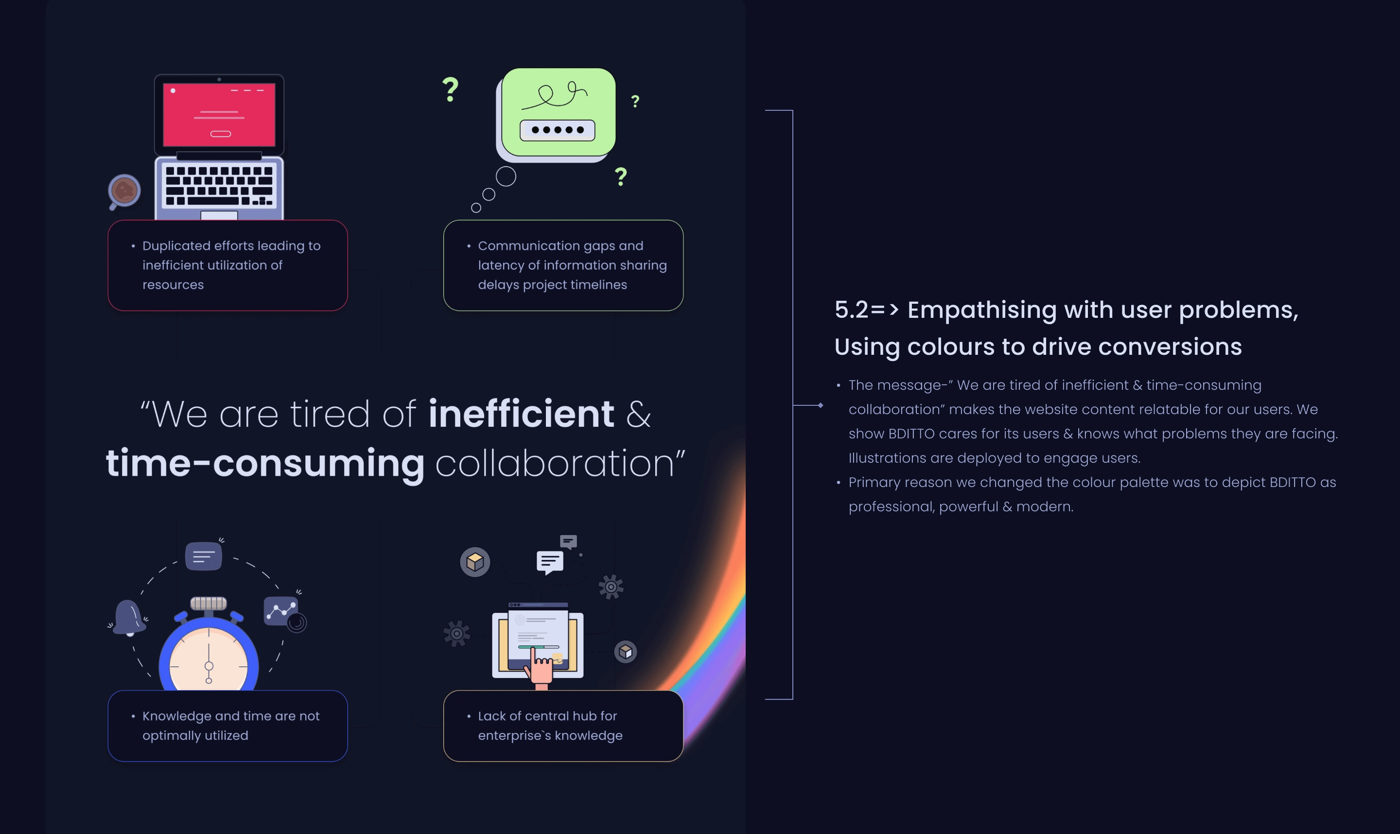
Number one source of stress in the workplace is missing information or not being able to find the content they need.
2. Duplicated efforts
It is observed that multiple times more than one business unit works on the same project without knowing it has already been done.
3. Irrelevant emails
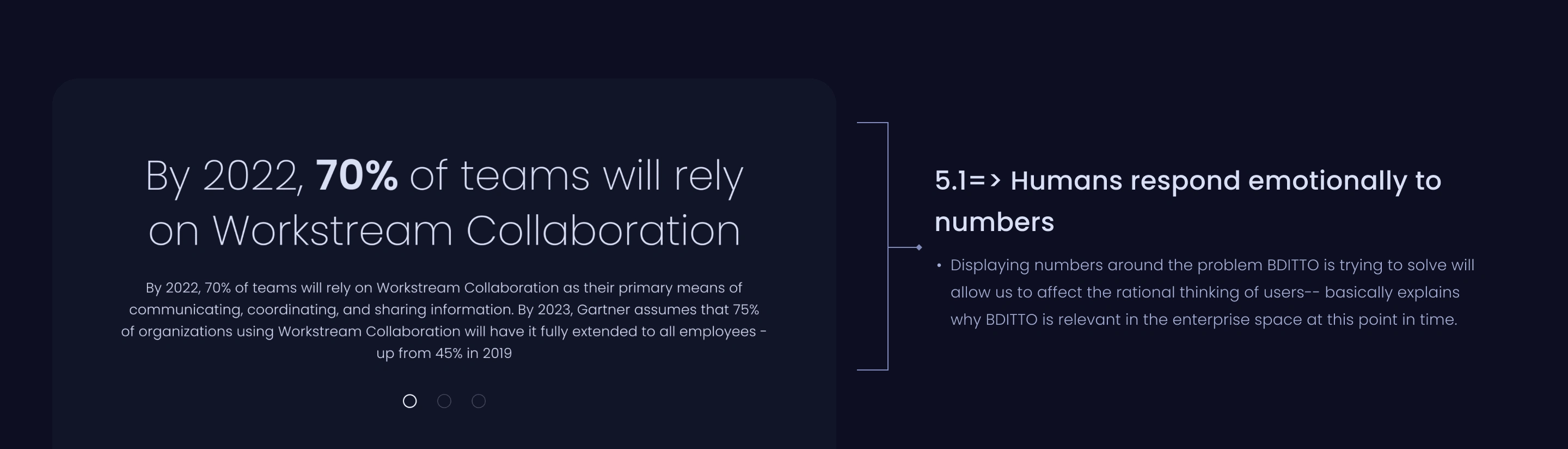
Emails are old school, too long and endless. Irrelevant emails account for about 62% of the total emails in an average inbox!
4. Outdated tools
There is no instant way to connect, share knowledge or discuss as and when needed. People have to wait to receive what they need (answers, feedback, etc.) then.
It was critical to understand the pains of the users for whom we were designing the website.
THE PROCESS
How did I design the homepage?🤔
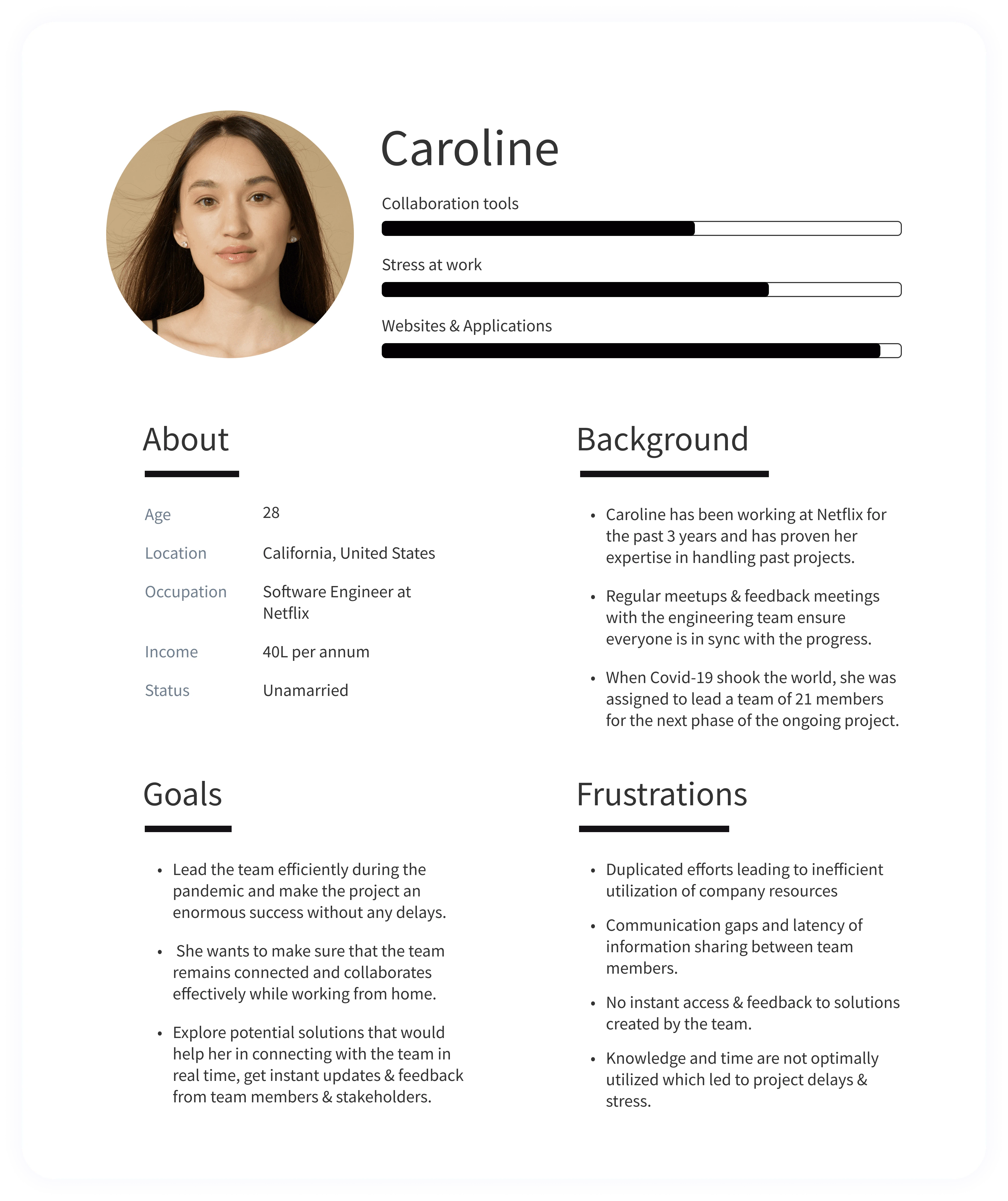
#1- Collating user frustrations and goals 🤵
First, to build for the intended target users, I worked on creating a persona collating the user insights from interviews and secondary research.
#2- Analyzing competitor websites (Jacob’s Law) 🔍
Secondly, to build a highly competitive website, I wanted to gain an in-depth understanding of the business models, technical solutions offered & user experience of the direct + indirect competitors of BDITTO.
Want to see some of the recommendations I made for Bditto after the competitor analysis of Slack?
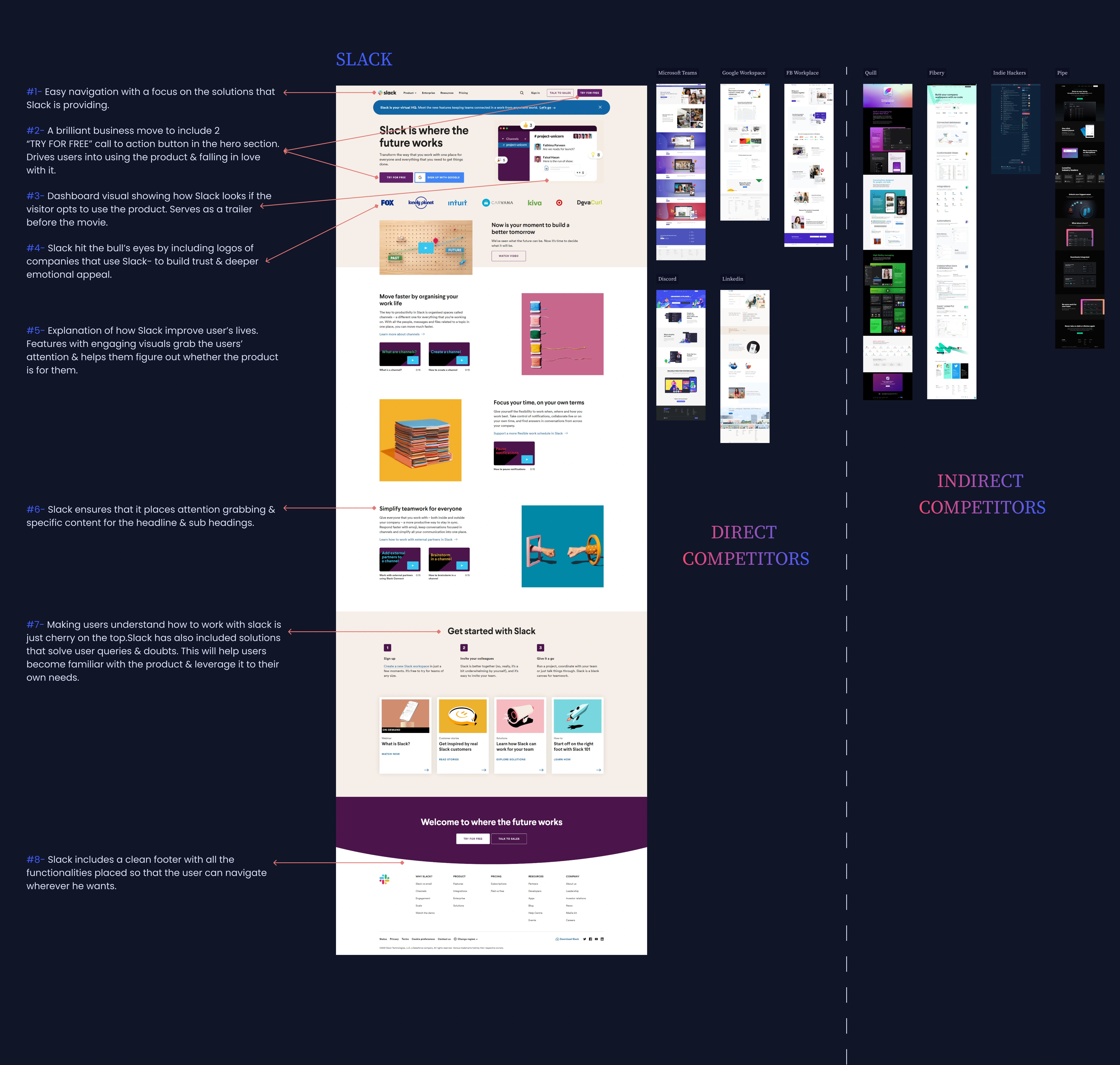
I recommended #2, 3, 6 & 8 points for BDITTO from Slack's landing page competitor analysis to the Product Manager & other critical stakeholders for further review.
I drafted more than 190+ recommendations after analyzing all the pages for the 10 competitors of BDITTO. I’ve mastered excel sheets now :)
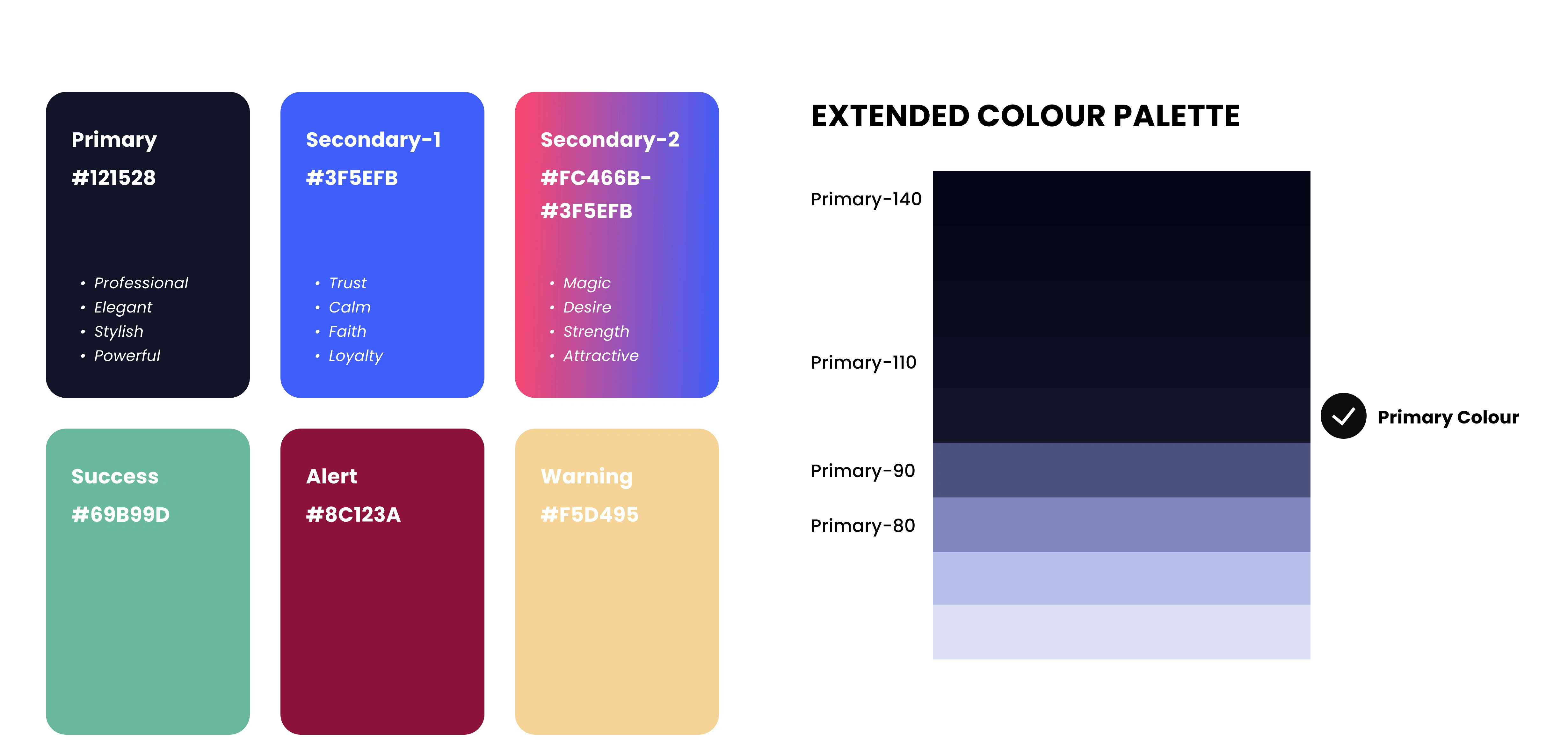
#3- Creating a new colour palette 🎨
The primary goal was to create a colour palette that is professional, meaningful, appealing to the target audience & the one which gives a unique look to BDITTO
I recommended #2, 3, 6 & 8 points for BDITTO from Slack's landing page competitor analysis to the Product Manager & other critical stakeholders for further review.
I drafted more than 190+ recommendations after analyzing all the pages for the 10 competitors of BDITTO. I’ve mastered excel sheets now :)
#4- Deciding the typeface 🖹
For the past 3 years, I have interacted with over 30+ typefaces, and I understand the usage and purpose of each. For BDITTO, I filtered the options to the top 5 typefaces (with 8+ styles each and which were legible):- Roboto, Open Sans, Poppins, Source Sans Pro & Montserrat.
I mainly chose the Poppins typeface because :
→ It could achieve the desired look & feel for an enterprise product like BDITTO. We wanted to portray BDITTO as professional, trendy, sleek, modern & minimalist.
→ Poppins have a tall x-height and have better legibility at small font sizes, as white space within each letter is more legible. Excellent for both headlines & paragraph copy-- improve readability.
→ Includes 18 different font weights, which will help us develop a visual hierarchy.
#5- Creating multiple versions & asking for feedback 😊
I believe it is essential to experiment with design to get the best out of it. Likewise, I designed multiple versions for a particular section on the homepage
For instance, take the below section from the new homepage; the primary goal was to enhance the look and feel using a particular typographic style. What did I do?
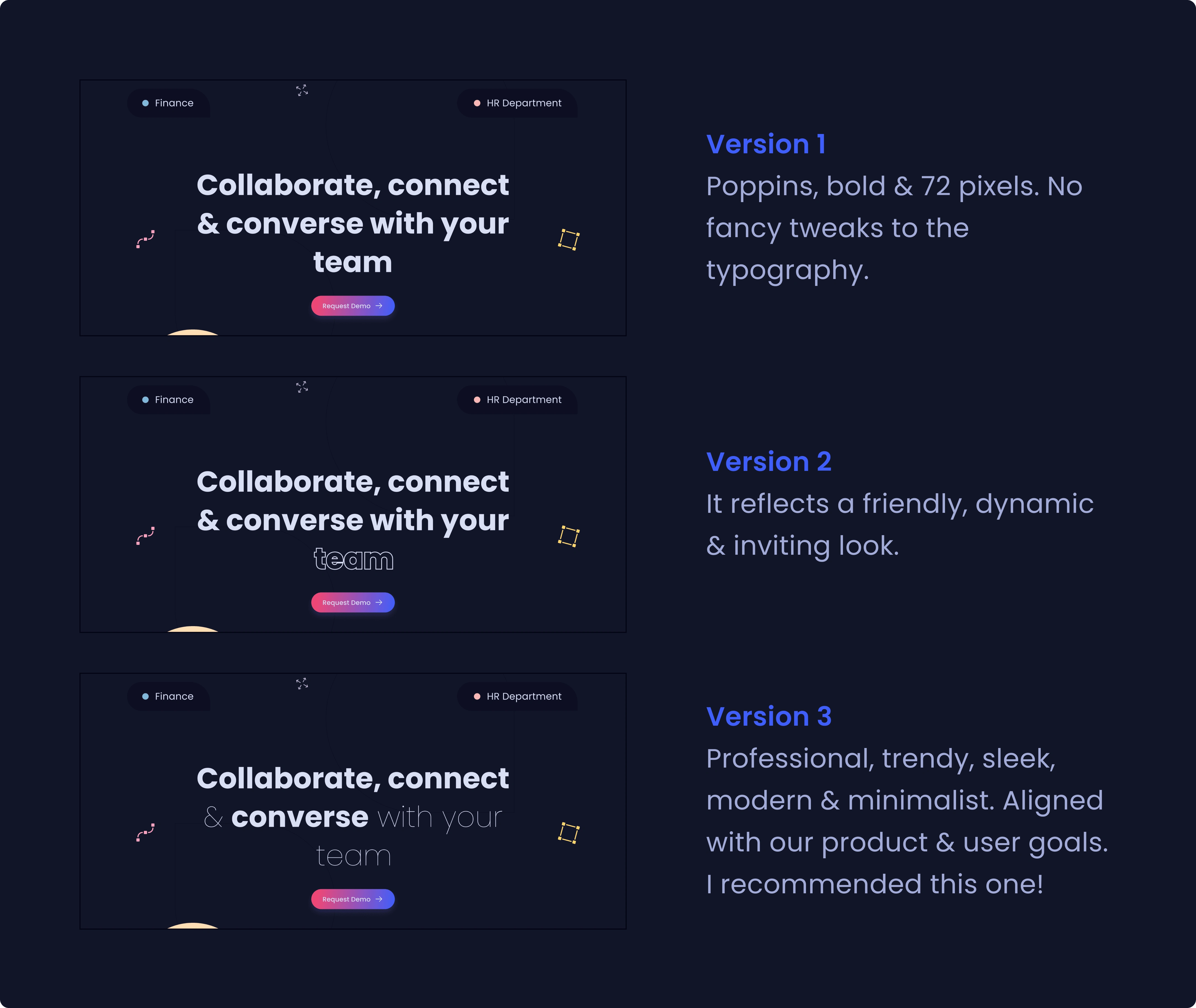
What did I do?
→ Made 3 different versions, reflecting 3 different emotions.
→ Guiding question: Which style will help us in building a professional & engaging brand image for BDITTO? (keeping in mind that our target audience is businesses)
→ Organised a design review meeting with my mentor and took feedback from him to define the brand language for Bditto.
Taking feedback from stakeholders ensures we are heading towards an improved user experience that is aligned with Bditto's business & user goals.
PS: We went ahead with version 3. Cheers!
#6- Evaluating old homepage & designing the new one🎬
To design the new homepage, I benchmarked user research findings (already done), recommendations from competitor analysis (already done), solutions from brainstorming sessions (they never stop) and UX & UI principles (past learnings & experience).
The new homepage is designed
→ to create an effective experience for the target audience (investors, businesses & big companies)
→ to stimulate more engagement & conversions for BDITTO with minimum funnel leaks
The old landing page is broken down into sections so that you can access the design decisions taken easily. After every section of the old homepage, I have put the newly designed version for comparison. Let's gooooooo!
A. HEADER & NAVIGATION
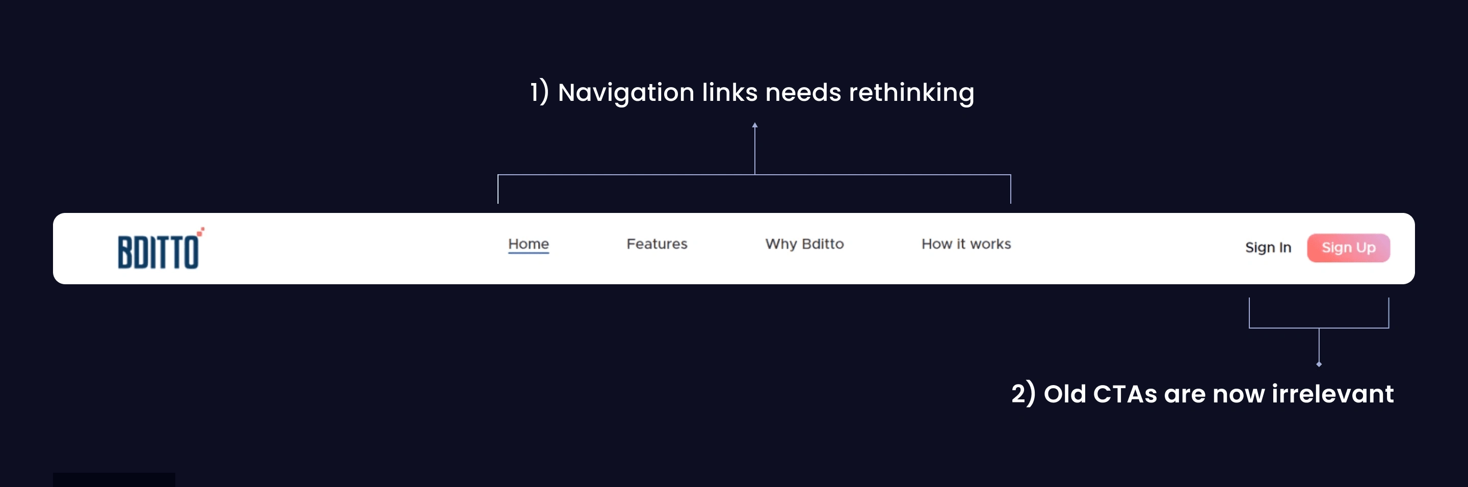
Old design (Header & Navigation)
1) Navigation links need rethinking: Old navigation links cannot cover what BDITTO has to offer & what it stands for. New critical sections (like BDITTO Labs & About Us) that the user expects on the menu need to be included.
2) Old CTAs are now irrelevant: With the newly defined target audience (businesses)-> there was a need to update the CTAs. Version 1 of the product was in the development stage then; therefore, providing demos to companies instead of direct access to the platform was done to attract interested companies.
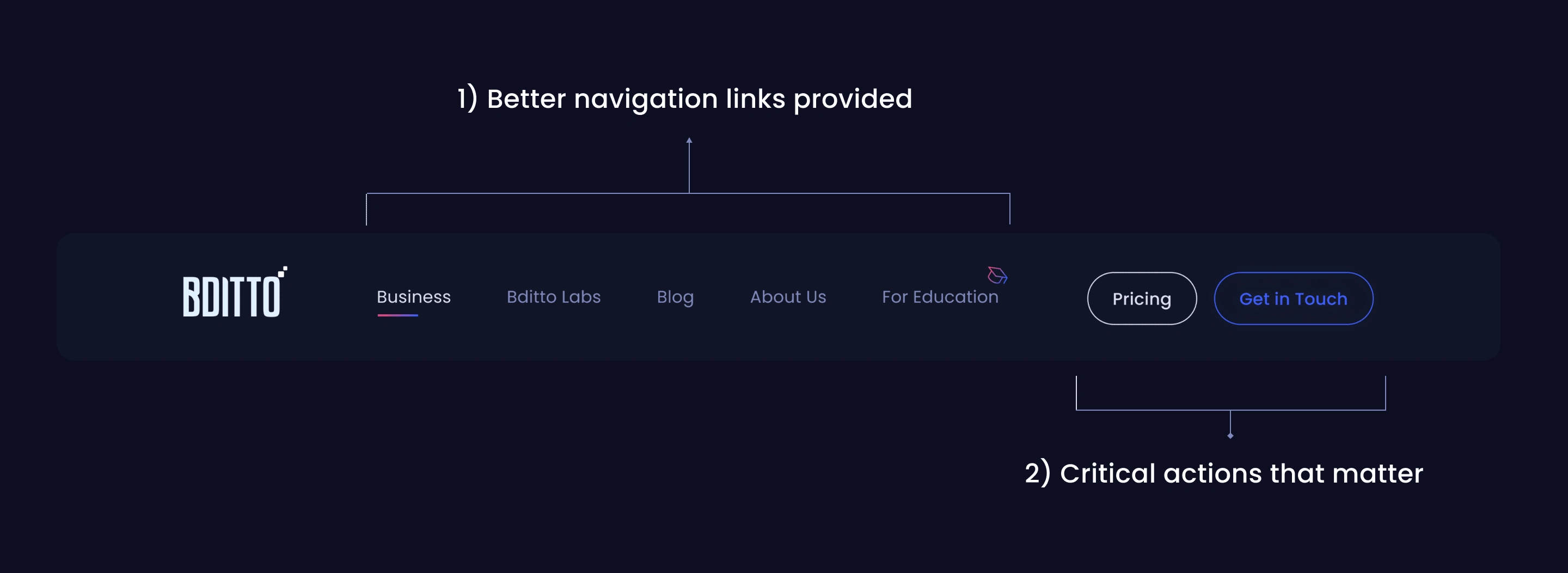
New design (Header & Navigation)
1=> Better navigation links provided: Links are strategically placed in order of importance, which fuels the navigation for BDITTO users. Stakeholders wanted users (especially university students) not to miss this section. And that is why an icon has been deployed for the “For Education” nav link to attract visual interest & make it stand out.
2=> CTAs that matter: To attract companies, the “Get in touch” CTA button is more human & will drive conversion rates higher. The pricing button serves as the secondary CTA button. Both CTA buttons direct businesses to pages wherein they can connect with BDITTO. (mental model that is followed by most of the competitors)
B. HERO SECTION
→ Problems in old design
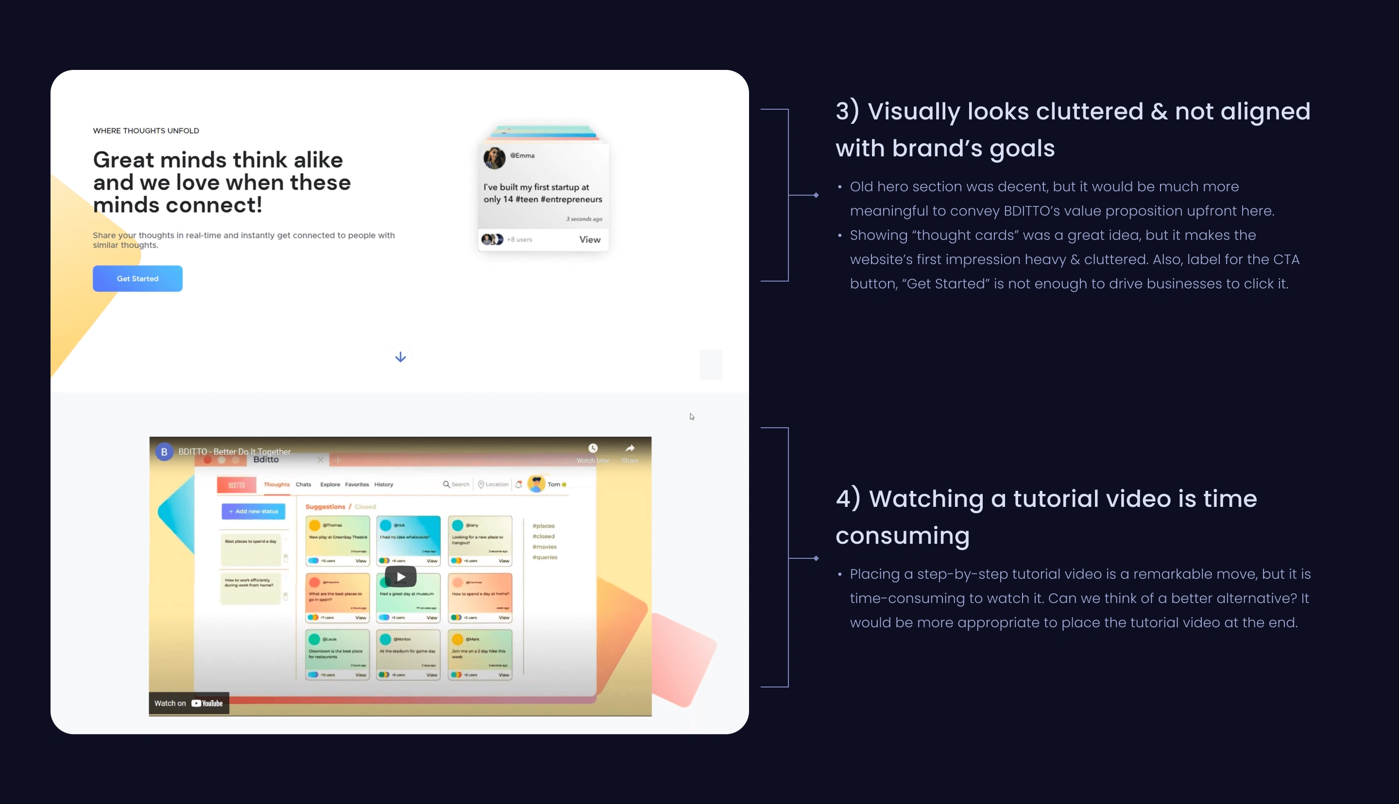
Old design (Hero Section)
→ Solutions in new design
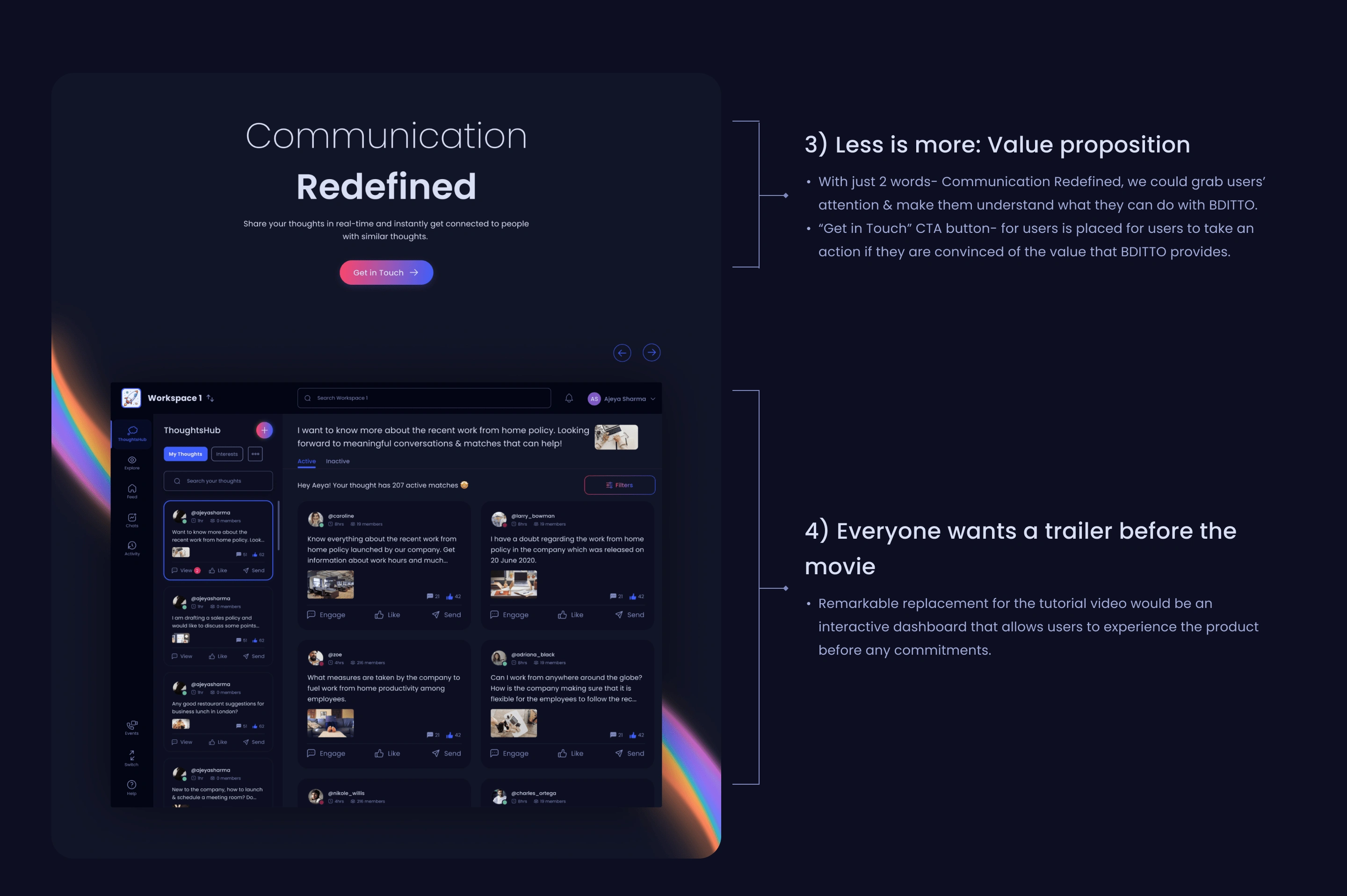
New design (Hero Section)
C. WEBSITE CONTENT
→ Problems in old design
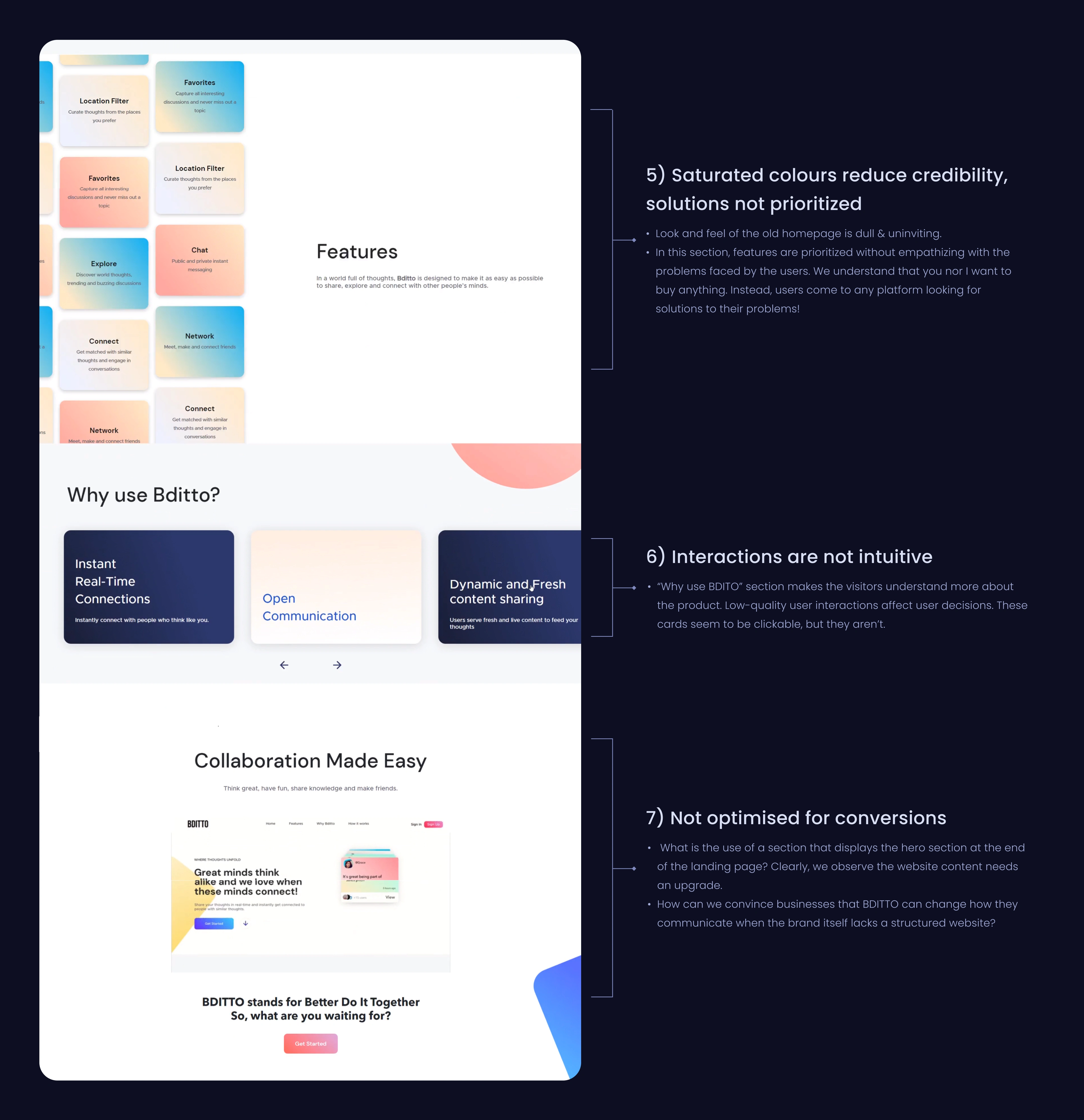
→ Solutions in new design
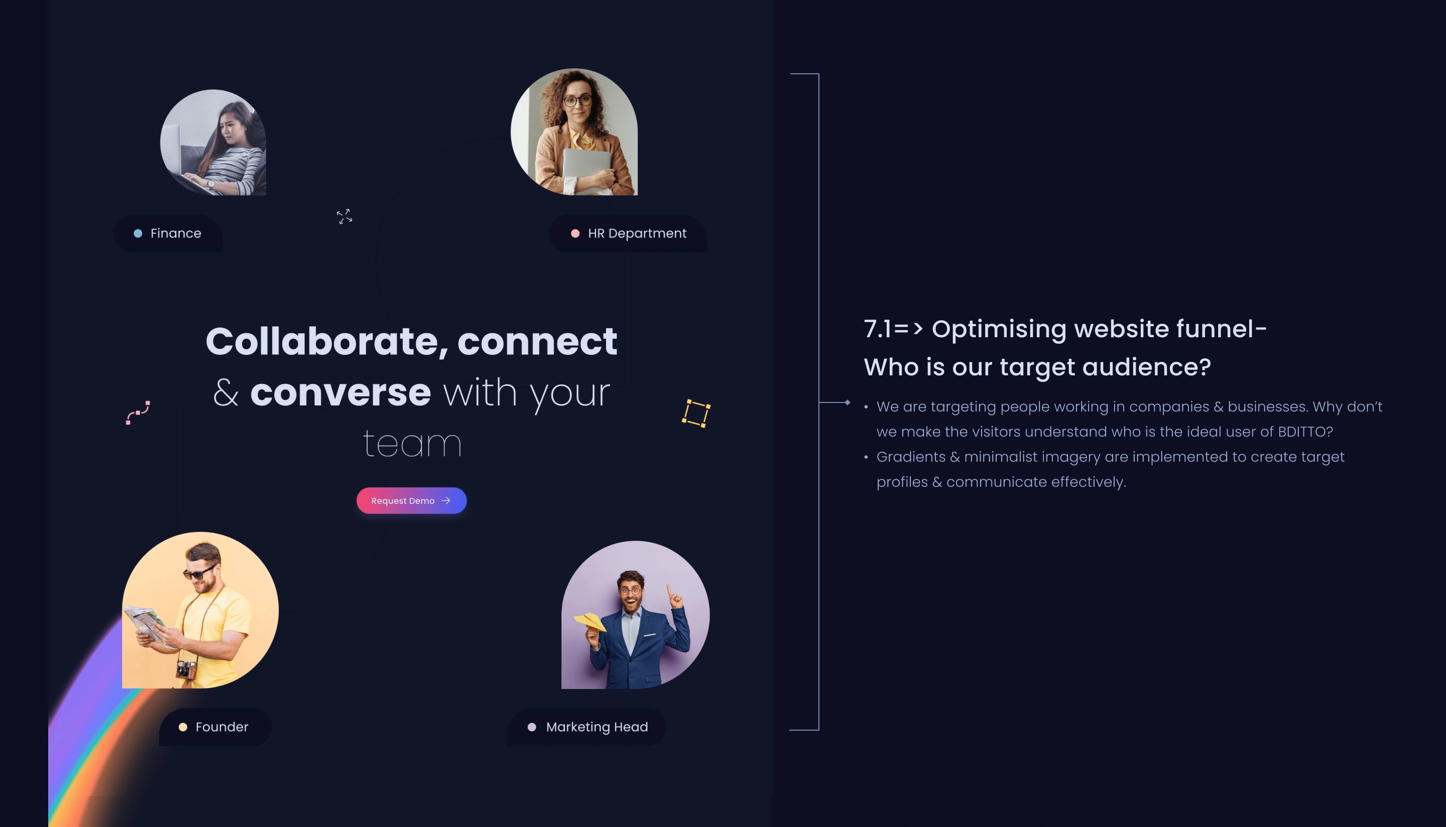
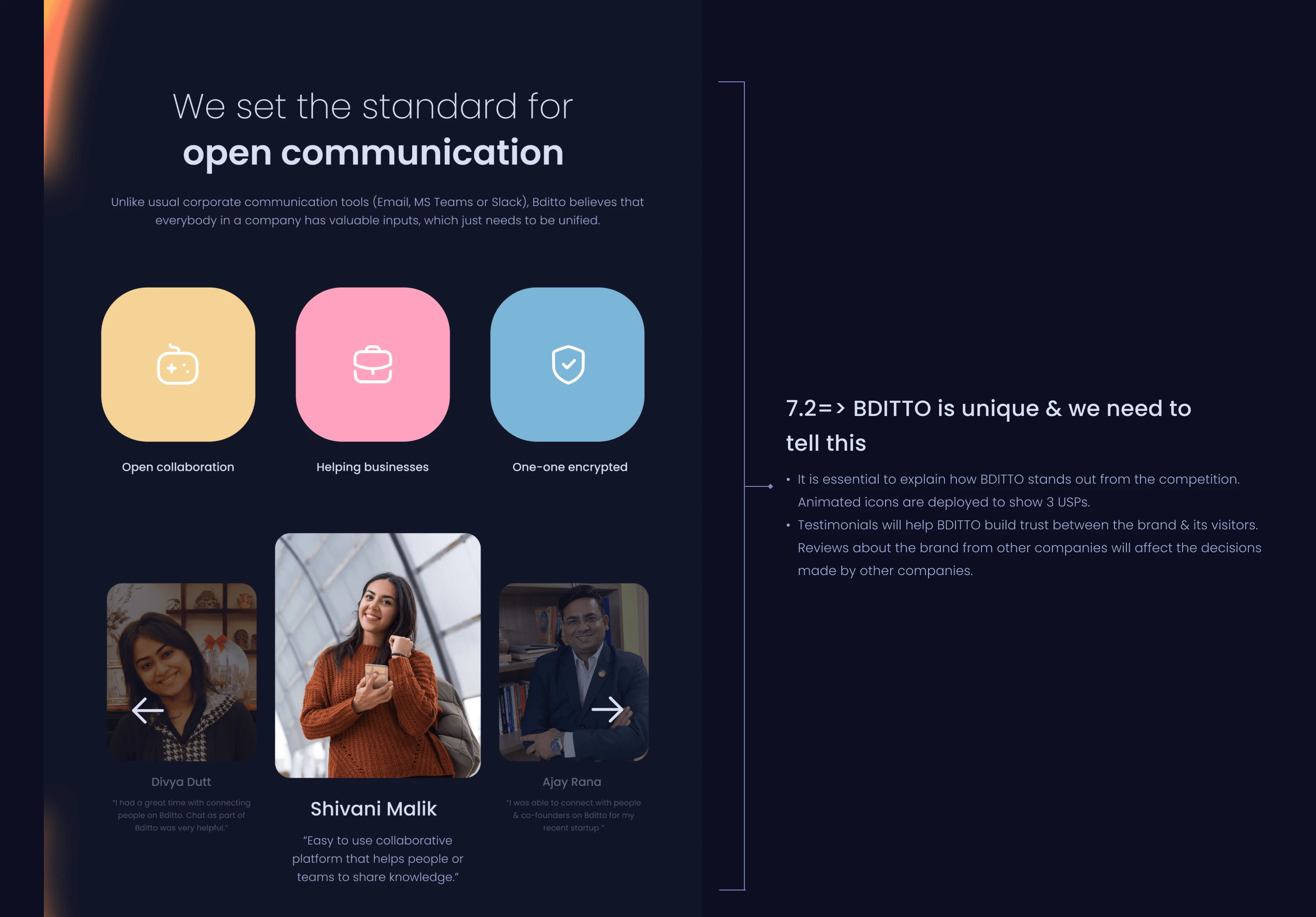
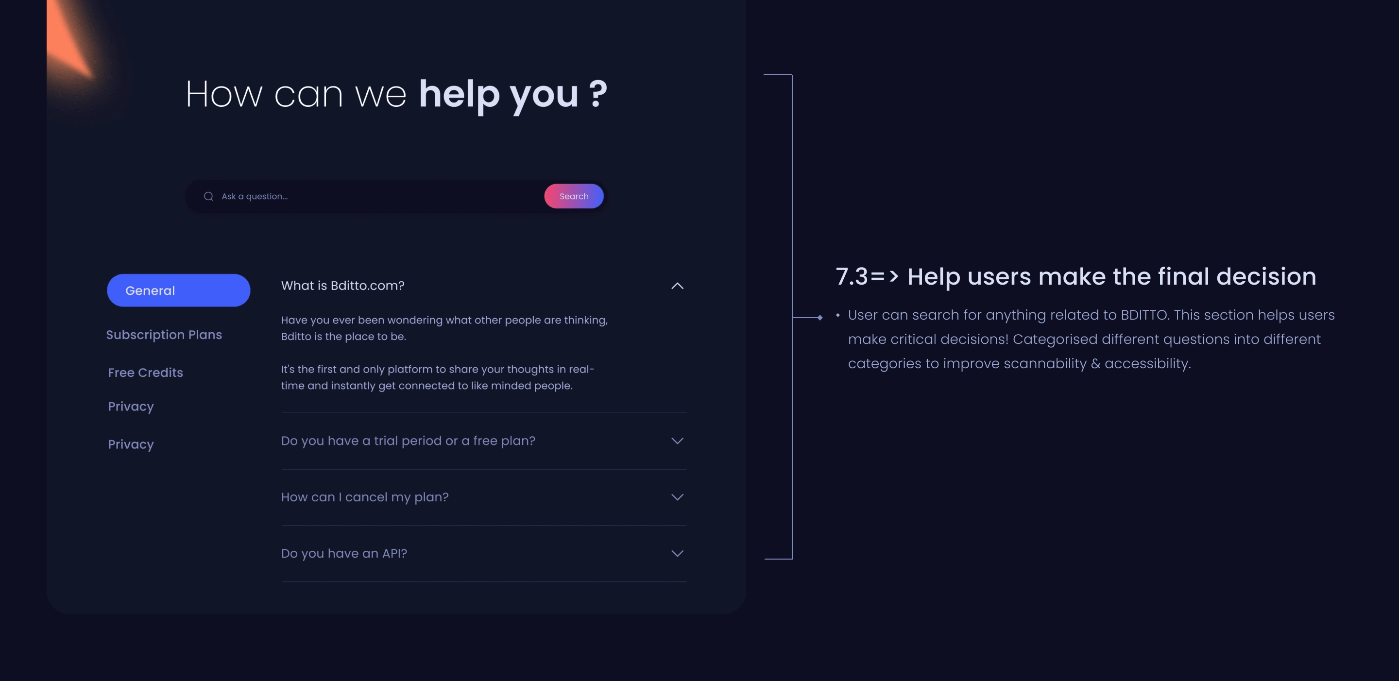
New design (Website Content)
D. FOOTER
→ Problems in old design
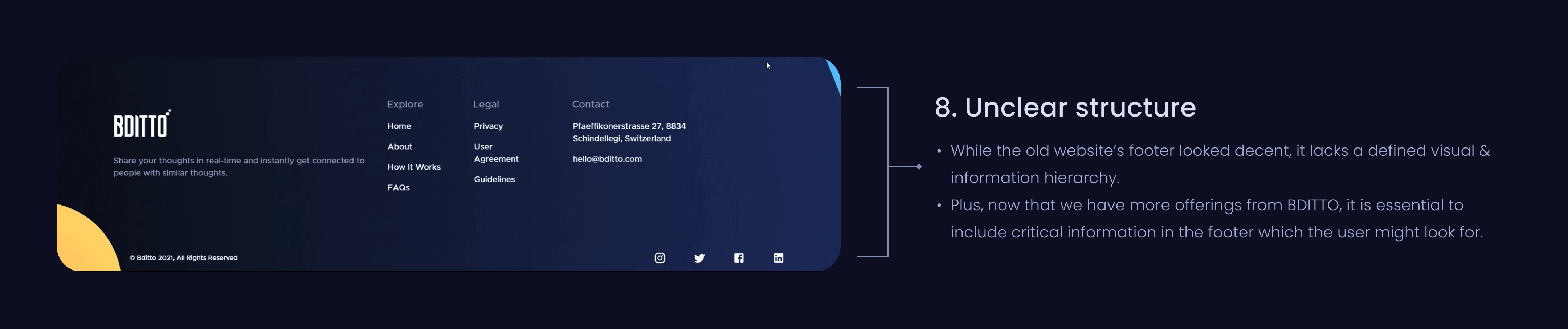
Old design (Footer)
→ Solutions in new design
New design (Footer)
ENTIRE WEBSITE REDESIGN
Designing other web pages 🔥
Pages such as BDITTO Labs, About Us, BDITTO for education & many more were missing in the old website designs. These pages are important to allow companies to understand BDITTO in great detail.
A fantastic learning experience!🤗
Working as a Product Designer for Bditto, I would have never imagined myself giving so much to a product. And yes, this is because of the way my mentor created my learning curve & the possibilities I see with Bditto which motivates me to drive that extra hour.
We usually had design review meetings every 2-3 days. Not only do we talk about design but topics such as career advancements & entrepreneurship always found a place during our meetups.
Learnings: Time to take a step back✍️
I'd be delighted to share what I learned from this website redesign project.
1. Role after creating the high-fidelity UI screens: My job is not done until the engineers implement the website designs perfectly. I worked closely with the development team to spec out any missing interactions or usability issues. (We have already started working on version 2 for the website design of BDITTO based on user & stakeholder feedback)
2. Demystifying the design process: During this month, I understood that no particular design process can be implemented to make a project successful. I had to adapt my design process to meet the user, project & business goals for BDITTO.
3. Taking initiative is essential: To achieve the project goals within the specified timelines, I followed up with the PM & other stakeholders with regular updates. This helped keep all of us in sync.
Thank you for making it to the end! I hope you found this case study interesting and meaningful!❤️✨
Yours truly,
Ajeya Sharma
Like this project
Posted Apr 23, 2025
I partnered with the brand to transform their website into a conversion-focused experience for enterprise users. Ready to compete with Slack and Teams.
Likes
1
Views
10
Timeline
Nov 1, 2024 - Nov 15, 2024
Clients
BDITTO


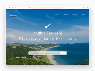
AP Tourism ◦ Travel Website
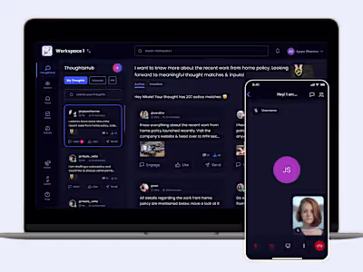
Bditto ◦ iOS App & Dashboard
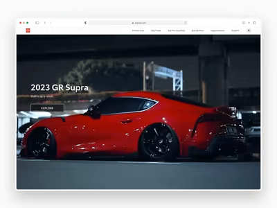
Toyota Car Configurator Redesign
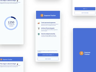
Designing an Android Personal Finance App