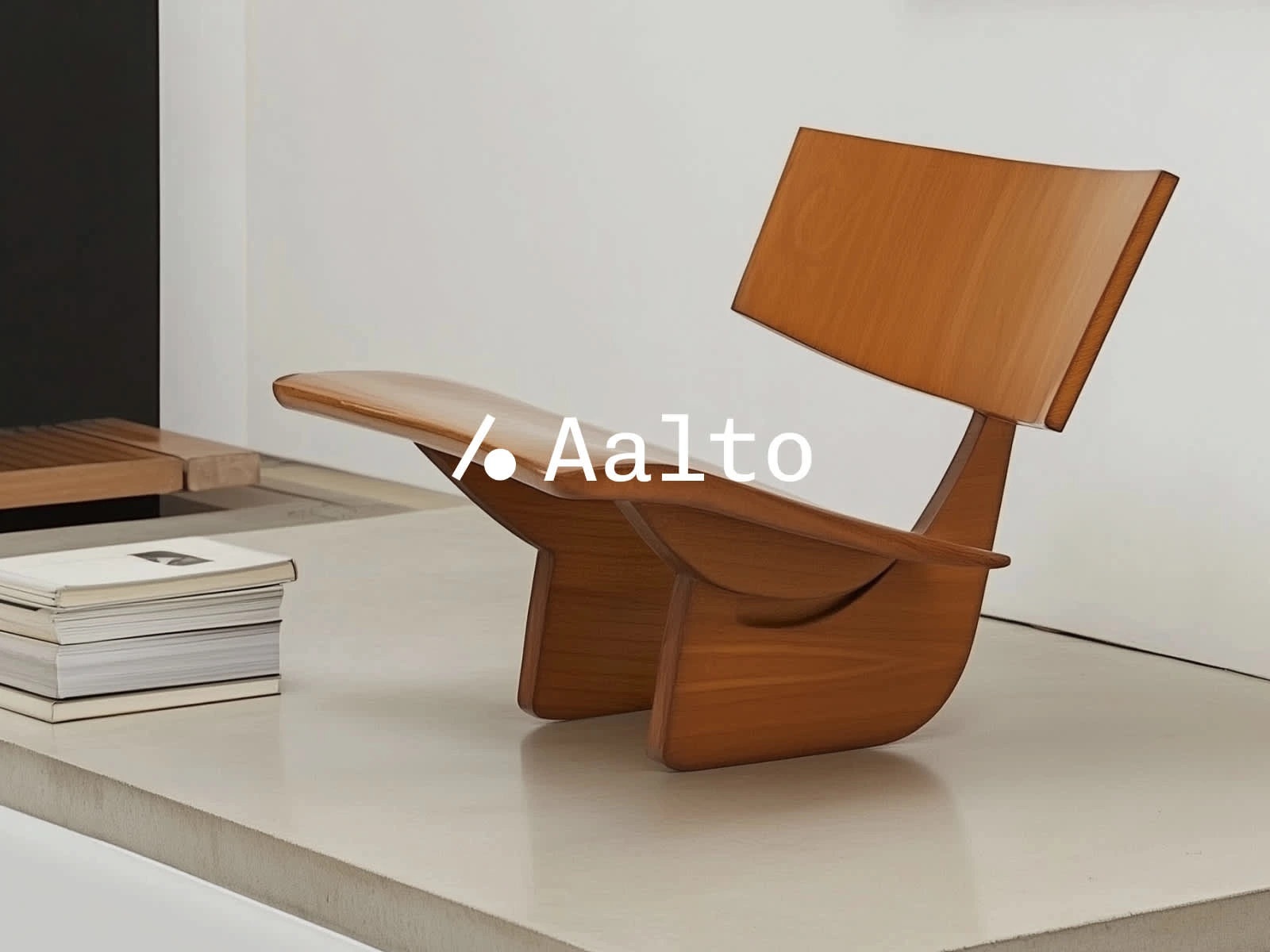
Aalto | Brand Identity — Sprint

Matt Carvalho


Intro
This self-initiated project showcases my approach to building a refined brand identity for a commercial and residential real estate company—designed to demonstrate how strategic design, thoughtful storytelling, and visual restraint can create a distinctive presence in a traditionally uniform industry.
View this service 👉 https://contra.com/s/NROFZvNM-brand-identity-sprint 🔗
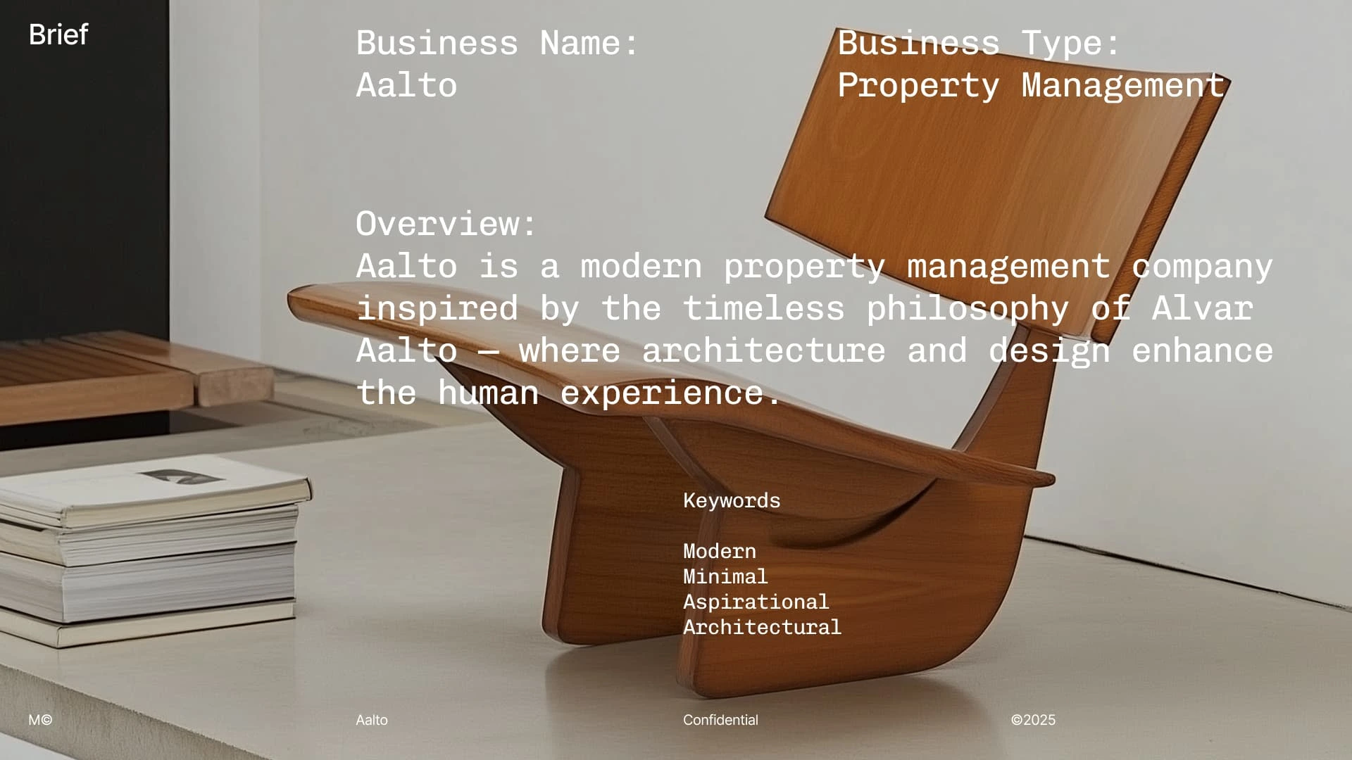
Overview
Aalto is a premium property management brand inspired by the philosophy of Finnish architect Alvar Aalto. Targeting professionals—Aalto offers refined rental living that blends design, functionality, and lifestyle.
Target Audience
Demographic:
Age: 25–55
Income: $100K+
Occupation: Tech, creative, finance, and healthcare professionals
Lifestyle: Busy, upwardly mobile, digitally native, values aesthetics and convenience
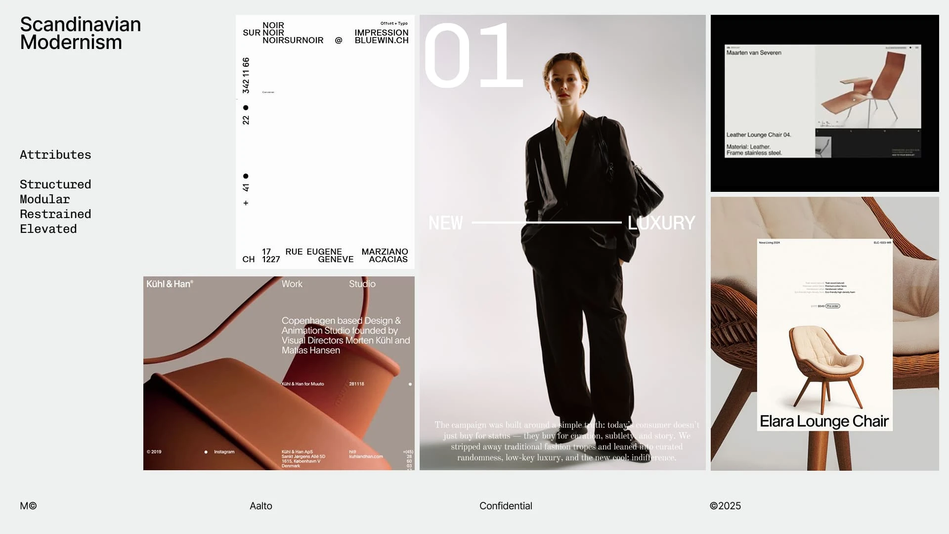
Moodboard
The moodboard was built using the design ethos of Scandinavian Minimalism—prioritizing natural materials, functional simplicity, and emotional warmth. This approach shaped a visual style that feels clean yet tactile, with a calm, intentional tone that aligns with modern elevated living.
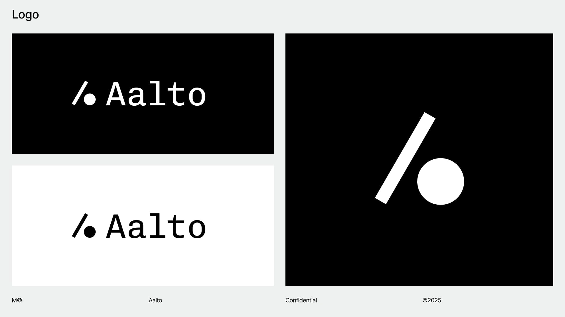
Logo
The Aalto logo combines pure geometric forms—a forward slash and circle—to express balance, motion, and functional elegance. Inspired by architectural clarity and organic design, it captures the brand’s refined, modernist spirit in a timeless and minimal symbol.
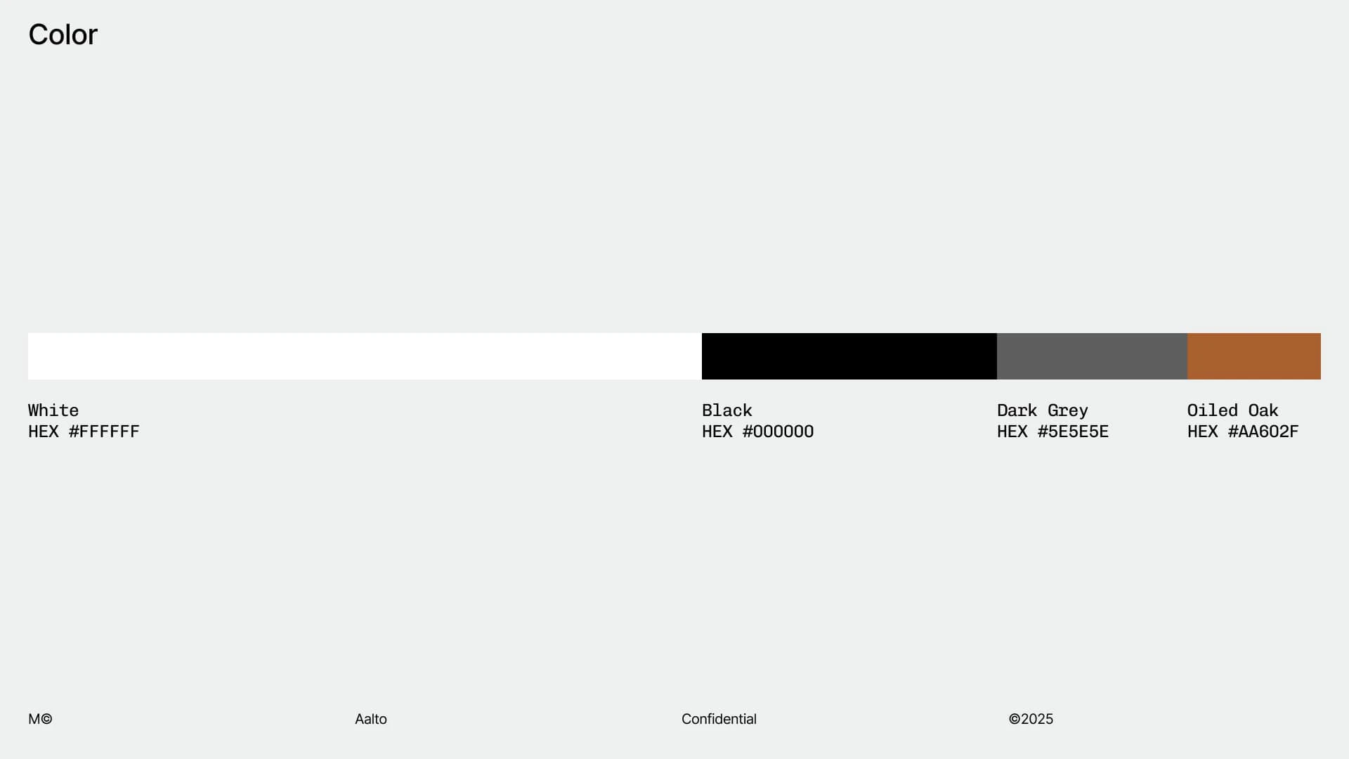
Color
The Aalto color palette is composed of warm neutrals, soft greys, and deep charcoal—evoking a sense of calm, clarity, and understated luxury. Inspired by natural materials like stone, wood, and linen, the palette reinforces the brand’s connection to modern, tactile living.
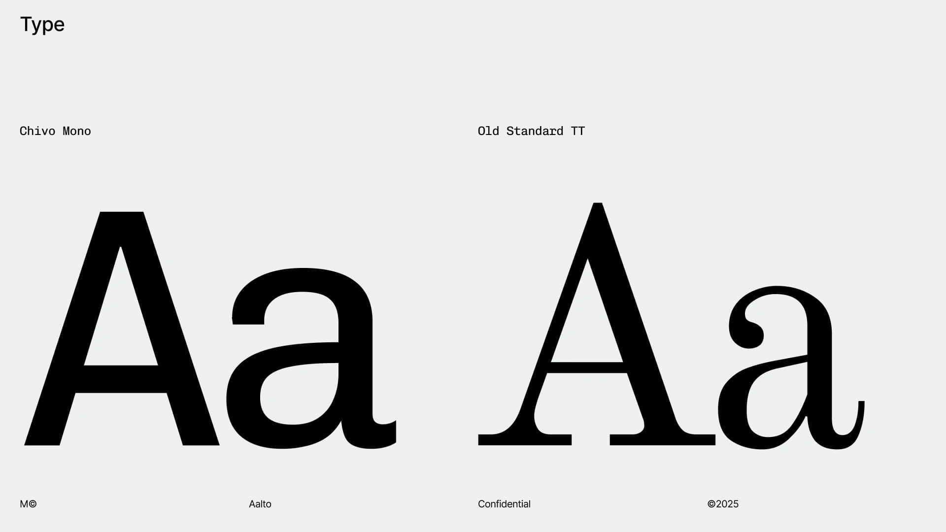
Typography
The Aalto brand uses Chivo Mono for its primary typeface, bringing a sense of modern utility and structured rhythm through its monospaced form. Paired with Old Standard TT, a classic serif with refined contrast, the typography balances contemporary clarity with a subtle nod to tradition and timeless design.
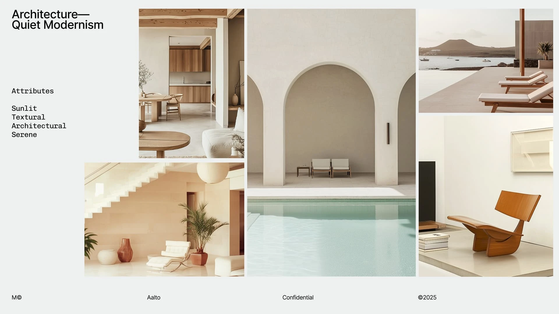
Art Direction
The architectural photography embraces quiet modernism—highlighting clean lines, soft natural light, and minimal compositions that evoke calm and clarity. Each image is thoughtfully framed to emphasize space, texture, and balance, reflecting the brand’s focus on intentional, design-led living.
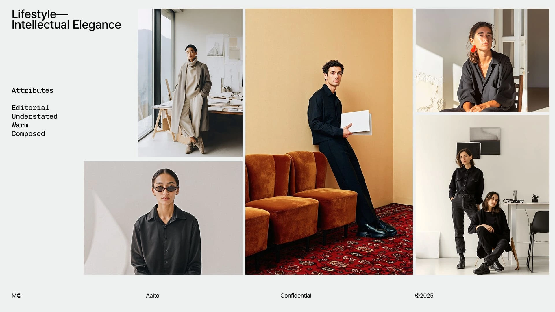
Lifestyle Photography
The lifestyle photography captures candid, intimate moments in warm, minimal settings—reflecting a sense of ease, intention, and modern comfort. With soft lighting and natural tones, the imagery conveys a lived-in elegance that aligns with Aalto’s philosophy of elevated everyday living.
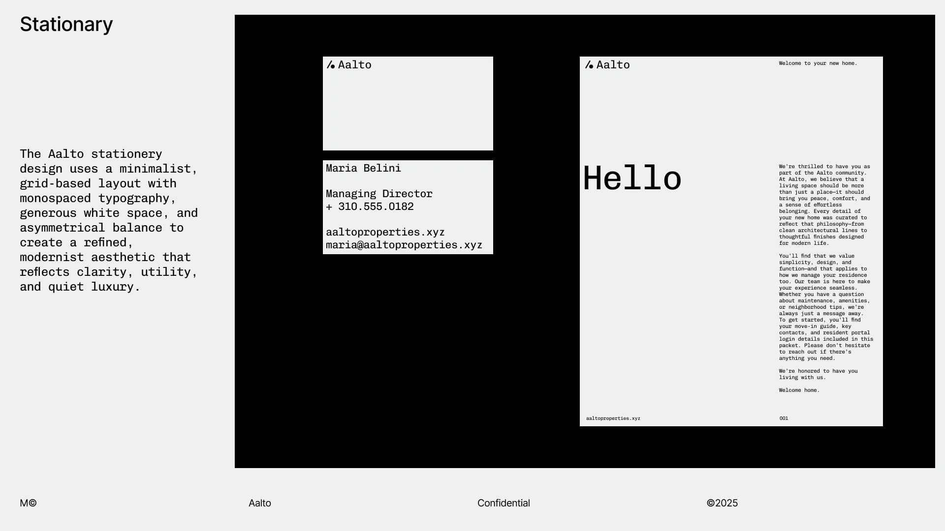
Stationary
The Aalto stationery system is built on a clean, grid-based layout with monospaced typography and generous white space, reflecting clarity and modern restraint. Each piece—from business cards to letterhead—feels quietly confident, balancing structure with softness to embody the brand’s refined, architectural spirit.
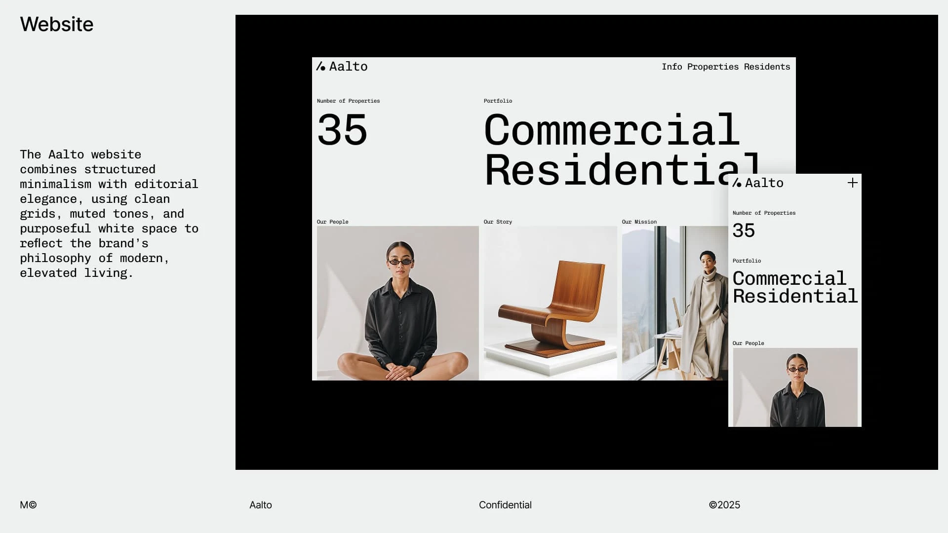
Website
The Aalto website pairs structured layouts with calm, spacious design to create a seamless digital experience rooted in modern minimalism. With editorial typography, warm neutral tones, and intuitive navigation, the site reflects the brand’s focus on thoughtful, design-led living.
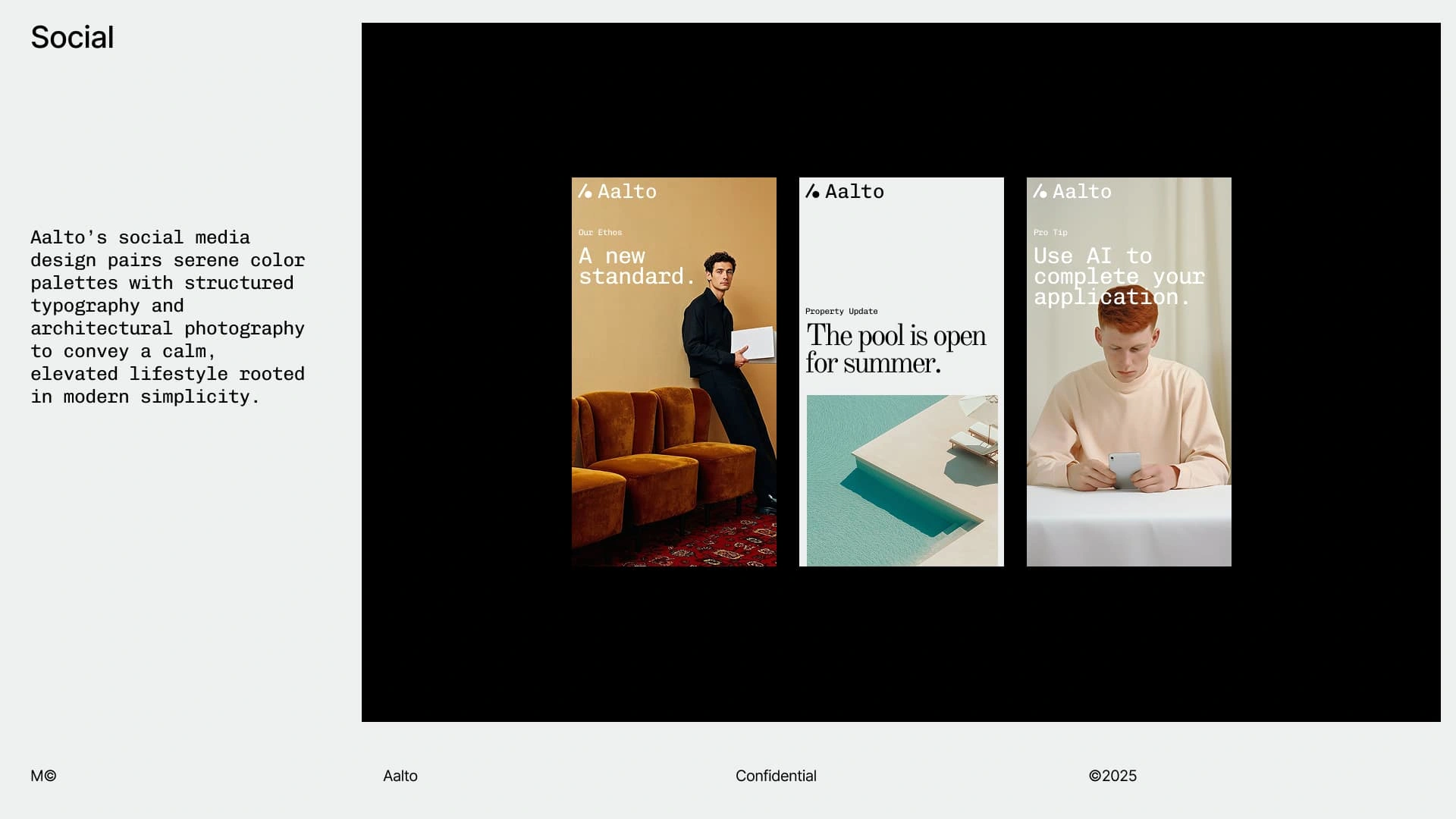
Social Media
Aalto’s social media presence blends architectural calm with curated minimalism—featuring clean design, warm tones, and intentional storytelling. Every post reflects the brand’s commitment to modern living, quiet luxury, and visual clarity.
Build a Bold, Strategic Brand in Just 2 Weeks
Ready to launch with clarity and confidence? My Brand Identity Sprint is a fast, focused process that delivers a complete visual identity—designed to align with your vision, speak to your audience, and set you apart in your market. Let’s make it real, fast.
Get started 👉 https://contra.com/s/NROFZvNM-brand-identity-sprint 🔗
Like this project
Posted Jun 9, 2025
A self-initiated brand identity for a modern real estate company, blending minimalism and warmth to redefine commercial and residential living.
Likes
0
Views
3
Timeline
May 26, 2025 - Ongoing


Revair | Brand Identity — Sprint

Rastro | Brand Identity — Sprint
Milly | Brand World — Sprint
Yikoshi | Brand Identity — Sprint