UI/UX Critique & Redesign
Roadmap
Analyzing the current design
UI/UX critique - Identification of the needed amelioration|
Applying new alternatives/modifications
Crafting the final design
Current design analysis
Audience:
People in need of calming atmosphere
UX design:
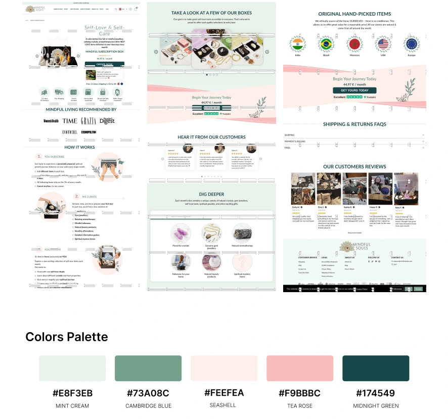
Navigation bar is too long
Items of the navigation not organised
The navigation bar is a highly important element in an e-commerce shop, it should be highlighted
→ The current navigation might cause frustration to the user. Navigation menus work best when they are short and simple.
Lack of harmony between the different sections
Some sections should be either incorporated or modified to highlight the meaning of each one. Example: Hear it from our customers" highlights the review of customers engaged in the journey while "our customer reviews" is about reviewing the product itself. → The difference needs to be highlighted
Shipping and Billing sections are duplicated in the FAQs list.
UI design:
Better to use black instead of midnight green color in the navbar
Search bar is not highlighted
The box of the language switcher has 0 radius corners which is different from the website's style.
Lack of color rule → Good to set a 60-30-10 color rule
The use of dark green text on light green background makes it unclear
The use of attractive colors (pink and green) affects the visibility of the products → Better to keep design simple and minimalist to highlight the products and provide a good atmosphere to the targeted audience (people in need of relaxation)
Lack of spacing between the different blocs.
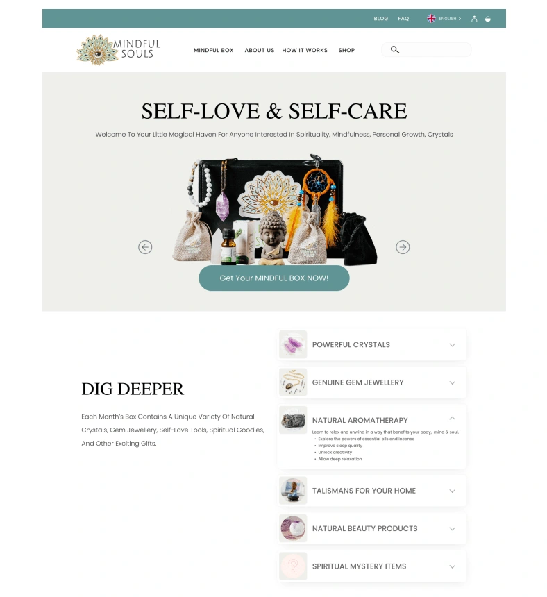
New Color Palette
Calm coastal palette.

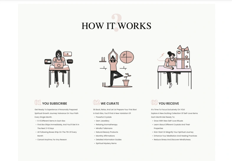
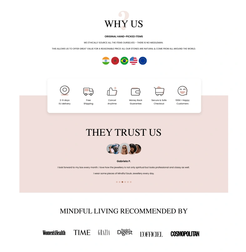
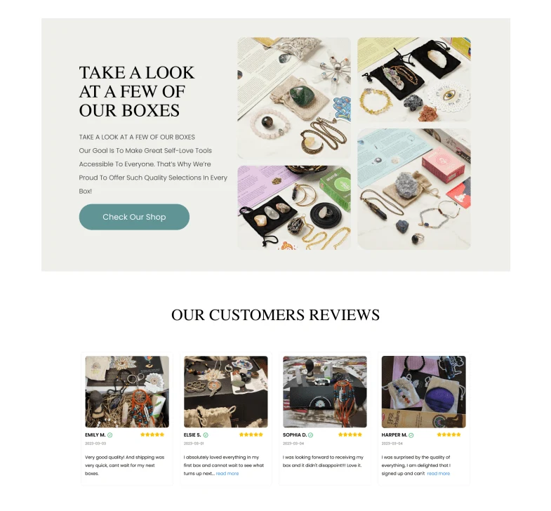
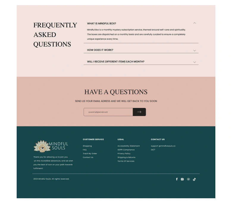
New design - Desktop version
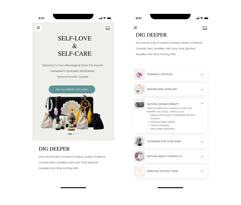
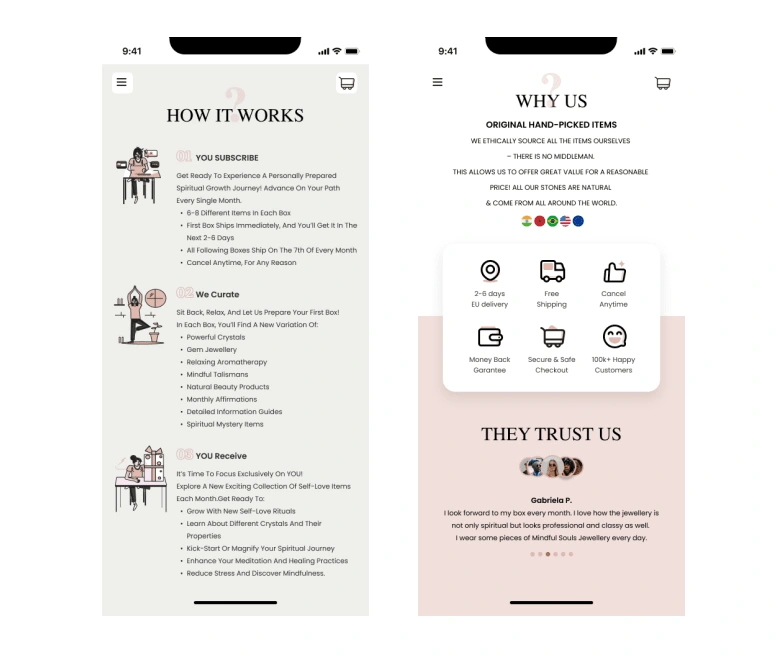
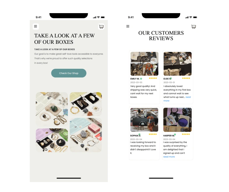
New design - Mobile version
Like this project
Posted Jun 21, 2024
UI/UX analysis and redesign of the landing page - Mindful Soul.

