Clipido – Smarter media management


Clipido reimagines how you find and manage media.
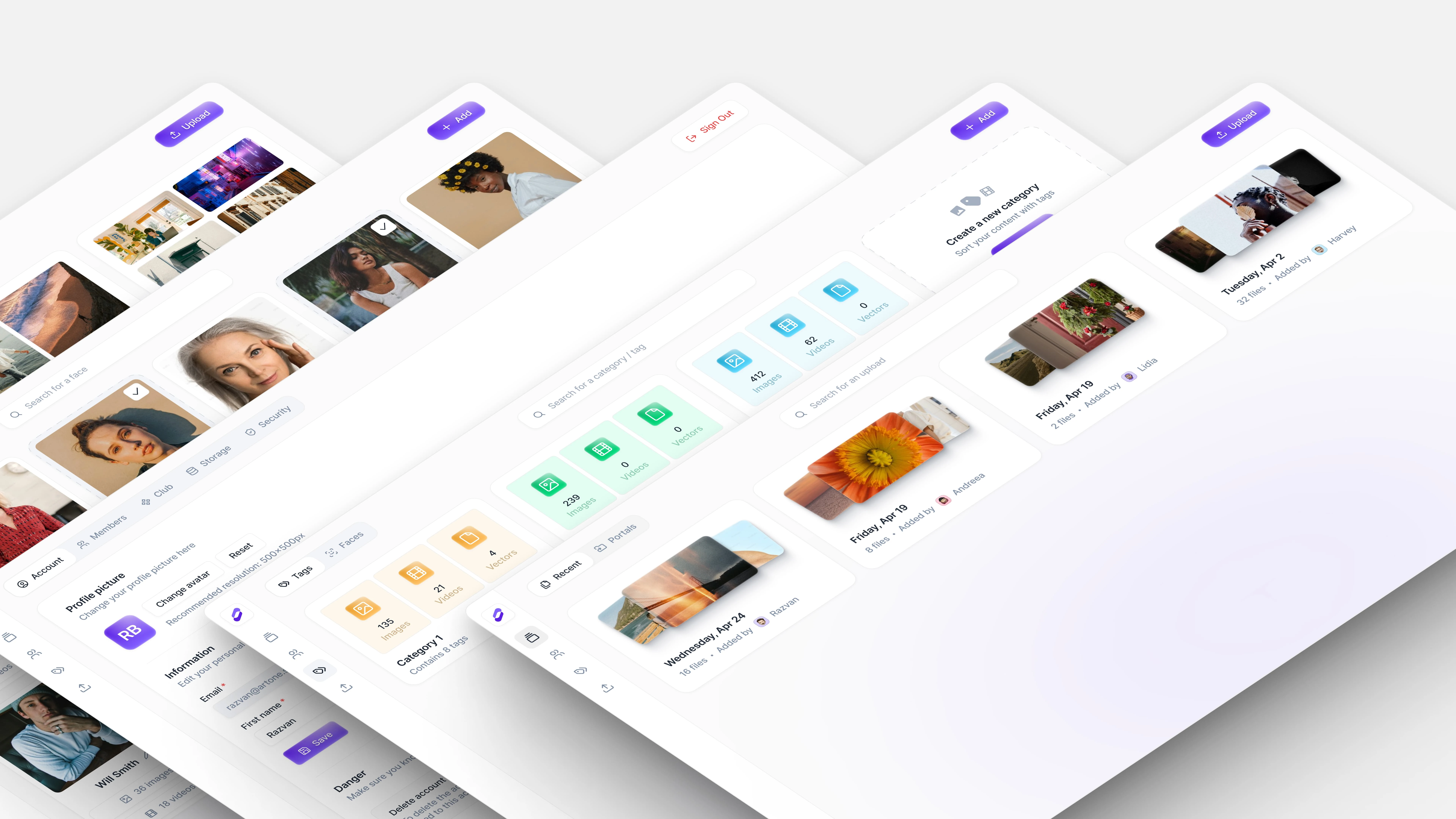
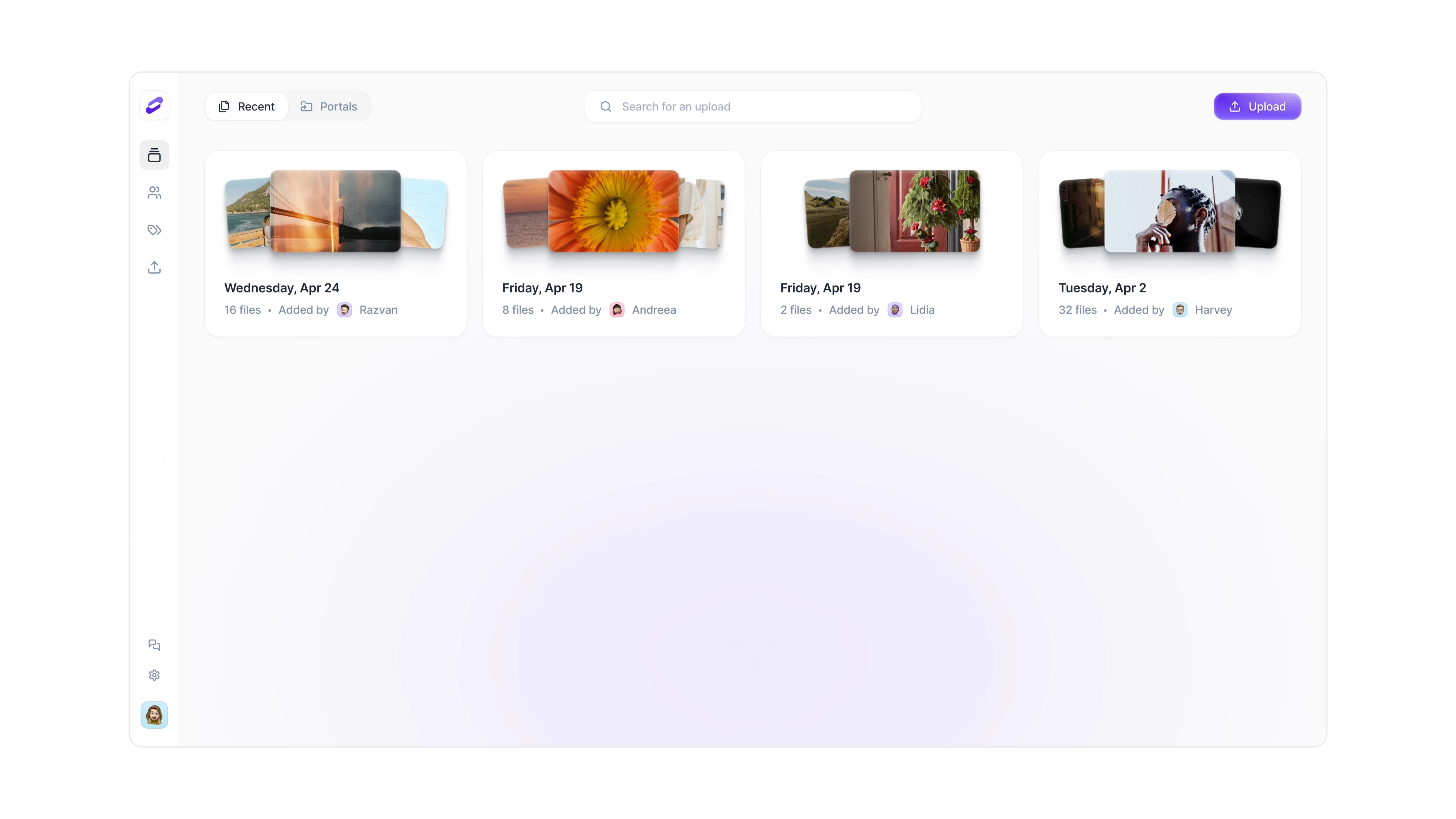
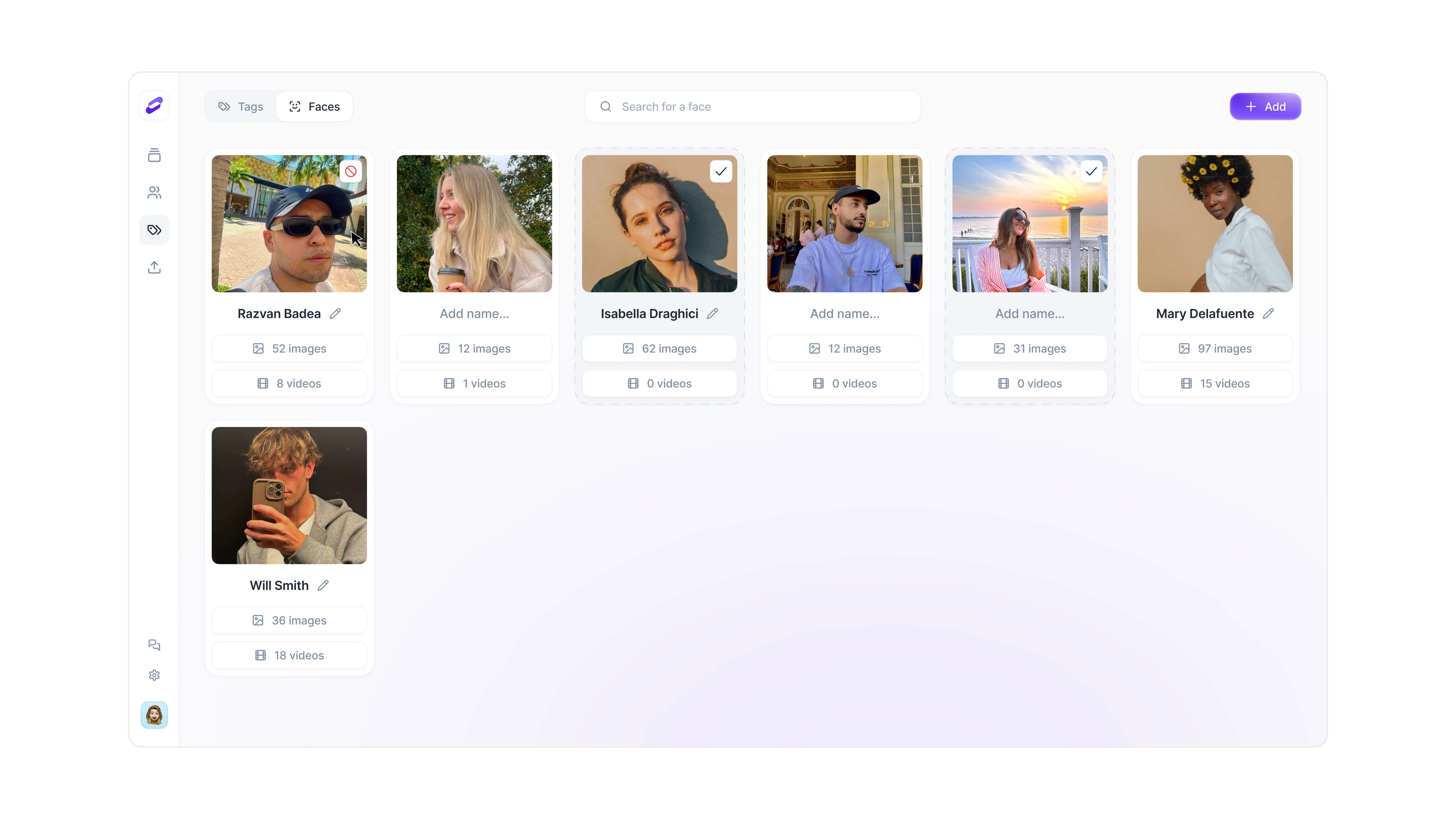
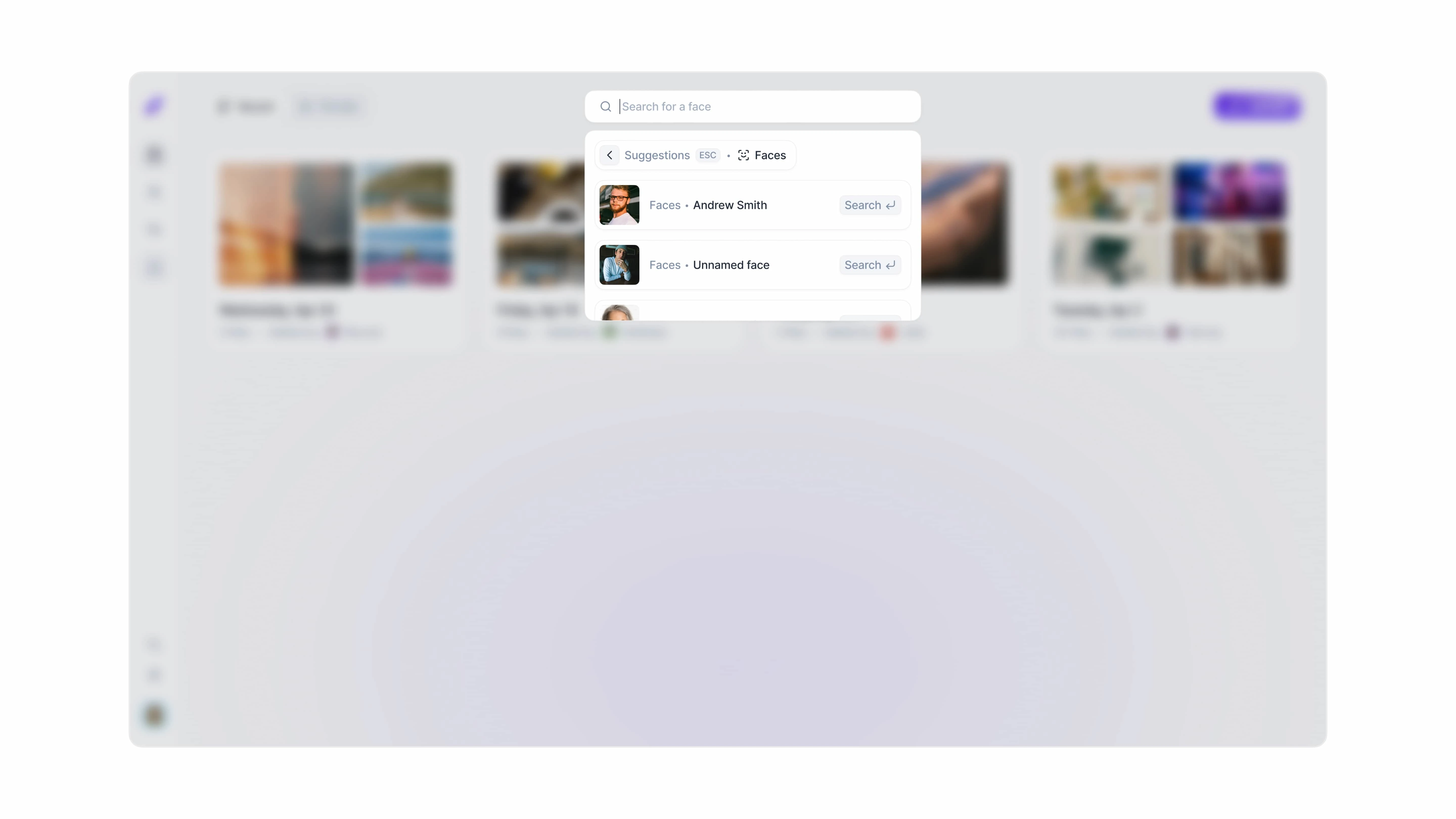
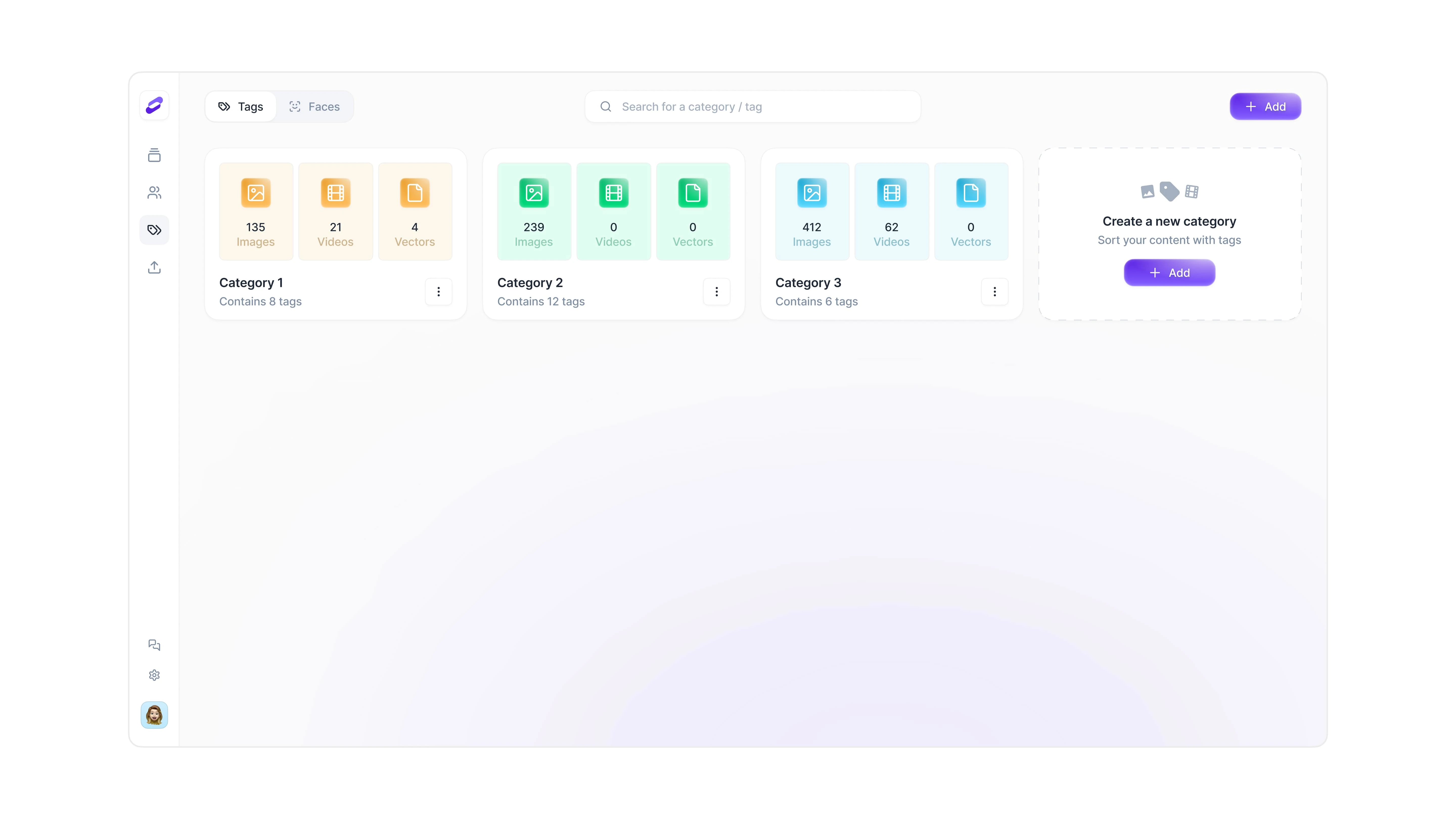
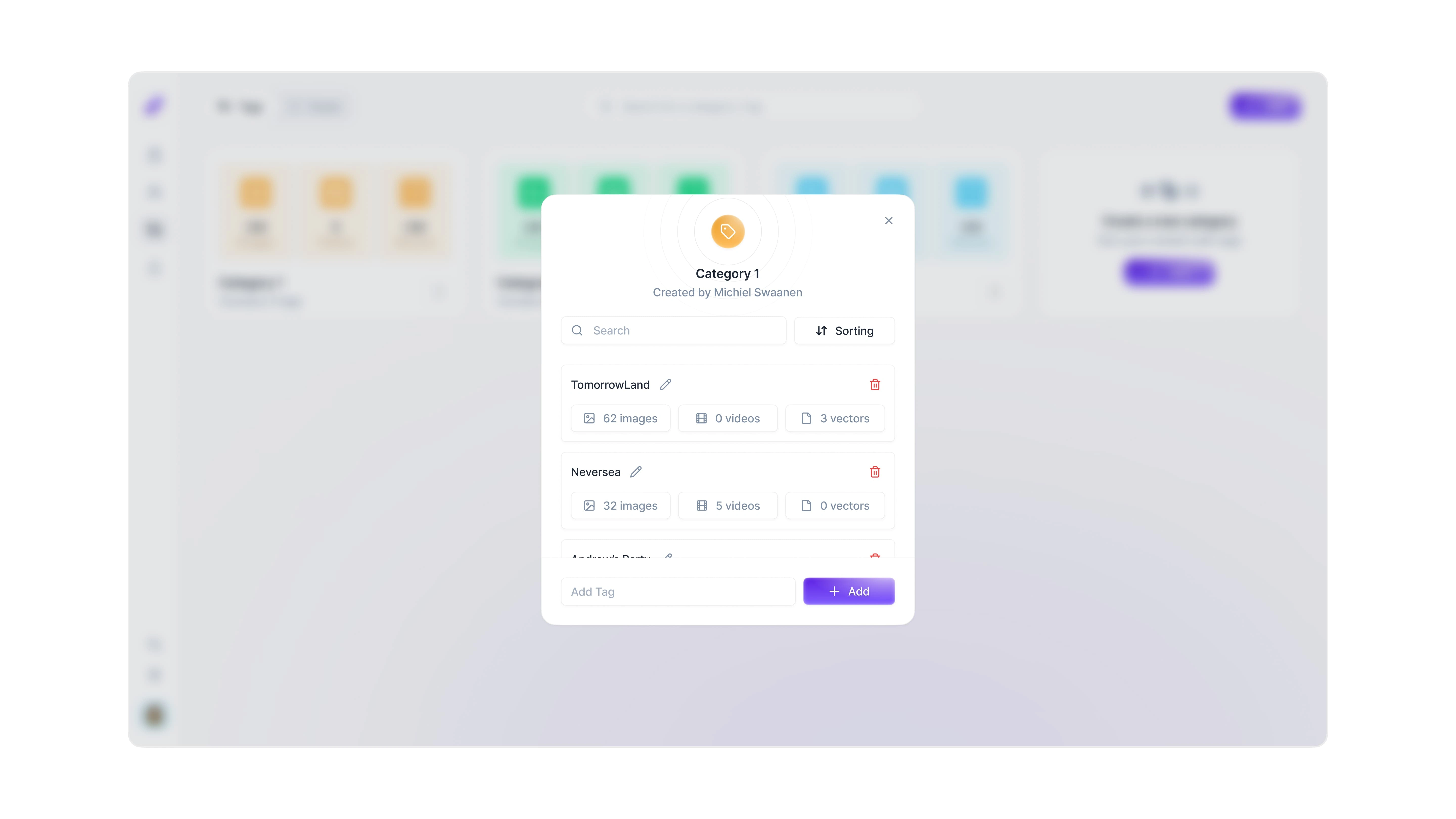
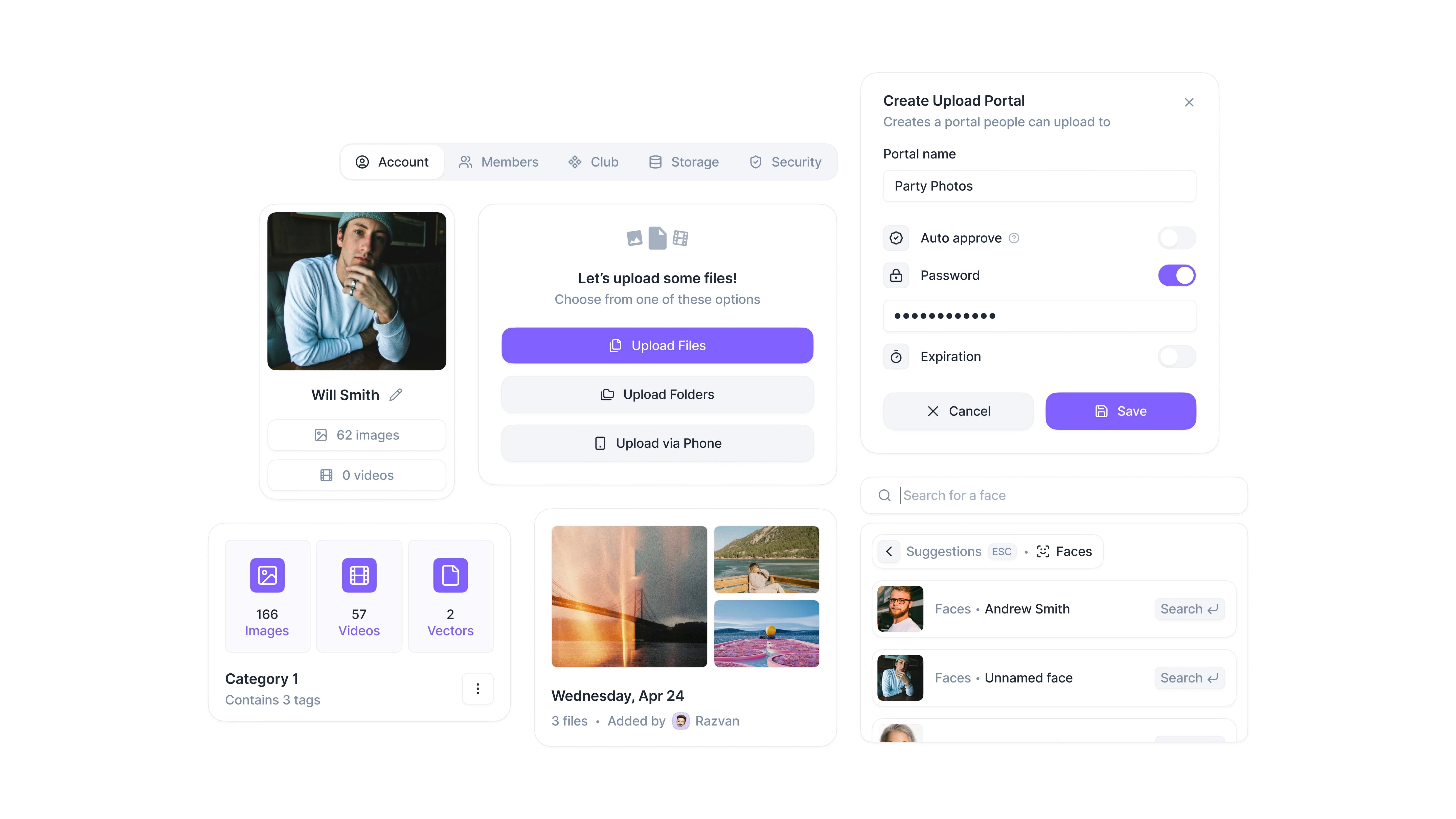
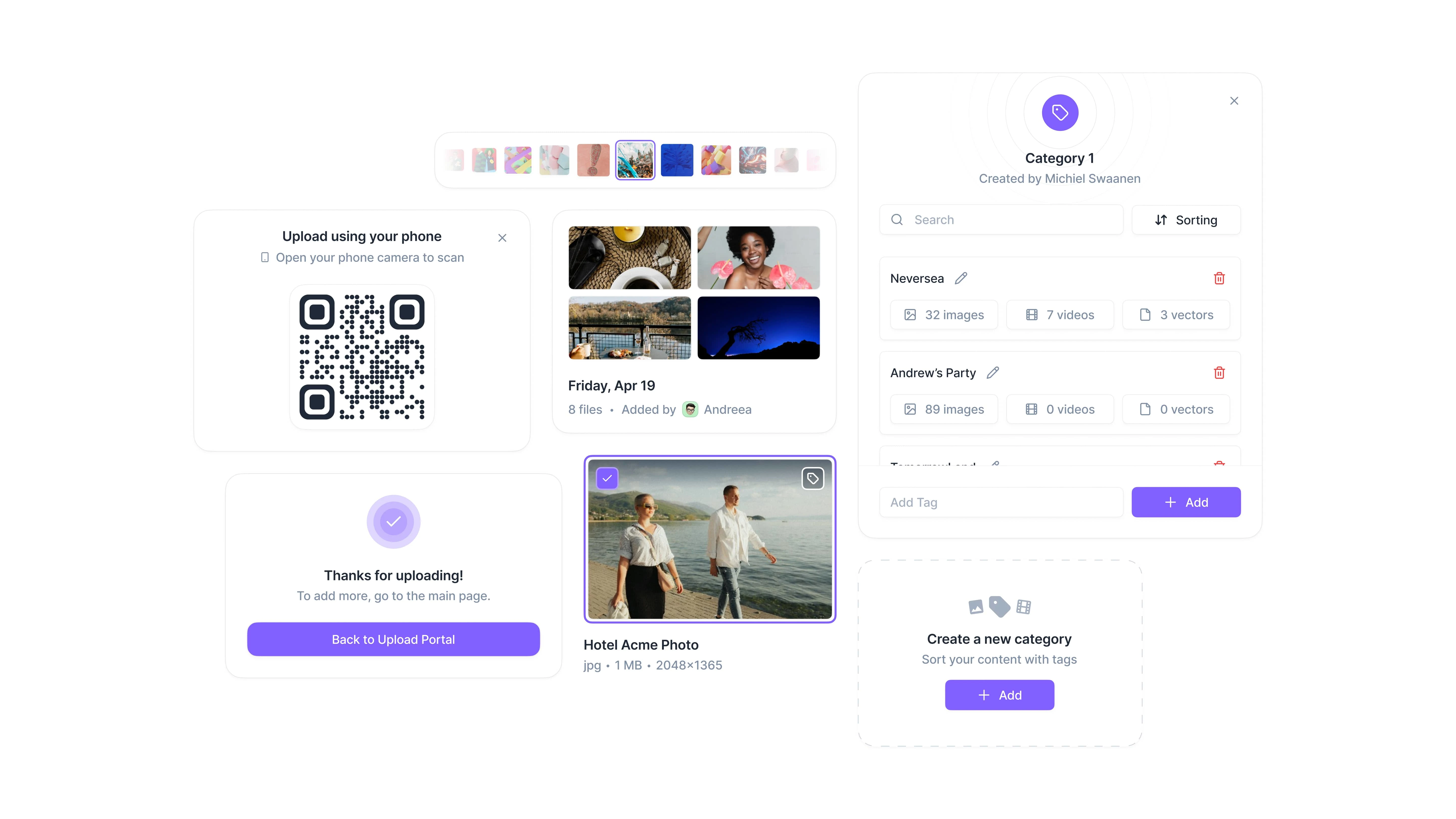
Clipido is a platform that helps teams organize, search and manage large volumes of visual content. It automatically tags media files, makes filtering and searching easy, and allows for real-time collaboration — replacing scattered folders and disconnected tools with a single, organized workspace.
The challenge
The product was already functional and usable, but the UI lacked a strong, cohesive visual language. The team reached out to us to elevate the interface and bring a more modern, polished look to the platform. Alongside the visual refresh, we also identified and addressed a few key UX areas where small adjustments could improve clarity and flow.
Our process
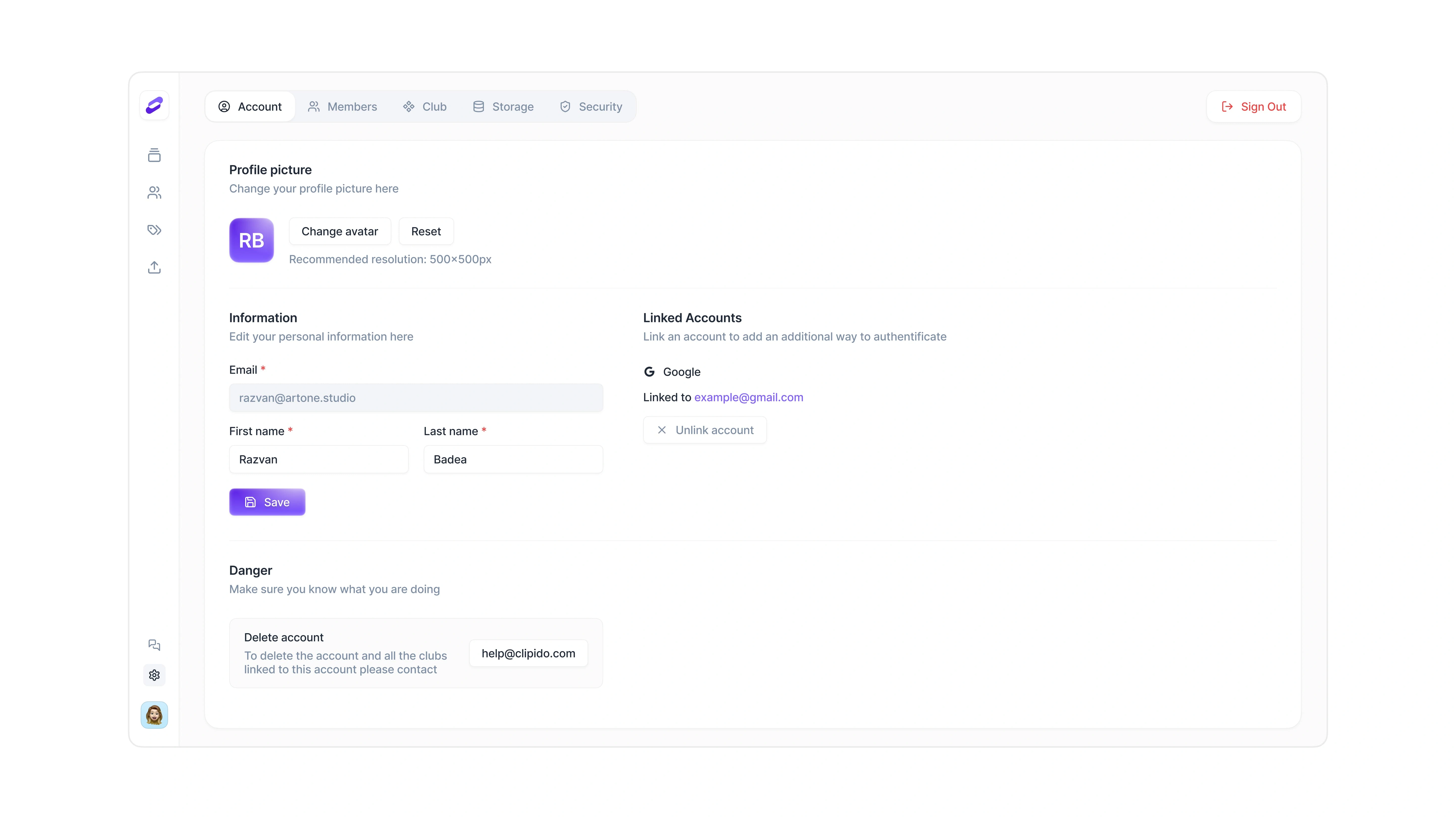
We collaborated over the course of a focused one-month sprint. Working closely with the founder, we redesigned nearly every screen in the app, with an emphasis on structure, hierarchy and simplicity. While the backend and logic remained intact, the UI and UX were overhauled to better guide users through the product, reduce friction and highlight its core value.
The outcome
The redesign gave Clipido a clean, modern interface that feels lighter and more intuitive to navigate. We brought consistency across screens, created clearer flows, and made the interface feel aligned with the product’s strengths. The result was a more approachable product that not only improved usability but also made a strong impression with potential clients and partners. The team was highly satisfied with both the speed and quality of the work.
Interested in working together? Reach out at artone.studio
Like this project
1
Posted Apr 5, 2025
We helped Clipido improve their web app with a full UI refresh and UX tweaks, making it easier for teams to search, view and manage visual content.
Likes
1
Views
3
Timeline
Apr 24, 2024 - May 24, 2024


Starbox – Connecting creators

Open – AI copilots for customer support