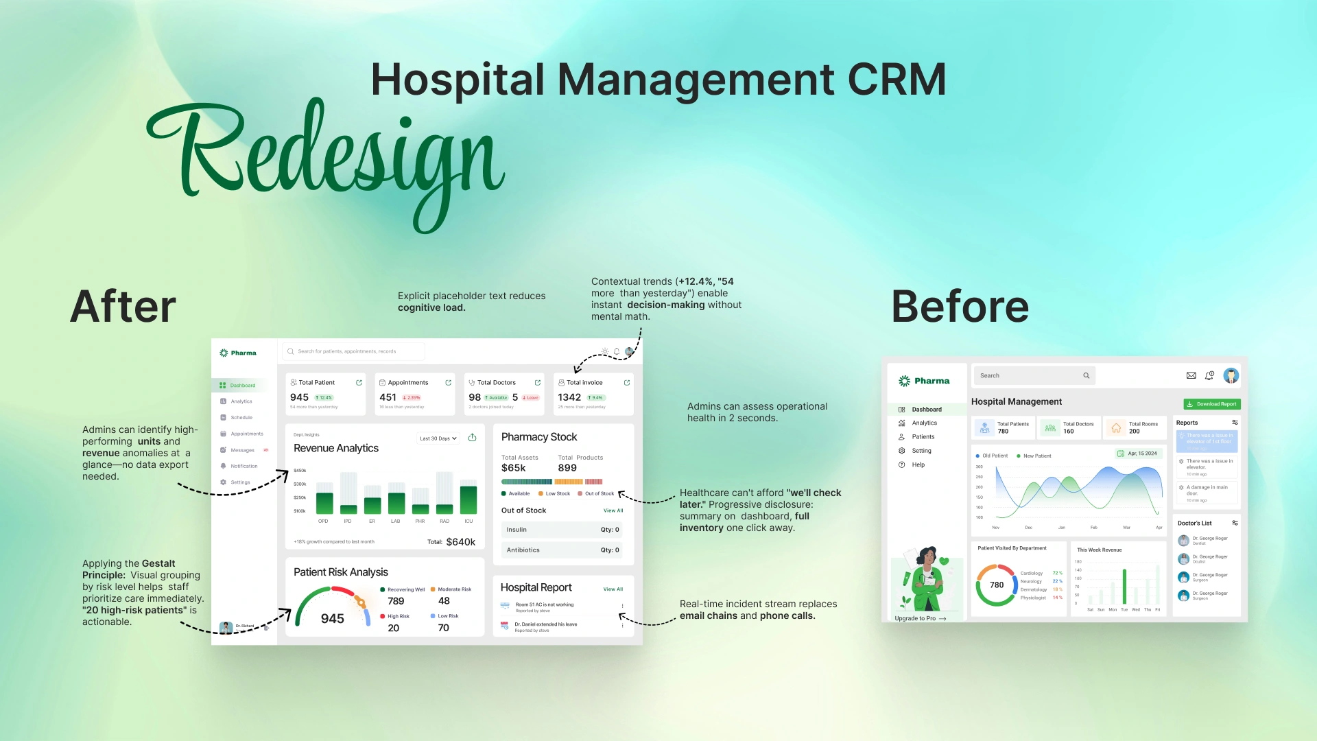
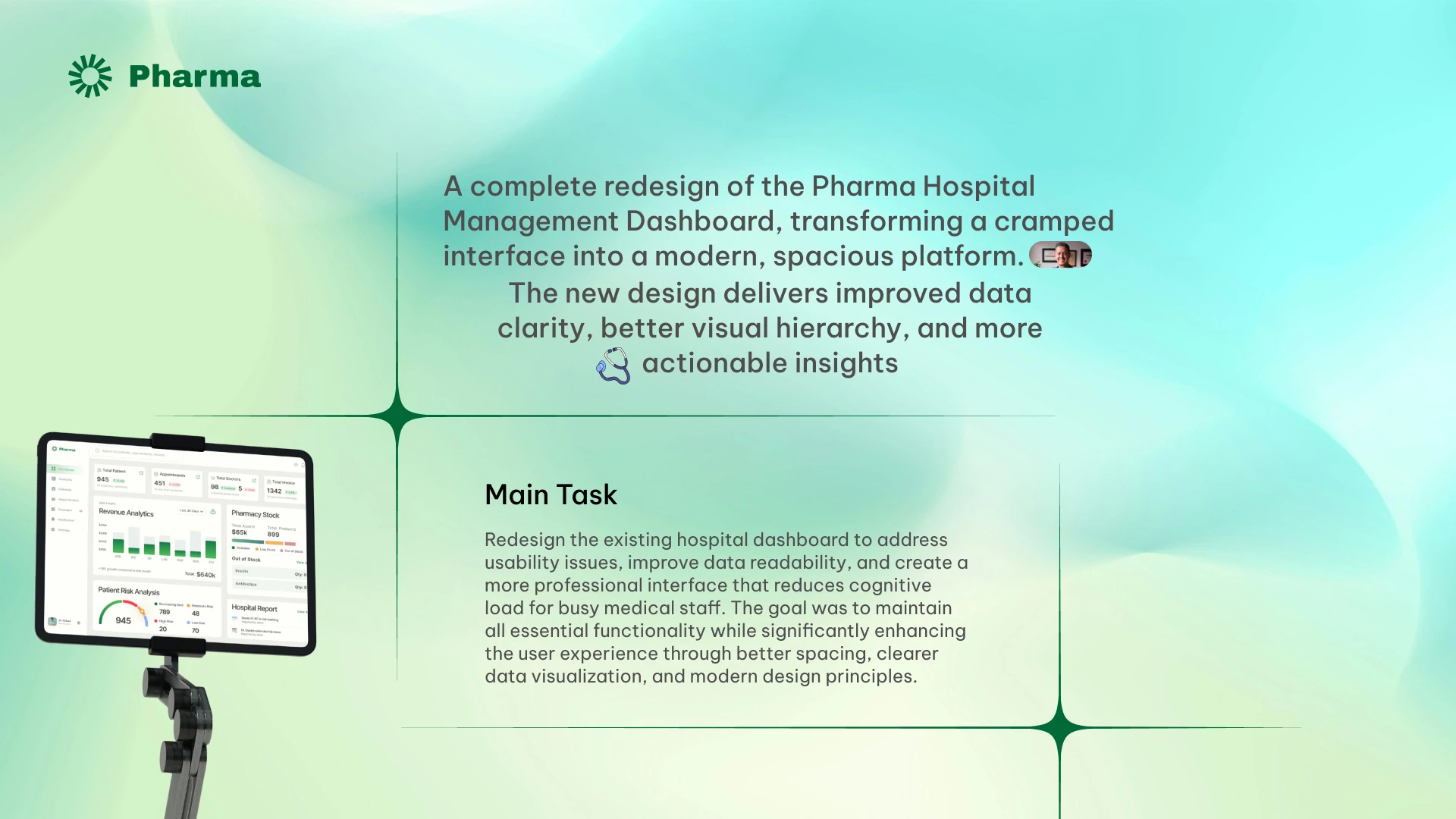
Hospital Management CRM Redesign
Roman Rashid

Like this project
Posted Apr 26, 2026
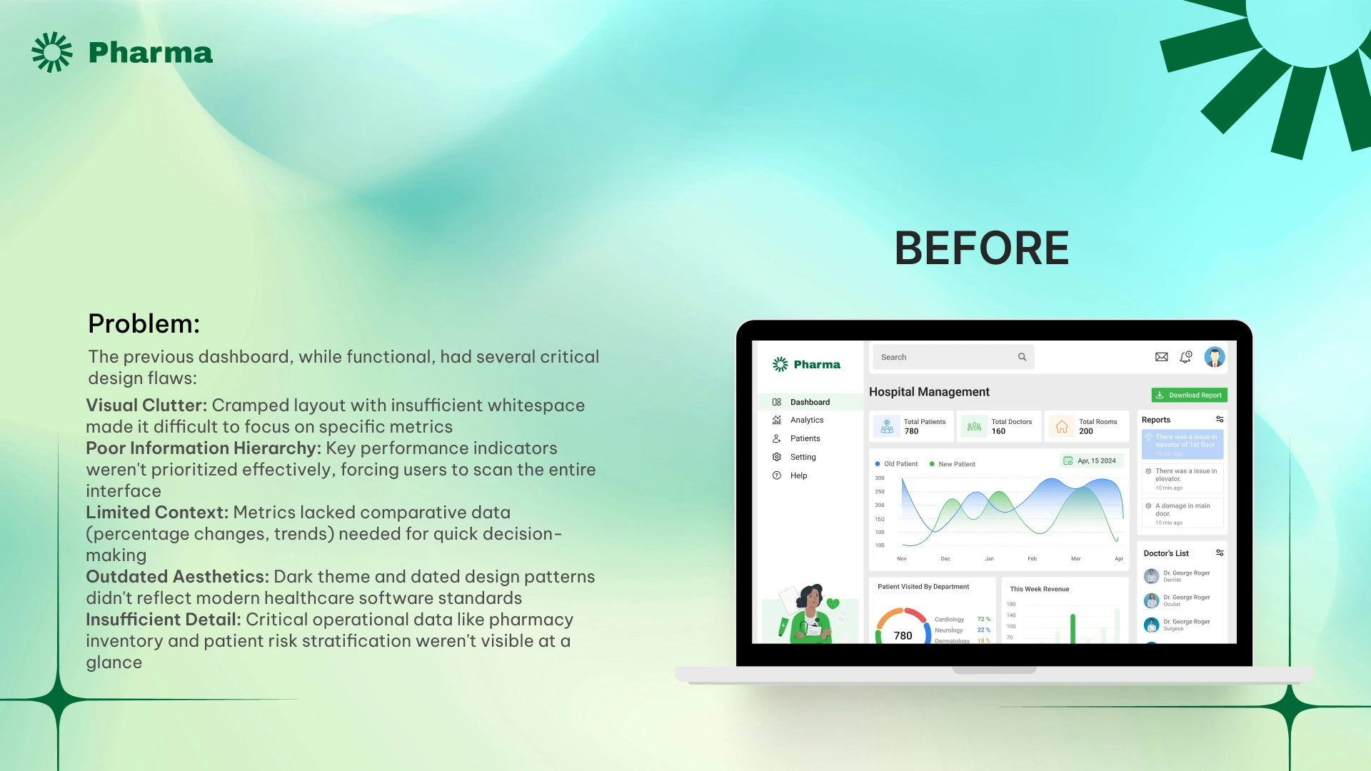
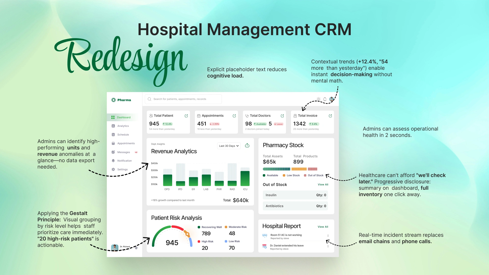
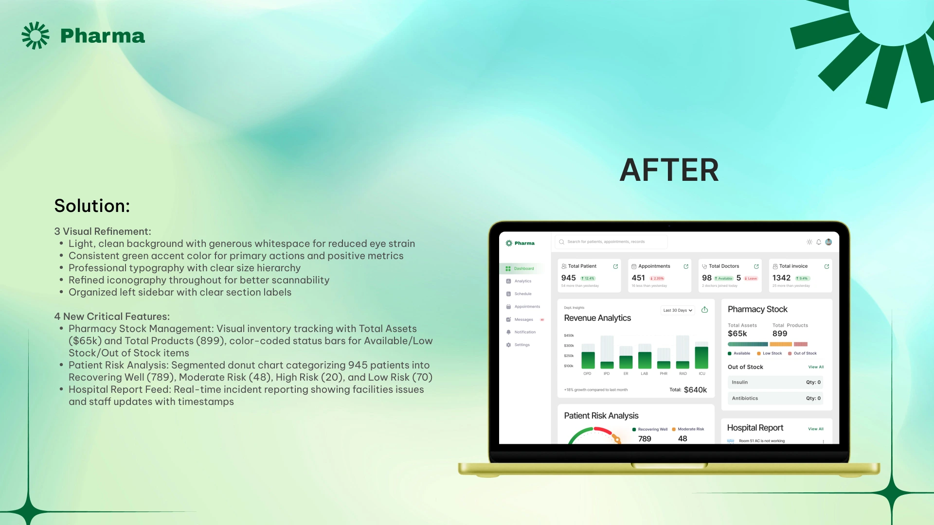
I redesigned a hospital management dashboard serving 780+ patients and 160 staff members. The original interface had poor visual hierarchy and cluttered data presentation, making it difficult for medical staff to find critical information quickly. I restructured the layout using Gestalt principles of proximity and grouping, creating distinct sections for patient metrics, revenue analytics, pharmacy stock, and incident reports. I introduced a Patient Risk Analysis module with color-coded urgency levels and improved data visualization with departmental performance charts.