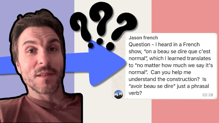
Vibrant Travel & Exploration YouTube Banner Design
Project Description:
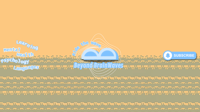
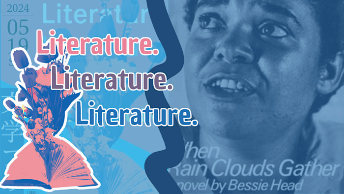
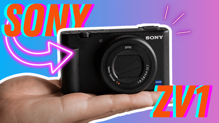
I designed a captivating YouTube banner as a portfolio piece for a hypothetical travel and exploration channel. The goal was to create a visually appealing banner that would entice viewers to click and watch the videos. Here’s an outline of the steps involved in achieving this goal:
Brand and Concept Development:
- Imagined the brand identity of the YouTube creator, focusing on a vibrant and adventurous style.
- Defined the brand’s color palette, incorporating bright, eye-catching colors such as green and orange.
- Established a consistent visual style, including the use of bold, playful typography and dynamic imagery.
Research and Inspiration:
- Studied successful travel channels to understand effective banner designs.
- Collected inspirational images and elements that resonate with the travel and exploration theme and the imagined brand.
Design Execution:
- Used Canva to create the digital banner.
- Applied the brand’s color scheme to enhance visual attraction.
Typography and Text Placement:
- Chose bold, playful fonts consistent with the brand identity to ensure the channel name and tagline stand out.
- Strategically placed text to complement the visual elements without overpowering the image.
Final Touches and Adjustments:
- Made iterative adjustments to refine the design and ensure it met the envisioned goal.
- Optimized the banner for various devices and screen sizes to maintain its impact.
Outcome:
- The final banner successfully simulates a professional, eye-catching design intended to increase channel visibility and attract more viewers. This project showcases my ability to create visually engaging and brand-consistent digital content for the travel and exploration niche.
Like this project
Posted Jun 8, 2024
Crafted a vibrant YouTube banner for a travel & exploration channel, blending bold typography & dynamic imagery to captivate viewers' attention.
Likes
0
Views
7
